
Furniture design and typography might seem like two different creative disciplines, but both rely on proportion, structure, material, and personality. A chair communicates through its silhouette and construction. A wordmark communicates through letterforms, spacing, and visual rhythm. When these elements work together, especially when using an intentional asset family like the Safo Furniture font, they can create a recognizable identity that feels considered from the product itself to the website, packaging, and marketing materials.
Safo Furniture font provides an interesting starting point for exploring this relationship between product design and typography. For designers developing a furniture, interior, or lifestyle brand, the challenge is finding a typeface that complements the visual character of the products. A futuristic font can suggest experimentation, a rounded typeface can soften a contemporary identity, and a distorted display font can introduce a more artistic edge.
This article explores how typography can carry the same creative energy as modern furniture design and introduces ten font alternatives for Safo Furniture font from Craft Supply Co. for different branding directions. The selections are independent creative suggestions, not claims about Safo Furniture’s official logo, typeface, or visual identity.
Why Typography Matters in Furniture Branding
Furniture brands communicate more than the practical function of their products. Their visual identities can express ideas about comfort, innovation, craftsmanship, sustainability, or the relationship between people and the spaces they inhabit. Typography helps translate these ideas into a consistent visual language.
Consider the difference between a slim, geometric wordmark and a bold, rounded display font. The first may feel architectural and precise, while the second can appear more playful and approachable. Neither direction is inherently better. The right choice depends on the furniture collection, intended audience, and atmosphere the brand wants to establish.
Typography also needs to work alongside product photography. Furniture imagery often features distinctive shapes, materials, and carefully arranged interiors. A Safo Furniture font that competes with these details can make the overall presentation feel crowded. A complementary typeface, by contrast, can create a clear hierarchy and let the products remain the visual focus.
For designers looking for Safo Furniture font that carry a similar energy to a contemporary furniture concept, it helps to think beyond conventional minimalist sans serifs. Futuristic lettering, dimensional display styles, rounded forms, and experimental typography can all offer fresh possibilities when used with a clear design purpose.
Finding the Right Visual Energy
1. Form and Proportion
Furniture design often begins with proportion: the relationship between a seat and its legs, the balance of a tabletop, or the curve of a backrest. Typography has its own proportional system. The width of each character, the height of the letters, and the spacing between them determine how a wordmark occupies space.
When choosing a Safo Furniture font, consider the geometry of the products. A collection built around sharp angles and precise structures may work well with futuristic or technical lettering. Softer furniture silhouettes may pair naturally with rounded forms. These relationships do not need to be literal, but they can help create visual consistency between the product and its branding.
2. Material and Texture
Wood grain, brushed metal, molded plastic, upholstery, and polished stone each have distinct visual qualities. Typography can complement these materials through its shape and treatment. A clean display font can create contrast against textured photography, while an experimental or dimensional Safo Furniture font may echo the sculptural character of a product.
However, texture should support the message rather than overwhelm it. If the furniture photography already contains strong patterns or reflective surfaces, simpler typography may provide the balance the composition needs.
3. Innovation and Experimentation
Contemporary furniture branding does not always need to follow a restrained, traditional approach. Some concepts benefit from a more experimental visual language that draws on digital design, futuristic forms, or unconventional lettering. These directions can help a brand feel forward looking, particularly when presenting new collections or creative collaborations.
For additional visual inspiration, explore the portfolio of Craft Supply Co. and consider how typography can become an integral part of a broader design system.
10 Font Alternatives That Carry a Similar Creative Energy
The following typefaces offer different approaches to contemporary branding, from futuristic and techno inspired lettering to dimensional, rounded, and monospaced styles. Each can serve a different purpose depending on whether you are creating a primary wordmark, a collection campaign, a product catalog, or an editorial presentation.
1. CS Axiome Futuristic Font

CS Axiome Futuristic Font is worth exploring when a furniture identity needs a forward looking visual direction. Futuristic typography can introduce a sense of experimentation and innovation, making it a useful option for brands that present furniture as part of a contemporary lifestyle rather than simply a functional object.
Try using CS Axiome for a collection title, a large campaign headline, or a distinctive wordmark. Pair it with clean product photography and a restrained color palette so the lettering can stand out. Before using it as the primary logo, test the complete brand name at different sizes and confirm that the letterforms remain readable in compact applications.
2. Liavin Futuristic Font

Liavin Futuristic Font provides another direction for exploring a technology inspired or forward thinking identity. Comparing two futuristic typefaces is useful because each may create a different impression through its proportions, character shapes, and overall rhythm.
For a furniture brand, Liavin could be tested in editorial layouts, collection announcements, digital campaigns, and product presentation graphics. Consider placing the typography beside photographs of sculptural furniture or carefully composed interiors. The contrast between the physical objects and the futuristic lettering can create an interesting visual dialogue.
3. CS Amused Distort

CS Amused Distort offers an experimental direction for designers who want typography to feel less conventional. Distorted lettering can create movement, tension, or a deliberately unconventional appearance. In furniture branding, this approach may work especially well for limited edition collections, artistic collaborations, or campaign concepts that emphasize creative expression.
Use the font selectively rather than applying it to every element of the identity. A distorted headline can become a strong focal point when surrounded by simple typography, generous negative space, and clear product imagery. This contrast helps the experimental treatment feel intentional rather than distracting.
4. Dorelia Inktrap Font

Dorelia Inktrap Font offers a different approach through its inktrap inspired design direction. Inktrap details can give letterforms a distinctive character and create visual interest without requiring additional graphic effects. This makes the style worth exploring for brands that want typography to feel designed and considered.
Consider Dorelia for a furniture wordmark, a catalog heading, or a collection identity where the typography needs to contribute more than basic information. It can be particularly interesting when paired with close up photography that highlights construction details, material finishes, or the geometry of furniture components.
5. Hecolle Techno Typeface

Hecolle Techno Typeface is a candidate for a brand that wants to explore a more technical, digital, or futuristic personality. Techno inspired typography can introduce a strong visual identity for contemporary furniture concepts, especially when the design direction emphasizes innovation, new materials, or experimental forms.
Try Hecolle in bold collection titles, campaign graphics, or a digital presentation for a new product range. Pair the lettering with simple layouts and carefully controlled alignment. If the font has a strong visual presence, avoid introducing too many competing shapes, colors, or decorative details.
6. Guinsa Blur Font

Guinsa Blur Font opens the door to a more atmospheric and experimental typographic direction. Blur inspired typography can suggest motion, softness, or visual transformation, depending on how it is used in the composition. This makes it an interesting option for campaigns that focus on mood and visual storytelling rather than straightforward product information.
For a furniture project, experiment with Guinsa in a large editorial headline or an art directed collection campaign. Pair it with crisp furniture photography to create contrast between the lettering and the products. Alternatively, use a restrained image treatment to create a more unified atmosphere.
7. Liavin 3D Font

Liavin 3D Font offers a dimensional direction for designers who want typography to feel like a visual object. Three dimensional lettering can echo the sculptural qualities of furniture, especially when the products feature bold silhouettes, unusual structures, or striking proportions.
Consider using Liavin for campaign posters, product launch graphics, or collection announcements. A dimensional headline can add depth to a composition and create a more immersive visual presentation. It may also work well with architectural backgrounds, studio photography, or simple layouts that allow the lettering to become the focal point.
8. Liavin Rounded Font
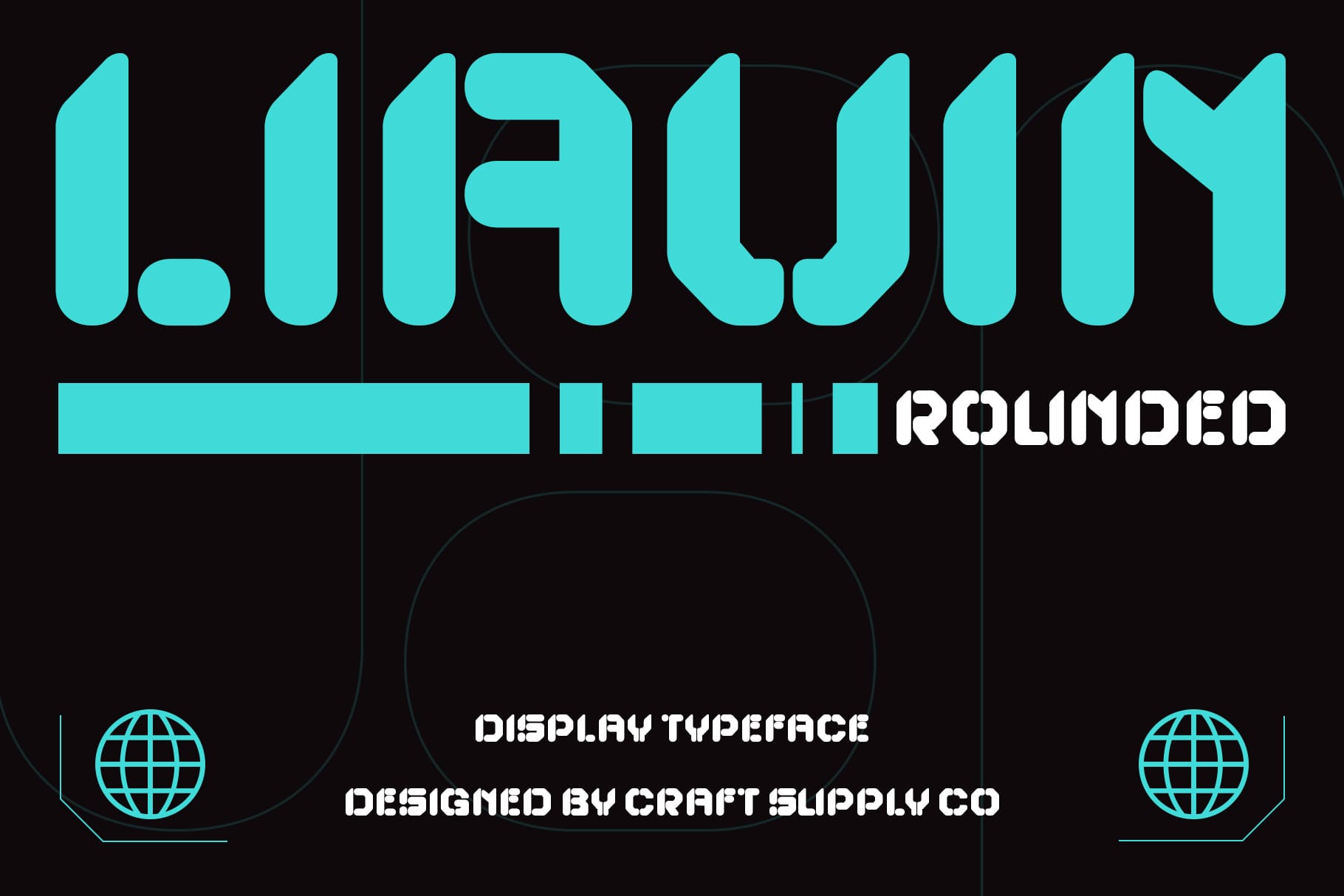
Liavin Rounded Font offers a softer alternative to the more experimental styles in this selection. Rounded typography can create a friendlier visual tone and may work well for furniture brands that want to emphasize comfort, approachability, and everyday living.
This option is worth testing for a lifestyle oriented identity, product packaging, social media graphics, or website headings. Pair it with warm interior photography, natural textures, and a thoughtful color palette to create a welcoming presentation. For furniture collections with softer silhouettes or playful forms, rounded typography can reinforce the product’s personality without relying on elaborate effects.
9. CS Slade 3D Font
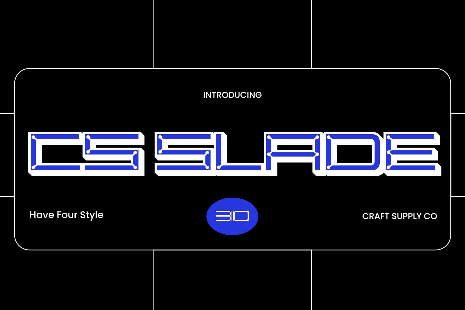
CS Slade 3D Font provides another way to investigate dimensional display typography. Comparing it with Liavin 3D Font allows designers to explore how different letterforms and proportions can change the visual character of a campaign, even when both options share a three dimensional approach.
Use CS Slade for large format headlines, exhibition graphics, or visual concepts that treat typography as part of the product presentation. It can be especially useful when the goal is to create a striking first impression rather than a purely understated wordmark.
10. CS Robert Mono Monospaced Font

CS Robert Mono Monospaced Font offers a structured alternative to the expressive display styles above. Monospaced typography gives characters consistent horizontal spacing, creating a systematic rhythm that can feel technical, editorial, or industrial depending on the surrounding design.
This makes it worth considering for furniture catalogs, product specifications, collection labels, and brand systems that value order and clarity. It can also create an interesting contrast with sculptural furniture photography by introducing a more measured typographic structure alongside organic forms.
How to Choose the Right Safo Furniture Font for Your Furniture Brand
To build a strong brand identity, you must first match your typography directly to the visual forms of your furniture. For instance, geometric or futuristic fonts complement modern, innovative designs, whereas rounded typefaces support warm, minimal collections. Therefore, you should always test your preferred options across multiple digital headers and small packaging mockups to ensure the lettering remains perfectly scalable and legible.
Additionally, using a single expressive font for every element can make a brand feel visually overwhelming to online viewers. Consequently, you must establish a clear typographic hierarchy by pairing a bold headline display font with a simpler sans serif for practical descriptions. After that, use negative space, consistent alignment, and restrained graphic elements so the text guides consumer attention rather than competing with your product photography.
Finally, once you select a definitive typeface system, make sure to document exactly how it should be used. Specifically, define your target headline sizes, letter spacing, and specific alignment treatments within a comprehensive style guide. In contrast to unstructured design setups, these clear guidelines will help your brand maintain a highly recognizable and premium appearance across all printed and digital marketing channels.
For more creative references, explore the portfolio of Craft Supply Co. while developing a visual system that connects typography, imagery, and product presentation.