
In a competitive wellness market, visual identity can make a meaningful difference in how people perceive a brand. Therabody font, in particular, helps communicate a company’s personality before customers experience its products or services. A carefully chosen font can suggest innovation, precision, comfort, or confidence, making it an essential part of a recognizable brand identity.
Therabody font is a useful reference point for exploring the relationship between modern wellness branding and typography. Known for its focus on wellness technology and recovery products, the brand operates at the intersection of performance, lifestyle, and innovation. These qualities provide an interesting starting point for designers who want to explore typefaces that feel contemporary, functional, and distinctive.
This article examines the design principles behind technology oriented wellness branding and introduces ten font alternatives from Craft Supply Co. that can help inspire a similar creative direction. These recommendations are independent design alternatives, not claims about the exact font used in Therabody’s official logo or other brand materials.
Why Typography Matters in Wellness Branding
Wellness brands need to communicate several ideas at once. Customers may look for expertise, reliability, comfort, and a sense of progress. Therabody font can help bring these qualities together by establishing a consistent visual tone across packaging, websites, advertising, product interfaces, and printed materials.
A modern sans serif can communicate clarity and simplicity. A monospaced font may suggest technical precision, data, and structured information. A stencil typeface can introduce a performance oriented character, while a more expressive drawn style can make a technology focused identity feel less clinical.
The challenge is finding a balance between functionality and personality. A Therabody font that looks highly technical might suit a product specification sheet but feel too rigid for a wellness campaign. Conversely, a decorative font might attract attention in an advertisement but become difficult to read on packaging or a mobile interface.
For designers searching for a Therabody font inspired alternative, the goal should not be to reproduce an existing identity. Instead, identify the qualities that suit the intended project and translate them into an original typographic system.
Understanding the Visual Direction of Technology-Inspired Wellness Brands
Clarity and Readability
Wellness technology often combines product information with educational content. Customers may need to understand product features, instructions, benefits, or usage recommendations quickly. Clear typography helps organize this information and makes the overall experience more accessible.
When evaluating a Therabody font, examine its letterforms at different sizes. Check whether similar characters remain distinguishable and whether the spacing feels comfortable. A font that works well in a large headline should also be considered carefully before using it for smaller supporting text.
Precision Without Losing Warmth
Technical products can benefit from a visual identity that feels precise and organized. Monospaced typography is one way to explore this direction because its characters occupy consistent horizontal spaces. However, a highly technical appearance can sometimes feel impersonal.
Designers can balance that effect by pairing a monospaced headline font with a more approachable typeface for longer passages. Warm photography, natural colors, and generous spacing can also soften a rigid typographic system without compromising its clarity.
A Consistent Product Experience
A strong brand identity needs to work across multiple touchpoints. The Therabody font used on a product box should feel related to the typography on the website, social media graphics, product instructions, and campaign materials.
Creating a simple typographic hierarchy helps maintain this consistency. A display font can establish the primary visual personality, a secondary font can support headings, and a highly readable text style can handle longer content. This structure allows the identity to remain recognizable without using the same font for every purpose.
10 Font Alternatives for a Modern Wellness and Technology Identity
The following ten Therabody font offer different creative directions for designers exploring a wellness or technology inspired visual identity. Some emphasize monospaced structure, while others introduce stencil details, circular forms, drawn character, or mixed typographic styles. Test each option with your own brand name before deciding which one fits the project best.
1. CS Caleb Mono Monospaced Font

CS Caleb Mono Monospaced Font is a useful starting point for a design concept built around precision and structure. Monospaced typography gives each character the same horizontal allocation, creating a consistent rhythm across a word or line of text. This quality can support a technology oriented identity that emphasizes organization and technical confidence.
Consider using it for product specifications, short headlines, interface labels, or campaign graphics that need a structured appearance. For a complete wellness brand identity, pair it with a highly readable sans serif for longer paragraphs. This combination can preserve the technical character of the display typography while making everyday communication easier to read.
2. Darbots Modern Stencil Sans Serif
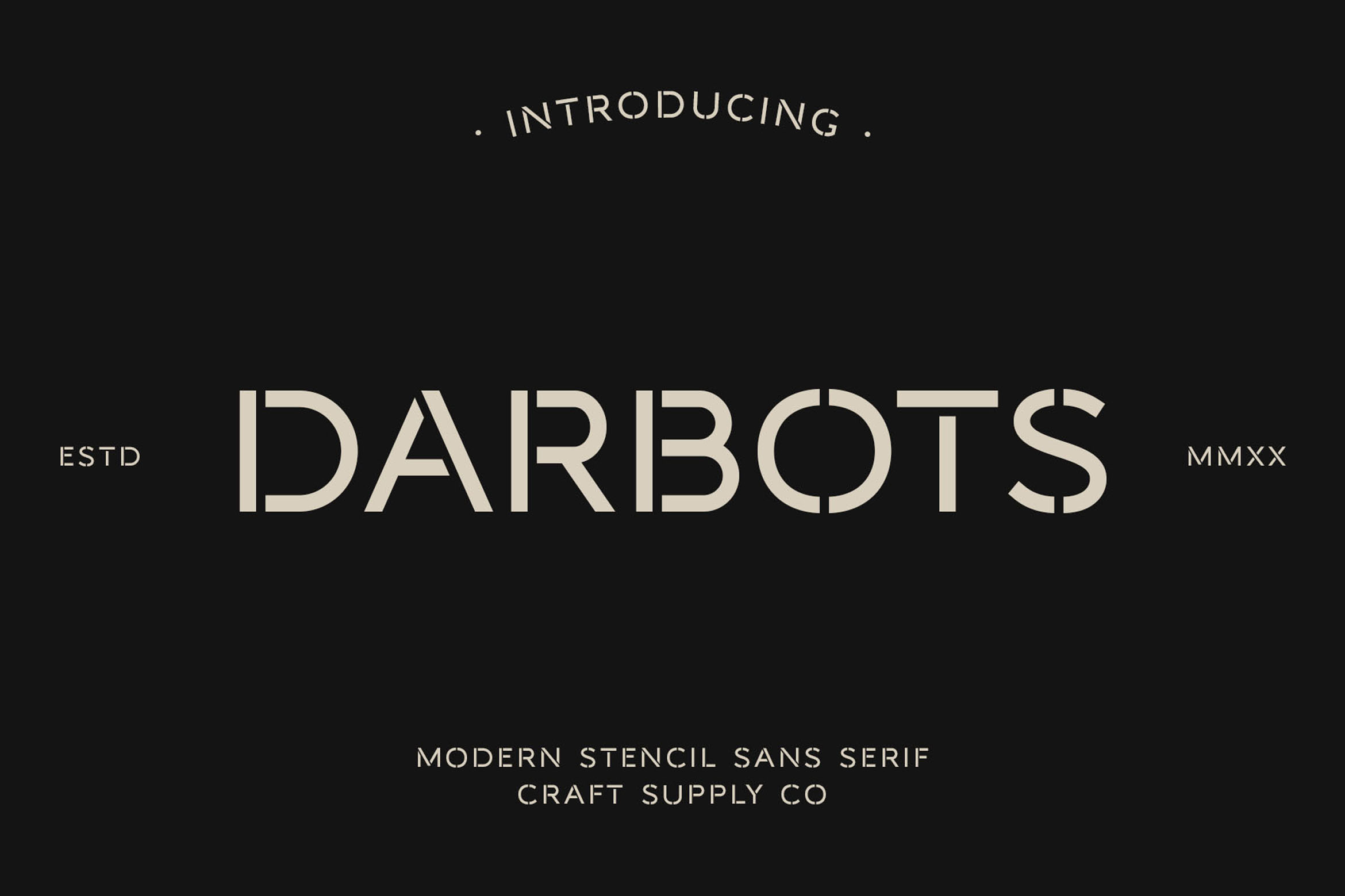
Darbots Modern Stencil Sans Serif offers a different direction through its combination of sans serif styling and stencil inspired construction. Stencil typography can introduce a sense of strength, equipment, and performance, making it worth exploring for fitness technology, recovery products, and active lifestyle campaigns.
Use this typeface when a design needs a more assertive visual voice. It may work particularly well in large headlines, product launch graphics, or promotional layouts where the lettering can become a prominent visual feature. To maintain a balanced identity, combine it with simpler typography and avoid adding too many competing graphic effects.
3. CS Hovan Mono Monospaced Font

CS Hovan Mono Monospaced Font is another option for exploring a technical typographic direction. Although it shares the monospaced category with CS Caleb Mono, comparing the two fonts can reveal differences in letter shapes, proportions, and overall visual rhythm.
Set your brand name in both typefaces and compare how the full word looks rather than focusing on individual characters. You can also test CS Hovan Mono in supporting information, short labels, and editorial style layouts. A consistent monospaced treatment can help organize content while giving a visual identity a distinct technical character.
4. CS Norman Mono Monospaced Font

CS Norman Mono Monospaced Font offers another candidate for projects that need structured, evenly spaced lettering. Monospaced fonts can be especially useful when a layout includes short technical labels, numerical information, or concise statements that benefit from a consistent typographic rhythm.
For a wellness technology concept, experiment with CS Norman Mono in a product information panel or a bold headline paired with plenty of negative space. Keep longer explanatory content in a comfortable reading font, and test the monospaced lettering at smaller sizes to ensure that the final layout remains legible.
5. CS Hovan Mono Drawn Font

CS Hovan Mono Drawn Font introduces a drawn interpretation of monospaced typography. This combination can be worth exploring when a project needs some of the structure associated with monospaced lettering but also benefits from a more expressive visual treatment.
Consider it for editorial headlines, campaign artwork, packaging accents, or visual concepts that aim to make technology feel more personal. It may be particularly useful when a strict technical aesthetic feels too formal for the intended audience. Keep supporting elements simple so the drawn character can stand out without making the design feel cluttered.
6. CS Caleb Mono Drawn Font

CS Caleb Mono Drawn Font provides another way to combine monospaced structure with a drawn typographic style. Comparing this option with CS Hovan Mono Drawn can help designers understand how different letterforms influence the personality of an otherwise similar design direction.
This font may suit a creative wellness campaign, a limited edition packaging concept, or an editorial layout that needs more visual character than a conventional technical typeface can provide. Try it in a large headline first, then examine how it works alongside simple supporting typography. The contrast can help the design feel expressive without losing its underlying structure.
7. Belmein Modern Grotesk Circular Inktrap

Belmein Modern Grotesk Circular Inktrap offers a direction centered on modern grotesque typography, circular forms, and inktrap inspired details. A grotesque sans serif can provide a contemporary foundation for a wordmark, while circular shapes may help create a more approachable visual impression.
This option is worth testing when you want to balance the technical side of wellness technology with a more human centered identity. Explore it for a logo, website headings, or brand campaign titles. Before making a final choice, inspect the full wordmark carefully and check that the distinctive details remain clear at the sizes required for your project.
8. CS Latimer Mix

CS Latimer Mix offers an opportunity to explore a mixed typographic direction rather than relying on a strictly uniform visual style. Mixed typography can help a brand develop a more distinctive personality, especially when a design needs to bridge functional communication and expressive campaign work.
Consider using it in editorial compositions, promotional graphics, or visual experiments that combine different typographic treatments. If you use a mixed style for the main wordmark, keep the broader identity system organized. Establish clear rules for when to use the expressive treatment and when to switch to simpler typography for instructions or product information.
9. CS Richard Mix

CS Richard Mix is another option to investigate when a project calls for a more varied typographic personality. A mixed approach can help create contrast between prominent headlines and secondary information, giving a layout a more editorial character than a single style system might offer.
For a wellness inspired concept, test the font in a campaign headline or a brand story layout. Look at how the lettering interacts with product photography and graphic elements. If the typography is visually expressive, use restraint elsewhere so the overall design remains easy to understand and the brand name stays recognizable.
10. CS Standish Mix
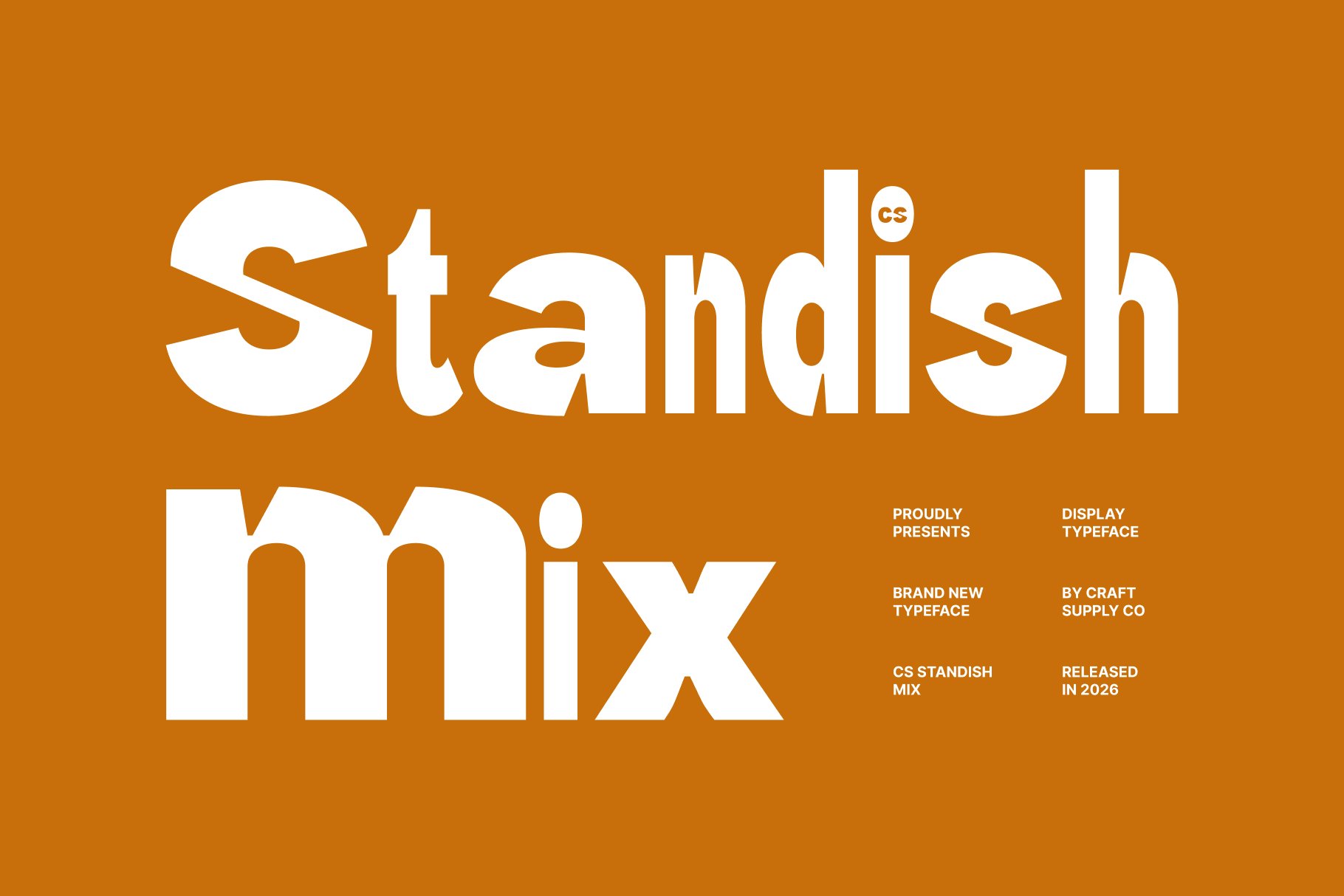
CS Standish Mix rounds out this selection with another mixed style option for designers who want to explore a less conventional typographic direction. It can serve as a starting point for layouts that need a distinctive display treatment or a more experimental relationship between typography and other visual elements.
Use it to develop mood boards, campaign concepts, or alternative wordmark sketches. Compare the result with the monospaced and sans serif options in this list. That comparison will help you decide whether the brand benefits more from a structured, technical appearance or a more expressive visual identity.
How to Select the Best Alternative for Your Project
Before choosing a Therabody font, identify three or four qualities that the brand should communicate. These might include precise, innovative, approachable, energetic, or premium. Use those qualities as a reference when evaluating each option, rather than choosing a font based solely on visual appeal. A font can look impressive in a sample but behave differently when applied to a particular brand name. Set the full name in each candidate and review its proportions, spacing, and overall silhouette. Pay attention to how the first and last letters frame the word, and adjust kerning where necessary.
Not every font needs to perform every role. A display typeface can provide the identity’s personality, while a more straightforward sans serif supports product descriptions, instructions, and longer website content. A monospaced style may be reserved for concise technical details or labels. This division of roles helps prevent the identity from becoming visually repetitive. It also allows expressive fonts to make an impact without compromising readability in more information heavy applications.
Preview the selected typeface on packaging, digital interfaces, social media graphics, printed materials, and promotional imagery. Consider both large and small sizes, and test the design in color as well as black and white. A font that looks excellent in a presentation may need adjustments when placed into a real layout. Using an established brand as inspiration can be a useful part of the creative process, but the final result should express the identity of your own project. Develop a distinctive combination of typography, color, imagery, spacing, and graphic elements instead of attempting to reproduce another company’s logo or overall visual identity.
For further creative inspiration, explore the work of Craft Supply Co. and consider how different typographic choices can influence the tone of a visual presentation.