
A comic font brings energy, personality, and expression to a design. Inspired by comic books, cartoon lettering, and illustrated storytelling, these comic fonts can make headlines feel lively and help visual messages stand out. Whether you are designing a comic strip, a children’s poster, a gaming graphic, or playful brand materials, the right typography can add character to your work.
comic fonts comes in many styles. Some fonts use rounded, friendly letterforms that suit children’s projects, while others feature bold shapes, rough textures, or dramatic details that work well for action scenes and alternative artwork. Choosing the right style depends on your audience, the mood you want to create, and how the lettering will appear in your final design.
In this guide, we explore what makes a good comic font, how to use comic lettering effectively, and 10 comic fonts alternatives from Craft Supply Co that can inspire your next creative project.
What Is a Comic Fonts?
A comic fonts is a typeface designed or selected to evoke the visual language of comics, cartoons, and illustrated storytelling. Comic lettering often uses expressive shapes, distinctive proportions, and strong visual contrast to communicate emotion and movement.
Designers use comic fonts for speech bubbles, sound effects, character titles, children’s books, posters, merchandise, gaming graphics, and social media content. The style can be playful and approachable, bold and energetic, or dark and dramatic.
comic fonts is also useful outside traditional comic books. A playful display font can give a product label a friendly personality, while a rough or textured style can help create an alternative poster or a retro inspired visual identity. The key is choosing a font that supports the message rather than distracting from it.
What Makes a Good Comic Font?
Expressive Letterforms
Comic designs often depend on typography to communicate emotion. Bold, irregular, rounded, or exaggerated letters can help a headline feel exciting, funny, dramatic, or friendly. Choose a style that matches the tone of your illustration or story.
Clear Readability
Comic lettering should remain easy to read, particularly when it appears inside speech bubbles or alongside illustrations. Highly decorative fonts can work well for short phrases and sound effects, but longer dialogue and explanatory text usually benefit from simpler letterforms.
A Strong Visual Personality
A good comic font should contribute to the overall atmosphere of the design. Rounded fonts can feel welcoming, distressed styles can feel rough or vintage, and graffiti inspired lettering can add an urban edge. Think about the intended audience before choosing a direction.
Versatility Across Applications
Consider how the font will work across different formats. A typeface that looks effective on a large poster may need careful sizing and spacing to remain readable on a phone screen, a small label, or a printed comic panel.
10 Comic Font Alternatives to Explore
Looking for a comic font for your next project? These 10 comic fonts alternatives from Craft Supply Co offer a range of creative directions, from comic-inspired lettering to bubble styles, graffiti, and expressive display typography. Test each option with your own words and illustrations to find the best fit.
1. CS Nomic Comic Font

CS Nomic Comic Font is a natural starting point when exploring typography for comic inspired designs. Consider it for comic titles, cartoon graphics, illustrated storytelling, character introductions, and playful promotional materials.
For a classic comic inspired layout, use the font for short headlines or expressive phrases, then pair it with a simpler typeface for longer text. You can also combine it with speech bubbles, outlined illustrations, and contrasting colors to create a lively composition. Keep the main message prominent so readers can understand it quickly.
2. CS Sharow Vintage Horror Font

CS Sharow Vintage Horror Font offers a different direction for projects that lean toward spooky storytelling or retro horror aesthetics. Consider testing it for horror comic covers, Halloween posters, dark cartoon artwork, themed event graphics, and dramatic title treatments.
Pair this style with shadowed illustrations, limited color palettes, or distressed textures to build atmosphere. It can work especially well for short titles where the typography helps establish the mood. For supporting details, choose a readable font that maintains contrast with the more dramatic headline.
3. CS Nomic Lined

CS Nomic Lined is worth exploring for designs that benefit from a line-based or outlined visual treatment. Consider it for comic titles, illustrated posters, creative merchandise, and graphic compositions where typography needs a distinctive appearance.
Experiment with contrasting backgrounds and simple shapes to help the lettering stand out. If you use the font for a headline, keep the surrounding artwork relatively restrained so the letterforms remain visible. A solid, straightforward typeface can complement the more expressive style in captions and supporting information.
4. CS Remus Inktrap Font
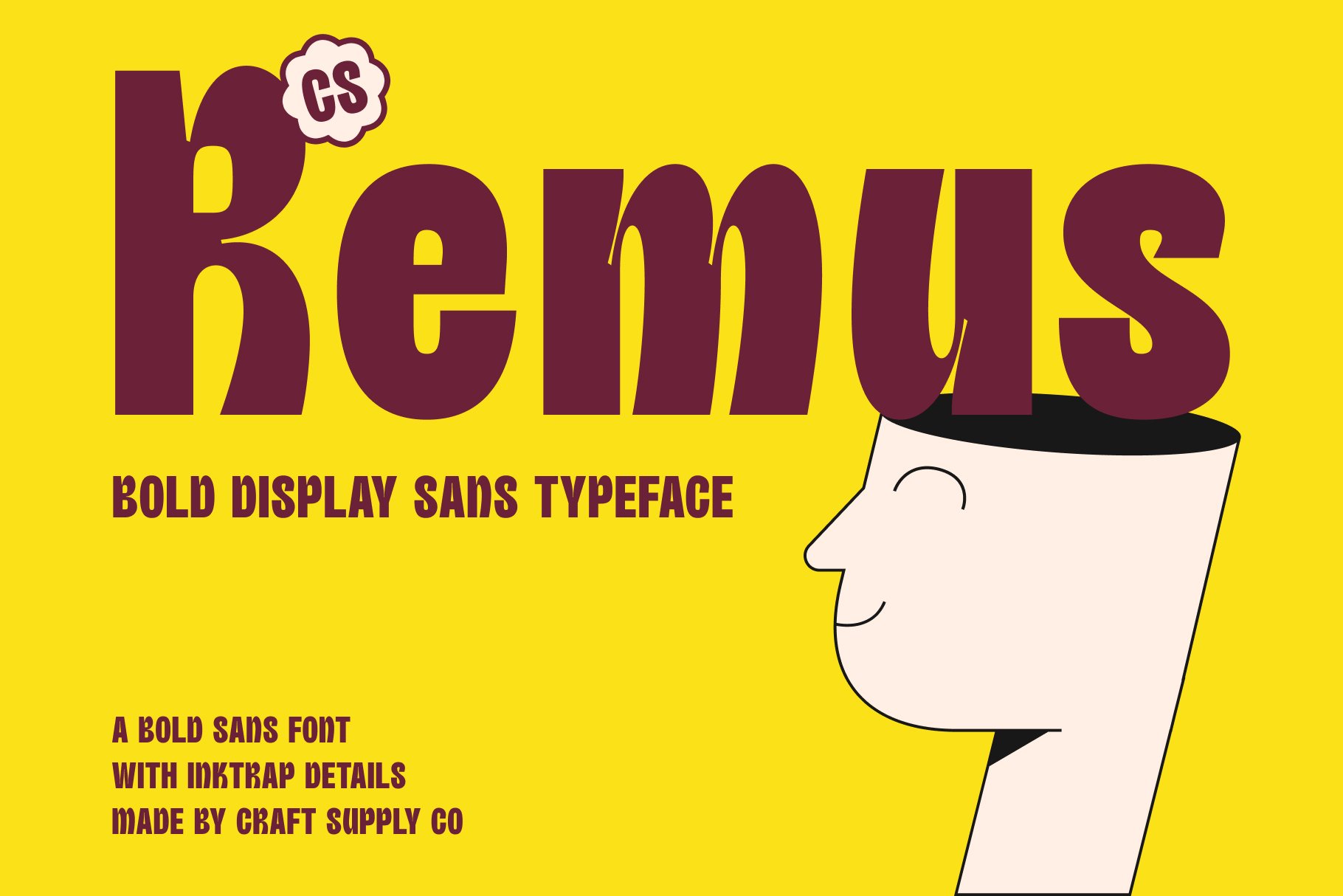
CS Remus Inktrap Font is an alternative to consider when exploring distinctive display typography for comic inspired graphics. Test it in title cards, editorial illustrations, poster headlines, or branding projects that need a recognizable typographic feature.
When choosing a font for comic artwork, think about how it interacts with the illustration style. A strong display font can provide contrast against detailed drawings, while a simpler supporting typeface helps maintain a clear reading order. Preview the combination at the size where it will actually be used.
5. CS Nomic Stamp

CS Nomic Stamp is worth testing for designs that use a stamped or textured visual direction. It may suit retro comic inspired posters, merchandise graphics, illustrated packaging, and creative projects that combine typography with a handmade appearance.
Try incorporating the font into short phrases, labels, or title treatments. Pair it with simple illustrations and restrained textures to avoid making the composition too busy. If you want a vintage inspired look, a limited palette and carefully selected background elements can help tie the design together.
6. CS Nomic Drawn

CS Nomic Drawn is another option to explore for comic inspired artwork with a drawn visual character. Consider it for cartoon posters, speech-bubble graphics, illustrated greeting cards, creative merchandise, or storytelling projects that need expressive typography.
Hand drawn lettering can help a design feel informal and creative. Combine it with sketch like illustrations or simple character drawings, and use a clean supporting font for practical details. Maintaining a clear hierarchy between the main phrase and secondary text will help the design feel intentional.
7. Acaphy Bubble Font for Kids
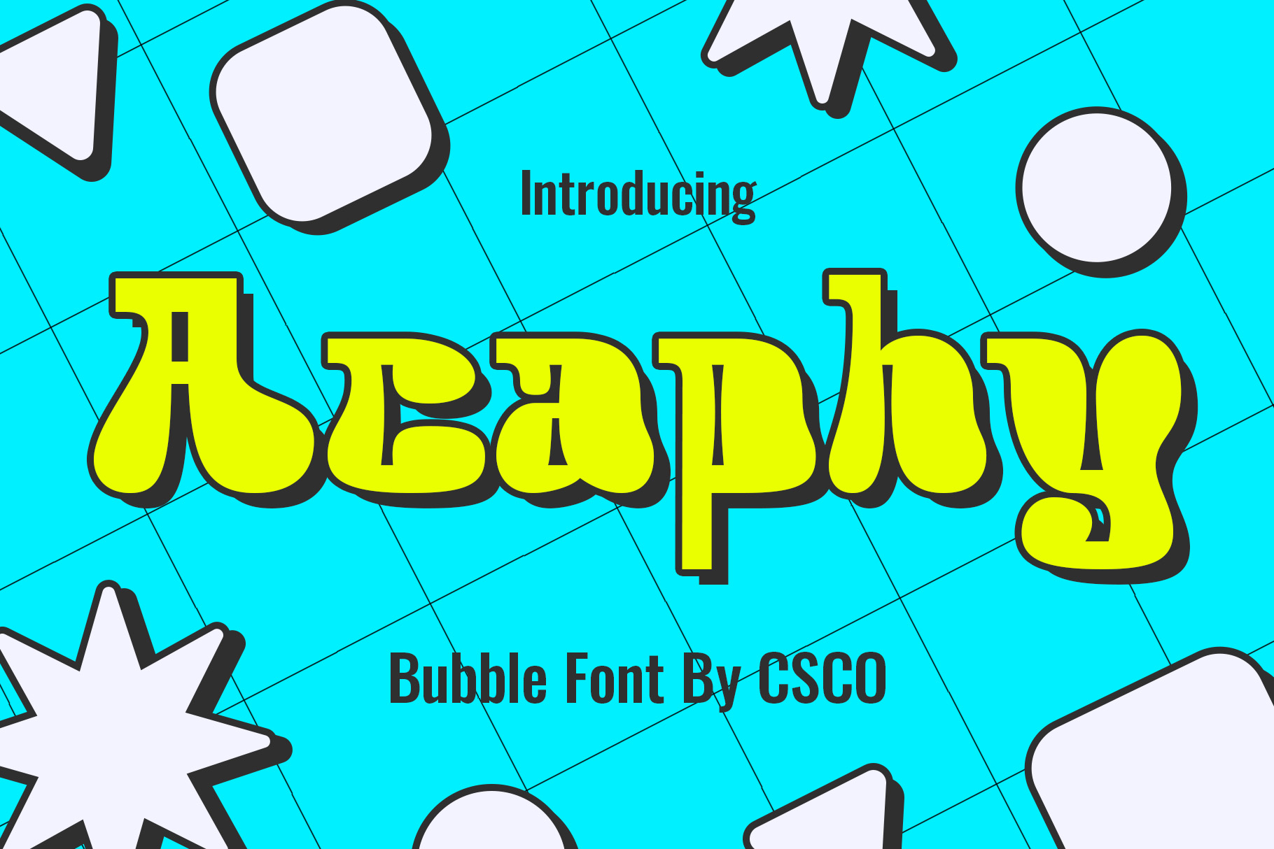
Acaphy Bubble Font for Kids is a strong candidate to explore for child friendly and playful design projects. Bubble style lettering often creates a rounded, approachable impression, making it worth testing for children’s posters, classroom materials, birthday invitations, cartoon graphics, and playful educational content.
Use it for short, cheerful headlines and pair it with bright colors or simple illustrations. For a children’s design, make sure the contrast between the letters and background is strong enough to support readability. Avoid placing too many decorative elements around the headline, especially when the design includes important instructions or event details.
8. Urban Graffiti Font Busky
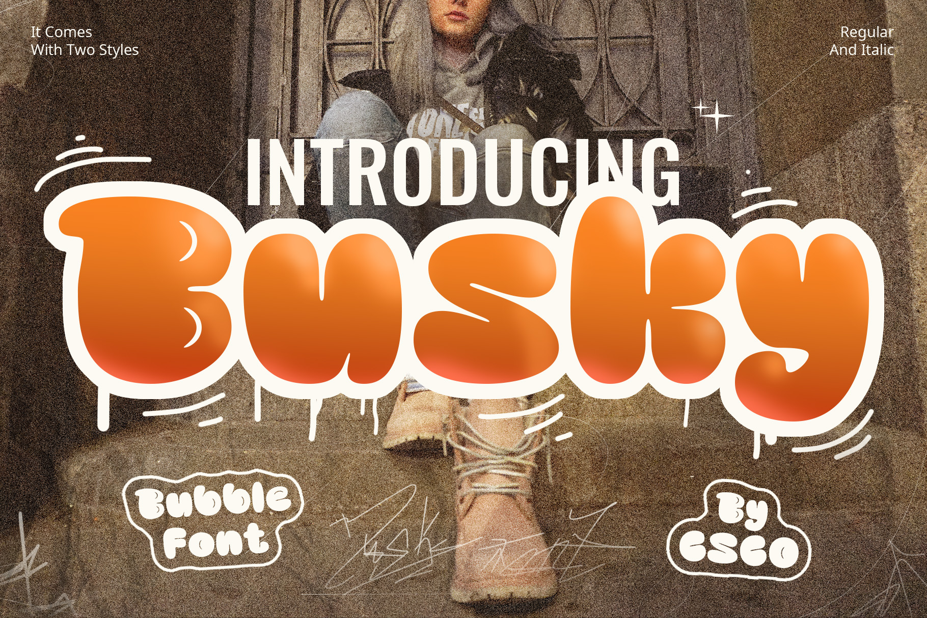
Urban Graffiti Font Busky offers an alternative for comic-inspired projects with an urban or street art direction. Consider it for bold poster designs, illustrated merchandise, gaming graphics, music artwork, or character driven visuals that need a more rebellious tone.
Combine the lettering with expressive illustrations, strong color contrasts, or geometric backgrounds to develop a cohesive look. Graffiti inspired typography can have a strong visual presence, so use it selectively when the layout contains a lot of other information. A clean secondary font can make the overall composition easier to navigate.
9. Radey Bubble Font Playful Design

Radey Bubble Font Playful Design is another option to consider for cheerful, rounded typography. Explore it for cartoon graphics, children’s book titles, playful packaging, stickers, social media posts, and other designs that benefit from a friendly visual mood.
For a lively comic inspired composition, try combining the font with simple character illustrations, colorful shapes, or speech bubbles. Use the main lettering to establish the focal point and keep smaller supporting text straightforward. This approach helps create a playful design without sacrificing clarity.
10. Raimes Script Typeface

Raimes Script Typeface provides a different typographic direction for designs that need contrast against bold comic lettering. Consider testing it for character signatures, short expressive phrases, decorative accents, or supporting words in an illustrated poster.
Combining a script style with a comic display font can create an interesting contrast between expressive lettering styles. Use the script selectively rather than for long passages, and make sure its visual character fits the overall design. A simple layout and consistent color palette can help the two styles work together.
How to Choose the Right Comic Font
Match the Font to the Story
Think about the mood of your comic or illustration before choosing a typeface. A lighthearted cartoon may call for friendly, rounded lettering, while a suspenseful story may benefit from darker or more dramatic typography. The font should reinforce the story’s atmosphere and help readers understand its tone.
Use Different Styles for Different Purposes
Not every word in a comic needs the same treatment. You might use a display font for the cover title, a readable typeface for dialogue, and a more expressive style for sound effects or dramatic moments. Assigning each style a clear role helps the overall design remain consistent.
Pay Attention to Size and Spacing
Comic lettering often appears inside compact spaces such as speech bubbles, captions, and narrow panels. Check how the font performs at the intended size and adjust line breaks or spacing where necessary. Avoid squeezing long text into a small area if it makes the words difficult to read.
Coordinate Typography With Illustrations
Typography and illustration should feel like parts of the same visual system. Match the font’s personality to the drawing style, color palette, and composition. For example, a playful bubble font may complement rounded cartoon characters, while a distressed display font may better suit rough textures and dramatic artwork.
For more creative inspiration, explore the portfolio of Craft Supply Co. Looking at different visual identity and graphic design projects can help you understand how typography, color, and illustration can work together.
Where Can You Use Comic Fonts?
- Comic books and graphic novels: Create memorable titles, character introductions, and expressive text treatments.
- Cartoon graphics: Add personality to illustrated characters, speech bubbles, and promotional artwork.
- Children’s designs: Use friendly lettering for educational posters, activity sheets, invitations, and book covers.
- Gaming graphics: Create energetic titles, event banners, and character focused promotional materials.
- Posters and merchandise: Give short slogans, product names, and graphic illustrations a distinctive appearance.
- Social media: Design engaging posts, thumbnails, announcements, and short form promotional graphics.
- Halloween and horror projects: Explore darker display styles for spooky comics, themed posters, and seasonal graphics.
Common Comic Font Design Mistakes to Avoid
Combining too many expressive typefaces can make a comic design feel inconsistent. Start with one main display font and one supporting font. Introduce another style only when it serves a specific purpose, such as distinguishing a title from a character’s dialogue.
Decorative lettering can look exciting in a headline but may become tiring when used for long passages. Prioritize legibility for dialogue, captions, and instructions. Test the text at its actual size rather than judging it only in a large font preview.
Typography needs enough contrast against its background to remain visible. Avoid placing detailed lettering over busy illustrations without a clear separation. You can improve readability with simpler backgrounds, carefully chosen colors, or additional spacing around the text.
A font should complement the illustrations and story rather than compete with them. Consider the weight, texture, and personality of the artwork before selecting a typeface. A cohesive visual direction makes the entire composition feel more polished.
Outlines, shadows, textures, and bright colors can enhance comic typography, but applying too many effects at once can reduce clarity. Start with the font’s natural appearance, then introduce effects selectively to emphasize important words or create a particular atmosphere.
For more typography inspiration and creative resources, visit Craft Supply Co. With thoughtful font selection and a clear visual hierarchy, you can create comic-inspired designs that feel distinctive, engaging, and easy to read.