
Typography plays a fundamental role in magazine design. Before readers explore an article, they encounter its cover, headlines, page layouts, and typographic hierarchy. The right magazine typography can establish the publication’s personality, communicate its subject, and make every page feel more engaging. Whether you are designing a fashion magazine, a lifestyle publication, an independent art journal, or a contemporary editorial, choosing the right typeface can transform the entire reading experience.
Finding the best magazine typography design requires a balance between visual character and readability. Elegant serif fonts can introduce sophistication to fashion and culture publications, while modern typefaces can create a clean and contemporary appearance. Drawn lettering can add an artistic quality to feature headlines, and condensed fonts can help designers fit impactful titles into limited cover space.
In this guide, we have selected 10 magazine typography from Craft Supply Co. that offer different creative directions for magazine and editorial design. From expressive drawn styles and elegant serifs to rounded letterforms, condensed typography, and experimental designs, these options can help you create distinctive magazine covers, article headlines, section titles, and promotional graphics.
What Makes a Good Font for Magazine Design?
A successful magazine relies on typography to organize information and establish a recognizable visual identity. Unlike a standalone poster, a magazine must accommodate different types of content, including headlines, introductory paragraphs, long-form articles, captions, pull quotes, and page numbers. Each element needs a clear typographic role.
Serif fonts remain a popular choice for editorial design because they can communicate elegance, tradition, and sophistication. Modern serif typefaces can also introduce a contemporary character through distinctive proportions and refined details. Display fonts, meanwhile, help magazine covers and feature headlines capture attention, particularly when designers want to create a memorable visual statement.
Readability should guide every decision. A font that looks beautiful in a large headline may not perform well in long paragraphs or small captions. Consider using a distinctive display font for headlines and a highly readable typeface for body copy. This combination creates contrast while helping readers navigate the publication comfortably.
10 Font Recommendations for Magazine Design
1. CS Granvile Drawn

CS Granvile Drawn offers an expressive direction for magazine layouts that need a distinctive, artistic typographic element. Drawn lettering can introduce a handcrafted quality that makes a publication feel creative and personal. This style works particularly well when a magazine wants to move beyond conventional editorial typography and create a more expressive visual identity.
Consider using this font for cover headlines, special feature titles, illustrated editorials, or promotional graphics. It can complement independent art magazines, creative lifestyle publications, culture journals, and experimental fashion editorials. For a balanced layout, combine its expressive character with a simpler supporting typeface for article text, captions, and other essential information.
2. CS Quinoa Drawn

CS Quinoa Drawn provides another option for magazine designers who want to introduce a creative and handcrafted appearance. A drawn typographic style can add personality to an editorial concept, especially when the publication uses illustrations, photography, or unconventional page compositions.
This font can work well for lifestyle magazines, independent publications, food editorials, arts and culture features, and creative projects. Use it for selected headlines or short statements that deserve extra attention. Pair it with a restrained serif or sans serif for supporting content, allowing the drawn lettering to establish the mood without making the entire page feel visually crowded.
3. CS Granvile Elegant Serif Font

CS Granvile Elegant Serif Font is a strong candidate for magazines that aim to communicate sophistication and editorial refinement. Serif typography often works beautifully in fashion, beauty, culture, and lifestyle publications because it can give headlines a polished and timeless character.
Use this font for magazine covers, feature titles, section headings, or prominent pull quotes. It can support an identity built around premium photography, carefully curated content, and spacious page layouts. Combine it with a clean sans serif for smaller text to create a clear hierarchy between expressive headlines and practical information.
4. CS Aspire Drawn

CS Aspire Drawn is worth considering when you want a magazine to communicate creativity through expressive typography. Drawn fonts can make an editorial layout feel more individual, helping designers create a recognizable visual signature for special features, interviews, and themed issues.
Explore this font for art magazines, creative journals, independent fashion publications, and lifestyle editorials. It can also bring personality to cover lines and promotional materials that accompany a print or digital issue. To preserve readability, reserve the font for selected display elements and use a simpler typeface for longer passages of text.
5. CS Aruba Modern Serif Font

CS Aruba Modern Serif Font offers a contemporary direction for editorial typography. Modern serif fonts can combine the sophistication associated with traditional publishing with a fresh visual character, making them useful for magazines that want to feel refined without appearing old fashioned.
Consider using CS Aruba for fashion editorials, culture magazines, travel publications, lifestyle features, and premium brand magazines. It can establish a strong typographic presence on a cover while providing a consistent style for section titles and article headlines. Pair it with a readable sans serif body font to create a clean and balanced editorial system.
6. CS Baliste Modern Serif Font
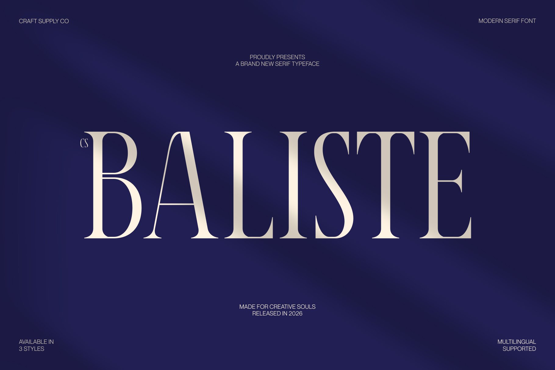
CS Baliste Modern Serif Font is another option for publications seeking an elegant and contemporary typographic identity. A modern serif can help a magazine communicate quality and confidence while giving its headlines a distinctive appearance. This makes the style particularly useful for publications that depend on strong art direction and carefully structured layouts.
Use this font for cover typography, long form feature headings, editorial introductions, and prominent quotations. It can suit fashion, design, beauty, travel, and culture publications that want a sophisticated visual language. Maintain generous spacing around large headlines and choose a complementary body font that supports comfortable reading across multiple columns.
7. Benida Rounded Versatile Serif
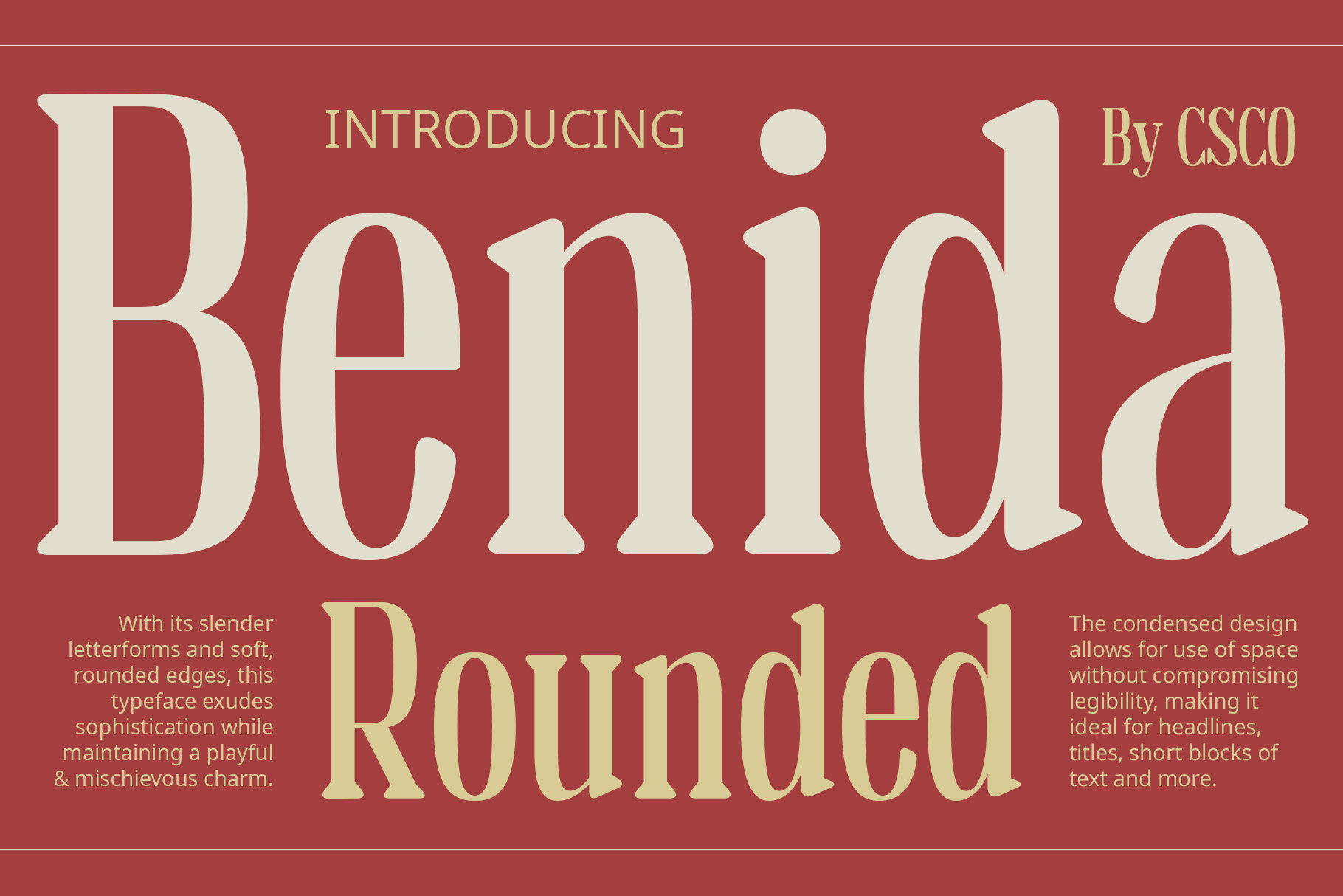
Benida Rounded Versatile Serif offers a softer alternative to more traditional editorial typography. Rounded characteristics can make serif lettering feel approachable and contemporary, helping a publication balance sophistication with warmth. This quality can be valuable for magazines that want to appeal to readers without adopting an overly formal visual style.
Consider this font for lifestyle magazines, food publications, wellness editorials, independent creative journals, and family oriented content. It can work for article titles, section headings, and selected cover lines. Pair it with a straightforward sans serif for body text, captions, and navigation elements to maintain clarity throughout the publication.
8. Rovey Blur Font

Rovey Blur Font provides an experimental direction for magazines that embrace contemporary art, visual culture, and unconventional design. A blur inspired typeface can create a sense of movement or atmosphere, making it particularly interesting for editorial concepts that use typography as an expressive graphic element.
Try it for experimental fashion editorials, music magazines, art publications, creative campaign covers, or special feature graphics. It can help a headline feel unexpected and visually dynamic. However, because blurred lettering can affect readability, use it selectively for short titles and combine it with a clearer font for article text, captions, and other important information.
9. CS Galcia Condensed Font

CS Galcia Condensed Font is a practical choice for magazine covers and editorial layouts that need strong headlines within limited space. Condensed typography allows designers to fit longer words into narrow columns or compact cover areas without immediately reducing the text size. It can also create a tall, graphic appearance that helps headlines stand out.
Use this font for news features, sports magazines, contemporary culture publications, event-focused issues, and bold cover lines. It can work particularly well when a cover includes several headlines competing for limited space. Pair it with a more neutral body font, and pay attention to spacing so the condensed lettering remains comfortable to read.
10. CS Pamela Inktrap Font

CS Pamela Inktrap Font offers a distinctive typographic direction for magazines that want to incorporate contemporary design details. Inktrap inspired typography can introduce a technical or graphic character, giving editorial layouts an alternative to conventional serif and sans serif combinations.
Consider using this font for design magazines, technology publications, contemporary culture editorials, creative portfolios, or modern lifestyle features. It can add visual interest to headlines, section titles, and supporting display text. For the best results, establish a clear hierarchy and use a readable companion font for long articles and smaller supporting details.
Choosing the Right Magazine Font Style
Every publication has a different editorial personality. Before choosing a typeface, consider the subject of your magazine, the expectations of your readers, and the visual direction you want to establish. A fashion magazine may need refined typography, while an independent art journal may benefit from more experimental lettering.
Elegant and Contemporary Editorial Design
For a polished publication with a sophisticated appearance, consider CS Granvile Elegant Serif Font, CS Aruba Modern Serif Font, or CS Baliste Modern Serif Font. These options can help establish a refined direction for fashion, lifestyle, culture, and design magazines.
Creative and Artistic Magazine Layouts
If your publication celebrates illustration, experimental photography, or independent creative culture, explore CS Granvile Drawn, CS Quinoa Drawn, and CS Aspire Drawn. Drawn lettering can introduce a personal touch and create a stronger connection between the typography and the artwork.
Bold and Space Efficient Headlines
For covers with multiple headlines or limited layout space, CS Galcia Condensed Font can provide a useful direction. Condensed typography can help organize cover lines and create strong vertical elements without forcing every headline into the same size or shape.
Experimental and Contemporary Typography
For magazines that embrace unconventional visual storytelling, Rovey Blur Font and CS Pamela Inktrap Font offer alternative approaches to display typography. Use these styles for selected headlines and visual accents while keeping the main reading text clear and accessible.
Where to Use Magazine Typography
A strong magazine font system should work across the publication rather than only on the cover. Test your chosen typefaces in different editorial contexts to make sure they support both the visual identity and the reading experience.
- Magazine covers and main headlines
- Article titles and section headings
- Feature introductions and opening spreads
- Pull quotes and highlighted statements
- Contents pages and editorial navigation
- Captions and photography credits
- Print advertisements and sponsored features
- Digital magazine layouts and online articles
- Promotional graphics for new issues
- Social media posts announcing editorial stories
Tips for Pairing Fonts in Magazine Design
Effective magazine typography pairing creates contrast while maintaining a consistent editorial identity. Rather than using several decorative typefaces together, choose one primary display font and a complementary font for body text. You may also introduce a third typeface for captions or small labels if the publication genuinely needs another level of hierarchy.
For example, a modern serif can establish a sophisticated tone for headlines while a clean sans serif keeps longer articles readable. A drawn display font can create an artistic cover, while a restrained supporting typeface ensures that the publication remains easy to navigate. A condensed font can also complement a wider body font when the layout needs strong contrast between headlines and paragraphs.
Pay attention to font size, line spacing, column width, and letter spacing. Long articles require comfortable line lengths and sufficient leading, while cover headlines can use more expressive arrangements. Test your typography across multiple pages to make sure the system feels consistent and supports the content.
Common Mistakes to Avoid in Magazine Typography
One common mistake is choosing a font based only on its appearance in a headline. A typeface may look impressive on a cover but become tiring or difficult to read when used for long passages. Evaluate every font according to its intended role instead of expecting one typeface to solve every design challenge.
Another mistake is using too many fonts in a single publication. Excessive variation can weaken the magazine’s identity and make its pages feel disconnected. A carefully selected combination of display and supporting fonts usually creates a stronger editorial system than a collection of unrelated typefaces.
The best magazine typography for magazine design depends on the publication’s personality, subject, and editorial goals. Elegant serif fonts can establish a refined visual identity, drawn typefaces can add artistic character, condensed lettering can strengthen cover headlines, and experimental styles can help a magazine stand apart from conventional layouts.
The 10 magazine typography featured in this guide offer different creative directions for magazine covers, feature titles, editorial layouts, and promotional materials. Explore CS Granvile Elegant Serif Font for sophisticated editorial styling, CS Quinoa Drawn for expressive lettering, or CS Galcia Condensed Font for space efficient headlines.
For more typography inspiration and creative design ideas, explore the work of Craft Supply Co. Discovering different type styles can help you build a more distinctive visual identity and develop a consistent approach to editorial design.