
A military font is a popular choice for designs that need to communicate strength, discipline, durability, and authority. Inspired by army lettering, military equipment markings, vintage insignias, and rugged industrial graphics, military style typography can create a bold visual identity for posters, apparel, outdoor branding, badges, and themed artwork.
Although military fonts are often associated with stencil lettering and uppercase characters, the style includes many different approaches. Vintage serif fonts can create a historical appearance, bold sans serif typefaces can deliver a powerful modern look, and stamp inspired fonts can add a distressed, utilitarian finish. Choosing the right option depends on the atmosphere you want to create and how the lettering will be used.
In this article, we will explore the characteristics of military typography and introduce 10 font alternatives from Craft Supply Co that you can consider for rugged, vintage, industrial, and army inspired creative projects.
What Is a Military Font?
A military font is a broad term for typography that resembles lettering used in military related graphics, uniforms, equipment labels, historical documents, vehicle markings, and army inspired designs. These fonts often emphasize clarity, strength, and visibility, making them useful for designs that need a direct and commanding appearance.
Traditional military lettering is frequently associated with uppercase characters, compact proportions, bold strokes, and stencil like construction. However, not every military inspired design needs a stencil font. Vintage display typefaces, rugged sans serif fonts, and distressed stamp styles can also help create a similar atmosphere.
When selecting a military font, consider the context. A historical poster may benefit from weathered lettering, while an outdoor brand could use a sturdy display font. A tactical inspired graphic may need a simpler typeface that remains readable at smaller sizes.
Key Characteristics of Military Typography
Understanding the visual features of military typography can help you select a font that fits your project’s purpose. The following characteristics are useful starting points when building an army inspired design.
1. Bold and Strong Letterforms
Military style typography often uses sturdy, prominent lettering that gives words a sense of authority. Bold characters work well for short headlines, large labels, and graphic compositions where the main message needs to stand out.
2. Clear and Functional Shapes
Legibility is an important consideration in military inspired design. Simple, well defined letterforms can communicate information quickly and remain recognizable across different applications, including posters, patches, packaging, and digital graphics.
3. Vintage and Weathered Details
Some military inspired designs reference historical equipment, archival documents, and old printed materials. Vintage typography and stamp effects can introduce a worn appearance that feels rugged, established, or industrial.
4. Stencil and Stamp Influences
Stencil lettering is strongly associated with military inspired visuals because its construction resembles characters applied through cut out templates. Stamp style typography offers another approach, creating an impression of printed markings or distressed labels. These effects can help communicate a practical, utilitarian mood.
5. Restrained Color Palettes
Olive green, khaki, black, charcoal, sand, and off white are common choices for army inspired visual concepts. These colors can complement bold lettering and textured backgrounds. However, the most suitable palette depends on your design’s purpose, contrast requirements, and intended audience.
10 Military Font Alternatives to Explore
The following 10 fonts offer vintage, bold, serif, sans serif, and stamp inspired styles that you can explore for military themed graphics. They are creative alternatives rather than verified replicas of official military lettering or technical stencil typefaces. Review each font’s appearance and available features before choosing one for your project.
1. Arnel Vintage Font

Arnel Vintage Font is worth exploring if you want to introduce a vintage character into an army inspired design. Vintage typography can suggest history, heritage, and an established visual identity, making it useful for graphics that reference historical themes or rugged aesthetics.
Consider using it for poster headlines, apparel graphics, outdoor themed branding, or decorative labels. Pair the lettering with a restrained palette of olive green, tan, and black to create a cohesive visual direction. If your design needs a more authentic military appearance, check whether the font’s actual letterforms match your intended reference.
2. Duskey Vintage Serif Font Extras
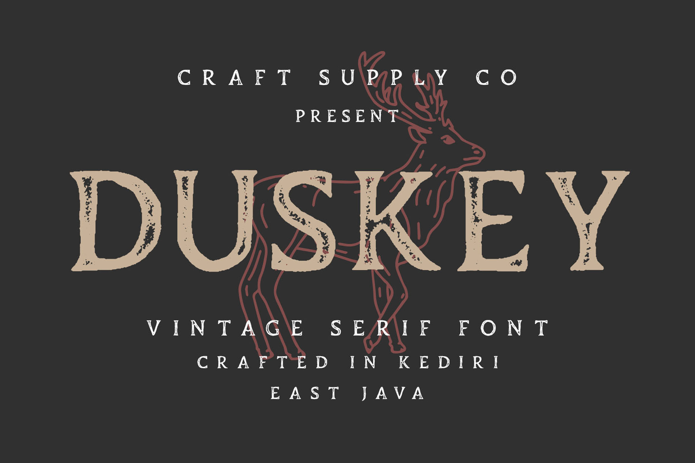
Duskey Vintage Serif Font Extras is an option to investigate when your design calls for a vintage serif appearance. Serif typography can introduce a historical or editorial quality that works well for commemorative graphics, heritage inspired branding, and retro military themed artwork.
Use it for titles, decorative headings, or supporting elements in a composition inspired by archival prints. Combine the font with paper textures, muted colors, and carefully selected graphic details. For functional labels or compact text, test readability before finalizing the design.
3. Benida Rounded Vintage Display Typeface
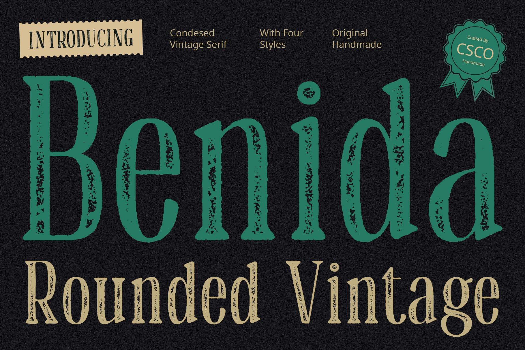
Benida Rounded Vintage Display Typeface offers a different direction for designers who want to explore vintage display typography with rounded styling. This approach may suit projects that need a retro, approachable, or slightly softer interpretation of rugged lettering.
Consider it for lifestyle branding, themed merchandise, outdoor event graphics, or retro inspired posters. It may be especially useful when you want a military inspired concept without making the design feel overly severe. Balance the rounded lettering with straightforward layouts and complementary graphic elements.
4. Gerfard Vintage Serif Font Vintage Stamp

Gerfard Vintage Serif Font Vintage Stamp is worth exploring for designs that combine vintage serif typography with a stamp inspired direction. Stamp style lettering can evoke printed marks, old labels, and distressed graphics, making it relevant to historical and industrial visual concepts.
Try it for poster titles, packaging concepts, decorative badges, or retro labels. For an army inspired composition, combine the typography with simple geometric shapes and a restrained color palette. Avoid adding too many distressed textures at once, as they can make the design difficult to read.
5. Robine Vintage Charm Modern Fonts

Robine Vintage Charm Modern Fonts is an alternative to consider when you want to explore a balance between vintage character and a more contemporary design direction. This combination can help a project feel inspired by the past without relying entirely on an aged or distressed appearance.
Consider using it for lifestyle brands, retro promotional materials, editorial graphics, or outdoor-inspired merchandise. When building a military themed visual identity, use supporting elements such as strong alignment, simple icons, and carefully controlled colors to reinforce the overall concept.
6. Galber Vintage Font

Galber Vintage Font is worth investigating for projects that need a vintage typographic foundation. A vintage font can help communicate heritage and character, making it suitable for designs inspired by old equipment labels, historical posters, and rugged merchandise.
Explore it for large headlines, apparel graphics, event posters, or decorative packaging. Pair it with a clean secondary font when your design includes explanatory text. Before using it for a specific military reference, inspect the letterforms and verify that the style matches your intended visual direction.
7. Godger Vintage Bold Sans Serif

Godger Vintage Bold Sans Serif is a strong option to consider when you want bold lettering with a vintage influence. Bold sans serif typography can provide a direct, prominent headline that suits rugged graphic design and high impact compositions.
Use it for posters, outdoor branding concepts, apparel graphics, or bold labels. For a military inspired look, experiment with uppercase text, compact layouts, and colors such as olive green, charcoal, or sand. Check the available characters and spacing before setting long headlines or tightly arranged text.
8. Calive Stamp

Calive Stamp is worth exploring if you want a stamp inspired treatment for your typography. Stamp styles can create a printed, marked, or slightly distressed visual effect that fits vintage labels and rugged graphic concepts.
Consider it for decorative seals, packaging, posters, merchandise, and themed badges. In a military inspired layout, use stamp style lettering as a focal point or supporting detail rather than applying the same effect to every line. Keeping the rest of the composition simple will help the stamped text remain noticeable.
9. CS Travis Stamp
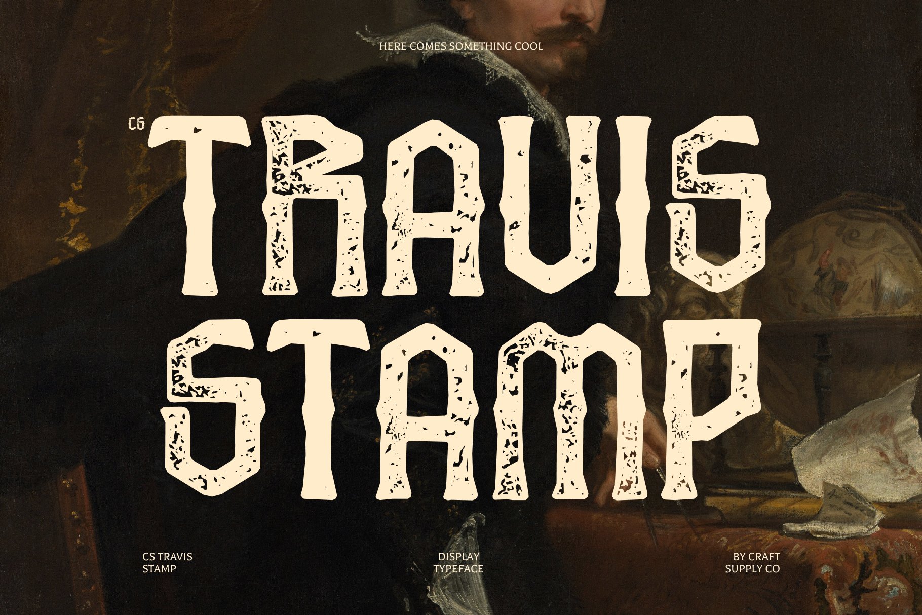
CS Travis Stamp is another alternative to investigate for designs that benefit from a stamp like appearance. Its category makes it relevant to concepts involving vintage print treatments, rugged labels, and industrial inspired graphics.
Try it for promotional posters, decorative packaging, retro emblems, or army inspired artwork. Combine the typography with simple borders and a limited color palette to create a more unified design. If the lettering will communicate important information, make sure its texture and size do not interfere with readability.
10. Gerfard Halfpixel

Gerfard Halfpixel provides an alternative direction for designers interested in a more digital or pixel inspired visual style. Rather than relying on traditional vintage lettering, a pixel based approach can help create a modern interpretation of tactical graphics, digital interfaces, or retro gaming aesthetics.
Consider it for digital posters, game related projects, experimental graphics, or designs that combine rugged themes with digital visual language. Pair it with a simple layout and carefully chosen supporting type to maintain clarity. Check the font’s actual appearance at the intended size before using it in a finished composition.
How to Choose the Right Military Font
To select the ideal military font, you must match the typography directly to your core message and intended application size before finalizing a creative direction. For instance, recognizable army stencil cuts work perfectly for large apparel graphics, whereas compact equipment labels demand simpler, bold sans serif typefaces to maintain readability. Therefore, you should always evaluate your text layout at its final display scale to ensure your chosen lettering creates the right historical or contemporary impression without losing its physical legibility.
Additionally, you must establish a highly consistent color palette and maintain a clear typographic hierarchy across the design. Consequently, combining traditional tones like olive green or khaki with high contrast backgrounds will elevate your layout while keeping it organized. However, remember to pair your textured stamp style headlines with simple, clean typefaces for supporting information, while checking the commercial software license early to verify that all necessary stencil patterns or special character sets are fully included.
Where Can You Use Military Fonts?
Military style typography can work across many design applications, from historical visual projects to contemporary rugged branding. The key is to select a font that fits the context.
- Apparel graphics: Create bold designs for T-shirts, hoodies, caps, and other merchandise with rugged or vintage themes.
- Posters and banners: Use strong headlines to establish a clear focal point for events, exhibitions, and themed artwork.
- Outdoor and adventure branding: Explore bold typography for camping, hiking, equipment, or outdoor lifestyle concepts.
- Packaging and labels: Use vintage or stamp inspired lettering for products that need a utilitarian or heritage oriented appearance.
- Historical artwork: Combine vintage typography with archival inspired textures and period appropriate graphic references.
- Gaming and digital graphics: Explore bold or pixel inspired fonts for tactical game concepts and digital themed artwork.
- Badges and emblems: Use concise lettering and a clear layout to create decorative insignias for fictional, personal, or themed projects.
For additional visual ideas, explore the typography and design projects shared by Craft Supply Co. Reviewing different approaches to display lettering, color, and composition can help you develop a distinctive visual direction for your own work.