
IKEA is widely recognized for its practical approach to furniture, accessible home solutions, and distinctive visual identity. Its branding demonstrates how simple typography can become memorable when combined with consistent colors, clear messaging, and a recognizable logo. For designers working on furniture brands, interior design projects, home decor packaging, or retail campaigns, Ikea font offers a useful reference for creating a visual identity that feels approachable, confident, and easy to recognize.
If you want to achieve a similar visual direction, choosing the right typeface is an important starting point. Bold sans serif fonts can communicate clarity and confidence, while expanded letterforms create a strong presence in headlines and signage. Other styles, including distorted, blurred, and hand drawn fonts, can offer a more experimental interpretation of familiar retail typography.
This guide explores 10 Ikea font alternatives from Craft Supply Co. that you can consider for projects inspired by IKEA’s straightforward, functional design language. These recommendations are independent design suggestions, not claims about the exact typeface used in IKEA’s official logo. The goal is to help you find a font that suits your project’s personality while maintaining a clean and effective visual presentation.
What Makes IKEA’s Typography So Recognizable?
Effective retail typography needs to communicate quickly. Customers may encounter a brand name on a storefront, product label, catalog, website, delivery box, or promotional banner. The typeface must remain recognizable across these different environments while supporting the brand’s overall personality.
IKEA’s visual identity provides a useful example of this principle. Its familiar blue and yellow branding creates a strong color association, while its bold, uncomplicated wordmark helps the name stand out. The overall impression is direct rather than decorative, making typography an important part of the brand’s communication strategy.
Designers looking for a similar look can explore several typographic characteristics:
- Bold letterforms: Heavy lettering creates a confident appearance and helps short names stand out.
- Clear construction: Simple, legible shapes support quick recognition across print and digital media.
- Strong proportions: Wide or expanded fonts can create a substantial presence in large headlines and signage.
- Consistent application: Using a small, coordinated type system makes different brand materials feel connected.
- Practical readability: Typography should remain easy to read on everything from small product labels to large retail displays.
These characteristics can guide your font selection without requiring you to copy an existing logo. A successful alternative should capture the qualities you appreciate while giving your own project a distinctive identity.
10 Best IKEA Font Alternatives for a Similar Look
The following Ikea font offer different ways to explore bold, modern, and attention grabbing typography. Some are suited to straightforward branding, while others work better for creative campaigns and expressive display graphics. Consider your intended application before choosing a font.
1. CS Geneva Bold Sans Serif

CS Geneva Bold Sans Serif is a strong option for designers who want a confident, uncomplicated typographic style. Its bold sans serif direction makes it worth considering for brand names, promotional headlines, product categories, and retail graphics where clarity matters.
For an IKEA inspired project, use this font to establish a clear visual hierarchy. A large headline can communicate the main message, while a lighter supporting typeface provides details such as product descriptions, prices, or calls to action. This combination keeps the design accessible without making the overall layout feel plain.
2. Demine Wide Display Typeface

Demine Wide Display Typeface offers a wide display direction that can help a short brand name occupy more visual space. Expanded proportions are useful when you want typography to feel substantial without relying entirely on decorative effects.
For furniture and homeware branding, consider using Demine for large campaign headlines, showroom signage, editorial covers, or statement text on packaging. Its wide presentation can give a composition a deliberate, architectural quality, particularly when paired with structured grids and clean supporting elements.
3. Galeno Expanded Serif Font

Galeno Expanded Serif Font introduces a different interpretation of bold retail typography by combining expanded proportions with a serif style. It is a useful choice when you want the confidence of wide lettering but prefer a more editorial or distinctive personality.
This typeface could work well for a furniture collection, an interior styling publication, a home accessories campaign, or a concept brand that balances practicality with a more expressive aesthetic. The serif construction can create contrast against minimalist layouts and simple product photography.
4. Rolide Expanded Sans Serif

Rolide Expanded Sans Serif is another option for designers who want wide, contemporary lettering without moving away from a sans serif direction. Expanded typography can give brand names and short messages a strong presence, making it useful for large format applications.
Consider Rolide for furniture brand wordmarks, retail banners, website hero sections, product launch graphics, and interior design presentations. It can help establish a strong headline that anchors the composition while leaving enough room for photography and supporting copy.
5. Galeno Distort

Galeno Distort offers a more experimental direction for designers who want to move beyond conventional retail typography. A distorted font can introduce movement and visual tension, creating a noticeably different mood from a straightforward wordmark.
Rather than using it as a direct substitute for IKEA style lettering, consider Galeno Distort for limited edition furniture campaigns, creative event posters, experimental packaging, or social media promotions. It can bring energy to a campaign that needs to feel unexpected or artistic.
6. CS Blanco Distort
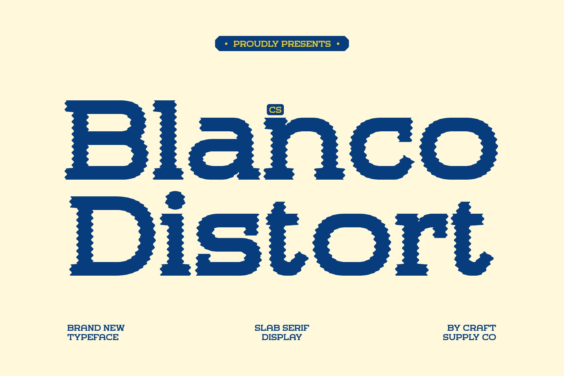
CS Blanco Distort is worth exploring when a project needs a distinctive, unconventional typographic element. Distorted lettering can give a visual identity a more playful or experimental character, depending on how it is styled and applied.
For home decor and furniture projects, this font could suit a creative collection launch, a concept store campaign, or an editorial graphic built around unexpected combinations of materials and shapes. It can also provide contrast in a visual system dominated by clean grids and neutral backgrounds.
7. Galeno Blur Font

Galeno Blur Font provides a visual direction for designers interested in softer, motion inspired, or atmospheric typography. A blurred treatment can make a headline feel dynamic and introduce a sense of movement that differs from the crisp edges commonly associated with minimalist branding.
This option is particularly worth considering for digital campaigns, experimental posters, creative homeware promotions, or visual concepts built around light, motion, and contemporary culture. It can also work as a secondary display style in a broader brand system.
8. CS Blanco Drawn

CS Blanco Drawn is an alternative for projects that need a more handmade or illustrative typographic direction. Drawn lettering can introduce a personal quality that contrasts with highly structured layouts and conventional commercial design.
Consider this font for a home accessories collection, a craft focused furniture label, an informal product campaign, or packaging that emphasizes creativity and individuality. It may also suit promotional materials for workshops, pop up stores, and design markets.
9. Bamboly Bold Sans Serif

Bamboly Bold Sans Serif is a candidate for designers seeking a bold sans serif option with a strong display presence. Bold lettering can help a brand name or campaign message stand out, particularly when the surrounding layout remains uncluttered.
Use Bamboly for furniture advertisements, collection titles, storefront graphics, product category headings, or promotional materials that need to communicate quickly. It can also help create a consistent hierarchy across a range of assets when the same typographic style is repeated in a deliberate way.
10. CS Generic Bold Sans Serif
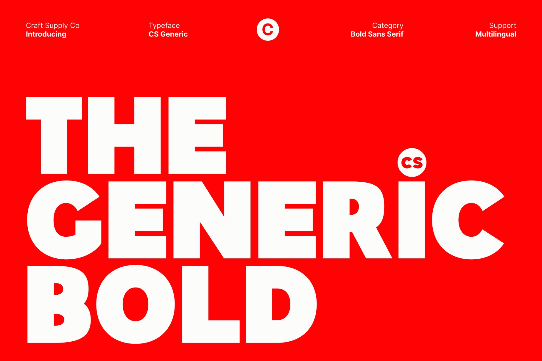
CS Generic Bold Sans Serif rounds out this selection with another bold sans serif direction to consider for straightforward branding. It is a practical candidate for designs that prioritize prominent headlines, clear messaging, and a recognizable typographic hierarchy.
For an IKEA inspired visual concept, try CS Generic Bold Sans Serif in product labels, website headings, promotional posters, retail signage, or furniture collection graphics. Its bold sans serif classification makes it a natural starting point for exploring a direct and functional visual language.
How to Choose the Right IKEA Inspired Font
Choosing among ten distinct font styles requires aligning the typography directly with your brand personality and intended viewing environment before making a final creative choice. For instance, testing a bold sans serif like CS Geneva delivers a direct, practical impression, whereas using Galeno Distort or Galeno Blur serves a highly expressive, editorial campaign direction. Therefore, you should always build test layouts early across large storefront signs, mobile website headers, and compact product labels to verify that your chosen lettering maintains its aesthetic value and strict visual legibility at every scale.
Additionally, you must establish a clear typographic hierarchy and coordinate your layouts with unique color systems to prevent copying competitors directly. Conceptually, pairing your bold primary display headings with neutral paragraph fonts and consistent spacing rules will make your branding elements feel unified across both digital ads and physical packaging. However, remember to treat external design references such as IKEA’s structured, high contrast layouts purely as an initial benchmark, subsequently developing your own distinct color palette and graphic details to make the final identity uniquely yours.
Whichever font you choose, test it in realistic applications and prioritize readability, consistency, and originality. A successful visual identity should communicate the brand’s personality clearly rather than depend on imitation. For more type inspiration and creative resources, explore the work of Craft Supply Co. and discover how different lettering styles can shape a design concept.