
The Facebook typeface is a popular topic among designers who want to understand the typography behind recognizable digital brands. Facebook’s visual identity has evolved over time, but its typography continues to reflect a broader design principle: simple, readable lettering can help a brand communicate clearly across websites, mobile interfaces, and social media platforms.
When people search for a Facebook typeface, they may be looking for the lettering used in the brand’s logo, the typeface displayed throughout its interface, or a similar font for their own projects. These are different needs. A logo wordmark has distinctive branding requirements, while interface typography must remain readable across many screen sizes and content types.
If you want to create designs with a similarly clean, contemporary appearance, modern grotesque and sans serif fonts are useful alternatives to explore. This guide introduces ten font options from Craft Supply Co and explains how to choose typography for social media graphics, websites, branding, and other digital applications.
What Is the Facebook Typeface?
The term Facebook typeface can refer to several things: the lettering in Facebook’s logo, the fonts used in its products and interfaces, or typefaces that resemble the brand’s general visual style. Understanding this distinction is important when selecting a font for a design project.
A brand logo is usually treated as a specific visual asset. Its letterforms, proportions, and spacing are part of the identity, so a similar font will not necessarily reproduce the official wordmark exactly. Interface typography serves a different purpose: it helps users read posts, navigate menus, complete actions, and understand information.
For designers seeking a similar general aesthetic, contemporary sans serif and grotesque typefaces are worth exploring. These styles often emphasize clear letterforms, practical readability, and flexibility across different layouts. However, a font’s category alone does not guarantee that it matches Facebook’s official typography.
What Makes Facebook Inspired Typography Effective?
Clean and Readable Letterforms
Digital interfaces display text in many contexts, from small navigation labels to longer posts and headlines. Typography with clear letterforms helps users recognize words quickly and reduces unnecessary visual distraction.
When selecting an alternative font, test it at different sizes. A typeface that looks attractive in a large heading may not perform as well in compact interface elements.
Consistent Visual Structure
Digital products need a consistent typographic system. Font weight, line spacing, character spacing, and heading sizes work together to establish hierarchy and make content easier to scan.
A versatile sans serif family can help designers maintain a consistent appearance across headings, supporting text, buttons, and other interface components.
Adaptability Across Devices
Typography for digital platforms must work across different screen sizes and resolutions. Letterforms should remain recognizable, spacing should feel balanced, and text should fit comfortably within its layout.
Before choosing a font, preview it on both large and small screens. Consider how its appearance changes when used for a website heading, a mobile graphic, or a compact social media caption.
A Recognizable Brand Personality
Even simple sans serif fonts have distinct personalities. Some feel neutral and functional, while others appear geometric, rounded, experimental, or bold. The right choice depends on whether your project needs a restrained digital aesthetic or a more expressive interpretation.
10 Facebook Typeface Alternatives to Explore
The following Facebook typeface offer different options for creating contemporary digital typography. Some are modern grotesque designs, while others introduce rounded forms, blur effects, dimensional lettering, or a more expressive display style. They are alternatives for exploring a related design direction, not verified matches for Facebook’s official typeface.
1. Standerd Modern Grotesk

Standerd Modern Grotesk is an option to explore if you want a contemporary typographic foundation for digital design. Modern grotesque fonts are often considered for layouts that need a clean, structured appearance without relying on decorative letterforms.
Consider testing this font for website headings, brand presentations, social media graphics, or digital campaign materials. Compare its letter shapes and spacing with the visual direction you want to achieve. If you are developing an interface, also test smaller text sizes to see whether the typeface remains comfortable to read.
2. Belmein Modern Grotesk Circular Inktrap

Belmein Modern Grotesk Circular Inktrap offers a more distinctive direction to investigate within contemporary grotesque typography. Its product name points to circular and inktrap inspired design characteristics, which can provide a different visual personality from more conventional sans serif fonts.
Explore it for creative branding, editorial graphics, digital posters, or social media artwork. If your goal is to create a Facebook inspired design, consider using the font for prominent headlines while keeping supporting text straightforward. This can balance visual personality with clear communication.
3. Lupina Modern Grotesk

Lupina Modern Grotesk is another option to compare when looking for contemporary grotesque typography. A modern sans serif direction can work well for designers who want a flexible starting point for brand identities and digital content.
Try it in website mockups, social media templates, presentation slides, or promotional graphics. Pay attention to its proportions, weight, and spacing when paired with other typefaces. These details help determine whether the font fits a minimal, editorial, or technology oriented visual identity.
4. Berghan Modern Grotesk
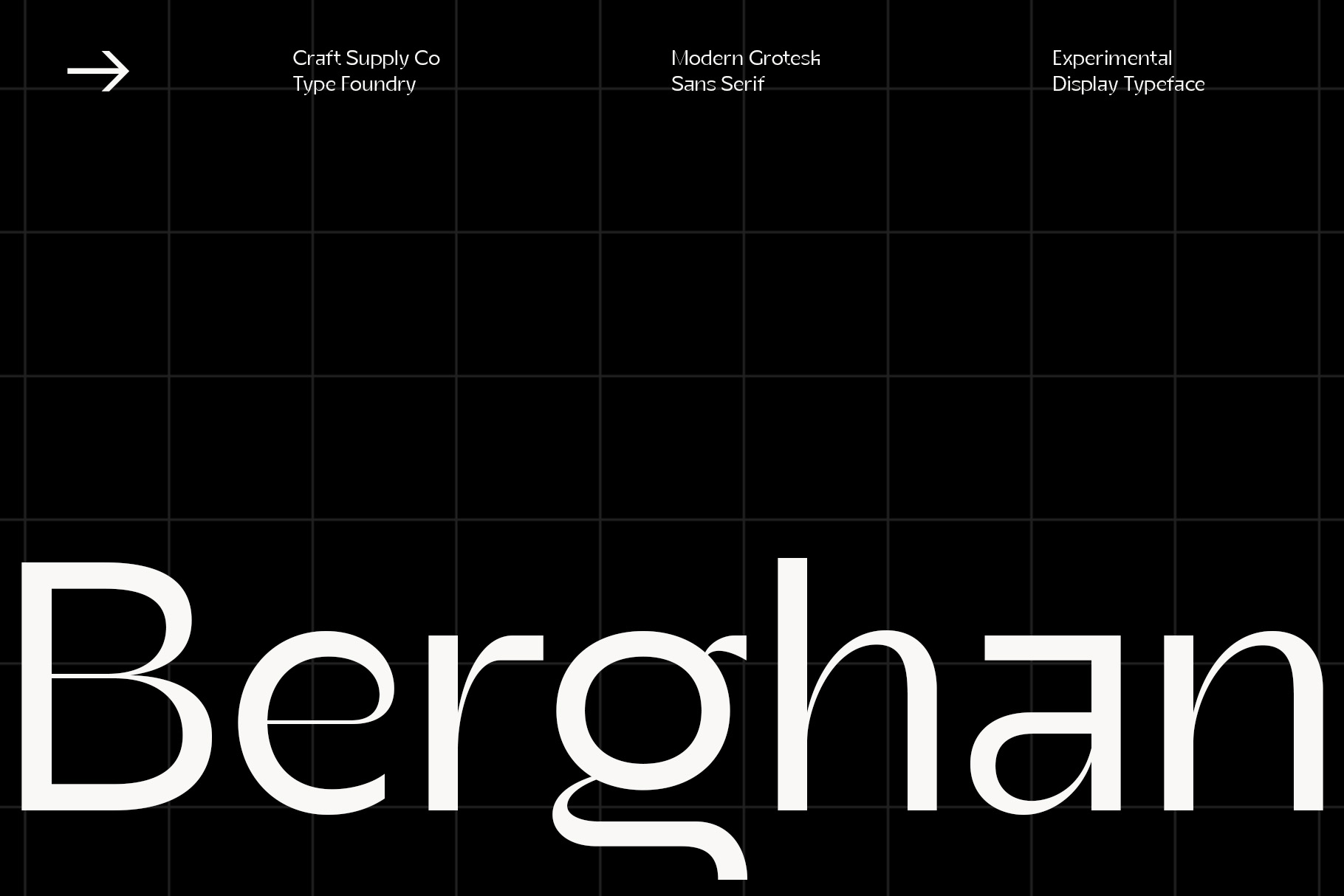
Berghan Modern Grotesk is worth exploring for projects that call for a contemporary grotesque style. Fonts in this category can provide a useful balance between visual simplicity and typographic character, depending on their specific letterforms and available styles.
Consider testing it for brand guidelines, digital advertisements, landing pages, and social media content. Use a clear hierarchy between headings and body copy, and avoid relying on font size alone to distinguish different information levels. Weight and spacing can also help organize the layout.
5. Benetti Grotesk Blur Font

Benetti Grotesk Blur Font offers a more experimental direction for projects that combine contemporary typography with blurred visual treatments. While a blur inspired style differs from the restrained typography often associated with digital interfaces, it can be useful for expressive campaign graphics and conceptual branding.
Explore it for event posters, creative social media content, digital artwork, or visual experiments inspired by technology. For designs that need to communicate information clearly, reserve more expressive treatments for short headlines and use a more readable typeface for detailed text.
6. Benetti Grotesk Rounded Versatile Display Typeface
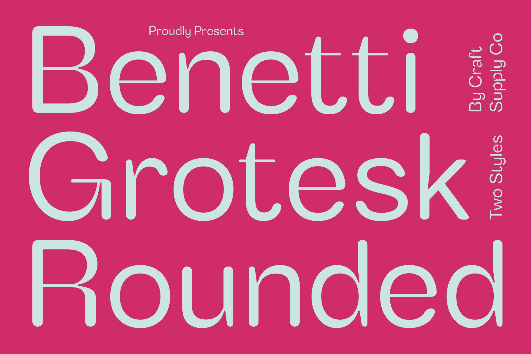
Rounded typography can give a digital design a softer and more approachable appearance. Benetti Grotesk Rounded Versatile Display Typeface is an alternative to explore if you want a contemporary display style with rounded visual characteristics.
Consider using it for campaign headlines, social media graphics, brand presentations, or promotional banners. Compare the letterforms with your chosen supporting font to make sure the combination feels cohesive. Since it is described as a display typeface, test its readability carefully before using it for long paragraphs or compact interface labels.
7. Galdien Rounded 3D Font
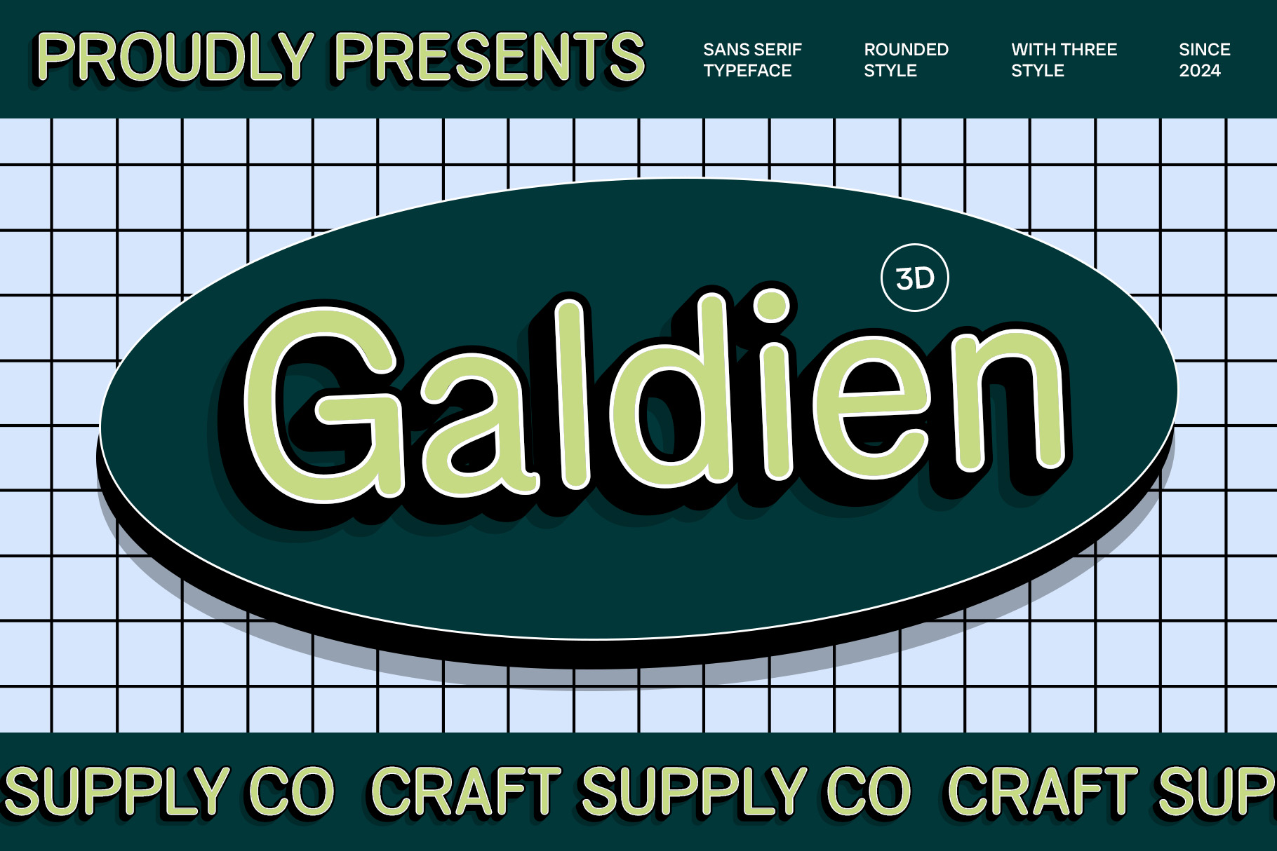
Galdien Rounded 3D Font offers a dimensional approach to typography. Its rounded, three dimensional direction is different from conventional interface fonts, but it can be useful when you want digital branding or social media artwork to feel more visually expressive.
Try it for promotional graphics, creative campaign headlines, digital posters, or experimental brand concepts. Pair the dimensional lettering with a simple background and restrained supporting text. This helps the display typography stand out without making the composition difficult to navigate.
8. Belmein 3D Font

Belmein 3D Font is another option to explore for designs that need depth and visual emphasis. Three dimensional typography can make a headline feel prominent, particularly in compositions designed for advertising, social media, or digital promotional campaigns.
Consider testing it for short titles and key messages rather than using it for every text element. If you are creating a digital brand concept inspired by familiar social platforms, use the font as a creative accent while keeping the rest of the layout organized and readable.
9. Raftwork Contemporary Sans Font

Raftwork Contemporary Sans Font is an option to investigate for projects that need a modern sans serif direction. Contemporary sans serif fonts can be useful for a wide range of applications, including websites, digital campaigns, editorial layouts, and brand communication.
Test it with different heading sizes, paragraph lengths, and interface style components. Compare the font’s appearance across light and bold text treatments if those options are available. This can help you evaluate whether it supports the typographic hierarchy and visual consistency your project requires.
10. Baguede Grotesque Sans Serif

Baguede Grotesque Sans Serif completes this collection of contemporary font alternatives. A grotesque sans serif can serve as a useful foundation for projects that prioritize typography, layout structure, and clear communication.
Explore it for website mockups, corporate presentations, social media templates, or digital branding concepts. Test the actual words you plan to use and review the font at different sizes before choosing it for a complete design system.
How to Choose a Font Similar to Facebook’s Typography
To capture Facebook typeface contemporary digital aesthetic, you must first define your specific project goals and prioritize absolute text readability across all layouts. For instance, you need to decide whether your design requires a clean interface sans serif or a simple, geometric headline wordmark to guide your font selection. Therefore, always choose a highly legible typeface with distinguishable letterforms and appropriate line heights so your text blocks remain comfortable for readers to navigate on screen.
Additionally, you should establish a clear typographic hierarchy and rigorously test your chosen font across multiple display dimensions. Consequently, pairing a bold display face for main headings with a simpler sans serif for functional label buttons will help your digital system feel organized. However, you must always preview your real navigation labels on actual mobile screens and review the commercial licensing permissions early to ensure your final design is fully compliant and visually optimized.
Where to Use Facebook Inspired Typography
Social Media Graphics
Modern sans serif typography can create a clean foundation for social media posts, announcements, and promotional banners. Use a clear headline, readable supporting text, and consistent spacing to make the message easy to scan.
Website and App Design
Contemporary sans serif fonts are frequently considered for digital interfaces because they can support structured layouts and clear content hierarchy. When evaluating a typeface for a website or app, test realistic text and confirm that it performs well at different sizes.
Brand Identity and Marketing
A consistent typeface can help connect logos, presentations, advertising materials, and digital campaigns. Choose fonts that reflect your brand personality and remain practical across different applications.
Digital Posters and Campaigns
Promotional graphics allow more room for expressive typography. A modern grotesque font can create a restrained look, while a blurred, rounded, or dimensional alternative may suit a more experimental concept.
For additional typographic ideas and creative branding inspiration, explore Craft Supply Co and review how different font styles work within complete visual compositions.