
Bubble font is a playful typography style known for its rounded shapes, bold outlines, and soft, inflated appearance. Inspired by hand drawn letters, cartoons, retro graphics, and colorful street art, this style can make words feel friendly, expressive, and full of personality. Designers often use bubble letters for posters, stickers, invitations, logos, packaging, and social media graphics.
One of the biggest advantages of bubble lettering is its versatility. You can create simple outlined letters for coloring pages, chunky filled in typography for bold headlines, or colorful compositions with shadows and highlights for a dimensional effect. Depending on the font and treatment, bubble font can feel nostalgic, youthful, retro, or contemporary.
If you want to experiment with this style, choosing the right typeface is a useful starting point. Some fonts provide rounded, chunky letterforms, while others offer hand drawn details or a distinctive Y2K inspired aesthetic. This guide explores ten font alternatives from Craft Supply Co and shares practical tips for creating effective bubble lettering designs.
What Is Bubble Lettering?
Bubble lettering is a decorative lettering style in which characters appear rounded, inflated, and often thicker than conventional text. The letters may feature soft corners, wide strokes, playful proportions, or outlines that resemble hand drawn bubbles.
Unlike standard typography, bubble lettering often acts as a central visual element rather than simply presenting information. Its exaggerated shapes make short words and phrases stand out, especially when combined with bright colors, contrasting outlines, shadows, or decorative details.
Bubble lettering can be created by drawing letters manually or by using a suitable display font. Designers can then customize the results with outlines, gradients, highlights, and other effects to match a particular creative direction.
Popular Characteristics of Bubble Letters
Rounded and Inflated Shapes
Rounded forms are one of the defining features of bubble lettering. The letters often have soft edges and generous curves that make them look plump or inflated. This quality gives the typography a friendly appearance and distinguishes it from sharp, geometric lettering.
Thick and Bold Strokes
Bubble letters frequently use thick strokes to create a strong visual presence. Heavier lettering is especially effective for short headlines, stickers, and graphic compositions where the words need to stand out quickly.
Playful Proportions
Some bubble lettering styles feature uneven letter heights, unusual spacing, or exaggerated curves. These variations can create a hand drawn appearance that feels energetic and spontaneous. More uniform styles, by contrast, can provide a cleaner and more organized look.
Colorful Fills and Outlines
Color is an important part of many bubble lettering designs. Bright fills, contrasting outlines, gradients, and highlights can make letters appear dimensional or glossy. A monochromatic treatment can also work well when the design needs a simpler, more restrained aesthetic.
10 Bubble Lettering Font Alternatives to Explore
The following ten fonts offer different creative directions for bubble lettering, from chunky display styles to hand drawn designs and retro inspired typography. Not every font is necessarily a traditional bubble font, but each provides a starting point for exploring playful lettering. Preview the actual letterforms before choosing one for your project.
1. CS Macaron Drawn

CS Macaron Drawn is an option to explore when you want a more hand-drawn direction for playful typography. Hand drawn lettering can introduce a personal, informal quality that works well with the spontaneous character of bubble lettering.
Consider testing it for greeting cards, stickers, creative packaging, or social media graphics. You can experiment with colorful fills, thick outlines, and simple shadows to create a more pronounced bubble inspired treatment. Before finalizing your design, check that the lettering remains clear at the intended size.
2. CS Scalion Chunky Display Font
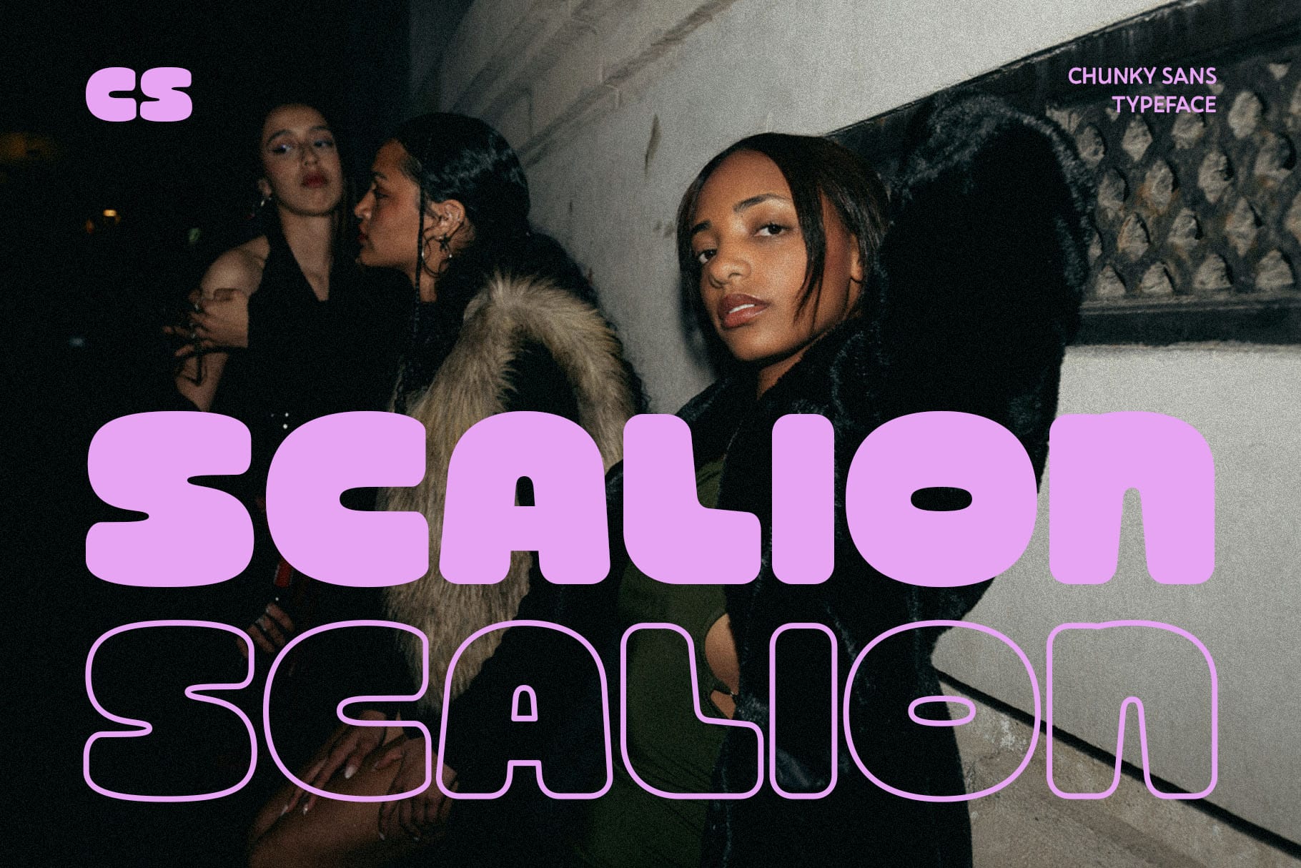
Chunky typography is a natural direction to explore when creating bold bubble lettering. CS Scalion Chunky Display Font is worth testing for designs that need a strong headline with a substantial visual presence.
Try it for posters, merchandise graphics, event promotions, or playful brand identities. Add a contrasting outline or a second offset layer to emphasize the shape of the letters. If you use multiple colors, keep the palette coordinated so the typography remains the main focal point.
3. CS Scalion Drawn

CS Scalion Drawn offers another direction to investigate for expressive, illustrated typography. Drawn lettering can help a design feel more organic than a perfectly uniform typeface, making it suitable for compositions that emphasize creativity and personality.
Explore it in sticker designs, playful posters, packaging concepts, and digital illustrations. To bring the lettering closer to a bubble aesthetic, experiment with rounded outlines, bright colors, and subtle highlights. Choose effects that complement the letterforms instead of overwhelming them.
4. CS Atomic Y2K Font
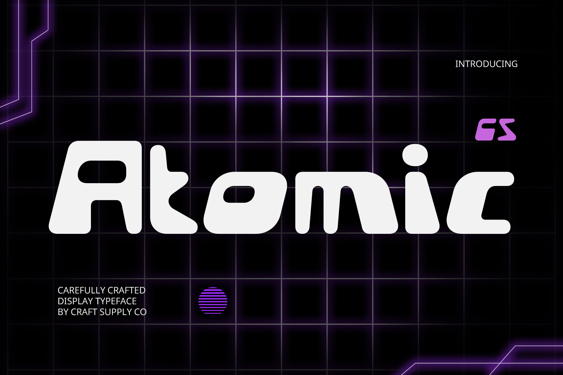
Y2K inspired typography is useful when you want bubble lettering to feel nostalgic, energetic, and connected to early digital aesthetics. CS Atomic Y2K Font is an alternative to explore for designs influenced by retro technology, pop culture, and futuristic graphic styles.
Consider using it for music artwork, fashion graphics, posters, or social media campaigns. Pair the font with metallic gradients, vivid colors, or layered shadows to develop a distinctive retro futuristic composition. Review the actual letter shapes to determine how closely they fit your preferred bubble lettering style.
5. Clefy Disco

For a more expressive, retro inspired direction, Clefy Disco is worth exploring alongside colorful bubble lettering concepts. Typography influenced by disco era graphics can work well in designs that call for movement, personality, and a celebratory atmosphere.
Try it for party invitations, music posters, event graphics, or playful promotional materials. Bright colors and decorative outlines can help reinforce the mood, while a simple background keeps the lettering readable. Test the complete headline before adding extra effects.
6. CS Metro Y2K Font
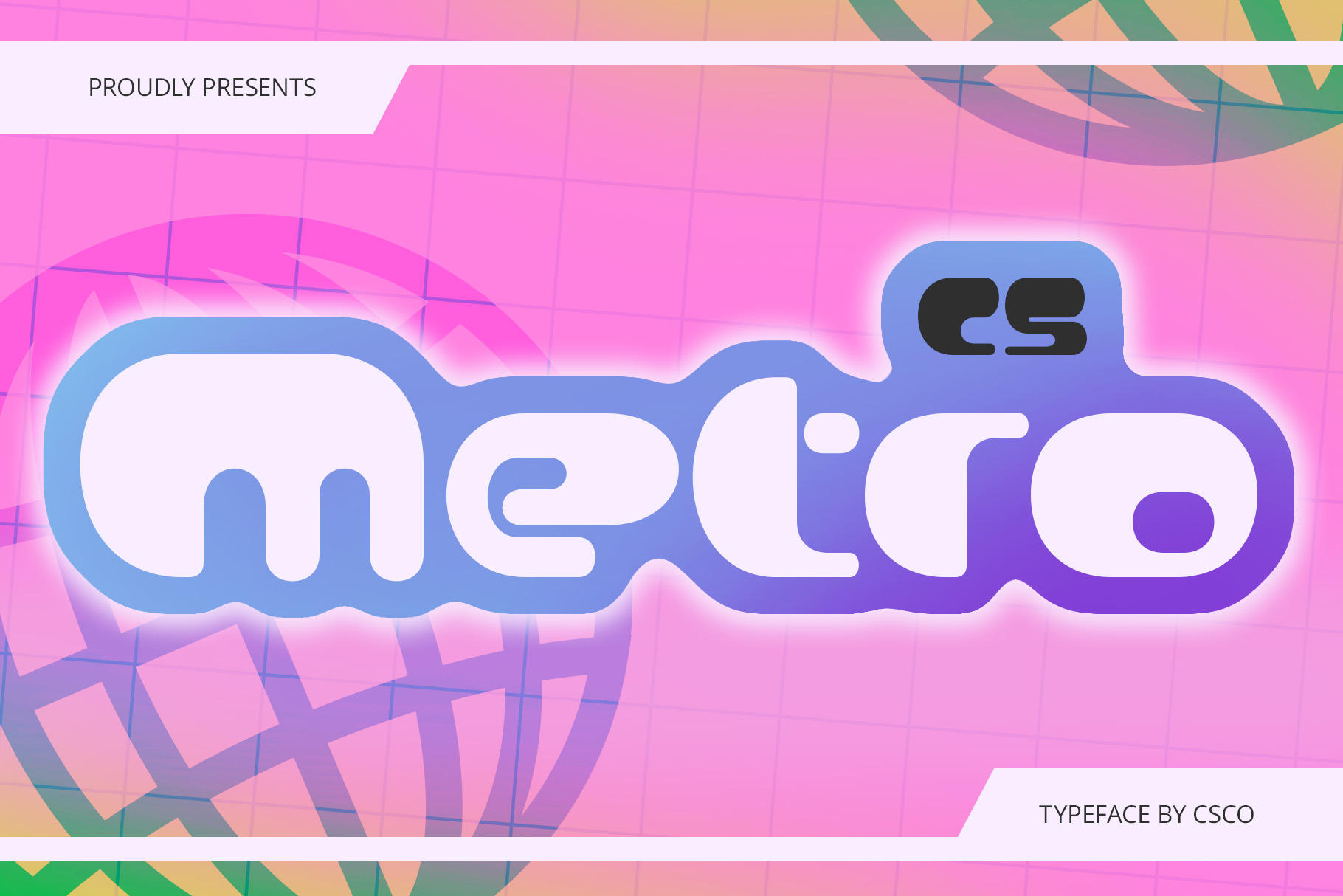
CS Metro Y2K Font is another alternative to consider for bubble lettering with a contemporary retro influence. Y2K inspired typography can help create a design that feels youthful, digital, and visually energetic.
Explore it for social media graphics, creative merchandise, campaign posters, and experimental branding. You can test bright gradients, contrasting shadows, or layered color treatments to build a playful visual style. Use the font’s actual letterforms as your guide when deciding how much decoration to add.
7. Calverto Drawn Font

Calverto Drawn Font provides another option for designs that benefit from a drawn typographic character. Hand drawn lettering can bring variation and personality to a composition, particularly when the overall concept is informal, creative, or illustration led.
Consider testing it for stickers, greeting cards, packaging, or decorative headlines. If you want a bubble inspired finish, experiment with an outer stroke, a solid fill, or a soft shadow. Keep the supporting typography simple to preserve a clear hierarchy.
8. CS Love Y2K Font

CS Love Y2K Font is worth exploring for playful compositions influenced by retro digital aesthetics. The combination of expressive typography and a nostalgic visual direction can be useful for creative projects that aim to feel fun and memorable.
Try it for greeting cards, themed posters, fashion graphics, or social media designs. Heart motifs, colorful fills, and rounded graphic accents can help reinforce a playful mood when they suit the project. Avoid adding too many decorative elements around the letters, especially when the headline is already visually prominent.
9. CS Flexion Y2K Font
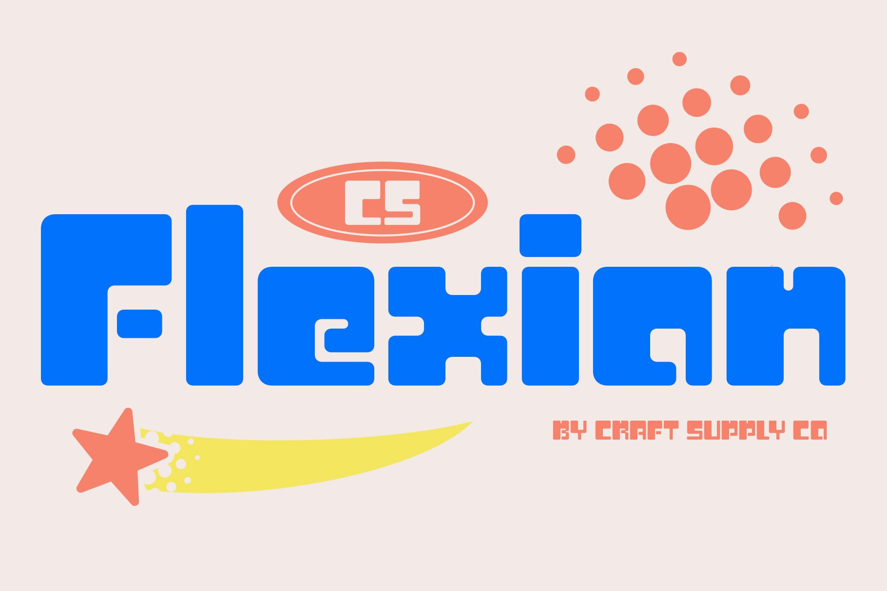
CS Flexion Y2K Font offers another option for exploring the relationship between bubble lettering and retro futuristic design. This direction can be useful when you want expressive typography that feels connected to digital culture rather than traditional hand lettering.
Consider testing it for event graphics, digital artwork, music promotions, and creative branding. Layered outlines, gradients, and subtle shadows can help build depth, but make sure the main text remains readable. Preview the final design on both large screens and smaller mobile displays.
10. CS Shimer Bubble Font
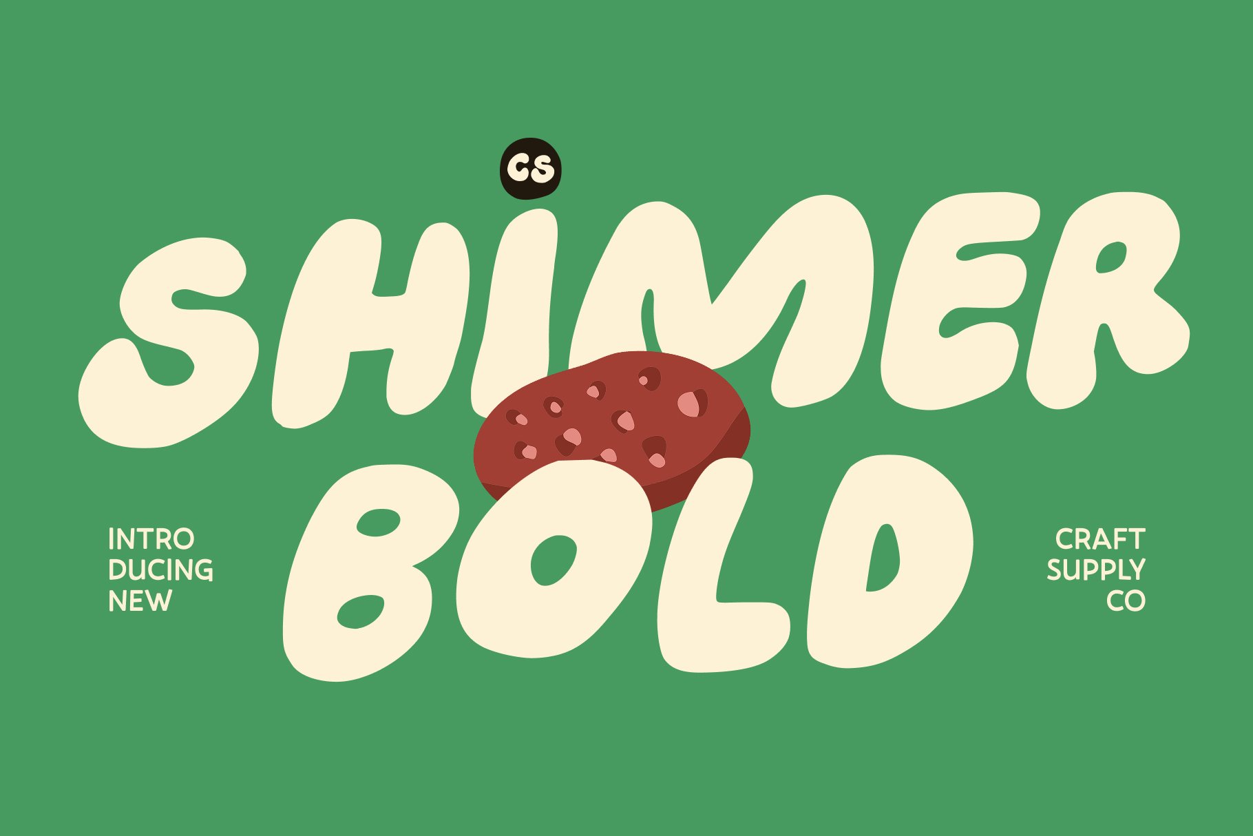
CS Shimer Bubble Font is the most directly relevant option in this collection for anyone specifically searching for bubble lettering. A bubble font can provide a starting point for rounded, bold typography without requiring you to construct every letter manually.
Explore it for stickers, playful packaging, children’s graphics, posters, invitations, and social media content. Experiment with filled letters, contrasting outlines, highlights, or drop shadows to customize the appearance. For the best result, use a short phrase and leave enough space around the letters so their shapes remain easy to recognize.
How to Create Bubble Lettering
To create a striking bubble font effect, you should always start your design journey with a short word or a simple phrase. For instance, a concise layout gives you much more freedom to experiment with exaggerated letter proportions, outlines, and colors without making the canvas feel overcrowded. Therefore, choose a chunky, rounded, or Y2K inspired font family as your primary foundation, making sure to soften any sharp corners so the characters maintain a playful, inflated shape.
Additionally, adding a clean outline and using drop shadows are excellent ways to instantly separate your text from the background. Consequently, you can apply a contrasting stroke or use an offset duplicate layer to give your bubble letters a distinct, three dimensional appearance on the page. After that, you must carefully monitor the thickness of these graphic outlines so they do not accidentally close small character gaps and ruin the readability of your text.
Finally, remember that experimenting with limited color palettes and soft highlights will give your bubble lettering a highly polished, energetic look. Specifically, you should use bright colors for a bold impact or pastel tones for a softer impression, adding subtle highlights along the edges to suggest a glossy, rounded surface. In contrast to chaotic designs, repeating just a few core colors across the text block will build a much stronger visual rhythm for your audience.
Where to Use Bubble Lettering
Bubble lettering creates an immediate visual focal point across a wide variety of promotional posters, event graphics, and children’s educational materials. For instance, its bold, rounded shapes are highly effective for school events, music promotions, and classroom activity sheets where the main message is short. Therefore, you can easily use these friendly outlines to capture attention instantly, providing a playful layout that younger audiences can easily read or even color in manually.
Additionally, this expressive typography works beautifully on commercial stickers, social media graphics, and modern merchandise packaging. Consequently, lifestyle brands looking to communicate a fun, approachable personality frequently print these inflated characters on T-shirts and custom tote bags. However, you must always maintain strong contrast against your backgrounds and test your outlines across different display dimensions to ensure the text remains legible on smaller smartphone screens.
For more typographic inspiration and creative design references, explore Craft Supply Co and see how different lettering approaches can influence a visual composition.