
Cyrillic font are essential for designers creating visual identities, publications, websites, and marketing materials for audiences who use Cyrillic writing systems. From elegant serif typography to clean sans-serif lettering, the right typeface can make a design feel professional, readable, and visually consistent across languages.
The cyrillic font is used to write languages such as Russian, Bulgarian, Serbian, Ukrainian, and several others. Although these languages share many characters, their alphabets and typographic conventions are not identical. Choosing a suitable font therefore involves more than finding a style you like. You also need to verify that the typeface supports the specific characters, language variants, and diacritics your project requires.
Whether you are developing a multilingual brand identity, designing an editorial layout, or creating packaging for an international audience, exploring different font styles can help you establish the right visual direction. This guide introduces ten font alternatives from Craft Supply Co and explains what to consider when selecting Cyrillic typography.
What Are Cyrillic Font ?
Cyrillic font are typefaces that include characters from the Cyrillic script. They can range from traditional serif designs and modern sans serif families to decorative display fonts created for expressive headlines.
The visual appearance of cyrillic font depends on the typeface’s design, proportions, stroke contrast, spacing, and character construction. A classic serif can communicate tradition and sophistication, while a modern grotesque may create a more neutral, contemporary impression. Display fonts can bring personality to logos, posters, and promotional graphics.
However, a font’s visual style does not automatically mean it supports Cyrillic characters. Some fonts are designed primarily for Latin alphabets. Before using any font for a Cyrillic language project, check its official character set, language coverage, and available font files.
Why Cyrillic Support Matters in Typography
Accurate Language Representation
Different Cyrillic using languages require different character sets. Russian, Ukrainian, Bulgarian, and Serbian, for example, do not all use exactly the same letters or typographic conventions. A font intended for one language may lack characters needed for another.
Check the glyph coverage for your target language, including any accented or specialized letters. This step helps prevent missing characters, inconsistent substitutions, and unexpected changes in the final layout.
Consistent Brand Identity
Businesses that communicate in multiple languages need typography that maintains a recognizable identity across different scripts. A font family with suitable Cyrillic and Latin support can help keep headlines, body copy, and brand materials visually coordinated.
When a single family does not cover every requirement, choose complementary typefaces with compatible proportions and visual characteristics. Always test the actual text rather than relying only on a font specimen.
Better Readability
Typography should remain legible at the sizes and distances where people will encounter it. Body text, interface labels, and long-form editorial content typically require careful attention to spacing, letter shapes, and contrast. Decorative styles are often better suited to short phrases and headlines.
10 Cyrillic Font Alternatives to Explore
The following ten typefaces offer a range of visual directions, including elegant serifs, modern grotesques, versatile display styles, and drawn lettering. They are font alternatives to investigate for Cyrillic oriented design projects, not a verified list of fonts with Cyrillic character support. Confirm each product’s glyph coverage and language licensing before using it for Cyrillic text.
1. Espoir Serif Font Family

Serif typography can be a strong choice for editorial projects, premium branding, and visual identities that need a refined appearance. Espoir Serif Font Family is an option to explore if your design direction calls for a classic typographic foundation.
Consider testing it for magazine layouts, book covers, sophisticated packaging, or brand presentations. If its character set supports your target Cyrillic language, evaluate how the Cyrillic and Latin characters work together in headings, product names, and supporting copy.
2. Deluce Luxury Serif Font

Luxury oriented serif typography can help communicate elegance and attention to detail. Deluce Luxury Serif Font is worth exploring for projects that call for a polished visual identity, especially in beauty, fashion, lifestyle, or premium product branding.
Try the typeface in short headlines, packaging titles, or campaign graphics. For multilingual use, inspect the available glyphs carefully and compare the visual weight of its Cyrillic and Latin characters before applying it throughout a complete identity system.
3. Aguero Serif Clean Elegant Font

A clean, elegant serif direction can work well when a design needs a balance between sophistication and clarity. Aguero Serif Clean Elegant Font is an alternative to investigate for editorial compositions, refined branding, and presentation materials.
When evaluating it for Cyrillic typography, test both large and small text sizes. Look at character spacing, punctuation, and the overall rhythm of words in your target language. These details can help you determine whether the typeface suits your specific layout.
4. Riffle Font Family
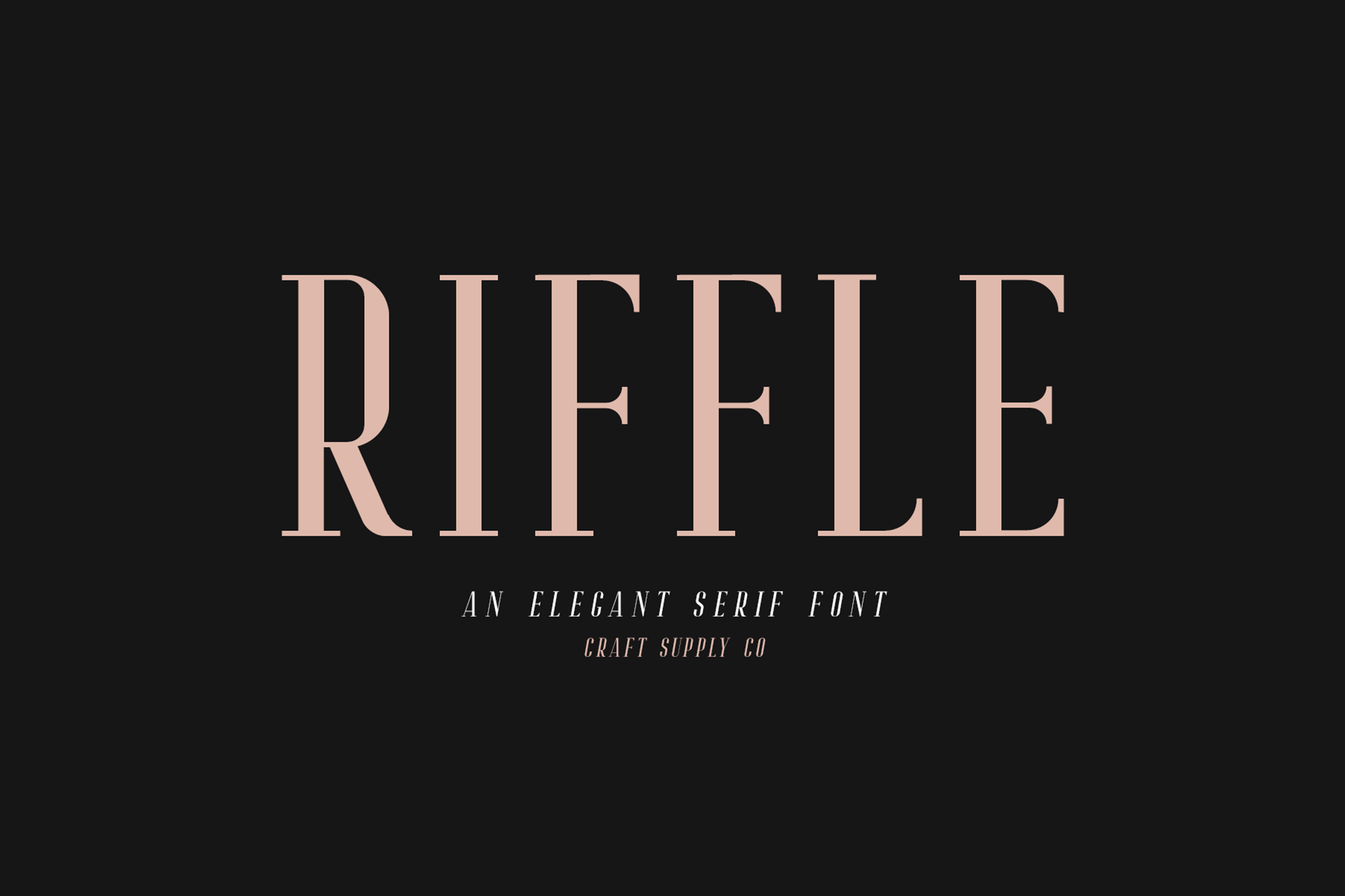
A font family can provide flexibility when a project needs more than one typographic role. Riffle Font Family is worth exploring if you want to investigate a coordinated typeface option for headings, supporting text, and visual identity applications.
Before selecting it for multilingual branding, review the available styles and character coverage. A consistent family can help establish hierarchy across different content types, but only if the necessary Cyrillic glyphs are available in the specific styles you plan to use.
5. CS Mango Grotesque Font
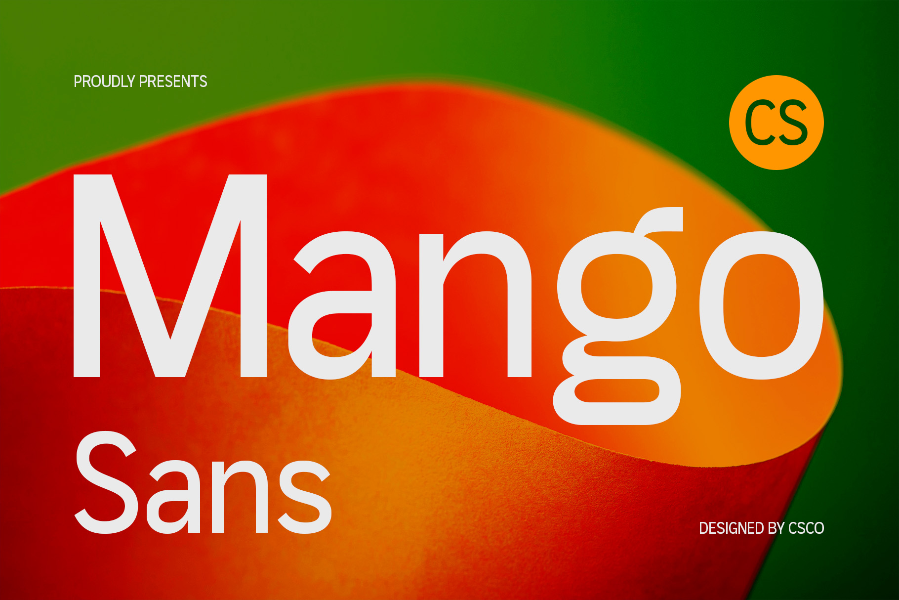
Grotesque typography is often considered for contemporary branding because it can create a clean, direct, and modern impression. CS Mango Grotesque Font is an option to examine for projects that need a modern sans serif visual direction.
It may be worth testing for website headings, brand communication, posters, and promotional layouts. If the font includes the Cyrillic characters you need, check the letterforms at different sizes and ensure that the chosen weights remain clear across both print and digital applications.
6. Heily Modern Grotesque Swiss Design

Swiss inspired design is commonly associated with structured layouts, clear hierarchy, and disciplined use of typography. Heily Modern Grotesque Swiss Design is an alternative to explore when you want a contemporary, organized approach to visual communication.
Consider testing it in editorial grids, corporate identity systems, websites, and presentation decks. For Cyrillic projects, verify that the font supports the correct language and that its character proportions integrate naturally with any Latin text used alongside it.
7. Gervaso Modern Grotesque Versatile Display

Display typography can help headlines establish a strong presence without relying on elaborate decorative elements. Gervaso Modern Grotesque Versatile Display is worth investigating for posters, campaign graphics, packaging, and brand communication that needs a prominent typographic voice.
Use a specimen containing your actual Cyrillic copy to evaluate its suitability. Pay attention to the difference between headline performance and smaller text performance, since a display oriented typeface may be most effective in short, high impact applications.
8. Bergins Mix

Bergins Mix offers another option to explore when comparing different typographic directions for a creative project. The most effective way to assess a typeface is to examine its actual letterforms, available styles, and supported characters rather than relying on its name alone.
Try placing it within a mood board alongside your intended colors, imagery, and layout references. If it includes the Cyrillic glyphs required by your project, test it with realistic headlines and body copy to see whether it fits the intended visual identity.
9. CS Standish Drawn

Drawn typography can introduce a more expressive, illustrative quality to a design. CS Standish Drawn is worth exploring for creative concepts where the lettering should contribute personality rather than simply organize information.
Consider testing it for short poster headlines, creative campaign graphics, or selected branding elements. If Cyrillic support is available, inspect the complete character set to make sure the required letters maintain a consistent style and remain legible in the final composition.
10. Ranberg Rounded Drawn Font
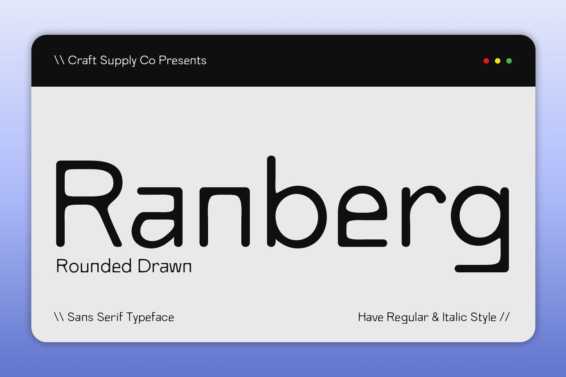
Rounded, drawn lettering can provide a softer visual direction than more formal serif or grotesque typography. Ranberg Rounded Drawn Font is an alternative to investigate for friendly branding, creative packaging, and designs that benefit from a more informal typographic character.
Before using it in Cyrillic language work, verify the exact language coverage and test any specialized letters or diacritics required. Rounded and expressive lettering can be useful for short messages, but make sure it remains readable at the final size and in the intended medium.
How to Choose the Right Cyrillic Font
1. Identify Your Target Language
Start by determining which language or languages the design must support. Do not assume that a font supporting Russian necessarily includes every character required for Ukrainian, Bulgarian, Serbian, or another Cyrillic using language.
Prepare a sample containing the alphabet, common words, punctuation, and any special characters relevant to your project. Use this sample when reviewing font specimens and testing the typeface in your design software.
2. Check the Font Character Set
Look for an official glyph list, font specimen, or product description that confirms Cyrillic support. If the information is unclear, contact the font creator or seller before purchasing or using the font commercially.
Also confirm whether Cyrillic coverage is available in every weight or style you intend to use. A font family may offer different character coverage across individual files, so checking only one style may not be enough.
3. Match the Font to the Project
Choose typography based on the purpose of the design. Serif fonts can be suitable for editorial layouts and refined branding, while grotesque styles can work well for modern communication. Display and drawn fonts may provide personality for short headlines, posters, and packaging.
These are general design considerations rather than strict rules. The best choice depends on the specific typeface, the language being used, and the overall composition.
4. Test Cyrillic and Latin Together
Multilingual designs often combine Latin and Cyrillic text within the same layout. Compare the scripts side by side to assess their visual weight, spacing, proportions, and baseline alignment.
If the two scripts look noticeably different, consider adjusting the typographic hierarchy or selecting complementary fonts. The objective is not to make every character identical in appearance, but to create a coherent and readable design system.
5. Review Licensing and Technical Requirements
Check the font license before using a typeface for a logo, website, app, packaging, or commercial campaign. Confirm whether the license covers your intended use and whether the files are compatible with your design software or web implementation.
For web projects, check the available webfont formats and whether the necessary Cyrillic subsets are included. Proper technical preparation helps ensure that visitors see the intended typography instead of fallback fonts or missing characters.
Where to Use Cyrillic Typography
Cyrillic typography is important for businesses communicating with audiences who read Cyrillic scripts. A suitable typeface can help maintain consistency across logos, packaging, menus, brand guidelines, and marketing materials. Books, magazines, reports, and digital publications need typography that supports their full text content. Readability, character coverage, and consistent spacing should take priority over decorative appearance when selecting a font for long passages. Websites and applications may need to support multiple languages within the same interface. Choosing fonts with the required character coverage can help maintain consistent navigation, buttons, labels, headings, and body text.
Display fonts can help promotional designs stand out, especially when a headline needs to communicate a message quickly. Confirm the font’s Cyrillic support before building the final artwork, then test the text at its actual output size. For more creative typography references and visual identity inspiration, explore Craft Supply Co.