
The smoke font style brings mystery, atmosphere, and visual drama to graphic design. Inspired by drifting smoke, hazy silhouettes, dark environments, and blurred lettering, this style can make ordinary typography feel expressive and unforgettable. Designers often use smoky typography for music posters, Halloween graphics, alternative fashion branding, cinematic titles, and social media artwork.
Although some smoke font style include actual smoke like shapes or wispy letterforms, you can also create a similar atmosphere by combining distinctive display fonts with blur effects, textured overlays, layered shadows, and soft gradients. The right typeface gives your design a strong foundation, while additional effects help communicate the desired smoky mood.
If you are looking for alternatives to achieve this visual direction, the following ten fonts from Craft Supply Co offer different starting points, from pixel inspired lettering and dimensional typography to rough textures, vintage bubble forms, and blurred effects.
What Is a Smoke Font Style?
A smoke font style refers to typography that evokes the appearance or atmosphere of smoke. Depending on the design, the letters may look hazy, distorted, soft, wispy, or partially obscured. Some designs imitate smoke directly, while others use atmospheric effects to suggest mystery, movement, and depth.
There is no single typeface structure that defines this style. Designers can create smoky lettering with display fonts, experimental typography, distressed letterforms, or digital effects. The most suitable approach depends on whether the design should feel elegant, eerie, futuristic, vintage, or rebellious.
Common Characteristics of Smoky Typography
Smoky typography is defined by soft edges and blurred lettering that make the text appear to dissolve into the background. Additionally, designers often incorporate distressed, rough textures to give the typeface an imperfect, weathered quality. Consequently, these features make this style incredibly effective for atmospheric posters, horror artwork, and alternative streetwear graphics.
Furthermore, this aesthetic relies heavily on dimensional, layered effects like shadows and atmospheric gradients to create visual depth. In contrast to traditional fonts, it can also feature experimental, pixel inspired shapes for a futuristic, glitch like design. Therefore, combining these distinct details allows your main headlines to stand out sharply against dark backgrounds without cluttering the layout.
10 Smoke Font Style Alternatives to Explore
The following font alternatives offer different visual directions for projects inspired by smoke. They are not all literal smoke effect fonts instead, each can serve as a starting point for creating atmospheric typography. Preview the lettering and test the font in your intended application before choosing it for a final design.
1. Cavella Pixel

Cavella Pixel is worth exploring if you want a digital interpretation of the smoke font style. Pixel inspired typography can introduce a fragmented, electronic quality that works well with glitch effects, hazy gradients, and dark visual compositions.
Try pairing this font with a soft blur, subtle glow, or scattered particles to create an experimental headline. It may be suitable for electronic music artwork, gaming graphics, digital posters, and social media designs that combine smoke inspired atmosphere with a technological edge.
2. Cavella Stamp

For a more textured direction, Cavella Stamp provides an option to explore alongside distressed and smoky visual treatments. Stamp inspired typography can introduce an imperfect, printed character that contrasts with soft gradients or hazy backgrounds.
Consider using it for underground event posters, alternative branding, merchandise graphics, or editorial layouts. A restrained smoky overlay can help connect the textured lettering with the overall atmosphere while keeping the main message clear.
3. Cavella 3D Font

Dimensional lettering can help create a dramatic smoke inspired design. Cavella 3D Font is an option to test when your composition needs a headline with a sense of depth. Three dimensional typography can work especially well with dark backgrounds, directional lighting, and layered shadows.
For a smoky effect, experiment with fading shadows, muted highlights, and translucent gray overlays around the letters. This approach can suit cinematic titles, promotional artwork, event graphics, and bold digital compositions.
4. Cavella Rough Font
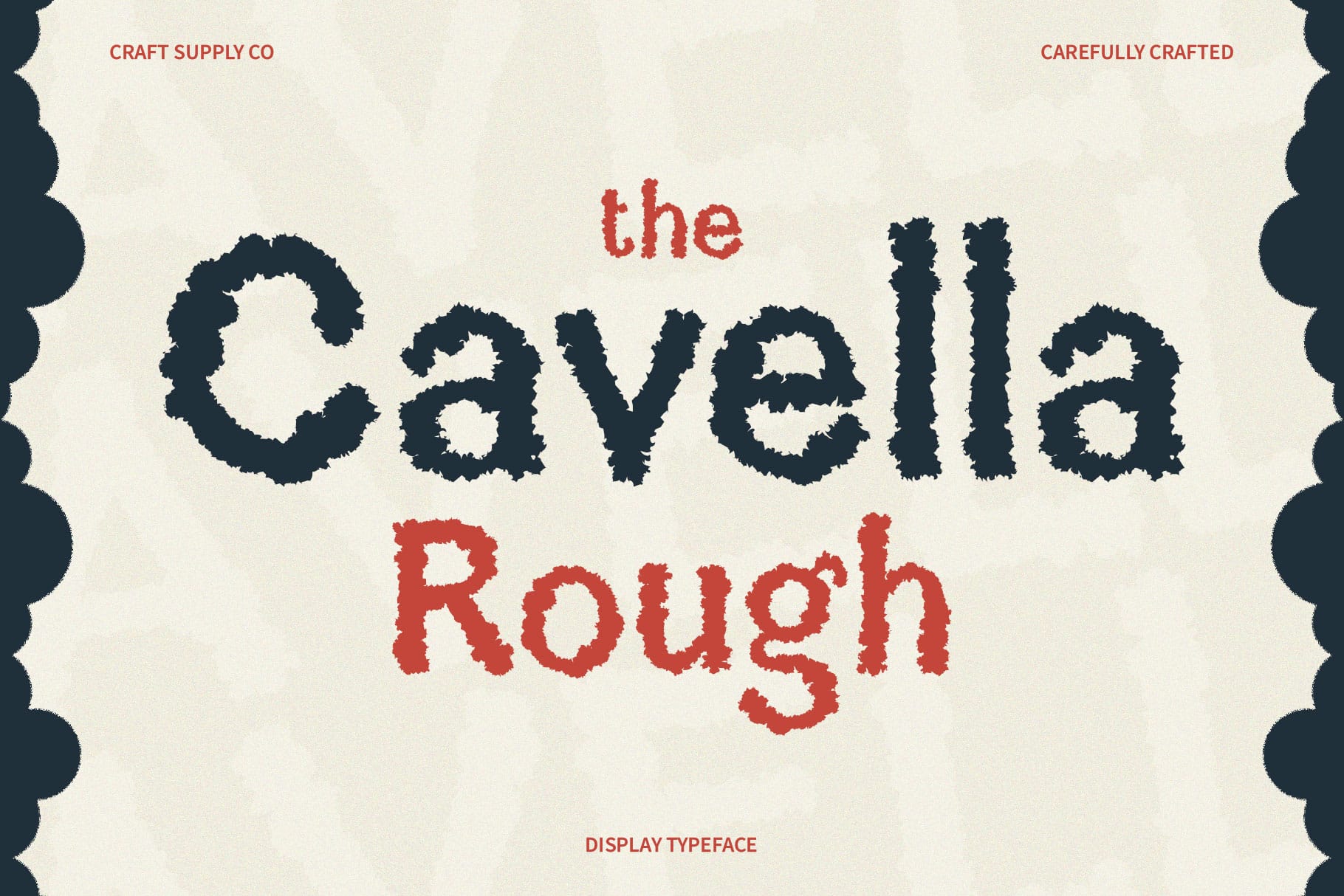
Cavella Rough Font is an alternative to consider for designs that lean toward gritty, distressed, or rebellious typography. Rough lettering can complement smoke textures by introducing a sense of imperfection rather than relying entirely on smooth, polished shapes.
Use it as a starting point for horror inspired posters, rock music graphics, streetwear concepts, or experimental editorial work. Combining rough lettering with soft smoke imagery can create an interesting contrast between sharp texture and atmospheric movement.
5. Clodice Vintage Retro Bubble Typeface

Smoke inspired typography does not always have to look dark or frightening. Clodice Vintage Retro Bubble Typeface offers a direction to explore when you want a more playful, rounded, or nostalgic visual mood.
Try combining the lettering with pastel haze, colored smoke, or soft gradients to create a retro inspired composition. This approach may work for creative campaigns, music artwork, experimental packaging, and social media graphics that need atmosphere without feeling overly dramatic.
6. Cavella Font Display Typography
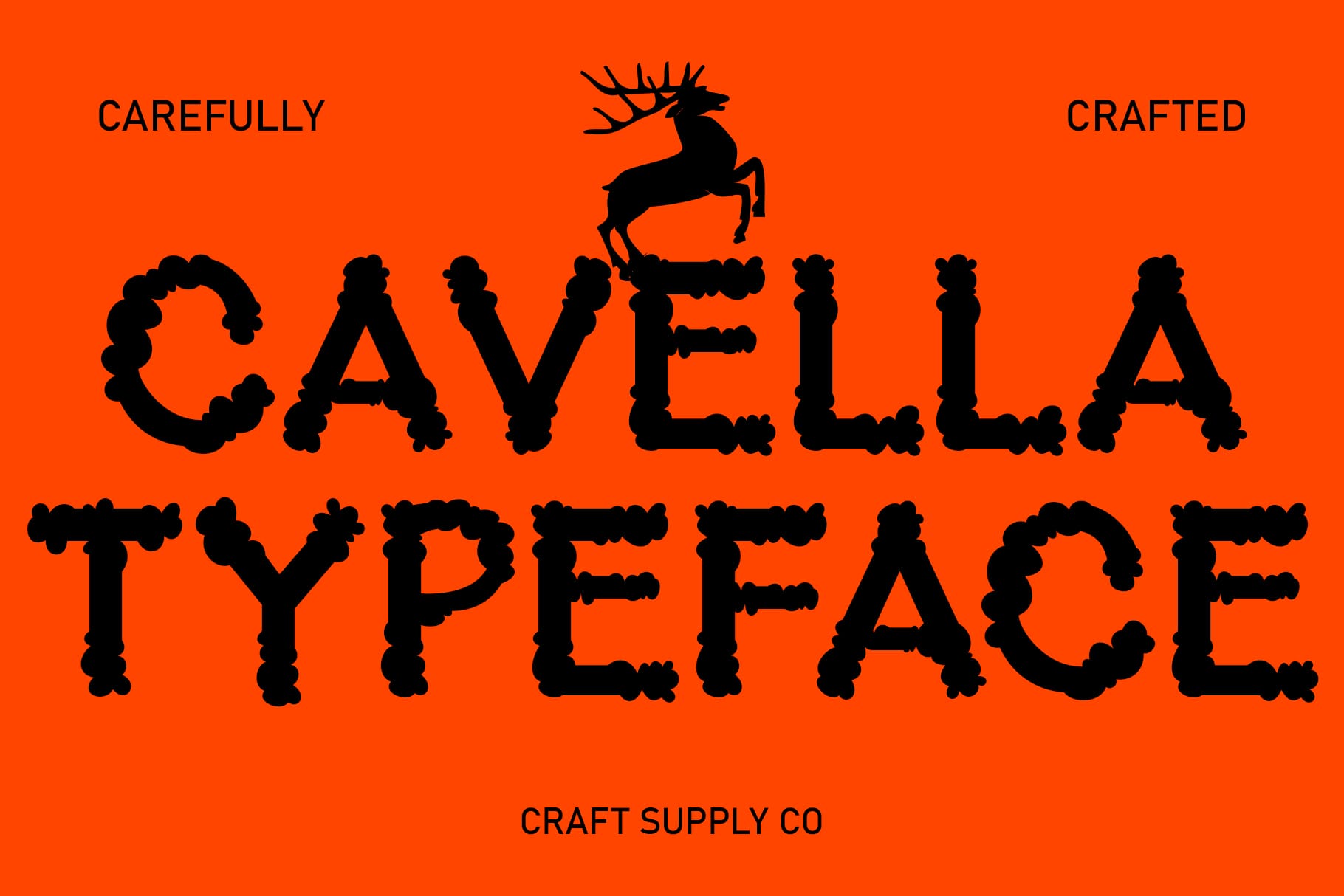
Display typography can help establish a strong visual hierarchy in smoke inspired designs. Cavella Font Display Typography is worth testing for prominent titles, campaign headlines, and short phrases that need to remain noticeable against an atmospheric background.
Consider using the font with a smoky gradient, subtle outer glow, or a faded duplicate layer behind the main lettering. Keep supporting text simple so the headline remains the focal point. This technique can be useful for posters, branding presentations, and digital promotional materials.
7. Clodice 3D Font

Clodice 3D Font is another option for designers interested in dimensional lettering. It can be explored for compositions where depth, shadows, and contrast play an important role in creating a smoky atmosphere.
For a cinematic look, test the font against a charcoal or black background with soft gray haze around the lettering. A small amount of directional light can help separate the headline from the background. This style may suit title cards, promotional posters, and visually expressive digital artwork.
8. Clodice Rough Font
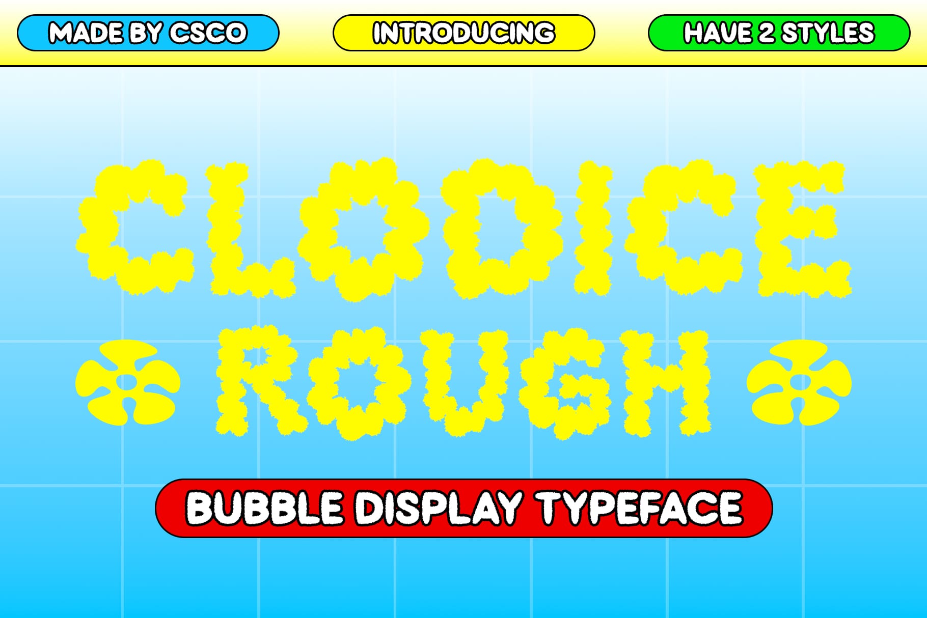
Clodice Rough Font offers another direction for distressed typography. Rough letterforms can help create a raw, imperfect visual identity that complements smoke overlays, grainy textures, and dramatic lighting.
Experiment with monochromatic artwork, faded edges, and uneven texture placement to build an atmospheric design. The font may be useful for alternative music campaigns, horror themed graphics, editorial posters, or merchandise concepts where a polished appearance is not the main goal.
9. Clodice Blur

Blur is closely associated with the visual language of smoke because both can soften edges and make shapes appear to dissolve into their surroundings. Clodice Blur is a particularly relevant alternative to explore when you want typography that supports a hazy or motion inspired composition.
Test it for experimental posters, digital artwork, nightlife promotions, and atmospheric social media graphics. If the lettering becomes difficult to read, create a stronger contrast between the text and background or reserve the blurred treatment for a short headline. Pairing blurred typography with sharper supporting text can create a balanced composition.
10. Clodice Stamp Nostalgic Typography

Clodice Stamp Nostalgic Typography is worth considering for designs that combine smoky atmosphere with a vintage or printed character. Stamp inspired treatments can introduce visual texture, making them an interesting contrast to soft, translucent smoke effects.
Explore this alternative for retro inspired posters, music merchandise, packaging concepts, and editorial graphics. A limited color palette, subtle grain, and layered background imagery can help unify the composition without overwhelming the typography.
How to Create a Smoke Font Effect
To create atmospheric typography, begin by selecting a bold typeface against a dark, cinematic background. After that, place a translucent smoke texture around the text and apply a subtle blur to duplicate font layers. Finally, manage your contrast and leave enough empty space around the main headline so the text remains easy to read.
Consequently, this striking visual style works beautifully across a wide variety of creative projects. For instance, smoky lettering easily establishes a moody, suspenseful atmosphere for music posters, album artwork, and horror graphics. In addition, alternative fashion labels and streetwear brands frequently use these dimensional textures to create bold graphics for apparel.
Therefore, mastering this simple technique allows you to quickly generate engaging visual hooks for digital platforms. Specifically, short headlines with blurred effects are perfect for grabbing attention in social media graphics and promotional posters. However, you must always review your final design at its intended display size to ensure it remains legible on mobile screens.
Smoke effects can quickly make typography difficult to read. Use stronger contrast for important words, limit decorative effects on long text, and leave enough empty space around the main headline. For additional design inspiration and creative typography projects, explore Craft Supply Co.
Where to Use Smoke Font Style
Music Posters and Album Artwork
Smoky typography can establish a moody atmosphere for electronic music, rock, experimental releases, and other visually expressive music projects. Combine the font with atmospheric photography, abstract gradients, or subtle grain to reinforce the concept.
Halloween and Horror Graphics
For Halloween promotions and horror inspired designs, smoke effects can create suspense without relying on complicated illustrations. Distressed fonts, dark backgrounds, and fading edges can help establish an eerie visual mood.
Fashion and Streetwear Branding
Experimental display fonts can support alternative fashion campaigns, clothing graphics, and limited edition merchandise. Rough textures or dimensional lettering can help create a bold identity, especially when the typography is paired with strong photography.
Social Media and Digital Artwork
Short headlines with blurred or atmospheric lettering can attract attention in digital compositions. Use a clear focal point and avoid adding too many competing effects. The design should remain recognizable on smaller screens.
Posters and Creative Campaigns
Promotional posters often benefit from expressive typography because the headline needs to communicate the theme quickly. Choose a font that fits the campaign, then use smoke imagery and lighting effects to reinforce the concept.
Tips for Choosing the Best Smoke Font Style
- Match the mood: Choose rough lettering for a gritty atmosphere, dimensional typography for drama, or blurred styles for a hazy digital look.
- Check readability: Make sure the main message remains legible after applying effects.
- Limit visual clutter: Use smoke textures selectively and leave room for the typography to breathe.
- Consider the final format: A font that works for a large poster may need simpler effects for a small social media graphic.
- Test different combinations: Preview the typeface with several backgrounds, colors, and effects before settling on the final design.
- Review licensing: Check the font’s current license and permitted uses before using it in commercial projects.
For more ideas on combining typography with distinctive visual treatments, visit Craft Supply Co and explore creative design inspiration.