
A memorable coffee shop logo can do more than display a business name. It can communicate the atmosphere of a café, express its personality, and help customers recognize the brand across cups, takeaway bags, menus, signage, and social media. Typography plays a central role in this process. A carefully chosen font as seen in the design of the Spills Coffee logo can make a coffee brand feel relaxed, creative, playful, artisanal, or contemporary without relying on complicated graphics.
Spills Coffee logo offers an interesting starting point for exploring the relationship between typography and coffee shop branding. When looking for fonts behind similar logos, designers can investigate the broader visual language often associated with independent cafés, including expressive lettering, hand drawn details, and distinctive character shapes. These approaches can give a coffee identity a personal quality that feels different from a conventional corporate wordmark.
This article explores the role of typography in coffee branding and introduces ten Spills Coffee logo font alternatives from Craft Supply Co. The selection focuses on drawn and hand drawn styles that can help designers experiment with expressive café logos, packaging, promotional artwork, and other brand applications. These are independent design alternatives, not verified matches for the official Spills Coffee logo or claims about the typeface used by the brand.
Why Typography Matters in Coffee Shop Branding
Coffee brands compete in a visual environment filled with familiar symbols, from takeaway cups and coffee beans to café interiors and product packaging. Typography gives a business another way to establish its identity. Even when two cafés sell similar products, their lettering can make their brands feel noticeably different.
A clean sans serif may communicate simplicity and modernity, while a traditional serif can suggest heritage or refinement. Hand drawn typography introduces another possibility: it can create a sense of individuality, informality, and creative expression. This makes drawn lettering worth considering for cafés that want their branding to feel distinctive and approachable.
For a Spills Coffee logo inspired design exploration, hand drawn fonts provide a useful creative direction. Their irregularities and expressive forms can introduce personality to a wordmark, especially when paired with a thoughtful color palette and simple supporting graphics. However, the right choice depends on the brand’s intended character rather than on a single trend.
What Makes a Coffee Logo Memorable?
1. A Distinctive Wordmark
A recognizable wordmark gives a coffee business a visual signature. The shape of each letter, the spacing between characters, and the overall silhouette influence how the name appears at a glance. Instead of choosing a font simply because it looks attractive, consider how it represents the business and whether the complete name remains easy to recognize.
2. A Sense of Personality
Typography can communicate a brand’s personality before customers interact with its products. Hand drawn lettering may suit a café with a creative, casual, or independent identity, while a more structured font could work better for a minimalist coffee concept. Decide what the brand should express, then select a typeface that supports that direction.
3. Consistency Across Applications
A coffee shop identity needs to work across several formats. The logo may appear on a small cup sleeve, a paper bag, a menu, a storefront sign, or a social media profile. A font should retain its character across these applications without becoming difficult to read when reproduced at smaller sizes.
4. Balance Between Expression and Readability
Expressive typography can make a logo stand out, but excessive irregularity or intricate details may reduce legibility. The best design balances personality with clarity. Before committing to a font, test the full business name, examine the spacing, and view the design at different sizes.
10 Font Alternatives for Spills Coffee Logo Inspired Logos
The following fonts offer different ways to explore hand drawn typography for coffee shop branding. Some may suit a playful wordmark, while others can be considered for more expressive packaging, editorial style menus, or promotional graphics. Review each font’s actual specimen and available characters before deciding how it fits your project.
1. CS Hestia Drawn

CS Hestia Drawn is a useful starting point for designers exploring drawn lettering in a coffee shop identity. A drawn font can bring an illustrative quality to a wordmark and help a café develop a visual personality that feels less standardized. Consider this option for takeaway packaging, menu headings, coffee labels, or promotional artwork. Test the full café name to see how its individual letterforms work together and whether the finished wordmark remains clear at smaller sizes.
2. CS Aylios Hand Drawn Font

CS Aylios Hand Drawn Font is worth exploring when a brand needs a more personal typographic direction. Hand drawn styles can introduce a crafted quality that works well with independent café concepts, specialty coffee packaging, and creative visual campaigns. Try it in a wordmark study alongside simple illustrations or a restrained color palette. Keeping the surrounding design uncluttered allows the lettering to become a central feature without competing with too many decorative elements.
3. Mondeur Playful Hand Drawn Serif
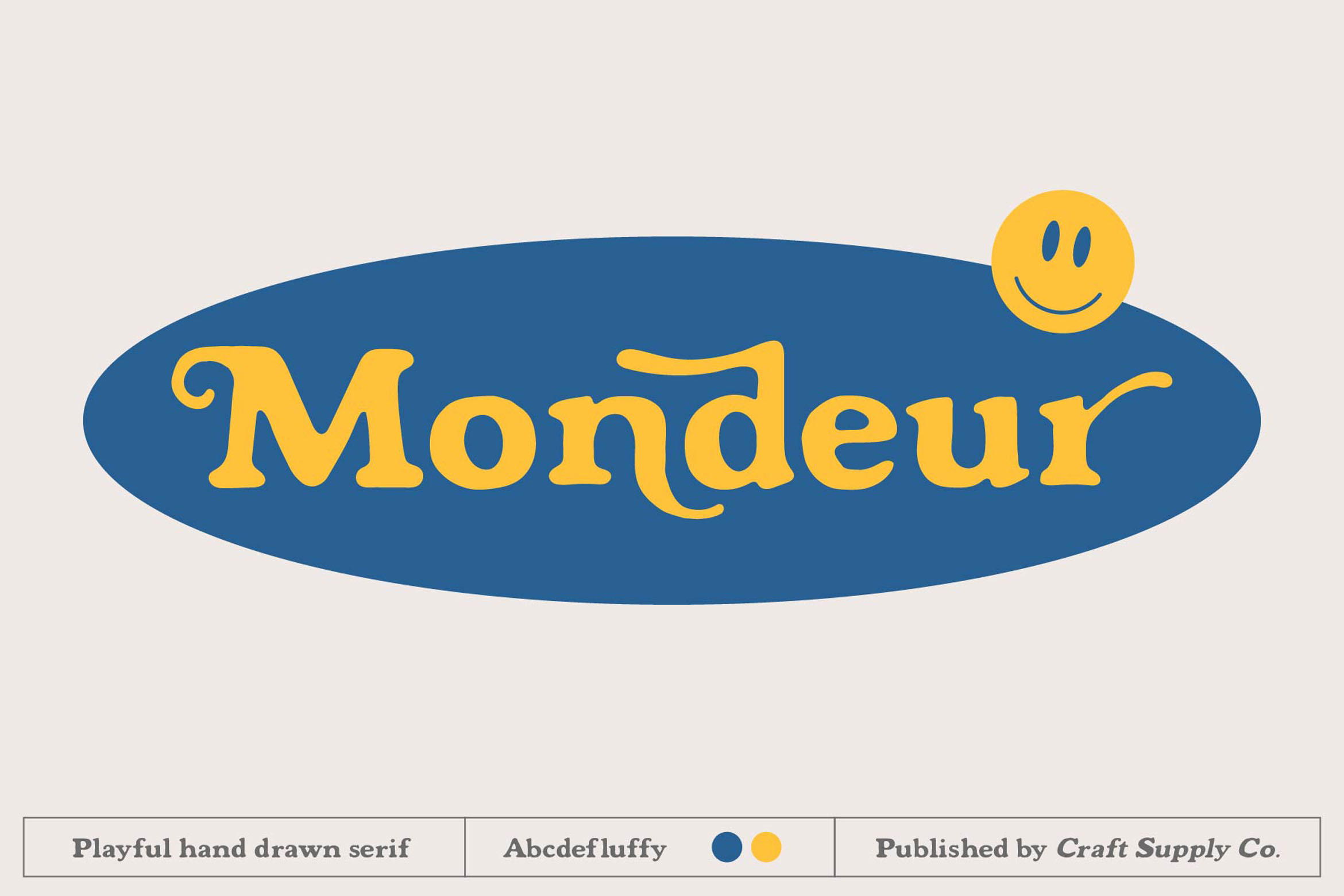
Mondeur Playful Hand Drawn Serif is an option for coffee brands looking to combine serif typography with a more expressive, hand drawn character. This direction can work well for café identities that want to feel creative, distinctive, or slightly unconventional. Explore it for packaging titles, menu covers, merchandise, and logo concepts. Its serif classification also makes it worth comparing with simpler sans serif options to determine which style best reflects the intended brand personality.
4. CS Brilon Handdrawn Font
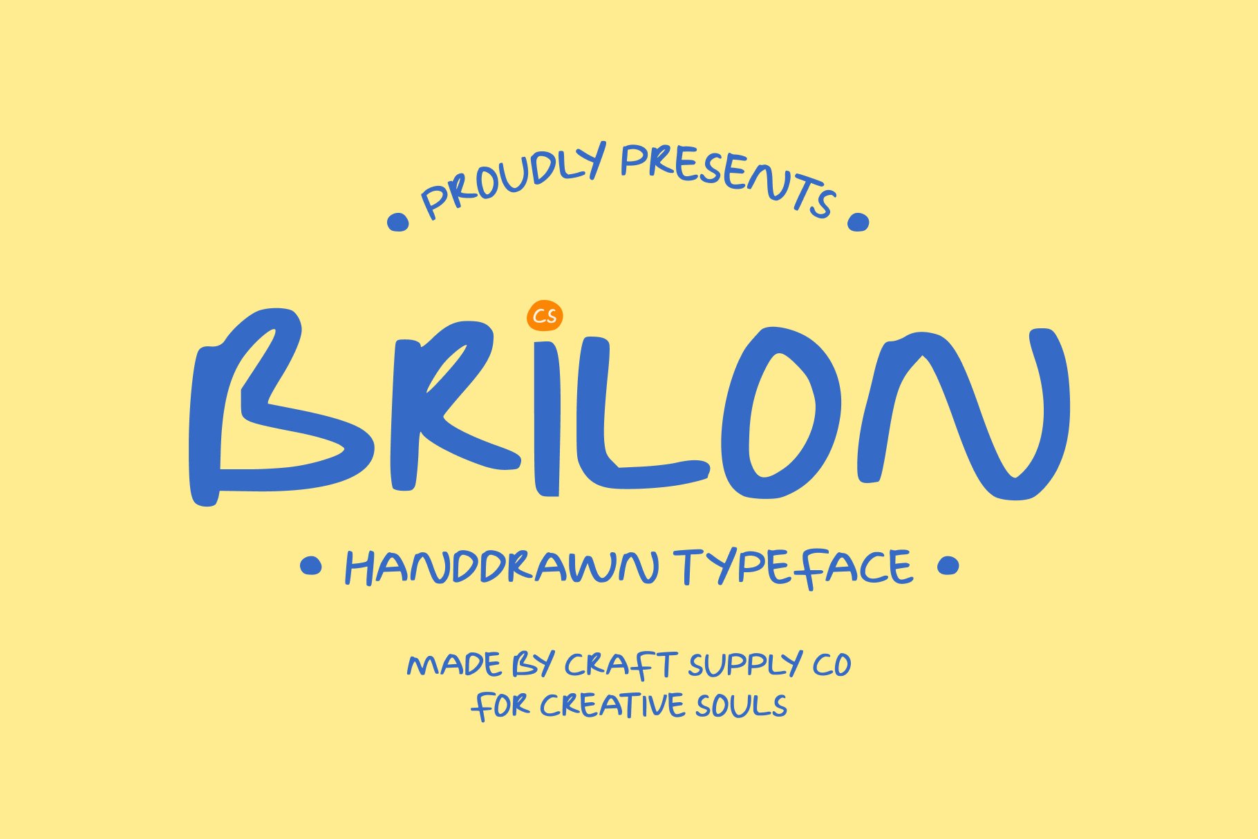
CS Brilon Handdrawn Font offers another route for designers interested in expressive lettering. It can be explored in café branding where a distinctive wordmark needs to carry more personality than a standard text face. Try it on coffee bags, cup graphics, menu headings, or social media artwork. Pay attention to how the complete name fits within different layouts, and consider using a clean supporting typeface for product descriptions and other information that customers need to read quickly.
5. Chaos and Madness Handdrawn Font
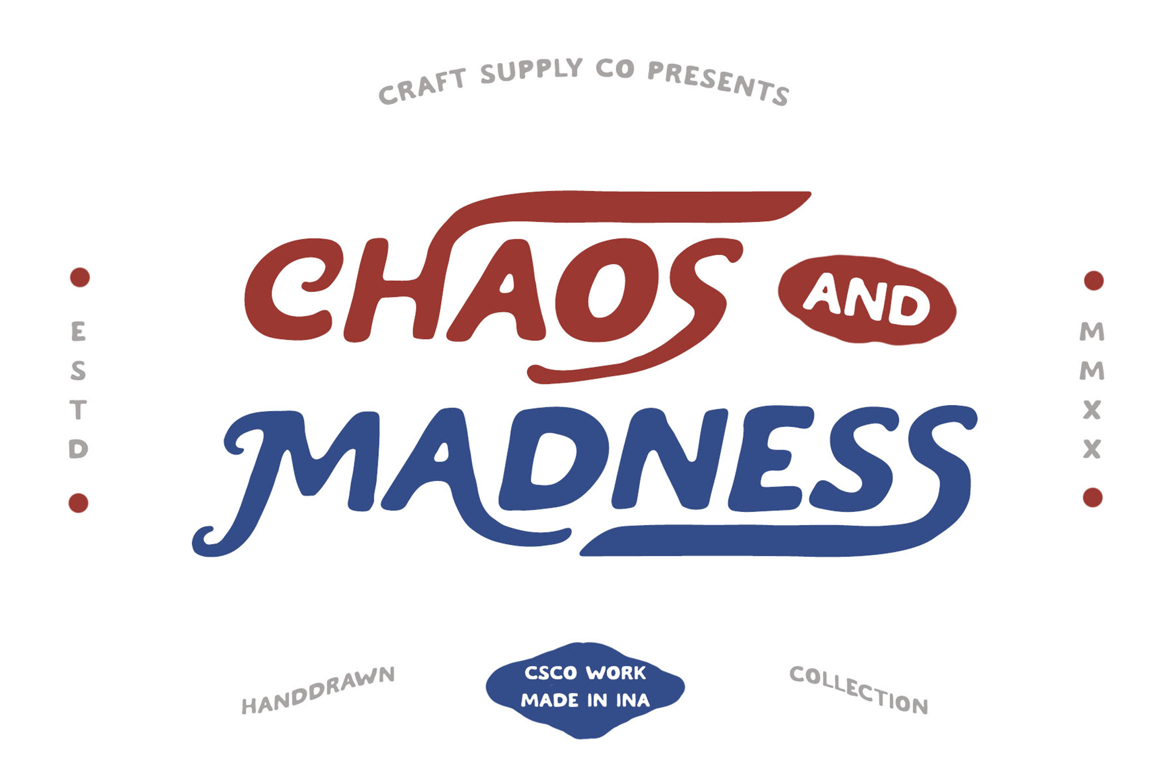
Chaos and Madness Handdrawn Font is worth investigating for more expressive or unconventional coffee branding. Its hand drawn classification makes it a candidate for designs that want to move away from a highly polished, uniform appearance. Consider it for creative café campaigns, limited edition packaging, event posters, or merchandise. Because expressive typography can become visually dominant, pair it with simple layouts and restrained supporting graphics to maintain a clear hierarchy.
6. CS Yonder Drawn

CS Yonder Drawn provides another alternative for exploring drawn lettering in a coffee shop identity. It can be included in early logo concepts when you want to compare an expressive direction with more conventional typography. Test it across a range of applications, from a large storefront style wordmark to smaller cup labels and social media graphics. This process helps reveal whether the typeface works best as the primary logo or as a supporting display font for seasonal promotions and campaigns.
7. CS Susan Drawn

CS Susan Drawn is another font to consider when exploring a more individual approach to café lettering. Drawn typography can help a coffee brand develop a recognizable visual signature, particularly when the font is used consistently across packaging, menus, and promotional materials. Compare the font with other options in this list using the same business name. Look at the overall word shape, spacing, and readability rather than judging the typeface only by its appearance in a specimen.
8. CS Brilon Drawn
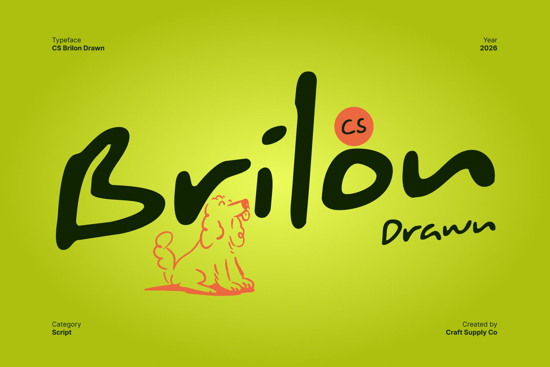
CS Brilon Drawn offers a further option for designers investigating drawn display typography. It can be useful to compare this version with CS Brilon Handdrawn Font when developing a shortlist, while checking the individual product previews for their actual visual differences. Explore it for café logos, menu titles, coffee packaging, or campaign graphics. The final decision should depend on the way its letterforms support your concept and how well the wordmark performs across different formats.
9. CS Brawley Drawn

CS Brawley Drawn is worth testing when you want to compare another drawn style for a distinctive coffee brand. A display font can provide a visual anchor for a design, especially when the brand name appears prominently on a cup, bag, or promotional poster. Try several arrangements and examine how the typography interacts with illustrations, icons, and supporting text. Avoid adding too many visual effects before evaluating the lettering on its own.
10. CS Belluga Drawn

CS Belluga Drawn completes this selection with another possibility for drawn coffee shop typography. Consider it during the comparison stage when you want to evaluate several different lettering directions before finalizing a logo. Use the actual café name in your test layouts, then preview the result on packaging, menu covers, and digital graphics. A suitable font should not only look distinctive in a large presentation but also remain practical for the everyday needs of a coffee business.
How to Choose the Right Font for a Coffee Logo
Selecting the right typeface for a café requires matching the font directly to your brand’s unique personality rather than following temporary trends. For instance, an artisanal shop might call for a hand drawn serif, whereas a contemporary café could benefit from an unconventional display font. Therefore, you should always evaluate your actual business name inside each font candidate to check how specific letter combinations, line breaks, and overall silhouettes balance together out in the real world.
Additionally, you must consider the practical requirements of your packaging while building a clear typographic hierarchy. Consequently, your primary wordmark needs to fit comfortably onto narrow cup sleeves, takeaway bags, and small labels without losing its visual details or background contrast. However, remember to pair your expressive logo font with a simple supporting typeface for menus and prices, while auditing the commercial licensing early to ensure your final design is fully compliant.
Creating a Cohesive Coffee Brand Identity
A memorable coffee logo depends on more than the font itself. Color, composition, imagery, and the way the brand communicates all contribute to the overall impression. A hand drawn wordmark might be paired with simple coffee illustrations, a restrained palette, and generous spacing to create a clear identity. Alternatively, a more expressive font can become the central visual element of a bold campaign or limited-edition package.
Consistency is essential. Once you choose a typeface, define how it should appear across cups, takeaway bags, menus, storefront materials, and digital channels. Keep the logo’s proportions consistent, establish a clear hierarchy for supporting text, and avoid introducing unrelated fonts without a clear purpose.
For more typographic inspiration and creative design ideas, explore the work shared by Craft Supply Co. Looking at different design applications can help you understand how typefaces contribute to packaging, wordmarks, and broader visual identities.