
Typography is one of the most powerful tools in brand design. It can make a company feel approachable, energetic, professional, or innovative before an audience reads a single sentence. A well designed wordmark can become an important part of brand recognition, while the fonts used across websites, applications, advertising, and other materials help create a consistent visual experience. Looking at Lyft font offers a useful opportunity to explore how typography contributes to a recognizable brand identity.
Lyft font is widely associated with a modern, digitally oriented service that connects people with transportation. In this kind of environment, typography must do more than look attractive. It needs to communicate clearly across different screens, remain legible in compact spaces, and support a brand personality that feels accessible to a broad audience. These requirements reveal several valuable lessons about type design, particularly for designers working on contemporary service brands and digital products.
This article examines the broader design lessons that can be drawn from Lyft font visual identity and introduces ten bold Lyft font alternatives from Craft Supply Co. These typefaces offer different starting points for exploring strong wordmarks, expressive headlines, and modern brand applications. They are independent creative alternatives, not claims about the exact font used in Lyft’s official branding.
Why Typography Matters in Lyft’s Brand Identity
For a digital service, typography often becomes part of the customer’s everyday experience. People may encounter a brand name on a mobile screen, in a promotional campaign, on a vehicle, or within a website interface. A consistent Lyft font approach helps connect these touchpoints and makes the overall identity feel more unified.
Lyft font provides a useful case study because transportation services depend on both recognition and usability. Customers need to identify the service quickly, while the broader brand experience must feel coherent across digital and physical environments. Typography can support these goals through distinctive lettering, clear hierarchy, and carefully considered spacing.
Rather than treating a recognizable brand wordmark as a Lyft font to copy, designers can study the principles behind effective typography. The most useful questions are how a wordmark establishes personality, how its letterforms remain recognizable, and how the typography relates to the rest of the visual system.
Five Lessons Lyft Can Teach Us About Type Design
1. Simplicity Can Create Strong Recognition
A brand does not always need complicated lettering to stand out. Simple wordmarks can be memorable when their proportions, spacing, and overall shape work together. A clear typographic structure also makes a name easier to reproduce across different sizes and applications.
When developing a logo, begin by testing the name in a straightforward typeface. Study the width of the word, the relationship between individual letters, and the balance of the complete composition. Only introduce custom details when they improve recognition or support the intended personality.
2. Typography Communicates Personality
Letterforms can make a brand feel friendly, confident, energetic, or serious. Rounded shapes may suggest a softer character, while bold lettering can create a stronger visual presence. Narrower proportions can feel compact, and more expansive forms may give a wordmark a confident appearance.
The important lesson is to choose typography that supports the brand’s purpose. A transportation service, a financial platform, and a creative studio may all need modern identities, but their typefaces should not necessarily communicate the same personality.
3. Readability Must Work Across Screens
Digital brands need typography that performs well at different sizes. A wordmark that looks impressive on a large presentation can become difficult to recognize when reduced to an app icon or a small interface label. Thin details, tight spacing, and complicated letter shapes can become less effective at smaller scales.
Designers should test typography in realistic conditions rather than relying only on large mockups. Preview the wordmark on mobile screens, in compact headers, and against different backgrounds. Make sure the lettering remains clear without sacrificing its distinctive character.
4. Consistency Builds a Unified Brand
A strong typographic identity extends beyond the logo. Headlines, body copy, navigation labels, advertisements, and supporting graphics should feel like parts of the same visual system. This does not mean using one font for everything. It means creating a clear hierarchy and choosing typefaces that work together.
A bold display font can establish the brand’s voice, while a simpler sans serif can support paragraphs and interface content. Consistent sizing, spacing, and alignment help these elements work together across different platforms.
5. Bold Typography Can Make a Message Stand Out
Bold fonts are useful when a design needs a clear focal point. Their visual weight can help brand names and headlines stand out in busy environments, including advertising, social media graphics, and promotional campaigns.
However, boldness alone does not guarantee good design. Letter spacing, word length, contrast, and the surrounding layout all influence the result. The most effective typography balances impact with legibility, allowing a message to attract attention without making the composition feel crowded.
10 Bold Font Alternatives for Modern Brand Design
If you are exploring a contemporary wordmark or want to develop a visual identity inspired by the broader lessons of Lyft font branding, bold fonts are a practical place to begin. The following options from Craft Supply Co. offer a selection of bold sans serif and display styles for different design directions.
1. CS Balk Bold Sans Serif

CS Balk Bold Sans Serif is a strong candidate for designers who want a bold sans serif foundation for a modern identity. This category of typeface can help create clear headlines, confident wordmarks, and prominent brand messaging. Consider it for digital services, business identities, campaign graphics, or promotional layouts where a direct typographic statement is important. Test the complete brand name to see how its proportions and spacing work together.
2. CS Albon Bold Sans Serif

CS Albon Bold Sans Serif offers another option for projects that need substantial typographic weight. A bold sans serif can support a clean visual hierarchy by making the main message immediately distinguishable from supporting content. Explore this font for website headings, brand presentations, packaging, and logo concepts. Pair it with a more restrained supporting typeface when the design includes longer paragraphs or detailed information.
3. CS Costin Bold Sans Serif

CS Costin Bold Sans Serif is worth considering when you want to compare different bold sans serif approaches for a brand identity. Even within the same general category, typefaces can create different impressions through their letter shapes, proportions, and spacing. Use this option in a wordmark study or headline layout, then compare it with the other sans serif alternatives. Looking at the same word in several fonts makes it easier to identify the most suitable visual personality.
4. CS Rensa Bold Sans Serif
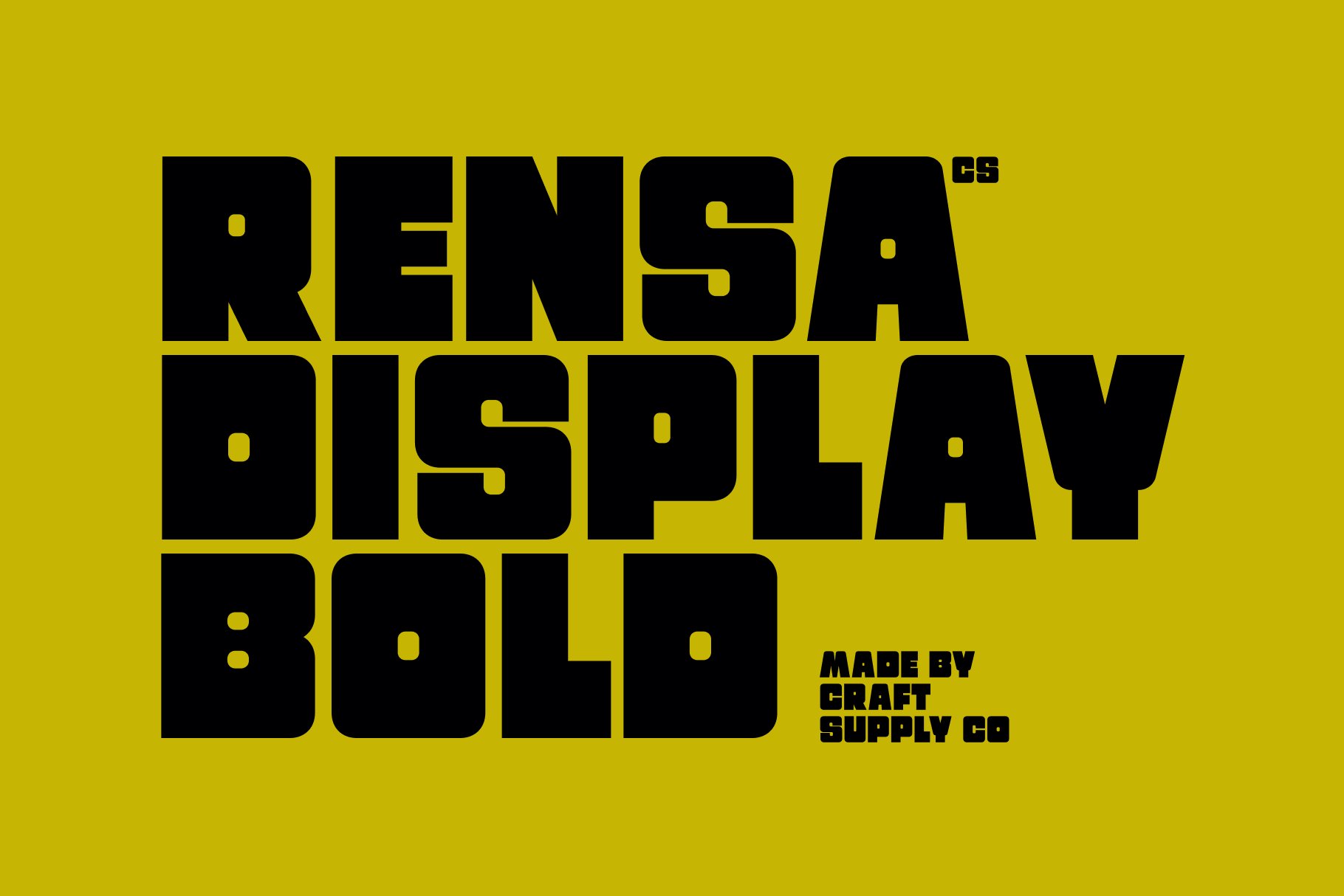
CS Rensa Bold Sans Serif provides another direction for designers looking for bold sans serif typography. It can be explored for contemporary business identities, digital branding, editorial headlines, and promotional materials. Focus on how the font handles the specific letters in your brand name and whether its visual weight remains balanced across the word. A successful choice should create a strong focal point while preserving the readability needed for practical use.
5. CS Midway Bold Font
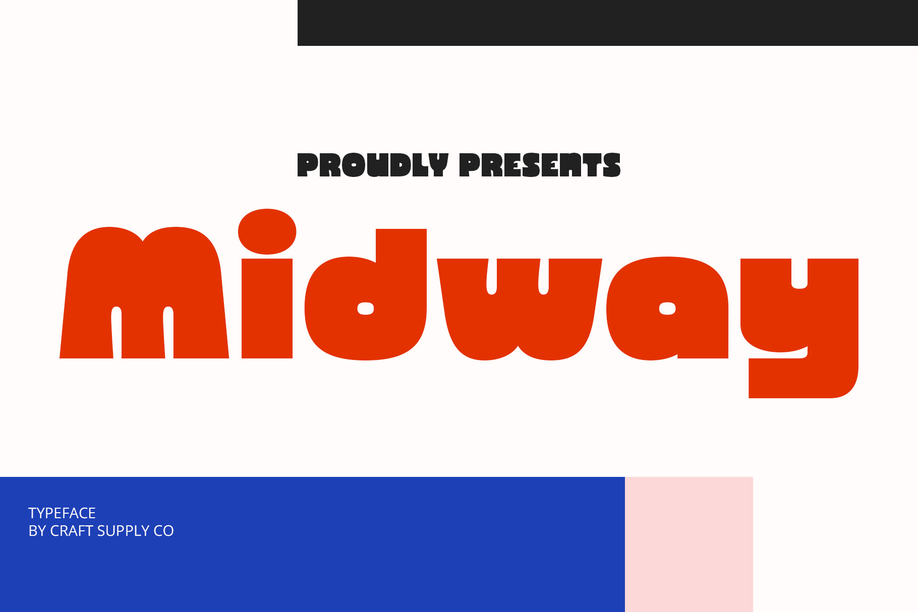
CS Midway Bold Font is an alternative to investigate when a project calls for a bold display treatment. Display fonts can give headlines and short brand statements a more pronounced presence than a typeface intended primarily for body text. Consider it for promotional graphics, campaign titles, presentation covers, or experimental wordmarks. Before adopting it as the main brand typeface, review its character set and test how the complete name appears at both large and small sizes.
6. CS Bruce Bold Font
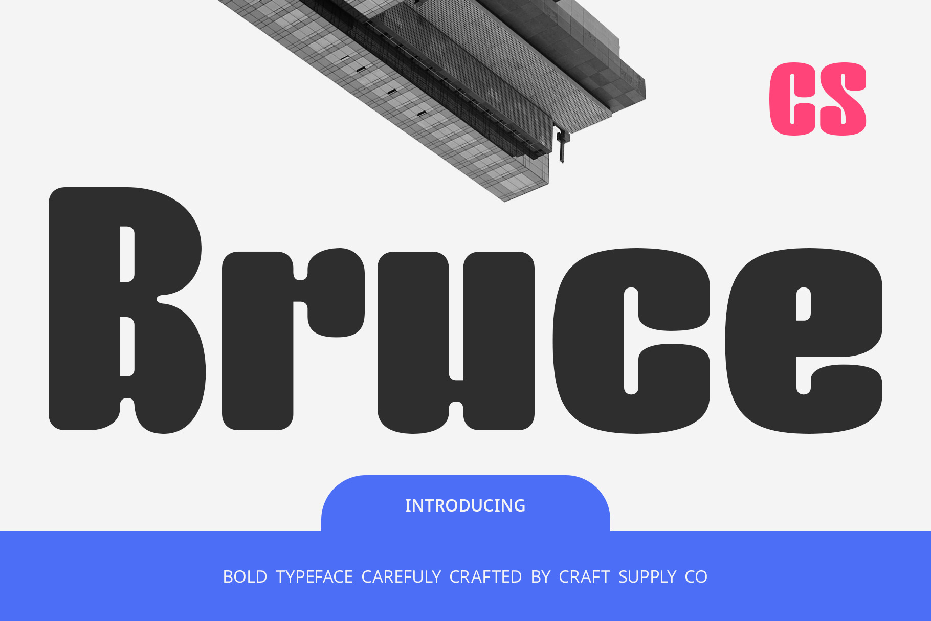
CS Bruce Bold Font offers another possibility for designs that benefit from a strong typographic presence. It can serve as a starting point for bold headlines, product graphics, and brand concepts where the lettering needs to carry much of the visual impact. Experiment with different spacing settings and layout proportions to see how the font behaves in your design. Keep supporting elements simple if the headline is already visually prominent.
7. CS Santino Bold Font

CS Santino Bold Font is worth exploring as part of a broader comparison of bold display typography. It may be useful for projects that need a distinctive headline or a wordmark with a confident visual presence. Test it in several contexts, such as a logo presentation, social media graphic, or promotional banner. Comparing these applications will help you determine whether the typeface works best as a primary brand element or as a supporting display style.
8. CS Aftone Bold Font
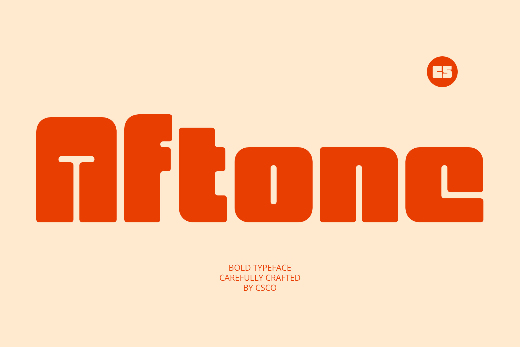
CS Aftone Bold Font adds another option to a selection of bold typefaces for modern branding. When evaluating a font like this, pay attention to how its letterforms interact and how much space the full word occupies. These details can influence whether the finished logo feels compact, expansive, or visually balanced. Consider using it in brand concepts, headlines, or campaign graphics, and compare the result against a simpler sans serif alternative.
9. CS Dayne Bold Font

CS Dayne Bold Font is another candidate for designers seeking a strong display style. It can be tested in projects where the brand name or headline needs to remain a clear focal point. Try different background colors and contrast levels, but avoid adding unnecessary effects before evaluating the font on its own. A good typographic choice should contribute to the design through its letterforms and composition rather than depending entirely on decoration.
10. CS Bolvar Bold Font

CS Bolvar Bold Font completes this selection with another bold option to compare during the type exploration process. Use it to test a range of wordmark compositions, headline treatments, and brand applications. Consider how the font works alongside secondary typography, graphic elements, and the intended color palette. The right choice will be the one that supports the project’s personality while remaining practical across the places where the identity will appear.
How to Select the Best Font for Your Brand
Choosing among several bold typefaces becomes much easier when you compare each font candidate against the same structural requirements rather than relying on a quick first impression. For instance, you should always begin by writing down a few key brand qualities such as energetic, dependable, or contemporary to use as a strict visual filter. Therefore, make sure to type the actual brand name into each typeface option to evaluate the complete wordmark’s silhouette, spacing, and balance before making a final creative decision.
Additionally, you must establish a clear typographic hierarchy and test your preferred layouts across realistic everyday applications. Consequently, you should pair your expressive bold display face with a neutral supporting font to handle longer body descriptions and interface details cleanly. However, remember to preview these mockup designs early on small mobile screens and website headers to catch any hidden readability, text contrast, or spacing problems before the brand identity is finalized.
Finally, check the Lyft font licensing terms before using it commercially. Confirm that the license covers your intended applications, including branding, advertising, and digital products where relevant.
Beyond the Wordmark: Creating a Consistent Brand System
One of the most important lessons in type design is that a font rarely works in isolation. The strongest brand identities connect typography with color, layout, imagery, and the tone of their messaging. Even a bold wordmark needs a supporting visual system to function consistently across different contexts.
Start with the wordmark, then define how headings, paragraphs, buttons, labels, and promotional messages should appear. Establish a clear hierarchy so audiences can quickly distinguish the most important information. Use consistent spacing and alignment to connect the different elements, and avoid adding decorative effects that compete with the typography.
For further creative inspiration, explore the projects and type related work shared by Craft Supply Co. Studying different applications can help you discover new ways to combine typefaces, develop wordmarks, and build cohesive brand systems.