
Type design becomes especially interesting when familiar letterforms meet unusual visual systems. A typeface does not have to rely on traditional curves, classic serifs, or standard proportions to communicate a clear personality. When exploring a concept like Volatilis type design, pixel structures, digital textures, geometric grids, and hand-drawn details can all transform the way a word looks and feels.
What Volatilis Taught Us About Type Design explores this idea through a digital first perspective. The Volatilis type design provides an opportunity to think about how typography can communicate movement, technology, experimentation, and visual precision. Instead of treating a font as a simple container for words, designers can consider every letter as a graphic construction.
This approach becomes particularly useful when exploring pixel and semipixel typography. These styles reinterpret familiar characters through blocks, grids, and simplified forms. The result can feel nostalgic and futuristic at the same time, making digital-inspired fonts useful for gaming, technology, entertainment, posters, branding, and experimental design.
Why Volatilis Is an Interesting Type Design Study
A word mark such as Volatilis demonstrates how typography can shape the identity of a name. Each letter has its own structure, but the characters must also work together as a complete visual system. The width of the letters, the amount of negative space, and the relationship between straight and curved forms all influence the final result.
Digital typography adds another layer to this process. Instead of drawing every curve freely, designers may construct characters around a grid. This creates consistency while also introducing a recognizable visual language.
What Pixel Typography Teaches Designers
Pixel fonts demonstrate that simplicity can create strong personality. When curves are reduced to small blocks, designers must make deliberate decisions about which details remain and which disappear. This process can produce surprisingly expressive letters.
Pixel typography also creates a connection to digital history. Grid-based lettering can evoke games, early computer interfaces, digital displays, and electronic graphics. At the same time, contemporary designers can use these visual references in new ways rather than simply reproducing an old aesthetic.
10 Font Alternatives Inspired by Digital Type Design
1. CS Degita Stamp

CS Degita Stamp provides an interesting introduction to the collection because it combines digital-inspired character with a stamped visual treatment. This creates a tactile quality that contrasts with the precision normally associated with digital typography. For a Volatilis-inspired word mark, it can help create a balance between technology and physical print. Use it for posters, packaging, apparel, labels, and experimental branding.
2. CS Antire

CS Antire offers a semipixel approach that sits between conventional typography and fully pixelated lettering. This makes it useful when you want digital character without making every letter appear completely block-based. The semipixel construction can create an interesting balance between readability and experimentation. It is well suited to technology brands, gaming projects, digital artwork, and contemporary word marks.
3. CS Arogant
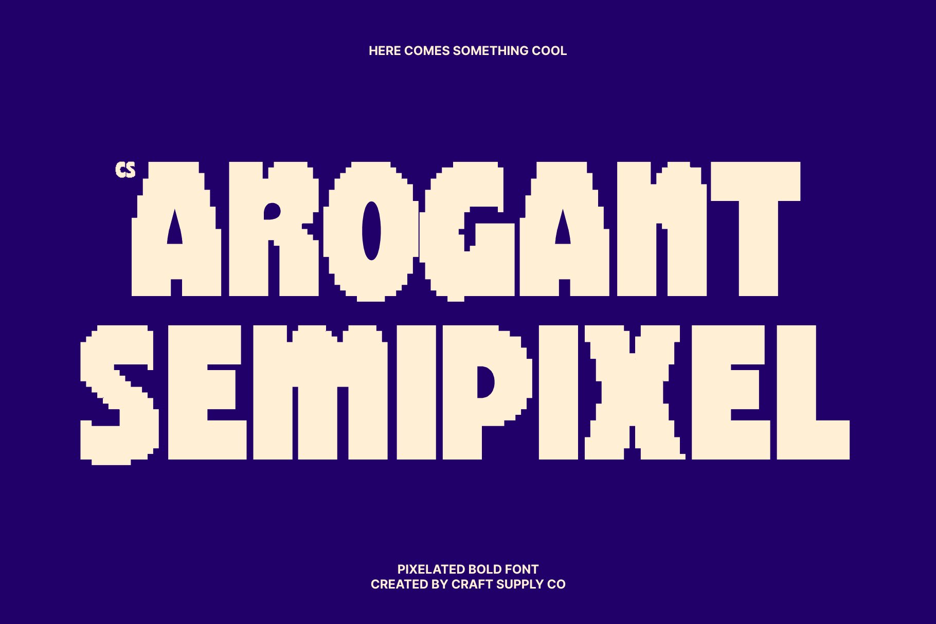
CS Arogant brings another semipixel direction to the Volatilis font alternative search. Its digital construction can give a word mark a distinctive grid-based personality while retaining enough recognizable structure for branding. This makes it useful for designers who want to explore futuristic typography without moving completely into traditional pixel lettering. Try it in large headlines, posters, digital products, or gaming-related identities.
4. CS Striker

CS Striker introduces a more direct pixel aesthetic. Pixel typography can make individual letters feel like carefully constructed digital objects, which is particularly effective for gaming and technology-inspired identities. For a Volatilis-inspired design, CS Striker can emphasize the digital side of the concept. It can also work well for merchandise, game titles, social graphics, and retro-inspired campaigns.
5. CS Morsa
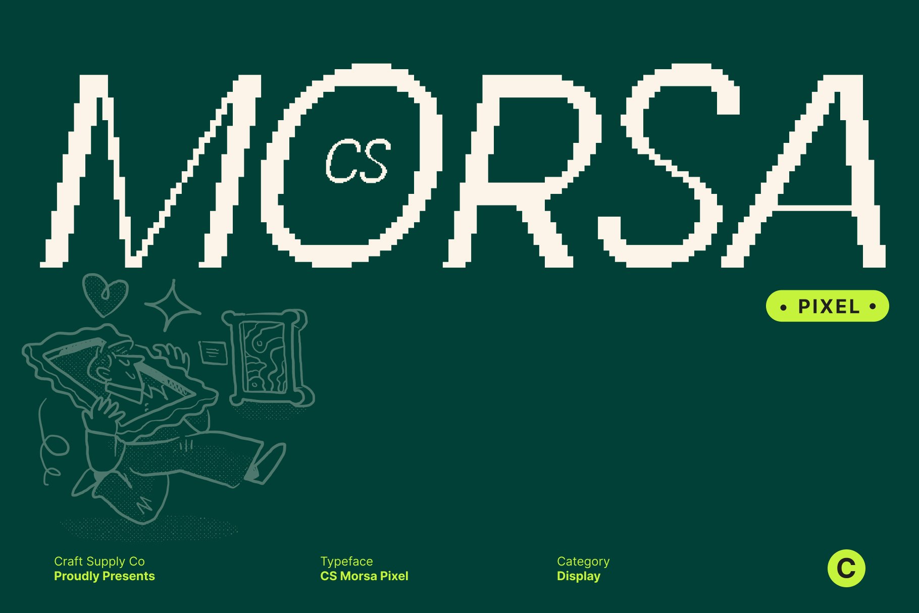
CS Morsa offers another pixel-based alternative for designers exploring digital lettering. Its block-oriented construction can create a strong visual rhythm across a short word. Pixel fonts often benefit from large-scale applications because the construction of each character becomes part of the design. Use CS Morsa for posters, game identities, digital interfaces, branding, or creative projects that need a recognizable electronic atmosphere.
6. CS Ralphie
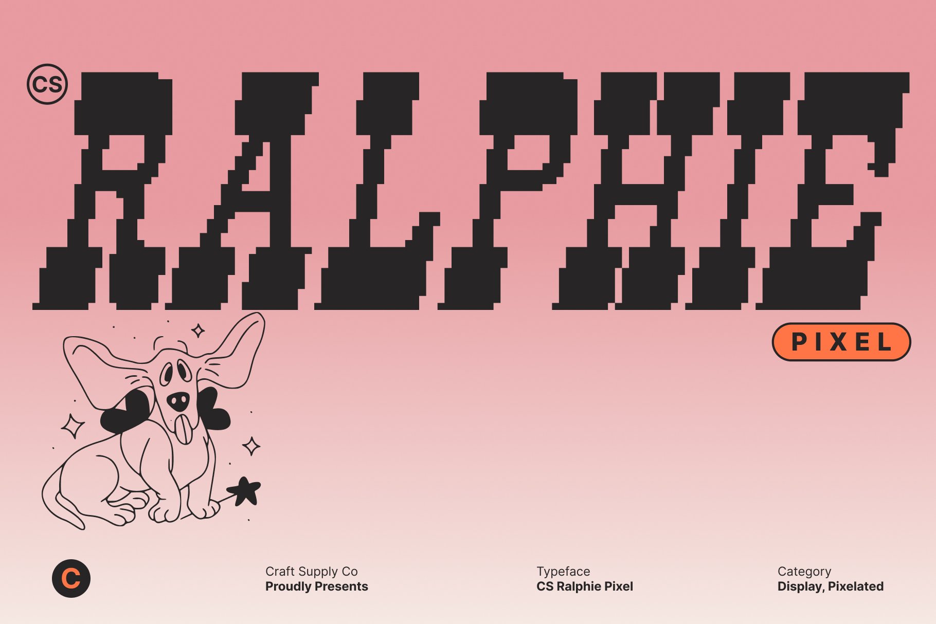
CS Ralphie brings another digital character to the collection. Its pixel construction can make a word mark feel connected to gaming culture and early digital graphics while still functioning as a contemporary display treatment. For a Volatilis font alternative, it offers a way to emphasize structured letterforms and visual rhythm. Experiment with generous spacing to ensure each pixel detail remains visible.
7. CS Alsager

CS Alsager continues the pixel-focused exploration with a strong digital identity. Pixel fonts are particularly useful when the typography itself needs to become a recognizable graphic element. CS Alsager can help create that effect in game branding, technology concepts, posters, merchandise, and digital campaigns. Its structured appearance also provides an interesting foundation for custom letter modifications.
8. CS Ablaze

CS Ablaze adds another energetic pixel direction to the collection. Pixel lettering can communicate energy through compact shapes and repeated grid structures, making it useful for dynamic visual identities. For a Volatilis-inspired concept, CS Ablaze can help make the typography feel active and digitally focused. Try it with strong contrast and simple layouts to keep the letter construction clear.
9. CS Degita Pixel

CS Degita Pixel provides a direct pixel alternative with a strong digital character. Its grid-oriented construction can turn each character into a small graphic composition. This makes it especially useful for gaming, technology, retro-inspired branding, and digital entertainment projects. When using CS Degita Pixel, consider displaying the word at a size that allows the pixel details to remain visible and intentional.
10. CS Norman Mono

CS Norman Mono provides a different perspective by combining a monospaced structure with a drawn quality. This contrast makes it an interesting alternative to purely pixel-based fonts. The monospaced foundation can create consistent spacing, while the drawn character adds a more human visual quality. For a Volatilis-inspired identity, this can help balance technical precision with creative expression.
Pixel vs Semipixel Typography
One of the most useful lessons from this collection is that digital typography does not have to follow one visual formula. Fully pixelated fonts use block-based construction throughout the characters, creating a strong connection to digital grids. Semipixel fonts take a more flexible approach and can retain smoother or more conventional aspects of letter construction.
CS Antire and CS Arogant demonstrate how semipixel typography can provide a middle ground. They can feel digital without becoming as rigid as a fully pixel-based typeface. This makes them useful when readability and experimentation need to coexist.
Pixel options such as CS Striker, CS Morsa, CS Ralphie, CS Alsager, CS Ablaze, and CS Degita Pixel push the digital aesthetic further. They can create stronger associations with gaming, retro technology, and electronic graphics.
Why a Grid Matters in Type Design
A grid gives designers a system for constructing letters. Each character must fit within an established framework, which creates consistency across the alphabet. At the same time, designers need to make individual letters recognizable despite having fewer visual tools available.
This limitation can actually improve design thinking. When every pixel matters, unnecessary details become easier to identify. Designers learn to focus on silhouette, counters, spacing, and rhythm rather than relying on subtle curves or complex strokes.
How to Find the Right Volatilis Font Alternative
Begin by deciding how digital you want the final identity to feel. If you want a strong retro-gaming atmosphere, explore the pixel options. Prefer a contemporary digital aesthetic with more flexibility, semipixel fonts may be a better starting point.
If you want something less predictable, CS Degita Stamp introduces physical texture, while CS Norman Mono adds a drawn and monospaced character. These options demonstrate that a digital-inspired identity can still incorporate tactile or human qualities.
After choosing a font, test the complete word. Look at the silhouette from a distance and then inspect individual characters closely. Pay attention to how the grid affects the spacing between letters and whether the word remains readable at smaller sizes.
Lessons for Modern Word Mark Design
Simplification creates character. Removing visual details does not necessarily make typography boring. A carefully simplified letter can become more recognizable.
Consistency matters. Digital typography works best when characters follow a coherent construction system.
Constraints encourage creativity. Working within a grid forces designers to solve letterform problems in inventive ways.
Spacing is part of the design. Pixel and semipixel fonts can require careful tracking because the construction of each character may create different visual densities.
Digital does not mean cold. Drawn and textured treatments can introduce human qualities into technology-inspired typography.
Using Digital Fonts Beyond Gaming
Although pixel typography has strong connections to gaming, designers can use it in many other contexts. Technology startups, music projects, fashion campaigns, event identities, packaging, editorial graphics, and social media content can all benefit from a controlled digital aesthetic.
The key is context. A pixel font does not automatically make a design feel nostalgic. The surrounding layout, color system, imagery, and composition determine whether the final identity feels retro, futuristic, playful, or contemporary.
Explore More Typography Inspiration
For more creative typefaces, experimental lettering, and visual identity inspiration, explore Craft Supply Co. Studying different font constructions can help you understand how designers use grids, texture, proportion, and spacing to create distinctive word marks.
What Volatilis teaches us about type design is that typography can become a complete visual language. Pixel and semipixel fonts demonstrate how designers can build recognizable characters from simplified structures while maintaining personality and readability.
The 10 Volatilis type design in this collection show several ways to explore that idea. CS Antire and CS Arogant provide semipixel directions, while CS Striker, CS Morsa, CS Ralphie, CS Alsager, CS Ablaze, and CS Degita Pixel offer stronger pixel-based aesthetics. CS Degita Stamp introduces tactile texture, and CS Norman Mono demonstrates how a drawn approach can coexist with a structured monospaced foundation.
The most effective approach is to experiment rather than simply imitate. Study the construction of the letters, adjust the spacing, test different scales, and consider how the typography interacts with the rest of the identity. With thoughtful type design, even a simple word can become a distinctive digital graphic system.