
Calligraphy fonts bring personality, movement, and artistic character to typography. Inspired by the craft of decorative handwriting and expressive lettering, these fonts can transform simple words into striking visual elements. Designers use calligraphy styles for invitations, logos, packaging, editorial layouts, greeting cards, posters, and many other creative projects that benefit from distinctive lettering.
Not every calligraphy font looks delicate or romantic. Some feature flowing strokes and graceful forms, while others draw inspiration from blackletter traditions, hand drawn lettering, and vintage printmaking. These variations allow you to explore different moods, from dramatic and historical to artistic and contemporary. The right choice depends on your design goals, audience, and the visual personality you want to communicate.
If you are searching for calligraphy fonts with a distinctive appearance, this collection introduces ten options from Craft Supply Co. It includes blackletter styles, drawn lettering, and textured fonts that can add character to your creative work. While some options take a gothic or experimental approach rather than a traditional flowing script style, they offer useful alternatives for designers who want expressive, decorative typography.
What Are Calligraphy Fonts?
Calligraphy fonts are typefaces inspired by decorative lettering created through controlled strokes, pen movements, and carefully shaped letterforms. Traditional calligraphy often emphasizes rhythm, contrast, and the relationship between individual characters. Digital calligraphy fonts reinterpret these qualities in a reusable format, allowing designers to create consistent lettering across print and digital projects.
The category covers several visual directions. Script calligraphy often features connected letters and flowing strokes, making it suitable for invitations, personal stationery, and elegant branding. Blackletter typography uses dense forms, angular structures, and historical influences to create a more dramatic appearance. Hand drawn and textured display fonts introduce another approach by emphasizing artistic irregularity, print effects, or a handmade quality.
Understanding these differences helps you select a font that fits the project. If you want a formal wedding invitation, a flowing script may be the most appropriate choice. If you are designing a music poster, alternative fashion graphic, or dramatic wordmark, blackletter or textured lettering may provide a stronger visual impact.
What Makes a Good Calligraphy Font?
A good calligraphy font should complement the purpose of your design while remaining readable. Decorative letterforms can attract attention, but they also need to work with the surrounding content. Consider the following factors before choosing a typeface.
- Distinctive letterforms: Look for shapes and details that give your typography a recognizable personality.
- Consistent visual rhythm: Letterforms should work together naturally, especially in words and short phrases.
- Appropriate style: Choose flowing scripts for graceful applications, blackletter for dramatic designs, or textured lettering for a more handmade appearance.
- Readability: Make sure decorative details do not make important words difficult to recognize.
- Versatility: Consider how the font performs across different sizes, backgrounds, and applications.
It is also important to think about font pairing. A decorative typeface often works best alongside a simpler font that handles supporting text. This contrast keeps your design organized and lets the expressive lettering become the focal point.
10 Calligraphy Font Recommendations
1. CS Noisy Blackletter Font

CS Noisy Blackletter Font is an option for designers who want a bold, dramatic approach to decorative lettering. Blackletter inspired typography draws on historical forms and distinctive angular structures, creating a strong visual identity. Rather than the delicate appearance associated with traditional cursive calligraphy, this direction emphasizes density, contrast, and a more expressive gothic mood.
Consider CS Noisy Blackletter Font for music artwork, alternative fashion graphics, statement logos, posters, and apparel designs. It can work especially well when the typography needs to communicate attitude and become a central visual element. Pair it with a clean sans serif for secondary information, and avoid placing too many decorative elements around the headline. This helps the lettering remain prominent and legible.
2. CS Gamila Blackletter Font

CS Gamila Blackletter Font offers another direction for exploring blackletter typography. The style is useful when you want lettering with a historical or gothic influence rather than the familiar appearance of a conventional script font. Its blackletter category makes it a candidate for designs that need decorative lettering with a distinctive, dramatic character.
Explore this font for expressive wordmarks, editorial headlines, poster designs, merchandise, and creative branding concepts. It can create an interesting focal point when combined with restrained colors, structured layouts, and simple supporting typography. Before using it in a logo, test the full brand name to check spacing and character balance. The goal is to create a composition that feels intentional instead of relying on decorative lettering alone.
3. CS Gentry Drawn
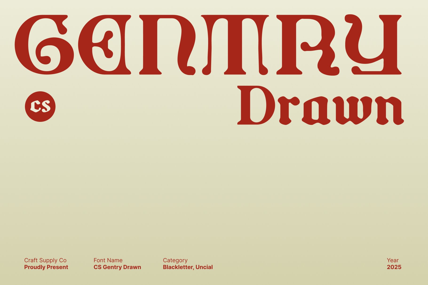
CS Gentry Drawn brings a drawn lettering direction to this collection. Hand drawn typography can feel more personal and artistic than perfectly uniform digital lettering. Its visual approach can suit projects that benefit from an illustrative quality, especially when you want the typography to feel like part of the artwork rather than a separate layer.
Consider CS Gentry Drawn for creative posters, handmade product labels, editorial illustrations, scrapbook designs, and distinctive packaging. It can also complement visual identities that use organic shapes or hand rendered graphic elements. Pair the lettering with a simple typeface for practical information and allow enough negative space around the words. This approach gives the drawn style room to express its character without overwhelming the composition.
4. CS Drusilla Blackletter Font

CS Drusilla Blackletter Font is worth exploring when your design calls for ornate, historically influenced typography. Blackletter styles can create a strong sense of atmosphere, making them useful for projects that need more visual drama than a standard serif or sans serif can provide. Although blackletter differs from flowing calligraphy, it belongs to the broader world of expressive decorative lettering.
Use this font for gothic inspired logos, music posters, editorial titles, fashion graphics, and decorative merchandise. It can serve as a prominent headline against a minimal background or become part of a more elaborate composition with carefully controlled ornamentation. Keep secondary text simple to preserve readability. If you want to use it for a longer phrase, check how the letterforms interact and whether the final result remains clear at the intended size.
5. CS Lizbeth Drawn Font

CS Lizbeth Drawn Font offers another option for projects that benefit from hand rendered typography. Drawn lettering can introduce subtle irregularity and a more artistic mood, making it suitable for designs that aim to feel crafted, expressive, or less formal. This approach provides a useful contrast to traditional blackletter styles and conventional digital typefaces.
Explore CS Lizbeth Drawn Font for creative branding, packaging, illustrated posters, stationery, and editorial layouts. It can work particularly well when paired with hand drawn icons, organic shapes, or paper inspired textures. For a balanced design, let the drawn lettering handle the main title and use a more straightforward font for captions or descriptions. Always preview the typography in context so its visual details complement rather than compete with the rest of the artwork.
6. CS Noisy Stippled

CS Noisy Stippled introduces a stippled texture to decorative typography. Stippling uses small dots to create a textured visual effect, giving lettering a more tactile, print inspired appearance. This style offers an alternative to smooth calligraphy and can help designers build expressive compositions influenced by illustration, vintage graphics, and experimental print design.
Consider CS Noisy Stippled for poster headlines, creative packaging, editorial artwork, and graphic led branding. It can also complement blackletter typography when you want to develop a layered gothic visual direction. Use the font at a size that allows its texture to remain visible, and pair it with clean supporting text for clarity. A restrained color palette can help the stippled treatment stand out without adding unnecessary visual clutter.
7. CS Meriam Stippled

CS Meriam Stippled is another option for designers interested in textured lettering. A stippled treatment can make typography feel more illustrative and add visual interest to otherwise simple compositions. It can also create contrast between the letterforms and a smooth background, helping a title become a more prominent part of the overall design.
Use CS Meriam Stippled for artistic posters, packaging concepts, publication covers, decorative titles, or experimental brand graphics. It can work well with subtle paper textures, muted colors, and simple supporting elements. If you are combining it with a blackletter font, assign each style a clear role. One can establish the main message while the other provides a small accent, preventing the composition from becoming too visually dense.
8. CS Meriam Stamp
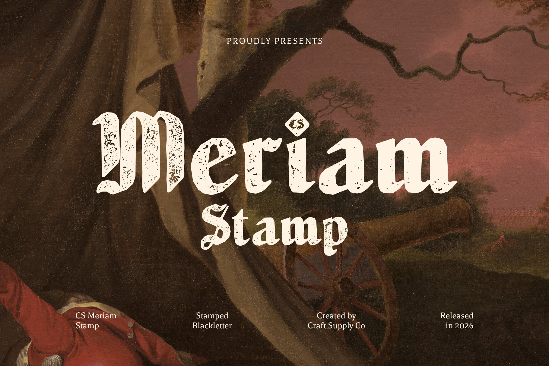
CS Meriam Stamp explores a stamped visual treatment that can give typography a vintage, tactile character. Stamp inspired lettering often evokes printed labels, traditional production methods, and the irregularities associated with physical materials. This style can be useful when you want decorative typography to feel connected to handmade objects or vintage inspired graphic design.
Consider CS Meriam Stamp for product labels, packaging, badges, posters, and stationery with a print inspired aesthetic. It can pair naturally with kraft paper, monochromatic layouts, or distressed graphic elements. Keep the text relatively short so the stamped effect remains clear. For designs that include instructions or longer descriptions, use a clean font for the supporting copy and let the stamped typography provide the main decorative accent.
9. CS Mistfeil Blackletter Font
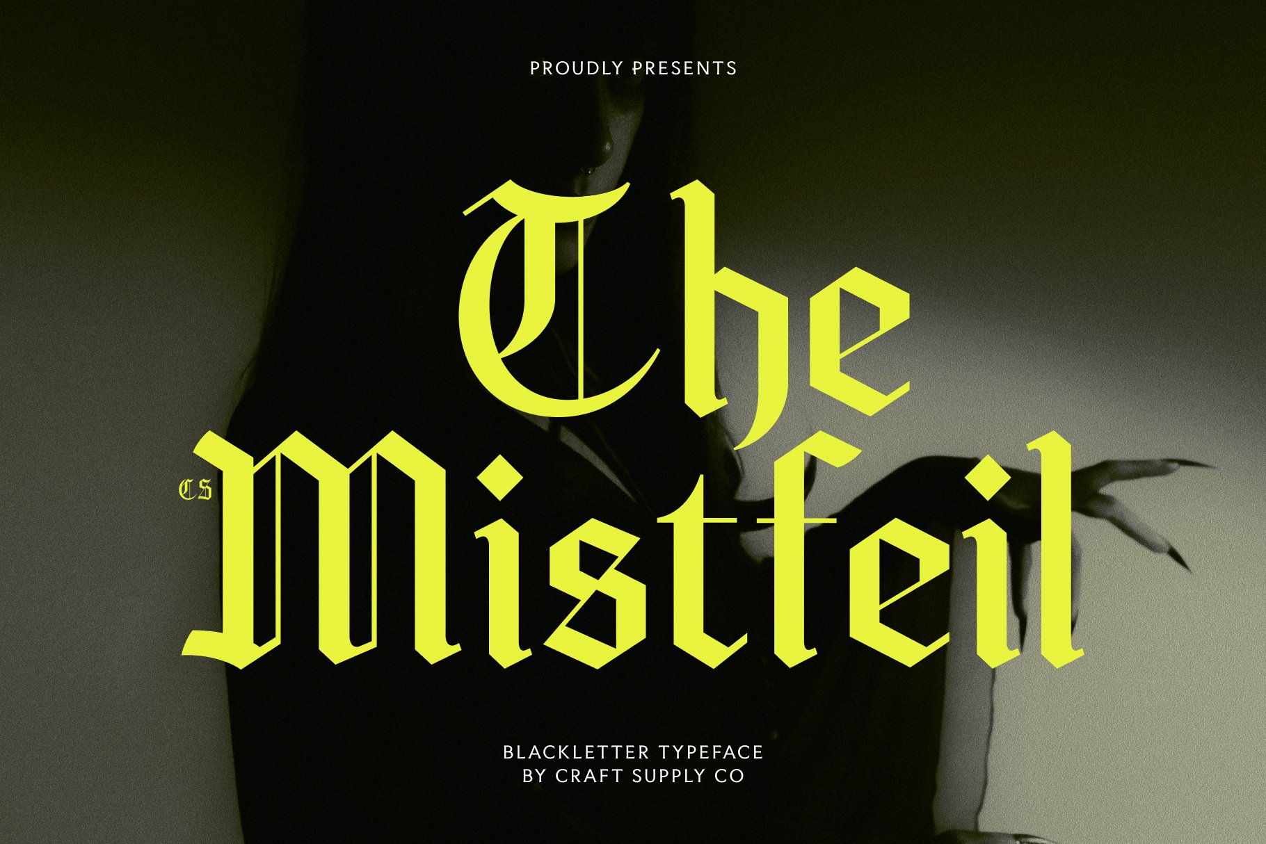
CS Mistfeil Blackletter Font is an option for projects that lean toward dramatic, gothic inspired lettering. Blackletter typography can establish a strong identity through its distinctive shapes and historical references. It often works best when the design embraces its expressive character rather than attempting to make every element understated or neutral.
Explore CS Mistfeil Blackletter Font for alternative fashion branding, music artwork, statement graphics, apparel designs, and themed posters. It can be used for a prominent wordmark or a short phrase that anchors the composition. To maintain balance, combine it with simple typography and a focused color palette. Before finalizing the design, review the letter spacing and test the font at the size where your audience will encounter it.
10. CS Hades Blackletter Font

CS Hades Blackletter Font completes this selection with another blackletter option for expressive display typography. This category can help designers create lettering with a strong historical or gothic influence, offering a visual alternative to flowing script fonts. It is particularly relevant when the project needs typography that feels bold, dramatic, and visually distinctive.
Consider CS Hades Blackletter Font for logos, editorial titles, poster designs, merchandise, and gothic inspired creative projects. It can provide a strong focal point when paired with generous spacing and restrained graphic elements. If you plan to combine it with decorative illustrations or textured backgrounds, establish the headline first and add supporting details gradually. This makes it easier to preserve readability and ensure the lettering remains the main feature of the design.
How to Choose the Right Calligraphy Font Style
Choosing a calligraphy fonts begins with the mood you want to communicate. For elegant and personal projects, flowing script styles are often a natural choice. For dramatic or historical designs, blackletter typography can provide a stronger visual statement. Drawn and textured styles work well when you want a handmade, illustrative, or print inspired character.
Consider the purpose of the design before committing to a typeface. Wedding invitations, personal stationery, and romantic packaging may benefit from graceful lettering, while music artwork and alternative fashion graphics may call for a more expressive blackletter style. The fonts in this collection lean toward blackletter, drawn, stamped, and stippled typography, so they are especially relevant when you want decorative lettering with a distinctive display character.
It also helps to test the font with the actual words you plan to use. Some styles look striking in a single word but become crowded in longer phrases. Check uppercase and lowercase forms, punctuation, spacing, and overall balance. The most effective font should support the message as well as the aesthetic.
Where to Use Calligraphy Fonts
Decorative lettering can support a wide range of creative applications. The most important consideration is matching the calligraphy fonts visual character to the context in which people will see it.
- Wedding invitations and stationery: Use flowing calligraphy styles when you want an elegant, personal appearance.
- Logo design: Create a distinctive wordmark with expressive lettering that reflects a brand’s personality.
- Packaging and labels: Use decorative typography to make product names and short messages stand out.
- Posters and editorial design: Give a headline a dramatic or artistic quality with blackletter and drawn lettering.
- Apparel and merchandise: Explore gothic typography for statement graphics, alternative fashion, and music related designs.
- Greeting cards: Use expressive lettering to make short messages feel more personal and memorable.
- Digital content: Apply decorative typography to title cards, promotional graphics, and social media artwork.
For additional typography ideas and creative design references, explore the work of Craft Supply Co. Observing how designers combine lettering, color, composition, and supporting imagery can help you develop a more cohesive visual direction.
Tips for Pairing Calligraphy Fonts
Decorative calligraphy fonts often contain intricate details, so thoughtful pairing helps maintain clarity. Instead of combining several elaborate styles, choose one typeface as the focal point and let a simpler font handle the supporting information.
- Pair expressive lettering with a simple sans serif: Use clean supporting text to balance ornate or textured headlines.
- Combine different visual roles: Let one font handle the title and another handle captions, dates, or descriptions.
- Limit the number of styles: Two complementary font families are often enough for a focused composition.
- Pay attention to contrast: Make sure the lettering stands out against the background and remains legible.
- Use decorative effects selectively: Avoid adding too many textures, shadows, and ornaments to already expressive typography.
- Test at the final size: Fine details can disappear or become crowded when a font is used too small.
For example, a poster might use a blackletter font for its main title and a simple sans serif for event information. A packaging design could combine drawn lettering with a restrained label layout. In both cases, the contrast between expressive and practical typography helps the design communicate clearly.
Common Mistakes to Avoid When Using Calligraphy Fonts
One common mistake is treating every decorative font as traditional calligraphy. Script calligraphy, blackletter, drawn lettering, and textured display fonts have different visual characteristics. Understanding these distinctions helps you choose a font that genuinely fits your concept instead of relying on the broad category alone.
Another mistake is using elaborate lettering for long passages. Decorative typefaces can become difficult to read when applied to paragraphs or small labels. Reserve expressive fonts for titles, names, and short phrases, then use a more readable font for essential information.
Overdecorating the layout can also reduce the impact of the lettering. When a design already includes intricate typography, extra textures, ornamental borders, and complex imagery may compete for attention. Start with a simple composition and introduce additional elements only when they improve the overall result.
Finally, check the practical requirements of your project. Test the font at different sizes, review the available characters, and confirm the license before using it commercially. A visually appealing typeface should also work reliably in the environment where you intend to use it. For more creative inspiration and typography references, visit Craft Supply Co. With a thoughtful font choice and a balanced layout, you can create decorative designs that feel distinctive, expressive, and purposeful.