
Letter fonts can transform ordinary words into expressive visual elements. Whether you are designing a logo, creating wedding invitations, personalizing greeting cards, or building a distinctive brand identity, the right typography helps communicate your message with personality and style. From natural handwritten lettering to elegant scripts and expressive brush styles, there are countless ways to make your text stand out.
Choosing the best letter fonts involves more than finding a typeface that looks attractive. You also need to consider readability, mood, audience, and the purpose of your design. A relaxed handwritten font can make a brand feel approachable, while a refined script can introduce elegance to invitations, packaging, and editorial layouts. Brush lettering, meanwhile, can add energy and an artistic touch to promotional graphics.
In this guide, we explore 10 letter fonts from Craft Supply Co that offer different approaches to expressive typography. Each option can inspire your next branding project, social media graphic, stationery design, or personal creative experiment.
What Are Letter Fonts?
Letter fonts are typefaces used to give written words a particular visual style. The term can describe a wide range of lettering styles, including handwritten fonts, script typefaces, brush lettering, signature fonts, and casual display fonts. Designers use them to communicate emotion, establish visual identity, and make text more memorable.
Some letter fonts imitate the natural movement of handwriting, with irregular details that create a personal appearance. Others feature flowing connections, decorative curves, and elegant strokes associated with calligraphy. Signature fonts often suggest an individual handwritten mark, while brush scripts can introduce a more energetic, expressive character.
The right style depends on the project. For example, a wedding invitation may benefit from graceful script lettering, while a lifestyle brand might use casual handwriting to create a friendly and contemporary identity. Understanding these differences makes it easier to choose typography that supports your message.
10 Letter Fonts to Explore for Your Next Design
1. Manyland Handwritten Font
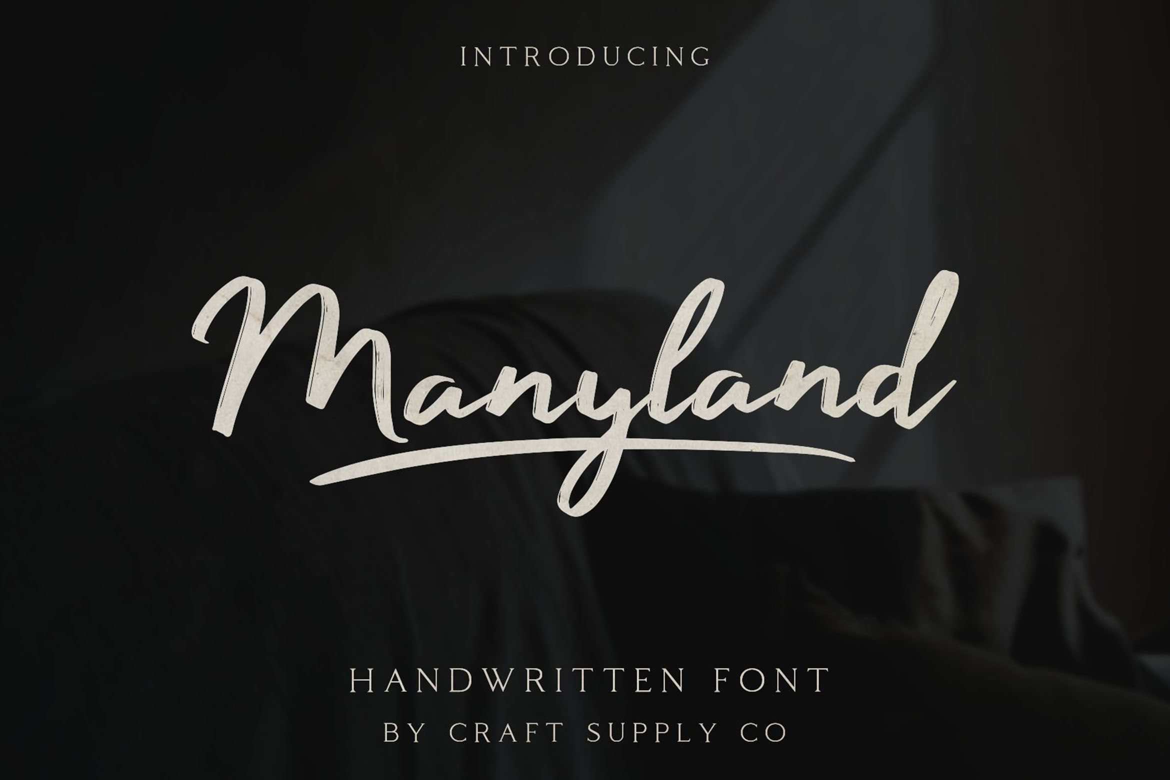
Manyland Handwritten Font is a useful option for projects that call for a personal, handwritten appearance. Handwritten typography can bring warmth and authenticity to a design, helping digital layouts feel more individual and approachable. This style works particularly well when a project needs a human touch rather than a formal or overly structured look.
Consider using Manyland for greeting cards, journal covers, social media graphics, personal branding, or lifestyle product packaging. It can also work well for short headlines and decorative phrases. Pair it with a clean sans serif font for supporting information so the handwritten lettering remains the visual focus without compromising readability.
2. Cattus Modern Casual Script Font
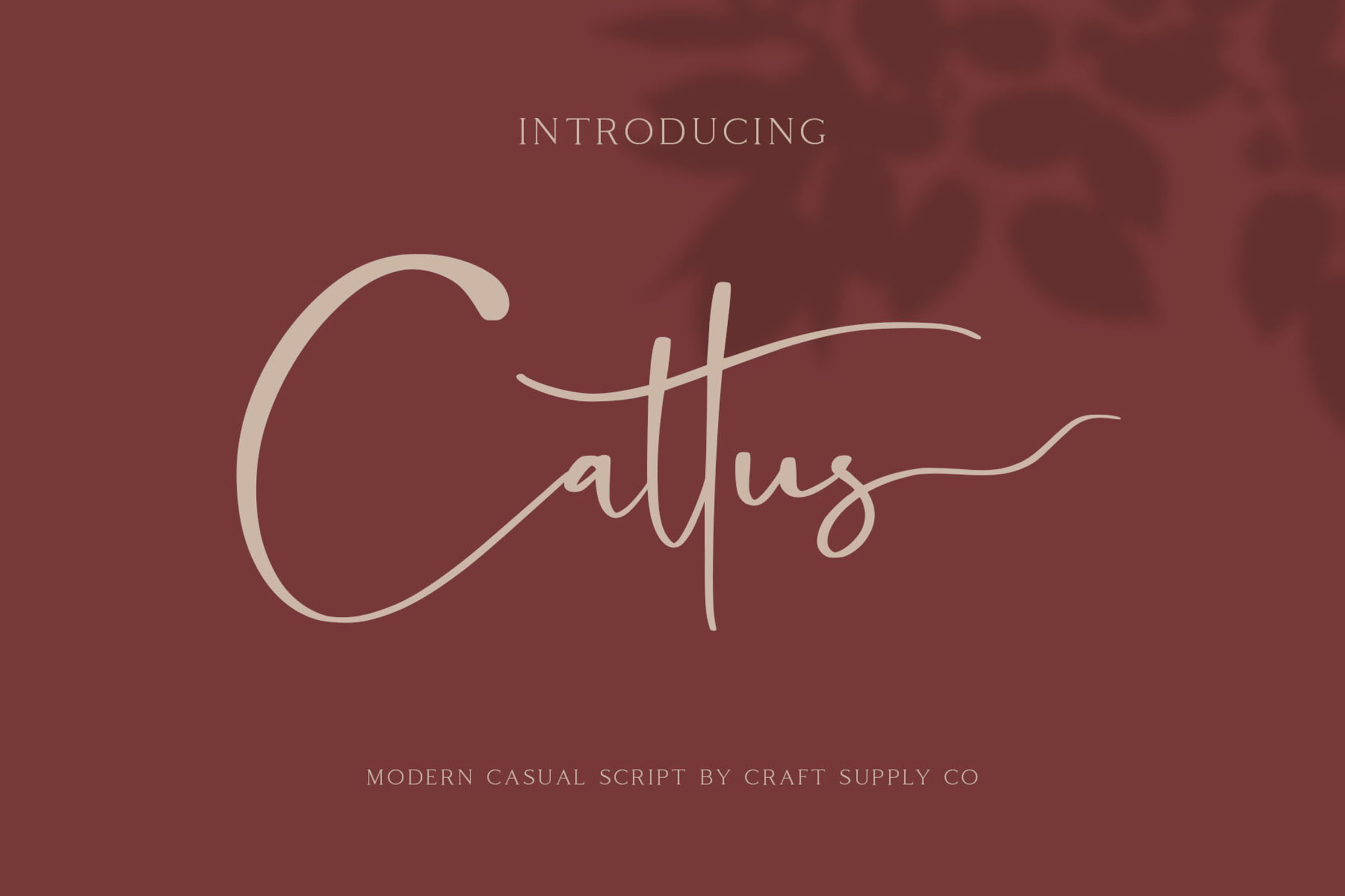
Cattus Modern Casual Script Font offers a direction for designers who want the fluidity of script lettering with a relaxed, contemporary mood. Casual scripts can make a design feel friendly and stylish without creating the formality associated with more traditional calligraphy. They are especially useful for brands that want to balance personality with a modern visual identity.
Explore this font for boutique branding, café menus, event invitations, packaging, and social media content. It can also add character to product labels and promotional headlines. For a balanced composition, combine the script with a simple supporting typeface and leave enough space around the lettering to highlight its shape.
3. Pommel Handstylish Font
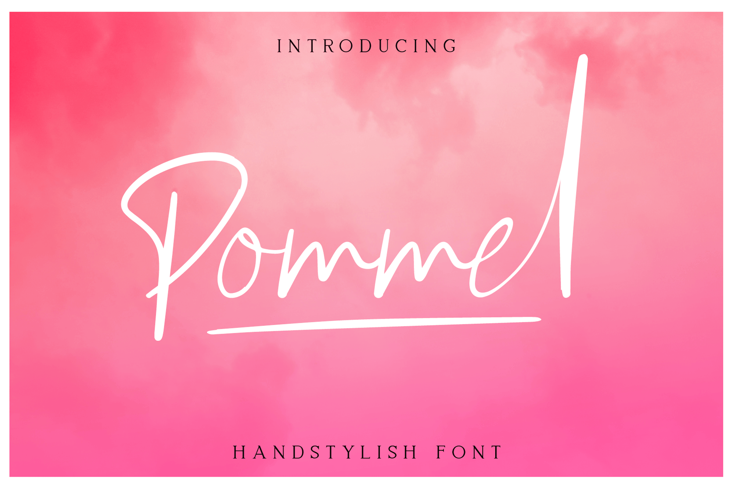
Pommel Handstylish Font is worth considering when your project needs lettering that feels personal and visually expressive. Hand styled typography can bridge the gap between natural handwriting and decorative display lettering, making it a flexible direction for designs that need character.
Use this font for creative business identities, personal stationery, packaging, quote graphics, and editorial accents. It can help a short phrase become a recognizable part of a visual composition. Before finalizing your layout, test the lettering with the actual words you intend to use, since different letter combinations can create different rhythms and spacing requirements.
4. Sophiscated A Lovely Script Font
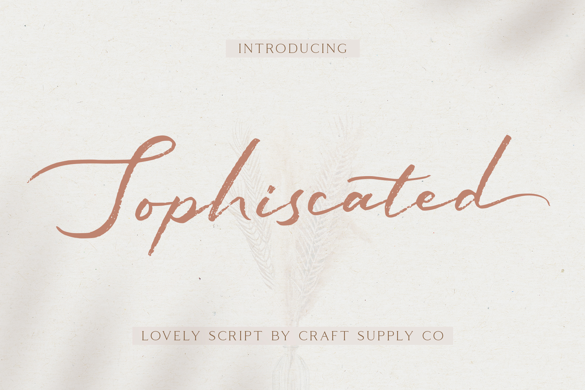
For designs that call for a graceful and romantic direction, Sophiscated A Lovely Script Font is an option to explore. Script typography often creates an elegant impression through flowing letterforms and decorative movement. This aesthetic can help communicate refinement, celebration, and a sense of personal attention.
Consider using this font for wedding invitations, event stationery, beauty branding, gift packaging, and decorative quotes. It can also serve as a focal point on greeting cards and special occasion graphics. To preserve its visual impact, avoid surrounding the script with too many decorative elements. A restrained layout and complementary typography can make the finished design feel more polished.
5. Marlyn Handwritten Script Font
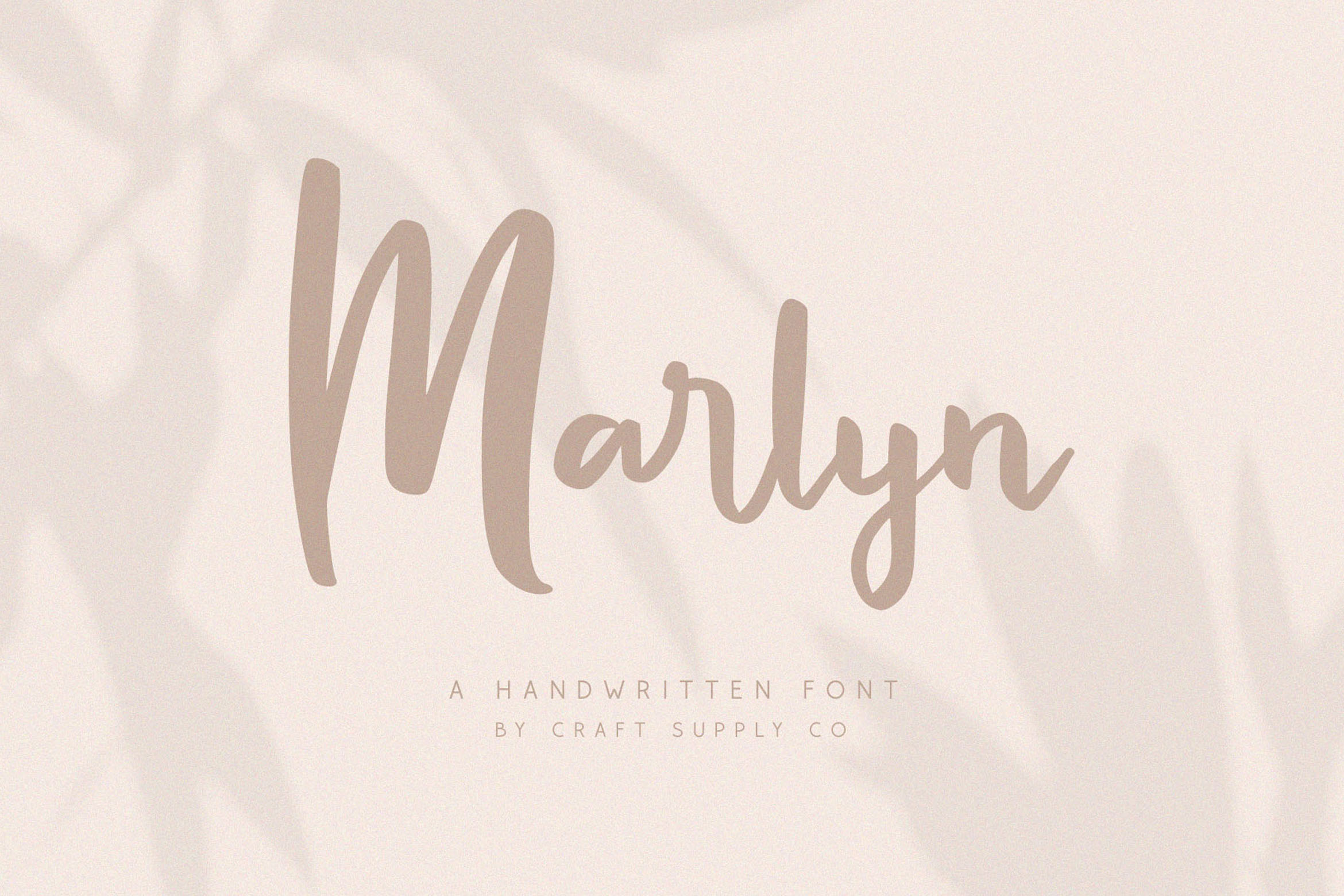
Marlyn Handwritten Script Font combines the idea of handwriting with the flowing character of script typography. This general style can suit projects that need a personal touch while retaining a coordinated, designed appearance. It offers an alternative to rigid lettering when you want a composition to feel more expressive and inviting.
Try Marlyn for lifestyle branding, personal logos, greeting cards, product labels, and social media graphics. It can work especially well for short brand names or phrases that need a distinctive typographic identity. When using it in a logo, check how the complete wordmark looks at both large and small sizes to ensure the lettering remains clear.
6. Colbiac Casual Script Font
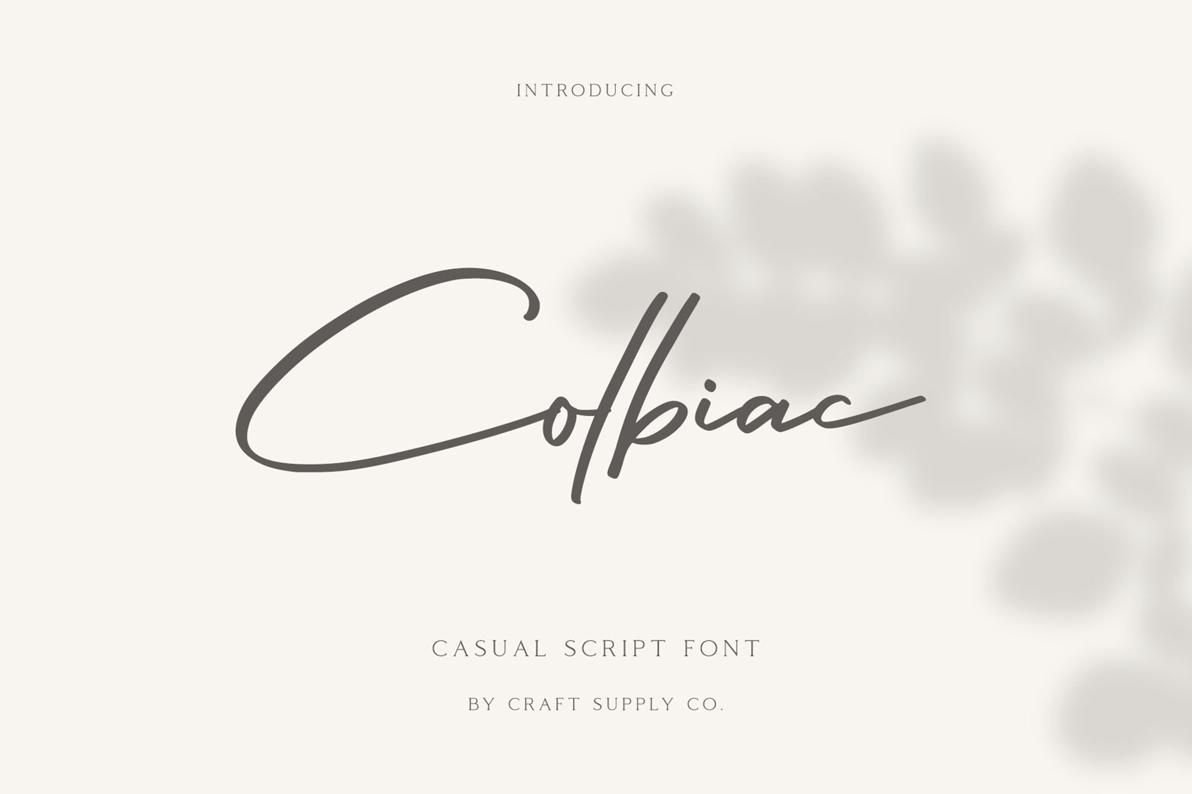
Colbiac Casual Script Font is a strong candidate for projects that need a relaxed script style. Casual script fonts can introduce movement and personality while feeling less formal than traditional calligraphy. This makes them useful for contemporary brands, creative businesses, and designs aimed at an approachable audience.
Use this font for café branding, handmade product labels, apparel graphics, promotional materials, or casual event invitations. It can also provide a distinctive accent in a layout that otherwise uses clean, minimalist typography. For best results, let the script carry the main phrase and use a simpler typeface for descriptions, dates, and other practical details.
7. Lucylane Signature Typeface

Signature typefaces are designed to evoke the personal quality of a handwritten signature. Lucylane Signature Typeface is an option to consider when a design needs an individual, refined, and personal appearance. This style can help create a sense of authorship, making it useful for identities built around a person, creator, or distinctive brand personality.
Explore Lucylane for personal branding, photographer signatures, beauty and fashion identities, packaging, and editorial details. It can also work as a subtle finishing touch on business cards or promotional graphics. Because signature lettering can be delicate or decorative, use sufficient contrast against the background and check legibility before applying it to small text.
8. Alpiar Handwritten Typeface

Alpiar Handwritten Typeface offers another direction for projects that benefit from the warmth of handwriting. Handwritten typefaces can soften a formal layout, introduce personality to product presentation, and make short messages feel more direct. They are especially effective when the visual identity needs to communicate creativity or an approachable point of view.
Consider Alpiar for packaging, stationery, lifestyle branding, quote designs, and digital content. It can be useful for adding a handwritten accent to a more structured layout. Pair it with a neutral serif or sans serif font when you need contrast, and avoid using multiple competing handwritten styles in the same composition.
9. Kareny Brush Script Font

Brush script fonts introduce a more energetic style of lettering inspired by the movement of a brush. Kareny Brush Script Font is worth exploring when your design needs expressive typography with an artistic direction. Brush lettering can create a sense of movement and spontaneity, helping headlines and short phrases feel more dynamic.
Try this font for creative campaign graphics, apparel designs, posters, packaging, and social media promotions. It can also suit projects that combine handmade aesthetics with contemporary design. For a strong visual hierarchy, use brush lettering for the main message and a simpler typeface for smaller supporting text. This approach keeps the composition expressive without making it difficult to read.
10. Passtyn Handwritten Font Duo
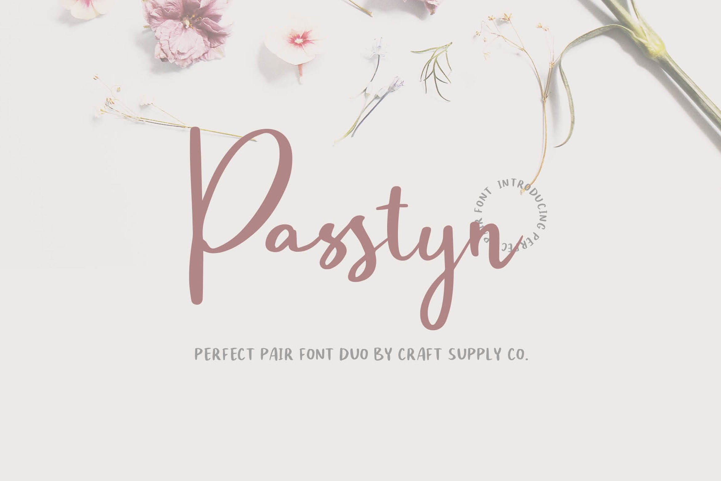
Passtyn Handwritten Font Duo is an interesting choice for designers looking for a coordinated handwritten typography option. A font duo can offer flexibility when a project requires more than one complementary typographic treatment. Using coordinated styles can help establish hierarchy while maintaining a consistent visual personality across different design elements.
Consider this option for branding systems, stationery, invitations, packaging, and social media templates. You can explore different combinations for headlines, short messages, and supporting accents, depending on the available styles. Keep the overall design consistent by limiting the number of additional fonts and using color, size, and spacing to distinguish information.
How to Choose the Best Letter Fonts for Your Project
Begin by defining the mood you want your design to express. Elegant script lettering can suit weddings and premium packaging, while casual handwritten styles can create a friendly, personal impression. Signature typefaces may be appropriate for personal identities, and brush scripts can add energy to promotional artwork.
Next, consider where the typography will appear. A logo, website heading, invitation, and product label each have different requirements. A font that looks beautiful at a large size may become difficult to read on a small screen or printed label. Test the typeface in its intended environment before making a final decision.
Finally, think about the audience and the surrounding visual elements. Typography should support the message rather than compete with it. Consider the color palette, imagery, layout, and supporting fonts as part of one system. A consistent approach will help your chosen letter font feel purposeful and memorable.
Tips for Pairing Letter Fonts
- Combine contrasting styles: Pair a handwritten or script font with a simple sans-serif typeface to balance personality and clarity.
- Establish a clear hierarchy: Use the decorative font for headlines or short phrases and a more readable font for body copy.
- Limit the number of typefaces: Two complementary fonts are often enough to create an organized and professional design.
- Pay attention to spacing: Adjust line height, letter spacing, and margins so connected or flowing lettering has enough room.
- Test different sizes: Preview your design on mobile screens and in print to make sure the lettering remains legible.
- Match typography to the brand: Choose a style that supports the brand’s personality, audience, and intended message.
Common Mistakes to Avoid
One common mistake is choosing a font based on appearance alone. Attractive lettering may not suit every message or application, especially when readability matters. Always test the actual words and consider how the typeface behaves at different sizes.
Another mistake is overusing decorative typography. When several elaborate fonts appear together, the design can feel crowded and lose its visual hierarchy. Instead, choose one primary letter font and support it with a simpler style. Also, avoid using delicate script lettering over busy images or low-contrast backgrounds, since these conditions can make the text difficult to read.
Finally, remember that consistency matters across a brand or campaign. Repeating a small set of complementary fonts, colors, and spacing rules creates a more cohesive identity than selecting a different decorative style for every asset. For more creative type inspiration, font discoveries, and design references, explore Craft Supply Co on Behance. Use these ideas as a starting point to create lettering that feels distinctive, consistent, and right for your next project.