
An Old English font can give a design a distinctive sense of history, drama, and tradition. Recognized for its intricate letterforms, decorative strokes, and strong visual presence, Old English typography draws inspiration from historical lettering and the broader blackletter tradition. Designers often use this style to create expressive logos, tattoo lettering, vintage posters, apparel graphics, album artwork, and other projects that need a memorable typographic identity.
Although Old English fonts share a historical visual influence, each typeface can communicate a different mood. Some emphasize traditional blackletter forms, while others introduce hand drawn details, stamped textures, or stippled effects. These variations make it possible to explore the style in different creative directions, from dramatic gothic compositions to distressed vintage graphics.
If you are searching for an Old English font for your next design project, this guide introduces ten options from Craft Supply Co. The collection includes blackletter typefaces, Old English inspired fonts, and textured display styles that can help you create a distinctive visual identity. Whether you are designing a logo, a poster, a T-shirt, or a digital graphic, these fonts offer different ways to explore historical typography.
What Is an Old English Font?
An Old English font typically refers to a decorative lettering style inspired by historical English blackletter scripts. These letterforms often feature angular shapes, dense strokes, elaborate capitals, and distinctive contrasts between thick and thin lines. Their intricate construction creates a recognizable appearance that feels traditional, formal, and dramatic.
In modern graphic design, people often use the term “Old English font” to describe several related styles, including blackletter, gothic lettering, and medieval inspired display typography. Although these categories overlap visually, they are not always identical. Blackletter describes a broader family of historical script styles, while contemporary Old English fonts may interpret those forms with modern proportions, decorative details, or distressed textures.
Designers use these fonts for projects that benefit from strong visual character. A blackletter headline can make a music poster feel intense, while an Old English wordmark can establish a heritage inspired identity. Textured variations can also create a worn, printed appearance that suits vintage packaging, streetwear graphics, and editorial artwork.
What Makes a Good Old English Font?
A good Old English font should match the personality and practical requirements of your project. Traditional looking letterforms can create an authentic historical impression, while contemporary interpretations may feel more expressive or unconventional. Before choosing a typeface, consider the mood you want to communicate and how much decorative detail your layout can support.
- Distinctive letterforms: Angular strokes, ornate capitals, and recognizable blackletter structures help establish the Old English aesthetic.
- Strong visual presence: Display fonts should stand out in logos, titles, posters, and other prominent placements.
- Appropriate texture: Drawn, stamped, or stippled treatments can introduce a handmade or distressed appearance.
- Readability: Decorative lettering should remain understandable at the size and distance where people will see it.
- Versatility: Consider whether the font works with your intended colors, imagery, supporting typography, and production method.
10 Old English Font Recommendations
1. CS Aither Blackletter Font

CS Aither Blackletter Font is an option to explore when you want the distinctive character associated with blackletter typography. Blackletter inspired fonts can bring a dramatic, historical mood to a design through their structured strokes and decorative letterforms. This makes them useful for projects where typography needs to establish a strong identity rather than simply communicate information.
Consider using CS Aither Blackletter Font for gothic logos, music artwork, statement headlines, apparel graphics, and themed promotional designs. It can serve as the main typographic feature in a composition with restrained colors and simple supporting elements. For longer text, combine the decorative lettering with a clean, readable font. This contrast helps preserve the visual impact of the blackletter style without making the entire layout difficult to navigate.
2. CS Quicker Blackletter Font
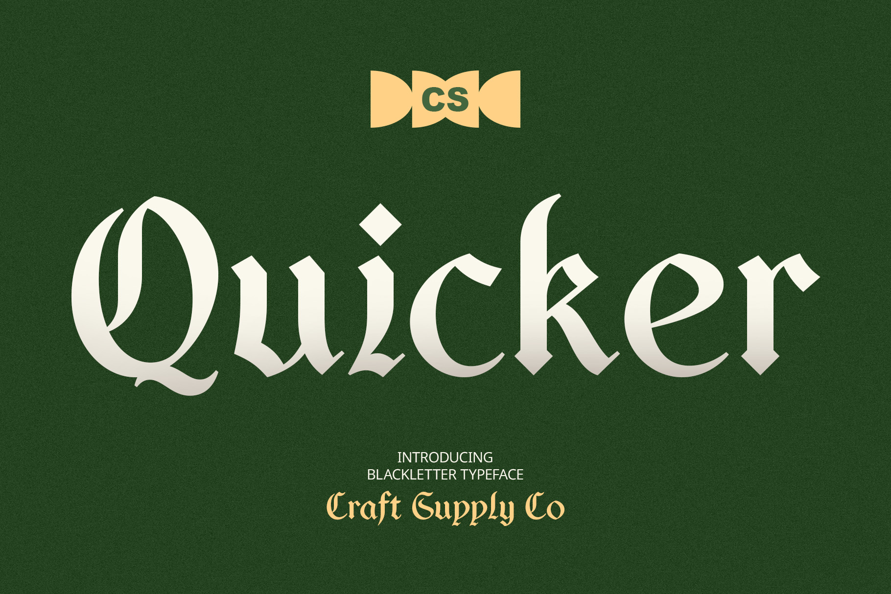
CS Quicker Blackletter Font offers another direction for designers exploring blackletter inspired typography. While the broader blackletter tradition provides a recognizable historical foundation, individual typefaces can differ in their letter shapes, spacing, and overall visual rhythm. Comparing these details can help you identify a font that suits your particular project.
This font is worth considering for alternative fashion graphics, bold poster titles, band merchandise, editorial artwork, and distinctive wordmarks. Use it for short phrases that deserve visual emphasis, then support the design with simple typography and a clear composition. If you plan to use it in a logo, test the complete brand name rather than judging the typeface by a single character. The finished lettering should feel balanced and remain recognizable across different applications.
3. CS Rubeus Drawn
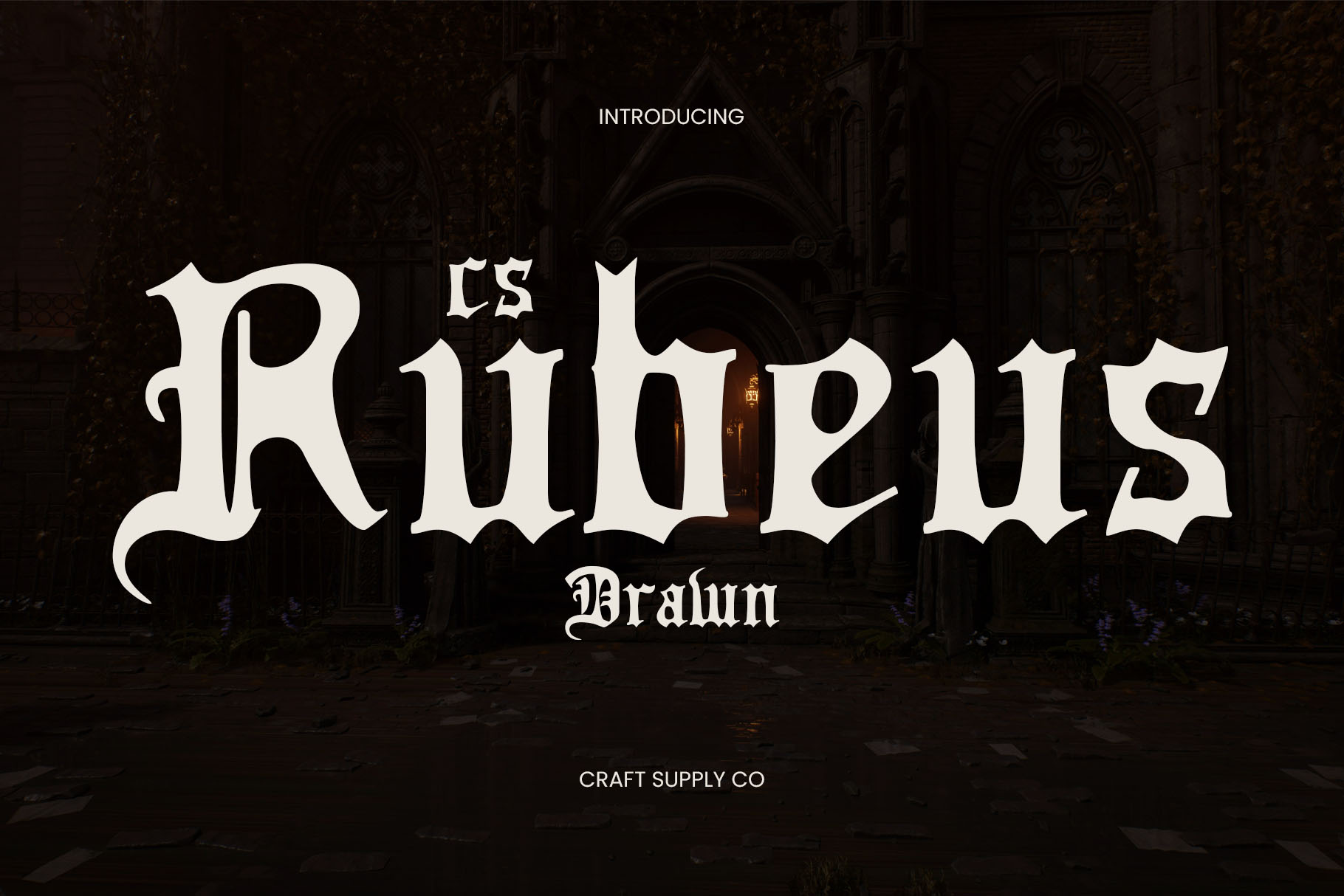
CS Rubeus Drawn introduces a hand drawn direction to this collection of expressive display fonts. Drawn typography can add an illustrated quality to lettering, making it feel more personal and visually textured than a strictly uniform type treatment. This approach can work well when a design calls for an artistic, handcrafted, or deliberately imperfect appearance.
Explore CS Rubeus Drawn for creative posters, independent publishing, custom packaging, scrapbook inspired graphics, and expressive headlines. It can also help create contrast in a composition that combines photography with hand drawn decorative elements. Consider using a limited color palette and leaving enough open space around the lettering. This allows the drawn treatment to contribute personality without competing with every other part of the layout.
4. CS Varden Drawn

CS Varden Drawn provides another option for projects that benefit from the character of drawn display typography. A hand rendered appearance can make lettering feel less mechanical and introduce a more artistic quality to a design. When used alongside Old English or gothic inspired elements, drawn typography can help create a layered visual direction that feels distinctive rather than overly formal.
Use CS Varden Drawn for poster headlines, creative branding, editorial titles, product labels, or graphic compositions that combine lettering and illustration. It can be particularly useful when you want typography to act as part of the artwork itself. For a balanced result, pair it with a simple sans serif for supporting text and keep decorative accents under control. Test the font at its intended size to ensure that its details remain visible in the final output.
5. CS Canopus Stamp

CS Canopus Stamp is worth exploring if you want typography with a stamped, print inspired appearance. Stamp style lettering can evoke vintage labels, traditional printing methods, and the imperfect marks associated with physical production. This treatment offers a different way to approach historical or gothic inspired design, especially when a perfectly clean finish would feel too polished.
Consider this font for retro posters, packaging labels, badge designs, event graphics, and merchandise artwork. It can work well with kraft paper backgrounds, monochromatic layouts, rough textures, or limited color printing aesthetics. Keep the wording concise and give the lettering enough contrast against its background. If you use it alongside another decorative typeface, assign each font a specific role so the composition remains organized and readable.
6. CS Canopus Stippled

CS Canopus Stippled offers a stippled visual treatment that can introduce a granular, textured quality to your typography. Stippling creates tonal effects through small dots, making it a useful stylistic direction for designs inspired by printmaking, illustration, and vintage graphic techniques. This texture can give a headline more visual depth than a completely solid treatment.
Explore CS Canopus Stippled for editorial artwork, vintage inspired posters, experimental branding, packaging concepts, and decorative display lettering. It can complement paper textures, muted colors, and illustration led compositions. Because stippled details can become less visible at small sizes, test the font in the actual dimensions of your project. Use clean supporting typography for important information, allowing the textured lettering to function as the main visual accent.
7. CS Modula Old English Font
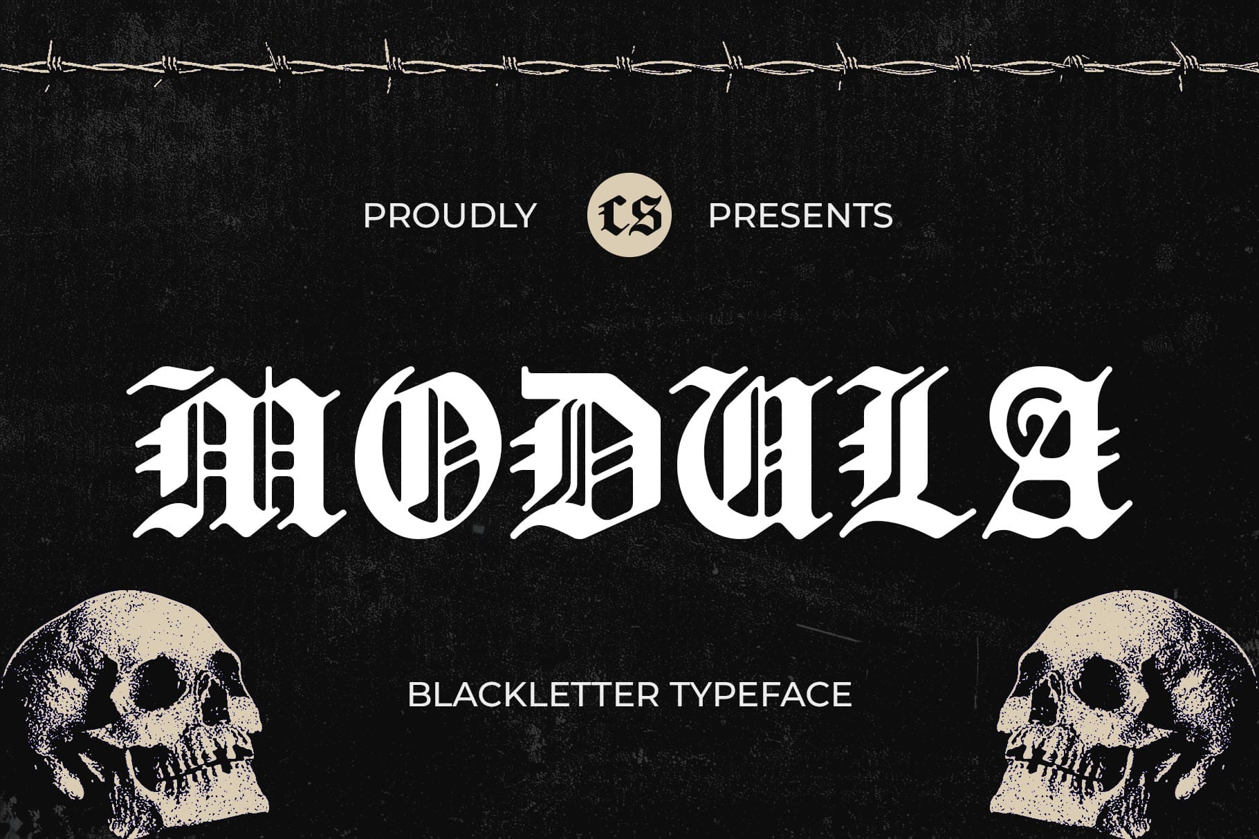
CS Modula Old English Font is a direct option to consider when you want a typeface explicitly associated with the Old English aesthetic. This style is useful for designs that rely on recognizable historical lettering, including gothic wordmarks, decorative headlines, and traditional inspired display compositions. Its intended category makes it a relevant starting point for designers searching specifically for Old English typography.
Consider CS Modula Old English Font for apparel graphics, tattoo inspired artwork, music merchandise, event posters, and identity concepts with a dramatic visual direction. Short words and prominent titles can give the letterforms room to stand out. If you are creating a logo, experiment with spacing and placement before adding extra decorative elements. A carefully arranged wordmark often communicates more effectively than a composition crowded with competing ornaments.
8. CS Rubeus Old English Font
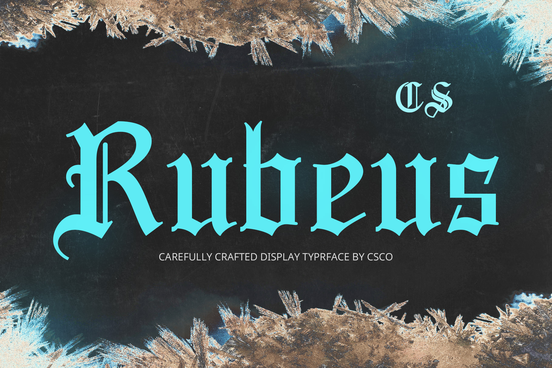
CS Rubeus Old English Font is another option for designers who want to explore Old English inspired display lettering. Historical lettering can create a strong sense of identity, especially when a project needs an expressive title or a distinctive typographic centerpiece. This style can also help connect contemporary graphics to traditional gothic and medieval visual references.
Use CS Rubeus Old English Font for statement logos, poster headlines, apparel designs, cover artwork, or decorative titles. It can pair effectively with restrained layouts that emphasize contrast, spacing, and a clear hierarchy. Try placing the lettering against a simple background before introducing additional textures or imagery. This makes it easier to judge its visual character and determine whether the font communicates the right mood for your audience.
9. CS Morstan Old English Font
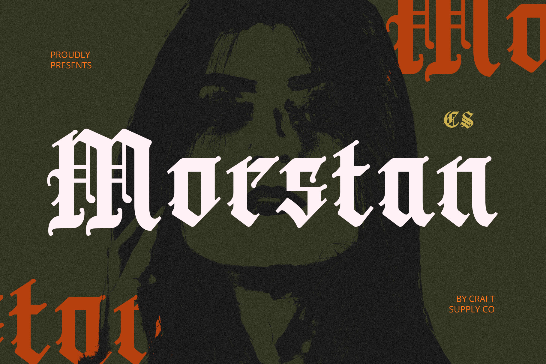
CS Morstan Old English Font expands the selection of typefaces for projects built around traditional inspired lettering. When choosing among Old English fonts, small differences in character shapes and overall rhythm can significantly influence the final design. Comparing several options allows you to find a typeface that complements your concept instead of relying on the first font that matches the category.
Consider CS Morstan Old English Font for gothic inspired branding, decorative typography, music posters, apparel graphics, and themed editorial layouts. It can function as a prominent headline or a short typographic accent. Combine it with neutral supporting text and a focused color palette to create a clear visual hierarchy. For commercial projects, review the font’s licensing terms and confirm that its available characters support the words and languages you need.
10. CS Hyena Stippled

CS Hyena Stippled is an option for designers who want to incorporate stippled texture into a display focused composition. Rather than relying exclusively on traditional blackletter structures, a textured font can add a print inspired surface that changes the way lettering interacts with the rest of the design. This can be useful when you want to build a layered visual style around illustration, photography, or vintage graphic elements.
Explore CS Hyena Stippled for poster designs, experimental editorial graphics, creative packaging, and textured headline treatments. It can complement distressed backgrounds, limited color palettes, and other print inspired details. Keep the overall composition simple enough for the stippled effect to remain visible. If the project includes a lot of information, use a more straightforward font for captions and body copy so the decorative treatment does not compromise readability.
How to Choose the Right Old English Font
The right Old English font depends on your project’s visual direction and practical needs. If you want a traditional blackletter appearance, begin by comparing CS Aither Blackletter Font and CS Quicker Blackletter Font. If you prefer a typeface explicitly categorized as Old English, explore CS Modula Old English Font, CS Rubeus Old English Font, and CS Morstan Old English Font.
For a more tactile approach, consider the drawn, stamped, and stippled styles in this collection. CS Rubeus Drawn and CS Varden Drawn can be starting points for hand rendered typography, while CS Canopus Stamp and CS Canopus Stippled offer different texture-led directions. CS Hyena Stippled can also be worth exploring when a granular finish supports your concept.
Before making a final decision, preview each font with your actual wording. Check how the capitals, lowercase letters, punctuation, and spacing work together. A typeface may look impressive in a short sample but become difficult to read in a longer phrase. Test it against your intended background and at the size where your audience will encounter it.
Where to Use Old English Fonts
Old English and blackletter inspired fonts can support a range of creative applications when their distinctive character matches the project’s purpose. Their strongest role is often in short, prominent text rather than long passages.
- Logo design: Create a distinctive wordmark for a brand with a gothic, heritage inspired, or alternative identity.
- Tattoo inspired graphics: Explore historical lettering for artwork, posters, and visual concepts influenced by traditional tattoo typography.
- Streetwear and apparel: Use blackletter style titles for T-shirts, hoodies, merchandise, and fashion graphics.
- Music artwork: Apply dramatic lettering to album covers, gig posters, and promotional materials for suitable musical genres.
- Posters and editorial design: Give a headline a recognizable historical or gothic character.
- Packaging and labels: Combine decorative lettering with restrained colors and textures for distinctive product presentation.
- Digital content: Use Old English typography for title cards, themed social posts, and graphic led web content.
For more ideas on combining type, imagery, and graphic elements, explore the design work of Craft Supply Co. Looking at different compositions can help you understand how decorative lettering works alongside spacing, color, and supporting typography.
Tips for Pairing Old English Typography
Old English fonts often contain complex shapes and strong visual details, so a thoughtful font pairing can make a substantial difference. The goal is to give the decorative typeface enough attention while keeping the rest of the design easy to read.
- Use a simple companion font: Pair blackletter or Old English lettering with a clean sans serif for captions, descriptions, and supporting information.
- Establish a clear hierarchy: Reserve the decorative font for titles, short phrases, or selected words.
- Control decorative effects: Avoid combining too many textures, shadows, and ornamental elements in one composition.
- Choose a suitable color palette: Black, cream, charcoal, muted red, and earthy tones can support gothic or vintage inspired concepts, depending on the intended mood.
- Adjust spacing carefully: Review word spacing and line breaks so intricate letterforms remain distinct.
- Test at multiple sizes: Make sure the font remains legible on small screens, printed labels, and larger display applications.
For example, a poster might use Old English lettering for its main title, a simple sans serif for event details, and a limited palette to create contrast. A brand identity might use the decorative typeface only for the wordmark while keeping product descriptions and website text straightforward. These approaches allow historical typography to make an impact without sacrificing usability.
Common Mistakes to Avoid
One common mistake is assuming that every blackletter font is interchangeable. Old English and blackletter styles include a range of visual interpretations, and their differences can affect the personality of a design. Compare the shape, density, and decorative character of each typeface instead of choosing based on the category name alone.
Another mistake is using intricate lettering for long passages. Highly decorative fonts can be difficult to read when used for body copy, especially at small sizes. Keep them for short titles and display text, then use a more readable font for paragraphs and essential information.
Designers can also weaken a strong font by adding too many effects. Distressed textures, heavy shadows, elaborate borders, and decorative illustrations may compete with the letterforms instead of supporting them. Start with a simple composition and add details only when they strengthen the overall concept.
Finally, consider how the font will be produced. Fine details may look different on fabric, packaging, or small printed materials than they do on a large digital canvas. Test the final artwork at the intended size, check the available character set, and confirm the licensing requirements before using a font commercially. Visit Craft Supply Co and explore ways to make historical lettering work in contemporary design.