
Some brands become recognizable because of their products, while others build an identity that communicates an entire lifestyle. Nautica belongs to the latter category. Inspired by the sea and the spirit of exploration, the American clothing brand has developed a visual identity associated with maritime heritage, classic casual fashion, and an enduring connection to coastal living. Its branding particularly the use of Nautica typography demonstrates how a clear concept can extend beyond a logo to influence clothing, advertising, packaging, and the broader experience of a brand.
For designers, Nautica typography offers an interesting case study in how a consistent visual direction can create recognition across different markets. Nautical references, strong typography, familiar color associations, and accessible styling all contribute to an identity that feels connected to a specific world. The result is more than a collection of graphic elements, it is a visual language that communicates a recognizable attitude.
In this article, we explore the design principles behind Nautica typography maritime inspired identity and examine how typography supports a consistent brand image. We also introduce 10 condensed Nautica typography alternatives from Craft Supply Co. that designers can explore when developing nautical inspired logos, fashion branding, editorial layouts, and contemporary visual identities.
The Story Behind Nautica’s Visual Identity
Nautica was founded in 1983 by designer David Chu. The brand took inspiration from sailing and the maritime world, translating these influences into clothing and accessories designed for everyday life. Its identity connects the practicality of nautical clothing with a polished, casual aesthetic that appeals to people beyond sailing communities.
This connection to the sea gives Nautica a strong foundation for visual storytelling. Maritime references can communicate adventure, movement, craftsmanship, and a sense of freedom. When designers use these ideas consistently, they can create a brand identity that feels recognizable even when the logo is not the only visual element present.
Nautica’s broader visual direction also illustrates the value of balancing heritage with accessibility. Rather than limiting the brand to specialist sailing equipment, its lifestyle positioning allows maritime influences to appear across everyday clothing, campaigns, and retail experiences. That flexibility helps the brand maintain a coherent identity across different products and audiences.
Why Nautica’s Visual Language Works
A Clear and Recognizable Concept
Strong branding starts with a concept that people can understand. Nautica typography draws on the familiar visual world of sailing, the ocean, and coastal life. These associations give the brand a clear foundation for its colors, imagery, product styling, and communications.
For designers, this is a valuable lesson: a logo becomes more meaningful when it belongs to a wider story. Before choosing a Nautica typography or designing a symbol, identify the ideas your brand should communicate. A clear concept makes it easier to select the right visual elements and maintain consistency throughout the identity.
Maritime References With Broad Appeal
Nautica typography often draws on navy blue, white, red accents, stripes, rope details, sails, and ocean inspired imagery. These references can establish a connection to maritime culture without requiring every application to include an anchor or boat illustration.
The most effective approach is to use such elements selectively. A restrained color palette, an image of the open sea, or a strong typographic headline can communicate a nautical mood without making the identity feel like a costume or a themed decoration. This balance helps maritime inspired branding feel relevant in contemporary fashion and lifestyle markets.
Typography That Supports the Brand Personality
Nautica typography plays an important role in how audiences interpret a visual identity. Strong, compact lettering can communicate confidence and practicality, while more refined typefaces may introduce an editorial or premium quality. The key is to choose a font that supports the brand’s positioning rather than relying on a style simply because it looks attractive.
Condensed fonts are especially useful when a design needs to communicate clearly within a limited space. Their narrower proportions can create a strong visual rhythm in headlines, garment graphics, labels, and promotional layouts. However, the right font depends on the actual letterforms, the length of the brand name, and the intended application.
Consistency Across Different Touchpoints
A recognizable brand identity must work across more than one medium. Clothing labels, retail signage, websites, packaging, advertising, and social media all present different design challenges. A consistent visual system helps these touchpoints feel connected even when their layouts and content differ.
Designers can achieve this consistency by defining rules for typography, colors, spacing, image treatments, and logo placement. These guidelines make the identity easier to apply and help maintain recognition as the brand expands into new products or markets.
10 Condensed Font Alternatives for Nautical-Inspired Branding
Condensed typography can be a useful starting point for creating maritime-inspired identities, particularly when a design needs bold headlines, compact wordmarks, or strong lettering on apparel. The following 10 Nautica typography from Craft Supply Co. offer options to investigate for different creative directions.
These recommendations are design alternatives rather than claims about the exact typeface used in Nautica’s logo. Before choosing one, review its letterforms and test how it works with your brand name, visual concept, and intended applications.
1. CS Muray Condensed Font

CS Muray Condensed Font is worth exploring when you want a compact typographic treatment that can fit comfortably into a structured layout. Condensed lettering can create a strong vertical rhythm and make headlines easier to accommodate on garment graphics, labels, or promotional materials. For a nautical inspired identity, consider using it in a wordmark study alongside navy, white, and a restrained red accent. Pay attention to the spacing between letters and the overall silhouette to ensure that the result remains clear and balanced.
2. CS Exile Condensed Font
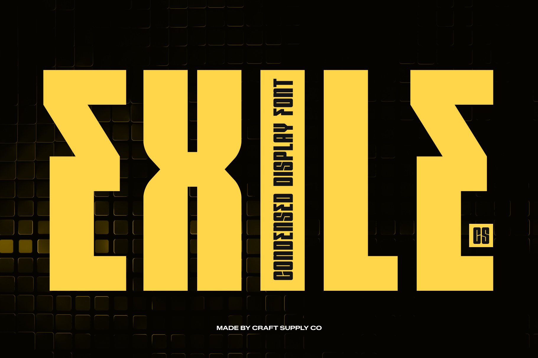
CS Exile Condensed Font offers another direction for designers interested in compact, display oriented typography. It may be worth testing for fashion graphics, campaign headlines, or visual identities that need a distinctive typographic presence. When exploring a maritime concept, place the font within a clean composition rather than surrounding it with too many literal nautical symbols. A restrained layout gives the lettering room to establish its own character while allowing color and photography to communicate the wider brand story.
3. CS Smithe Condensed Font
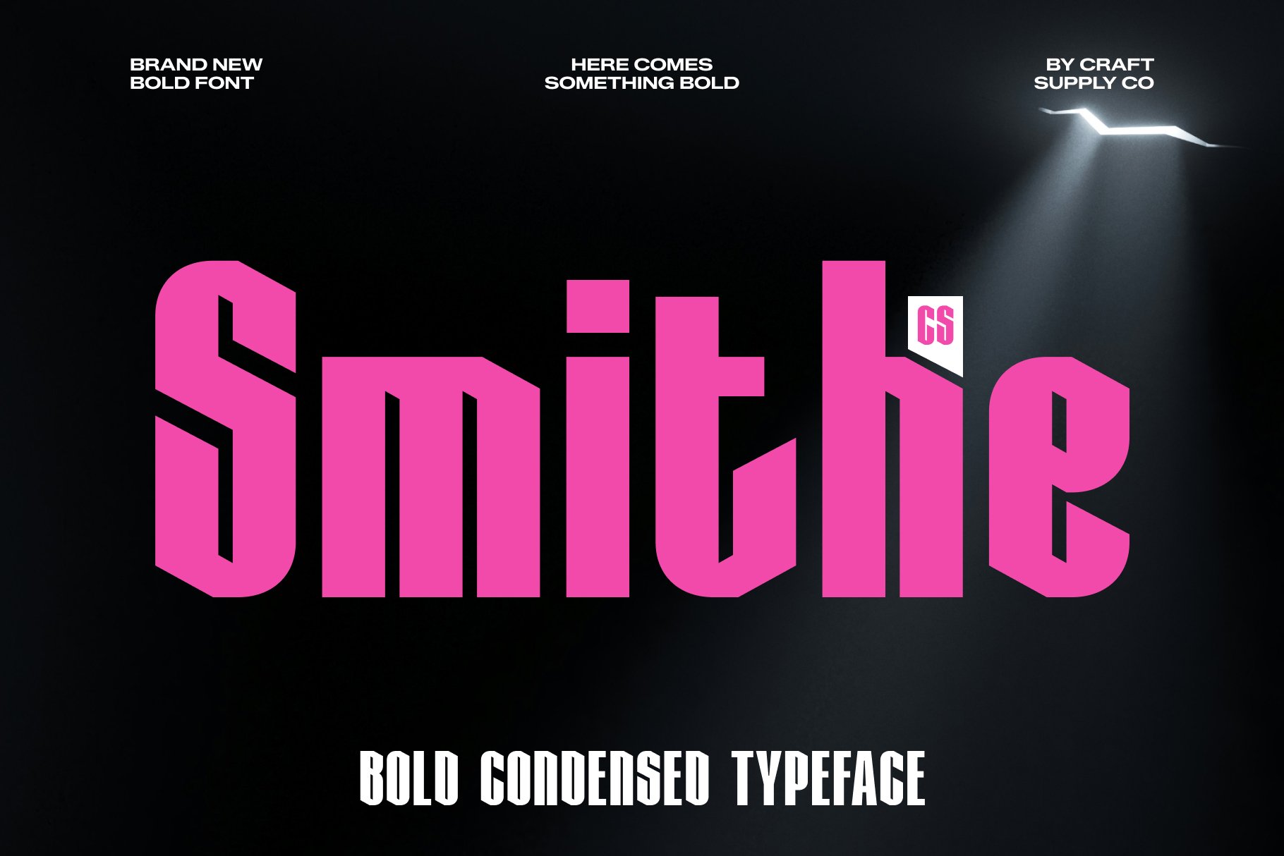
CS Smithe Condensed Font is an option to investigate for designs that need narrow lettering and a strong headline structure. Condensed fonts can be particularly practical for apparel branding because they help longer words fit into limited horizontal spaces. Try setting the typeface in uppercase for a campaign headline, then compare it with a more restrained treatment for the primary wordmark. This testing process helps you determine whether the font suits the brand’s personality and remains legible across different sizes.
4. CS Stelios Condensed Font
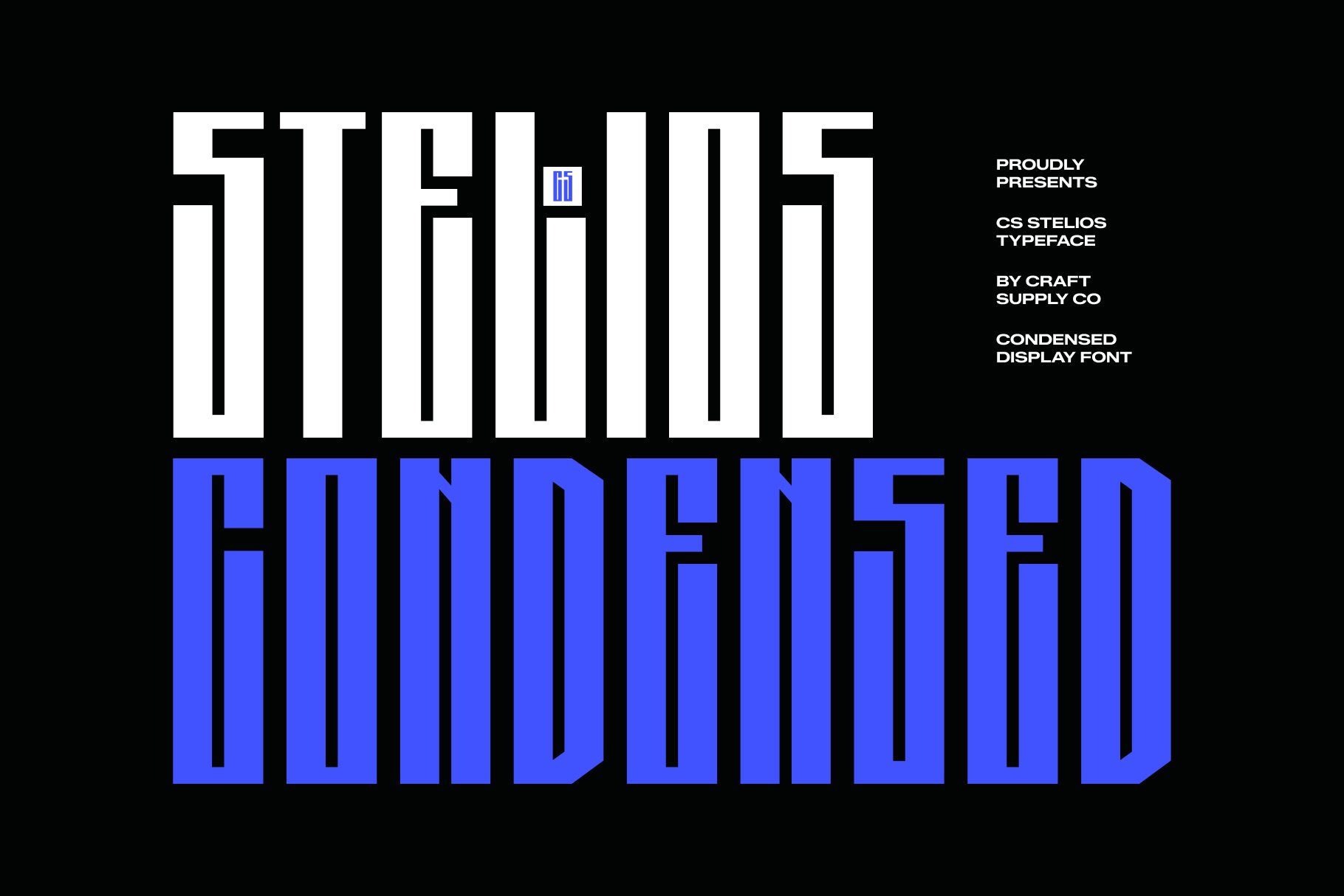
CS Stelios Condensed Font provides another candidate for building a compact and distinctive visual identity. When evaluating it, focus on the shape of the characters, the spacing between letters, and the way the full brand name occupies the available space. These factors influence how the wordmark performs on clothing, packaging, and digital applications. For a maritime inspired concept, pair the lettering with a simple grid, clean photography, and a limited palette to create a contemporary interpretation of classic coastal style.
5. CS Reidar Condensed Font
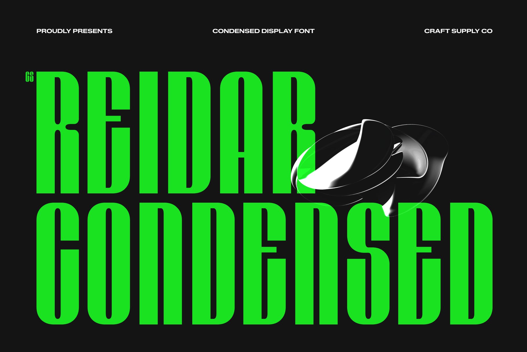
CS Reidar Condensed Font is worth testing for projects that require compact typography with a clear visual hierarchy. A condensed typeface can help a design communicate efficiently while giving the headline a more distinctive silhouette. This can be useful for fashion lookbooks, product labels, promotional posters, and editorial layouts. Consider using it alongside a simpler body font to keep longer information readable. The contrast between display typography and practical supporting text can create a cohesive identity without making every element compete for attention.
6. CS Deylon Condensed Font
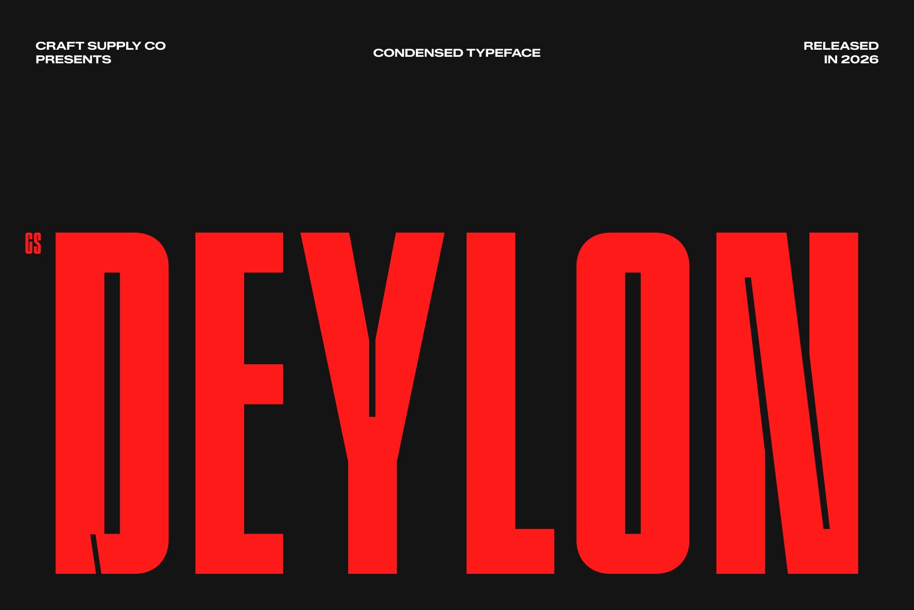
CS Deylon Condensed Font offers another option for exploring compact lettering in brand design. It can serve as a starting point for testing wordmarks, apparel graphics, and strong typographic headlines. For a nautical inspired identity, consider combining the font with horizontal lines, ocean photography, or simple geometric shapes that suggest direction and movement. Keep these supporting details subtle so they reinforce the concept rather than overpowering the typography. Always check the finished design at small sizes to make sure the lettering remains easy to recognize.
7. CS Vilkas Condensed Font
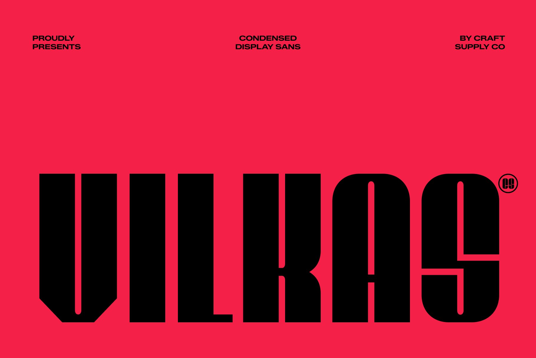
CS Vilkas Condensed Font is another typeface to explore when developing a compact logo or a display led visual system. Condensed lettering can help create a strong visual block, which is useful for labels, merchandise, and campaign layouts with limited space. Start by testing the font with the actual brand name and compare several spacing options. Once you find a balanced arrangement, introduce the wider visual language through color, imagery, and layout. This process helps ensure that the typography and supporting graphics work together as a unified identity.
8. CS Wicklow Condensed Font
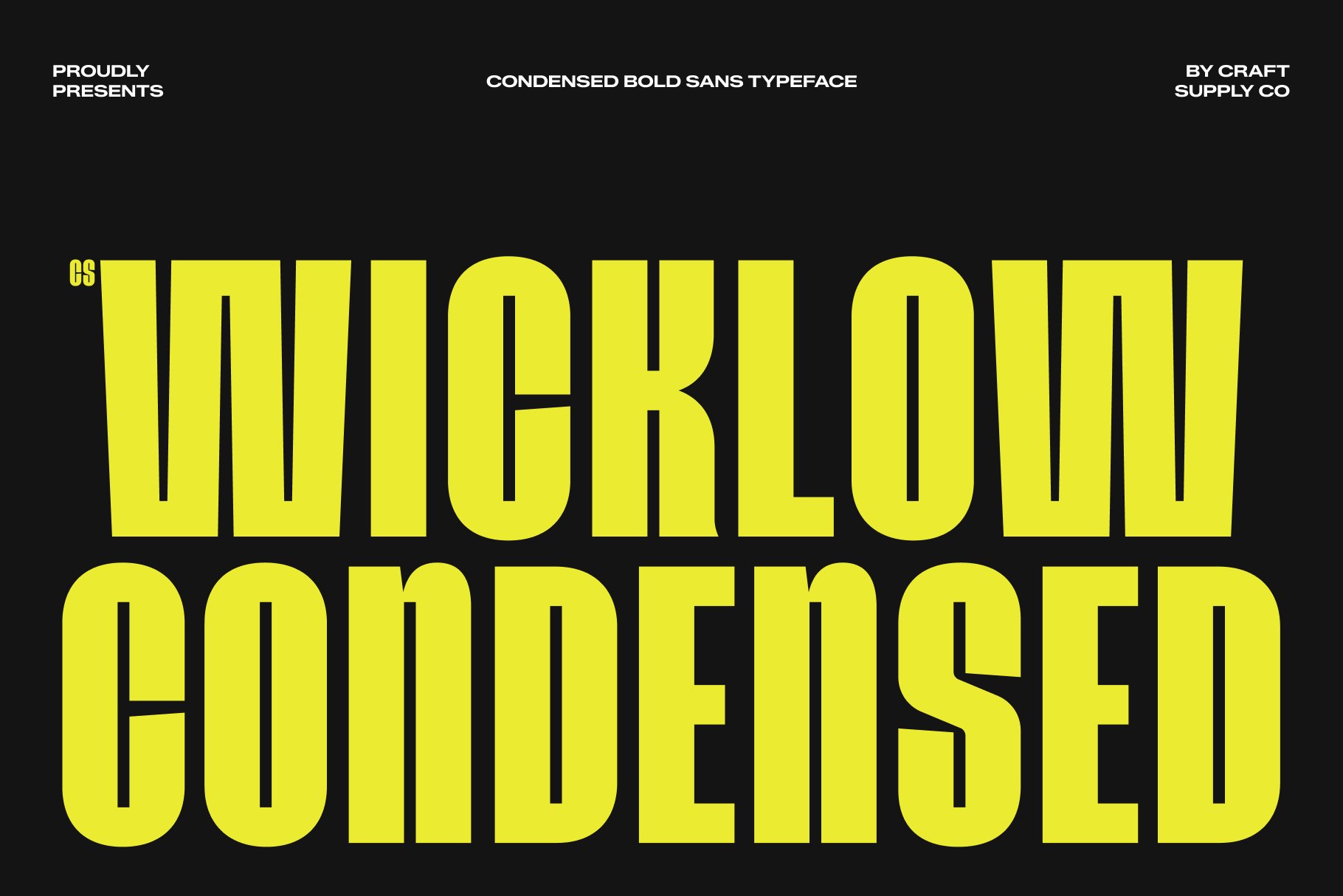
CS Wicklow Condensed Font is worth considering for projects that require a narrow typographic direction with a clear display role. A condensed font can help a brand name stand out within a tightly structured composition, particularly when it appears alongside photography or supporting information. For a coastal lifestyle concept, explore how the font works with navy backgrounds, white space, and minimal graphic details. Avoid using decorative elements simply to fill empty space. A confident layout often becomes more memorable when every element has room to breathe.
9. CS Zachery Condensed Font

CS Zachery Condensed Font provides another possibility for creating a compact wordmark or a distinctive headline. When selecting a condensed typeface, compare the proportions of individual characters and evaluate how the letters interact when placed together. The right combination can give a short brand name a recognizable shape, even without a separate symbol. Consider testing this font across apparel graphics, website headings, and packaging layouts to understand where it performs best. A consistent application helps the identity feel connected across different brand touchpoints.
10. CS Shiloh Condensed Font

CS Shiloh Condensed Font rounds out this selection with another option for exploring compact display typography. Use it as a starting point for a logo study, an editorial headline, or a graphic element within a broader branding system. Before finalizing the design, compare the font with the other alternatives and consider which one best reflects the intended brand personality. A typeface should do more than fit the layout; it should support the brand’s message and remain useful across multiple applications.
How to Create a Nautical Inspired Brand Identity
Creating a nautical inspired identity does not mean copying the visual language of an established fashion brand. Instead, begin with the ideas that make maritime design compelling: exploration, movement, durability, craftsmanship, and a connection to the coast. Translate those values into a visual system that fits your own audience and positioning.
Start with a focused color palette. Navy and white provide a familiar maritime foundation, while muted red, sand, or pale blue can introduce contrast. Select a primary font for the logo and a supporting typeface for longer text. If you choose a condensed display font, make sure it works with the brand name and does not compromise readability.
Next, develop a set of supporting graphic elements. Horizontal stripes, simple geometric forms, subtle linework, and carefully selected photography can reinforce the concept without making the identity overly literal. Use these elements consistently across packaging, apparel, digital platforms, and promotional materials.
Finally, test the identity in realistic contexts. A logo may look effective on a presentation board but behave differently when embroidered on fabric or printed on a small label. Review the design in monochrome, at different sizes, and against both light and dark backgrounds. These practical checks help turn an attractive concept into a usable brand system.
Why Visual Consistency Matters in Global Branding
A global brand needs an identity that remains recognizable while adapting to different products, audiences, and cultural contexts. Consistency provides the foundation for that recognition. When typography, colors, imagery, and design principles remain connected, customers can identify the brand across different environments.
At the same time, a visual identity should not be so rigid that it prevents creative development. Campaigns, seasonal collections, and new product categories may require different layouts or supporting imagery. A clear set of design principles allows those variations while preserving the central identity.
Nautica’s maritime inspiration illustrates how a coherent concept can support a broad lifestyle brand. For designers, the key lesson is to establish a recognizable foundation and apply it thoughtfully. A logo, a typeface, and a color palette become more effective when they contribute to the same story.
Nautica typography demonstrates how a clear visual concept can extend beyond a logo to influence an entire brand experience. Maritime inspiration, consistent styling, and a recognizable design direction help connect products and communications to a broader lifestyle. Typography plays an important role in that process by establishing hierarchy, personality, and recognition.
For more typography and branding inspiration, explore the creative work featured by Craft Supply Co. Ultimately, a successful visual identity combines a clear concept with thoughtful design decisions. Choose typography with purpose, maintain consistency across applications, and create a brand language that remains recognizable as the business grows.