
Minimal typography has become one of the most influential directions in modern graphic design. As brands compete for attention across websites, packaging, social media, and physical products, designers increasingly rely on simple letterforms that communicate personality without unnecessary decoration. Exploring a concept like millae typography in Millae and the Rise of Minimal Typography offers an interesting way to explore this design movement and understand why restrained type can create such a memorable visual identity.
A minimalist wordmark does not mean a design has to look plain. In fact, successful minimal typography often depends on careful decisions about letter proportions, spacing, curves, weight, and rhythm. A small change to a single letter can completely transform the personality of a logo. This balance between simplicity and character makes minimal typography especially valuable for contemporary brands.
For designers searching for a similar visual direction, exploring carefully selected font alternatives can provide an excellent starting point. The following fonts offer different interpretations of elegance, organic curves, vintage influence, and refined typography while giving designers room to develop their own identity.
Why Millae Represents the Appeal of Minimal Typography
The appeal of minimalist typography comes from its ability to remove visual distractions. Instead of depending on complicated illustrations or multiple graphic elements, the type itself becomes the primary design feature. This approach can make a brand feel confident, sophisticated, and easy to recognize.
A Millae inspired direction can work particularly well when a designer wants a wordmark that feels elegant without becoming overly formal. The right typography can create softness through curved characters, sophistication through spacing, and individuality through unusual letter shapes.
Minimal typography also adapts easily to different applications. A clean wordmark can appear on a product label, website header, business card, social profile, storefront, or packaging without losing its visual identity. This flexibility explains why minimalist branding continues to influence fashion, beauty, lifestyle, editorial, and creative businesses.
The Role of Letterforms in Minimal Logo Design
When a logo contains only a few letters, every character matters. Designers must consider how each letter interacts with the next one. Rounded letters can soften a brand, while sharper forms can introduce a more confident or contemporary personality.
Spacing also plays a major role. Generous tracking can create an airy and luxurious appearance, while tighter spacing can make a wordmark feel compact and energetic. Designers can also adjust individual characters to create a custom look without changing the entire typeface.
This attention to detail makes font selection one of the most important stages of minimalist logo development. A font should not simply look attractive on its own. It should support the personality, audience, and positioning of the brand.
10 Font Alternatives for Millae-Inspired Typography
1. CS Bilyana Art Nouveau Font

CS Bilyana Art Nouveau Font offers an elegant alternative for designers who want to combine minimal composition with graceful decorative character. Its flowing letterforms can bring softness and sophistication to a wordmark while still working within a restrained layout. Use it for beauty brands, boutique identities, packaging, or editorial projects where subtle elegance matters.
2. CS Mistral Art Nouveau Font
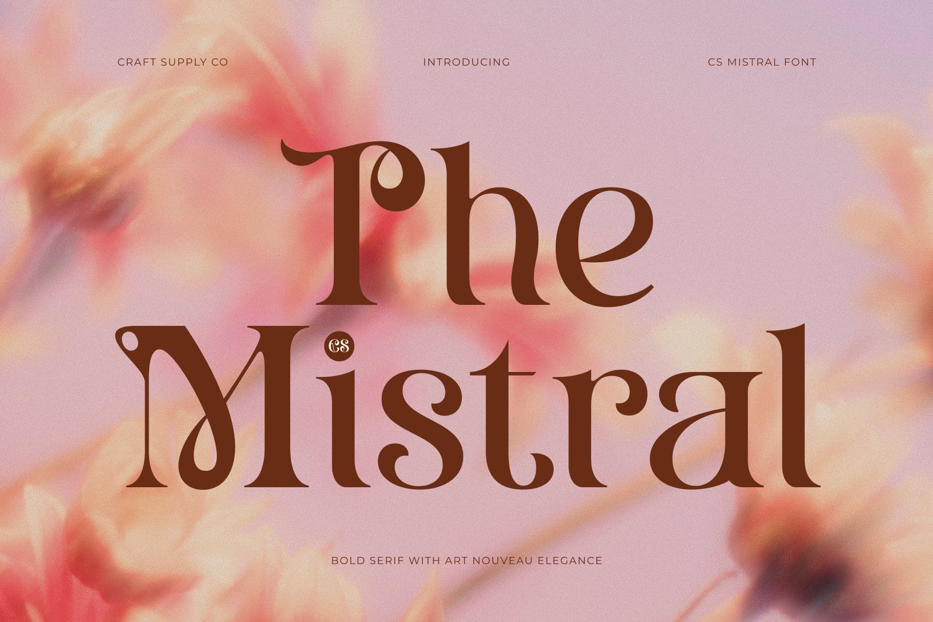
CS Mistral Art Nouveau Font brings an expressive personality to minimalist typography. Its artistic character can help a simple wordmark feel more distinctive without requiring additional graphic elements. Designers can use it when they want an identity that feels creative, refined, and slightly nostalgic while maintaining a clean overall composition.
3. CS Sage Art Nouveau Font

CS Sage Art Nouveau Font provides a sophisticated direction for brands that need a calm and graceful typographic identity. Its organic influence can work beautifully with minimalist layouts, especially when paired with generous spacing and a neutral visual palette. Consider it for wellness, lifestyle, beauty, boutique, or handcrafted brands.
4. CS Nevada Art Nouveau Font

CS Nevada Art Nouveau Font combines decorative inspiration with a strong typographic presence. It can help a minimalist logo develop a more recognizable personality while keeping the composition focused on the word itself. This makes it a useful choice for brands that want sophistication with a distinctive vintage-inspired edge.
5. CS Aurellyn Art Nouveau Font

CS Aurellyn Art Nouveau Font works well when the goal is to create an elegant and expressive wordmark. Its graceful forms can introduce a sense of luxury without requiring excessive visual decoration. Try it for fashion labels, beauty products, personal brands, stationery, and other projects where typography needs to feel polished.
6. CS Giova Art Nouveau Font
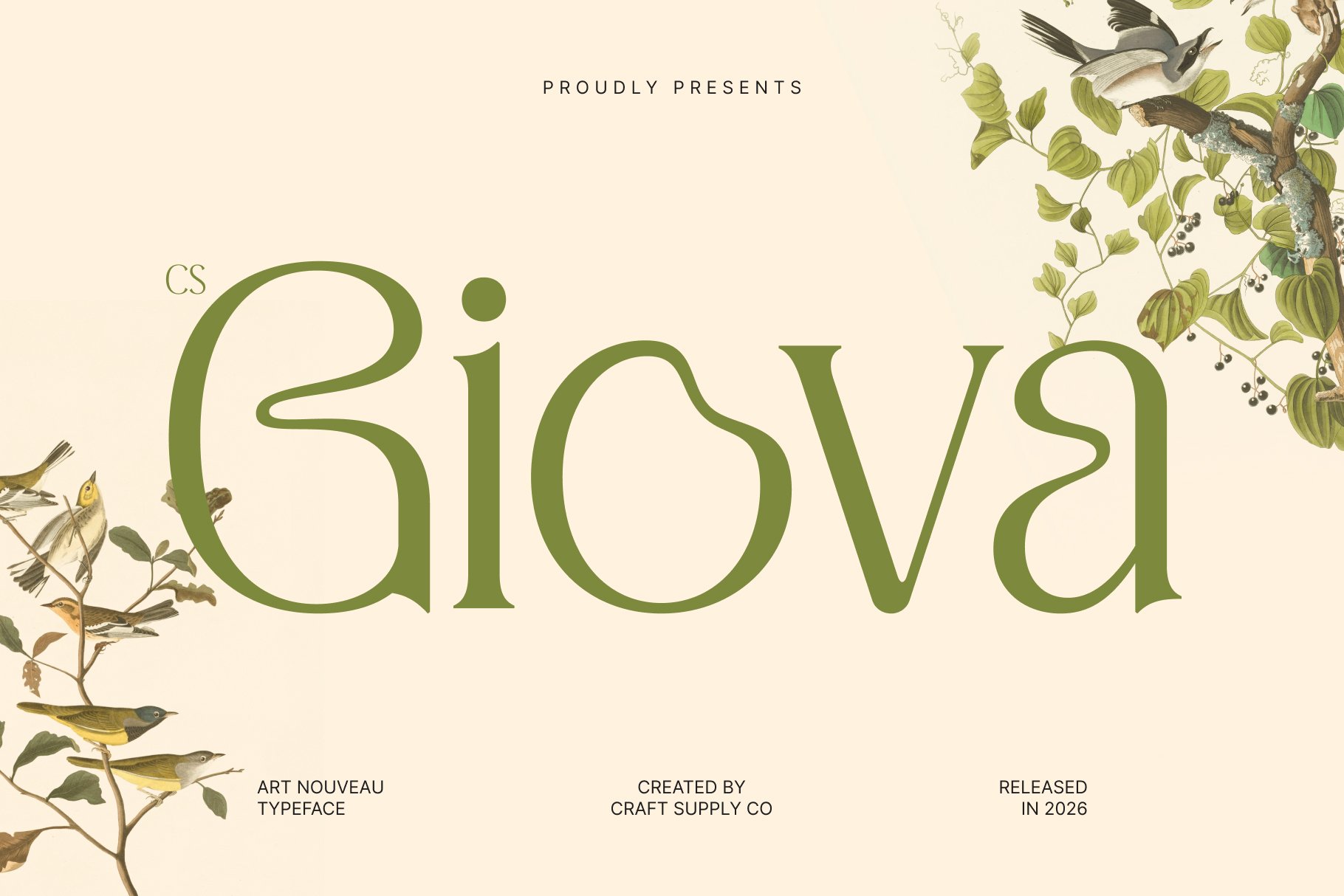
CS Giova Art Nouveau Font gives minimalist branding an artistic and sophisticated character. The font can serve as a strong starting point for custom wordmarks because designers can experiment with spacing, capitalization, and selective letter adjustments. It works especially well when a brand needs typography that feels both classic and creative.
7. CS Sargent Art Nouveau Font
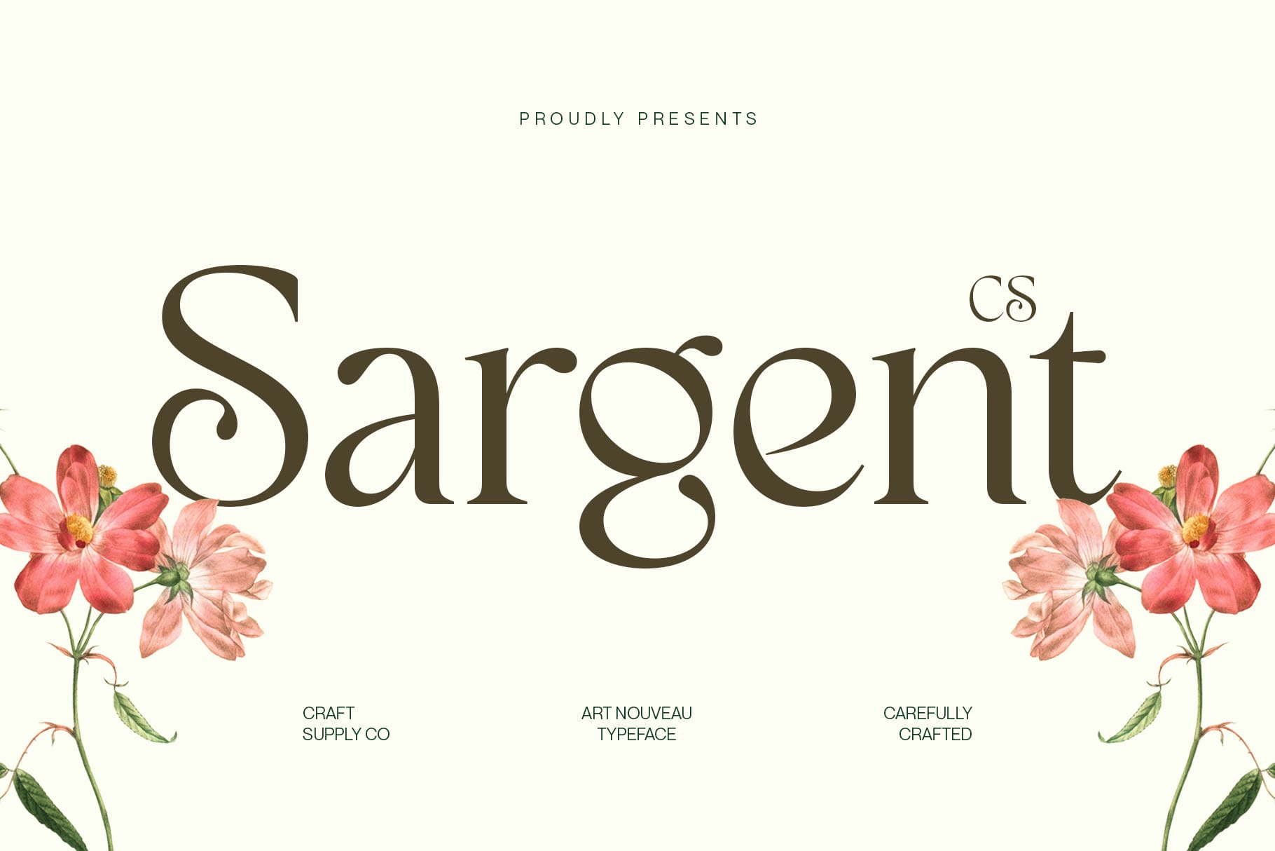
CS Sargent Art Nouveau Font offers a more pronounced decorative personality while still supporting focused logo compositions. It can help a short brand name become visually memorable and can add historical character to contemporary branding. Use it selectively when you want the typography to become the main visual statement.
8. CS Abuela Art Nouveau Font

CS Abuela Art Nouveau Font introduces a warm, artistic feeling that can complement minimalist branding. Its distinctive forms can create an inviting identity for boutique businesses, creative studios, lifestyle products, and handcrafted brands. Pairing it with plenty of negative space can prevent the design from feeling visually crowded.
9. CS Bailey Art Nouveau Font
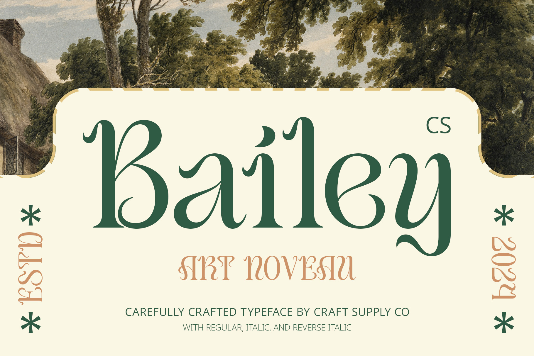
CS Bailey Art Nouveau Font is a versatile option for designers who want an elegant alternative with artistic personality. It can give a short wordmark a memorable silhouette while allowing the rest of the identity to remain simple. Consider using it for packaging, editorial branding, invitations, fashion projects, and creative businesses.
10. CS Amora Art Nouveau Font
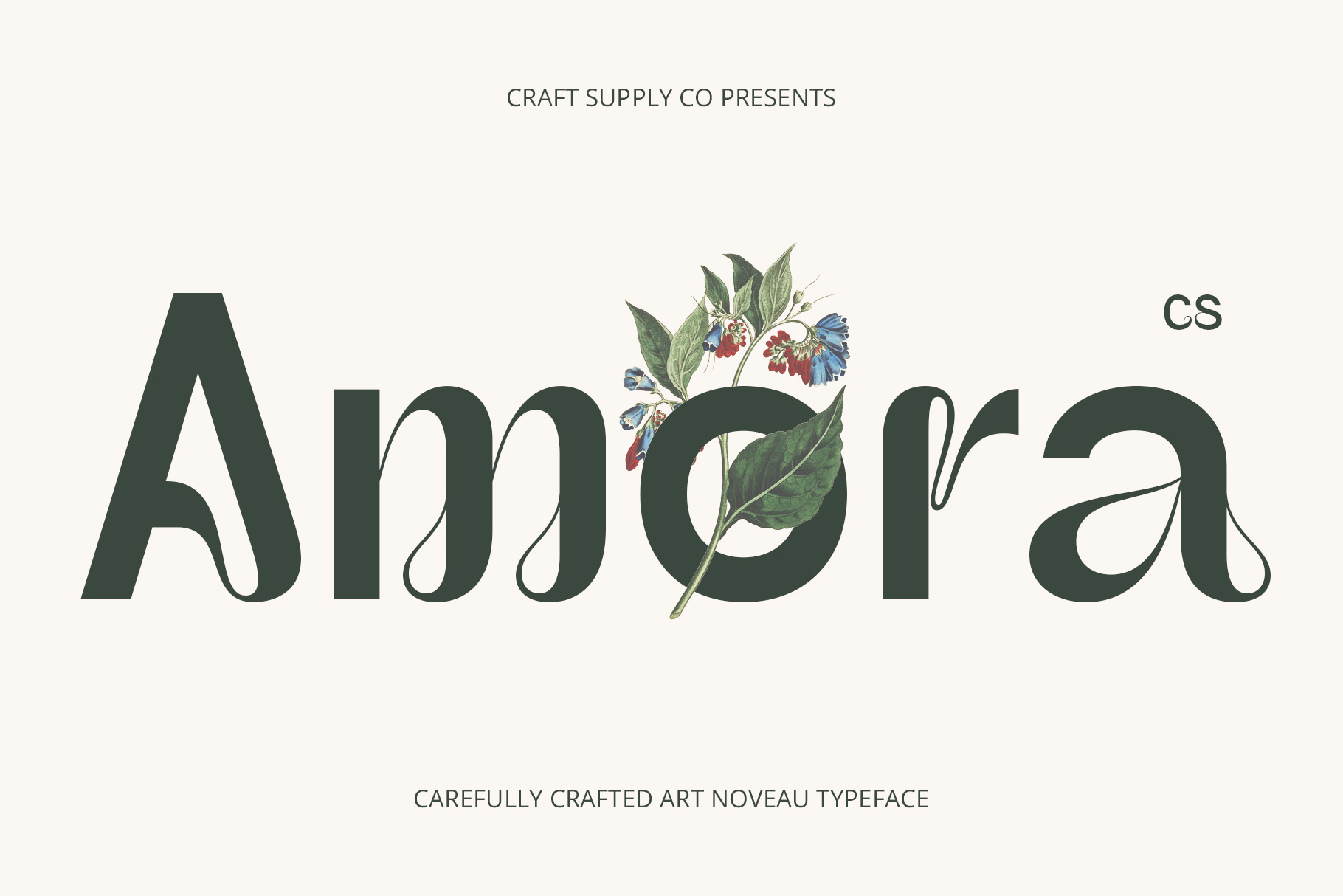
CS Amora Art Nouveau Font provides a romantic and sophisticated direction for minimalist typography. Its character can work particularly well with brands that want an elegant, feminine, or boutique oriented appearance. Keep the supporting graphics simple so the letterforms remain the primary focus of the identity.
How to Create a Millae-Inspired Minimal Wordmark
Creating a minimalist wordmark starts with choosing a font that already has the right personality. From there, designers can customize the typography rather than adding unnecessary visual elements.
- Start with the brand name: Test the complete name before making stylistic decisions. Some fonts perform better with short names, while others create stronger compositions with longer words.
- Study the letter shapes: Look closely at unusual curves, terminals, counters, and proportions. These details often define the personality of a minimalist logo.
- Adjust spacing: Experiment with tracking and kerning to create a balanced rhythm. Even a strong font can look weak if the spacing feels inconsistent.
- Use negative space: Give the wordmark room to breathe. Empty space can make typography feel more luxurious and intentional.
- Limit supporting elements: Avoid adding icons or decorative graphics simply to fill space. Let the typography carry the identity whenever possible.
- Test different sizes: A minimalist logo should remain recognizable across large and small applications. Test it on packaging, mobile screens, social profiles, and print materials.
Why Minimal Typography Works for Modern Branding
Modern audiences encounter hundreds of visual messages every day. Minimal typography gives brands an opportunity to communicate clearly without competing with excessive decoration. A well designed wordmark can feel immediate, professional, and memorable.
Minimal typography also provides long term flexibility. Trends in color, photography, illustration, and layout can change quickly, but a carefully constructed typographic identity can remain useful for years. Designers can refresh the surrounding visual system without completely redesigning the core wordmark.
Another advantage comes from scalability. A simple typographic logo usually translates well between digital and physical environments. It can appear on a website, product label, storefront, social media avatar, or business card while maintaining a consistent visual language.
Choosing the Right Font Alternative
The best alternative millae typography depends on the personality you want to create. If your goal is soft and elegant, choose a font with graceful curves. If you want a stronger artistic presence, explore more expressive letterforms. For vintage inspired branding, Art Nouveau influences can provide distinctive shapes without relying on complicated illustrations.
Before committing to a typeface, test several variations of the brand name. Compare uppercase and lowercase treatments, spacing options, and different weights where available. You can also combine the primary wordmark with a simple secondary typeface for supporting information.
Exploring the work of Craft Supply Co can also provide useful visual inspiration when developing a typographic direction.
Millae and the Rise of Minimal Typography highlights an important principle in contemporary identity design: simplicity becomes powerful when every detail has a purpose. A minimalist wordmark does not need complicated graphics to make an impression. Instead, it can rely on carefully chosen letterforms, balanced spacing, strong proportions, and thoughtful composition.
The ten millae typography alternatives above offer different ways to explore this approach. Their Art Nouveau influences introduce elegance and personality while giving designers a foundation for creating distinctive wordmarks. Whether you are designing a fashion identity, beauty brand, lifestyle business, boutique, or creative studio, the right typography can turn a simple name into a memorable visual identity.
Ultimately, minimal typography is not about removing personality. It is about concentrating personality into fewer elements. When the font, spacing, proportions, and composition work together, even a simple word can become a powerful brand asset.