
A strong logo does not always need a complicated illustration. Sometimes the typography carries much of the identity. The shape, weight, spacing, and proportions of the letters can make a brand name feel powerful, contemporary, playful, or highly recognizable. This becomes particularly interesting when exploring a custom look like the Living Things font, where the words themselves suggest movement, nature, energy, and personality.
Finding Living Things font behind similar logos is less about locating an exact copy and more about understanding the characteristics that create a comparable visual effect. Bold sans serif fonts can establish confidence, while display typefaces can give a word mark more individuality. Chunky and heavy letterforms can also make a brand name feel substantial and memorable.
This article explores 10 Living Things font alternatives for inspired branding. The selection focuses on bold display and sans serif typefaces that can help designers create strong word marks for lifestyle brands, creative businesses, merchandise, packaging, campaigns, and digital identities.
Why Typography Matters for a Living Things Logo
The phrase “Living Things” contains two words, giving designers more room to experiment with hierarchy and spacing. The words can sit on one line, stack vertically, or use contrasting weights to create visual emphasis.
A bold typeface can make the identity feel energetic and confident. A softer sans serif can make it more approachable, while an expressive display font can add a creative edge. The right choice depends on the personality the brand wants to communicate.
Typography can also reinforce the concept behind a name. Since “living things” suggests life, movement, and variety, a rigid or overly neutral typeface may communicate a different message from a bold, expressive one. This makes font selection an important part of the overall branding process.
What Makes a Similar Logo Font Work?
When searching for a font alternative, focus on visual qualities rather than simply looking for a similar looking alphabet. Start with weight. Heavy fonts create strong silhouettes and remain visible at a distance. Then consider width, as wide lettering can feel expansive while compact forms create a denser composition.
Letter spacing is equally important. Two fonts with similar weights can look completely different when their spacing changes. A tighter setting can create a powerful block of text, while generous spacing can make bold typography feel more refined.
10 Font Alternatives for Living Things Inspired Logos
1. CS Guner

CS Guner provides a bold display direction for designers who want the words Living Things to become a strong graphic element. Display fonts can give individual characters more personality than a conventional text face, making the complete word mark feel distinctive. CS Guner works well for large-scale logos, posters, merchandise, packaging, and campaigns where typography needs to command attention.
2. CS Benoit
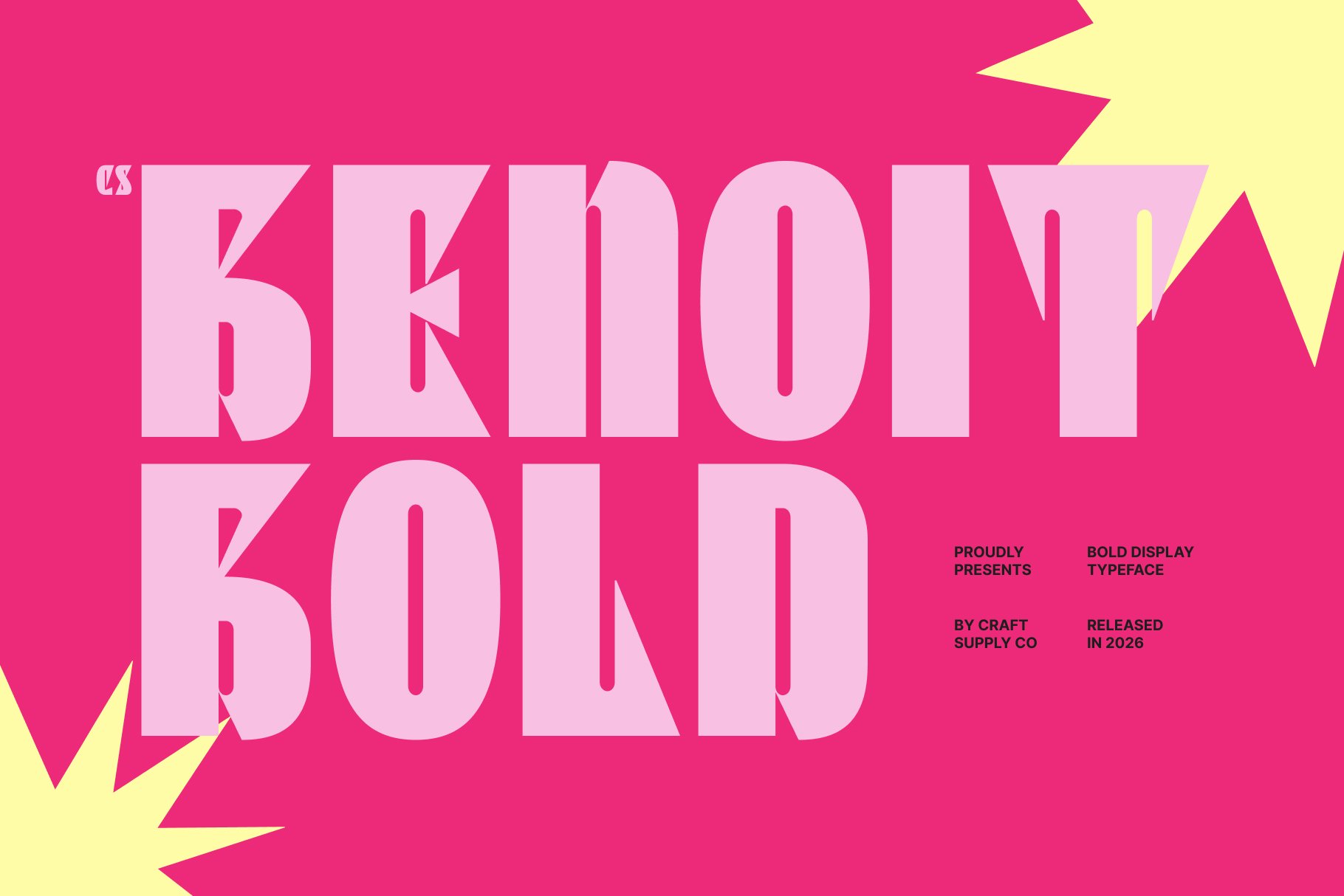
CS Benoit offers a bold sans serif approach that can create a clean and confident Living Things inspired identity. Strong sans serif forms are versatile because they can work across both digital and physical applications. Use CS Benoit when you want the word mark to feel modern and direct while maintaining strong readability. It can also provide an excellent foundation for custom kerning and layout adjustments.
3. CS Moza
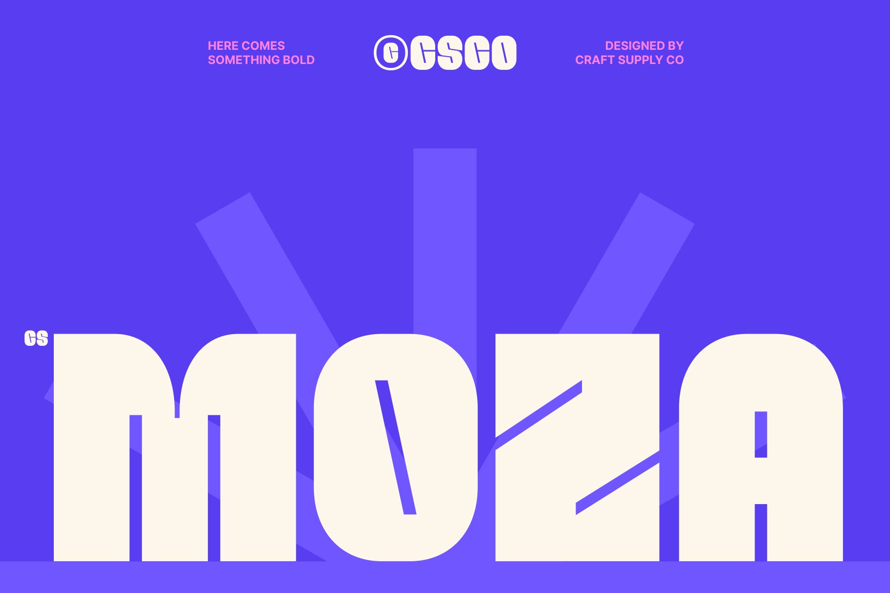
CS Moza brings another bold sans serif alternative to the collection. Its substantial weight can make the brand name feel visually grounded and easy to recognize. This makes it useful for lifestyle branding, packaging, signage, social media graphics, and apparel. For a Living Things-inspired concept, try combining its bold forms with generous negative space to create a clean but impactful composition.
4. CS Stadle
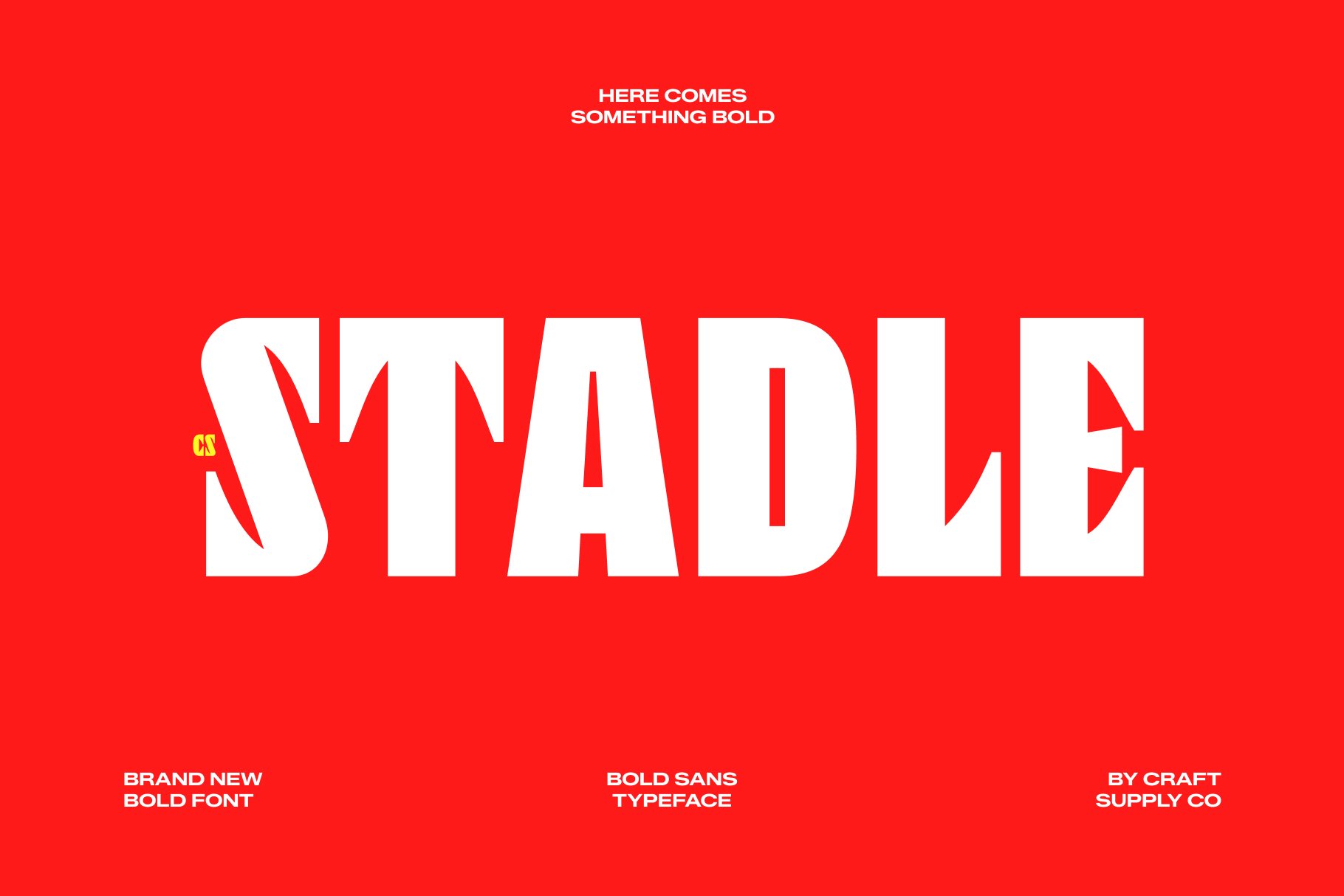
CS Stadle provides another strong sans serif direction with a confident visual presence. Bold lettering can help a two-word name maintain impact across different applications, especially when the logo needs to remain recognizable from a distance. CS Stadle can work well for modern consumer brands, creative projects, events, merchandise, and digital identities that need clear and substantial typography.
5. CS Ablaze

CS Ablaze takes the typography in a more expressive display direction. A bold display font can give the Living Things concept additional energy and make the word mark feel more like a graphic composition. This makes it suitable for posters, entertainment projects, fashion concepts, campaigns, packaging, and merchandise. Consider using large type and simple supporting elements to keep the lettering at the center.
6. CS Beast
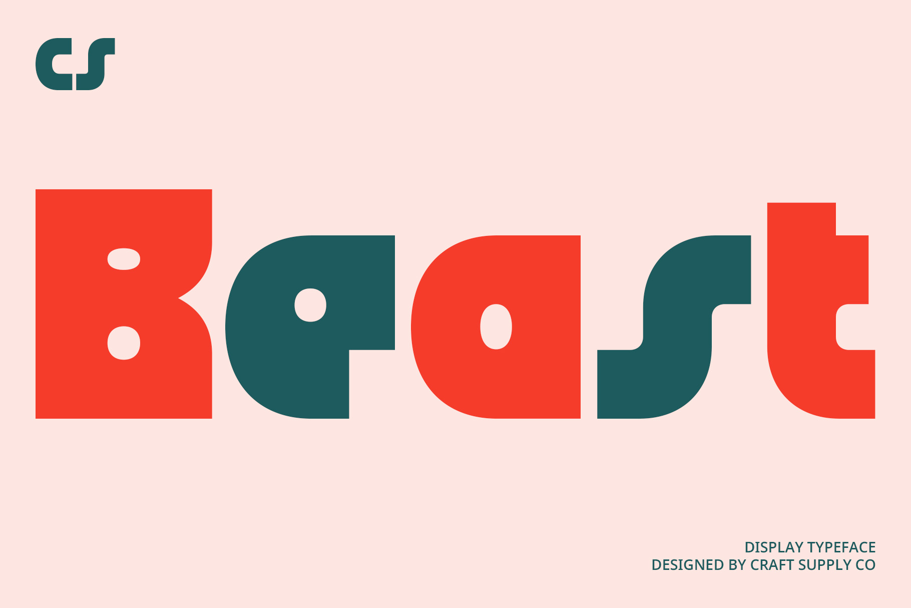
CS Beast introduces a stronger and more forceful personality to the Living Things font alternative search. Heavy typography can create a powerful silhouette and make the brand name feel confident and assertive. This direction can work particularly well when the identity needs to stand out on apparel, posters, signage, or promotional materials. Keep the surrounding layout relatively simple so the weight of the letters remains effective.
7. CS Querist

CS Querist offers another bold option for creating a substantial word mark. Its strong letterforms can give Living Things a clear visual presence without requiring additional decorative graphics. This makes it useful for contemporary branding, digital campaigns, packaging, and editorial applications. Experiment with uppercase and different spacing configurations to discover the most balanced composition.
8. CS Aftone
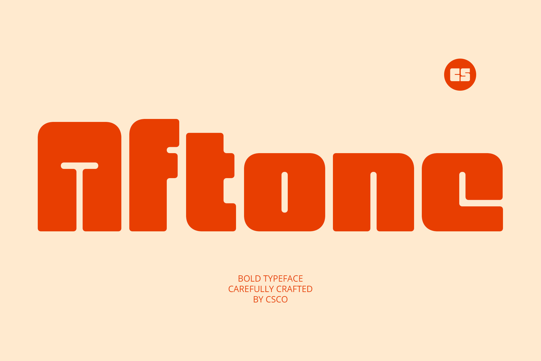
CS Aftone provides a versatile bold direction for designers searching for an alternative to more conventional sans serif branding. Strong typography can make the two word name feel unified and recognizable, particularly when the spacing between the words is carefully controlled. Use CS Aftone for lifestyle brands, product identities, social media graphics, merchandise, and promotional designs that need a confident typographic foundation.
9. CS Genista
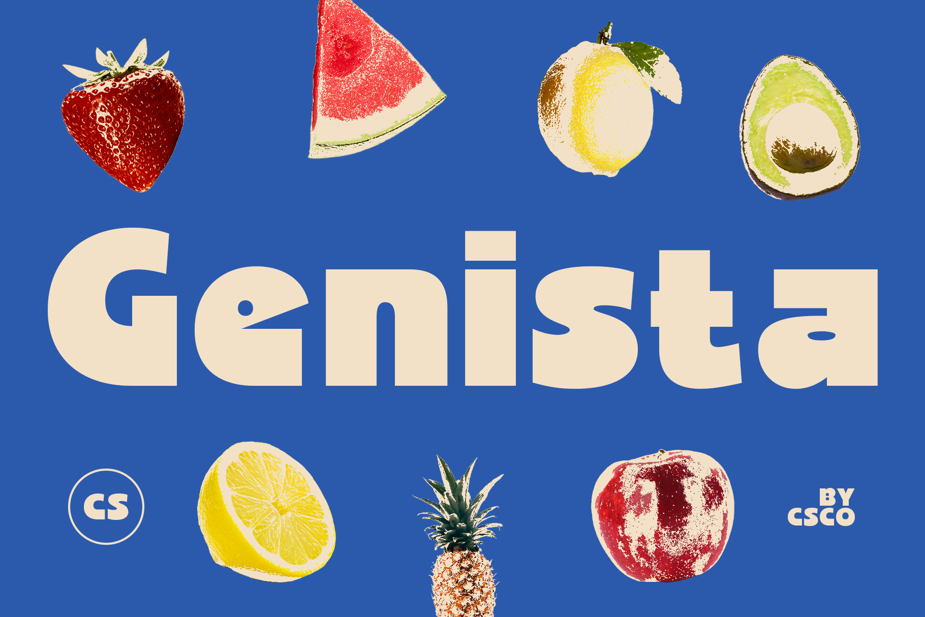
CS Genista adds another bold font option with a strong display presence. Its weight can help establish a memorable silhouette, while the letterforms provide enough structure for a wide range of branding applications. For a Living Things inspired logo, CS Genista can work especially well when the typography needs to feel prominent without relying on complex illustrations.
10. CS Boldier
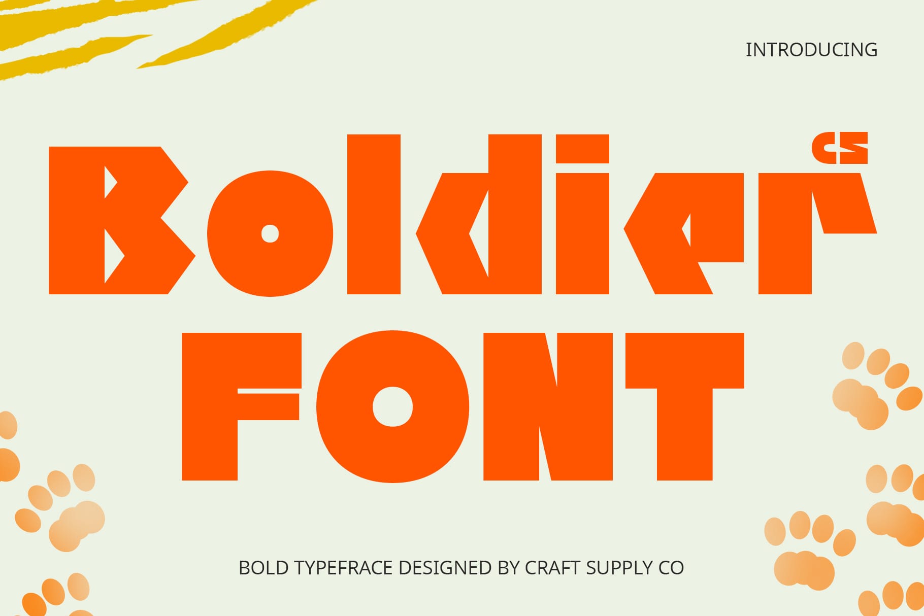
CS Boldier completes the selection with a font built around visual strength. A heavy typeface can turn a simple name into a bold graphic statement, which makes it useful for logos, apparel, packaging, posters, and advertising. For Living Things, CS Boldier can create a substantial word mark that feels energetic and confident. Give the letters enough breathing room to prevent the composition from becoming visually crowded.
Bold Sans Serif vs. Bold Display Typography
The font alternatives in this collection demonstrate two broad approaches. Bold sans serif fonts such as CS Benoit, CS Moza, and CS Stadle offer versatility and clarity. They can adapt easily to different brand applications because their structure remains relatively straightforward.
Bold display fonts such as CS Guner and CS Ablaze provide more visual personality. They can make the typography feel like an illustration in its own right. CS Beast, CS Querist, CS Aftone, CS Genista, and CS Boldier provide additional heavy directions that can help the word mark feel substantial and memorable.
There is no universal solution. The right choice depends on whether the identity should prioritize flexibility, personality, impact, or a combination of these qualities.
How to Find the Right Living Things Font Alternative
Begin by defining the brand personality. If the identity needs to feel modern and straightforward, start with the bold sans serif options. If the design needs more visual drama, explore the display fonts.
Next, test both words together. “Living” and “Things” may have different letter combinations, so their visual weight can vary. Pay attention to how the final letter of the first word interacts with the first letter of the second word.
Experiment with the relationship between the two words. They can share the same weight, or one can become slightly more prominent. Stacking the words can also create a compact logo shape and provide opportunities for interesting alignment.
Typography Tips for a Strong Word Mark
Control the weight. Bold fonts already occupy substantial visual space, so make sure the weight supports readability rather than overwhelming it.
Adjust word spacing. The space between “Living” and “Things” can influence whether the logo feels compact, friendly, formal, or expansive.
Test uppercase. Uppercase lettering can create a more authoritative visual identity, while lowercase can produce a softer and more contemporary impression.
Use negative space. Strong typography benefits from a clean surrounding area. Give the logo enough space to remain visually clear.
Check different sizes. Test the logo as a large headline and as a small digital mark to make sure the typography remains recognizable.
Consider customization. Small adjustments to individual letters can make a font-based identity feel more distinctive without changing the fundamental typeface.
Creating Personality Without Overcomplicating the Logo
A common mistake in word mark design is adding too many graphic elements to compensate for typography that lacks personality. A strong font can often do the opposite. When the letterforms already have enough visual character, a simple composition can make the identity more memorable.
This is especially relevant for a name like Living Things. The concept itself provides plenty of creative possibilities, but the logo does not necessarily need leaves, animals, plants, or other literal imagery. Typography can communicate energy and life through its shape, weight, rhythm, and movement.
Try experimenting with scale, alignment, and spacing before adding decorative symbols. You may find that the lettering already provides everything the identity needs.
Explore More Typography Inspiration
For more creative typefaces, logo ideas, and experimental lettering inspiration, explore Craft Supply Co. Studying different bold type treatments can help you understand how weight, proportion, and spacing influence the personality of a word mark.
Living Things and the fonts behind similar logos show how powerful typography can be when a brand name becomes the main visual element. Bold sans serif and display fonts can transform the same words into identities that feel confident, energetic, contemporary, or expressive.
The 10 alternatives in this collection offer several directions. CS Benoit, CS Moza, and CS Stadle provide bold sans serif foundations, while CS Guner and CS Ablaze offer more display-oriented character. CS Beast, CS Querist, CS Aftone, CS Genista, and CS Boldier add further options for creating a strong visual presence.
The best font depends on the personality and purpose of the brand. Test several alternatives, adjust the spacing between the words, explore different scales, and examine the logo across real applications. With careful typographic decisions, a simple name can become a distinctive word mark that feels alive, confident, and memorable.