
The Y2K aesthetic continues to inspire designers who want to combine futuristic technology with nostalgic early-digital visuals. Metallic details, glossy graphics, pixel elements, futuristic shapes, vibrant colors, and experimental typography can create the distinctive atmosphere associated with the turn-of-the-millennium era. leading many to seek out similar font recommendation for y2k style.
Typography plays a major role in building that visual identity. The right font recommendation for Y2K style can make a poster feel futuristic, give a brand a nostalgic digital personality, or turn a simple headline into an eye-catching graphic element. From futuristic display fonts to pixel lettering and hand-drawn styles, there are many ways to approach Y2K typography.
In this guide, we explore ten typefaces from Craft Supply Co that can work for Y2K posters, Y2K-style lettering, artistic designs, branding, fashion graphics, social media artwork, and other retro-futuristic projects.
What Is the Y2K Style?
The Y2K style refers to a visual aesthetic inspired by the late 1990s and early 2000s. Designers often associate the style with the transition into the new millennium and the optimism surrounding digital technology at that time.
Y2K-inspired designs frequently combine futuristic typography with chrome-like surfaces, bright gradients, translucent shapes, digital interfaces, pixel graphics, stars, bubbles, metallic textures, and experimental layouts.
Typography does not have to follow one exact formula. Some Y2K designs use sleek futuristic lettering, while others embrace chunky display fonts, pixel typography, or deliberately imperfect hand-drawn forms.
What Makes a Good Y2K Font?
A good Y2K font should support the futuristic and nostalgic qualities of the design. However, you do not need to use an obviously “retro” font for every project. Sometimes a contemporary futuristic typeface can create a stronger Y2K feeling when combined with the right colors, textures, and graphic effects.
When choosing a Y2K font, consider:
- Futuristic shapes: Unusual curves, geometric forms, and experimental letterforms can create a digital atmosphere.
- Distinctive silhouettes: Memorable lettering helps headlines stand out.
- Digital character: Pixel and technology-inspired styles can reinforce the early-computer aesthetic.
- Display impact: Y2K typography often works best when used prominently.
- Pairing flexibility: A strong display font should work with simpler supporting typography.
- Visual personality: The typeface should contribute to the overall mood rather than simply display the words.
Font Recommendation for Y2K Style
There is no single typeface that defines the Y2K aesthetic. The style can move from futuristic and technological to playful and nostalgic. These ten font recommendation for y2k style provide several different directions for creating a Y2K-inspired visual identity.
1. CS Vontech Y2K Font

CS Vontech Y2K Font is a natural starting point for designers looking for typography specifically inspired by the Y2K aesthetic. Its futuristic character can help create a strong early-digital atmosphere in headlines and display compositions.
Use it for Y2K posters, fashion graphics, album artwork, social media campaigns, technology-inspired designs, event graphics, and futuristic branding. Its distinctive forms can become the central visual element of a composition.
For an authentic Y2K-inspired layout, experiment with gradients, metallic effects, glow, chrome textures, or translucent shapes around the typography.
2. CS Valtrix Y2K Font
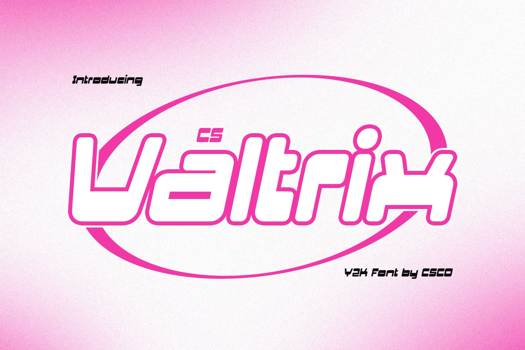
CS Valtrix Y2K Font offers another direct route into retro-futuristic typography. Its futuristic character can help give a simple word or phrase a more technological appearance.
Consider it for digital posters, futuristic fashion branding, music artwork, gaming graphics, technology campaigns, and social media designs. It can work especially well when the typography needs to feel more experimental than a conventional sans serif.
Use short phrases and large sizes to give the distinctive letterforms enough space to become part of the artwork.
3. CS Darwin Y2K Font
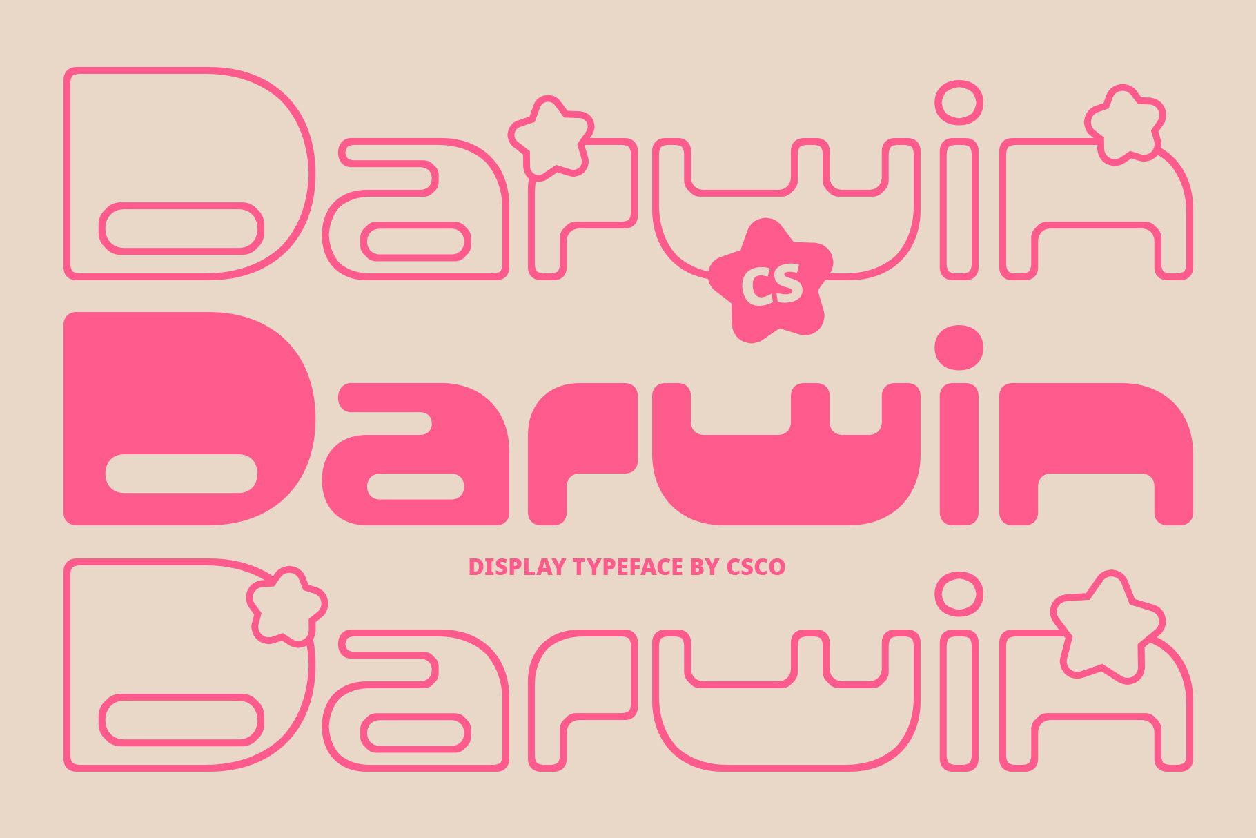
CS Darwin Y2K Font provides another option for creating a recognizable millennium-inspired aesthetic. Its display character can help transform ordinary words into strong graphic elements.
Try it for Y2K posters, streetwear graphics, digital artwork, album covers, event promotions, and nostalgic social media designs. It can also work well for branding projects that want to reference early digital culture without copying a specific historical logo.
Pair it with minimal supporting typography to keep the main headline dominant.
4. CS Metro Y2K Font
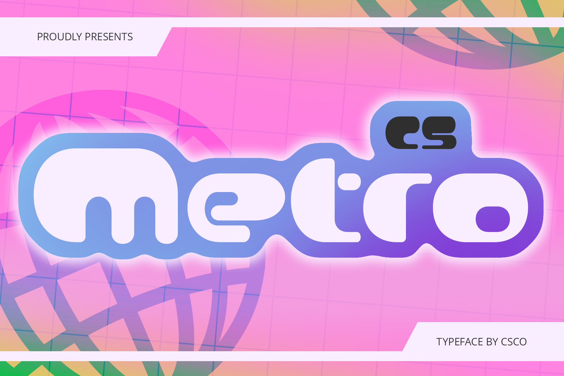
CS Metro Y2K Font can bring a metropolitan and futuristic direction to Y2K typography. This makes it useful for projects that combine digital nostalgia with fashion, urban culture, or contemporary graphic design.
Use it for fashion posters, streetwear graphics, music promotions, event identities, digital campaigns, and brand concepts. It can also provide an interesting foundation for experimental layouts featuring grids and geometric shapes.
Try combining large typography with small interface-inspired labels to create a stronger digital atmosphere.
5. CS Flexion Y2K Font
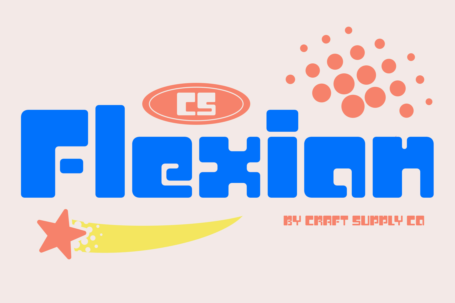
CS Flexion Y2K Font provides a flexible futuristic direction for designers who want expressive typography with a strong digital character.
Consider it for posters, album artwork, technology-inspired branding, gaming graphics, fashion campaigns, and experimental editorial designs. The font can work particularly well when you want the lettering to feel like part of the graphic rather than simply a block of text.
Try using oversized lettering, unusual alignment, or layered typography to emphasize the futuristic character.
6. CS Darwin Stamp

CS Darwin Stamp takes a different approach to the Y2K aesthetic. Instead of relying entirely on futuristic lettering, a stamp treatment can introduce texture and physical character into a digital-inspired composition.
This makes it useful for Y2K designs that mix old and new visual languages. Try it for fashion graphics, posters, merchandise, experimental branding, and mixed-media artwork.
Combine the stamped appearance with digital textures, pixel graphics, gradients, or chrome-inspired elements for an intentionally hybrid look.
7. CS Randy Pixel
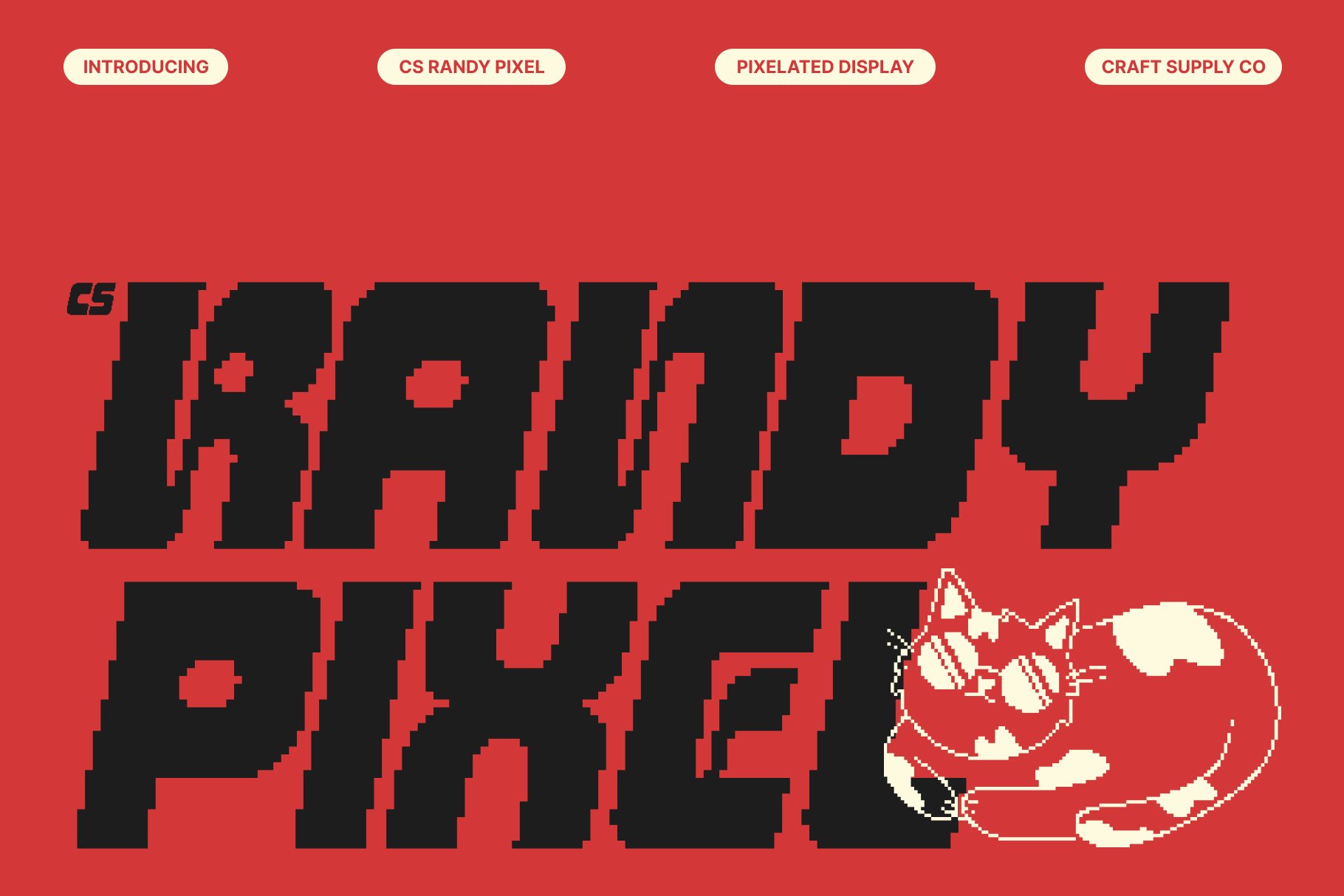
Pixel typography has an obvious connection to early digital culture, making CS Randy Pixel a useful choice for Y2K-inspired designs. Pixel fonts can evoke computer interfaces, arcade games, early websites, and digital graphics.
Use it for gaming posters, technology graphics, nostalgic social media artwork, album covers, event designs, and digital merchandise.
For a stronger Y2K atmosphere, combine pixel lettering with gradients, chrome surfaces, small interface elements, and futuristic symbols.
8. CS Metro Drawn

CS Metro Drawn introduces a more expressive and imperfect quality to the Y2K-inspired font selection. Hand-drawn typography can create contrast against polished digital effects.
This approach works well when your design combines nostalgic technology with streetwear, youth culture, fashion, or music. Use it for posters, merchandise, social graphics, creative campaigns, and experimental branding.
The contrast between hand-drawn lettering and digital effects can make the composition feel more layered and unexpected.
9. CS Mecha Drawn

CS Mecha Drawn offers a futuristic hand-drawn direction that can work particularly well for experimental Y2K artwork. The combination of mechanical inspiration and drawn character gives the typography a distinctive personality.
Consider it for gaming graphics, futuristic posters, music artwork, technology-inspired branding, streetwear, and digital illustrations.
Use the font with mechanical shapes, grids, technical details, or metallic effects to strengthen the futuristic atmosphere.
10. CS Rilke Futuristic Font
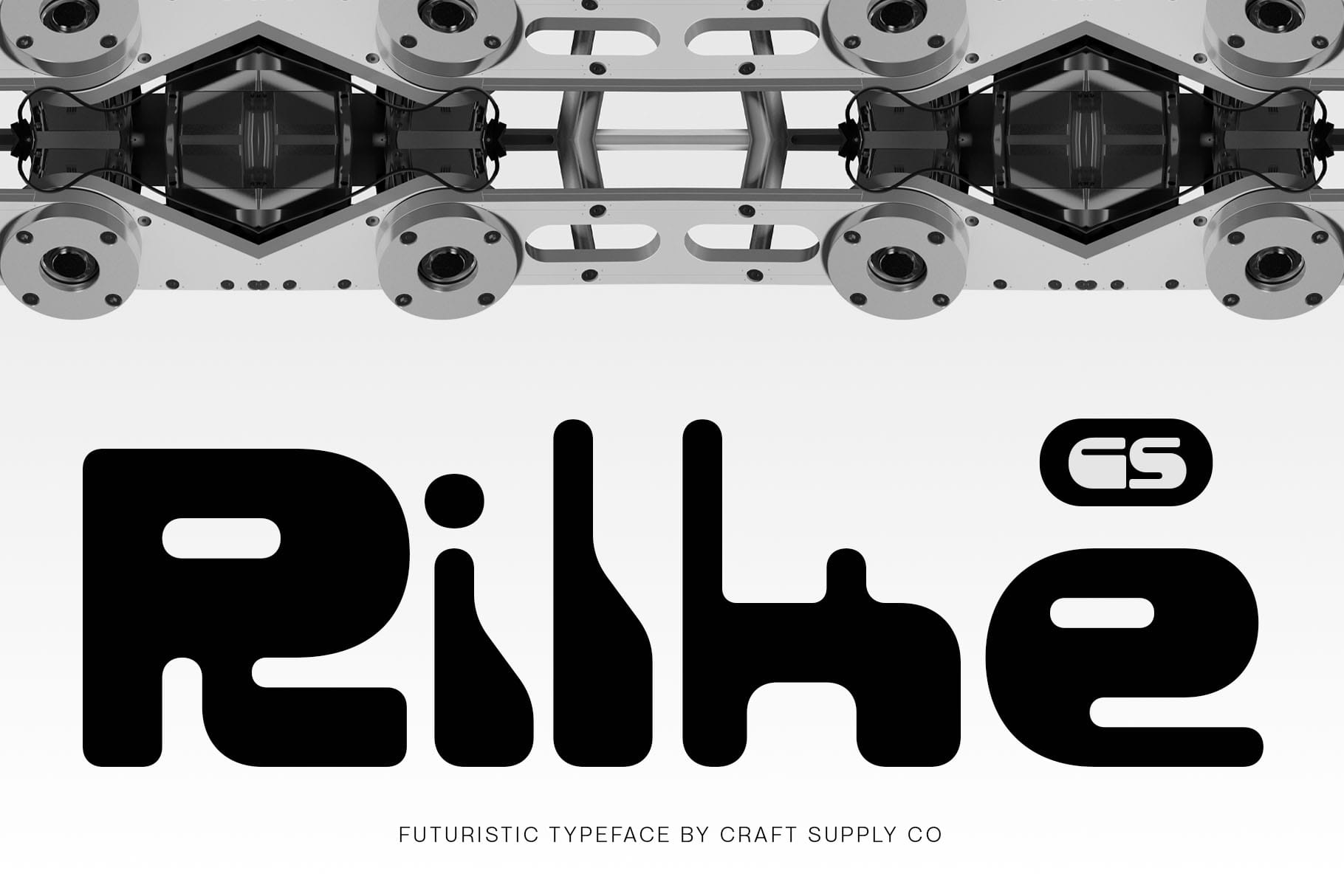
CS Rilke Futuristic Font provides a broader futuristic direction that can work beyond strictly nostalgic Y2K graphics. Its futuristic character makes it suitable for designs that combine millennium-inspired visuals with a more contemporary digital aesthetic.
Use it for technology branding, futuristic posters, fashion campaigns, gaming projects, music artwork, digital products, and experimental editorial layouts.
If you want your design to reference Y2K without looking overly nostalgic, a futuristic font such as CS Rilke can help create that balance.
Font for Y2K Poster Design
When creating a Y2K poster, typography should become an important part of the visual composition. The poster does not need to use every Y2K visual trend at once. Instead, choose a few recognizable elements and build a consistent system around them.
Start with a strong display font such as CS Vontech, CS Valtrix, CS Darwin, or CS Flexion. Then add supporting graphics such as gradients, chrome textures, translucent shapes, stars, pixel elements, or digital interface details.
Keep the main headline large. If the poster contains a date, location, or call to action, use a simpler font so viewers can quickly understand the practical information.
Font Letter With Y2K Style
Y2K typography often works because individual letters have strong visual identities. Instead of treating the font as ordinary text, designers can use the shapes of the letters as graphic objects.
Try enlarging one letter, cropping part of a word, or layering typography with translucent shapes. You can also experiment with outlines, gradients, shadows, and metallic effects.
Pixel fonts such as CS Randy Pixel provide a digital direction, while futuristic fonts such as CS Vontech and CS Rilke can create more streamlined millennium-inspired lettering.
When experimenting with these techniques, maintain enough contrast between the letters and background. Decorative effects should enhance the typography rather than make it difficult to recognize.
Y2K Artistic Design Ideas
A Y2K artistic design can combine typography with several visual references from early digital culture. The goal is not to reproduce one exact style but to create a visual language that feels nostalgic, futuristic, and experimental.
Consider combining:
- Futuristic display typography
- Pixel graphics
- Chrome and metallic textures
- Bright gradients
- Transparent or glass-like shapes
- Stars and digital symbols
- Computer-interface-inspired elements
- Distressed or stamped textures
- Unusual typography placement
- High-contrast color combinations
You can also create an interesting contrast by mixing polished digital effects with imperfect lettering. CS Darwin Stamp and CS Metro Drawn can help create this kind of visual tension.
How to Create Y2K Brand Vibes
Creating brand Y2K vibes requires more than selecting a futuristic font. Branding works best when typography, color, imagery, and graphic elements all communicate the same personality.
Start by selecting one primary display font. CS Vontech, CS Valtrix, CS Metro, and CS Rilke can provide different futuristic directions. Then choose a supporting font with simpler forms for product descriptions, navigation, captions, or other practical information.
Next, establish a recognizable color and graphic system. Metallic gradients, vibrant blues, pinks, purples, silvers, translucent effects, and digital textures can help reinforce the aesthetic. However, you do not need to use all of these elements. A restrained approach can create a more modern interpretation of Y2K.
Finally, apply the visual system consistently across your logo, packaging, social media graphics, website, merchandise, and promotional materials.
Y2K Font Pairing Tips
Y2K typography often contains strong visual details, so pairing requires careful control. A decorative futuristic font can become difficult to read when combined with another equally complex display font.
- Futuristic font + simple sans serif: Use the futuristic font for headlines and the clean font for supporting information.
- Pixel font + modern typeface: Let the pixel style provide nostalgia while the modern font maintains readability.
- Drawn font + futuristic font: Create contrast between imperfect and technological letterforms.
- Stamp font + digital graphics: Combine physical texture with digital elements for an experimental Y2K look.
Use contrast intentionally. Different widths, weights, and visual treatments can help establish hierarchy without making the design feel chaotic.
The right font recommendation for Y2K style depends on the specific visual direction you want to create. Futuristic fonts can produce sleek digital branding, pixel fonts can reference early computer culture, and hand-drawn or stamped styles can introduce an unexpected physical quality.
For the strongest result, build the entire visual system around the typography. Consider colors, textures, imagery, spacing, and graphic effects together rather than treating the font as an isolated choice.
Whether you are designing a Y2K poster, experimenting with a font letter with Y2K style, creating a Y2K artistic project, or developing a brand with Y2K vibes, the right typeface can establish the visual direction from the first glance.
For more creative typefaces and typography inspiration, explore Craft Supply Co. You can also discover more design and typography projects from Craft Supply Co on Behance.