
Neon sign font have a unique way of attracting attention. From vibrant storefront displays and retro diner signs to modern bar interiors and creative event decorations, glowing typography can transform an ordinary space into a memorable visual experience. However, the glow alone does not make a sign effective. The font you choose determines how the message looks, how easily people can read it, and what kind of atmosphere the design creates.
Finding the right neon sign font recommendation requires more than choosing a typeface that looks attractive on a screen. The lettering should complement the sign’s purpose, work with the available space, and remain recognizable when illuminated. Bold display fonts can create a powerful statement, rounded letterforms can produce a friendly appearance, and experimental styles can give a sign a distinctive futuristic personality.
In this guide, we have selected 10 neon sign font from Craft Supply Co. that offer different creative directions for neon signage. From refracted and rough lettering to rounded, pixel inspired, three dimensional, and Y2K styles, these options can help you explore fresh ideas for storefronts, restaurants, bars, studios, event spaces, and decorative installations.
What Makes a Good Font for Neon Signs?
Neon typography needs to balance visual impact with readability. Since neon signs often appear against dark backgrounds, their letterforms must remain clear when surrounded by a bright glow. A font with a distinctive silhouette can make a sign memorable, while a suitable weight and spacing can help people recognize the message from a distance.
Bold and rounded fonts often work well for short phrases because their letterforms create a strong visual presence. Futuristic and pixel inspired styles can suit gaming spaces, entertainment venues, and contemporary interiors. Rough or hand drawn fonts can introduce a more expressive character, making them useful for creative businesses that want something different from conventional signage.
Before selecting a neon sign font, consider how the sign will be produced. Traditional glass neon and LED neon flex do not always support the same shapes, stroke details, or tight letter spacing. A font that looks impressive in a digital mockup may require adjustments to work effectively as a physical sign. Always test the lettering at its intended size and consult your sign fabricator about practical limitations.
10 Font Recommendations for Neon Signs
1. CS Central Refracted

CS Central Refracted is an interesting choice for neon sign concepts that call for a contemporary, experimental appearance. Its refracted visual direction can introduce a sense of movement and visual distortion, making it suitable for designs that aim to feel futuristic rather than traditional. This approach can help a sign become a graphic feature in its own right.
Consider this font for creative studios, music venues, fashion pop ups, digital art installations, and modern entertainment spaces. It can also inspire promotional graphics for events that use glowing typography as a central visual element. For physical neon production, review the letter shapes carefully and simplify complex details when necessary to preserve clarity.
2. CS Chastain Refracted

CS Chastain Refracted offers another direction for designers exploring unconventional neon typography. A refracted lettering style can create an energetic and distinctive impression, particularly when paired with dramatic lighting, dark surfaces, and high contrast colors. It can help a sign feel connected to contemporary graphic design and experimental visual culture.
This font may suit nightlife branding, creative exhibitions, modern retail interiors, and promotional displays for music or art events. Use it for short messages, names, or headline treatments where its visual character can take center stage. If you intend to translate the design into illuminated tubing, check whether the lettering can be simplified into clear, continuous forms.
3. Reifost Rough Font
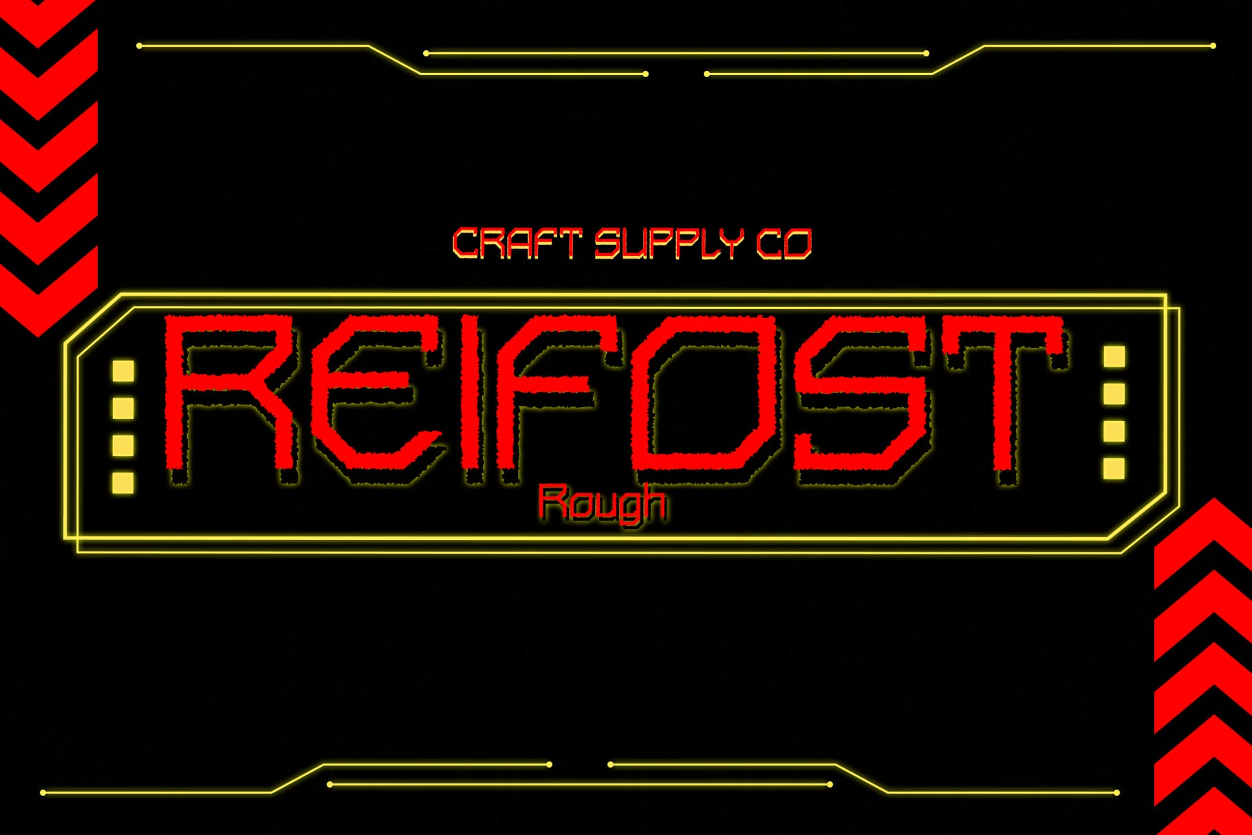
Reifost Rough Font brings a textured, imperfect direction to neon sign design. Rough typography can make a sign feel expressive, unconventional, and less polished than standard commercial lettering. This quality can be useful when a business wants to create an atmosphere inspired by underground culture, handmade graphics, or vintage industrial spaces.
Try this font for independent cafés, alternative bars, creative workshops, vintage inspired shops, and music venues. It can also work well in digital mockups for signs that combine glowing lettering with brick walls, distressed surfaces, or industrial materials. For actual neon fabrication, examine the rough details carefully because small irregularities may not translate cleanly into illuminated tubing.
4. Rebolt Rough Font
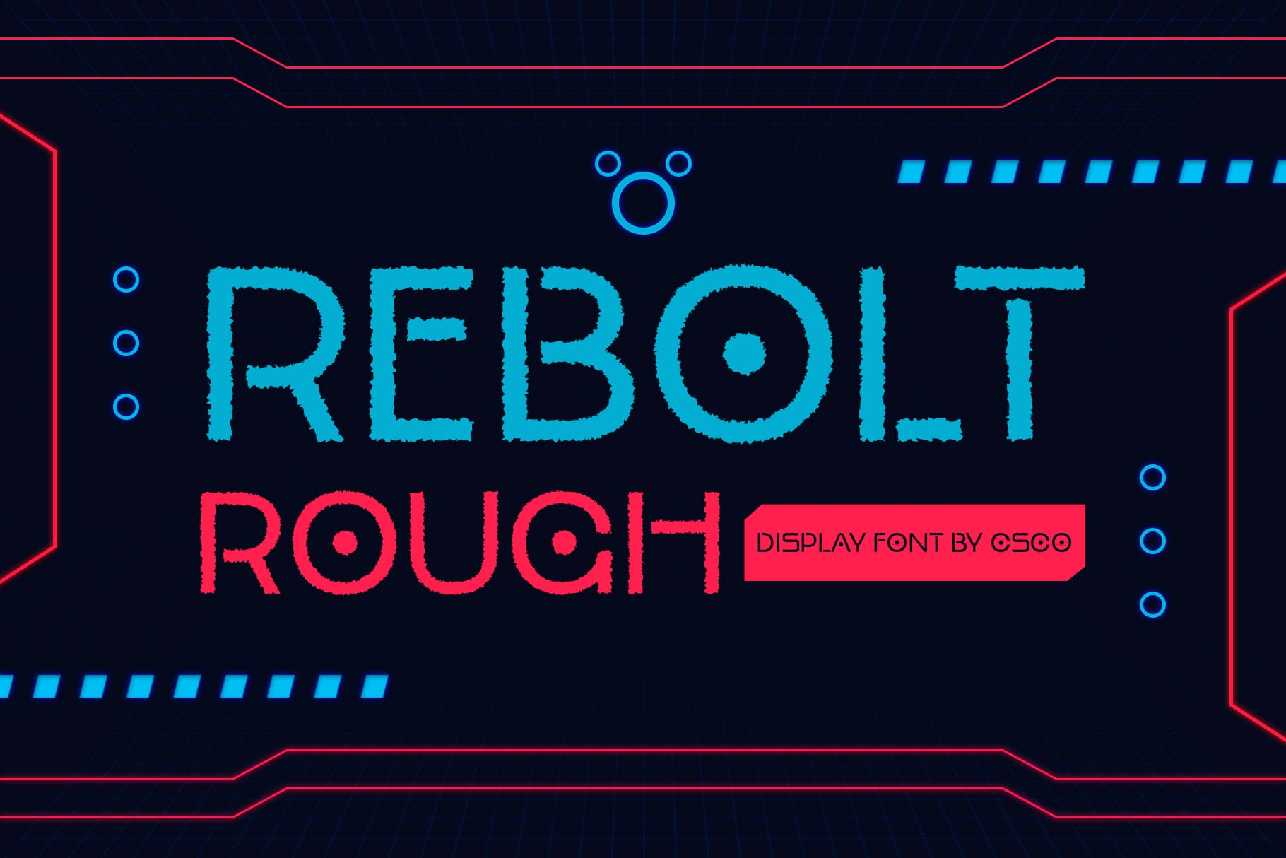
Rebolt Rough Font is worth considering when you want neon typography to feel bold, raw, and full of personality. Its rough visual direction can give a design a more rebellious attitude, making it a useful option for businesses that do not want their signage to look overly formal or predictable.
Use it as a creative starting point for streetwear stores, tattoo studios, alternative entertainment venues, music spaces, and event branding. Short phrases and compact brand names can help the lettering stand out without overwhelming the surrounding environment. Keep the supporting graphics relatively simple so the font remains the main attraction.
5. Liavin Rounded Font
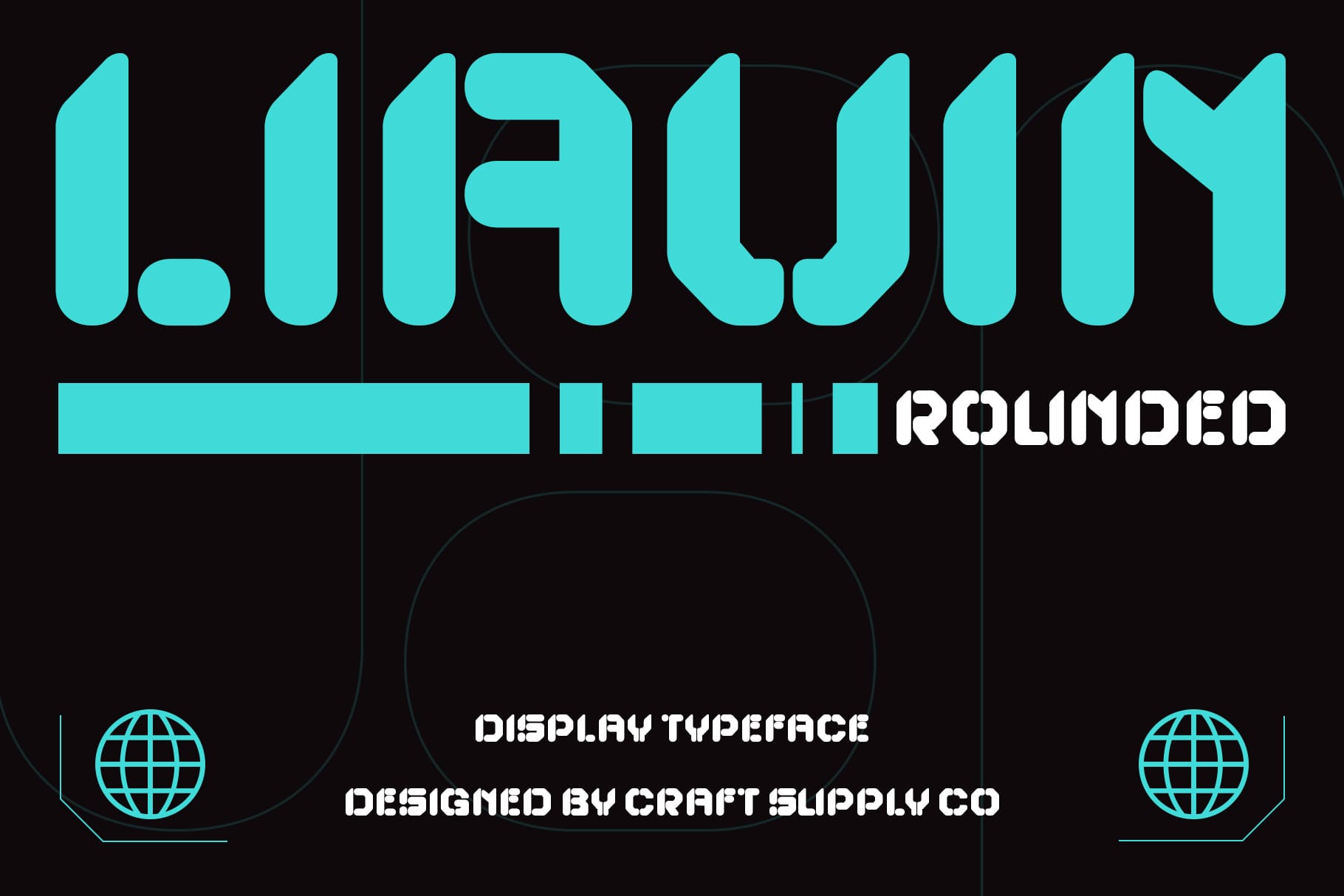
Liavin Rounded Font offers a softer visual direction for neon signs. Rounded typography can make a message feel approachable, friendly, and welcoming, which is especially useful for businesses that want their signage to attract attention without appearing aggressive. Its rounded character also provides an alternative to sharp, angular futuristic lettering.
Consider this font for cafés, dessert shops, beauty studios, lifestyle stores, creative offices, and welcoming hospitality spaces. It can suit short phrases, business names, or decorative wall signs that contribute to the atmosphere of an interior. When preparing a physical sign, check that the rounded letterforms maintain consistent spacing and remain recognizable when illuminated.
6. Alavine Pixel Font

Alavine Pixel Font is a distinctive option for neon signage inspired by digital graphics and retro gaming. Pixel typography references the visual language of early computer interfaces and arcade games, giving a sign a playful, technology driven personality. This can help a space communicate a specific theme without relying entirely on illustrations or decorative objects.
Use this font for gaming cafés, esports venues, arcade rooms, technology events, creative studios, or entertainment spaces with a nostalgic digital aesthetic. It can also work for digital neon mockups and promotional artwork. Because pixel lettering contains block like details, simplify the design when translating it into physical neon and make sure the finished message remains legible from the intended viewing distance.
7. Darille 3D Font

Darille 3D Font provides inspiration for neon sign designs that emphasize depth and dimensionality. Three dimensional typography can make lettering feel more substantial and dramatic, especially in digital compositions that combine glowing edges, shadows, and layered lighting effects.
This font can be explored for entertainment venues, exhibition graphics, promotional installations, event backdrops, and futuristic interior concepts. It is particularly useful when you want a sign to feel like a central visual feature rather than a simple label. For a real illuminated sign, remember that a three dimensional digital effect may require separate construction techniques and cannot necessarily be reproduced through neon tubing alone.
8. CS Love Y2K Font

CS Love Y2K Font is a creative option for neon designs influenced by the playful visual culture of the late 1990s and early 2000s. Y2K inspired typography can bring a nostalgic yet futuristic mood to signage, making it suitable for brands that embrace expressive graphics, pop culture, and youthful visual identities.
Try this font for fashion boutiques, beauty studios, themed parties, pop up events, creative cafés, and entertainment spaces. It can also support neon sign concepts that use bright pink, electric blue, purple, or other vivid accent colors. Keep the composition focused on one main phrase to prevent the playful style from becoming difficult to read.
9. CS Volans Drawn Font

CS Volans Drawn Font offers a more expressive direction for neon sign concepts. Drawn typography can introduce a personal, artistic quality that makes signage feel less generic. This approach can work particularly well for businesses that value creative expression and want their interiors to communicate a distinct personality.
Consider using this font for art studios, independent shops, creative cafés, event spaces, and boutique businesses. It can inspire a custom looking sign that complements illustrated branding or hand drawn graphic elements. If you plan to produce the design as an illuminated installation, test the lettering at full size and adjust intricate strokes or overlapping details to suit the fabrication method.
10. CS Valtrix Y2K Font
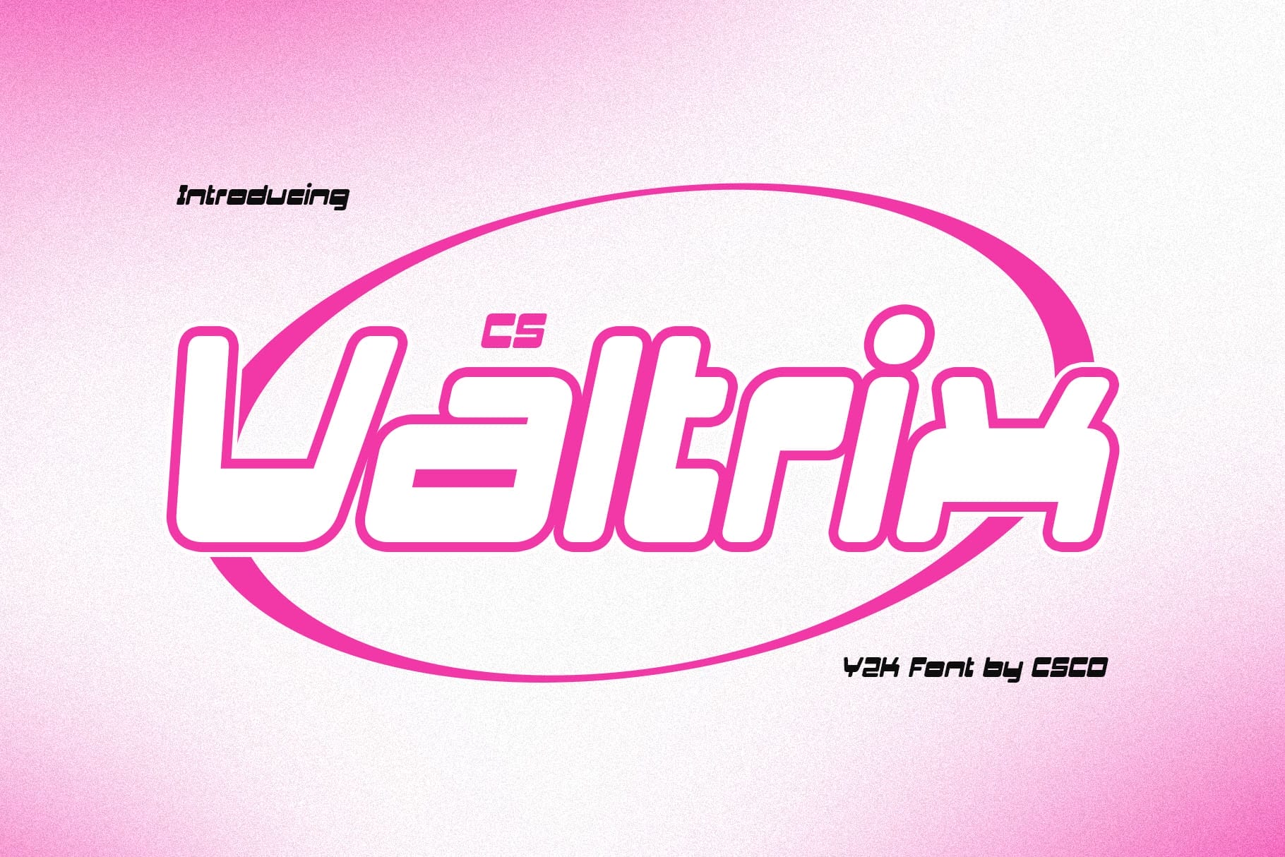
CS Valtrix Y2K Font completes this selection with another option for futuristic and retro digital neon concepts. Y2K inspired typography can help a design feel energetic and contemporary while referencing the playful technology aesthetics associated with the turn of the millennium. This style is particularly useful when a sign needs to communicate a strong visual identity.
Explore it for gaming spaces, fashion displays, nightlife branding, creative events, and modern entertainment venues. It can also work in digital concepts for illuminated logos and promotional graphics. Pair the font with a restrained background and a clear lighting treatment so the lettering remains the focal point of the composition.
Choosing the Right Neon Sign Font Style
Different fonts create different moods, so the best choice depends on the purpose of your sign and the personality of your brand. Before settling on a typeface, consider whether you want the finished design to feel futuristic, industrial, friendly, nostalgic, or artistic.
Futuristic and Experimental Neon Signs
For signs that emphasize digital culture and contemporary design, consider CS Central Refracted or CS Chastain Refracted. These options offer a direction for experimental typography and can inspire creative concepts for music venues, exhibitions, and modern retail spaces.
Rough and Industrial Neon Signs
If you want a raw, unconventional appearance, explore Reifost Rough Font and Rebolt Rough Font. Rough typography can complement industrial interiors, alternative businesses, and brands that want to communicate an independent attitude.
Friendly and Playful Neon Signs
For welcoming spaces and playful branding, Liavin Rounded Font offers a softer direction. Meanwhile, CS Love Y2K Font can inspire more expressive concepts for fashion, beauty, entertainment, and lifestyle businesses.
Retro Digital and Creative Neon Signs
For designs influenced by gaming, digital graphics, or nostalgic technology, consider Alavine Pixel Font and CS Valtrix Y2K Font. These styles can help establish a distinctive theme for gaming spaces, themed events, and contemporary entertainment venues.
Where to Use Neon Sign Typography
The right font can support a wide range of illuminated signage and digital design applications. Before choosing a typeface, identify the environment, viewing distance, and purpose of the sign.
- Storefront signs and retail displays
- Restaurant, café, and bar interiors
- Gaming rooms and entertainment venues
- Event backdrops and exhibition installations
- Beauty studios and creative workspaces
- Wall décor for homes and offices
- Music venues and nightlife branding
- Promotional graphics and digital neon mockups
- Brand names, logos, and short illuminated messages
- Photography backgrounds and social media content
Tips for Designing Effective Neon Signs
Start with a short message. Neon signs usually communicate most effectively when the wording is concise and the lettering has room to breathe. A memorable phrase or recognizable business name often creates a stronger result than a long sentence.
Next, pay attention to contrast. Bright lettering against a darker background can make the sign easier to recognize, but the surrounding colors should support the message rather than compete with it. Test the design in realistic lighting conditions, since reflections, ambient light, and viewing distance can change how the typography appears.
Letter spacing also matters. Fonts with tight spacing or complex details may need adjustments before fabrication. Consult your sign maker to determine the minimum stroke width, spacing, and curve requirements for the selected production method. A font that works beautifully in a digital mockup may need modifications to produce a clear and durable physical sign.
Finally, use effects with restraint. Glow, shadows, reflections, and dimensional treatments can strengthen a digital presentation, but too many effects can obscure the letterforms. Let the font establish the personality of the sign, then use lighting and color to reinforce that direction.
Common Mistakes to Avoid When Choosing Neon Fonts
One common mistake is prioritizing decorative style over readability. An intricate or highly experimental typeface may look impressive up close but become difficult to recognize from across a room or street. Always test your design at its intended viewing distance.
Another mistake is choosing a font without considering fabrication. Traditional neon tubing and LED neon flex have practical limitations, especially when a design includes sharp corners, narrow spaces, or complicated letterforms. Review the font with your sign fabricator before finalizing the artwork.
It is also easy to overcrowd a sign with multiple fonts, colors, and decorative effects. Instead, select one main typeface and build the composition around it. A focused design often creates a more recognizable and professional result.
The right font recommendation for neon signs depends on the atmosphere you want to create. Refracted typography can inspire futuristic concepts, rough fonts can introduce an industrial character, rounded lettering can make a business feel welcoming, and pixel or Y2K styles can bring a nostalgic digital influence to illuminated displays.
The 10 neon sign font options featured in this guide offer different creative directions for storefronts, bars, cafés, studios, gaming spaces, events, and decorative installations. Explore CS Central Refracted for experimental concepts, Liavin Rounded Font for a softer personality, or Alavine Pixel Font for a digital inspired look. Remember to evaluate each typeface in context and adapt the lettering to the practical requirements of the final sign.
For more typography inspiration and creative design ideas, explore the work of Craft Supply Co. Discovering different lettering styles can help you develop a stronger visual direction for your next signage project and create designs that remain memorable long after the lights turn on.
Whether you are designing a glowing business name, an expressive interior feature, or a bold promotional display, choose a font that balances personality, clarity, and practical production needs. With thoughtful typography and a focused composition, your neon sign can become a distinctive part of the space and the brand it represents.