
Typography can become one of the most memorable elements of a mural. Whether you are painting a public wall, creating a branded interior, designing an urban art piece, or adding lettering to a large-scale illustration, the right font can help the message become part of the artwork. Font selection is also important for enhancing the character of a mural, font recommendation for mural help give the mural a creative look.
A strong font recommendation for mural design needs to work differently from typography used in small digital graphics. Murals are often viewed from a distance, across large walls, and from different angles. The lettering needs enough visual presence to remain recognizable while also complementing the surrounding artwork.
Large-scale wall art also gives designers more freedom to experiment. Psychedelic fonts can create flowing visual movement, graffiti fonts can introduce an urban character, 3D lettering can add depth, and hand-drawn fonts can make the mural feel more personal.
In this guide, we explore ten creative fonts from Craft Supply Co that can inspire mural lettering, wall art, street art, commercial interiors, event spaces, and other large-scale creative projects.
What Makes a Good Font for a Mural?
A mural font needs to balance artistic personality with readability. Unlike a small poster or social media graphic, a mural can occupy an entire wall and may be viewed from several meters away. This means the typography should have a clear silhouette and enough contrast with the background.
When selecting a font recommendation for mural for mural lettering, consider:
- Large-scale readability: The words should remain recognizable from a reasonable viewing distance.
- Strong visual character: A mural font should contribute to the artistic identity of the wall.
- Clear shapes: Distinctive letterforms can make the lettering easier to recognize.
- Composition: The font should work with illustrations, patterns, and surrounding artwork.
- Scalability: The typeface should maintain its visual character when enlarged significantly.
- Theme compatibility: The font should match the atmosphere of the mural and its environment.
You should also consider the physical surface. A font that looks excellent on a smooth digital mockup may behave differently when painted on brick, concrete, wood, or another textured wall.
Font Recommendation for Mural Design
There is no single perfect font recommendation for mural. The right choice depends on the style of artwork, location, audience, and message. The following font recommendation for mural cover psychedelic, graffiti, distorted, 3D, and hand-drawn directions.
1. CS Rampage Psychedelic Font

CS Rampage Psychedelic Font is a strong choice for murals that need an energetic and unconventional visual identity. Psychedelic typography can create flowing movement and transform ordinary words into graphic shapes.
Use it for music murals, creative studios, entertainment spaces, festival walls, art installations, and colorful lifestyle interiors. The expressive forms can also work well when the lettering needs to interact with surrounding illustrations.
For a large wall, consider using the font at an oversized scale and allowing some of the lettering to overlap or interact with the artwork.
2. CS Shiver Psychedelic Font
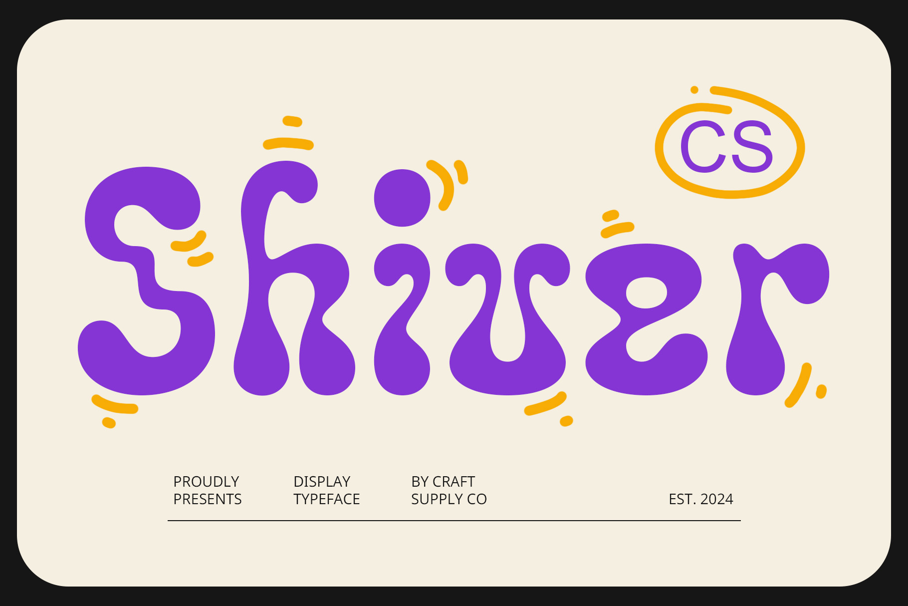
CS Shiver Psychedelic Font provides another expressive option for mural lettering. Its psychedelic direction can create a sense of movement and visual distortion, making the words feel like part of the artwork rather than ordinary text.
Consider it for music venues, creative businesses, event spaces, art walls, fashion environments, and experimental murals. It can also work well with bold color combinations and flowing illustrations.
When using a highly expressive font, keep the main phrase relatively short. Short words give the letterforms more space and help maintain readability.
3. CS Graze Psychedelic Font
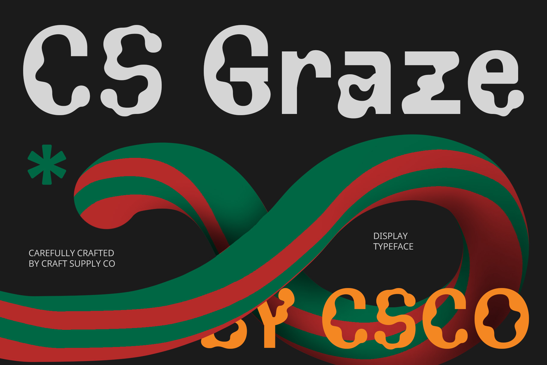
CS Graze Psychedelic Font offers another flowing and artistic direction for large-scale typography. Psychedelic letterforms can create an immersive visual effect, particularly when the lettering becomes part of a larger illustrated composition.
Try it for creative murals, restaurant interiors, music artwork, festival walls, art studios, and lifestyle spaces. It can also complement organic shapes, abstract illustrations, and colorful patterns.
Use strong contrast between the lettering and wall background so the artistic forms remain visible from a distance.
4. CS Lachen Psychedelic Font
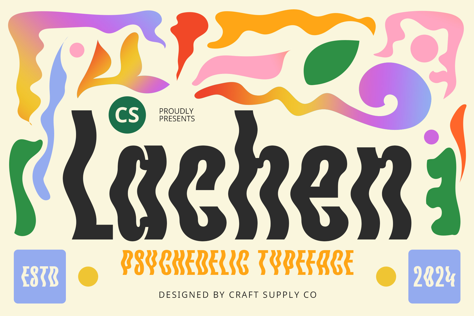
CS Lachen Psychedelic Font can bring a playful and experimental quality to mural typography. Its unusual forms can help create a focal point within a large composition.
Use it for entertainment spaces, youth-oriented interiors, creative studios, festival graphics, music-related murals, and artistic installations. The font can also work well when the mural aims for a dreamlike or unconventional atmosphere.
Because psychedelic typography can contain complex shapes, test the lettering at full scale before committing to the final wall.
5. Triompe Psychedelic Typeface

Triompe Psychedelic Typeface offers another distinctive direction for expressive mural lettering. Its psychedelic style can help transform a short phrase into a major graphic feature.
Consider it for art installations, creative retail interiors, music venues, festival walls, fashion spaces, and cultural projects. It can also create an interesting contrast when placed alongside simpler geometric illustrations.
For a balanced mural, use the typeface for the main phrase and keep secondary information in a simpler style.
6. Balwine Rippled
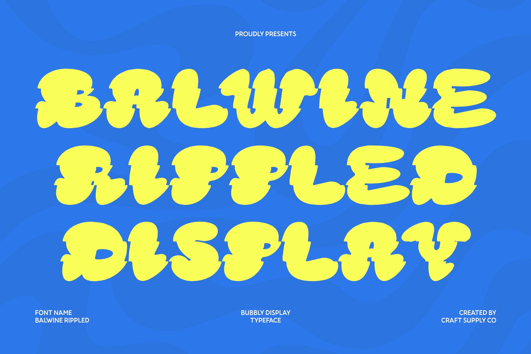
Balwine Rippled provides a distorted and flowing visual direction that can work particularly well on large surfaces. Rippled typography can make the letters appear as though they are moving, bending, or interacting with the surrounding artwork.
Use it for abstract murals, creative interiors, music spaces, experimental branding, and artistic wall installations. The effect can become even more interesting when the mural uses gradients or flowing shapes that continue through the lettering.
Keep enough space around the words so the rippled forms remain visually distinct.
7. Urban Graffiti Font Busky
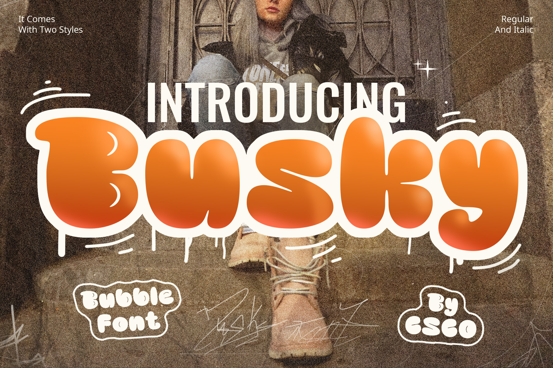
For an urban direction, Urban Graffiti Font Busky can provide a more street-inspired approach to mural lettering. Graffiti typography has a natural connection to large-scale walls and urban art, making it useful for projects that want an energetic city aesthetic.
Consider it for streetwear stores, creative studios, youth spaces, restaurants, music venues, skate-inspired interiors, and urban-themed murals.
Graffiti lettering can become quite dense, so use color contrast and negative space carefully. Make sure the most important words remain recognizable even when the design contains additional artistic details.
8. CS Boyka Drawn

CS Boyka Drawn offers a hand-drawn alternative for mural designs that need a more personal and expressive character. Hand-drawn typography can make a wall feel less formal and more connected to the artist’s individual style.
Use it for creative studios, cafés, restaurants, children’s spaces, community projects, lifestyle businesses, and illustrated murals. It can also work nicely alongside hand-drawn characters and illustrations.
For a cohesive composition, repeat some of the font’s visual qualities in the surrounding illustrations or decorative elements.
9. Neckyn 3D Font

3D typography can make a mural headline appear to have physical depth. Neckyn 3D Font is a useful direction when the lettering needs to feel dimensional and visually prominent.
Use 3D typography for entertainment spaces, gaming environments, sports interiors, retail walls, creative offices, and promotional murals. The dimensional effect can work particularly well when the wall design includes shadows, perspective, or architectural elements.
When painting 3D lettering, plan the light direction carefully so the shadows remain consistent throughout the mural.
10. Rastely Blur Font

Rastely Blur Font offers a more experimental approach to mural typography. Blur-inspired lettering can suggest speed, motion, distortion, and energy, making it an interesting choice for contemporary wall art.
Consider it for music venues, creative offices, fashion interiors, digital-themed spaces, sports environments, and experimental murals.
Because blurred typography can reduce readability, use it for short words or phrases and create strong contrast against the surrounding wall.
How to Choose a Mural Font
Start by identifying the purpose of the mural. A community mural may need approachable lettering, while a music venue can support more experimental typography. A commercial mural may need to communicate a brand name clearly, while an art installation can prioritize visual expression.
Next, think about the viewing distance. If people will see the mural from across a large room or from the other side of a street, choose letterforms with a strong silhouette. Highly detailed fonts can still work, but they should receive enough scale to remain recognizable.
Also consider the background. If the mural already contains complex illustrations, a simpler lettering style may create better contrast. If the background is relatively open, you have more freedom to use an expressive display font.
Psychedelic Fonts for Murals
Psychedelic typography can be particularly effective for murals because large surfaces give the flowing letterforms enough room to expand. CS Rampage, CS Shiver, CS Graze, CS Lachen, and Triompe can provide different directions for creating an immersive visual experience.
Try integrating the lettering with the surrounding artwork. Instead of treating the words as separate elements, allow lines, colors, patterns, and illustrations to interact with the letterforms.
However, maintain a clear focal point. If every part of the mural contains intense detail, viewers may struggle to identify the main message.
Graffiti Fonts for Mural Art
Graffiti typography has a natural connection to mural culture. A graffiti-inspired font can create an urban atmosphere and work well with street art, fashion, music, and youth-oriented projects.
Urban Graffiti Font Busky is a useful direction when you want the lettering to become part of a street-inspired composition. Combine it with bold outlines, shadows, textures, or illustrated elements where appropriate.
Remember that graffiti-style lettering can become difficult to read when heavily decorated. Keep important words clear and use visual effects to support the letters rather than hide them.
3D Fonts for Wall Murals
Three-dimensional lettering can make a mural feel more immersive. Instead of simply painting flat words, designers can use perspective, shadows, highlights, and depth to make the typography appear to project from the wall.
Neckyn 3D Font can provide a starting point for this approach. Before painting, create a digital mockup to determine how the 3D effect will interact with the wall’s architecture and lighting.
Consistent lighting is essential. If the shadow direction changes between letters, the dimensional effect can become confusing.
How to Make Mural Typography Readable
Artistic typography should still communicate its message. Start by keeping the main phrase short and use enough spacing between words. Strong contrast between the letters and background can also improve visibility.
Consider the wall’s physical texture. Rough brick and concrete can break up fine details, while smooth surfaces allow more intricate letterforms to remain visible.
It is also helpful to view the design from several distances. Stand close to inspect the details, then step back to see whether the main words remain recognizable. If the mural will appear in photographs, check the design through a camera as well.
Font Pairing Tips for Murals
Large-scale artwork often benefits from a clear typographic hierarchy. You do not need several elaborate fonts to make the mural interesting.
- Display font + simple sans serif: Use the artistic font for the main phrase and the simple font for supporting information.
- Graffiti font + clean typeface: Let the graffiti style establish the urban character while the supporting font maintains readability.
- 3D font + minimalist font: Make dimensional lettering the focal point and keep other text understated.
- Psychedelic font + simple lettering: Allow the psychedelic typeface to provide visual movement while supporting text remains clear.
- Hand-drawn font + geometric font: Create contrast between organic lettering and structured supporting elements.
The right font recommendation for mural design depends on the project’s artistic direction, physical environment, audience, and message. Large walls provide an excellent opportunity to experiment with typography, but successful mural lettering still needs a strong balance between creativity and readability.
For psychedelic murals, CS Rampage, CS Shiver, CS Graze, CS Lachen, and Triompe can create expressive and flowing compositions. Balwine Rippled and Rastely Blur can introduce distortion and movement, while Urban Graffiti Font Busky provides a street-inspired direction.
For more dimensional or handmade approaches, Neckyn 3D Font and CS Boyka Drawn offer different ways to make the typography feel more physical and personal.
Before committing to the final wall, create a full-scale or accurately proportioned mockup. Test the typography from multiple distances and check how it interacts with the wall texture, lighting, illustrations, and surrounding architecture.
A successful mural font does more than display words. It becomes part of the artwork. By choosing typography that supports the theme and planning the composition carefully, you can create wall lettering that remains visually engaging while communicating its message clearly.
For more creative display fonts and typography inspiration, explore Craft Supply Co. You can also discover more design and typography projects from Craft Supply Co on Behance.