
Typography can make a horror movie poster feel unsettling before the audience even sees the full artwork. A carefully chosen typeface can suggest fear, mystery, darkness, suspense, or supernatural danger while helping the movie title become the most memorable element of the composition. If you are looking for a Font recommendation for Horror Movie Poster designs, the right font can dramatically change the atmosphere of your artwork.
Horror typography comes in many forms. Vintage horror fonts can create the feeling of an old cult film, Gothic lettering can suggest supernatural or historical themes, while distressed and stamped fonts can make a poster feel aged and unsettling. Hand drawn styles can also create an unpredictable quality that works well for psychological horror, independent films, and experimental movie artwork.
In this guide, we explore ten font recommendation for Horror Movie Poster from Craft Supply Co that can be used for horror movie titles, posters, trailers, streaming thumbnails, promotional artwork, social media graphics, and other dark cinematic projects.
What Makes a Good Font for a Horror Movie Poster?
A horror movie font should establish the mood without overwhelming the rest of the poster. Since horror artwork often contains dramatic photography, illustrations, shadows, textures, and atmospheric effects, the typography needs to work with these elements rather than compete with them.
Vintage horror fonts can suggest classic cinema and retro poster design. Gothic fonts are useful for supernatural, occult, historical, or dark fantasy themes. Distressed and stamped lettering can make a title feel aged, damaged, or mysterious, while serif display fonts can create a more cinematic and psychological atmosphere.
Readability is also important. A movie title needs to be recognizable quickly, particularly when the poster is viewed as a thumbnail online. Highly decorative fonts are often best reserved for the title and major headlines, while simpler typography can handle release dates, cast information, credits, and other supporting details.
10 Font Recommendations for Horror Movie Posters
1. CS Sharow Vintage Horror Font

CS Sharow is a natural choice for a classic horror movie poster aesthetic. Its vintage horror direction can help evoke the atmosphere of old cinema posters while giving a modern design a dark and theatrical personality.
Use CS Sharow for the main movie title, promotional posters, teaser artwork, DVD or streaming graphics, and social media campaigns. It can work especially well when paired with aged textures, dramatic shadows, vintage photography, or atmospheric illustrations.
2. CS Goster Vintage Horror Font
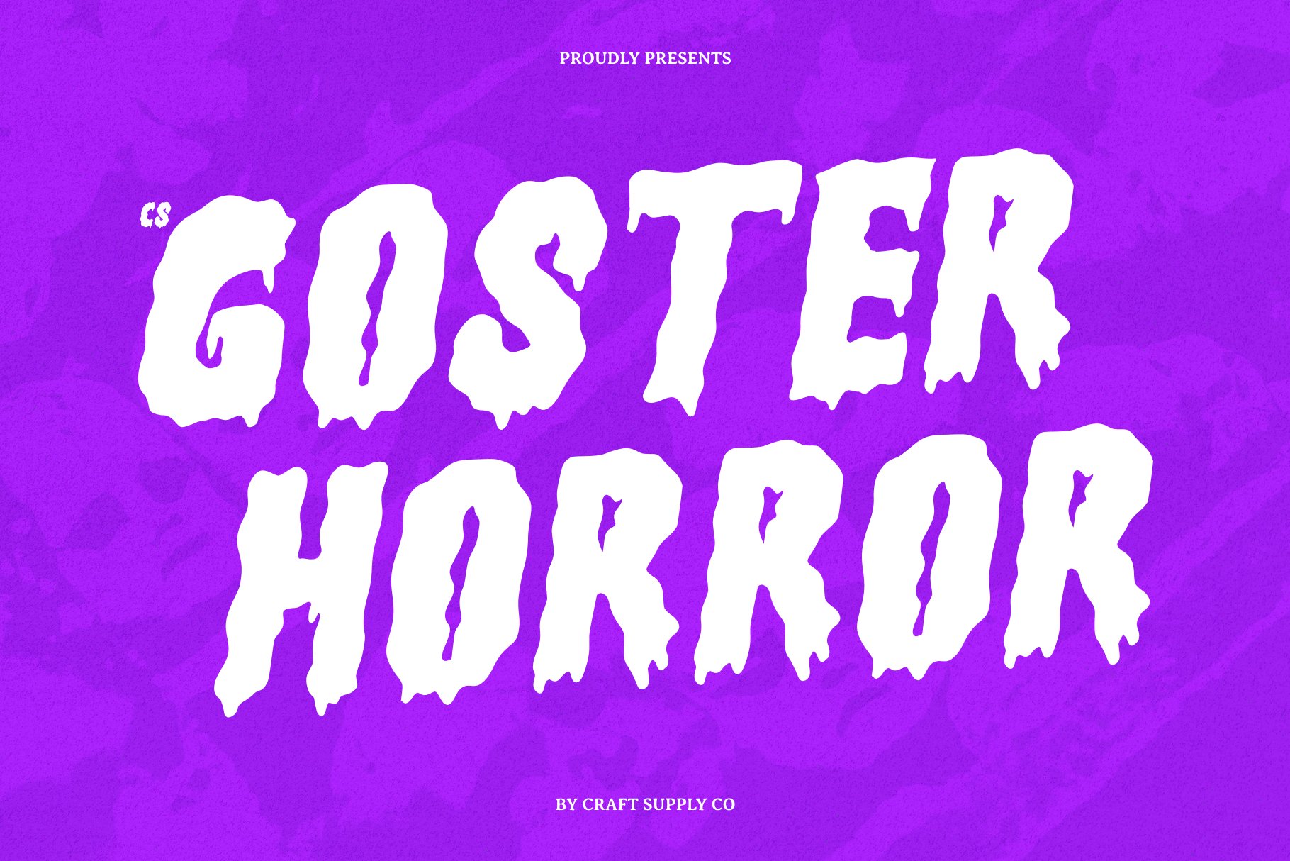
CS Goster provides another vintage horror direction for designers who want their typography to feel connected to classic horror aesthetics. A vintage-inspired display font can give a fictional movie the visual character of an old theatrical release.
Try CS Goster for haunted house stories, supernatural films, creature features, psychological horror, and retro inspired productions. It can also work well on posters where the title needs to feel dramatic without relying on excessive effects.
3. Cambrine Halfpixel

Cambrine Halfpixel offers a more unusual direction for horror typography. A pixel inspired treatment can introduce a digital and technological atmosphere, making it suitable for modern horror projects involving computers, virtual worlds, games, surveillance, or digital threats.
Use it for experimental horror posters, technology based thrillers, streaming graphics, game inspired horror artwork, and digital promotional campaigns. It can also provide an interesting contrast when combined with dark photography or glitch-inspired effects.
4. CS Bunsen Vintage Horror Font

CS Bunsen is another useful option for creating a vintage horror atmosphere. Its display oriented horror character can help establish the tone of a movie title while maintaining a strong visual presence on a poster.
Use Bunsen for classic horror concepts, monster movies, supernatural thrillers, Halloween campaigns, and retro cinematic artwork. Combine it with distressed backgrounds or vintage inspired illustrations to reinforce the period aesthetic.
5. CS Oztende Stamp

CS Oztende Stamp offers a stamped and distressed direction that can add an aged quality to horror typography. This type of treatment is useful when you want the title to feel like an old printed artifact or a mysterious mark discovered in an unsettling story.
Consider using Oztende for horror posters, thriller artwork, fictional case files, found-footage concepts, haunted locations, and promotional badges. It can also work as a secondary graphic element alongside a more traditional horror title.
6. CS Alarix Serif Display Font

CS Alarix offers a serif display direction that can bring a more sophisticated cinematic quality to horror typography. Not every horror film needs distressed or obviously frightening lettering. A refined serif can create tension by looking elegant while suggesting something darker beneath the surface.
Use Alarix for psychological thrillers, gothic horror, mystery films, period horror, and atmospheric movie posters. It can work particularly well with minimalist layouts where the title needs to carry much of the visual identity.
7. CS Another Stamp
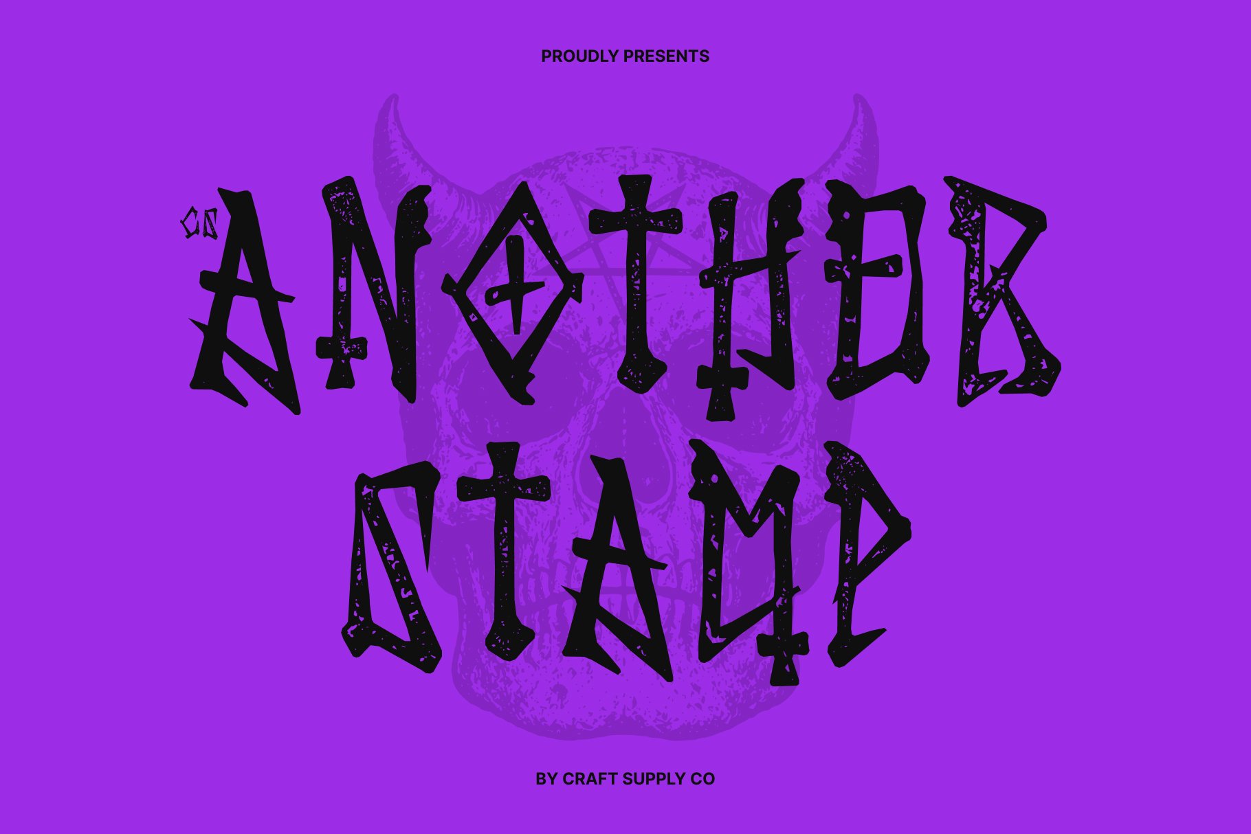
CS Another Stamp provides another textured option for horror poster designs. Stamp inspired typography can introduce imperfections that make the lettering feel physical, aged, and slightly unsettling.
Use it for horror movie titles, promotional badges, fictional warning labels, teaser graphics, merchandise, and social media artwork. It can also be layered with subtle textures to create a more distressed cinematic effect.
8. CS Nemesis Drawn

CS Nemesis Drawn brings a hand-rendered quality to horror typography. A drawn font can be useful when the design needs to feel personal, unstable, mysterious, or connected to a character’s handwriting.
This makes it suitable for psychological horror, supernatural stories, independent films, horror comics, fictional diaries, and mysterious movie concepts. Use it for short titles or key phrases where the hand drawn quality can remain visually prominent.
9. Highand Gothic Horror Font
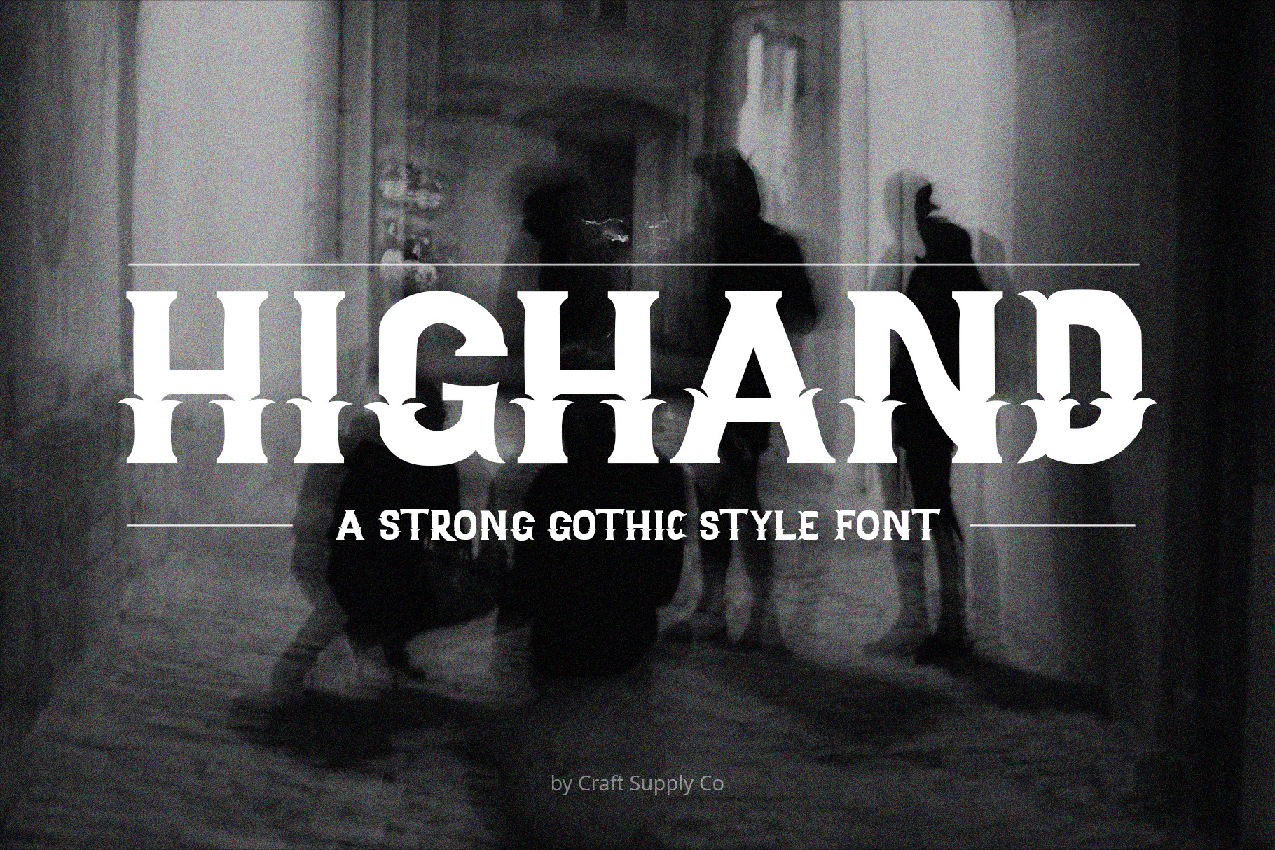
Highand offers a Gothic horror direction for projects that need a darker and more dramatic identity. Gothic typography naturally complements themes involving haunted locations, supernatural forces, occult imagery, dark fantasy, and historical horror.
Use Highand for movie titles, posters, book covers, Halloween campaigns, horror merchandise, and atmospheric promotional graphics. Pair it with dark imagery and controlled spacing to keep the design dramatic without becoming overly crowded.
10. CS Another Gothic Font
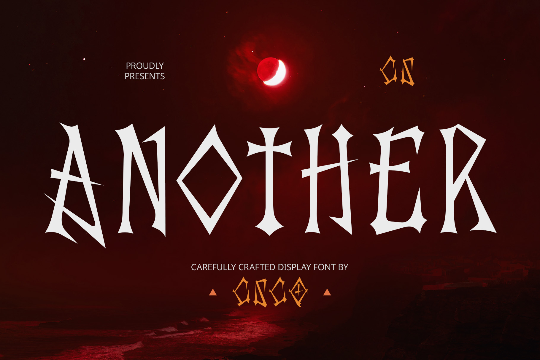
CS Another Gothic provides a further option for designers who want traditional Gothic character in a horror poster. Gothic lettering can create a strong historical and mysterious feeling, especially when combined with old buildings, supernatural imagery, or dramatic photography.
Use it for Gothic horror movies, vampire stories, haunted castles, occult thrillers, dark fantasy, and period-inspired horror. Its strong display character makes it particularly suitable for large movie titles and promotional artwork.
Choosing a Horror Font by Movie Genre
The best Font recommendation for Horror Movie Poster depends on the type of fear your film is trying to create. Different horror subgenres can benefit from completely different typographic approaches.
Vintage Horror
Classic horror films can benefit from typography with a vintage character. CS Sharow, CS Goster, and CS Bunsen are useful options for creating the atmosphere of older horror cinema and retro promotional artwork.
Gothic Horror
Gothic fonts are particularly effective for supernatural stories, vampires, haunted castles, occult themes, and historical horror. Highand and CS Another Gothic can help establish this darker visual direction.
Psychological Horror
Psychological horror does not always need an obviously frightening font. A refined serif such as CS Alarix can create an elegant surface while the imagery and composition introduce the disturbing elements. CS Nemesis Drawn can provide another direction when the design needs a more personal or unstable quality.
Digital Horror
Technology-focused horror can benefit from unusual digital typography. Cambrine Halfpixel can introduce a pixel-inspired character suitable for stories involving computers, artificial intelligence, virtual environments, or digital surveillance.
Found-Footage Horror
For found-footage or documentary-style horror, stamped and distressed typography can help make the poster feel connected to physical evidence or archived material. CS Oztende Stamp and CS Another Stamp can work well for this concept.
Where to Use Horror Movie Fonts
A horror font can become part of the film’s broader visual identity. Consider using the chosen typeface consistently across promotional materials.
- Horror movie posters
- Movie title treatments
- Film festival artwork
- Streaming thumbnails
- Movie trailers
- Teaser campaigns
- Social media graphics
- DVD and Blu-ray artwork
- Horror merchandise
- Film website headers
- Halloween promotional campaigns
- Movie title cards
How to Pair Fonts for a Horror Movie Poster
Horror posters often contain multiple pieces of information, including the movie title, tagline, release date, credits, and promotional copy. Using one decorative horror font for everything can quickly make the design difficult to read.
Instead, reserve the most distinctive font for the movie title. Pair it with a clean serif or sans serif for secondary information. This creates a clear hierarchy and allows the title to remain the most memorable element.
You can also use a second decorative style sparingly. For example, a Gothic movie title could be accompanied by a subtle stamped badge, while a vintage horror title could use a clean supporting typeface for the release information.
Using Texture and Effects with Horror Typography
Typography is only one component of an effective horror poster. Texture, lighting, imagery, and composition can strengthen the emotional effect of the chosen font.
Distressed textures can make lettering look aged or damaged. Shadows can create depth, while subtle blur or distortion can suggest instability. Grain and paper textures can support vintage horror concepts, while darker backgrounds can make lighter typography stand out.
However, avoid adding too many effects at once. A strong font can already communicate the mood. Excessive glow, distortion, scratches, shadows, and textures can make the title difficult to recognize, especially when the poster is viewed at a small size.
Common Mistakes When Choosing Horror Fonts
One common mistake is choosing a font that is frightening but unrelated to the movie’s story. Horror is a broad genre, and a Gothic typeface may be perfect for a supernatural film but inappropriate for a modern psychological thriller.
Another mistake is sacrificing readability. Horror fonts can have unusual letterforms, rough textures, or intricate details. Make sure the movie title remains recognizable, especially in digital thumbnails and promotional images.
It is also easy to make the poster visually overcrowded. Horror designs often use dramatic imagery, dark textures, effects, and illustrations. A simpler typographic treatment can sometimes create more tension than an overly complicated one.
Finding the right Font recommendation for Horror Movie Poster means matching typography to the specific atmosphere of the film. Vintage horror fonts can create a classic cinematic feeling, Gothic styles can communicate supernatural darkness, stamped fonts can suggest mysterious evidence, and hand-drawn or pixel-inspired fonts can support more unconventional horror concepts.
The ten font recommendation in this guide provide a variety of creative directions. CS Sharow, CS Goster, and CS Bunsen are useful for vintage horror aesthetics, while Highand and CS Another Gothic provide darker Gothic options. CS Oztende Stamp and CS Another Stamp add distressed character, while CS Alarix offers a more sophisticated cinematic approach. Cambrine Halfpixel and CS Nemesis Drawn provide more experimental possibilities.
Before choosing your final typeface, test the movie title against the actual poster artwork. Make sure the font remains readable, complements the imagery, and communicates the right type of fear. A successful horror poster does not simply look frightening it creates curiosity and makes the audience want to discover what is hiding behind the title.
For more typography inspiration and creative lettering projects, explore Craft Supply Co on Behance.