
Choosing the right font for children designs can make a big difference in how a project feels. Typography can make a children’s book look more inviting, help an educational poster feel more engaging, or give a birthday card a cheerful personality. When the letters have an approachable shape and a clear visual character, they can complement illustrations and make the overall design feel more memorable. Font recommendation for children designs are available here.
A good font recommendation for children should balance personality and readability. Children projects often use bright colors, illustrations, characters, patterns, and playful layouts, so the typography needs to work naturally with those visual elements. A highly decorative typeface may look excellent in a short title, while a simpler font may work better for longer passages.
This guide explores ten playful and distinctive Font recommendation for children from Craft Supply Co that can inspire designs for book stories, child education posters, and birthday cards for children. The selections include stamp-inspired, hand-drawn, and expressive display styles that can bring extra character to children creative projects.
What Makes a Good Font for Children’s Designs?
Children typography does not always need to look childish. The most useful approach is to choose a font that matches the project’s age group, subject, and visual style. A picture book for young children might benefit from friendly and expressive lettering, while an educational poster for older children may need a more structured display font.
When selecting fonts for children projects, consider the following characteristics:
- Clear letterforms: Children and parents should be able to recognize the words easily.
- Playful personality: Expressive typography can complement illustrations and characters.
- Strong visibility: Titles and important information should stand out clearly.
- Age-appropriate style: The font should suit the intended audience.
- Versatility: A useful font can work across books, posters, cards, packaging, and digital graphics.
- Visual warmth: Friendly shapes can make a design feel more welcoming.
It is also useful to separate display typography from body typography. A decorative font can create an exciting title, but a simpler typeface often works better for several paragraphs of text.
Font Recommendation for Children
There is no single best font for every children project. A storybook, classroom poster, and birthday invitation have different purposes. The following recommendations cover a variety of playful styles so you can choose a typeface that matches your project.
1. CS Rema Stamp

CS Rema Stamp offers a textured display style that can give children designs a tactile, printed personality. The stamp-inspired appearance can work particularly well when you want the typography to feel handmade rather than perfectly digital.
Try it for children storybook titles, classroom activity posters, craft projects, playful packaging, and creative event graphics. It can also work nicely with illustrations that have a traditional print or handmade appearance.
For a children book cover, use CS Rema Stamp for the main title and combine it with a simpler supporting font for the author’s name or additional information.
2. CS Roche Stamp
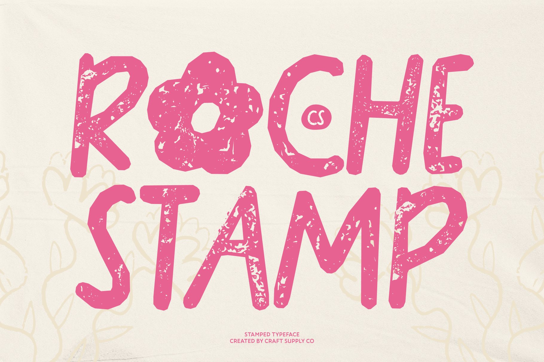
CS Roche Stamp provides another stamp-inspired option for children creative projects. Its textured character can add personality to short words and headlines while helping the typography become part of the illustration.
Consider this style for adventure-themed children books, educational activities, classroom displays, birthday graphics, stickers, and craft designs. It can work especially well when paired with playful illustrations, paper textures, or colorful shapes.
Because stamp typography has a strong visual character, keep longer supporting text in a more straightforward font to maintain readability.
3. CS Owelis Handdrawn Halloween Font

CS Owelis is a fun choice for children projects with a Halloween or spooky theme. Its hand-drawn character can help create a playful atmosphere without requiring complicated graphic effects.
Use it for Halloween storybooks, children party invitations, classroom Halloween posters, themed worksheets, decorations, and social media graphics. The hand-drawn quality can also complement illustrations of pumpkins, ghosts, monsters, bats, and other seasonal characters.
For younger audiences, pair the font with friendly illustrations and bright visual elements rather than relying entirely on dark or frightening imagery.
4. CS Roast Stamp

CS Roast Stamp can bring a bold, tactile quality to children typography. A stamp-style font can make a title feel as though it came from a physical craft project, which fits naturally with handmade children activities.
Use it for story titles, educational activity sheets, classroom posters, children’s merchandise, craft event graphics, and playful labels. It can also provide an interesting contrast against clean illustrations and simple backgrounds.
For a classroom design, consider using the font only for the main heading and keeping instructions in a highly readable typeface.
5. CS Meila Stamp

CS Meila Stamp is another expressive option for designers creating playful children graphics. Its stamp-inspired appearance can add a handmade quality to titles and short phrases.
This style can work for children book covers, birthday invitations, classroom decorations, activity cards, stickers, and creative posters. It can also support a vintage craft aesthetic when paired with paper textures and simple illustrations.
For a birthday card, use CS Meila for the main greeting and complement it with a clean supporting typeface for the child’s name, date, or party details.
6. CS Raving Stamp
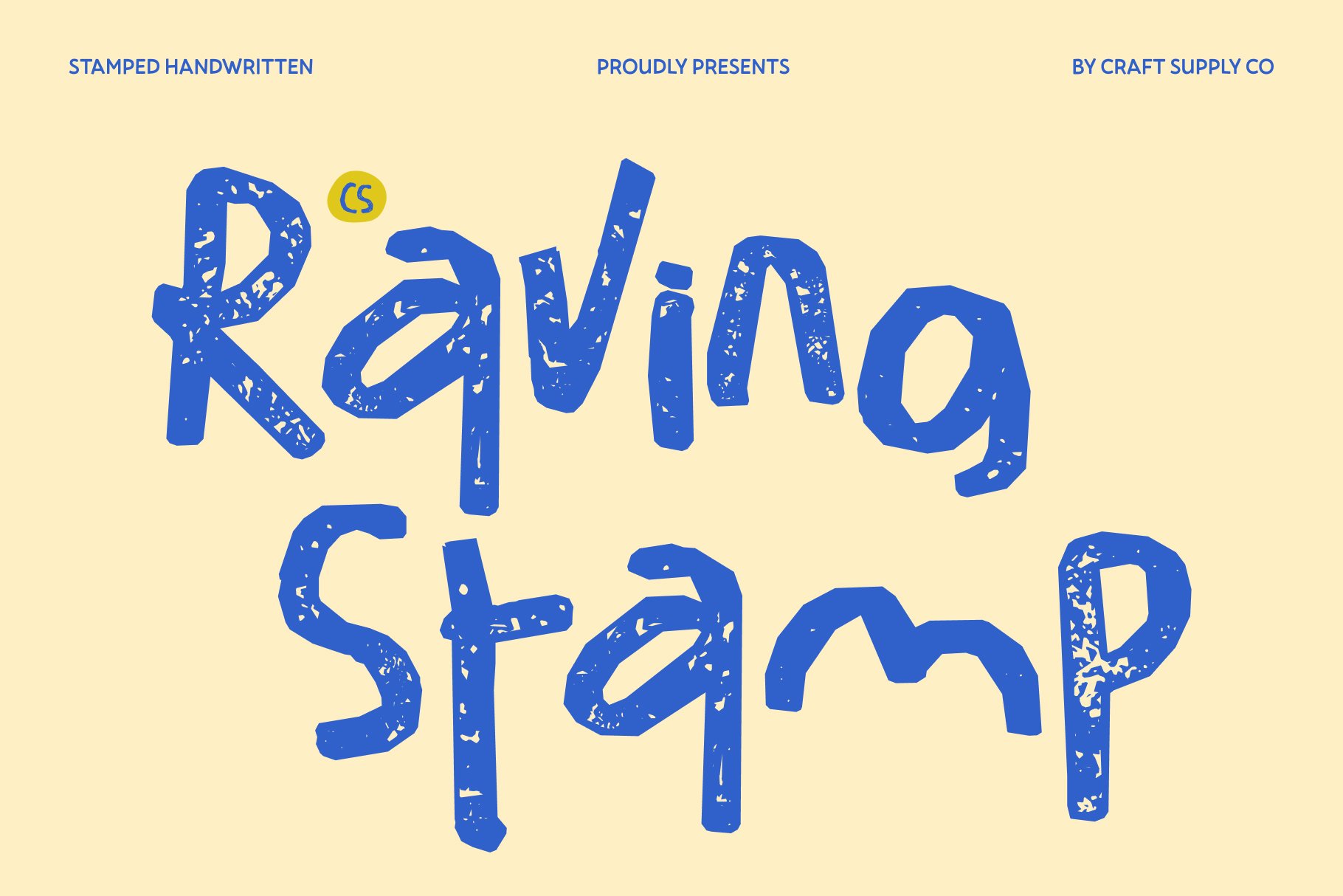
CS Raving Stamp offers an energetic direction for children designs. Its display-oriented character can help short words and phrases stand out, making it useful for titles and prominent messages.
Consider this font for children activity posters, school events, adventure-themed projects, party invitations, games, and colorful promotional graphics. Its stronger visual personality can help create a sense of movement and excitement.
Use it selectively when the design already contains multiple illustrations or colors. Giving the headline enough surrounding space will help it remain readable.
7. CS Damaris Stamp

CS Damaris Stamp can give children typography a handcrafted printed appearance. This makes it useful when you want a project to feel creative, tactile, and slightly nostalgic.
Try it for storybook titles, classroom signs, educational activity cards, birthday designs, children’s packaging, and handmade craft projects. It can work especially well with illustrations that use simple shapes and visible textures.
A short title can make the most of the font’s display character without making the design difficult to read.
8. CS Carys Stamp

CS Carys Stamp offers another distinctive direction for children typography. Stamp-inspired lettering can help create the feeling of a handmade print, making it a useful alternative to standard digital display fonts.
Use it for children books, educational posters, classroom projects, birthday cards, activity sheets, and creative merchandise. It can also work nicely with simple illustrations and colorful shapes.
For a balanced composition, reserve the font for titles and key words while using a clearer typeface for detailed instructions.
9. CS Barbara Stamp

CS Barbara Stamp can add character to short children headlines and creative messages. Its textured display approach can make typography feel more like part of a physical craft project.
This makes it suitable for children birthday cards, classroom decorations, book covers, event posters, stickers, and educational graphics. It can also complement illustrations that use rough, hand-made, or screen-printed visual textures.
Try combining it with rounded shapes and friendly illustrations to create a cohesive children’s design.
10. CS Yonder Drawn

CS Yonder Drawn provides a hand-drawn direction that can bring warmth and personality to children projects. Hand-drawn typography can make a design feel more personal and creative, particularly when the rest of the artwork uses illustrations or handmade elements.
Use it for children storybooks, educational posters, birthday cards, craft projects, classroom graphics, and playful branding. The informal appearance can work particularly well for projects that want to avoid a rigid or overly formal look.
Pair the font with a simple supporting typeface when the design includes longer text. This gives the hand-drawn lettering a clear role without sacrificing readability.
Font Recommendations for Children Book Stories
Typography plays an important role in children book design because the title needs to attract attention while the interior text needs to remain comfortable to read. A decorative display font can work beautifully on a cover, chapter heading, or short title, but it may not be the best choice for several pages of continuous text.
For book stories, consider using one expressive font for the title and a highly readable font for the story itself. The display font can establish the visual personality of the book, while the body font supports the reading experience.
CS Yonder Drawn, CS Rema Stamp, and CS Carys Stamp can provide interesting directions for storybook titles, especially when the illustrations also have a handmade quality.
Fonts for Child Education Posters
An educational poster needs to communicate information quickly. Children should be able to identify the main subject and follow the information without struggling with complicated letterforms.
For a child education poster, use decorative fonts primarily for headings. Keep instructions, definitions, labels, and longer explanations in a clean and readable typeface.
For example, you could use CS Raving Stamp for a large activity heading and combine it with a simple sans serif for the instructions. Alternatively, use CS Yonder Drawn for a friendly title and a straightforward font for supporting information.
Color and hierarchy also matter. Use size, spacing, illustrations, and visual grouping to help children understand which information they should read first.
Font Ideas for Birthday Cards for Children
A children birthday card gives you more freedom to experiment with expressive typography because the message is usually short. This makes decorative fonts particularly useful.
For a birthday card for children, try a playful display font for phrases such as “Happy Birthday” or the child’s name. CS Meila Stamp, CS Damaris Stamp, CS Barbara Stamp, and CS Yonder Drawn can help create a handmade and cheerful atmosphere.
You can make the typography even more engaging by combining it with balloons, stars, animals, confetti, toys, cakes, or other illustrations related to the child’s interests.
Keep the main greeting large and easy to identify. Smaller information such as the party date, location, or RSVP details should use a simpler font.
How to Pair Children Fonts
Font recommendation for children pairing can make a children’s design feel more organized. Instead of using several decorative typefaces together, choose one main display font and one supporting typeface.
- Hand-drawn + sans serif: Use the hand-drawn font for personality and the sans serif for readability.
- Stamp + clean font: Let the stamp font create texture while the supporting font communicates details.
- Decorative headline + simple body font: Create a strong visual hierarchy without making paragraphs difficult to read.
- Playful display + rounded sans serif: Combine friendly styles for children’s brands and educational projects.
Try to create clear contrast between the headline and supporting text. If both fonts have similar levels of decoration, the design can quickly become visually busy.
Font Design Tips for Children Projects
When designing for children, typography should work together with the entire visual experience. Do not evaluate a font separately from the illustrations, colors, and layout.
First, consider the age group. Designs for very young children often benefit from simple and friendly forms, while projects for older children can use more experimental typography.
Next, consider the amount of text. Short phrases give you more freedom to use expressive fonts. Longer text requires greater attention to readability.
Finally, test the design at its actual viewing size. A title that looks clear on a large computer screen may become difficult to read when printed on a small birthday card or displayed on a mobile device.
The right font recommendation for children depends on the project’s purpose, age group, visual theme, and amount of text. Children’s typography can be playful and expressive, but it should still communicate clearly.
For book stories, use decorative fonts mainly for titles and chapter headings while keeping body text highly readable. If it is for children’s educational posters, use strong display typography for headings and simpler fonts for instructions. For a birthday card for children, you can experiment more freely with hand-drawn and stamp-inspired lettering because the message is usually short.
CS Rema Stamp, CS Roche Stamp, CS Roast Stamp, CS Meila Stamp, CS Raving Stamp, CS Damaris Stamp, CS Carys Stamp, and CS Barbara Stamp offer textured directions, while CS Owelis and CS Yonder Drawn bring more hand-drawn personality. Each style can help create a different visual mood when used thoughtfully.
The most effective children typography does not simply look playful. It supports the story, message, illustration, and overall experience. Choose the font based on the project’s needs, establish a clear hierarchy, and pair decorative lettering with readable supporting text whenever necessary.
For more creative typography inspiration and unique typefaces for children’s projects, explore Craft Supply Co. You can also discover more typography and design inspiration from Craft Supply Co on Behance.