
Brutalist graphic design is known for its raw, direct, unconventional, and highly expressive visual language. It often embraces strong typography, rigid layouts, unexpected combinations, rough textures, and a deliberate lack of traditional polish. If you are searching for a Font recommendation for Brutalist Graphic Design, the right typeface can become one of the most important visual elements in the composition.
Unlike minimalist design, brutalist graphics do not always aim for visual harmony or softness. Instead, they can use contrast, oversized lettering, unusual spacing, distorted proportions, and unexpected textures to create impact. A condensed font can make a poster feel intense, while a pixel, stamp, stitched, or hand-drawn font can introduce a more experimental quality.
In this guide, we explore ten font recommendation for brutalist graphic design from Craft Supply Co that can work for brutalist posters, editorial layouts, websites, branding, album artwork, fashion graphics, social media designs, and experimental visual projects.
What Makes a Good Font for Brutalist Graphic Design?
Brutalist typography does not necessarily follow conventional rules. A suitable typeface should have enough personality to create visual tension and work effectively with strong layouts, oversized elements, unconventional spacing, or contrasting textures.
Condensed font recommendation for brutalist graphic design can create a strong architectural feeling, while pixel fonts can introduce a digital or technological character. Stamp inspired fonts can make a design feel raw and physical, and drawn or stitched styles can add imperfections that contrast with more rigid graphic elements.
Readability still matters, especially when brutalist typography is used for websites, posters, or editorial projects. The goal is not to make every piece of text difficult to read. Instead, use expressive typography strategically to create hierarchy and visual interest.
10 Font Recommendations for Brutalist Graphic Design
1. CS Casket Drawn Font

CS Casket Drawn offers a hand-rendered direction that can work well in raw and unconventional graphic compositions. A drawn font can introduce an imperfect quality that contrasts nicely with rigid grids, blocks, photography, and geometric layouts.
Use CS Casket for experimental posters, editorial covers, alternative branding, apparel graphics, music artwork, and art-focused campaigns. Its expressive character can become a strong focal point when combined with a restrained surrounding layout.
2. CS Alenka Classic Font

CS Alenka Classic provides an interesting contrast for brutalist design. Rather than relying exclusively on aggressive or distressed typography, brutalism can benefit from placing a more traditional looking typeface inside an unexpected visual system.
Use Alenka for editorial headlines, poster titles, fashion graphics, cultural publications, and experimental branding. Combining a classic font with oversized layouts, asymmetry, or unconventional spacing can create an intentional visual tension.
3. CS Leather Stamp

CS Leather Stamp brings a tactile and stamped character to brutalist typography. Stamp inspired lettering can add a physical, imperfect quality that works well with raw textures and industrial visual concepts.
Try it for packaging, posters, merchandise, fashion branding, labels, album artwork, and experimental campaigns. It can be especially effective when combined with photocopy textures, monochrome imagery, or rough paper backgrounds.
4. CS Smithe Condensed Font
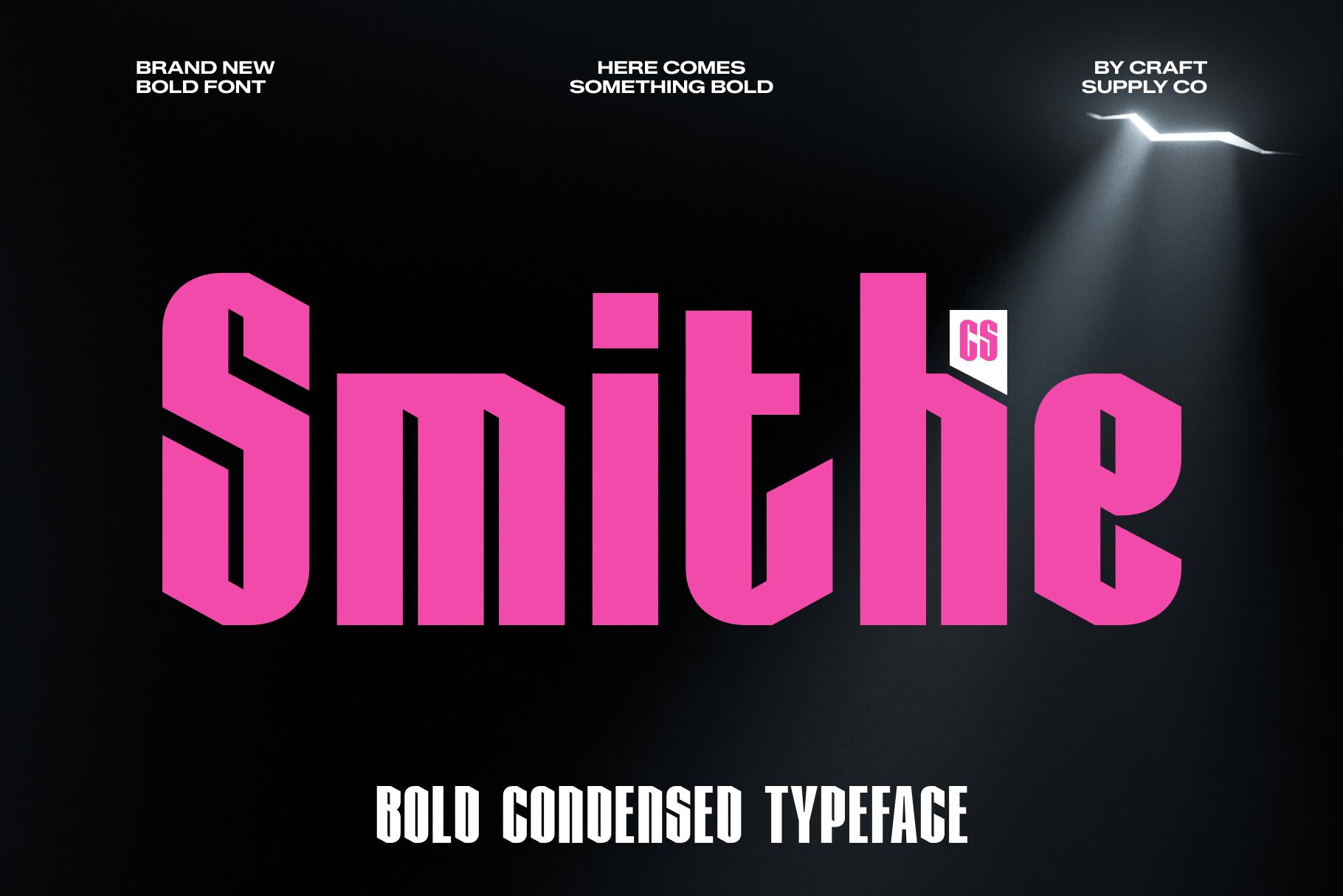
CS Smithe Condensed is a useful option for brutalist designs that depend on strong vertical typography. Condensed lettering can fit large amounts of text into narrow spaces while creating a powerful visual rhythm.
Use Smithe for posters, editorial headlines, event graphics, fashion campaigns, website headings, and signage. Oversized condensed text can become a major structural element in a brutalist composition.
5. CS Randy Pixel
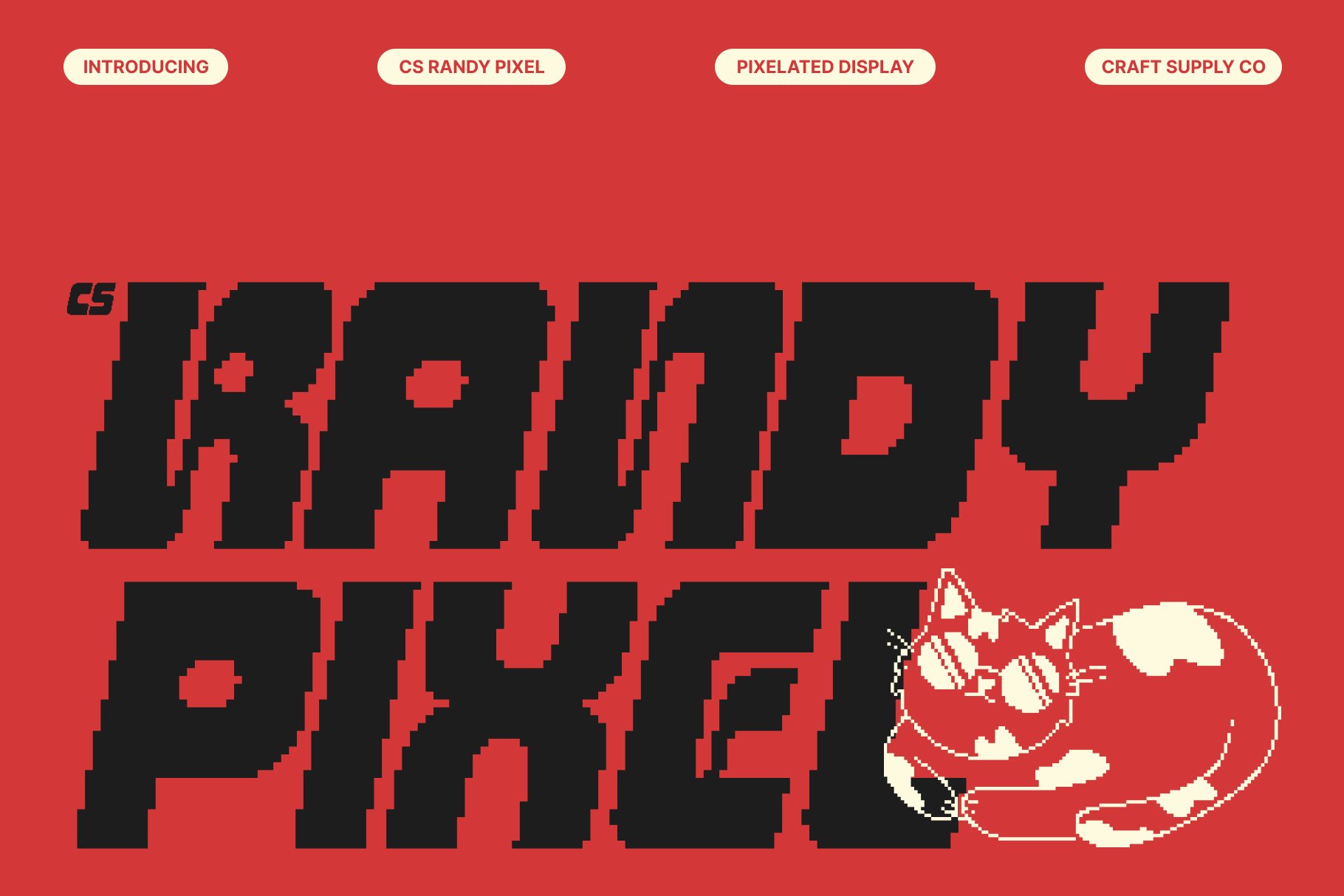
CS Randy Pixel introduces a digital and deliberately unconventional quality to brutalist design. Pixel typography can work particularly well when the project combines raw graphic layouts with references to computers, interfaces, digital culture, or retro technology.
Use Randy Pixel for experimental websites, posters, game related graphics, album artwork, digital campaigns, and social media designs. It can also be used as a secondary visual element alongside a more straightforward primary font.
6. CS Apexis Disco

CS Apexis Disco offers an energetic direction that can create strong contrast within brutalist compositions. Brutalist design does not have to be entirely monochrome or severe; unexpected decorative typography can create visual tension and make a composition more memorable.
Consider Apexis for music posters, nightlife graphics, fashion campaigns, experimental branding, and cultural event artwork. Its distinctive character can work particularly well when the surrounding layout remains simple and structured.
7. Belkon Rounded Stamp
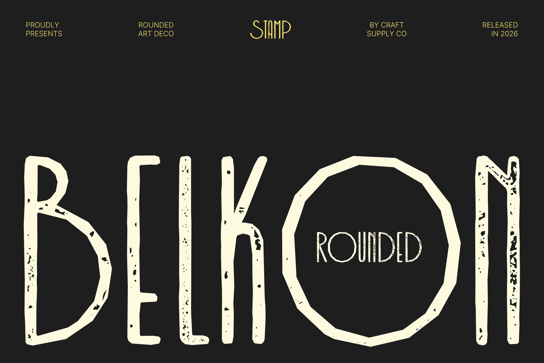
Belkon Rounded Stamp combines a softer rounded character with a stamped visual treatment. This unusual combination can be useful for brutalist designs that intentionally mix contrasting visual ideas.
Use Belkon for posters, packaging, stickers, editorial graphics, merchandise, and unconventional branding. The contrast between rounded lettering and raw layouts can create a contemporary and playful interpretation of brutalist typography.
8. CS Decima Stitched
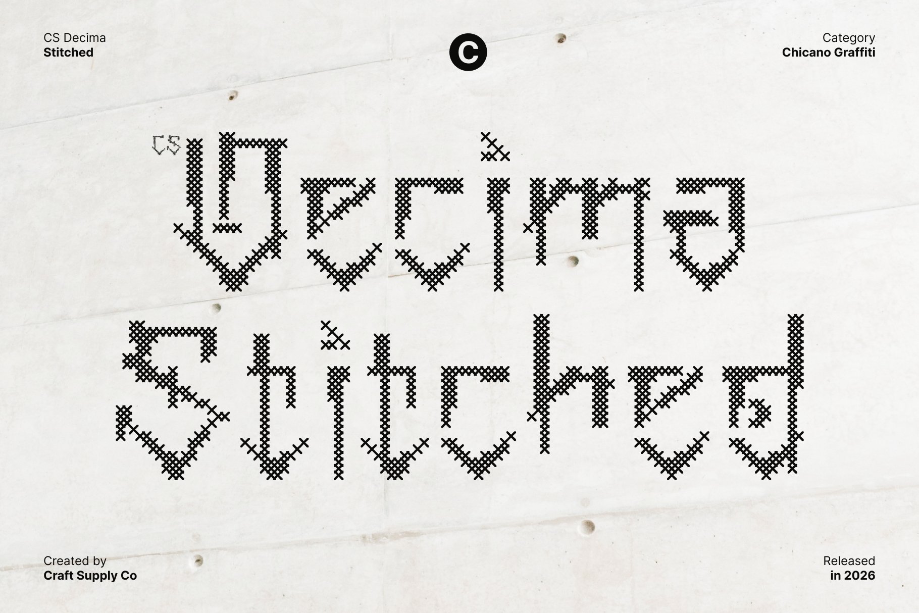
CS Decima Stitched introduces a handcrafted texture that can add depth to experimental designs. The stitched treatment creates a tactile quality that can contrast with rigid grids and industrial visual elements.
Try Decima for fashion graphics, textile inspired branding, posters, packaging, editorial artwork, and experimental merchandise. It can also be useful as an accent font when a composition needs a more physical or handcrafted detail.
9. CS Cypher Stamp

CS Cypher Stamp is well suited to brutalist projects that need a raw and graphic character. Stamp inspired typography can make lettering feel more physical and imperfect, which works naturally with distressed textures and unconventional layouts.
Use Cypher for posters, labels, album covers, streetwear graphics, packaging, and alternative branding. Its stamped appearance can also help create a sense of repetition when used across multiple graphic elements.
10. CS Vertigo Drawn

CS Vertigo Drawn provides another expressive hand drawn option for brutalist compositions. A drawn typeface can introduce movement and imperfection, making it a useful contrast to strict grids and geometric layouts.
Use Vertigo for experimental posters, art publications, music graphics, fashion campaigns, creative branding, and social media artwork. It can work particularly well when only selected words use the expressive style while the rest of the composition remains restrained.
Choosing a Brutalist Font by Visual Direction
The best Font recommendation for Brutalist Graphic Design depends on the visual character you want to create. Brutalism is flexible enough to accommodate classic, digital, industrial, playful, and handcrafted typography.
Industrial Brutalism
For an industrial appearance, consider condensed and stamped typography. CS Smithe Condensed and CS Leather Stamp can create a strong relationship with architectural layouts, raw materials, monochrome imagery, and heavy graphic structures.
Digital Brutalism
Digital brutalist design can incorporate pixel typography and technology inspired elements. CS Randy Pixel provides a useful direction for websites, posters, and graphics influenced by computers and digital interfaces.
Experimental Brutalism
If the goal is to create an unconventional artistic composition, drawn and decorative fonts can provide useful contrast. CS Casket, CS Vertigo, and CS Apexis can introduce expressive qualities without requiring the entire design to follow one visual style.
Raw and Distressed Brutalism
Stamp-inspired fonts can work especially well for raw compositions. CS Leather Stamp and CS Cypher Stamp can reinforce a physical, printed, or imperfect character when combined with distressed textures and bold layouts.
Playful Brutalism
Brutalist design can also have a playful side. Belkon Rounded Stamp can introduce softer shapes and create an unexpected contrast against hard-edged layouts, large typography, and structured grids.
Where to Use Brutalist Fonts
Brutalist typography can be used across both print and digital design. Because these fonts can have strong visual personalities, they are particularly effective in applications where typography is an important part of the composition.
- Brutalist posters
- Editorial magazine covers
- Experimental websites
- Fashion branding
- Album artwork
- Music posters
- Art exhibition graphics
- Packaging design
- Streetwear graphics
- Event branding
- Social media artwork
- Creative agency branding
- Experimental advertising
How to Use Typography in Brutalist Layouts
Brutalist typography often becomes part of the structure of the design. Instead of simply placing text inside a layout, consider using the letters themselves as shapes that organize the composition.
Oversized headlines can extend beyond the edges of a poster or overlap with photography. Condensed fonts can fill narrow columns, while stamped or drawn typography can be layered with other graphic elements. Strong alignment and unexpected spacing can also create visual tension.
However, experimentation works best when there is still some underlying structure. Choose a grid or visual hierarchy first, then intentionally break selected rules. This can make the design feel experimental rather than accidental.
Font Pairing Tips for Brutalist Design
One effective approach is to combine an expressive display font with a neutral typeface. Use the decorative or textured font for the main title, while a simple sans serif handles descriptions, captions, navigation, or other practical information.
You can also create contrast by pairing different typographic structures. For example, a condensed display font can work with a wider neutral font, or a pixel font can be paired with a simple geometric sans serif.
Avoid using several highly decorative fonts at the same time. Brutalist design already relies heavily on visual contrast, so one expressive typeface can often have more impact than several competing styles.
Common Mistakes When Choosing Fonts for Brutalist Design
One common mistake is assuming that brutalist design means making everything chaotic. Although the style can intentionally break conventional design rules, strong brutalist compositions often have a clear underlying structure.
Another mistake is sacrificing readability. Oversized and distorted typography can look visually impressive, but important information still needs to be understandable. Use extreme treatments primarily for display text and keep functional information clear.
It is also easy to add too many textures and effects. Stamps, stitching, pixel effects, drawings, and distressed backgrounds can all be effective individually. Combining too many of them can make the composition feel visually crowded.
Finding the right Font recommendation for Brutalist Graphic Design means thinking beyond traditional ideas of typography. Brutalist projects can benefit from condensed, drawn, stamped, pixel, stitched, classic, and decorative fonts, especially when those styles are placed in unexpected visual contexts.
The ten font alternatives featured in this guide provide different ways to build a brutalist typographic identity. CS Smithe Condensed can create strong structural layouts, while CS Randy Pixel introduces a digital character. CS Leather Stamp and CS Cypher Stamp add tactile texture, while CS Casket, CS Decima, and CS Vertigo provide handcrafted qualities. CS Alenka, CS Apexis, and Belkon can create useful contrasts between traditional, decorative, and playful typography.
Before selecting your final typeface, experiment with scale, spacing, alignment, texture, and contrast. The strongest brutalist typography does not simply look unusual it uses typography as a fundamental part of the visual structure.
For more typography inspiration and experimental design projects, explore Craft Supply Co on Behance.