
Some visual identities remain memorable because their typography does more than spell out a name. The letterforms create an atmosphere, establish a sense of era, and give the brand a personality that can remain relevant across different design trends. Fluttuo logo font offers an interesting starting point for exploring this relationship between lettering and enduring design.
When a word mark has a distinctive visual character, designers can study its structure to understand why it feels memorable. Proportion, spacing, stroke contrast, decorative details, and overall composition all contribute to the result. These elements become particularly interesting when a design has connections to elegant, vintage, or Art Deco inspired typography.
This article explores the design qualities associated with a Fluttuo-inspired direction and presents 10 Fluttuo logo font that can help designers create original identities with a similarly timeless atmosphere. The collection includes Art Deco fonts, condensed sans styles, vintage treatments, and stamp-inspired typefaces.
Why Enduring Typography Matters
Design trends change constantly, but strong typography can continue to work because it has a clear visual structure. A well-balanced word mark does not need to depend entirely on current trends. Instead, it uses proportion, rhythm, and recognizable letterforms to create a consistent identity.
This is one reason vintage and Art Deco-inspired typography remains useful in modern branding. These styles often feature deliberate geometry, elegant proportions, strong symmetry, and distinctive decorative details. When used thoughtfully, those qualities can make a logo feel established without making it look outdated.
Understanding the Fluttuo Design Direction
When developing a Fluttuo logo font inspired concept, typography should be treated as a complete visual system rather than simply a font choice. The shape of each letter matters, but so does the relationship between characters.
A narrow Fluttuo logo font can create a sophisticated vertical rhythm. Decorative Art Deco forms can introduce glamour and structure. A stamp treatment can add texture and make the lettering feel physical. These different characteristics provide multiple ways to explore the same general design atmosphere.
10 Font Alternatives for Fluttuo-Inspired Design
1. CS Hubert

CS Hubert brings a distinct Art Deco character to the Fluttuo font alternative collection. Art Deco typography often works through geometric structure and carefully balanced decorative details, making it useful for elegant word marks. CS Hubert can give a brand name a sophisticated period-inspired personality while still providing enough visual strength for contemporary applications. Consider it for fashion branding, hospitality, packaging, editorial projects, and premium-looking logos.
2. CS Watson
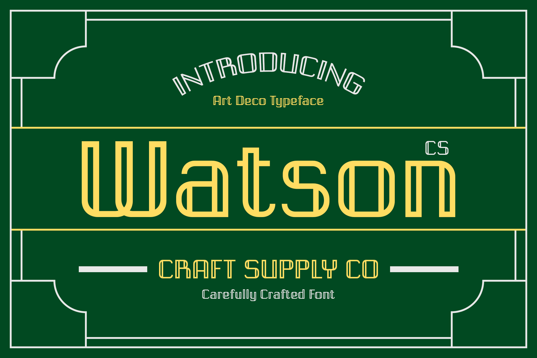
CS Watson offers another Art Deco direction for designers looking to build an elegant and structured word mark. Its decorative qualities can make individual letters more visually distinctive, which is particularly helpful for a short brand name. Use CS Watson when you want a Fluttuo-inspired identity to communicate sophistication and vintage glamour without relying on additional graphic decoration.
3. CS Heitar
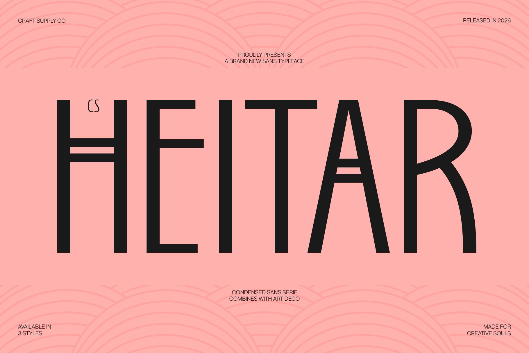
CS Heitar takes the collection in a cleaner and more streamlined direction. Its condensed sans serif structure can create a tall, organized word mark with strong vertical rhythm. This makes it a useful alternative when the goal is to translate an elegant vintage atmosphere into a more contemporary typographic system. Try it for editorial branding, fashion projects, signage, packaging, and modern identity systems.
4. CS Locked

CS Locked introduces a stamp-inspired aesthetic that gives typography a more tactile character. Instead of appearing perfectly polished, a stamp treatment can make the word feel printed, physical, and slightly imperfect. This provides an interesting contrast to the refined qualities of Art Deco typography. CS Locked can work particularly well for labels, packaging, apparel, badges, and brands that want a vintage-inspired visual identity.
5. CS Watson Stamp
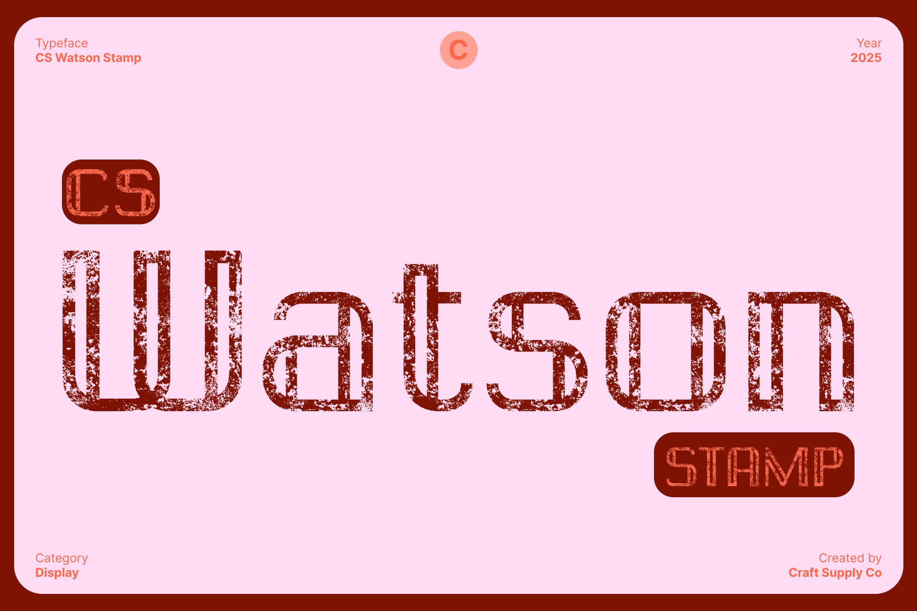
CS Watson Stamp combines the recognizable personality of a decorative style with a textured treatment. The result can help create a Fluttuo-inspired logo that feels more tactile and historic. It is a useful option for packaging, merchandise, signage, and promotional graphics where the impression of physical printing can add character. The texture also gives designers another layer to work with when building a vintage visual system.
6. Celesia Stamp

Celesia Stamp brings together vintage, Art Deco, and stamped qualities. This makes it a particularly versatile alternative for designs that need both elegance and texture. The decorative character can help a word mark feel established, while the stamp treatment introduces a more physical and handcrafted impression. Use it for hospitality branding, boutique packaging, apparel, posters, labels, or vintage-inspired product identities.
7. Anzuka

Anzuka offers a vintage Art Deco direction with an emphasis on elegance. This type of aesthetic can work well when the brand needs a refined and nostalgic personality. For a Fluttuo-inspired word mark, Anzuka provides an opportunity to explore decorative proportions and classic visual balance. It can be especially effective for fashion, beauty, events, hospitality, and premium packaging concepts.
8. Venio Stamp

Venio Stamp combines a timeless Art Deco atmosphere with the tactile quality of stamped typography. This creates a useful middle ground between polished elegance and vintage texture. It can help a Fluttuo-inspired logo feel established without becoming overly formal. Consider using it for packaging, badges, product labels, apparel, and promotional materials where texture can strengthen the overall identity.
9. Venio

Venio provides a vintage Art Deco option with a cleaner presentation than a heavily distressed treatment. Its style can support branding that needs decorative character while maintaining a relatively polished appearance. For a Fluttuo-inspired concept, this makes Venio useful when the goal is to create a logo with historical influence and contemporary versatility.
10. Celesia
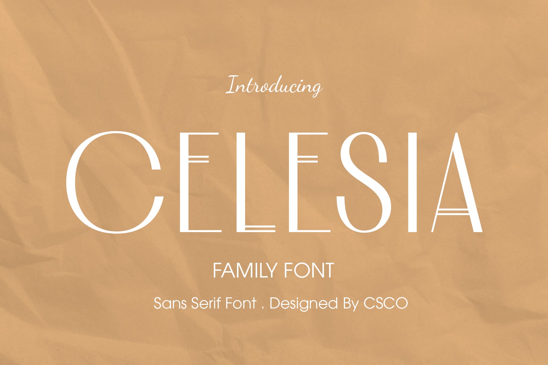
Celesia offers a modern interpretation of Art Deco typography, making it an excellent direction for designers who want to connect vintage influence with contemporary branding. The style can preserve geometric elegance while feeling more current in a modern identity system. Use Celesia for logos, editorial layouts, packaging, fashion branding, and other applications where classic inspiration needs a fresh presentation.
Art Deco as a Source of Enduring Design
Art Deco inspired typography remains useful because it combines decoration with structure. Geometric forms create order, while elegant details provide personality. This combination can make a word mark feel distinctive without requiring excessive visual complexity.
For a Fluttuo logo font inspired design, Art Deco fonts can establish a sophisticated foundation. The designer can then adjust spacing, scale, and supporting graphics to determine whether the final result feels luxurious, vintage, modern, or theatrical.
The Role of Condensed Typography
Condensed fonts provide a different interpretation of elegance. Their narrow proportions allow more characters to occupy less horizontal space, creating a tall and distinctive silhouette. This can be particularly useful for logos that need to work within narrow layouts.
CS Heitar demonstrates how a condensed sans serif can provide a modern alternative to decorative typography. Instead of relying on ornamental details, the design creates personality through proportion and rhythm.
Why Stamp Fonts Add Character
Stamp fonts can make a polished word mark feel more physical. Their texture suggests printing, packaging, labels, and traditional production methods. This visual quality can be especially effective when combined with vintage or Art Deco-inspired typography.
CS Locked, CS Watson Stamp, Celesia Stamp, and Venio Stamp offer different ways to introduce this tactile character. They can be used as primary logo fonts or as supporting treatments for secondary branding materials, depending on the project.
How to Choose the Right Fluttuo Font Alternative
Start by defining the personality you want to communicate. For a strongly decorative direction, explore CS Hubert or CS Watson. For a cleaner and narrower appearance, CS Heitar offers a different approach. If texture is important, consider CS Locked, CS Watson Stamp, Celesia Stamp, or Venio Stamp.
For a more refined vintage atmosphere, Anzuka and Venio can provide elegant starting points. Celesia is useful when you want to balance Art Deco influence with a more modern presentation.
Once you have narrowed down the options, type the complete word and evaluate the overall silhouette. Do not judge the font only by individual letters. A successful logo depends on how every character works together.
Tips for Building an Enduring Word Mark
Prioritize proportion. A balanced word mark can remain visually effective even when trends change.
Use decoration carefully. Art Deco fonts can already contain significant visual detail, so additional ornaments should support rather than overwhelm the lettering.
Refine spacing. Custom tracking and kerning can make a major difference in the appearance of a logo.
Test different applications. View the design on packaging, websites, signage, merchandise, and social media to make sure it remains recognizable.
Combine old and new thoughtfully. Vintage typography does not have to create a completely retro identity. Pairing classic letterforms with a clean layout can produce a contemporary result.
Explore More Typography Inspiration
For more creative lettering, display typefaces, and branding inspiration, explore the work of Craft Supply Co. Studying different type treatments can help designers understand how proportion, texture, and decorative details influence the personality of a word mark.
The story of Fluttuo and its enduring design can be explored through the relationship between typography, proportion, and visual character. A memorable word mark does not necessarily need complicated graphics. Carefully selected letterforms can communicate an entire atmosphere on their own.
The 10 Fluttuo logo font alternatives in this collection provide several ways to explore that idea. Art Deco options bring geometric elegance, condensed typography introduces a streamlined rhythm, and stamp treatments add physical texture. Vintage and modern Art Deco styles then create additional possibilities for balancing historical influence with contemporary branding.
Whether you are designing a logo, packaging system, editorial identity, or promotional campaign, the key is to choose typography that supports the story you want the brand to tell. By studying the structure of the letters and refining their spacing and proportions, you can create a visual identity that feels distinctive today while retaining qualities that can remain relevant for years to come.