
Short names can become surprisingly interesting typography studies. A compact word gives every letter a larger role in the overall design, making details such as curves, spacing, weight, and proportions easier to notice. Dodo font alternative is a useful example because its simple structure can support many different typographic personalities.
For designers and font lovers, studying a word like Dodo is not only about identifying one typeface. It is about understanding how different letterforms can change the mood of the same name. A rounded font can make it feel friendly, while an Art Deco style can make it feel sophisticated. A monospaced font can create a technical impression, while a rough or drawn style can add a handmade quality.
This article explores 10 Dodo font alternative for Dodo-inspired branding. The selection includes Art Deco, monospaced, rounded, contemporary, drawn, rough, and bold styles, providing several ways to reinterpret the name through typography.
Why Dodo Is an Interesting Typography Study
The repeated letters in Dodo create a natural rhythm. The two “D” characters provide a strong visual frame, while the repeated “o” shapes create consistency in the middle of the word. This makes the name particularly useful for studying repetition and balance.
Rounded forms can emphasize the circular shapes within the word, while more geometric fonts can make the repeated characters feel structured. Changing the weight or spacing can also dramatically alter the personality without changing the letters themselves.
What Designers Can Learn From Dodo Typography
A short word teaches designers to pay attention to details. When there are only four characters, small differences become more noticeable. The width of each letter, the size of the counters, the thickness of the strokes, and the space between characters all influence the final silhouette.
It also demonstrates why font alternatives are useful. Instead of searching for a single “correct” typeface, designers can compare different visual directions and determine which one best communicates the intended brand personality.
10 Font Alternatives for Dodo-Inspired Design
1. CS Hector

CS Hector introduces an Art Deco direction to the Dodo font search. Art Deco inspired typography can give a simple name a more sophisticated and decorative personality through geometric construction and distinctive details. For Dodo, this approach can emphasize the repeated letterforms while giving the complete word a polished visual presence. It can work well for fashion, hospitality, packaging, editorial projects, and premium branding.
2. CS Daine Mono

CS Daine Mono brings a monospaced structure to the collection. Because each character follows a consistent spacing system, monospaced typography can create a technical, organized, and contemporary appearance. This makes it an interesting alternative for Dodo inspired technology brands, creative studios, digital products, or editorial layouts. The repeated characters can also create an especially satisfying visual rhythm.
3. Dorlan
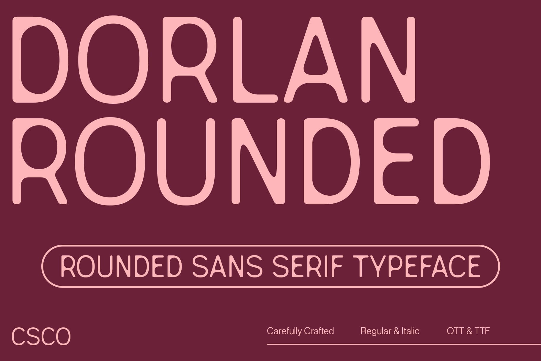
Dorlan offers a rounded approach that emphasizes softness and approachable letterforms. Rounded fonts can make a short brand name feel friendly, modern, and accessible. The circular shapes within Dodo naturally complement this direction, allowing the typography to feel cohesive. Use Dorlan for lifestyle brands, consumer products, packaging, children’s projects, digital products, or playful visual identities.
4. Derian
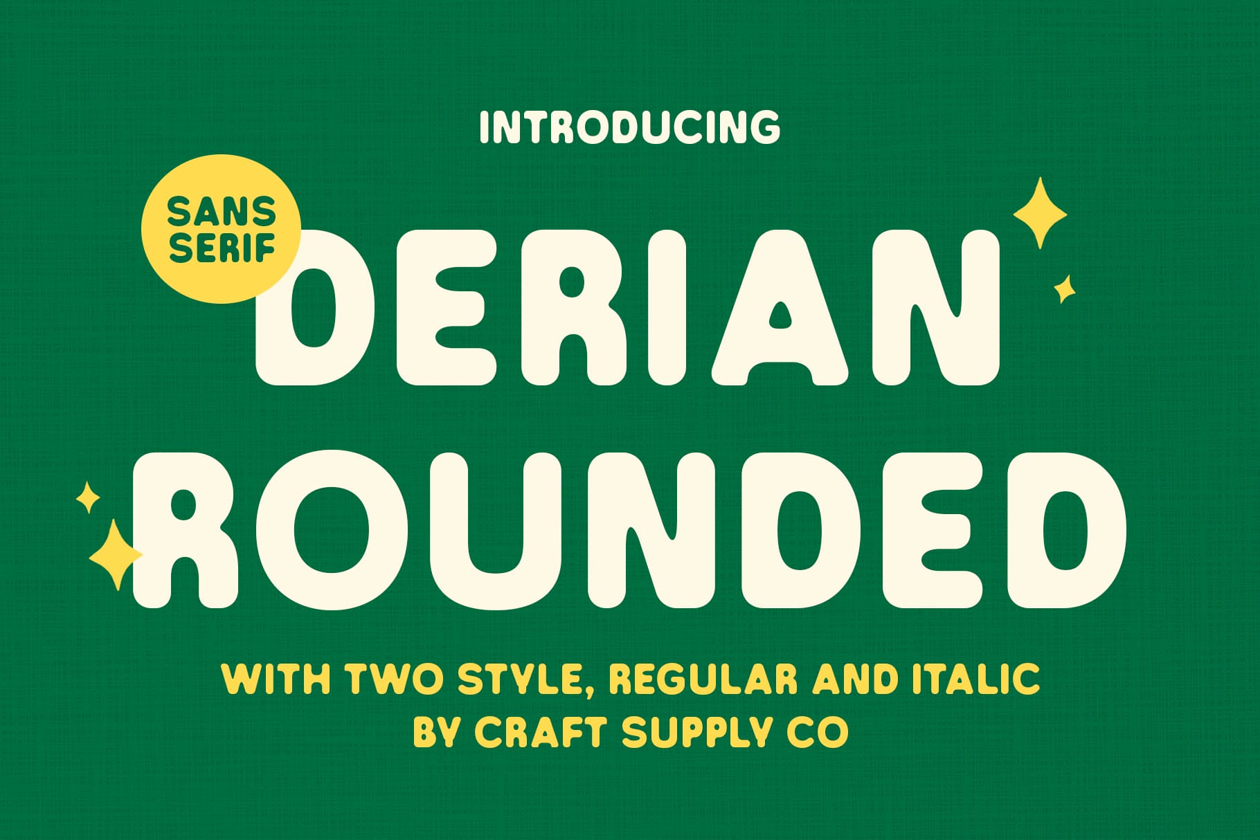
Derian provides another rounded alternative for designers who want Dodo to feel smooth and welcoming. Rounded typography can soften the overall silhouette and reduce the formality associated with sharper geometric typefaces. For a Dodo-inspired logo, Derian can create a clean visual identity with a friendly personality. It is especially suitable for brands that want simplicity without appearing overly corporate.
5. CS Aloise
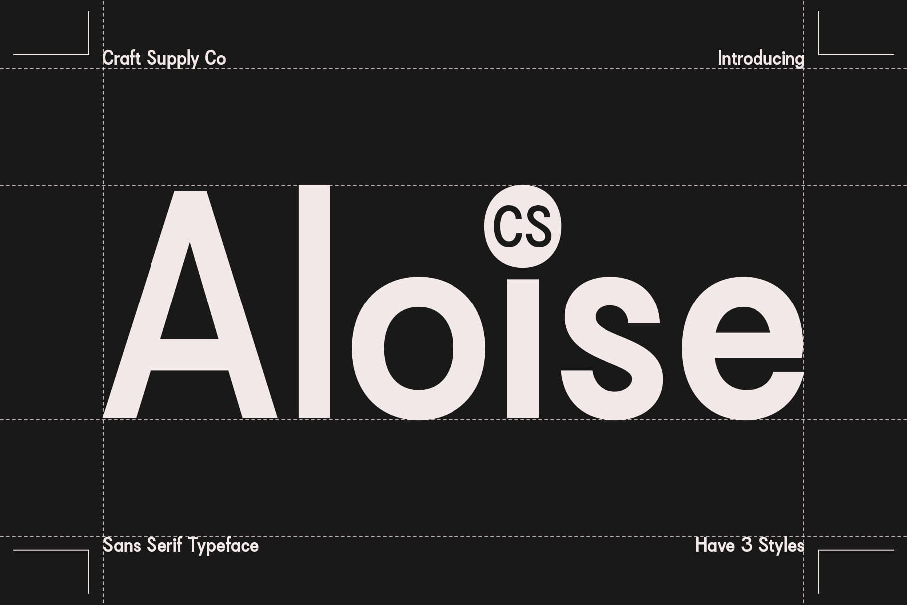
CS Aloise introduces a contemporary direction to the Dodo typography collection. Contemporary fonts can balance familiar letter structures with modern proportions, making them useful for brands that want to feel current and flexible. This alternative can help create a Dodo word mark that works across digital platforms, packaging, editorial layouts, and modern identity systems.
6. CS Hector Drawn

CS Hector Drawn gives the Dodo concept a more handmade personality. Drawn typography introduces irregular details that can make a word mark feel personal and expressive. This can be an effective alternative when a polished geometric font feels too predictable. Use CS Hector Drawn for creative businesses, independent brands, posters, merchandise, packaging, and projects that benefit from an artistic touch.
7. Maretyn
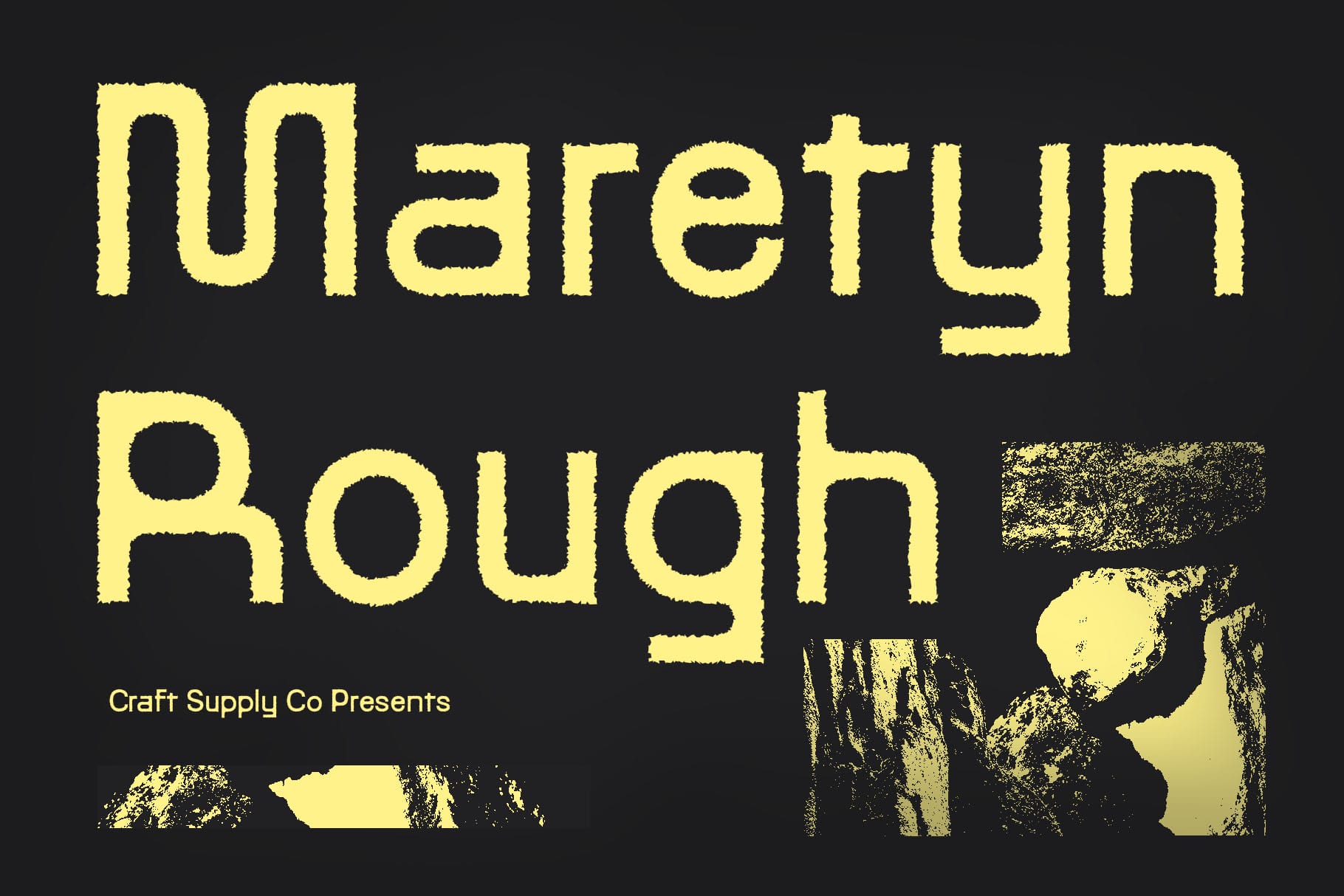
Maretyn adds a rougher visual quality to the font alternatives. Rough typography can introduce texture and a sense of physical imperfection, making the lettering feel more handcrafted. Applied to Dodo, this treatment can create an identity that feels energetic and unconventional. It can work particularly well for apparel, posters, music projects, packaging, and independent creative brands.
8. Rebolt
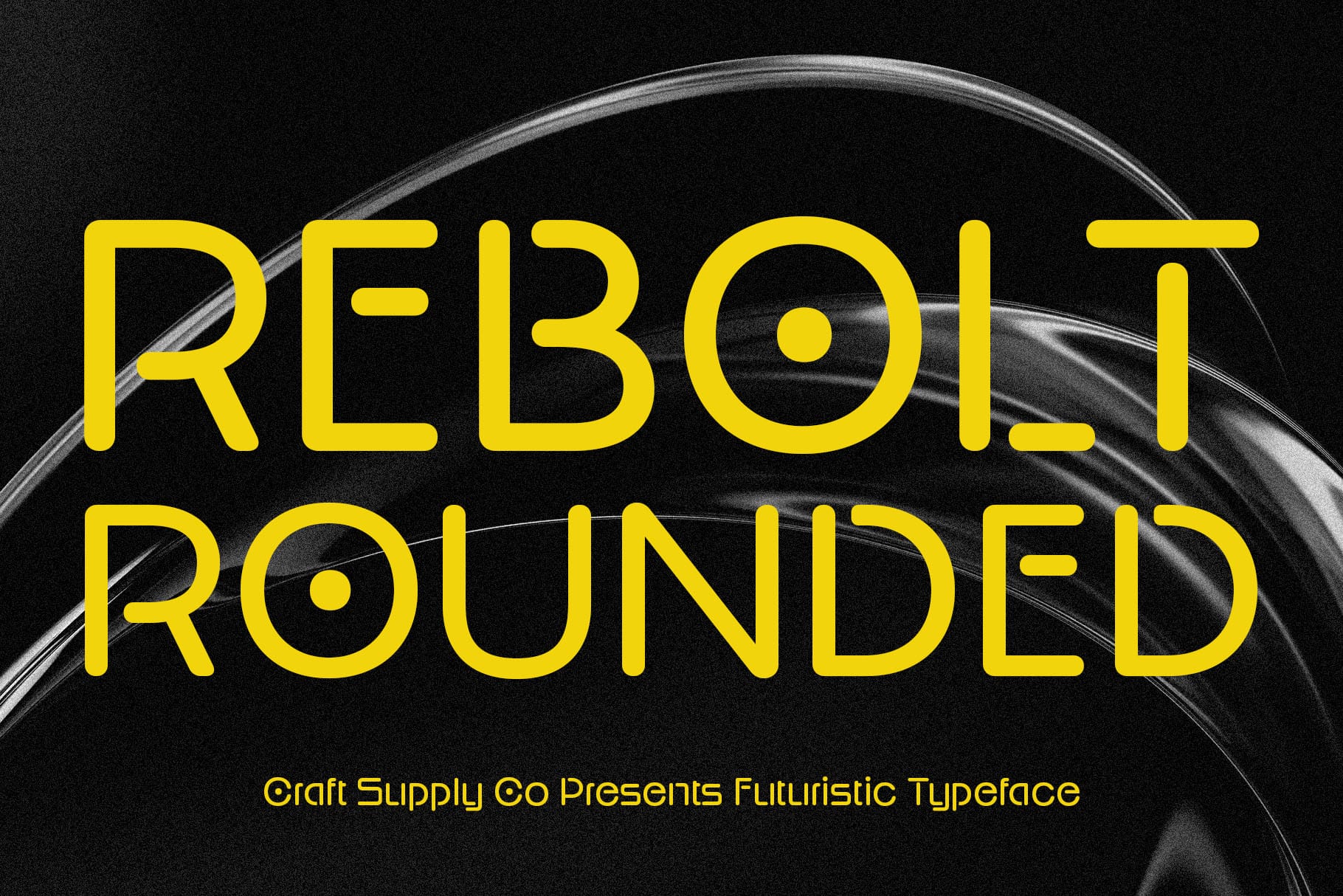
Rebolt offers another rounded direction with a stronger display personality. Rounded letterforms can remain approachable while heavier proportions give the word mark more visual impact. This combination makes Rebolt useful for Dodo inspired branding that needs to feel playful but still prominent. Consider it for logos, packaging, merchandise, social media graphics, and consumer-focused identities.
9. Radeil
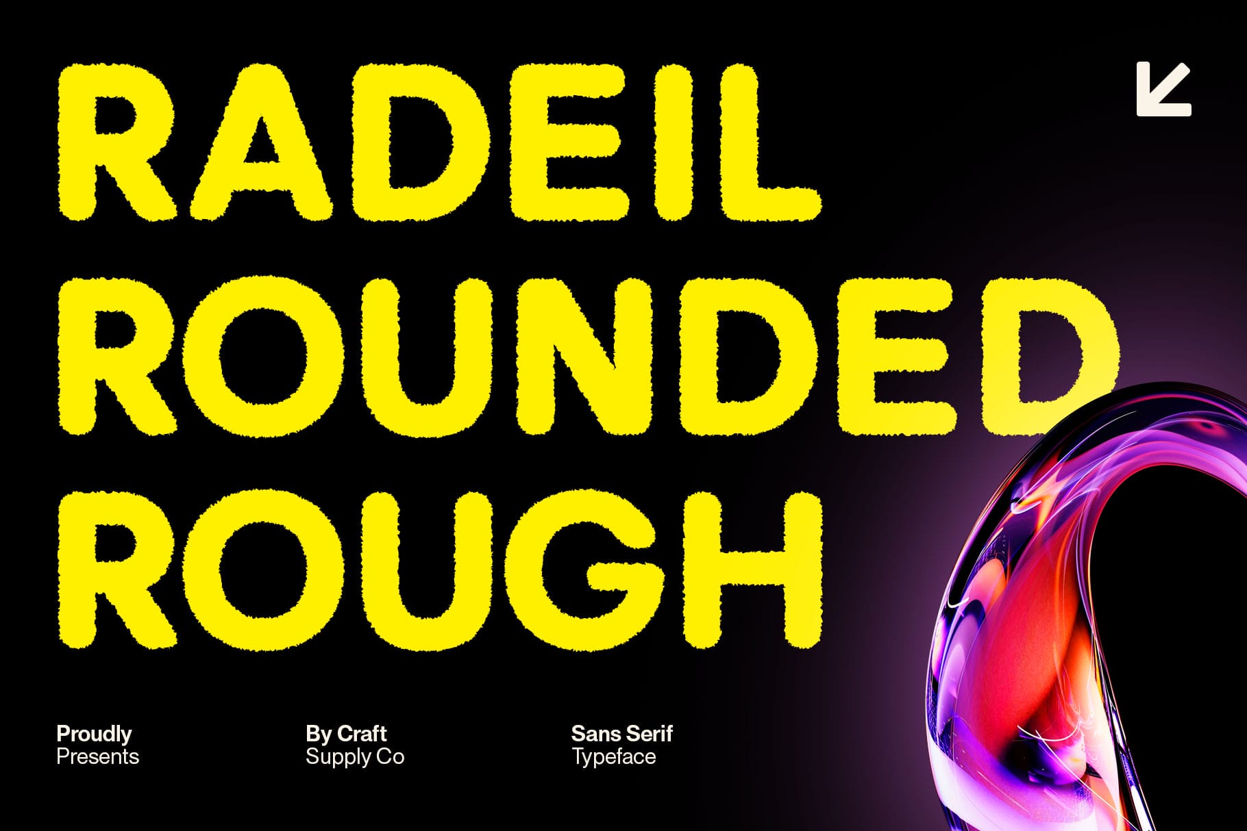
Radeil combines rounded construction with a rougher finish, creating a useful middle ground between softness and texture. This makes it an especially interesting alternative for designers who do not want Dodo to feel either completely polished or completely distressed. The rounded forms can maintain approachability, while the rough character adds personality and visual interest.
10. CS Qinetic
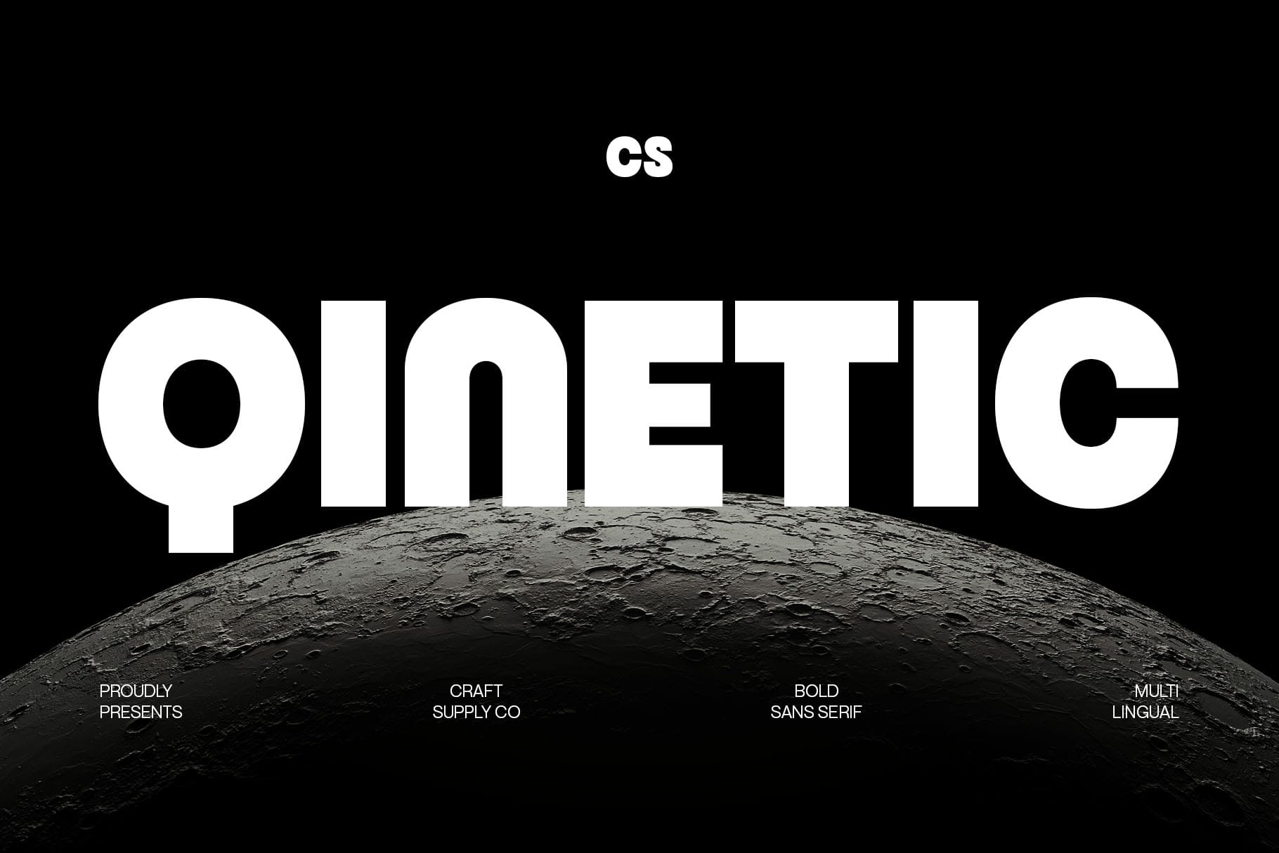
CS Qinetic brings a bold direction to the Dodo font search. Strong typography can give a short word an immediate visual presence and make the logo easier to notice. For Dodo, the heavier weight can emphasize the repeated forms and create a compact, memorable silhouette. It works well for posters, apparel, branding campaigns, packaging, and digital graphics where the word needs to stand out.
How Different Font Styles Change Dodo
The Dodo font alternative show how dramatically typography can change the same four letter name. CS Hector can give Dodo a sophisticated Art Deco personality, while CS Daine Mono introduces a technical and structured quality.
Dorlan, Derian, and Rebolt use rounded forms to create a friendlier impression. CS Aloise offers a contemporary direction, while CS Hector Drawn and Maretyn introduce more handcrafted qualities. Radeil combines rounded forms with rough texture, and CS Qinetic adds stronger visual weight.
This comparison demonstrates an important principle in type design: the meaning of a word does not exist separately from its visual presentation. Typography can influence how people interpret the name before they consider any other branding element.
How to Find the Right Dodo Font Alternative
Start with the brand personality you want to communicate. If you want sophistication, an Art Deco style may be a useful starting point. For a technical or digital identity, consider a monospaced font. Rounded styles work well for approachable branding, while drawn and rough fonts can communicate creativity and individuality.
Next, type the complete word and examine its silhouette. Because Dodo contains repeated characters, compare how each font handles the two D shapes and two circular forms. Some typefaces will make the repetition feel harmonious, while others may create stronger contrast.
Finally, test the font in realistic applications. A logo should remain recognizable on a website, social media profile, packaging, merchandise, signage, or printed material. Choose a typeface that performs well in the environments where the identity will actually appear.
The Importance of Repetition in Dodo Typography
Repeated letters can create visual unity, but they can also reveal inconsistencies. If two identical letters appear differently because of spacing or surrounding shapes, the rhythm can feel unbalanced.
This makes kerning particularly important. Check the space between the first D and the first o, then compare it with the space between the second o and the final D. Small adjustments can make the complete word feel much more polished.
Tips for Designing a Memorable Dodo Word Mark
Study the silhouette. Step back from the logo and look at the overall shape rather than individual characters.
Use repetition intentionally. The repeated D and o forms can become a defining feature of the identity.
Adjust kerning manually. Short names make spacing differences particularly noticeable, so do not rely entirely on default font settings.
Test different weights. A lighter version may feel elegant, while a heavier version can create stronger impact.
Keep the supporting design simple. If the font already has a distinctive personality, avoid adding unnecessary decorative elements.
Check small sizes. Details in drawn, rough, and Art Deco styles can disappear at small scales, so test the logo in realistic dimensions.
Why Font Alternatives Help Designers
Font alternatives encourage exploration. Rather than committing immediately to one visual direction, designers can compare multiple interpretations of the same name. This process often reveals unexpected possibilities.
For Dodo, the difference between a rounded font and an Art Deco typeface is significant. Yet both can work as starting points for an original identity if they match the brand’s intended personality. The goal is not to find a universal “best” font, but to discover the one that supports the story and visual system of the project.
Explore More Typography Inspiration
For more creative fonts, lettering concepts, and branding inspiration, explore Craft Supply Co. Studying different type treatments can help designers recognize how small changes in letterform construction influence the personality of a complete word mark.
Dodo is a simple name, but its four letters provide plenty of opportunities for typographic exploration. Repeated forms, circular shapes, spacing, and weight all contribute to its visual character, making it a useful study for designers and font lovers.
The 10 Dodo font alternative in this collection demonstrate just how many directions are possible. CS Hector introduces Art Deco elegance, CS Daine Mono brings a technical structure, and Dorlan, Derian, and Rebolt create softer rounded interpretations. CS Aloise provides a contemporary option, while CS Hector Drawn, Maretyn, and Radeil introduce texture and handcrafted character. CS Qinetic adds a bold and energetic finish.
The most effective approach is to experiment with the complete word rather than focusing only on individual letters. Compare silhouettes, adjust spacing, test different weights, and consider where the logo will appear. With thoughtful type selection and careful refinement, even a short name like Dodo can become a distinctive and memorable visual identity.