
Choosing the right typeface can completely change the font recommendation for logo. A good font for a logo should do more than look attractive. It should communicate the character of the brand, remain recognizable, work across different sizes, and support a consistent visual identity.
That is why font recommendation for logo searches are so common among designers, business owners, and creators. Whether you are designing a logo for a fashion brand, technology company, restaurant, creative studio, personal business, or online shop, your font choice can influence how people perceive the brand.
There is no single font that works for every logo. A professional technology brand may need a clean sans serif, while a luxury business may benefit from an elegant serif. A creative children’s brand might need something playful, while a streetwear label could use a bold display typeface.
In this guide, we will explore font recommendation for logo branding, logo font design best practices, important font choices, and several typefaces from Craft Supply Co that can inspire your next identity project.
What Makes a Good Font Recommendation For a Logo?
Before selecting a typeface, think about the role your logo needs to play. A logo often appears on websites, social media profiles, packaging, business cards, signage, merchandise, advertisements, and printed materials. The font needs to remain effective across all of these applications.
A good font recommendation for a logo usually has a distinctive character without sacrificing readability. It should give the brand a recognizable personality while allowing the logo to remain clear when displayed at smaller sizes.
Consider these qualities when making your selection:
- Readability: People should be able to recognize the brand name quickly.
- Distinctive character: The typeface should help the logo stand apart from generic branding.
- Scalability: The design should work on both large signs and small digital applications.
- Brand personality: The font should match the mood and positioning of the business.
- Versatility: The typeface should work across different marketing materials.
- Visual balance: Letterforms should create a harmonious wordmark rather than a cluttered appearance.
Font Design for Logo: Best Practices
Good font recommendation for logo typography starts with a clear understanding of the brand. Instead of choosing a font simply because it looks attractive, consider how its shapes communicate the brand’s personality.
1. Match the Font Style to the Brand
A luxury brand may use refined serif typography, while a modern technology company may prefer a geometric sans serif. A playful business can use rounded or expressive lettering, while an editorial brand may benefit from sophisticated serif typography.
The font recommendation for a logo should therefore reflect the audience and industry. Think about the emotions you want the logo to communicate before opening your font library.
2. Prioritize Readability
Decorative fonts can look impressive in large presentations, but logos often appear at small sizes. A complicated typeface can lose its character when reduced, and unusual letterforms can become difficult to recognize.
Test your logo at several sizes. Look at it as a large desktop graphic, a small website logo, a social media profile image, and a printed business card. If the brand name remains clear in each situation, the typeface has stronger practical potential.
3. Avoid Using Too Many Fonts
Most logo designs do not need several typefaces. Using too many fonts can make a wordmark feel inconsistent and visually crowded.
For a simple logo, one strong typeface may be enough. If you want a combination, use contrast intentionally. For example, pair a bold sans serif with a refined serif rather than combining several decorative fonts with similar visual weight.
4. Adjust Letter Spacing
Font selection is only part of logo typography. Letter spacing can dramatically change the appearance of a wordmark.
Try increasing tracking for a sophisticated, spacious look. Tighter spacing can create a compact and powerful appearance, particularly with bold display fonts. Always inspect individual letter combinations because some pairs may need additional adjustment.
5. Consider Customizing the Letterforms
Sometimes the best logo font is the starting point rather than the finished design. Designers can modify selected characters, adjust spacing, combine elements, or create custom ligatures to give the wordmark a more unique identity.
However, make sure your font license allows the intended modifications and logo use. Licensing terms can differ between typefaces and license types.
Fonts to Use for Logo Branding
The best fonts to use for logo branding depend on the personality you want to establish. Sans serif fonts often create a clean and contemporary impression, while serif fonts can add sophistication and tradition. Display fonts can make a logo more distinctive, especially when the brand wants a strong visual statement.
Here are ten font recommendations from Craft Supply Co that cover several different logo styles.
1. Cenios Expanded Sans Serif
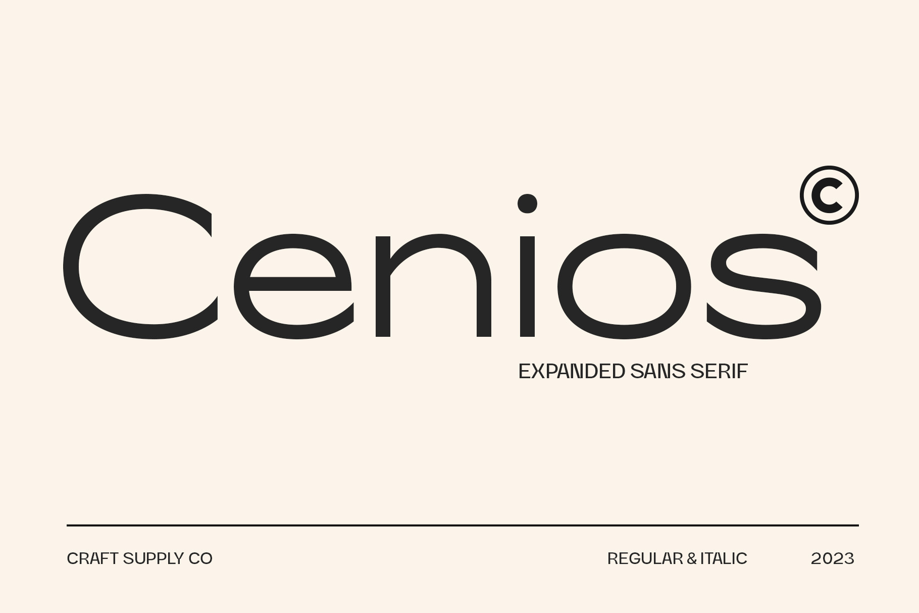
Cenios is a strong option for designers looking for a modern, spacious, and confident logo style. Its expanded sans serif construction gives words a wider visual footprint, which can make short brand names feel substantial and distinctive.
The generous proportions can work particularly well for contemporary branding, fashion identities, creative studios, technology-inspired projects, and bold wordmarks. Use it when you want the typography itself to provide visual impact without relying on excessive decoration.
2. Rolide Expanded Sans Serif

Rolide offers a contemporary expanded sans serif style with wide letterforms and a strong visual presence. Its broad construction makes it useful for logos that need to communicate confidence and modernity.
It can work especially well for fashion labels, lifestyle brands, digital businesses, posters, packaging, and modern wordmarks. Its expanded proportions also give designers plenty of opportunities to experiment with spacing and composition.
3. Gerline Contemporary Sans

Gerline is a useful choice when you want a cleaner contemporary direction. A modern sans serif can create a professional appearance while keeping the logo approachable and easy to read.
Consider Gerline for business identities, creative agencies, digital brands, portfolios, product packaging, and online businesses. Its clean character can also make it easier to build supporting typography around the logo.
4. CS Agerix Display Sans Serif

CS Agerix provides a bolder direction for designers who want the logo to make an immediate statement. Its geometric display approach can create a structured and powerful identity, making it suitable for brands that want an energetic, modern, or industrial visual language.
Try it for sports-related identities, streetwear, technology concepts, entertainment brands, event graphics, and bold wordmarks. It can also work well when the brand name itself needs to become the main graphic element.
5. Chavler Modern Serif Typeface

Not every professional logo needs a sans serif. Chavler offers a modern serif direction for brands that want elegance with a contemporary edge.
Serif typography can create a more established or editorial impression, making Chavler worth considering for fashion, beauty, publishing, hospitality, creative services, and premium product branding.
Use the serif details as part of the brand story rather than treating them as decoration. A well-chosen modern serif can give a wordmark personality while maintaining a polished appearance.
6. Monocole Playful Sans Serif
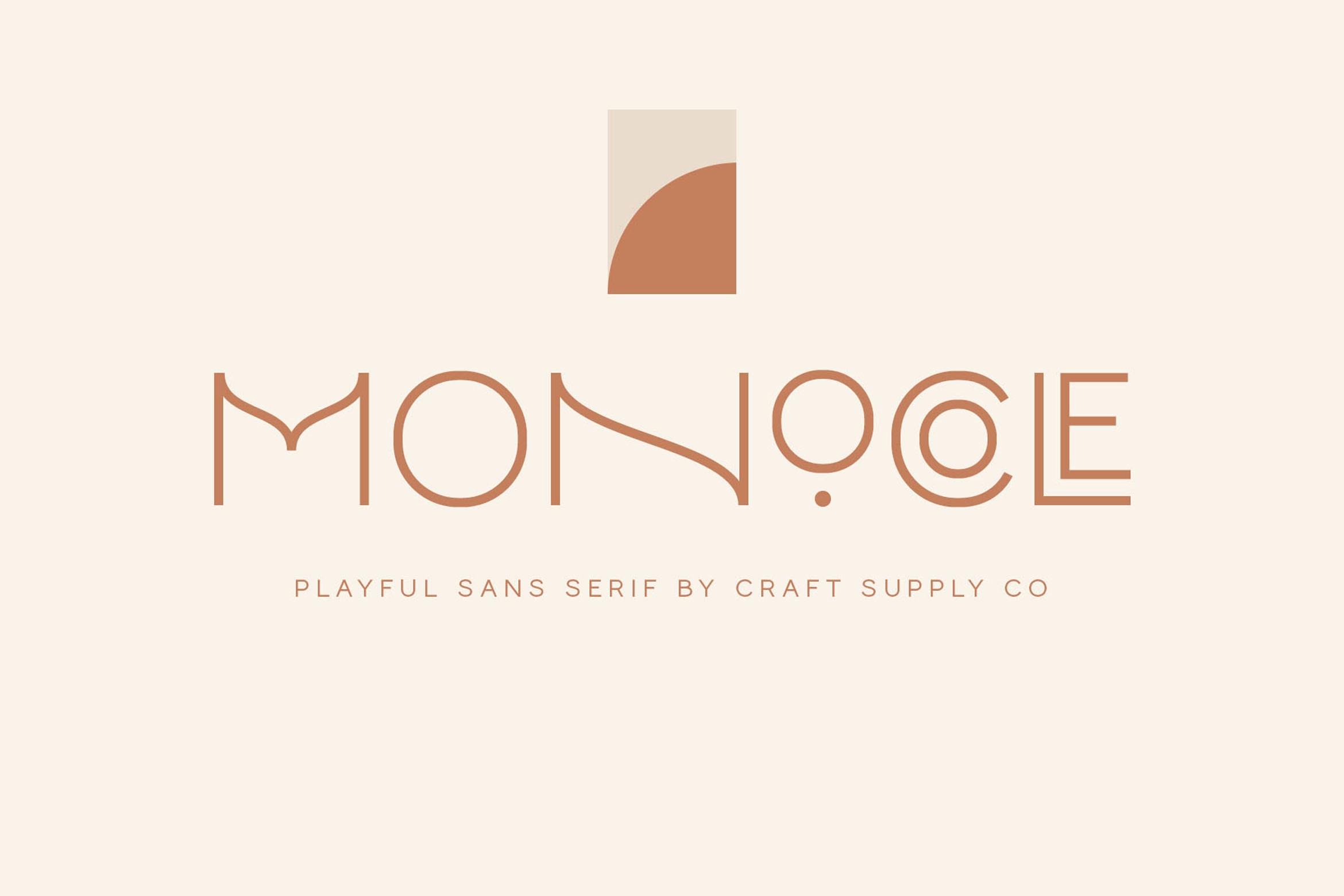
Monocole combines a modern sans serif foundation with playful details. Craft Supply Co describes its structure as a fusion of geometric logic and optical balance, with multiple styles, alternates, and ligatures. The family includes Thin, Regular, Semi Bold, and Bold weights, along with italic versions.
That flexibility makes Monocole useful when a logo needs to feel contemporary but not overly formal. It can suit creative businesses, lifestyle brands, stationery, fashion projects, and modern personal brands.
7. Gavency Display Serif Font
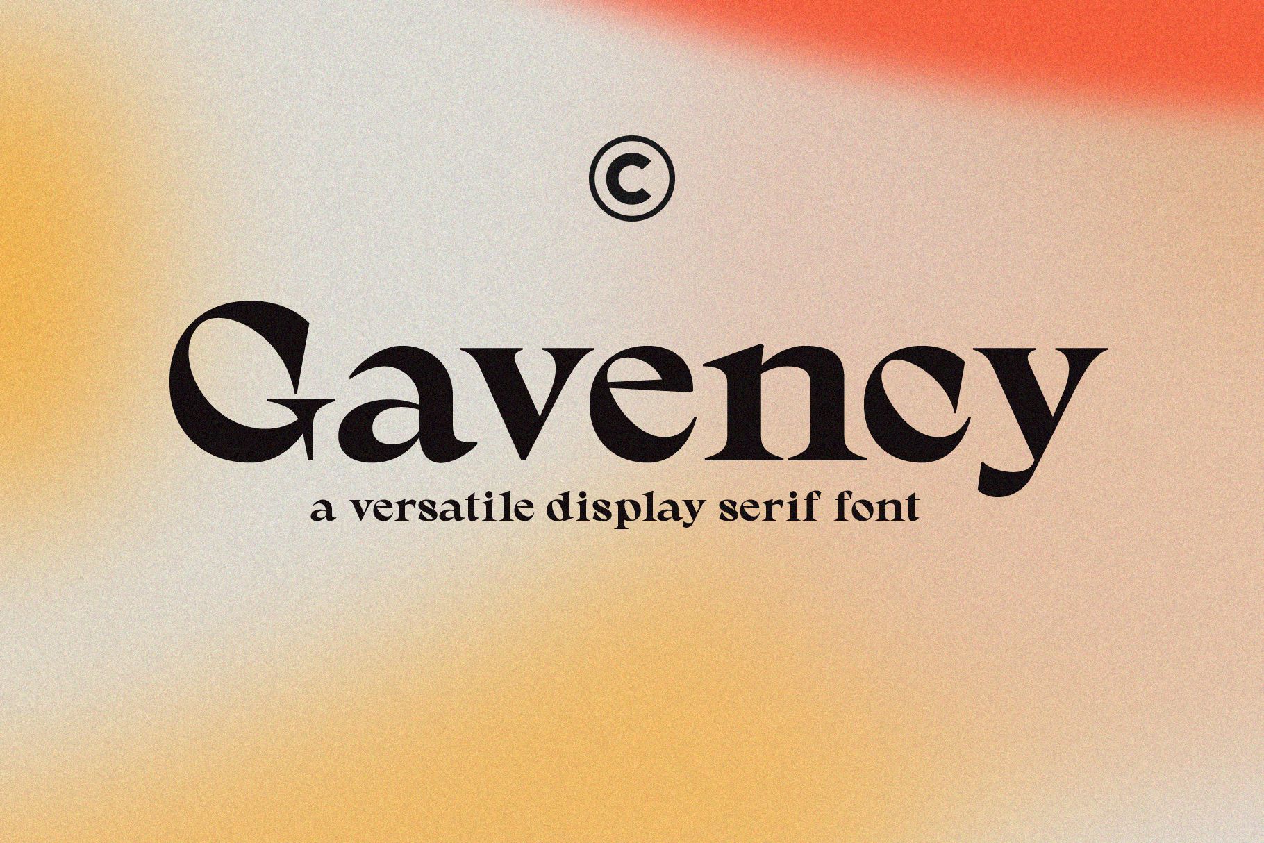
Gavency provides a display serif approach for designers who want a more expressive and stylish logo. Craft Supply Co describes Gavency as a versatile display typeface with six styles, giving designers additional possibilities when building a visual identity.
Consider it for fashion branding, editorial projects, beauty identities, boutique businesses, packaging, and creative logos where typography needs to feel distinctive.
8. Qualey Elegant Serif Font
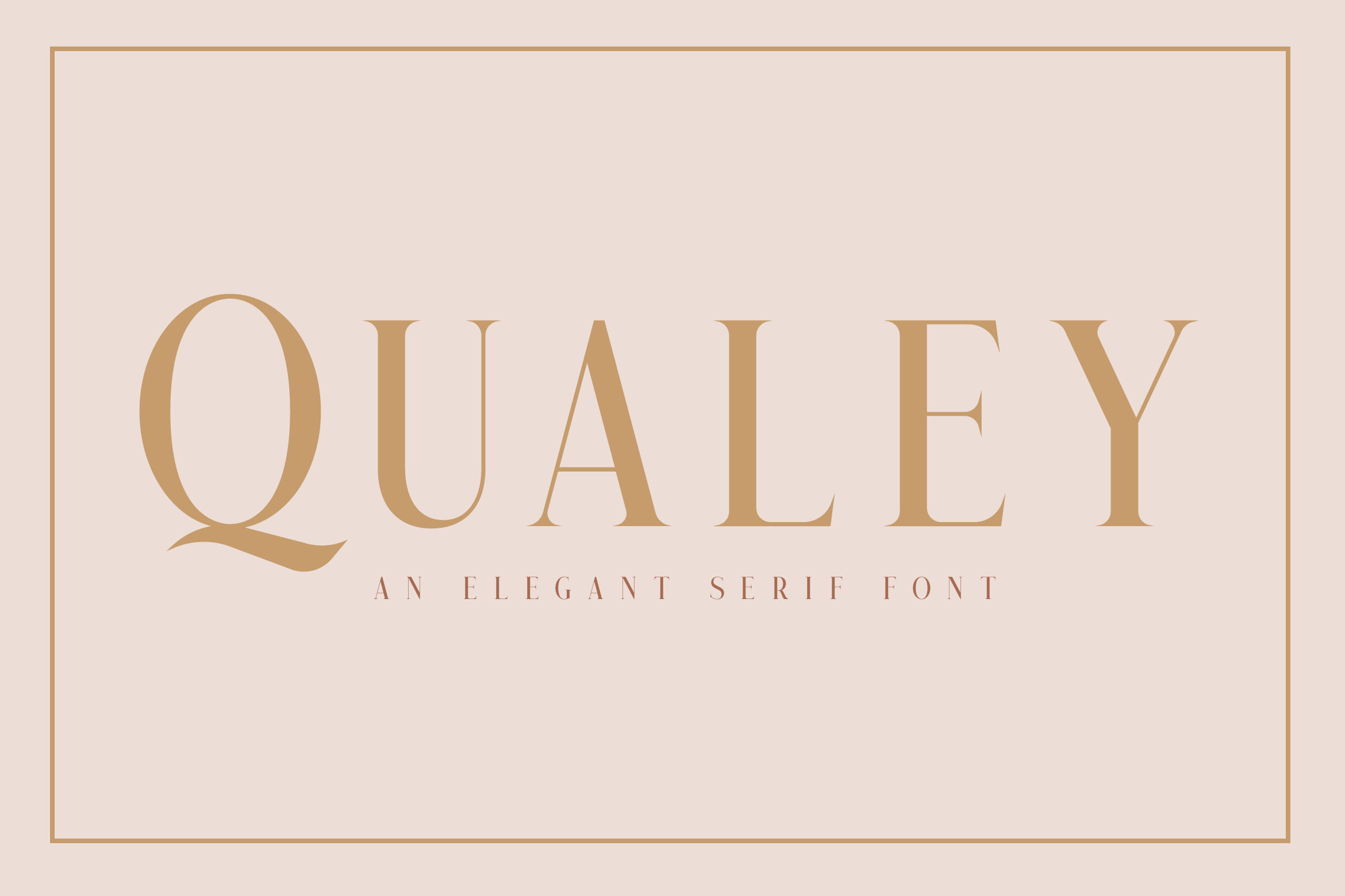
Qualey is a modern serif option with relatively high stroke contrast and a refined structure. Craft Supply Co’s font-in-use example also demonstrates how Qualey can support professional editorial and educational branding.
For a professional font for logo design, Qualey can suit brands that want a sophisticated appearance without moving too far into highly decorative typography. Consider it for consulting businesses, beauty brands, editorial companies, boutiques, and premium services.
9. Amadi Quirky Serif Font

Amadi offers a more unconventional serif direction. If your brand needs a logo that feels creative, memorable, and less predictable, a quirky serif can provide more personality than a standard traditional typeface.
This approach can work well for creative studios, independent brands, artistic businesses, restaurants, publications, packaging, and businesses that want typography to become part of their personality.
10. Lovalina Elegant Serif Font Family

Lovalina is an elegant serif family that can support polished and sophisticated branding. Craft Supply Co includes Lovalina among its elegant serif offerings, alongside other typefaces designed for logos, headings, merchandise, and related creative applications.
Use Lovalina when you want a logo to communicate elegance, refinement, and a premium visual character. It can be particularly suitable for fashion, beauty, wedding, lifestyle, boutique, and luxury-inspired identities.
Fonts to Use for Logo: Examples by Brand Personality
If you are unsure what font is good for a logo, start with the brand personality rather than a specific typeface. This approach narrows the choices much faster.
Modern and Professional Logos
For a clean business identity, consider contemporary sans serif fonts such as Cenios, Rolide, or Gerline. These styles can create a structured appearance without adding unnecessary visual complexity.
Bold and Confident Logos
For brands that need a strong presence, expanded and display sans serif fonts can create a powerful wordmark. Cenios, Rolide, and CS Agerix are useful directions to explore when you want the logo to feel prominent and energetic.
Elegant and Premium Logos
For luxury, beauty, fashion, wedding, and boutique identities, modern serif fonts can introduce sophistication. Chavler, Gavency, Qualey, and Lovalina offer different ways to approach an elegant logo.
Creative and Playful Logos
If your business has a youthful or creative personality, a playful sans serif can help the logo feel more approachable. Monocole provides a useful alternative when you want modern structure with additional character.
Font Use in Logo Design: What to Avoid
Choosing the right font also means knowing which problems to avoid. Do not select a typeface simply because it looks impressive in a font preview. Always test the actual brand name.
- Do not sacrifice readability for style. A logo needs to communicate the brand name clearly.
- Do not use too many decorative fonts. One distinctive typeface can often create more impact than several competing styles.
- Do not ignore small-size applications. Test the logo as a small icon, website header, and social profile image.
- Do not overlook spacing. Kerning and tracking can significantly improve a wordmark.
- Do not copy another brand’s typography too closely. Aim for a distinctive identity that fits your own business.
- Do not ignore licensing. Confirm that your chosen font license covers logo and commercial use.
How to Choose the Best Font for a Logo
When comparing font choices for logo design, create several versions of the same wordmark. Test the brand name in a modern sans serif, a bold display style, and a serif. Comparing the same word in different categories makes the differences much easier to see.
Next, test each version in black and white. A strong logo should not depend entirely on color or special effects to remain recognizable. If the typography has a clear silhouette and balanced spacing, it has a stronger foundation.
Finally, check the logo in realistic situations. Place it on a website header, business card, product package, social media profile, and merchandise mockup. This process can reveal problems that are easy to miss when viewing the logo alone on a large artboard.
There is no universal answer to the question, “what’s a good font for a logo?” The right choice depends on the brand’s personality, audience, industry, applications, and desired visual identity.
The most important principle is to choose typography with purpose. A great logo font should support the brand rather than compete with it. Test readability, adjust spacing, consider how the logo works at different sizes, and always check the font license before using a typeface commercially.
If you are looking for more typefaces for branding and identity projects, explore Craft Supply Co for additional font styles and creative resources. You can also explore the brand’s typography and design work on Craft Supply Co on Behance for further inspiration.