
Good design often looks simple at first glance. A wordmark may use only a few letters, a restrained color palette, and a straightforward typographic structure, yet those decisions can communicate an entire personality. Legg typography is a useful example of how typography can make a compact visual identity feel memorable, modern, and intentional.
Looking closely at Legg typography reveals several valuable lessons for designers. The proportions of the letters, the balance between positive and negative space, the rhythm created by repeated forms, and the overall width of the word can all influence how a brand is perceived. These details become especially important when the design relies heavily on typography rather than decorative graphics.
For designers searching for a similar visual direction, the right legg typography alternative can provide an excellent starting point. The following ten fonts offer different interpretations of condensed, modern, rounded, and mixed typographic styles that can help recreate some of the design energy associated with Legg without simply copying its identity.
Why Legg Is an Interesting Design Reference
One of the most useful lessons from Legg is the power of proportion. Condensed typography can fit a strong wordmark into a relatively small horizontal space while still creating a bold visual presence. This makes condensed fonts especially useful for logos, packaging, editorial headlines, posters, and other applications where space is limited.
Legg typography also demonstrates how a short word can become a visual object. When there are only a few letters to work with, every curve, stem, counter, and spacing decision becomes more noticeable. Designers cannot rely on long phrases to create rhythm. Instead, they must make each character contribute to the overall composition.
What Makes a Good Legg Font Alternative?
A useful legg typography alternative does not need to be an exact match. In fact, choosing a typeface with the same visual principles but a slightly different personality can lead to a stronger and more original result.
For a Legg inspired direction, look for typefaces with distinctive proportions, controlled spacing, modern construction, and enough personality to work as a standalone wordmark. Condensed sans serif fonts are a natural starting point, while rounded and mixed styles can introduce more warmth or individuality.
10 Font Alternatives Inspired by the Design Language of Legg
1. Folime Condensed Sans Serif Font

Folime is a strong starting point for designers who want to explore the compact proportions associated with Legg. Its condensed sans serif structure creates an efficient horizontal footprint while maintaining a clean and contemporary appearance. This makes it suitable for wordmarks where the typography needs to feel prominent without becoming overly wide.
The narrow construction can also create an editorial quality that works particularly well for fashion, lifestyle, creative studios, and modern product identities. Try using Folime in uppercase for a stronger display effect or experiment with spacing to establish a more distinctive rhythm.
2. Dozed Condensed Sans Serif Font
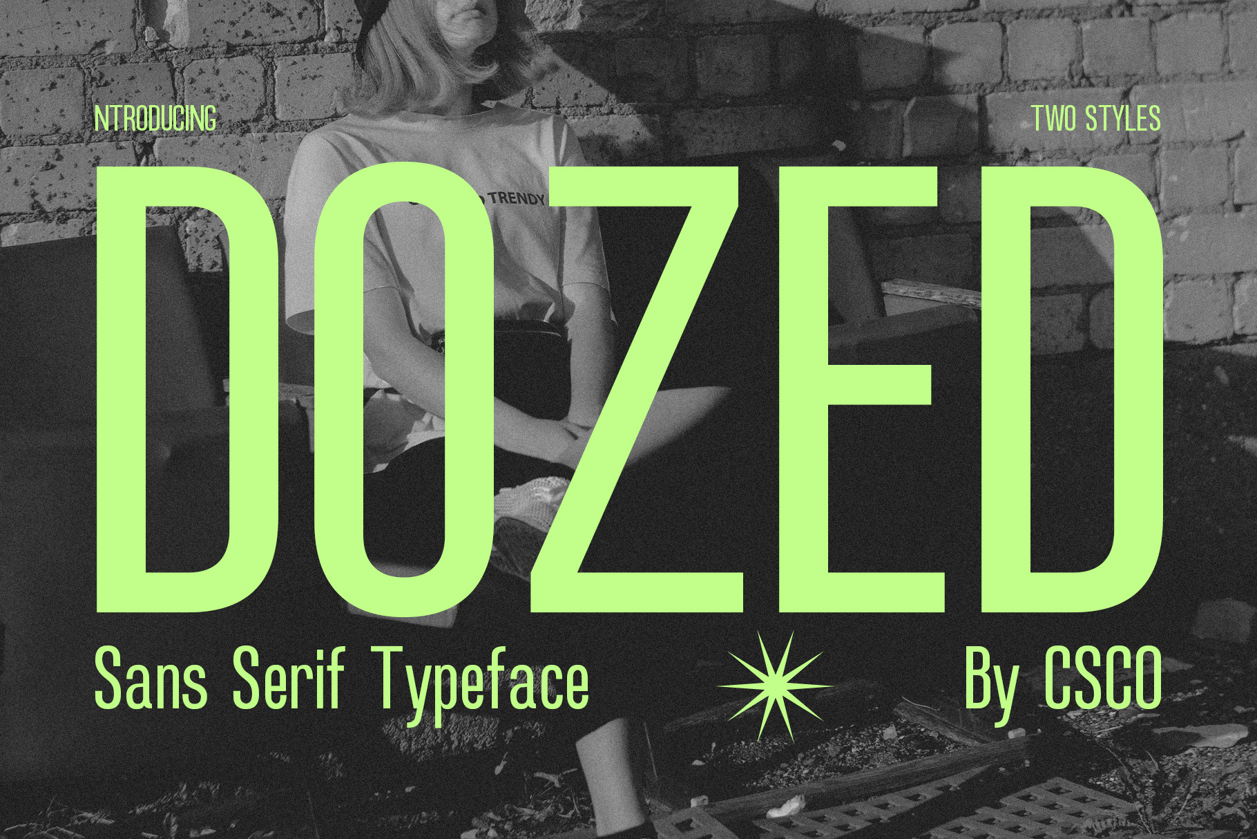
Dozed offers another interpretation of condensed typography. Its proportions can help create a wordmark that feels direct, structured, and contemporary. When working with a short brand name, a condensed typeface like Dozed can give the letters a stronger relationship with one another and make the complete word feel like one visual unit.
This font works especially well when you want a clean identity with a slightly assertive presence. Use it for logos, headlines, packaging labels, or campaign graphics where readability and visual impact need to work together.
3. CS Alford Condensed Font

CS Alford Condensed brings another useful lesson to a Legg-inspired design approach: condensed lettering can remain expressive while staying efficient. Its narrow structure allows designers to build strong typographic compositions without requiring excessive horizontal space.
Consider CS Alford when creating a logo that needs to feel organized but not generic. Its condensed character can work particularly well with minimal layouts, monochrome branding, signage, apparel graphics, and promotional typography.
4. CS Resting Modern Condensed Font
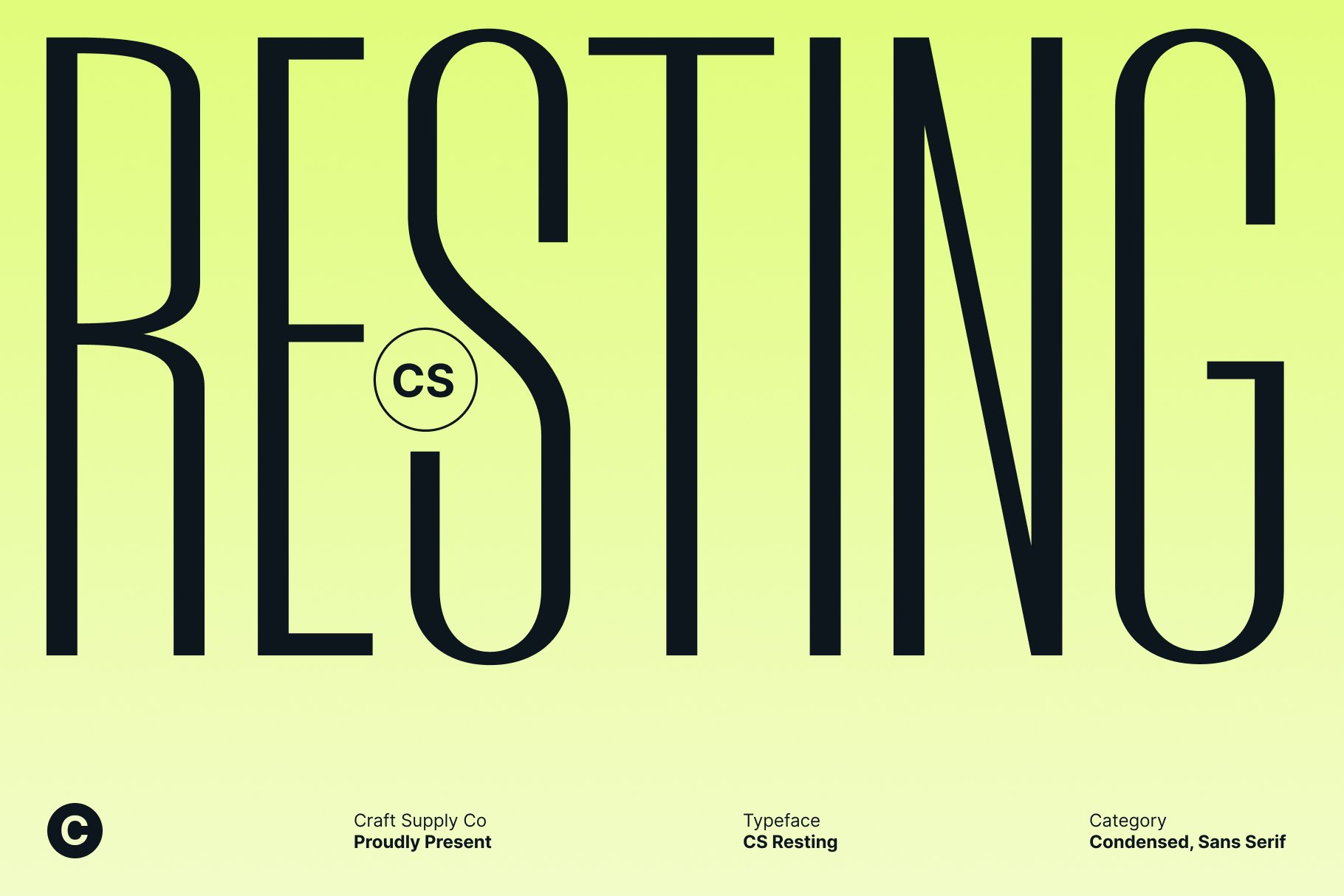
CS Resting Modern Condensed provides a more contemporary direction for designers studying the visual lessons behind Legg. The modern condensed structure gives the typeface a streamlined appearance, making it suitable for identities that need to communicate simplicity and confidence.
One effective approach is to let the typography become the primary graphic element. Keep the surrounding layout clean, use generous margins, and allow the condensed letters to create the visual tension. This technique can turn a relatively simple wordmark into a recognizable brand asset.
5. CS Astrophel Condensed Font

CS Astrophel Condensed introduces another perspective on narrow typography. Its condensed construction can help designers create a more distinctive display treatment while preserving the efficient proportions that make this category useful for logos and headlines.
For a Legg-inspired project, CS Astrophel can work when the goal is to move beyond purely neutral typography. Use it for branding that needs a little more character, especially in creative industries, posters, merchandise, and identity systems built around strong type.
6. Aguero Sans Rounded Dynamic Elegance
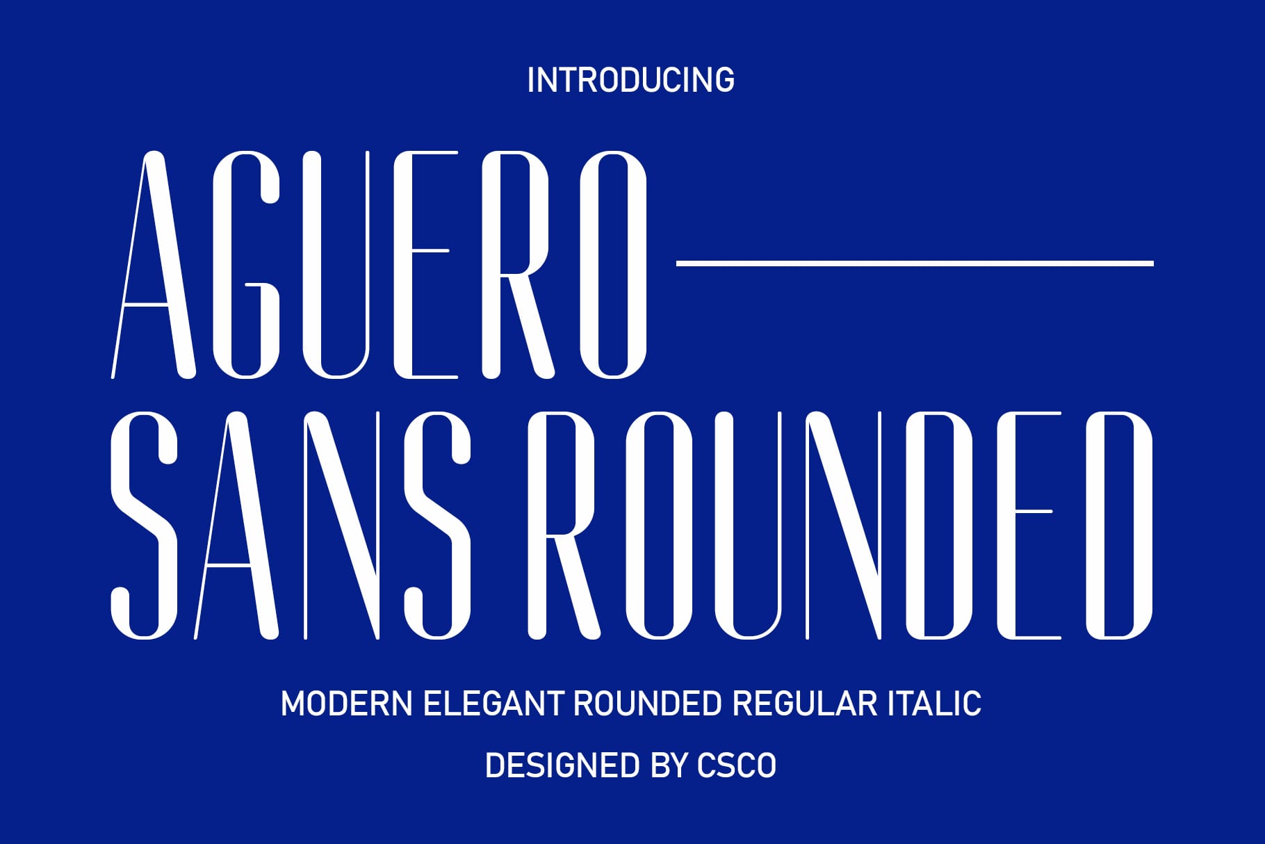
Aguero Sans Rounded takes the design conversation in a softer direction. While Legg can inspire designers to examine proportion and compact typography, a rounded sans serif shows how those principles can become friendlier and more approachable.
The rounded construction can work particularly well for brands that want a modern identity without feeling too rigid. Consider this style for lifestyle businesses, digital products, creative services, children’s brands, or contemporary consumer products. It is also useful when you want a wordmark to feel polished while maintaining a human touch.
7. CS Balenda Mix

CS Balenda Mix demonstrates how a mixed typographic approach can create more visual personality. Instead of depending entirely on condensed proportions, this style encourages designers to consider contrast, character, and variation as part of the identity.
It can be a compelling choice when a straightforward condensed sans serif feels too predictable. Use CS Balenda Mix for experimental branding, packaging, editorial projects, or logos where the typography needs to become a central part of the visual storytelling.
8. Albercio Mix

Albercio Mix offers another way to explore the relationship between structure and personality. For designers studying Legg, this is a useful reminder that a successful wordmark does not always need to follow one rigid typographic formula.
A mixed typeface can create unexpected relationships between letters and introduce contrast into an otherwise minimal identity. Albercio Mix is worth considering for creative brands that want their typography to feel designed rather than simply selected from a font menu.
9. Bondie Mix

Bondie Mix provides a flexible alternative for projects that need a more expressive typographic voice. Its mixed approach can help designers build a wordmark with stronger visual variation, which becomes especially useful when the brand name itself is short.
Use Bondie Mix when you want to preserve the idea of typography as the main visual element while adding more character to the composition. It can work across identity design, apparel, packaging, social graphics, and creative campaign materials.
10. CS Resting Mix
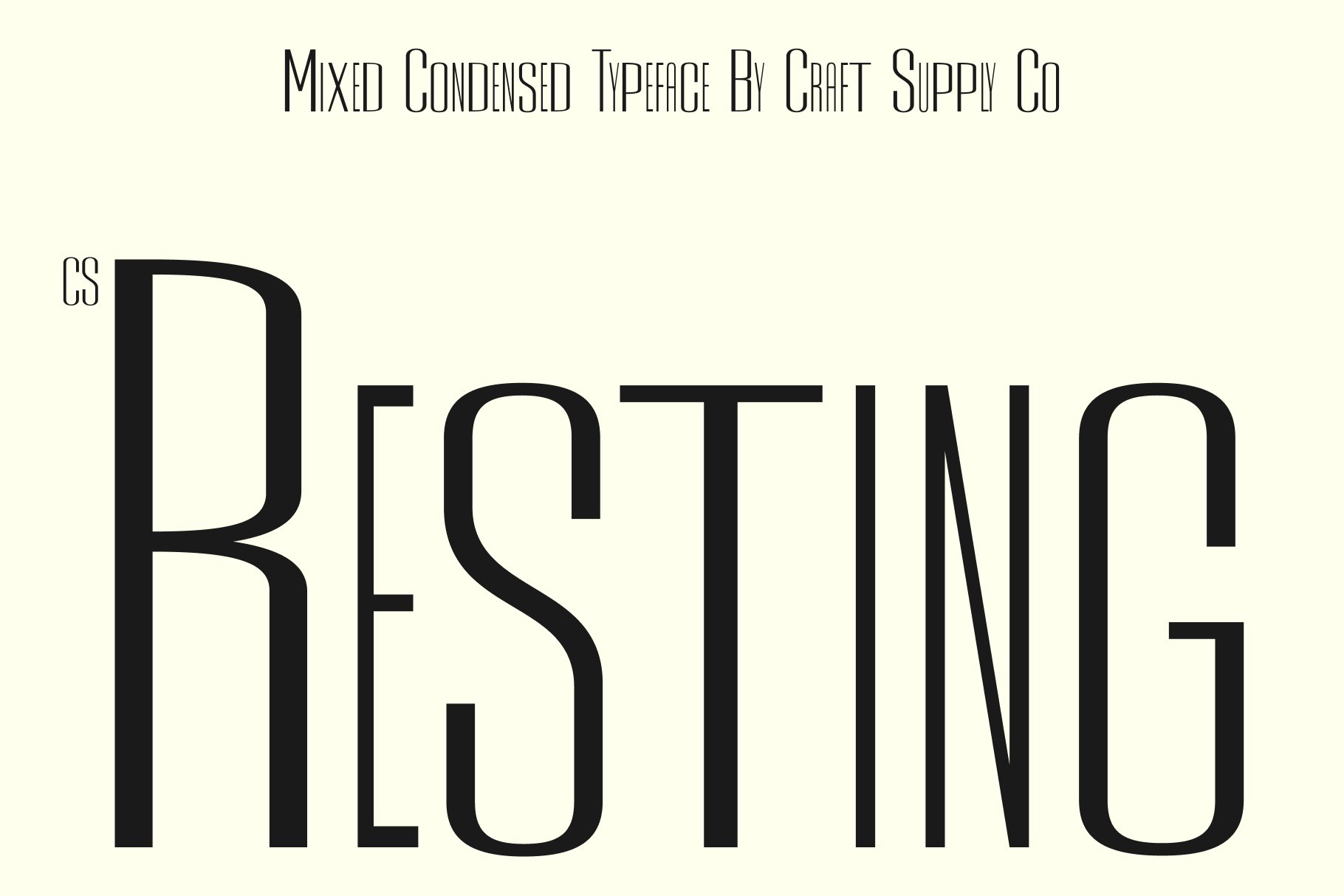
CS Resting Mix completes the selection with a more flexible interpretation of the modern typographic aesthetic. It can help designers move between structured and expressive treatments while keeping typography at the center of the composition.
This makes it useful for designers who like the visual discipline found in compact wordmarks but want more freedom to experiment. Try CS Resting Mix in large display sizes, explore different letter spacing, and test it alongside simple graphic elements to build a cohesive identity.
Typography Lessons Designers Can Take From Legg
The first lesson is that proportion matters. A font’s width can dramatically change the way a brand name occupies a layout. Condensed lettering creates density and efficiency, while wider lettering creates openness and a more relaxed rhythm. Neither approach is automatically better; the right choice depends on the personality the identity needs to communicate.
The second lesson is to treat spacing as part of the design. Even an excellent font can lose its impact when the tracking feels accidental. For a short wordmark, experiment with tighter and wider spacing until the letters form a balanced silhouette.
The third lesson is to consider the word as a complete shape. Designers sometimes evaluate each letter separately and overlook how the characters interact. A strong logo should work both as individual letterforms and as one recognizable visual structure.
How to Build a Legg-Inspired Logo Without Copying It
Start by identifying the qualities you want to borrow rather than attempting to reproduce the original appearance. You might choose condensed proportions, strong vertical rhythm, compact spacing, or a minimalist composition. These are design principles rather than specific visual details.
Next, test several typefaces from different categories. A condensed sans serif can provide precision, while a rounded or mixed font can create a softer or more expressive interpretation. Compare the options at the actual size where the logo will appear.
Finally, customize the typography. Adjust spacing, scale individual characters, explore capitalization, and consider subtle modifications to distinctive letters. These small changes can turn a font-based concept into a more personal brand identity.
Where Condensed Typography Works Best
Condensed fonts are particularly effective in environments where designers need strong typography without taking up too much space. They work well in logos, fashion labels, posters, magazine headlines, packaging, signage, event identities, and social media graphics.
They can also create a strong sense of hierarchy. A condensed display font can act as the visual anchor, while a simpler supporting typeface handles descriptions and longer text. This combination creates contrast without requiring complicated graphic elements.
Tips for Choosing the Right Font Alternative
- Check the proportions: Look at how narrow or wide the letters feel in the complete word.
- Test the spacing: Small tracking adjustments can completely change a logo’s personality.
- Study distinctive letters: Pay attention to characters that repeat or create the strongest visual features.
- Consider readability: A display font still needs to communicate the brand name clearly.
- Match the personality: Choose between clean, rounded, expressive, or experimental styles based on the brand.
- Test at multiple sizes: A font that looks impressive large may not work as well in a small logo.
- Build contrast: Pair expressive display typography with a simpler supporting font when necessary.
Explore More Typography Inspiration
Finding the right font often begins with studying how other designers approach typography. Looking through curated identity work can help you understand how letterforms, spacing, composition, and supporting graphics work together. For more creative typography and branding inspiration, explore the work of Craft Supply Co.
The design lessons hidden inside Legg go beyond choosing a similar font. They show how proportion, spacing, rhythm, and simplicity can transform a short word into a memorable visual identity. When a logo contains only a few letters, every typographic decision becomes more important.
The ten font alternatives above provide different ways to explore that design language. Condensed options such as Folime, Dozed, CS Alford, CS Resting Modern, and CS Astrophel can create compact and confident wordmarks, while Aguero Sans Rounded, CS Balenda Mix, Albercio Mix, Bondie Mix, and CS Resting Mix offer softer or more expressive interpretations.
The best approach is not to reproduce Legg exactly, but to understand what makes its visual structure effective and translate those principles into your own work. With thoughtful typography, careful spacing, and a clear sense of brand personality, even a simple word can become a powerful identity.