
A great travel vlog font thumbnail can turn a casual scroll into a click. Whether you share breathtaking mountain views, explore bustling city streets, document backpacking adventures, or discover hidden local destinations, your thumbnail needs to communicate the excitement of your journey in just a few seconds. While photography plays a major role, typography helps deliver the message, establish your personality, and make your videos recognizable.
Choosing the right font can transform an ordinary thumbnail into an eye catching visual. Bold lettering can emphasize an unexpected adventure, condensed typography can fit longer titles into limited space, and retro fonts can give travel content a nostalgic personality. The best choice depends on your destination, storytelling style, target audience, and overall channel identity.
In this guide, we explore 10 travel vlog font recommendation options, covering bold display fonts, contemporary sans serifs, expressive retro styles, elegant serifs, and experimental typography. As you explore Craft Supply Co to find these typefaces, these options can help you create engaging YouTube thumbnails while maintaining a consistent visual identity across your travel content.
What Makes a Good Font for Travel Vlog Thumbnails?
Travel thumbnails compete with countless other videos, so your typography needs to communicate quickly. A good thumbnail font should remain readable at small sizes, create a clear visual hierarchy, and complement the photograph rather than overpower it.
Readability comes first. Most viewers encounter thumbnails on mobile devices, where small lettering can quickly become difficult to read. Choose fonts with distinctive letterforms and enough weight to stand out against busy backgrounds. Bold and condensed fonts often work well because they let you display short phrases without covering too much of the image.
Personality matters, too. A backpacking vlog might benefit from energetic, funky typography, while a luxury travel channel may suit a more refined serif. Minimalist city guides can use clean sans serif fonts, and nostalgic road trip videos can embrace vintage lettering.
Finally, think about consistency. Using a recognizable set of fonts across your thumbnails helps viewers identify your videos while browsing. You can explore Craft Supply Co to find the right assets to experiment with colors, photographs, and layouts while keeping your typography familiar.
10 Font Recommendations for Travel Vlog Thumbnails
1. Vorline Bold Funky Font

Vorline Bold Funky Font is a strong option for travel creators who want their thumbnails to feel energetic, playful, and impossible to overlook. Its bold, funky design suits videos built around spontaneous adventures, unusual destinations, exciting activities, and entertaining travel experiences.
Use this font for short thumbnail headlines such as “WILD THAILAND,” “BEST ROAD TRIP,” or “FIRST TIME HERE.” Its expressive character can help communicate excitement before viewers even read the video title. It also works well for creators who build their channels around colorful destinations, street food discoveries, amusement parks, or lively travel challenges.
For the best results, keep your wording short and give the letters enough room to stand out. Pair the font with a clean supporting typeface when you need additional information, and avoid placing decorative lettering over a background that already contains too many competing details.
2. Blonden Rough Condensed Vintage Sans Serif

Blonden Rough Condensed Vintage Sans Serif offers a distinctive look for travel thumbnails that need a rugged, adventurous, or nostalgic atmosphere. Its condensed construction makes it useful when you want to fit a strong headline into a narrow space, while its rough vintage character can add personality to the overall composition.
This font is particularly suitable for road trips, mountain expeditions, camping adventures, backpacking journeys, and documentary style travel videos. Try phrases such as “LOST IN THE ALPS,” “DESERT ADVENTURE,” or “THE LONG ROAD.” The vintage treatment can also complement photographs of old towns, historic destinations, and classic vehicles.
Combine it with dramatic landscape photography and strong contrast. A subtle shadow or carefully placed outline can improve readability when the background contains trees, buildings, or textured scenery.
3. Gladwyn Vintage Funky Retro

Gladwyn Vintage Funky Retro is an appealing choice for travel creators who want to build a playful, colorful, and memorable visual identity. Retro typography can give thumbnails a sense of nostalgia, making it a natural fit for summer holidays, beach destinations, vintage road trips, and travel diaries inspired by earlier decades.
Use it for content such as “SUMMER IN BALI,” “RETRO TOKYO,” or “THE ULTIMATE BEACH TRIP.” Its expressive style can help your thumbnails feel more personal than standard travel graphics, especially when you use warm colors, film-inspired photographs, or playful compositions.
To maintain readability, avoid combining too many decorative elements. Let the headline become a focal point, and use a simpler font for any additional text. This approach creates an engaging thumbnail without distracting viewers from the destination itself.
4. Maretyn Contemporary Sans Serif

Maretyn Contemporary Sans Serif is worth considering for creators who prefer a modern, clean, and versatile thumbnail style. Contemporary sans serif typography can communicate information efficiently, making it useful for travel guides, destination reviews, hotel tours, and practical videos that help viewers plan their trips.
Try this font for headlines such as “48 HOURS IN SEOUL,” “WHERE TO STAY,” or “IS IT WORTH IT?” Its straightforward visual approach can support a wide range of photography, from bright tropical destinations to architectural cityscapes and minimalist hotel interiors.
Use a strong weight and a clear contrast between the text and the photograph. You can also establish a repeatable thumbnail system by keeping the font consistent while changing the headline, image, and accent color for each destination.
5. Heily Modern Grotesque Swiss Design

Heily Modern Grotesque Swiss Design is a suitable direction for travel vloggers who value clarity, structure, and contemporary visual design. Modern grotesque typography works especially well when a thumbnail needs to feel organized and editorial rather than overly decorative.
Consider using this font for city guides, cultural travel documentaries, architecture tours, museum visits, and destination comparisons. Headlines such as “EXPLORING COPENHAGEN” or “JAPAN TRAVEL GUIDE” can look clean and professional when supported by a well composed photograph.
This style also suits creators who want their channel to appeal to viewers looking for useful travel information. Keep the text hierarchy simple, use consistent alignment, and allow the photography to communicate the atmosphere of each location.
6. Geryn Elevating Elegance Serif Typography

Geryn Elevating Elegance Serif Typography offers an elegant direction for travel thumbnails that focus on premium experiences, sophisticated destinations, and carefully curated journeys. Serif typography can introduce a refined editorial quality that works particularly well with luxury hotels, upscale dining, boutique resorts, and cultural travel.
Use it for headlines such as “THE ART OF PARIS,” “LUXURY IN MALDIVES,” or “A WEEK IN FLORENCE.” The contrast between elegant lettering and striking travel photography can help communicate a sense of exclusivity without relying on excessive graphic effects.
Choose short headlines and test the lettering at thumbnail size before publishing. Serif details may become less distinct on small screens, so give the text enough space and use a background with sufficient contrast.
7. Rivania Contemporary Wedge Serif

Rivania Contemporary Wedge Serif provides another serif option for travel creators who want a distinctive look without abandoning a polished presentation. Wedge serifs can introduce a strong graphic character, making them useful for editorial style thumbnails and travel content with a clear narrative.
This font can work well for destination features, scenic train journeys, heritage locations, architectural explorations, and travel stories focused on local culture. Try phrases such as “BEYOND THE CITY” or “DISCOVER OLD EUROPE” to give the thumbnail a magazine inspired feel.
Pair it with striking photography and a restrained layout. A contemporary serif can look especially effective when the destination itself provides interesting shapes, textures, and colors, allowing the typography to complement the image rather than compete with it.
8. Raely Retro Funky Reverse Sans
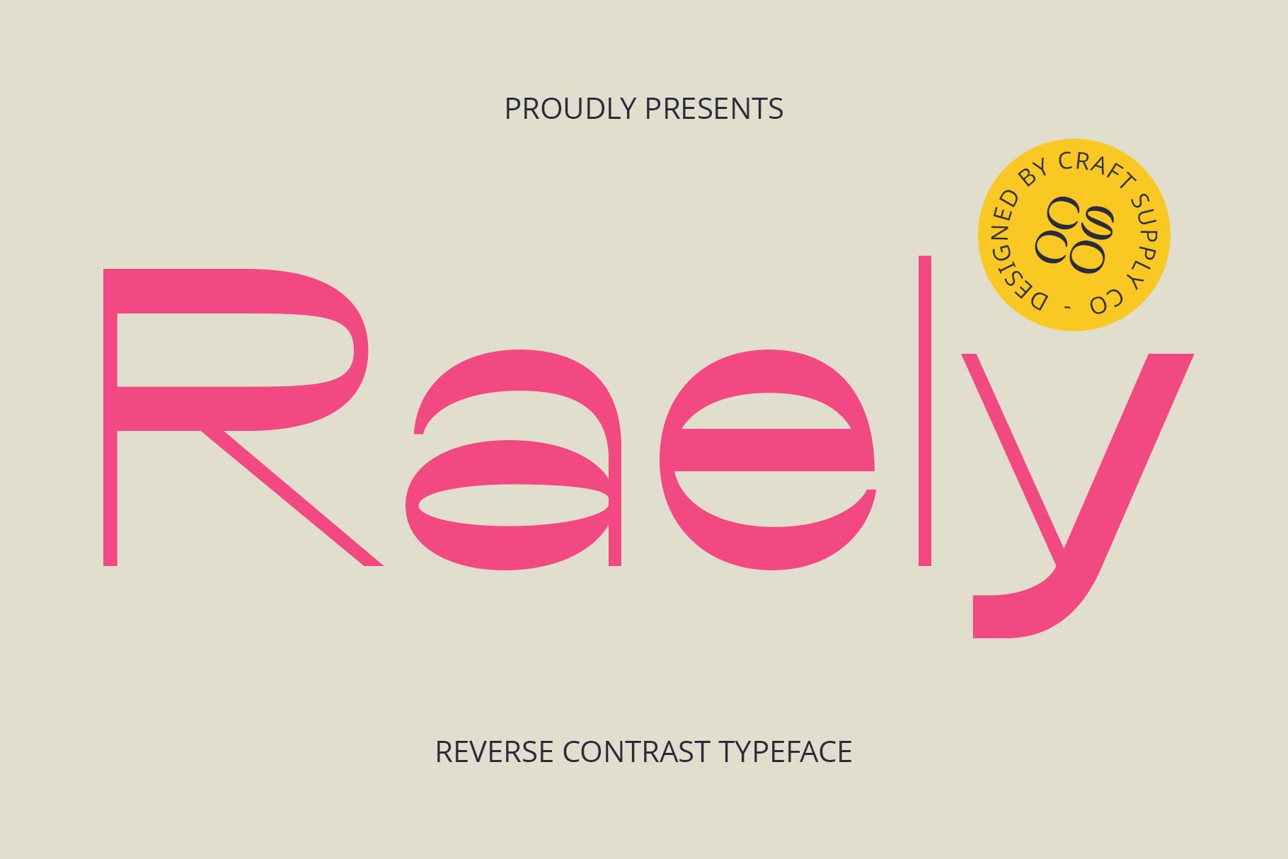
Raely Retro Funky Reverse Sans is a creative option for travel vloggers who want their thumbnails to feel bold, playful, and different from conventional designs. Its retro inspired personality can support content about unusual destinations, nostalgic experiences, colorful cities, and unconventional travel adventures.
Use it for attention grabbing phrases such as “WHAT A PLACE!” or “NEVER SEEN THIS.” The expressive style can also work for food tours, festival coverage, beach holidays, and videos documenting unexpected moments during a trip.
Because funky display fonts already carry a strong visual identity, keep the rest of the thumbnail relatively simple. Use one main headline, one prominent photograph, and a limited color palette to preserve clarity and make the overall composition feel intentional.
9. Railine Condensed Serif

Railine Condensed Serif can help travel vloggers combine an editorial appearance with space efficient headlines. Condensed lettering is useful when a destination name or short phrase contains several words, while the serif character adds visual interest.
This font can suit travel documentaries, historical destinations, cultural guides, scenic train journeys, and videos exploring lesser known places. Headlines such as “HIDDEN GEMS OF ITALY” or “THE OTHER SIDE OF JAPAN” can create a strong sense of discovery.
Use it when you want a thumbnail to feel more like a travel magazine cover than a conventional promotional graphic. Make sure the headline remains legible against the photograph, particularly when the background includes intricate architectural details or busy street scenes.
10. Rondey Blur Font

Rondey Blur Font offers an experimental direction for travel creators who want to explore motion, atmosphere, and unconventional visual storytelling. A blur inspired typeface can suggest movement and energy, making it interesting for fast paced travel videos, nightlife explorations, road trips, and urban adventures.
Consider using it for concepts such as “CITY AFTER DARK,” “ON THE MOVE,” or “A CRAZY WEEKEND.” Its distinctive appearance can help a thumbnail feel dynamic, especially when paired with photographs featuring motion, neon lights, busy streets, or action oriented activities.
Because blurred lettering can affect readability, use it selectively. Keep the headline brief, provide sufficient contrast, and consider using a clearer secondary font for essential information. This balance lets you experiment with an unusual type style without sacrificing the immediate communication that thumbnails require.
How to Choose the Best Font for Your Travel Vlog
Before selecting a font, identify the kind of travel experience your channel delivers. Adventure creators often benefit from bold or rough typography that communicates energy and exploration. Luxury travel vloggers may prefer elegant serif fonts that suggest sophistication. Creators who publish practical destination guides can prioritize clean sans serif styles for a more informative presentation.
Next, consider your photography. A thumbnail featuring a dramatic mountain landscape may need a bold headline that contrasts with the scenery. A photograph of a colorful market may already contain plenty of visual information, so a simpler font and less text could produce a better result.
Think about your audience, too. If viewers recognize your channel through a consistent visual style, your font choices become part of your brand identity. You can explore Craft Supply Co to find the perfect assets, then choose one primary display font and, if necessary, one supporting typeface. Keep their roles consistent across your videos to create a recognizable collection of thumbnails.
Tips for Making Travel Vlog Thumbnail Text More Effective
- Keep headlines short. Focus on a destination, activity, surprising discovery, or clear question instead of describing the entire video.
- Prioritize readability. Test your thumbnail at a small size to make sure viewers can read the headline on mobile devices.
- Create strong contrast. Choose text colors that stand out against the photograph, and use a subtle outline or shadow only when necessary.
- Choose fonts that match the story. Use funky lettering for playful adventures, condensed fonts for dramatic headlines, and elegant serifs for premium travel experiences.
- Avoid unnecessary decoration. One strong font and one clear message often work better than several competing type styles.
- Build a consistent identity. Reuse your selected fonts, text placement, and accent colors to help viewers recognize your videos.
The best font recommendation for travel vlog thumbnails depends on the story you want to tell. Bold and funky typefaces can communicate excitement, vintage fonts can create a nostalgic atmosphere, contemporary sans serifs can keep travel guides clear, and elegant serifs can bring a premium editorial quality to destination videos.
Experiment with different combinations, test your designs at realistic sizes, and choose typography that complements your photographs. For more creative inspiration and design ideas, explore the work of Craft Supply Co. With a thoughtful font choice and a clear visual hierarchy, you can create travel vlog thumbnails that communicate your story, strengthen your channel identity, and encourage viewers to discover your next adventure.