
Font recommendation for theater can set the mood for a theater production before the audience sees the first scene. A carefully chosen typeface can make a play poster feel dramatic, give a musical its own visual identity, or create an elegant style for a theater program and playbill. Because theater combines storytelling, performance, music, costumes, lighting, and visual design, font recommendation for theater should support the production’s atmosphere from the first glance.
A strong font recommendation for theater should match the genre, period, audience, and personality of the production. A historical drama may call for an ornate serif or Blackletter style, while a glamorous musical could benefit from Art Deco typography. An experimental stage production might work better with expressive Art Nouveau lettering.
Font recommendation for theater also needs to function across different formats. The same visual identity may appear on posters, tickets, programs, social media graphics, websites, banners, merchandise, and signage. Choosing a typeface that maintains its character across these applications can help create a more consistent theatrical identity.
In this guide, we explore ten font recommendation for theater from Craft Supply Co that can inspire theater posters, playbills, stage promotions, drama events, musical graphics, and other theatrical design projects.
What Makes a Good Font for Theater?
The best theater font depends heavily on the production. There is no universal typeface for every play or performance. Instead, begin with the story and identify the mood you want the audience to experience before they enter the theater.
When selecting typography for a theatrical project, consider:
- Drama and personality: The typeface should help establish the production’s mood.
- Readability: Production titles, dates, venues, and ticket information need to remain clear.
- Historical character: Period-inspired typography can support productions set in a particular era.
- Visual distinction: The title should stand apart from ordinary event information.
- Scalability: The font should work on posters, programs, social media graphics, and signage.
- Composition: The typography should complement photography, illustrations, costumes, and stage imagery.
For theatrical designs, decorative fonts often work best as display typography. Use them for production titles and prominent headings, then pair them with a simpler typeface for longer descriptions and practical information.
Font Recommendation for Theater Design
The following ten fonts cover Art Deco, Art Nouveau, and Blackletter-inspired styles. Each can create a different atmosphere, from sophisticated and glamorous to historical, decorative, and dramatic.
1. CS Savion Art Deco Font

CS Savion Art Deco Font is a natural choice for theater productions that need a glamorous and sophisticated visual identity. Art Deco typography can immediately suggest elegance, geometric ornamentation, and a classic stage atmosphere.
Use it for musical posters, theater marquees, cabaret performances, vintage-inspired productions, gala events, and sophisticated playbills. Its decorative character can make the production title feel like part of the stage environment.
For a balanced design, combine the Art Deco title with a simple supporting font for cast names, dates, ticket information, and venue details.
2. CS Lempo Art Deco Font

CS Lempo Art Deco Font provides another elegant direction for theatrical typography. Its Art Deco character can help create a polished identity for productions inspired by classic entertainment, fashion, architecture, or historical design.
Consider it for musical theater posters, performance programs, dance productions, cultural events, and vintage-themed stage shows. It can also work well for promotional materials where the title needs a strong decorative presence.
Use generous spacing and a restrained color palette to allow the geometric character of the typeface to remain visible.
3. CS Hazel Art Deco Font

CS Hazel Art Deco Font can bring a refined decorative quality to theater branding. Art Deco lettering is especially useful when a production wants to communicate glamour, sophistication, or a classic entertainment atmosphere.
Try it for stage musicals, theater festivals, dance performances, cabaret posters, and elegant event invitations. The typeface can also work well on tickets and programs when used as a title or section heading.
Pair the decorative lettering with simple body typography to maintain a clear hierarchy throughout the design.
4. CS Deimos Art Deco Font
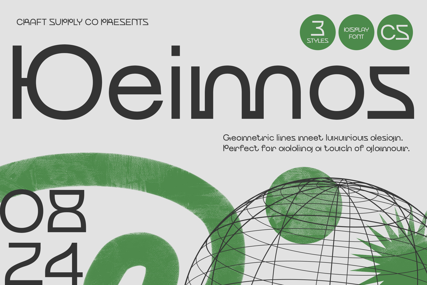
CS Deimos Art Deco Font offers another option for designers who want geometric elegance in a theatrical identity. Its decorative style can help transform a production title into a visual centerpiece.
Use it for theater posters, film-inspired stage productions, dance events, cultural performances, and vintage-inspired promotional campaigns.
For a strong composition, give the title enough negative space. Decorative fonts often become more effective when viewers can clearly see the details of the letterforms.
5. CS Watson Art Deco Font
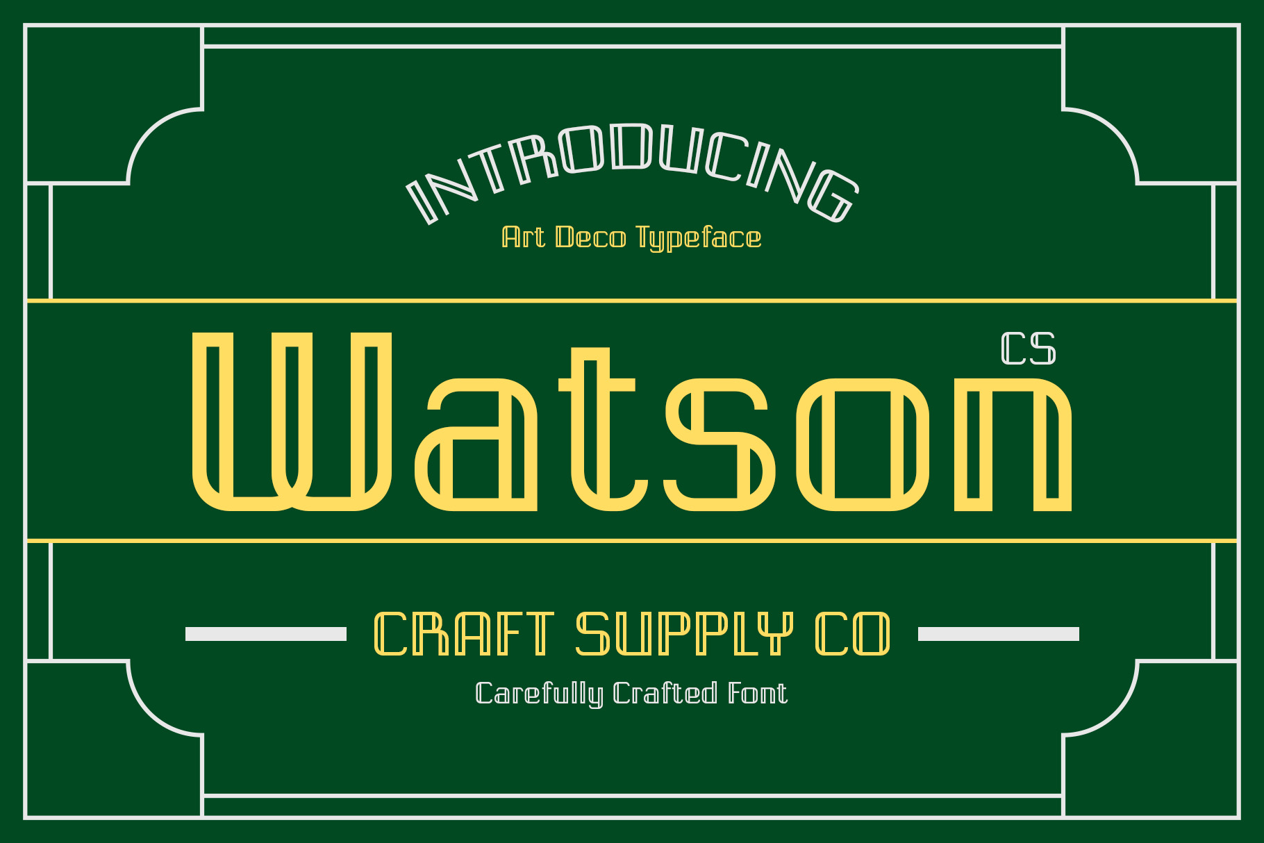
CS Watson Art Deco Font can create a classic and stylish direction for theater typography. Its Art Deco character makes it useful for productions that need an elegant visual language rather than an informal or contemporary appearance.
Consider it for musical posters, theater programs, gala performances, dance productions, and vintage-themed events. It can also work as part of a broader theatrical identity across tickets, banners, social graphics, and merchandise.
Use the font selectively for the main title and combine it with a readable typeface for secondary content.
6. CS Sabela Art Nouveau Font

CS Sabela Art Nouveau Font offers a more organic alternative to geometric Art Deco styles. Art Nouveau typography often uses flowing forms and decorative curves, making it suitable for productions with romantic, artistic, historical, or botanical visual themes.
Use it for theater posters, period dramas, dance performances, literary adaptations, artistic stage productions, and cultural events.
The flowing shapes can pair particularly well with botanical illustrations, ornamental borders, elegant photography, and theatrical costumes.
7. CS Bertile Art Nouveau Font
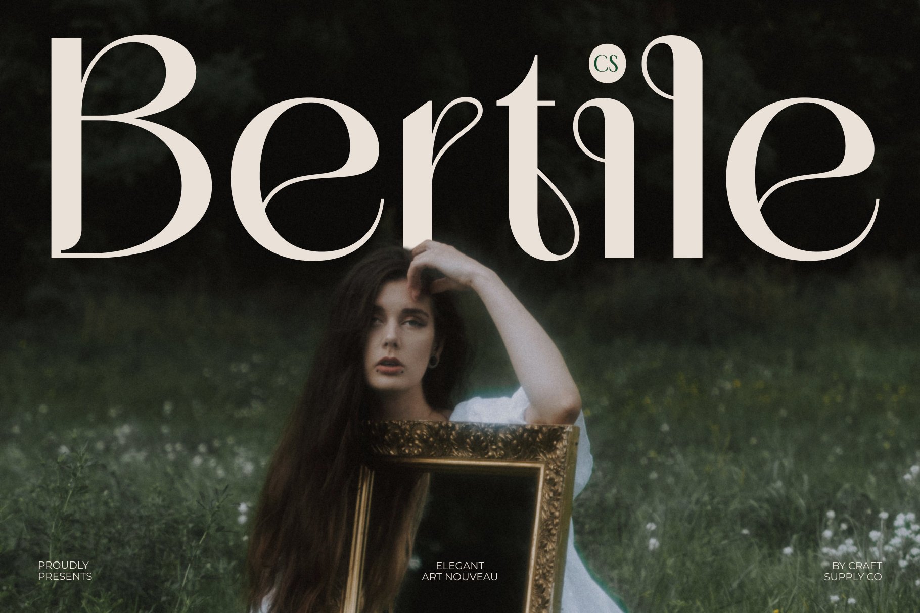
CS Bertile Art Nouveau Font provides another decorative direction for theatrical design. Its ornamental character can make a production title feel expressive and artistic.
Consider it for historical plays, romantic productions, art performances, theater festivals, cultural events, and creative stage projects. The font can also create an interesting visual identity for playbills and promotional posters.
When using an ornate typeface, avoid filling every area of the layout with decoration. Let the typography remain a focal point.
8. CS Maelyn Art Nouveau Font
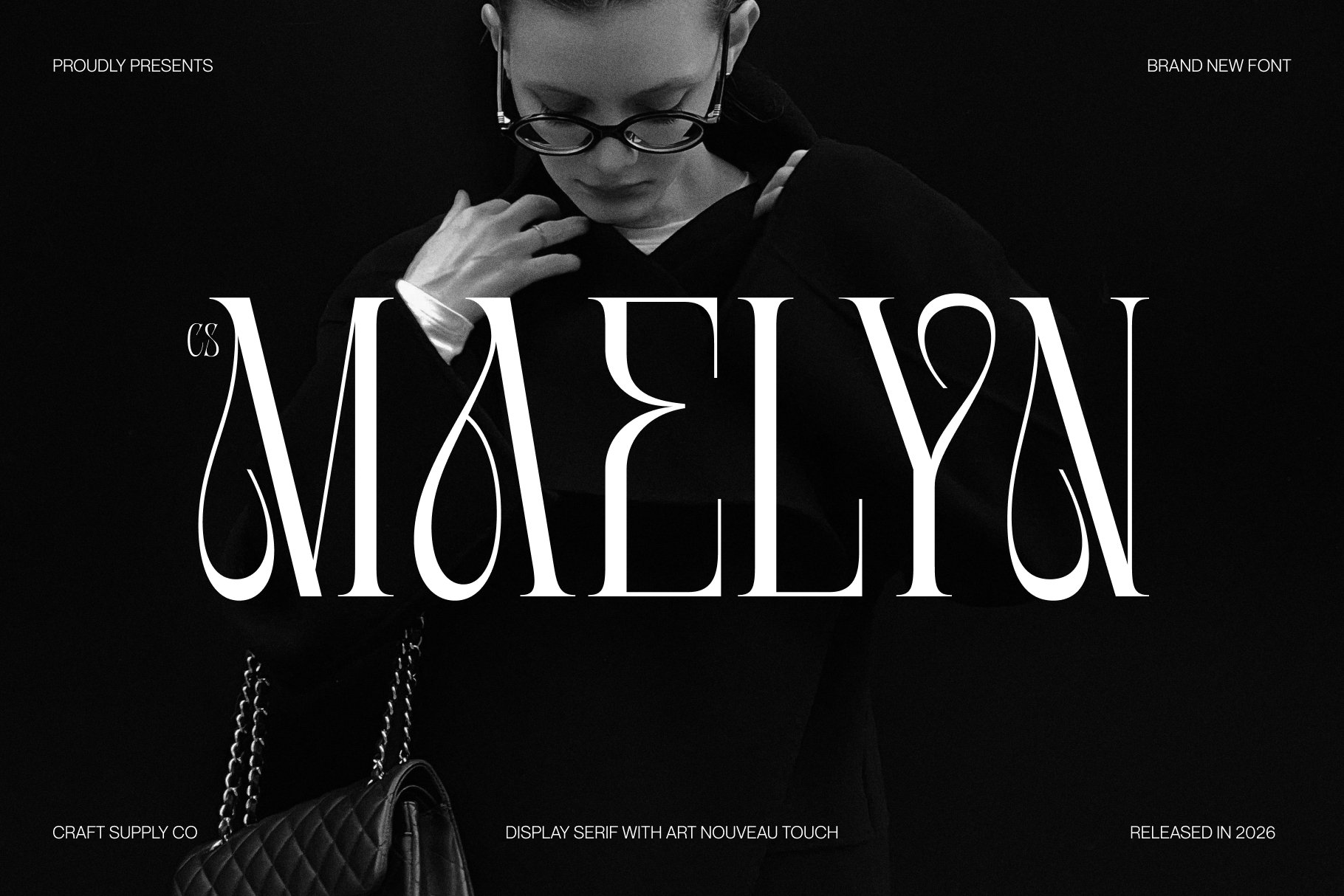
CS Maelyn Art Nouveau Font can bring an elegant and expressive quality to theater typography. Its Art Nouveau direction is suitable for productions where the visual identity needs flowing forms and decorative character.
Use it for stage dramas, dance performances, literary productions, art exhibitions with theatrical elements, and vintage-inspired events.
Try placing the production title prominently at the center of the poster and using the typeface alongside decorative curves or illustrated motifs that echo its visual language.
9. CS Hartley Blackletter Font
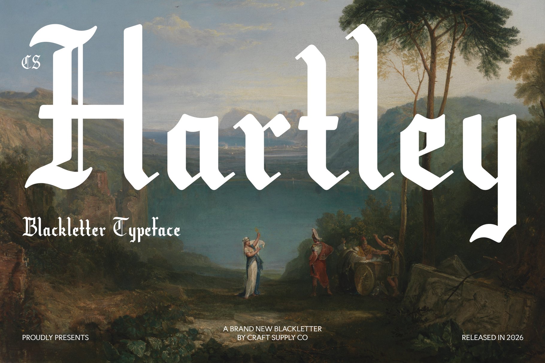
CS Hartley Blackletter Font provides a dramatically different visual direction. Blackletter typography can evoke historical manuscripts, medieval aesthetics, gothic themes, and traditional print culture.
This makes it useful for historical dramas, gothic theater, period productions, fantasy performances, dramatic plays, and productions with a dark or medieval visual theme.
Because Blackletter can become difficult to read at small sizes, use it primarily for the production title or short phrases. Pair it with a simpler font for dates, venue information, and longer descriptions.
10. CS Morwen Art Nouveau Font

CS Morwen Art Nouveau Font offers another decorative option for theatrical identities. Its artistic character can help create a distinctive atmosphere for productions that want an elegant or historical visual direction.
Use it for drama posters, dance performances, theatrical festivals, artistic events, and period-inspired productions. It can also work beautifully with ornamental illustrations and carefully composed layouts.
For a polished result, keep the rest of the typography restrained so the decorative letterforms remain the main visual feature.
Font Recommendation for Theater Posters
A theater poster needs to attract attention quickly while communicating essential information. The production title should usually receive the strongest typographic treatment, followed by the main performers, venue, dates, and ticket information.
For glamorous productions, Art Deco fonts such as CS Savion, CS Lempo, CS Hazel, CS Deimos, and CS Watson can establish a sophisticated visual identity. Artistic or historical productions, Art Nouveau options such as CS Sabela, CS Bertile, CS Maelyn, and CS Morwen can provide more organic decorative forms. Gothic or medieval productions, CS Hartley Blackletter can create a stronger historical character. The key is to match the typography to the story rather than selecting a font simply because it looks dramatic.
Choosing Fonts for Theater Playbills
A playbill has different typography requirements from a promotional poster. While the cover can use an expressive display font, the interior usually contains cast lists, production notes, biographies, schedules, acknowledgments, and other detailed information.
Use the decorative font for the production name, section headings, or selected visual elements. Then use a readable body font for paragraphs and lists.
This combination creates a clear hierarchy. Audiences can recognize the production identity while still reading the practical information comfortably.
Font pairing helps theatrical designs remain both expressive and readable. A decorative display font can establish the mood while a simpler supporting font handles the information.
- Art Deco + sans serif: Use the Art Deco font for the production title and a clean sans serif for dates and venue information.
- Art Nouveau + serif: Combine decorative curves with a readable serif for an elegant editorial appearance.
- Blackletter + simple sans serif: Let the Blackletter title establish the historical mood while the supporting font maintains clarity.
- Decorative title + neutral body font: Create strong contrast between theatrical branding and practical information.
Avoid pairing several highly decorative fonts together. When every element demands attention, the viewer may struggle to identify the most important information.
Common Theater Typography Mistakes
One common mistake is choosing a decorative font without considering the production’s actual theme. A beautiful Art Deco font may not suit a medieval drama, just as a Blackletter font may not communicate the intended mood of a contemporary comedy.
Another mistake is sacrificing readability for atmosphere. Theater posters need to communicate dates, locations, performers, and ticket information. These details should remain easy to read.
It is also important to avoid excessive decoration. Theater typography can be dramatic without filling every available space. Negative space can make an ornate title more powerful and easier to recognize.
How to Choose the Right Theater Font
Start by identifying three things: the production’s genre, its visual era, and its intended audience. These factors can quickly narrow the typography choices.
If the production feels glamorous or is inspired by classic entertainment, try the Art Deco style. For characters that are organic, romantic, or artistic, consider the Art Nouveau style. If the production features medieval, Gothic, or historical influences, the Blackletter style might provide a stronger visual connection.
Then create several poster variations using the same production title. Compare how the fonts affect the overall mood. Test the design in full color and black and white, and check how the title looks at both large and small sizes.
The right font recommendation for theater should support the story before the audience even enters the venue. Typography can establish historical character, glamour, mystery, elegance, or artistic expression through the shapes of the letters alone.
Use expressive fonts for titles and major headings, then combine them with readable supporting typography for dates, cast information, venue details, and other practical content. This balance allows the design to feel theatrical without becoming difficult to understand.
A successful theater font does more than decorate a poster. It helps establish the identity of the production and gives the audience a visual preview of the experience ahead. By matching typography to the story, maintaining clear hierarchy, and testing the design across different formats, you can create a theatrical identity that feels cohesive from the poster to the playbill.
For more creative typefaces and typography inspiration, explore Craft Supply Co. You can also discover more design and typography projects from Craft Supply Co on Behance.