
Choosing the right typography can make a skincare brand feel instantly more trustworthy, refined, natural, and luxurious. From product labels and jars to websites, social media graphics, and promotional materials, a well-chosen typeface helps communicate the personality of your skincare line before customers even read the product details. If you are looking for a font recommendation for skincare, the best choices often combine elegance, readability, softness, and a connection to beauty or nature.
Skincare branding can take many directions. A brand may focus on clean ingredients and botanical formulas, luxurious anti-aging products, modern minimalist packaging, or playful self-care products. Because of these different identities, there is no single perfect skincare font. Instead, typography should support the mood, audience, and positioning of the brand.
Below are font recommendation for skincare that can work beautifully for skincare logos, packaging, product labels, websites, advertisements, and social media designs.
What Makes a Good Font for Skincare Branding?
A font recommendation for skincare should communicate more than style. It needs to work across different brand applications while remaining easy to recognize and read. Elegant serif fonts can create a premium impression, while organic and artistic typefaces can reinforce natural or botanical themes.
When selecting a font for skincare branding, consider these characteristics:
- Elegance: Refined typography can help position skincare products as premium and sophisticated.
- Readability: Product names, ingredients, directions, and other information need to remain clear at different sizes.
- Natural character: Organic-looking typography can work well for botanical, clean-beauty, and plant-based products.
- Distinctiveness: A recognizable font can help a skincare brand stand apart from competitors.
- Versatility: Ideally, the typeface should work on packaging, websites, social media, and printed marketing materials.
Font Recommendation for Skincare
1. Sheilina Playful Art Nouveau Font

Sheilina is an interesting choice for skincare brands that want to move beyond conventional minimalist typography. Its playful Art Nouveau character can introduce decorative details and a sense of personality to branding. The style can work particularly well for botanical skincare, beauty collections, handmade products, and brands inspired by flowers or natural forms.
Use Sheilina for a skincare logo, product collection name, campaign headline, or packaging feature text. For smaller product information, pair it with a simple sans serif to maintain readability.
2. Advine Art Nouveau Low Contrast Serif

Advine offers a sophisticated direction for skincare brands that want an elegant and artistic visual identity. Its Art Nouveau influence can complement beauty products with botanical, vintage-inspired, or luxurious positioning. The low-contrast serif character also gives the typography a refined appearance without making the design feel overly dramatic.
This font can be especially effective for skincare logos, premium product names, packaging headers, and editorial-style beauty campaigns.
3. Belisda Stamp Elegant Nature Typeface

For natural skincare branding, Belisda can provide a strong connection between typography and the outdoors. Its elegant nature-inspired character makes it suitable for products built around botanical ingredients, herbs, flowers, essential oils, or natural formulations.
Try using Belisda for product labels, organic skincare logos, packaging accents, or promotional graphics. Combining it with neutral colors and simple layouts can help create a calm and nature-focused visual identity.
4. Advine Unfocus Retro Revival

Skincare branding does not always have to look clinical or minimalist. Advine Unfocus Retro Revival can help create a more expressive identity with a nostalgic and eye-catching personality. This makes it suitable for skincare brands targeting customers who appreciate distinctive packaging and unconventional beauty aesthetics.
Use this font selectively for product names, campaign headlines, limited-edition collections, or social media artwork. Its stronger personality can become a useful visual signature when supported by simpler secondary typography.
5. Bordie Rough Vintage Condensed Display Typeface

Bordie Rough brings a vintage display quality to skincare design. Its condensed character can be useful when packaging or promotional graphics need strong typography without taking up too much horizontal space. The rough vintage appearance can also give a skincare brand a handcrafted or heritage-inspired feeling.
Consider using Bordie Rough for bold product titles, special collections, beauty campaign posters, or labels for products with a vintage-inspired concept. Pair it with a clean serif or sans serif for supporting information.
6. Revalyn Rough Font
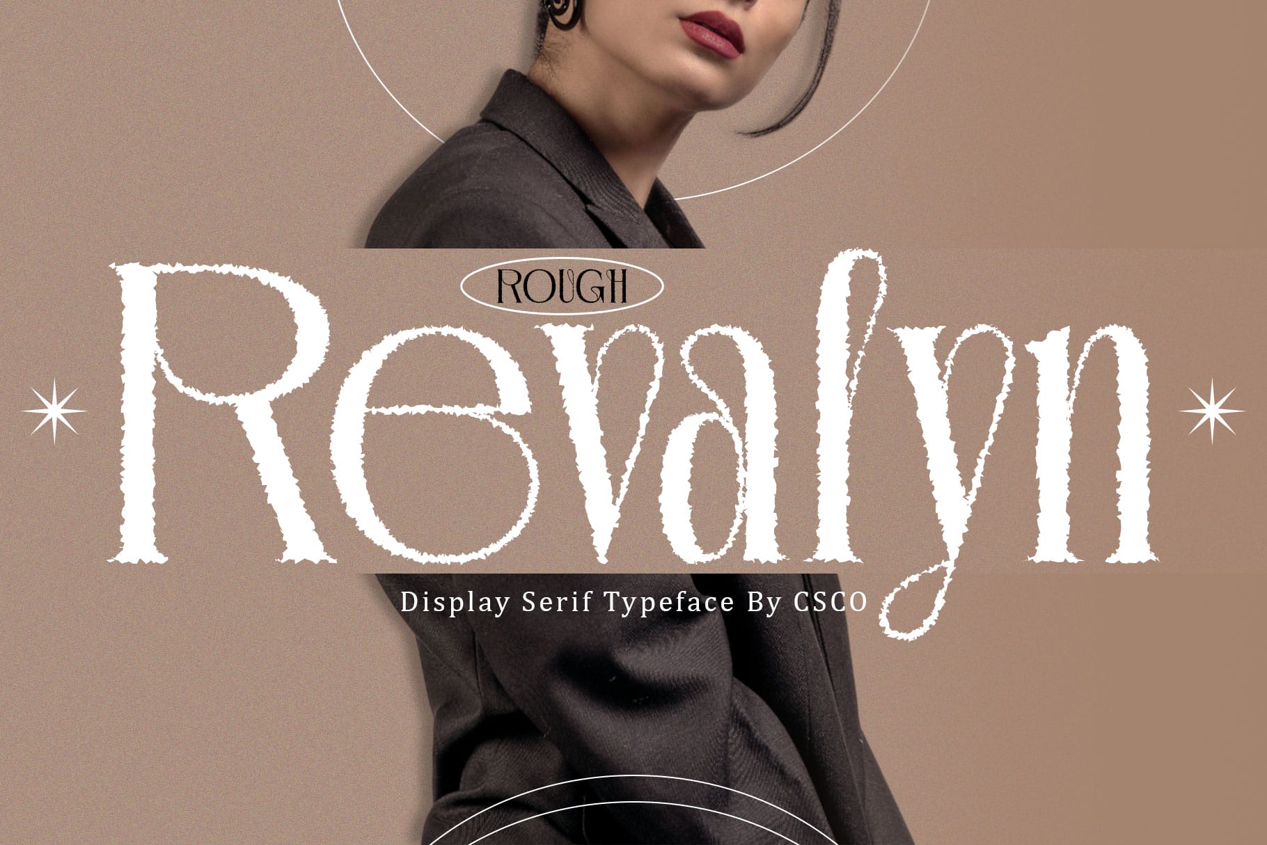
Revalyn offers a more textured and expressive direction for skincare branding. A rough typeface can be useful when the brand wants to communicate handmade character rather than a polished corporate appearance. This can suit artisan skincare, small-batch products, natural soaps, botanical products, and independent beauty businesses.
For the strongest result, use Revalyn primarily for larger display elements such as logos, product names, or campaign titles. Keep detailed product information in a cleaner supporting font.
7. Neckyn Blur Font

Neckyn Blur provides a more experimental option for modern skincare branding. Its blurred visual character can introduce movement and contemporary energy to a beauty identity. It may work particularly well for skincare campaigns aimed at younger audiences or brands that want a fashion-forward and unconventional appearance.
Rather than using it for every piece of text, consider Neckyn for short headlines, campaign graphics, social media posts, or special product launches. A straightforward secondary typeface can balance its distinctive appearance.
8. Qianzy Elegant Font

Qianzy is a natural candidate for skincare brands that want an elegant and sophisticated identity. Refined typography can immediately support a premium beauty aesthetic, making this style suitable for facial serums, moisturizers, creams, luxury treatments, and curated skincare collections.
Use Qianzy for a logo, product name, packaging headline, or website hero section. It can also work nicely in beauty editorials and social media graphics where elegance and visual simplicity are important.
9. Aquene Blur Font

Aquene offers another creative option for brands looking for typography that feels contemporary and visually unusual. Its blur-inspired appearance can add an atmospheric quality to skincare campaigns and help create a memorable visual identity.
Use Aquene for campaign titles, digital advertisements, social media graphics, or limited-edition skincare collections. Because distinctive display fonts can become difficult to read at small sizes, reserve the style for prominent text and use a more readable font for product information.
10. Merivale Rounded Font
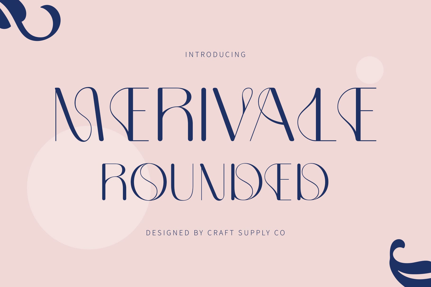
Merivale Rounded offers a softer direction for skincare branding. Rounded typography can make a visual identity feel approachable, friendly, and contemporary, which is useful for brands targeting younger customers or products designed around everyday self-care.
Use Merivale for skincare logos, product labels, social media posts, website headings, and promotional graphics. Its approachable appearance can work particularly well when the brand wants to feel welcoming rather than overly luxurious or formal.
Best Fonts for Natural and Organic Skincare
Natural skincare brands often benefit from typography that feels connected to plants, craftsmanship, and simplicity. Art Nouveau and nature-inspired styles can work particularly well because their decorative forms can complement botanical illustrations, leaves, flowers, and earthy packaging.
Belisda is a particularly useful direction when nature is central to the brand identity, while Sheilina and Advine can create a more decorative botanical atmosphere.
Keep the overall design balanced. If the font already contains decorative details, avoid overcrowding the packaging with too many illustrations or visual elements.
Best Fonts for Luxury Skincare
Luxury skincare branding usually benefits from typography that feels controlled, elegant, and intentional. Serif-based styles and refined display fonts can create the impression of exclusivity without requiring complicated graphics.
Qianzy Elegant can be used as a starting point for premium product branding. Consider pairing an elegant display font with a clean sans serif for ingredients, product descriptions, and directions. This creates a clear hierarchy between the brand name and practical information.
Best Fonts for Modern Skincare Brands
Modern skincare brands often use typography as a way to differentiate themselves from traditional beauty packaging. Instead of relying exclusively on classic serif fonts, contemporary brands can experiment with unusual display treatments, blur effects, and expressive lettering.
Neckyn Blur and Aquene Blur can help create this type of experimental direction. They can be especially useful for digital campaigns, social media, product launches, and fashion-inspired skincare branding.
How to Pair Fonts for Skincare Packaging
Using one font for every element can make skincare packaging feel repetitive. A better approach is to create a clear typographic hierarchy with a primary display font and a simpler supporting font.
- Logo: Use the most distinctive font to establish the brand personality.
- Product name: Choose a complementary display style that remains easy to recognize.
- Ingredients: Use a clean and highly readable font.
- Directions: Keep the typography simple so customers can quickly find important information.
- Marketing headlines: Experiment with the brand’s more expressive typeface for visual impact.
For example, an elegant skincare logo can be paired with a minimalist sans serif for product details. A botanical brand can combine an Art Nouveau display font with a straightforward serif or sans serif. The contrast creates hierarchy while keeping the packaging practical.
Common Skincare Font Mistakes to Avoid
One common mistake is choosing a decorative font recommendation for skincare simply because it looks attractive on its own. A skincare typeface must also work in the context of packaging, product information, and brand communication.
Avoid using highly decorative font recommendation for skincare for long paragraphs or tiny ingredient lists. Also avoid combining several competing display fonts. When multiple typefaces have strong personalities, the design can quickly become confusing.
Another mistake is ignoring the target audience. A playful skincare brand may benefit from expressive typography, while a premium serum brand may require a quieter and more refined approach. The font should reinforce the brand’s positioning rather than fight against it.
The right font recommendation for skincare depends on the personality you want customers to associate with the brand. Natural skincare products can benefit from botanical and Art Nouveau-inspired typography, luxury brands can explore elegant typefaces, while modern beauty companies can experiment with unusual and contemporary display fonts.
The font alternatives above provide several directions, from the decorative character of Sheilina and the sophisticated style of Qianzy to the experimental appearance of Aquene. The key is to choose typography that matches the product, audience, packaging, and overall visual language of the skincare brand.
For more creative type inspiration and design resources, explore Craft Supply Co and discover more ways to build a distinctive visual identity. You can also see more design work from Craft Supply Co on Behance.