
A minimalist curriculum vitae is all about clarity, structure, and purposeful design. Unlike highly decorative resumes, choosing the right Font recommendation for CV layouts ensures a minimalist CV uses clean typography, generous spacing, simple layouts, and a clear visual hierarchy to help recruiters find important information quickly. Because there are fewer visual elements competing for attention, typography becomes one of the most important parts of the design.
If you are looking for a font recommendation for CV projects, the ideal typeface should look professional while remaining easy to read. A good CV font should work well for your name, section headings, job titles, education details, skills, and supporting information without making the page feel crowded.
In this article, we have selected 10 font recommendation for CV alternatives from Craft Supply Co that can help create a polished and contemporary curriculum vitae. The collection includes modern grotesk, rounded, contemporary, and sleek sans serif styles that can fit different professional personalities.
What Makes a Good Font for a Minimalist Curriculum Vitae?
Typography for a minimalist CV should prioritize readability and hierarchy. Recruiters often scan resumes quickly, so your typography needs to make the most important information easy to identify. Your name should stand out, section headings should be easy to locate, and body text should remain comfortable to read.
Sans serif fonts are particularly useful for minimalist CV designs because they can create a clean and contemporary appearance. Modern grotesk styles can provide a professional tone, while rounded fonts can make a resume feel more approachable. Sleek corporate typefaces are useful when you want to communicate precision and confidence.
The best font recommendation for CV also depends on your industry and personal brand. A creative professional may choose a more distinctive modern font, while someone applying for a corporate position may prefer a restrained and highly readable typeface. Whatever your choice, consistency is essential.
10 Font Recommendations for Minimalist Curriculum Vitae
1. Benetti Grotesk Blur Font

Benetti Grotesk Blur Font offers an interesting interpretation of a modern grotesk style. Its distinctive character can help a minimalist CV stand out while still maintaining a contemporary visual direction. It can be especially useful for designers and creative professionals who want their resume to have a subtle artistic identity.
Consider using this font selectively for your name or major section titles rather than for long paragraphs. Pairing its distinctive appearance with a simpler body typeface can create contrast without compromising readability.
2. Standerd Modern Grotesk

Standerd Modern Grotesk is a natural choice for a clean and professional curriculum vitae. Modern grotesk typography can give a CV a structured appearance while keeping the design visually simple. This makes it suitable for resumes where clarity and professionalism are the primary goals.
Use it for headings, job titles, company names, and other important information. Its contemporary direction can also work well for portfolios and personal branding materials that need to maintain a consistent visual identity.
3. Lazario Modern Font

Lazario Modern Font is a versatile option for a contemporary CV. Its modern character can help create a polished layout without relying on excessive decoration. This makes it useful for professionals who want a resume that feels current and visually refined.
Use Lazario for your name, headings, or selected emphasis text. Combine it with a clean supporting font for descriptions and work experience details to maintain a strong typographic hierarchy.
4. Galdien Rounded Corporate Typeface
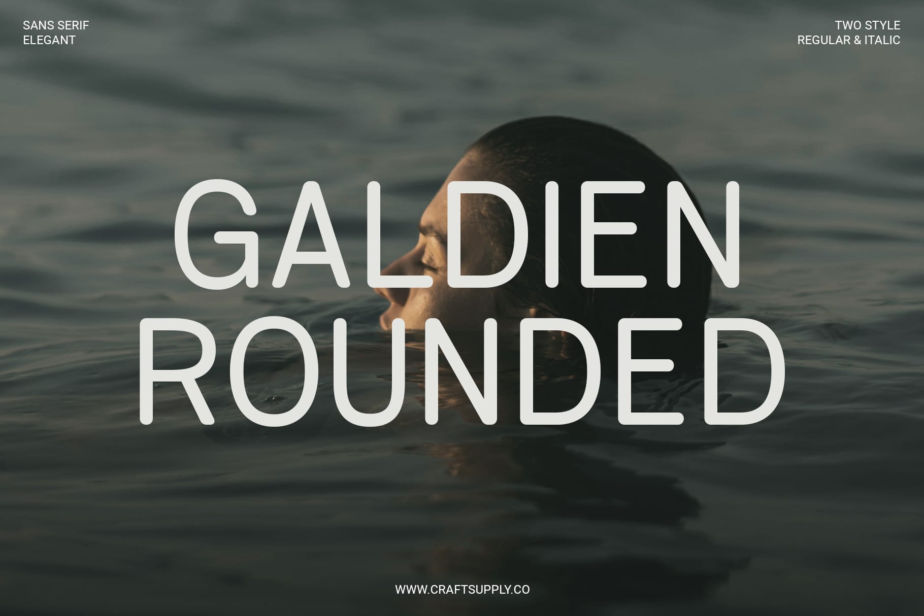
Galdien Rounded Corporate Typeface brings a softer interpretation of professional typography. Rounded forms can make a minimalist CV feel friendly and approachable while still maintaining a polished corporate appearance.
This font is a strong option for professionals working in technology, communications, marketing, education, design, or other industries where personality can complement professionalism. It can work particularly well for headings and personal branding elements.
5. Cenios Rounded Sleek Corporate
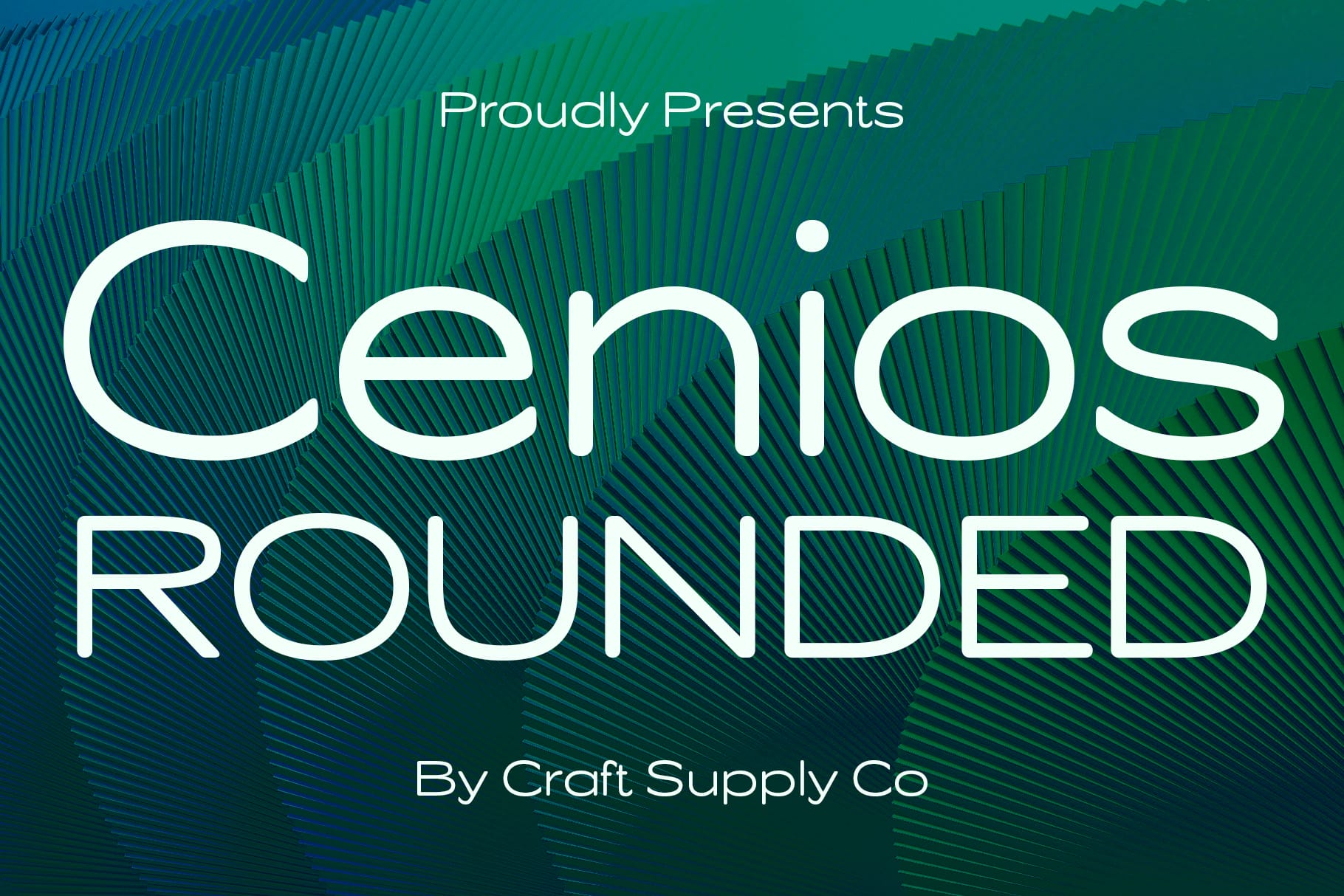
Cenios Rounded Sleek Corporate combines a contemporary corporate direction with rounded styling. This can be useful when you want a curriculum vitae that feels professional but less rigid than a traditional corporate resume.
Use Cenios for headings, contact information, job titles, and other key areas of the CV. Its sleek character can also support a modern personal brand when the same typography is used across your portfolio, website, and professional documents.
6. Heily Rounded Font
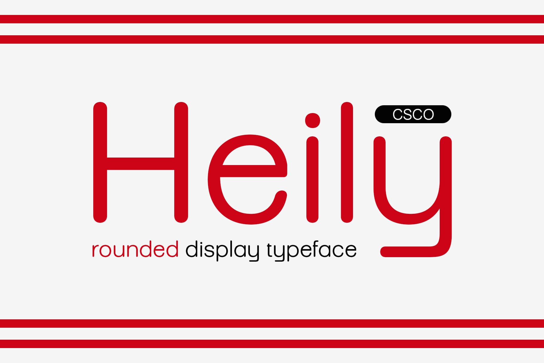
Heily Rounded Font can bring a friendly and contemporary personality to minimalist CV designs. Rounded typography is especially effective for professionals who want their resume to feel approachable rather than overly formal.
It can work well for personal names, section headings, skill categories, and other short pieces of information. Keep the layout spacious and pair the font with a straightforward body typeface for the best result.
7. CS Action Contemporary Font
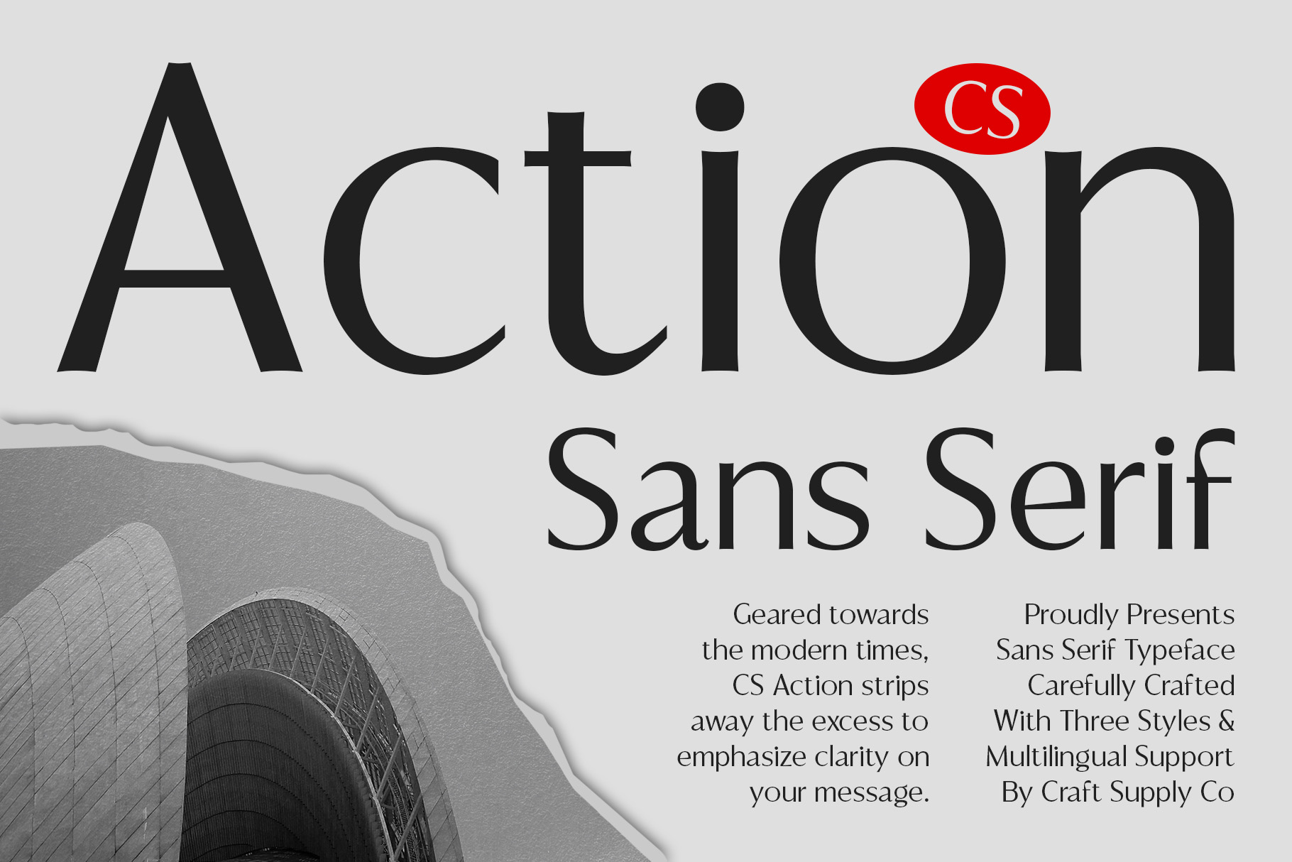
CS Action Contemporary Font is a good option for a modern CV that needs a little more visual personality. Contemporary typography can help creative professionals communicate that they are current, confident, and comfortable with modern design.
This font can be especially suitable for graphic designers, marketers, photographers, content creators, creative directors, and other professionals whose CV can benefit from a distinctive typographic treatment.
8. Brendie Modern Font

Brendie Modern Font offers another clean and stylish direction for minimalist resumes. A modern typeface can make a CV feel organized and polished while providing enough personality to avoid looking generic.
Try using Brendie for your name and major headings, then use a simpler font for longer descriptions. This creates a visual hierarchy that helps readers move naturally through your professional experience.
9. CS Glodive Modern Font

CS Glodive Modern Font is a useful alternative for a contemporary personal brand. Its modern character can help a minimalist curriculum vitae feel more distinctive while maintaining a clean overall presentation.
Use it for prominent headings, your professional title, or your name. It can be particularly effective when the CV uses a simple grid, generous margins, and limited decorative elements.
10. Charsey Modern Sans Serif Font

Charsey Modern Sans Serif Font is a strong choice for designers who want a clean and modern CV. Sans serif typography naturally supports minimalist layouts because it can provide a straightforward visual language without unnecessary ornamentation.
Use Charsey for headings, professional titles, contact information, or even body text when the size and spacing provide sufficient readability. Its modern direction makes it suitable for a wide range of professional industries.
How to Choose the Right CV Font
Choosing the right font depends on the impression you want your curriculum vitae to create. A minimalist resume does not have to look identical to every other minimalist resume. Typography gives you an opportunity to express your professional personality while maintaining clarity.
For Corporate Professionals
If you are applying for a corporate position, choose a font that communicates reliability and organization. Standerd Modern Grotesk, Galdien Rounded Corporate Typeface, and Cenios Rounded Sleek Corporate can support a contemporary professional appearance.
For Creative Professionals
Designers and other creative professionals have more flexibility to introduce personality into their resumes. Benetti Grotesk Blur Font, CS Action Contemporary Font, and Brendie Modern Font can help create a more distinctive visual identity.
For Friendly and Approachable Branding
If your profession involves communication, education, customer relationships, technology, or creative collaboration, a rounded font can make your CV feel more approachable. Heily Rounded Font and the rounded corporate options can add warmth without making the resume look informal.
Where to Use Your CV Font
Once you select a typeface, use it consistently throughout the document. Your chosen font can appear in several important areas:
- Your full name and professional title
- Profile or personal statement headings
- Work experience section titles
- Education headings
- Skills and qualifications
- Contact information
- Portfolio and website information
- Certifications and achievements
- Project descriptions
- References and additional information
How to Create a Minimalist Typography Hierarchy
A font recommendation for CV should have a clear hierarchy even when it uses only one font family. You can create contrast by changing font size, weight, spacing, and placement rather than adding multiple decorative typefaces.
Start with the largest text for your name. Your professional title can be slightly smaller, followed by section headings and then the body content. Keep the supporting text comfortably readable and use consistent spacing between sections.
Another effective approach is to use one primary font for headings and a complementary sans serif for body copy. Avoid using several unrelated display fonts because this can make a minimalist CV feel unnecessarily complicated.
Tips for Making a Minimalist CV Look Professional
Typography works best when supported by a clean layout. Give your content enough white space so the page does not feel crowded. Use consistent margins and align text carefully to create a structured visual rhythm.
Keep your color palette restrained. Black, white, gray, and one subtle accent color are often enough for a professional minimalist CV. Strong typography does not require excessive visual decoration.
Also consider the final format of your document. If you are sending the CV digitally, make sure the font renders correctly when exported as a PDF. Check the final document on both a computer and a mobile device to ensure the text remains easy to read.
Common Mistakes to Avoid
One of the biggest mistakes is choosing a decorative font that looks impressive but reduces readability. A curriculum vitae is a professional document, so the information must remain the priority.
Another common mistake is using too many font styles. A minimalist CV should feel controlled and intentional. One or two complementary typefaces are usually enough to establish a strong hierarchy.
Finally, avoid making every element the same size and weight. Without typographic hierarchy, recruiters may have difficulty identifying your job titles, companies, dates, and key achievements. Use size and spacing strategically to guide the reader.
The right typography can make a minimalist curriculum vitae feel polished, modern, and memorable without compromising professionalism. Whether you prefer a modern grotesk, rounded corporate style, contemporary typeface, or sleek sans serif, your font should support the content rather than compete with it.
For a font recommendation for CV, the 10 fonts featured in this guide offer a variety of professional directions. Standerd Modern Grotesk and Charsey Modern Sans Serif Font are useful for clean and structured resumes, while Galdien Rounded Corporate Typeface, Cenios Rounded Sleek Corporate, and Heily Rounded Font can introduce a friendlier personality. Creative professionals can explore more distinctive options such as Benetti Grotesk Blur Font and CS Action Contemporary Font.
Take the time to test your chosen font at different sizes and within the complete CV layout. The strongest minimalist typography is not necessarily the most decorative—it is the typography that makes your professional story easy to understand while giving the document a polished visual identity. For more typography and design inspiration, explore Craft Supply Co.