
A cafe menu is more than a list of food and drinks. It is an important part of the customer’s experience and can communicate the personality of a cafe before the first order is placed. Typography plays a major role in that experience. If you are searching for a Font recommendation for Cafe Menu designs, the right typeface can make your menu feel cozy, modern, artistic, playful, vintage, or sophisticated.
The best font recommendation for cafe menu needs to balance personality with readability. A decorative typeface can make category headings and featured drinks stand out, while a simpler font can keep prices, descriptions, and ingredients easy to scan. Depending on the cafe’s concept, handwritten, Art Nouveau, Art Deco, display, or playful fonts can all create different visual experiences.
In this guide, we explore ten font recommendation for cafe menu from Craft Supply Co that can be used for cafe menus, coffee shop branding, signage, packaging, promotional graphics, social media posts, and other hospitality designs.
What Makes a Good Font for a Cafe Menu?
A good cafe menu font should match the atmosphere of the establishment while remaining practical for everyday use. Customers need to find food categories, item names, descriptions, and prices quickly, so typography should have a clear hierarchy.
Display fonts are useful for the cafe name and major headings, while handwritten fonts can create a personal and welcoming feeling. Art Nouveau and Art Deco styles can give a cafe a more distinctive vintage personality, while bold display fonts can work well for contemporary coffee shops.
Before choosing a font, consider the cafe’s interior design, target audience, menu format, and brand colors. A rustic cafe may benefit from a hand-drawn style, while an elegant urban cafe may need a refined decorative typeface.
10 Font Recommendations for Cafe Menus
1. CS Quartic Mix

CS Quartic Mix is an interesting choice for cafes that want a distinctive display style. Its expressive character can help menu headings and featured items stand out while giving the cafe a memorable typographic personality.
Use CS Quartic Mix for the cafe name, menu title, section headings, featured drinks, and promotional signs. It can work particularly well in creative cafes where the typography is intended to become part of the overall visual identity.
2. CS Stuart Bold Display Font
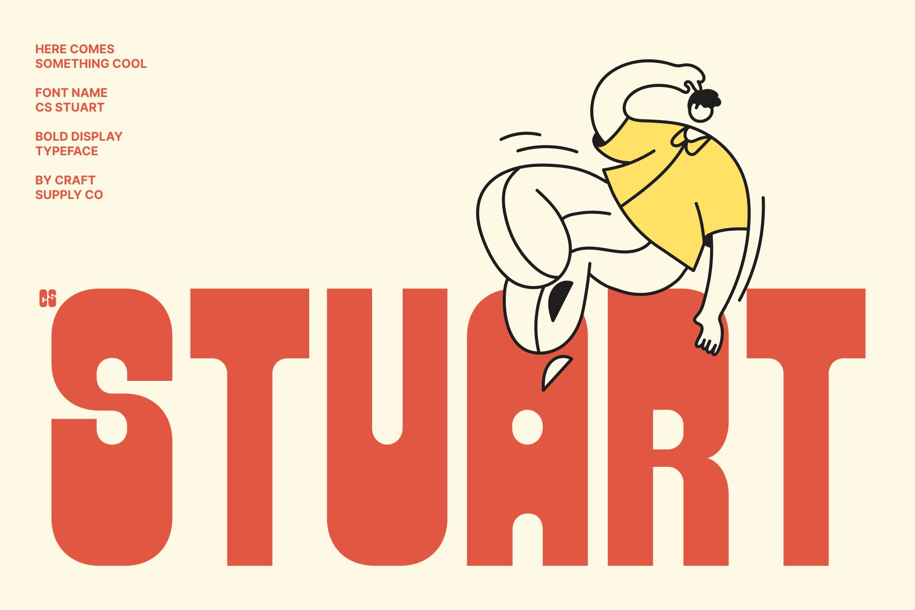
CS Stuart Bold is a strong option when a cafe menu needs bold and noticeable typography. A bold display font can make category names and special offers immediately visible, especially in menus with many items.
Try it for coffee shop signs, menu covers, drink categories, promotional posters, and social media graphics. Pair it with a simpler body font to ensure descriptions and prices remain easy to read.
3. CS Quartic Pixel
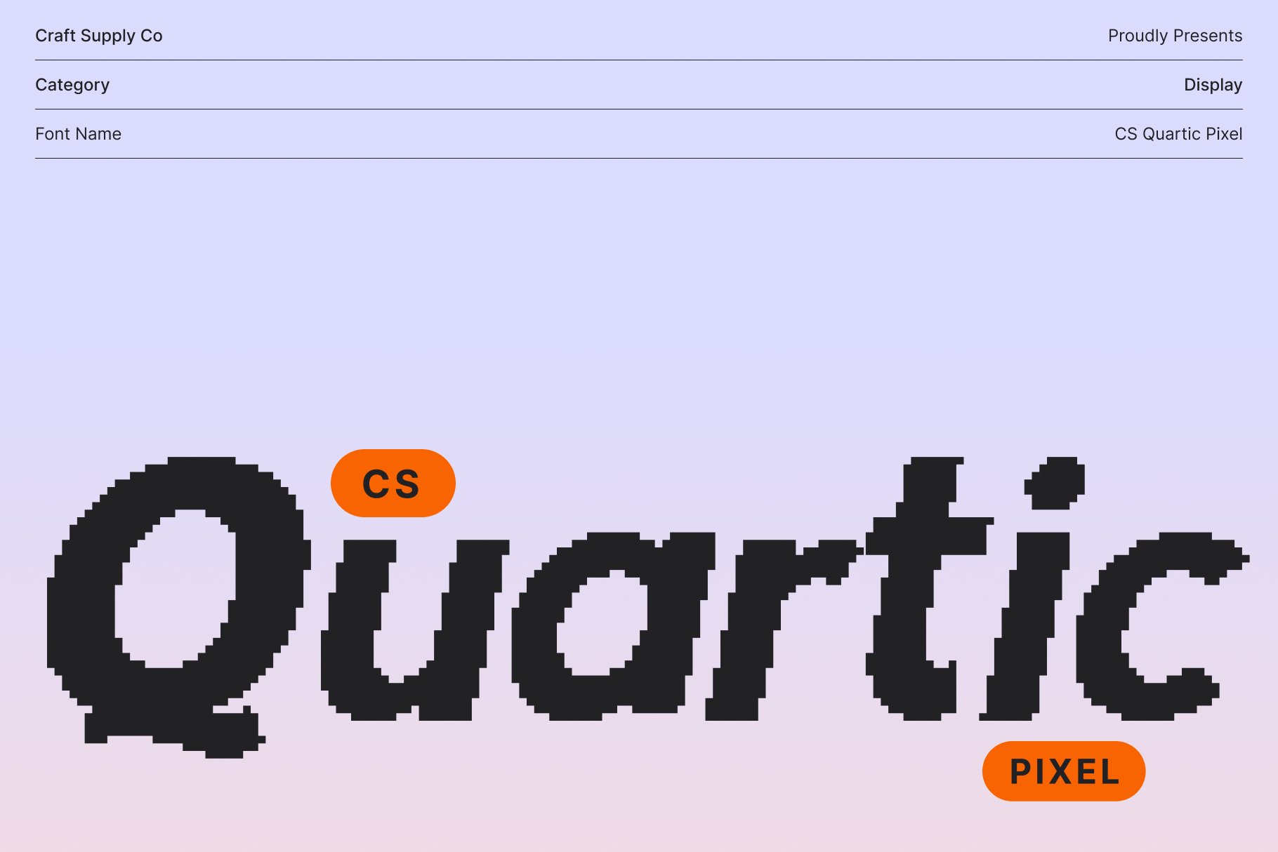
CS Quartic Pixel offers a more playful digital direction for cafe branding. Pixel-inspired typography can be an excellent choice for cafes with gaming, technology, retro, or youth-oriented themes.
Use CS Quartic Pixel for specialty drink names, menu headings, promotional graphics, gaming cafe menus, and digital signage. It can also add personality to social media content and limited-edition menu campaigns.
4. CS Barton Drawn

CS Barton Drawn brings a handcrafted quality to cafe typography. A drawn style can make a menu feel personal and relaxed, which works especially well for independent coffee shops, bakeries, brunch cafes, and artisan food businesses.
Use Barton for menu titles, food categories, chalkboard-style graphics, packaging, labels, and promotional artwork. Pair it with a clean supporting font for descriptions and prices.
5. CS Martha Handwritten Font

CS Martha Handwritten can create a warm and personal feeling in a cafe menu. Handwritten typography can make customers feel as though the menu was created specifically for the space rather than taken from a generic template.
This font can work well for bakery menus, brunch cafes, dessert shops, coffee shops, and cozy neighborhood restaurants. Use it for section headings, special recommendations, drink names, or short descriptions rather than large blocks of text.
6. CS Artesia Whimsical Handwritten Font

CS Artesia offers a more playful handwritten direction. Its whimsical character can make a cafe menu feel cheerful, creative, and approachable, making it useful for cafes with colorful interiors or youthful branding.
Use Artesia for dessert menus, specialty drinks, seasonal promotions, children’s cafe concepts, brunch menus, and social media graphics. It can also work as an accent font for highlighting recommended menu items.
7. CS Lempo Art Deco Font

CS Lempo Art Deco is a strong option for cafes inspired by vintage elegance. Art Deco typography can create a sophisticated atmosphere and is particularly suitable for cafes with glamorous interiors, cocktail menus, or historic visual references.
Use Lempo for the main menu title, category headings, signage, logos, promotional posters, and special-event menus. Combine it with clean typography for practical information to keep the design balanced.
8. CS Hayes Art Nouveau Font
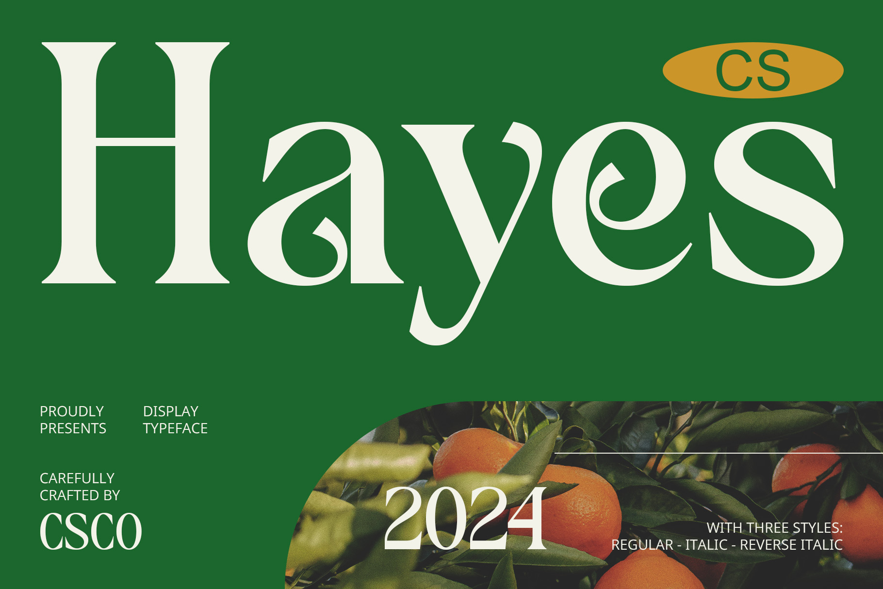
CS Hayes brings an Art Nouveau-inspired direction to cafe typography. Decorative lettering can work especially well for cafes that emphasize natural forms, artistic interiors, botanical themes, or vintage European influences.
Consider Hayes for cafe logos, menu covers, coffee packaging, pastry menus, signage, and promotional artwork. Its decorative character can make a simple menu feel more distinctive and carefully designed.
9. CS Chako Art Nouveau Font
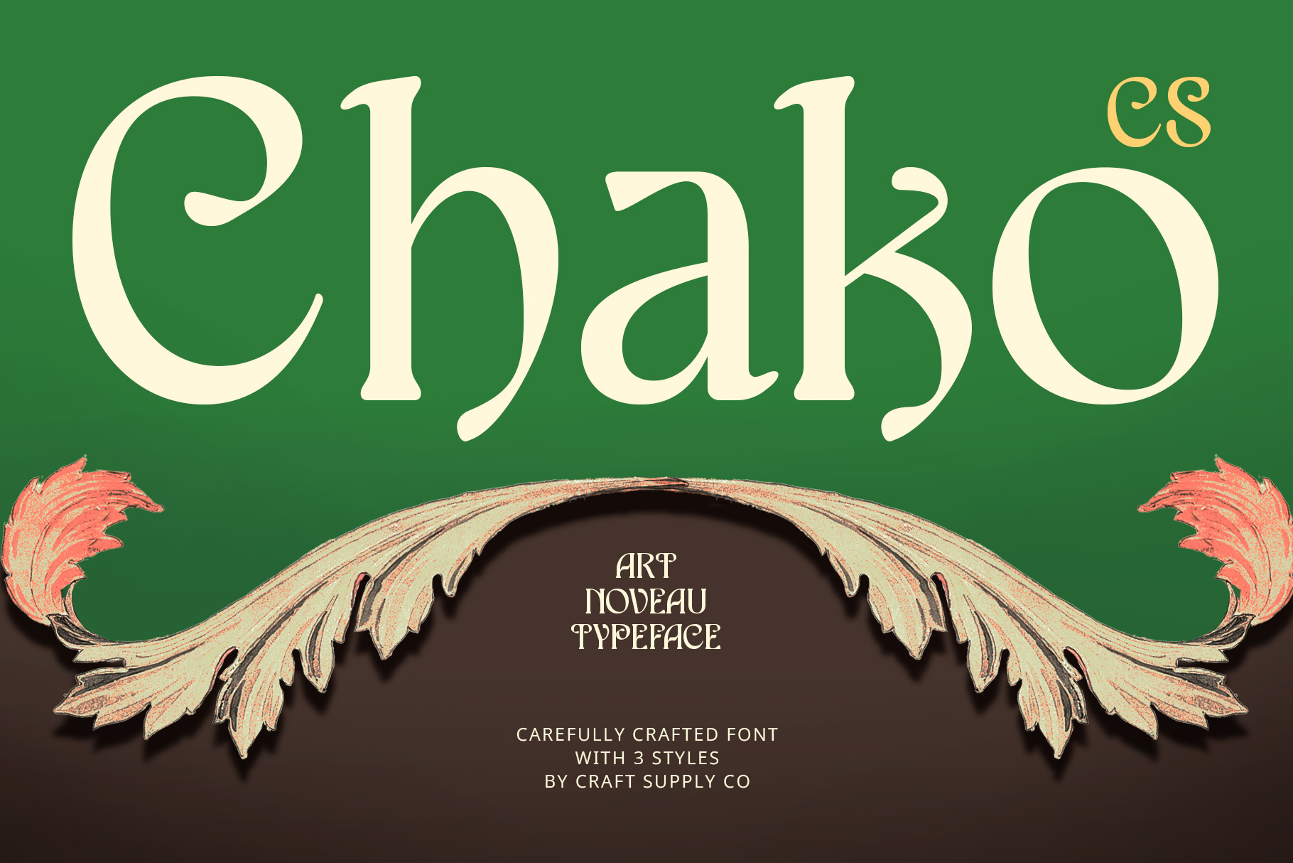
CS Chako provides another decorative option for cafes looking for an Art Nouveau-inspired identity. This style can introduce an elegant and artistic quality to menus while giving the cafe a strong visual theme.
Use Chako for menu headers, cafe branding, seasonal campaigns, packaging, posters, and social media graphics. It can work particularly well when paired with botanical illustrations, decorative borders, and warm color palettes.
10. CS Celia Art Nouveau Font
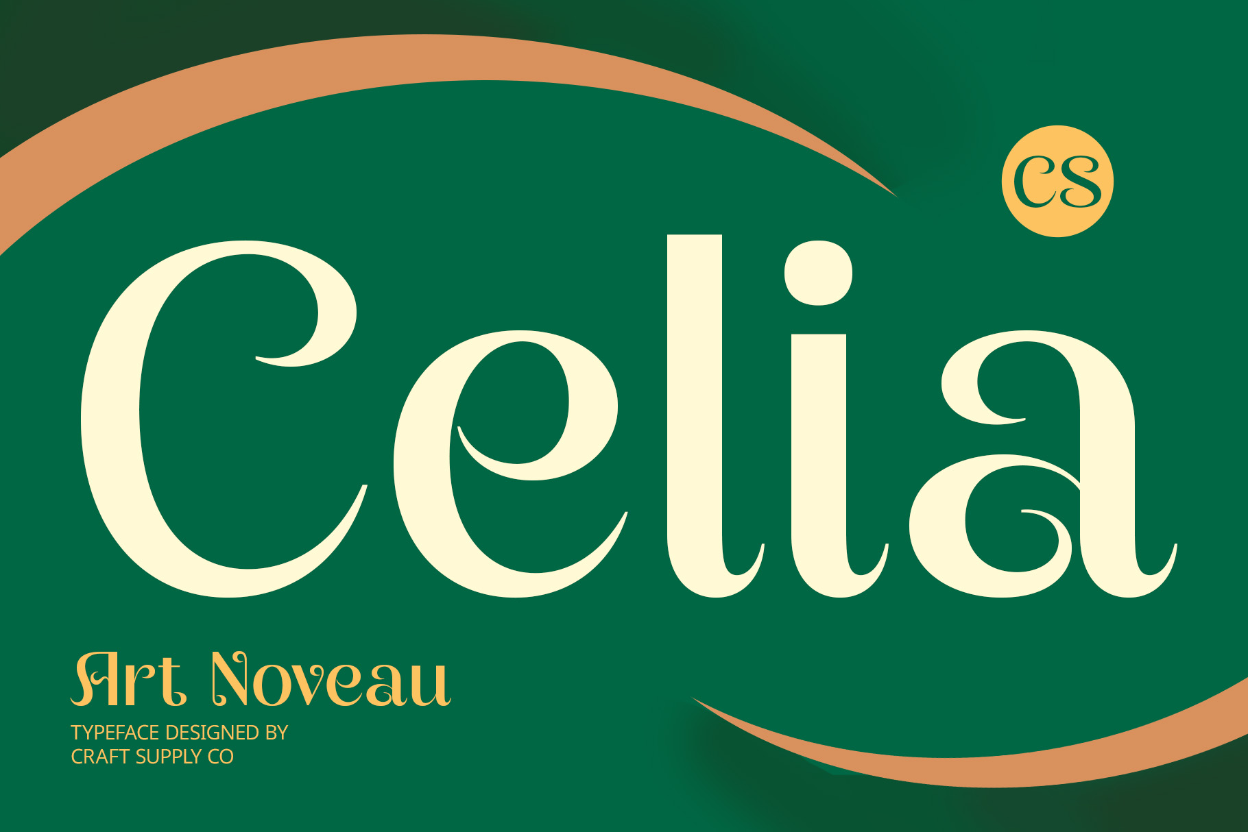
CS Celia completes the collection with another Art Nouveau-inspired option. It can help create a decorative and sophisticated atmosphere for cafes that want their typography to feel artistic rather than purely functional.
Use Celia for cafe logos, menu titles, dessert menus, coffee packaging, invitations, and promotional materials. Keep the supporting typography simple so that the decorative lettering remains the focal point.
Choosing a Cafe Menu Font by Cafe Style
The ideal Font recommendation for Cafe Menu depends on the atmosphere you want customers to experience. Typography should feel like a natural extension of the cafe’s interior, food presentation, packaging, and overall brand identity.
Modern Coffee Shop
Modern coffee shops can benefit from bold or distinctive display fonts. CS Stuart Bold can create a strong presence for headings, while CS Quartic Mix can introduce a more expressive personality to contemporary branding.
Cozy Cafe
For a warm and welcoming cafe, handwritten and drawn fonts can create a more personal atmosphere. CS Martha and CS Barton are useful options for menus that want to feel approachable and handcrafted.
Playful Cafe
Colorful cafes, dessert shops, and gaming cafes can experiment with more unusual typography. CS Artesia can provide a whimsical quality, while CS Quartic Pixel can introduce a playful digital aesthetic.
Vintage Cafe
Vintage cafes can explore Art Deco and Art Nouveau typography. CS Lempo, CS Hayes, CS Chako, and CS Celia can help establish a decorative identity that works with retro interiors and classic hospitality aesthetics.
Where to Use Cafe Menu Fonts
Your chosen typeface does not have to appear only on the printed menu. Creating consistency across different customer touchpoints can make the cafe brand feel more professional.
- Printed cafe menus
- Digital menus
- Menu boards
- Coffee shop logos
- Drink labels
- Coffee packaging
- Bakery packaging
- Table signs
- Promotional posters
- Social media graphics
- Special-event menus
- Seasonal drink campaigns
- Outdoor cafe signage
How to Pair Fonts for a Cafe Menu
Using one decorative font for every part of a menu can quickly reduce readability. Instead, create a simple typographic hierarchy. Use the expressive font for the cafe name and major headings, then use a clean supporting typeface for menu items, descriptions, and prices.
For example, a handwritten font can be used for category titles while a neutral sans serif handles food descriptions. An Art Nouveau display font can create the visual identity while a readable serif manages the practical information.
Font size also plays an important role. Menu item names should be easy to identify, while prices should have enough contrast to scan quickly. Keep line spacing comfortable, especially when a menu contains longer descriptions.
Design Tips for Better Cafe Menus
Typography works best when it is supported by a clear layout. Avoid filling every area of the menu with decorative elements. Give the headings and important menu items enough space so customers can move through the information naturally.
Color can also influence readability. Make sure the text has sufficient contrast against the menu background. Decorative fonts may already contain many visual details, so a simple background can often help them look more effective.
Consider the physical size of the menu as well. A font that looks excellent on a large wall menu may not be suitable for a small table card. Test your typography at the actual size customers will see before finalizing the design.
Common Mistakes When Choosing Cafe Menu Fonts
One common mistake is choosing a font based only on appearance. A beautiful decorative typeface may look great in a logo but become difficult to read when used for dozens of menu items. Always test the font with realistic content before using it throughout the menu.
Another mistake is using too many font styles. Combining handwritten, Art Deco, Art Nouveau, pixel, and bold display fonts in one menu can make the design feel disconnected. Choose one main style and one supporting typeface to maintain consistency.
It is also important to consider the cafe’s actual personality. A playful pixel font may work perfectly for a gaming cafe but feel inappropriate for an elegant coffee lounge. The typography should support the customer experience rather than simply follow a trend.
Finding the right Font recommendation for Cafe Menu starts with understanding the personality of the cafe. Bold display fonts can create a strong modern identity, handwritten fonts can make a menu feel warm and personal, while Art Deco and Art Nouveau styles can introduce vintage elegance.
The ten font alternatives in this guide offer a wide range of creative possibilities. CS Quartic Mix and CS Stuart can create bold menu headings, while CS Barton, CS Martha, and CS Artesia bring handcrafted and playful qualities. CS Lempo, CS Hayes, CS Chako, and CS Celia provide decorative vintage directions, while CS Quartic Pixel offers an unusual digital option.
Before selecting a final font, test it with real menu items, descriptions, and prices. The best cafe menu typography should look distinctive while making the information effortless to navigate. When typography, layout, colors, and branding work together, even a simple menu can become an important part of the cafe experience.
For more typography inspiration and creative branding projects, explore Craft Supply Co on Behance.