
Autumn is the perfect season to slow down, enjoy a warm cup of cinnamon tea, and capture everyday moments in a journal. From documenting peaceful mornings and weekend walks to collecting seasonal memories, journaling becomes even more personal when your pages reflect the warmth of the season. Finding the ideal font recommendation for autumn journaling layouts ensures the right typography can help you create that inviting atmosphere with handwritten details, nostalgic lettering, and softly textured accents.
Choosing a font recommendation for autumn journaling means finding a balance between personality and readability. Flowing scripts can make personal reflections feel intimate, while bold vintage lettering adds character to headings, scrapbook layouts, and memory pages. Meanwhile, playful handwritten styles bring a relaxed, imperfect quality that works beautifully with autumn leaves, coffee stains, kraft paper, and warm neutral color palettes.
In this guide, we explore ten font recommendations from Craft Supply Co that can help you create a cozy autumn journal, design printable inserts, decorate scrapbook spreads, and personalize seasonal stationery. Whether you prefer elegant handwriting or textured vintage typography, these options can help you build a consistent visual style for your fall inspired projects.
What Makes a Good Font for Cozy Autumn Journaling?
A good font recommendation for autumn journaling should express the season without making your pages feel crowded. Think about the atmosphere you want to create before choosing your typography. Cinnamon inspired designs often work well with warm brown, burnt orange, muted red, cream, and deep olive tones. Fonts with handwritten details, vintage character, or imperfect textures can complement these colors and make a journal feel more personal.
Readability also matters. Your journal may contain long reflections, short captions, dates, favorite recipes, or lists of seasonal activities. A decorative font can make a beautiful title, but a simpler typeface is usually easier to read in longer passages. Combining expressive headings with clear body text helps your pages feel cohesive while keeping your writing accessible.
Finally, consider the materials and visual elements surrounding your typography. Stamped lettering can pair naturally with kraft paper and scrapbook textures, while handwritten scripts suit diary entries, gratitude lists, and personal notes. Choosing font recommendation for autumn journaling that complement your photos, illustrations, and paper textures will help your autumn journal feel thoughtfully designed.
10 Font Recommendations for Cinnamon & Cozy Autumn Journaling
1. CS Windsey Font Duo

CS Windsey Font Duo is a versatile starting point for an autumn journaling project. A font duo gives you the opportunity to explore contrast between different typographic styles, making it useful when you want your page titles and supporting details to feel related without looking identical. This flexibility can help establish a visual hierarchy across a journal filled with seasonal memories.
Try using its more expressive style for headings such as “November Memories,” “Cinnamon Mornings,” or “Little Things I Love.” Use the complementary style for shorter notes, labels, or decorative phrases. Pair the typography with cream paper, cinnamon brown accents, and small leaf illustrations to create a warm, coordinated layout. For longer diary entries, use a highly readable body font alongside the decorative lettering.
2. CS Roche Stamp
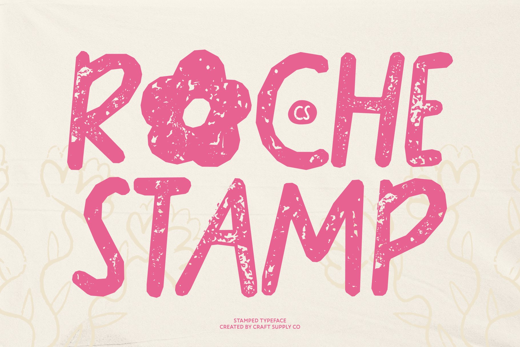
Stamped typography can introduce a tactile, nostalgic quality to cozy autumn journaling. CS Roche Stamp is worth considering when you want your layouts to feel inspired by old labels, paper ephemera, and handmade scrapbook details. Its stamp style direction can add visual texture to a page without requiring a large collection of decorative graphics.
Use it for short titles, date markers, page numbers, or little labels that identify a favorite autumn activity. It can also help create a faux label for a journal page about baking cinnamon rolls, visiting a farmers market, or spending a rainy afternoon indoors. Combine the lettering with kraft paper textures, muted terracotta, and simple line drawings. Keep stamped text brief so its decorative character remains easy to appreciate.
3. CS Blushing Stamp

For journal pages that need a softer decorative touch, CS Blushing Stamp offers another stamp inspired option to explore. Textured lettering can make a digital layout feel more handmade and give printed journal inserts a sense of personality. This direction works especially well when your autumn aesthetic includes vintage stationery, torn paper edges, washi tape, and collected keepsakes.
Consider using it for small phrases such as “Slow Days,” “Autumn Notes,” or “A Cozy Afternoon.” These short details can sit beside photographs, pressed leaf illustrations, or handwritten reflections. A restrained palette of dusty rose, warm beige, cinnamon, and soft brown can keep the page inviting rather than overly colorful. For a balanced result, combine decorative stamped lettering with simple headings and readable paragraph text.
4. CS Milena Handwritten Font

Handwritten typography feels especially appropriate for journaling because it reflects the personal nature of the activity. CS Milena Handwritten Font is a strong candidate for projects that need a more intimate, note like appearance. A handwritten style can make a page feel less formal and more like a collection of thoughts written during a quiet morning or a relaxing evening at home.
Use this font for short diary headings, personal reminders, gratitude prompts, or captions beneath seasonal photographs. It can also bring personality to printable journaling cards and autumn themed planner inserts. Pair it with cream backgrounds, warm brown borders, and small botanical details. If you use it for longer passages, test the size and spacing first to ensure that your writing remains comfortable to read.
5. CS Sharel Font Duo

CS Sharel Font Duo can help you develop a more flexible typography system for your seasonal journal. Using two complementary styles makes it easier to distinguish between different types of information, such as a prominent page title and a smaller supporting caption. This is particularly useful if you want your journal to feel coordinated across multiple spreads rather than relying on one font for every element.
Use the more decorative option for chapter titles, seasonal dividers, or featured quotes, then use the companion style for secondary labels where appropriate. For a cinnamon inspired theme, experiment with deep brown lettering on warm ivory paper and introduce muted orange through small graphic accents. This approach works for both physical scrapbook pages and digital journal templates, especially when you want a recognizable style without repeating the exact same layout every time.
6. CS Lindy Nostalgic Bold Script Font

Bold script lettering can bring a lively focal point to an otherwise quiet autumn layout. CS Lindy Nostalgic Bold Script Font is a fitting option when you want your journal headings to feel expressive and nostalgic. Script typography can suggest movement and a handmade quality, making it useful for pages inspired by handwritten recipe cards, vintage notes, and collected seasonal memories.
Make it the centerpiece of a page title such as “Pumpkin Patch Day,” “Cinnamon Everything,” or “My Autumn Bucket List.” Give the lettering enough open space so it does not compete with photographs or decorative elements. It can also work well on covers for mini journals, recipe collections, and fall themed printable inserts. Keep body text simple and use the bold script selectively to create contrast instead of making every line equally decorative.
7. CS Prisely Handwritten Script Font

CS Prisely Handwritten Script Font is another option for creating personal, flowing details in a cozy journal. Handwritten script can give short messages a thoughtful quality, which makes it suitable for reflective writing, memory keeping, and seasonal scrapbook captions. It can also complement an autumn aesthetic built around soft lighting, warm drinks, knitted fabrics, and quiet moments at home.
Try using it for small affirmations, favorite lines from your own reflections, or labels that introduce a collection of autumn photographs. A page titled “Things That Feel Like Home” could combine this style with simple sans serif text, soft brown borders, and pressed leaf imagery. Since script lettering is often most effective in short passages, reserve it for meaningful phrases and let a more readable font handle longer notes.
8. CS Dorinda Whimsical Font

Autumn journaling does not always have to feel rustic or traditional. A whimsical font can bring a playful quality to pages about seasonal adventures, favorite treats, and small everyday discoveries. CS Dorinda Whimsical Font is worth exploring when you want your layouts to feel imaginative rather than strictly vintage or minimal.
Use it for cheerful headings, illustrated checklists, scrapbook captions, or a page dedicated to your favorite things about fall. It can complement drawings of acorns, mushrooms, falling leaves, and steaming mugs. Keep the rest of the layout relatively simple so the typography has room to stand out. A palette of cinnamon, muted mustard, cream, and olive green can help connect the playful lettering to the broader seasonal theme.
9. CS Quella Stamp

CS Quella Stamp can be considered for layouts that use vintage inspired lettering and textured paper details. Stamp style typography is useful for creating the appearance of collected ephemera, from old packaging labels to handmade tags. In an autumn journal, these details can make pages feel layered and tactile, even when you create the design digitally before printing it.
Use it for compact labels such as “Collected Moments,” “Weekend Notes,” or “Seasonal Favorites.” It can also help separate sections in a journal dedicated to recipes, reading lists, autumn walks, and seasonal reflections. Try placing the lettering inside a simple frame or over a subtle paper texture. To preserve legibility, avoid placing busy illustrations directly behind the words and keep the supporting text clean and uncomplicated.
10. CS Mellow Stamp

CS Mellow Stamp rounds out this collection with another option for a textured, handmade visual direction. Stamp inspired typography can give journal pages a relaxed, collected appearance, making it useful for projects that combine handwritten notes, paper scraps, photographs, and small decorative labels. It can also create a consistent finishing detail across a set of autumn journal pages.
Use it for section markers, short captions, or small phrases that support a cozy theme. For example, a page about a slow Sunday could include a stamped heading, a photograph of a warm drink, and a few lines of personal reflection. Combine the lettering with warm ivory, toasted brown, and muted rust accents. When using multiple decorative fonts on the same page, keep the number of styles limited so the overall design remains calm and cohesive.
How to Choose the Right Font Style for Your Autumn Journal
The best font recommendation for autumn journaling depends on the mood you want each page to communicate. Rather than choosing a typeface based only on appearance, consider how it supports the content and the materials surrounding it.
- For personal reflections: Choose a readable handwritten style for short entries, captions, and personal notes.
- For seasonal titles: Use expressive scripts or a complementary font duo to make page headings stand out.
- For vintage scrapbook layouts: Explore stamp-inspired lettering that complements kraft paper, textured backgrounds, and collage elements.
- For playful autumn themes: Use whimsical lettering for bucket lists, activity trackers, and illustrated journal pages.
- For a consistent journal: Select two or three font styles and assign each a clear role throughout your layouts.
It also helps to establish a small color palette before you begin. Cinnamon brown, burnt orange, warm cream, muted burgundy, and olive green can work together to create a recognizable autumn mood. Use darker colors for contrast and lighter backgrounds to preserve readability.
Where to Use Cozy Autumn Journaling Fonts
These font recommendation for autumn journaling styles can support more than traditional diary pages. Once you find a combination that suits your aesthetic, you can use it across a range of seasonal creative projects.
- Daily journal pages: Create expressive titles for reflections, gratitude lists, and everyday memories.
- Scrapbook spreads: Pair decorative lettering with photographs, ticket stubs, paper scraps, and seasonal illustrations.
- Printable journal inserts: Design section dividers, prompt cards, weekly trackers, and notes pages.
- Autumn recipe journals: Give recipe titles and short annotations a cozy, handwritten character.
- Memory keeping albums: Use scripts and stamp-style fonts to label photos from autumn walks, weekend trips, and gatherings.
- Digital planners: Apply consistent headings and small decorative labels to seasonal templates and digital notebook pages.
- Creative gifts: Personalize handmade recipe books, mini journals, bookmarks, and stationery sets.
If you are building a broader visual identity for your creative projects, browsing the work of Craft Supply Co can provide additional typography inspiration. Pay attention to how type, color, spacing, and texture work together rather than focusing on the font alone.
Tips for Pairing Fonts in a Cozy Autumn Layout
Font pairing is about contrast and balance. When two styles perform the same role, a page can feel visually confusing. Instead, choose one font to lead and another to support it.
- Combine expressive and simple styles: Use a script or whimsical font for a title and a clean, readable font for longer text.
- Limit decorative lettering: Two decorative styles are usually enough for a small journal page. Add a third only if it has a clear purpose.
- Keep heading sizes consistent: Repeating similar title sizes and placements can make a collection of pages feel connected.
- Use color strategically: Let typography stand out against the background. Dark brown on cream often creates a warm, readable combination.
- Leave enough space: Give titles, captions, and decorative elements breathing room so the page does not feel crowded.
- Test before printing: Check small labels and fine lettering at their actual size to make sure they remain legible on paper.
Font pairing should also reflect the purpose of the page. A recipe page might benefit from a nostalgic heading and simple ingredient labels, while a personal reflection could use a handwritten title with understated body text. Keep the typography functional first, then use color and decoration to reinforce the seasonal mood.
Common Mistakes to Avoid When Choosing Autumn Journaling Fonts
One common mistake is using decorative fonts for every part of a layout. Stamped, whimsical, and script lettering can all add personality, but too many competing styles may make a page difficult to read. Give each font a defined role and use simpler typography for information that needs to be understood quickly.
Another mistake is choosing a font based only on its seasonal appearance. A typeface may look perfect in a large heading but become difficult to read in a small caption. Always test it with the actual words, size, and background you plan to use.
It is also easy to overdecorate an autumn journal. Leaves, textured paper, stickers, and warm colors already contribute visual interest. If the page contains several decorative elements, let the typography remain relatively restrained. On simpler pages, a more expressive font can take the lead.
Font recommendation for autumn journaling is an opportunity to capture the small details that make the season memorable. The right fonts can support that feeling, whether you prefer handwritten lettering for personal reflections, bold scripts for expressive titles, whimsical styles for playful layouts, or stamped typography for a nostalgic scrapbook effect.
Start with one or two fonts that suit your preferred aesthetic, then test them with your favorite autumn colors, paper textures, and decorative elements. For more typography ideas and creative design inspiration, explore the work of Craft Supply Co. Most importantly, let your journal reflect your own way of enjoying autumn. A few thoughtful font choices, a warm color palette, and meaningful memories are all you need to create pages that feel personal, inviting, and worth revisiting.