
Vessel is a useful reference for designers interested in minimal branding and typography-led logo design. A minimal word mark can look simple at first glance, but creating one that feels balanced, distinctive, and memorable requires careful decisions. Letterforms, spacing, proportions, weight, and alignment all contribute to the final result.
When a logo uses a word as its primary visual element, the typeface carries much of the brand’s personality. A refined serif can make the identity feel sophisticated, while a modern sans serif can create a cleaner and more contemporary impression. This makes the Vessel typography an interesting subject for anyone researching minimalist branding.
This article explores the craft behind minimal word marks and presents 10 Vessel typography from Craft Supply Co. The selection includes modern sans serif, classic serif, and elegant serif typefaces that can help you develop a clean and professional word mark for a wide range of brands.
What Makes a Minimal Word Mark Effective?
A minimal word mark removes unnecessary visual elements and allows the brand name to become the primary point of recognition. Instead of relying on a complicated symbol, the designer uses typography to establish the identity.
This approach can create a logo that feels flexible and timeless. A well-designed word mark can appear on a website header, product packaging, business card, storefront, social media profile, or app interface without requiring major changes to the composition.
However, minimal does not mean generic. A simple word mark still needs a distinctive quality. That quality can come from the proportions of the letters, unusual details in the typeface, carefully adjusted spacing, or the relationship between the word mark and the surrounding space.
The Importance of Typography in a Vessel Inspired Logo
Vessel typography becomes especially important when a logo contains little more than a brand name. Every letter contributes to the overall silhouette. The width of the word, the height of the capitals, the shape of curves, and the contrast between thick and thin strokes can all change how the identity feels.
A minimalist brand may benefit from a typeface with subtle characteristics rather than excessive decoration. Modern sans serif fonts can provide a clean foundation, while elegant serif fonts can introduce more visual contrast and sophistication.
When researching a Vessel typography alternative, focus on the overall impression instead of looking for an exact copy of an existing word mark. The goal is to identify typography that supports your own brand personality while maintaining the clarity and restraint associated with minimalist design.
10 Font Alternatives for a Vessel Inspired Minimal Word Mark
1. Alkalis Modern Elegant Serif

Alkalis provides a sophisticated serif direction for a minimal word mark. Its elegant character can give a brand name a refined appearance without requiring decorative graphics. This makes it suitable for fashion, beauty, architecture, hospitality, editorial, and premium lifestyle brands. Use generous whitespace around the word mark to emphasize its elegant proportions and create a more luxurious composition.
2. Impana Modern Sans Serif

Impana offers a clean modern sans serif direction for designers who want a straightforward and contemporary word mark. Sans serif typography can make a brand feel accessible and organized while remaining highly versatile. Use Impana for technology companies, creative studios, architecture brands, consulting businesses, lifestyle products, and modern service companies. Its clean appearance can also work effectively in digital interfaces.
3. Roku Modern Sans Serif

Roku provides another contemporary sans serif option for minimalist branding. Its modern character can help create a word mark that feels clean without becoming visually empty. It works well when the typography needs to remain clear across websites, packaging, presentations, signage, and social media. Try subtle adjustments to letter spacing to create a more distinctive composition.
4. CS Alland Classic Serif Font

CS Alland introduces a classic serif quality to minimal logo design. It can give a word mark a sense of tradition and reliability while maintaining a refined visual structure. This makes it useful for publishing, professional services, hospitality, fashion, education, and established lifestyle brands. A restrained layout can help the classic letterforms feel current rather than overly traditional.
5. CS Aureta Elegant Sans Serif

CS Aureta offers a more elegant interpretation of sans serif typography. It can create a sophisticated word mark while retaining the clarity associated with clean letterforms. This makes it a useful choice for beauty brands, fashion labels, creative agencies, wellness businesses, and modern lifestyle products. Pair it with a simple color palette and generous whitespace for a polished result.
6. CS Salsa Elegant Serif Font

CS Salsa provides an elegant serif alternative for designers who want subtle personality in a minimalist logo. Its refined character can make the brand name feel more distinctive without overwhelming the composition. Consider it for boutique businesses, fashion, beauty, photography, hospitality, and editorial branding. Keep supporting elements simple so the typography remains the primary visual feature.
7. CS Ristela Elegant Serif Typeface
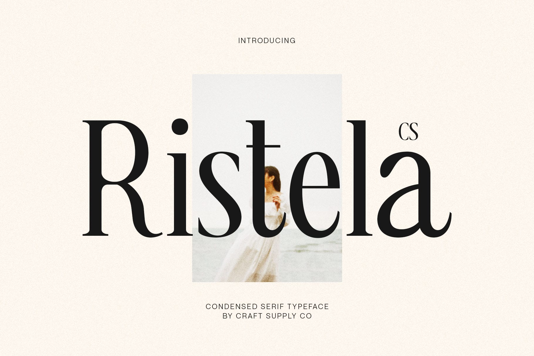
CS Ristela offers another refined serif direction for a sophisticated word mark. Its elegant qualities can add visual character to a short brand name while maintaining a clean overall composition. It can work particularly well for luxury-inspired businesses, creative studios, jewelry brands, fashion labels, and premium products. Test both uppercase and lowercase treatments to see which version creates the strongest silhouette.
8. CS Granvile Elegant Serif Font

CS Granvile can help create a polished and graceful word mark with a strong typographic foundation. Its elegant serif style is useful when the brand needs to communicate attention to detail and sophistication. Use it for hospitality, fashion, beauty, interior design, publishing, or creative services. The font can become the main visual element when paired with careful spacing and a restrained layout.
9. CS Kolder Serif Font

CS Kolder provides a versatile serif direction for minimalist branding. Its typography can give a word mark a structured and professional appearance while retaining enough character to avoid looking generic. Consider it for editorial brands, professional services, fashion, lifestyle businesses, and creative companies. Its serif structure can also create an effective contrast when paired with a clean sans serif for supporting text.
10. CS Gisele Modern Font

CS Gisele provides a contemporary option for designers who want their word mark to feel modern and distinctive. Its versatile character can support a range of brand personalities while keeping the logo focused on the name. Use it for creative businesses, fashion, lifestyle brands, digital products, beauty companies, or modern professional services.
How to Choose a Vessel Logo Font Alternative
Start by defining your brand personality. If you want the identity to feel contemporary and straightforward, a modern sans serif such as Impana or Roku can provide a clean foundation. If you want greater sophistication or a more editorial quality, elegant serif options such as Alkalis, CS Salsa, CS Ristela, or CS Granvile may be more appropriate.
Next, test the actual brand name rather than judging a typeface only from its specimen. Different letter combinations create different visual rhythms. Look closely at the width of the word, the relationship between uppercase and lowercase letters, and the spacing between characters.
Pay particular attention to kerning. In a minimal word mark, even a small spacing problem can become noticeable because there are so few other elements to distract from the Vessel typography. Adjust individual letter pairs when necessary to create a smoother visual rhythm.
The Role of Whitespace in Minimal Logo Design
Whitespace is one of the most important tools in minimal branding. Giving the word mark enough surrounding space can make it feel more confident and refined. Crowding the logo with illustrations, borders, or other visual elements can reduce the impact of the typography.
Experiment with the distance between the logo and other elements. A simple word mark can become a strong focal point when it has enough room around it. This principle works particularly well for premium brands, editorial identities, architecture studios, and modern lifestyle businesses.
Tips for Creating a Strong Minimal Word Mark
Choose one primary Vessel typography direction and refine it carefully. You do not need multiple decorative effects to make a word mark memorable. Instead, focus on the shape of the letters, spacing, proportions, and alignment.
Test the logo in black and white before introducing a larger color palette. This helps you evaluate the actual typography rather than relying on color to create visual interest. Once the structure works in monochrome, you can develop color variations that support the brand personality.
Also test the word mark at different sizes. A logo that looks elegant on a large presentation board may become difficult to read as a small website header or social media avatar. Make sure the essential letterforms remain clear at smaller sizes.
Finally, consider creating a compact version. A full word mark can work well in horizontal layouts, while an initial or abbreviated mark can provide a useful option for small applications. Keep the typography consistent between the variations so they remain visually connected.
Why Minimal Typography Remains Relevant
Minimal word marks continue to work because they can adapt to many environments. Digital interfaces, packaging, signage, social media, and printed materials all benefit from clear branding that does not depend on a complicated composition.
The challenge is maintaining individuality. A minimalist logo should not become so simple that it looks interchangeable with other brands. The typeface, spacing, proportions, and subtle details should create enough character to make the word mark recognizable.
This is where careful font selection becomes valuable. The right typeface can provide personality without requiring additional visual decoration. Instead of adding more elements, designers can refine what is already there.
Explore More Typography Inspiration
If you want to explore more font and branding ideas, visit Craft Supply Co on Behance. Looking through modern sans serif, classic serif, and elegant typefaces can help you discover new approaches to minimal word marks and typography-led identities.
Vessel provides a useful starting point for understanding the craft behind minimal word marks. A logo may contain only a few letters, but those letters can carry the entire personality of a brand. Typeface selection, spacing, proportions, and whitespace all become more important when typography takes center stage.
The 10 Vessel typography in this collection offer several directions for exploring a clean and sophisticated identity. Alkalis, CS Alland, CS Salsa, CS Ristela, CS Granvile, and CS Kolder provide serif options, while Impana, Roku, and CS Aureta offer modern sans serif alternatives. The second CS Kolder treatment demonstrates how spacing and composition can create a different result from the same typeface.
When creating your own minimal word mark, focus on refinement rather than adding unnecessary decoration. Choose a typeface that matches your brand personality, adjust the spacing carefully, test the logo at multiple sizes, and give the typography enough whitespace to breathe. A simple word mark can become a powerful identity when every typographic decision has a clear purpose.