
A bakery brand has an unusual opportunity in visual identity: it can make people feel something before they even taste the product. Names, colors, illustrations, packaging, and typography can all contribute to a sense of warmth, comfort, and indulgence. The Muffins Room font is an interesting design reference because its name naturally lends itself to a friendly visual identity built around personality and approachability.
Typography plays an especially important role in this type of branding. A stiff or overly formal typeface can make a bakery feel distant, while rounded, bubbly, funky, or hand drawn lettering can make the same name feel considerably more welcoming. The right The Muffins Room font can turn a simple business name into an identity that feels cheerful and memorable.
For designers exploring the visual character associated with The Muffins Room, the goal is not to reproduce an existing identity. Instead, it is to understand the qualities that make playful food branding effective and then find fonts that express those qualities in an original way. The ten alternatives below provide several directions, from rounded sans serifs and bubble lettering to retro, groovy, rough, and drawn styles. In this guide, we have selected 10 The Muffins Room font style from Craft Supply Co that can inspire design reference.
Why The Muffins Room Is an Interesting Branding Reference
The name itself creates a strong foundation for visual storytelling. “Muffins” immediately suggests comfort, sweetness, homemade food, and casual enjoyment. “Room” adds an unexpected sense of place, making the brand name feel like an invitation to enter a particular environment rather than simply buy a product.
That concept can translate beautifully into typography. Soft curves can suggest the shape of baked goods, while rounded letterforms can reinforce a friendly personality. Funky or retro details can add nostalgia, and hand drawn styles can make the identity feel more personal.
These qualities explain why food brands often benefit from typography that feels less formal. Customers are not simply purchasing a product, they are responding to the experience and emotions associated with it.
What Makes a Good Font Alternative for The Muffins Room?
A good font alternative should capture the visual mood without attempting to copy a specific logo. For a bakery or muffin focused identity, look for fonts that communicate warmth, friendliness, creativity, and appetite appeal.
Rounded fonts are particularly useful because soft curves can make a wordmark feel approachable. Bubble fonts can create a playful and youthful personality, while retro and groovy styles can introduce nostalgia. Drawn fonts can make the brand feel handmade, and rough fonts can add a more artisanal quality.
The best choice depends on the audience. A modern bakery may benefit from clean rounded typography, while a nostalgic dessert shop might perform better with a retro or groovy display font.
10 Font Alternatives Inspired by The Muffins Room
1. CS Glastic Rounded

CS Glastic Rounded is a strong starting point for designers looking to create a friendly and contemporary bakery identity. Rounded typography naturally softens a wordmark, making the brand feel more approachable and welcoming.
This style can work particularly well for muffin shops, cafés, dessert brands, children’s food products, and lifestyle businesses. Its rounded character can also complement simple food illustrations, making it easy to build a cohesive identity around the typography without overwhelming the design.
2. Belony Fun Bold Sans Serif

Belony Fun Bold Sans Serif brings a stronger display presence while keeping the overall personality cheerful. A bold sans serif can make a bakery name highly visible on storefronts, menus, packaging, and social media graphics.
For a The Muffins Room inspired direction, this font can help create a wordmark that feels energetic and confident. Use it when the brand needs to stand out quickly while maintaining a casual and friendly tone.
3. Beonty Funky Bubble Display Font

Beonty Funky Bubble Display Font is particularly well suited to playful food branding. Bubble lettering can immediately communicate fun and friendliness, making it a natural choice for businesses that want their identity to feel cheerful rather than formal.
This font can work beautifully for muffin packaging, dessert menus, social media campaigns, stickers, merchandise, and children’s products. Its expressive character can also help a short business name become a recognizable graphic element.
4. Monaz Rough Font
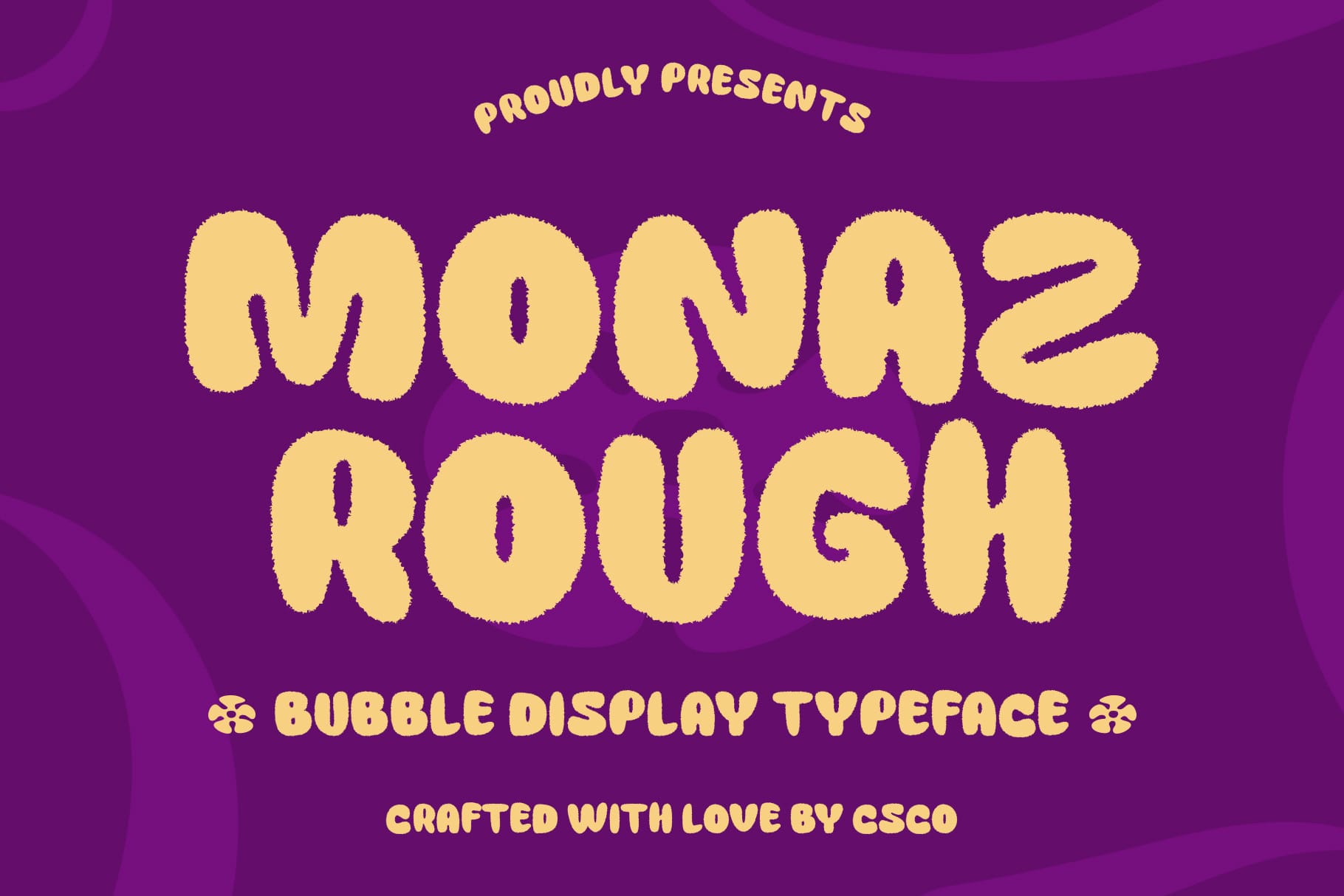
Monaz Rough Font introduces a more handmade and imperfect direction. Rough typography can be particularly effective for food brands because it can suggest craftsmanship and authenticity rather than mass produced perfection.
For a bakery identity, this quality can reinforce the idea of freshly made products. Use Monaz when you want the brand to feel artisanal, independent, and slightly rustic. Pair it with simple illustrations or natural visual textures to strengthen the handmade atmosphere.
5. Benicio Drawn Font

Benicio Drawn Font provides a more personal interpretation of playful typography. Drawn lettering can make a brand identity feel as though someone created it specifically for the business, which can be valuable for independent bakeries and small food brands.
This style works especially well when the identity needs warmth and personality. Try Benicio for packaging, bakery signs, menus, labels, promotional graphics, and merchandise. The hand drawn quality can also pair naturally with simple illustrations of muffins, pastries, or other baked goods.
6. Calverto Drawn Font

Calverto Drawn Font offers another route into handcrafted display typography. Its drawn character can make a brand name feel informal and inviting, qualities that work naturally with food and hospitality businesses.
For a The Muffins Room inspired identity, use Calverto when you want the typography to feel like part of the shop’s personality. It can be especially effective in large display applications where the character of the lettering has room to become visible.
7. CS Mojitos Groovy Font

CS Mojitos Groovy Font introduces a nostalgic and energetic direction. Groovy typography can create a sense of fun and retro charm, making it a compelling option for bakeries that want their branding to feel distinctive rather than conventionally modern.
This font could work especially well for a bakery with a colorful interior, nostalgic menu, or playful packaging. Combine it with simple geometric shapes, warm colors, and carefully selected illustrations to create a cohesive retro inspired identity.
8. CS Mondy Retro Font

CS Mondy Retro Font provides another way to bring nostalgia into bakery branding. Retro typography can make customers associate a brand with familiar, comforting visual references while still allowing the business to develop a modern identity.
For a muffin shop or café, this style can work across storefront signs, menus, packaging, posters, loyalty cards, and social media graphics. The key is to use the retro character consistently so the typography becomes part of a larger visual story.
9. Wegas Blur Font

Wegas Blur Font takes the collection in a more experimental direction. Blur effects can create movement and visual intrigue, offering a contemporary interpretation of expressive display typography.
This could be useful for a bakery that wants to feel youthful, modern, or unconventional. Instead of using the font everywhere, consider reserving it for campaign graphics, special packaging, promotional headlines, or social media content while using a cleaner typeface for practical information.
10. CS Macaron Bubble Font
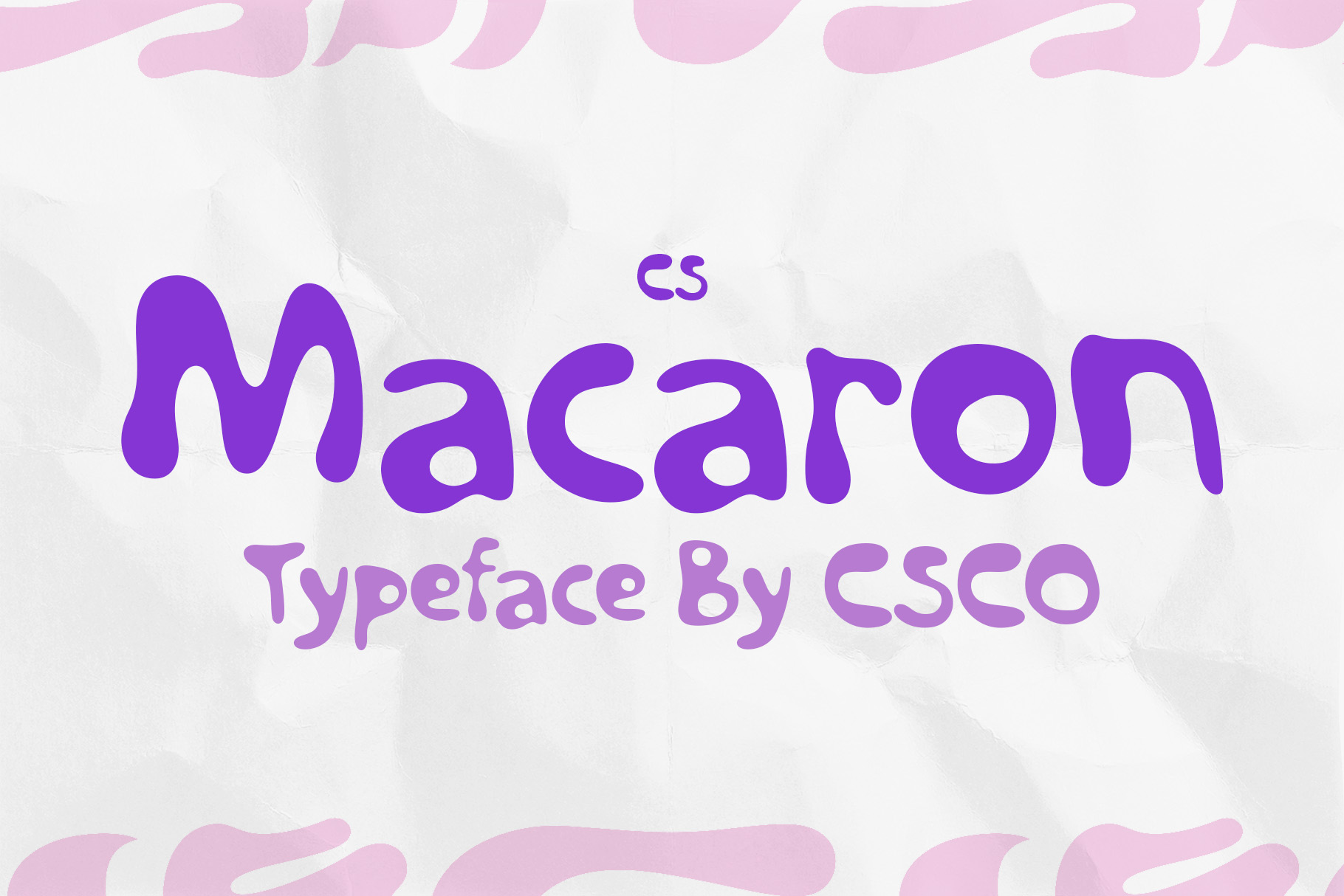
CS Macaron Bubble Font is an especially natural fit for sweet food branding. Bubble typography can create an immediate sense of softness and fun, making it well suited to products associated with treats, desserts, and indulgence.
For a The Muffins Room inspired concept, CS Macaron can help build a warm and memorable identity. Use it for packaging, product labels, stickers, menus, social graphics, and signage. Its playful character can become even stronger when paired with simple illustrations and a carefully controlled color palette.
The Importance of Warmth in Bakery Branding
Bakery branding often succeeds when it makes the customer feel welcome. Typography is one of the fastest ways to establish that feeling. Rounded shapes, playful proportions, and handcrafted details can create an emotional response before customers even see the products.
This is particularly important for small businesses competing with larger food brands. A distinctive typeface can give an independent bakery a recognizable personality that extends across its storefront, packaging, website, menus, and social media presence.
The goal is not to make everything look excessively cute. Strong bakery branding can remain sophisticated while still feeling warm. The balance between personality and restraint is what makes the identity memorable.
How to Choose Between Rounded, Retro, and Drawn Fonts
Rounded fonts are ideal when the brand should feel friendly, modern, and accessible. They work particularly well for businesses targeting families, younger customers, or audiences that respond to approachable visual identities.
Retro fonts are better suited to businesses that want nostalgia to play a major role. They can make a bakery feel established or culturally distinctive while giving the brand a clear visual era.
Drawn fonts work when craftsmanship and personality are more important. They can communicate a sense of handmade production and make the brand feel closer to the people behind the business.
Bubble and funky fonts are useful when the primary goal is fun. They can create memorable packaging and social media graphics, especially when the product itself has a playful or colorful personality.
How to Build a Muffin Shop Wordmark
Start by identifying the emotional direction of the bakery. Is it cozy and homemade, colorful and playful, modern and premium, or nostalgic and retro? The answer should influence the typography from the beginning.
Next, test the complete business name rather than selecting a font based only on its specimen. Look at how the letters interact, whether the wordmark remains readable, and whether the overall silhouette feels balanced.
Then build the surrounding identity. Consider a small illustration, simple pattern, packaging shape, or supporting font. The strongest bakery identities usually avoid adding too many unrelated visual elements. Let the main typeface establish the personality.
Tips for Creating Memorable Food Branding
- Choose emotion first: Decide how customers should feel when they see the brand.
- Match the typography to the product: Soft and playful fonts work naturally with sweet treats.
- Prioritize readability: A creative font should still communicate the business name clearly.
- Use consistent typography: Repeat the main display style across important brand touchpoints.
- Keep supporting graphics simple: Avoid competing with an expressive wordmark.
- Consider packaging early: Make sure the typography works on boxes, bags, labels, and stickers.
- Test digital applications: Check how the logo performs on websites, menus, and social media.
Where These Fonts Can Be Used
The ten The Muffins Room font alternatives in this collection can support much more than a primary logo. Rounded and bubble fonts can create memorable packaging and social media graphics. Drawn fonts can strengthen handmade or artisan positioning. Retro and groovy styles can establish a distinctive atmosphere for cafés and bakeries with nostalgic concepts.
Even the more experimental Wegas Blur Font can have a role when used selectively. Promotional campaigns, seasonal packaging, event graphics, and social content can provide opportunities to experiment without changing the core identity.
A flexible brand system can therefore use one primary typeface for recognition and several complementary styles for campaigns. This approach allows the brand to remain consistent while still having room to evolve.
Explore More Typography Inspiration
Studying different approaches to playful, retro, and expressive typography can help designers develop stronger instincts for food and lifestyle branding. For more creative font and identity inspiration, explore Craft Supply Co.
The legacy of The Muffins Room can be understood through a broader lesson in branding: typography can make a business feel like an experience. A rounded, bubbly, retro, groovy, rough, or hand drawn typeface can transform a simple name into something that feels welcoming and memorable.
The ten font alternatives in this article offer different interpretations of that idea. CS Glastic Rounded and Belony Fun Bold Sans Serif provide friendly contemporary directions, while Beonty and CS Macaron bring bubble like playfulness. Monaz, Benicio, and Calverto explore handcrafted character, while CS Mojitos, CS Mondy, and Wegas introduce retro or experimental energy.
The best choice ultimately depends on the story the bakery wants to tell. Instead of choosing a font simply because it looks attractive, consider how its shapes, texture, proportions, and personality support the customer experience. When typography, packaging, color, and imagery work together, even a simple muffin shop can develop a visual identity that customers remember long after the last bite.