
Some logos become memorable because they do more than display a name. They create a visual attitude. Trex font alternative is an interesting reference for designers because its identity can inspire questions about scale, movement, personality, and how typography can become a central part of a visual system.
When designers study a distinctive wordmark, they rarely need to reproduce every detail. The more valuable approach is to identify the principles behind the design. Letter proportions, unusual curves, visual rhythm, contrast, and expressive shapes can all become starting points for a new typographic direction.
The trex font alternative in this article explore several of those possibilities. From psychedelic and trippy typefaces to funky display styles and inktrap fonts, each option provides a different way to build a bold identity with strong visual character.
Why Trex Is an Interesting Typography Reference
Short names offer designers both an advantage and a challenge. A short word gives every character considerable visual importance. There are fewer letters to balance, so unusual shapes become easier to notice and the overall silhouette can become highly recognizable.
Trex also suggests how typography can communicate movement. Strong display lettering does not always need literal illustrations to feel energetic. Curves, distorted proportions, unconventional spacing, and unusual terminals can create a sense of motion within the letters themselves.
This makes the design particularly useful as a study reference for designers working on logos, posters, merchandise, music branding, entertainment projects, and other identities that need a memorable visual voice.
What Makes a Good Trex Font Alternative?
A good trex font alternative does not have to look identical to the reference. Instead, it should provide some of the same design opportunities. For a trex font alternative inspired direction, look for fonts with expressive shapes, strong display presence, unusual details, and enough personality to function as the primary graphic element.
Psychedelic fonts can create fluidity and visual movement. Funky typefaces can introduce humor and energy. Inktrap fonts can provide a more contemporary and structured interpretation of unusual letterforms. A mixed font can combine contrasting characteristics into a more experimental composition.
10 Font Alternatives Inspired by the Visual Energy of Trex
1. Quagey Psychedelic Typeface

Quagey Psychedelic Typeface is a strong choice for designers who want to explore fluid, expressive typography. Psychedelic lettering naturally creates visual movement through unusual curves and shapes, making it useful when a logo needs to feel energetic rather than static.
For a Trex inspired project, Quagey can help turn the brand name into a graphic object. Its expressive character makes it particularly suitable for posters, music identities, merchandise, creative campaigns, and bold display branding. Keep the supporting layout simple so the typeface can command attention.
2. Caplosy Trippy Font

Caplosy Trippy Font takes the experimental side of typography even further. A trippy typeface can introduce a sense of distortion and movement, allowing designers to create identities that feel unconventional and visually immersive.
This makes Caplosy useful for projects that want to move beyond ordinary logo typography. Try it for entertainment brands, creative events, apparel, album artwork, posters, or digital campaigns. The distinctive shapes can become the main visual feature of the identity.
3. Gadion Psychedelic Display Typeface

Gadion Psychedelic Display Typeface combines the attention grabbing nature of display typography with a psychedelic visual direction. This creates opportunities for designers who want a wordmark to feel expressive while still maintaining a strong headline presence.
Gadion can work well when the typography needs to dominate the composition. Use it at large sizes and experiment with compact arrangements, contrasting colors, or minimal supporting graphics. The result can feel bold without requiring a complicated logo system.
4. Rastely Funky Typeface
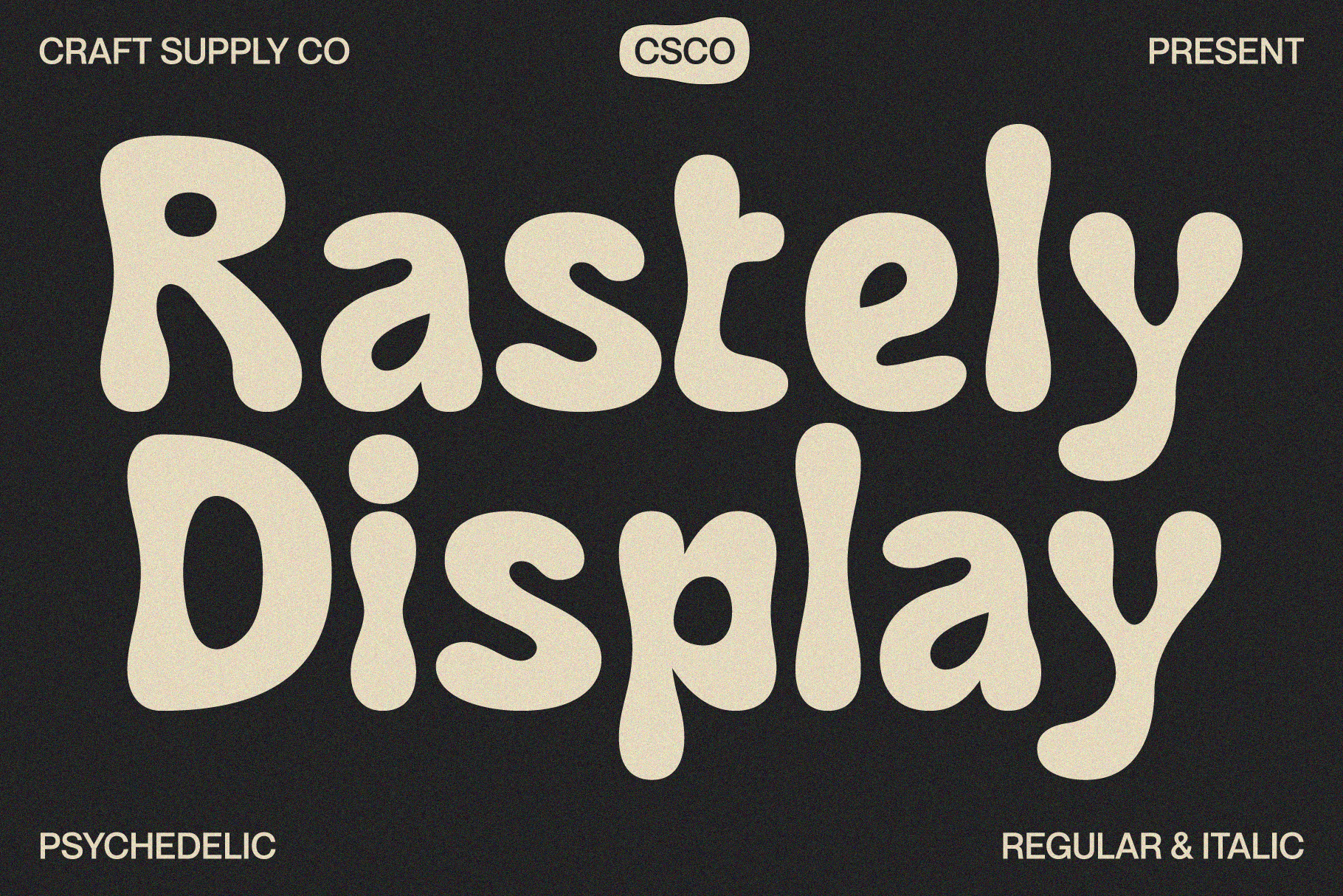
Rastely Funky Typeface provides a lighter and more playful interpretation of expressive display typography. Its funky character can help a brand communicate confidence, creativity, and personality without relying entirely on psychedelic distortion.
For designers studying Trex, Rastely offers an important lesson: bold typography does not always need to feel serious. A playful display style can make a short brand name more approachable while still giving it a strong visual presence. It can work especially well for merchandise, lifestyle brands, posters, packaging, and creative businesses.
5. Magedo Psychedelic Font
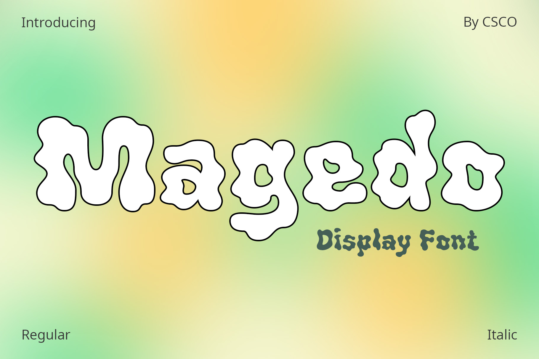
Magedo Psychedelic Font offers another route into fluid and expressive lettering. Psychedelic styles can make individual characters feel almost illustrative, which allows designers to use the wordmark itself as a piece of artwork.
This approach works well for identities that need a memorable silhouette. Magedo can be explored for music projects, fashion graphics, festival branding, creative studios, editorial artwork, and other applications where distinctive typography matters more than conventional corporate neutrality.
6. CS Liston Inktrap Font
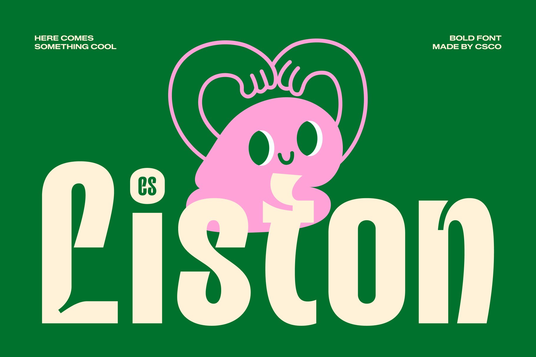
CS Liston Inktrap Font introduces a more structured alternative to the psychedelic selections. Inktrap inspired details can create distinctive letterforms while maintaining a contemporary typographic foundation.
This makes CS Liston useful when you want a Trex inspired identity to feel experimental without becoming extremely decorative. The unusual details can add personality while the overall structure remains suitable for logos, branding systems, editorial headlines, and digital applications.
7. CS Lewis Inktrap Font
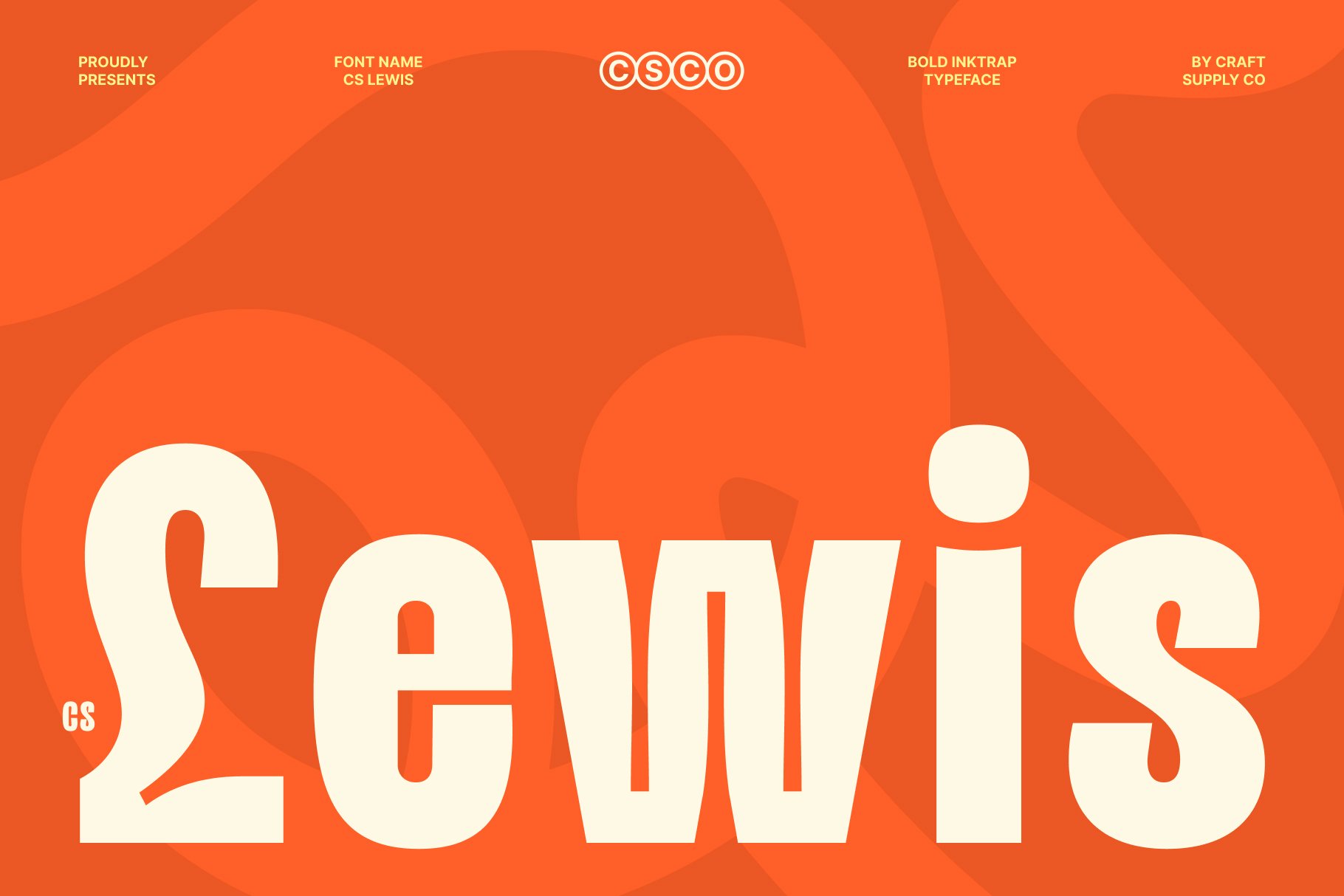
CS Lewis Inktrap Font provides another contemporary interpretation of unusual typography. Its inktrap characteristics can give letters a distinctive silhouette, especially when displayed at large sizes.
For a bold wordmark, this kind of detail can help the typography stand apart from generic sans serif alternatives. Use CS Lewis when the brand needs a modern foundation with an unconventional edge. It can be especially effective in technology, creative, fashion, editorial, or entertainment oriented branding.
8. CS Kelton Inktrap Font

CS Kelton Inktrap Font continues the exploration of structured but expressive typography. Inktrap details can create subtle visual tension within letterforms, giving the wordmark more character without relying on excessive decoration.
This makes CS Kelton a useful option for designers who want something distinctive but controlled. Try it in a monochrome logo first to understand its natural character, then introduce color or supporting graphics once the typography feels balanced.
9. CS Maiden Mix
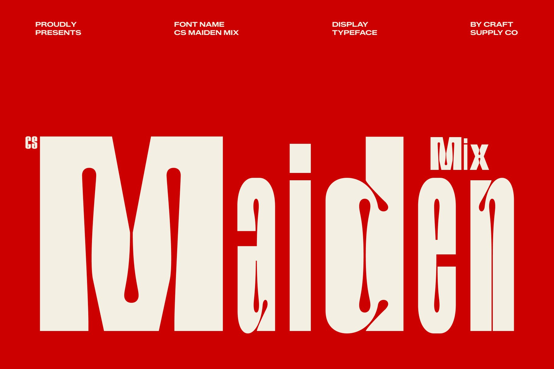
CS Maiden Mix provides a more experimental direction by combining different typographic characteristics. A mixed style can help designers create contrast within a single word, which is particularly valuable when the brand name is short.
For a Trex inspired concept, CS Maiden Mix can encourage experimentation with scale, spacing, and visual hierarchy. Rather than treating every character identically, designers can explore how subtle variation can turn a word into a more dynamic composition.
10. CS Rinko Inktrap Font
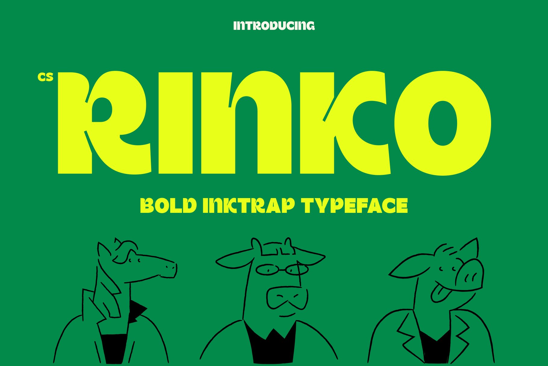
CS Rinko Inktrap Font completes the collection with another distinctive option for contemporary display typography. Its inktrap inspired details can add visual interest to a logo while keeping the overall direction more structured than a fully psychedelic typeface.
This makes it a strong choice for designers who like expressive typography but need a practical identity that can work across multiple applications. Consider CS Rinko for branding, packaging, editorial layouts, posters, digital campaigns, and merchandise.
Design Lessons Hidden in Trex
The first lesson is that distinctive typography can carry an entire identity. Designers sometimes assume that an interesting logo needs an icon, illustration, or complex symbol. In reality, an expressive wordmark can provide enough visual information on its own.
The second lesson is the importance of silhouette. When viewers see a logo from a distance or for only a moment, they may recognize its overall shape before reading every individual letter. Strong proportions and memorable contours can therefore improve recognition.
The third lesson is controlled experimentation. Unusual typography works best when the designer knows what to exaggerate and what to keep simple. If the letterforms are highly expressive, the surrounding composition can remain restrained. This creates a useful visual hierarchy.
How Psychedelic Typography Creates Movement
Psychedelic typography often creates the impression of motion through curved lines, distorted proportions, flowing connections, and unexpected letter shapes. Even when the words remain static, these visual characteristics can make the eye move through the composition.
This effect can be especially useful for brands associated with music, art, entertainment, fashion, events, or youth culture. Instead of simply communicating information, the typography creates an atmosphere.
However, readability should remain part of the design process. A highly distorted font may look impressive as artwork but become difficult to understand when used at small sizes. Always test expressive fonts at the actual sizes and applications where the identity will appear.
When to Choose a Funky or Psychedelic Font
A funky or psychedelic font works best when the brand has permission to be expressive. Creative industries can often use these styles naturally because their audiences expect visual experimentation.
Music projects, clothing brands, festivals, entertainment businesses, independent publications, art projects, and creative agencies can all benefit from typography with a stronger personality. A more conventional business may still use the style, but it may work better as a campaign or display element rather than the primary corporate typeface.
Tips for Creating a Trex Inspired Wordmark
- Start with the word shape: Look at the complete silhouette instead of evaluating individual letters in isolation.
- Experiment with scale: Large display typography can reveal details that disappear at smaller sizes.
- Control the distortion: Make sure unusual letterforms remain recognizable.
- Use spacing strategically: Tight or loose tracking can dramatically change the energy of a wordmark.
- Keep supporting graphics simple: Let expressive typography remain the main attraction.
- Test multiple categories: Compare psychedelic, funky, inktrap, and mixed fonts before choosing a direction.
- Build an original identity: Borrow design principles rather than reproducing another logo’s exact appearance.
Using These Fonts Beyond Logos
These trex font alternative can do much more than create wordmarks. Psychedelic and trippy fonts can become strong poster headlines or campaign graphics. Funky typefaces can add personality to packaging and merchandise. Inktrap fonts can provide unusual details in editorial layouts, social media graphics, and digital branding.
One effective strategy is to create a typography system with different levels of expression. Use the strongest display font for major headlines or logo applications, then pair it with a simpler supporting typeface for body copy. This approach preserves personality without sacrificing usability.
Explore More Typography Inspiration
Designers can develop stronger typographic instincts by studying a wide range of lettering styles, identity systems, and display type treatments. For more creative font and branding inspiration, explore the work of Craft Supply Co.
The lessons from Trex are ultimately lessons about confidence in typography. A memorable wordmark does not need to follow conventional rules at every step. It can experiment with shape, rhythm, distortion, contrast, and unusual details while still maintaining a clear visual purpose.
The ten font alternatives in this collection offer several paths into that approach. Quagey, Caplosy, Gadion, and Magedo explore psychedelic and trippy energy, while Rastely brings a funky display personality. CS Liston, CS Lewis, CS Kelton, and CS Rinko offer more structured inktrap directions, and CS Maiden Mix encourages experimentation through contrasting typographic characteristics.
The most important takeaway is to understand why expressive typography works before using it. Choose a font that supports the brand’s personality, control the surrounding composition, test readability carefully, and develop an original visual system. When those decisions work together, typography can become more than a name it can become the identity itself.