
Typography can give a sports design its energy before the audience even reads the full message. Whether you are creating a tournament poster, sports championship schedule, athlete announcement, team graphic, or promotional campaign, the right font can make the design feel more dynamic and focused.
A strong font recommendation for sporty design should combine visual impact with practical readability. Sports graphics often contain important information such as team names, player names, match times, locations, scores, dates, and sponsors. The typography needs to attract attention while keeping those details easy to find.
Different sports projects also require different visual styles. A football tournament poster might benefit from a bold athletic typeface, while a championship schedule may need a structured font that organizes multiple pieces of information. A sports star poster can use a more expressive display style to make the athlete’s name the main visual element.
In this guide, we explore ten font recommendations from Craft Supply Co that can work across sporty posters, tournament graphics, championship schedules, athlete designs, and other sports-related creative projects.
What Makes a Good Sporty Font?
A sporty font does not necessarily need to look aggressive or extremely bold. The most useful choice depends on the sport, audience, and design format. However, sports typography often benefits from strong shapes, clear proportions, and a distinctive personality.
When choosing a font for a sports project, consider these characteristics:
- Strong visual presence: The font should create enough impact for headlines and team names.
- Readability: Match times, dates, scores, and other details must remain easy to read.
- Energy: Dynamic lettering can help communicate movement and competition.
- Versatility: The font should work across posters, social graphics, schedules, merchandise, and digital media.
- Clear hierarchy: Typography should help viewers identify the most important information first.
- Sport compatibility: The font should match the character of the sport and event.
Font Recommendation for Sporty Designs
There is no single font that fits every sports identity. A professional championship can require a different approach from a school sports day or an extreme sports event. The following recommendations cover bold, drawn, stamped, slab serif, and display styles.
1. CS Allied Sporty Font

CS Allied Sporty Font is a natural starting point when you need typography specifically suited to athletic designs. Its sporty character can help establish an energetic visual identity for teams, competitions, events, and promotional graphics.
Use it for tournament titles, team branding, sports posters, social media graphics, merchandise, and event announcements. It can also work well when the team or event name needs to become the strongest typographic element in the composition.
For a sports poster, place the main headline in a large size and use a simpler supporting font for dates, locations, and other information.
2. CS Champion Sporty Font

CS Champion Sporty Font is another strong option for competitive sports graphics. Its name and visual direction make it particularly suitable for designs centered around championships, winning moments, tournaments, and athletic achievement.
Consider it for championship posters, team announcements, sports merchandise, competition branding, award graphics, and social media campaigns. The font can help make a short headline feel more powerful and event-focused.
It can also work well for a sports star poster where the athlete’s name needs to command attention.
3. CS House Stamp

CS House Stamp provides a more textured and printed direction for sports typography. Stamp-inspired fonts can create a rugged, vintage, or physical character that works well for team merchandise and old-school athletic aesthetics.
Try it for retro sports posters, team apparel, tournament badges, promotional graphics, gym branding, and event merchandise. It can also add texture to designs that use distressed photographs or vintage sports imagery.
For modern sports projects, use the stamp style selectively so the texture supports the design without reducing readability.
4. CS Allied Drawn

CS Allied Drawn brings a more expressive and hand-drawn character to sports typography. This can be useful when you want an athletic design to feel energetic and personal rather than highly corporate.
Use it for local sports events, team posters, youth tournaments, skateboarding graphics, merchandise, and promotional campaigns. Hand-drawn lettering can work especially well for sports with a strong street, lifestyle, or community culture.
Pair it with a clean sans serif when your design contains detailed schedules or event information.
5. CS Capito Drawn

CS Capito Drawn offers another expressive option for sporty designs that need a handmade display character. Its drawn appearance can give a poster a more informal and energetic personality.
Consider it for sports festivals, school tournaments, community competitions, team announcements, and event posters. It can also work well with illustrations and action photography.
Use the font primarily for short headlines or names, then switch to a more straightforward typeface for practical information.
6. CS Bargent Mix
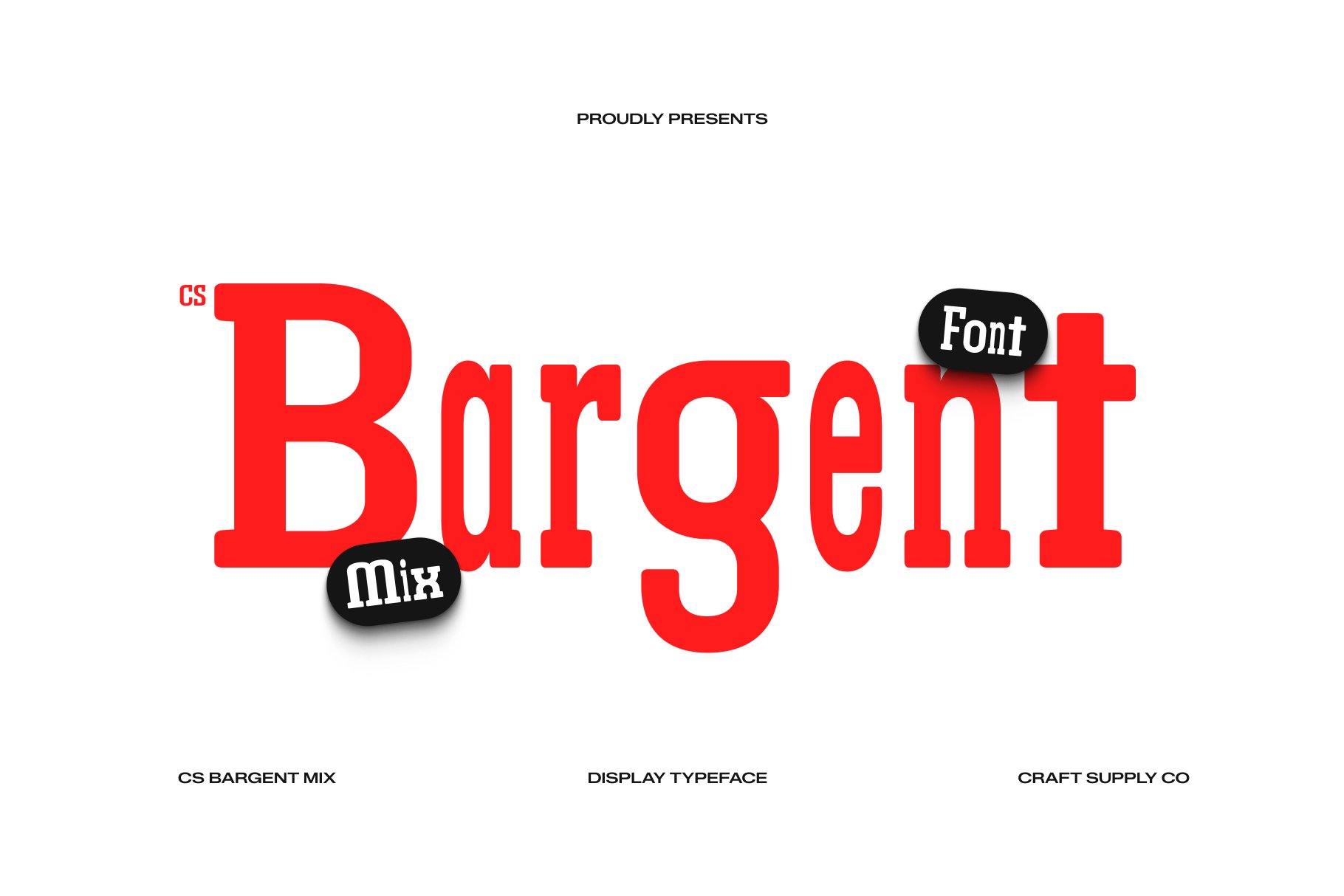
CS Bargent Mix gives sports designers a more versatile display direction. A mixed display style can add visual personality to posters where the typography needs to stand out from photography and other graphic elements.
Use it for sports campaigns, event posters, team promotions, social media graphics, and merchandise. It can also help create a distinctive identity when you want something different from conventional athletic fonts.
Experiment with large-scale headlines and strong contrast between the main title and smaller information.
7. CS Capito Rippled
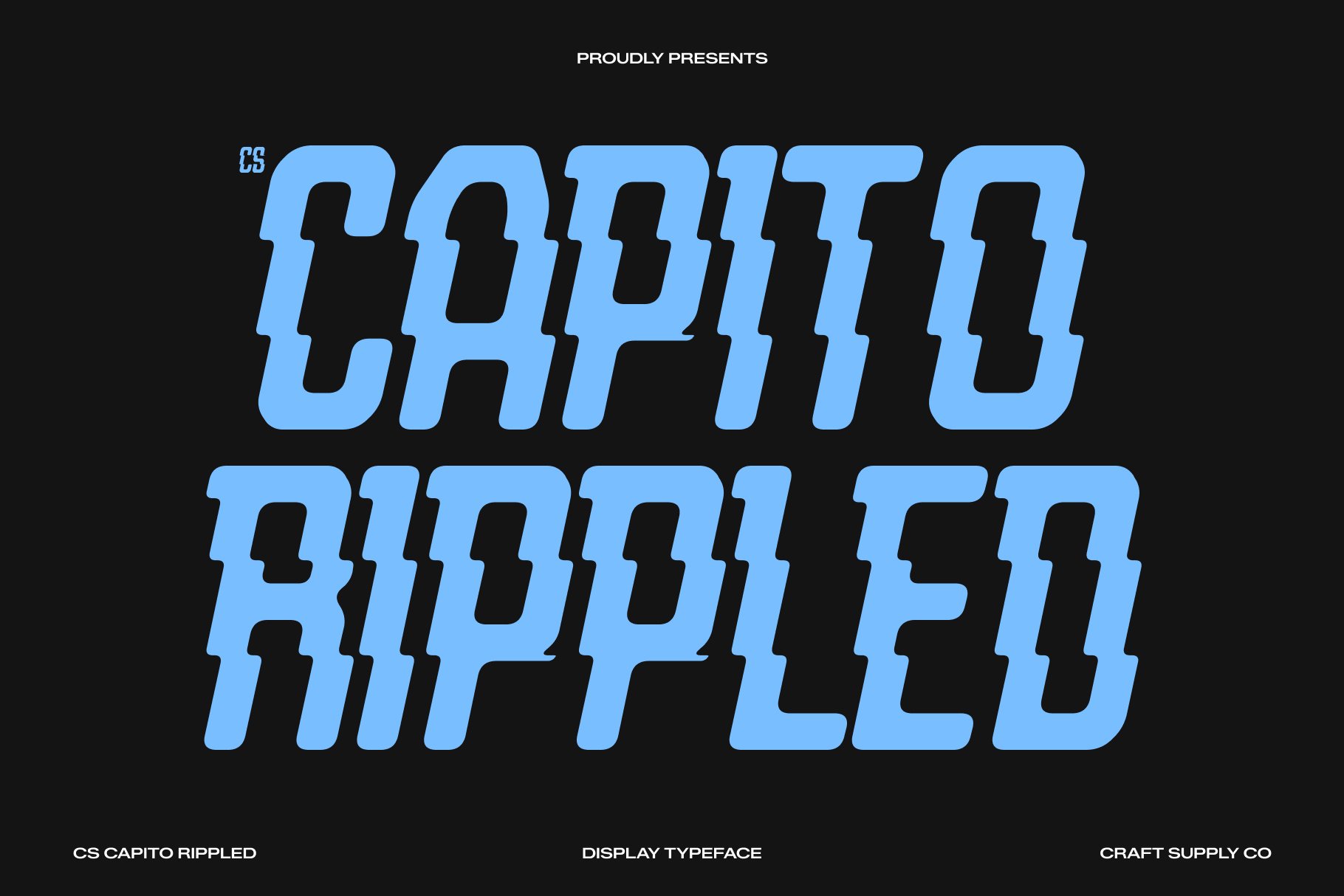
CS Capito Rippled provides a textured alternative for sports graphics. Its visual treatment can introduce movement and surface detail, making it suitable for posters that need more than a simple clean headline.
Consider it for action sports, music-and-sports events, youth competitions, promotional posters, and creative team graphics. A textured font can also work well with motion blur, photography, and energetic backgrounds.
Because the style already contains visual detail, keep other decorative elements under control to maintain a clear hierarchy.
8. CS Bargent Disco

Sports typography does not always need to look traditional. CS Bargent Disco can provide a more unconventional direction for sports-related events that combine athletic themes with entertainment, nightlife, or lifestyle branding.
Use it for sports parties, after-game events, promotional campaigns, fitness events, lifestyle competitions, and creative social media graphics. It can also help differentiate an event from more conventional tournament branding.
For a cohesive composition, use the font for the headline and keep the supporting information relatively simple.
9. CS Bargent Slab Serif Font
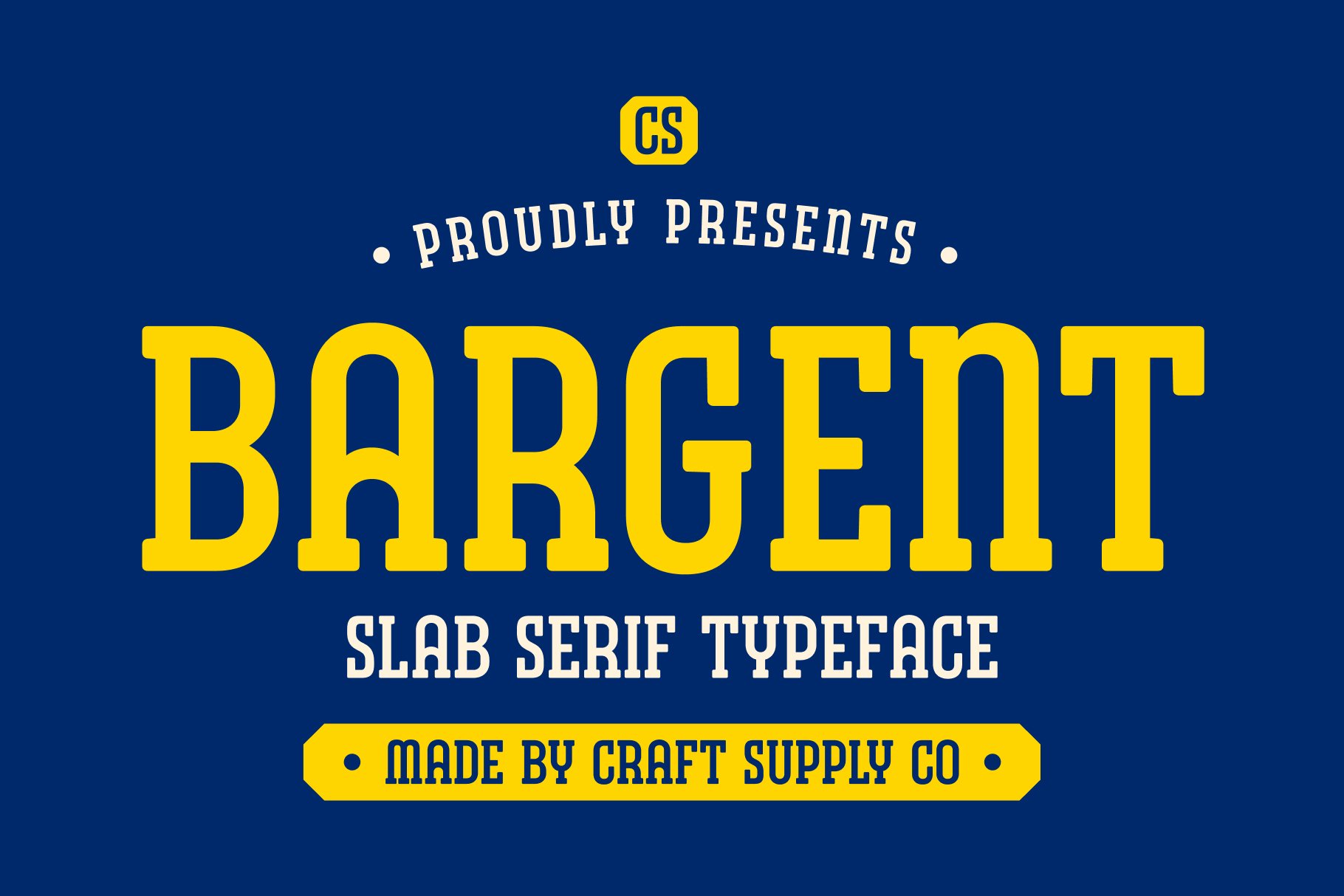
Slab serif fonts can provide a strong alternative to traditional sporty sans serif typography. Their substantial serifs can create a sturdy and confident appearance, which can work well for sports branding and event graphics.
CS Bargent Slab Serif Font can suit team identities, championship graphics, sports publications, athletic clubs, tournament posters, and merchandise. The structured letterforms can also help create a more established visual identity.
Try using it in uppercase for a powerful headline, then pair it with a clean sans serif for secondary information.
10. CS Wilford Slab Serif Font

CS Wilford Slab Serif Font offers another sturdy serif direction for sports design. Slab serif typography can create a classic athletic character, especially when combined with bold photography, team colors, and strong geometric layouts.
Use it for sports championships, tournament branding, athletic club identities, sports posters, team merchandise, and editorial sports graphics. It can also create a vintage-inspired appearance when paired with distressed textures.
For a championship schedule, consider using the font for the event name while using a highly readable font for match details.
Font Recommendation for Sport Tournament Posters
A font recommendation for sport tournament design needs to balance excitement with information. Tournament posters often include several important details, including the event name, participating teams, date, venue, registration information, and sponsors.
Use your most expressive font for the tournament name. CS Allied Sporty and CS Champion Sporty can provide an athletic direction, while CS Bargent Slab Serif can create a more traditional competitive identity.
Keep the supporting information visually organized. Use consistent font sizes, spacing, and alignment so viewers can quickly identify when and where the tournament takes place.
Font Recommendation for Sporty Posters
A font recommendation for sporty poster design should complement the visual energy of the imagery. If the poster contains an action photograph of a football player, basketball player, runner, or cyclist, the typography should support the movement rather than compete with it.
Bold sporty fonts work well for short headlines. Drawn or textured fonts can create a more expressive atmosphere, while slab serif fonts can add a classic athletic character.
Think about the negative space around the athlete. If the photograph has open space on one side, place the headline there rather than covering important parts of the subject. This approach gives the typography room to breathe.
Font Recommendation for Sports Star Posters
A font recommendation for Sports star poster design should make the athlete’s name easy to recognize. When a poster focuses on one player, the name often becomes the second-most important element after the athlete’s image.
CS Champion Sporty can work well for competitive athlete graphics, while CS Allied Sporty can provide a more general athletic direction. CS Bargent Slab Serif or CS Wilford Slab Serif can offer a classic sports-editorial appearance.
Use the player’s name at a large scale and establish a clear information hierarchy for statistics, team information, event details, or achievements. Avoid using several highly decorative fonts because the athlete should remain the primary visual focus.
Font Recommendation for Sports Championship Schedule
A font recommendation for Sports championship schedule needs to prioritize clarity. A schedule can contain multiple teams, dates, times, venues, rounds, and matchups, so decorative typography should have a limited role.
Use a distinctive display font for the championship title, then choose a clean and readable font for the actual schedule. CS Bargent Slab Serif and CS Wilford Slab Serif can work for section headings, while a simpler supporting typeface can handle the match information.
Use visual hierarchy to separate rounds. For example, the championship title can use the largest type, round names can use a secondary size, and match details can use a smaller but highly readable style.
How to Pair Fonts for Sports Designs
Successful sports typography often uses contrast. Instead of placing several bold fonts together, assign each typeface a specific job.
- Sporty display + clean sans serif: Use the display font for the headline and the simpler font for schedules and details.
- Sporty font + slab serif: Combine a modern athletic headline with a sturdy supporting heading.
- Drawn font + simple typeface: Let the hand-drawn style add personality while the supporting font maintains clarity.
- Stamp font + clean typography: Use texture for the event title and simple typography for practical information.
Limit the number of typefaces in one composition. Two well-chosen fonts can usually establish a clearer hierarchy than four or five competing styles.
Sports Font Design Tips
Typography is only one part of an effective sports graphic. Combine your font choice with strong layout decisions to create a cohesive design.
First, identify the most important message. If the poster promotes a championship, make the championship name prominent. If it promotes a specific athlete, prioritize the athlete’s name.
Next, consider scale. Large typography can create an immediate sense of energy, while smaller supporting text can organize practical details. Do not make every element large because this removes the hierarchy.
Finally, test the design at its intended viewing size. A poster displayed on a stadium wall needs different typography from a schedule shared on a smartphone. Make sure the important information remains readable in both situations.
Common Mistakes When Choosing Sports Fonts
One common mistake is selecting a font simply because it looks “sporty.” A typeface can have an athletic appearance but still become difficult to read when used for schedules or detailed information.
Another mistake is adding too many effects. Shadows, outlines, textures, gradients, and other treatments can sometimes make typography harder to read. Start with a strong font and clean layout before adding decorative effects.
It is also important to avoid placing important text over busy areas of an action photograph. Strong contrast between the typography and background will help the information remain visible.
The right font recommendation for sporty design depends on the purpose of the project. Tournament graphics need energy and clarity, sports star posters need strong visual hierarchy, and championship schedules need especially clear information design.
CS Allied Sporty and CS Champion Sporty are natural directions for athletic branding, while CS House Stamp can introduce a rugged printed character. CS Allied Drawn and CS Capito Drawn provide more expressive options, while CS Capito Rippled and CS Bargent Mix can add distinctive texture and display personality.
For a more classic athletic direction, CS Bargent Slab Serif and CS Wilford Slab Serif can provide sturdy serif structures. CS Bargent Disco offers a more unconventional direction for sports and entertainment projects.
Whatever style you choose, prioritize readability, hierarchy, and consistency. A strong sports font should not only look energetic; it should help viewers understand the event quickly and remember the visual identity.
For more creative typography and display font inspiration, explore Craft Supply Co. You can also discover additional design and typography projects from Craft Supply Co on Behance.