
A strong logo does more than identify a brand. It gives people an immediate sense of its personality, energy, and purpose. Oloo fonts is a great example of how typography can make a brand feel approachable, active, and memorable. Its lowercase wordmark has a distinctive visual rhythm, while the custom treatment of the letter “L” adds movement and personality to the overall identity.
The Oloo brand was created for a shared electric scooter service in Taiwan, with a concept built around convenient movement, everyday exploration, humor, and an easygoing user experience. Its identity uses a dynamic typographic approach, playful visual elements, and a recognizable green based color palette. The logo’s customized “L” helps suggest the movement of a rider and gives the otherwise simple wordmark a more energetic character.
That combination makes Oloo fonts an interesting reference for designers searching for a logo typeface that feels bold without becoming overly serious. The right Oloo fonts can create a similar sense of confidence, movement, and friendliness while giving a new brand its own visual identity.
What Makes the Oloo Logo Personality Stand Out?
Oloo demonstrates how a simple wordmark can communicate a lot through letterforms. Instead of relying on a complicated symbol, the identity places strong emphasis on the name itself. The rounded, energetic qualities of the lettering help make the brand feel accessible, while the custom letter treatment creates a memorable point of difference.
The wider identity also reinforces this personality. Oloo has been described through qualities such as being smart, humorous, relaxed, and easy to use. Its visual system combines typography, movement inspired lines, playful characters, and green tones to create a brand that feels more human than purely functional.
For designers developing a similar identity, a bold display font can provide a useful starting point. Strong display type can make a short brand name immediately noticeable, especially when the logo needs to work across apps, signage, packaging, merchandise, social media, and advertising.
10 Fonts That Match the Personality of Oloo
If you like the energetic character of the Oloo identity, these ten Oloo fonts from Craft Supply Co. offer different ways to explore a similarly bold and expressive direction. Each typeface can bring its own personality to a logo while giving designers plenty of room to customize spacing, letterforms, and individual characters.
1. CS Calton Bold Display Font

CS Calton is a strong option when you want a logo to feel confident, expressive, and immediately recognizable. Its bold display character gives short brand names plenty of visual weight without requiring additional graphic elements. For an Oloo inspired concept, you could use CS Calton as the foundation of a compact wordmark and customize one letter to introduce a sense of movement. Its strong presence also makes it suitable for digital first branding, where a logo needs to remain recognizable at smaller sizes.
2. CS Randy Bold Display Font
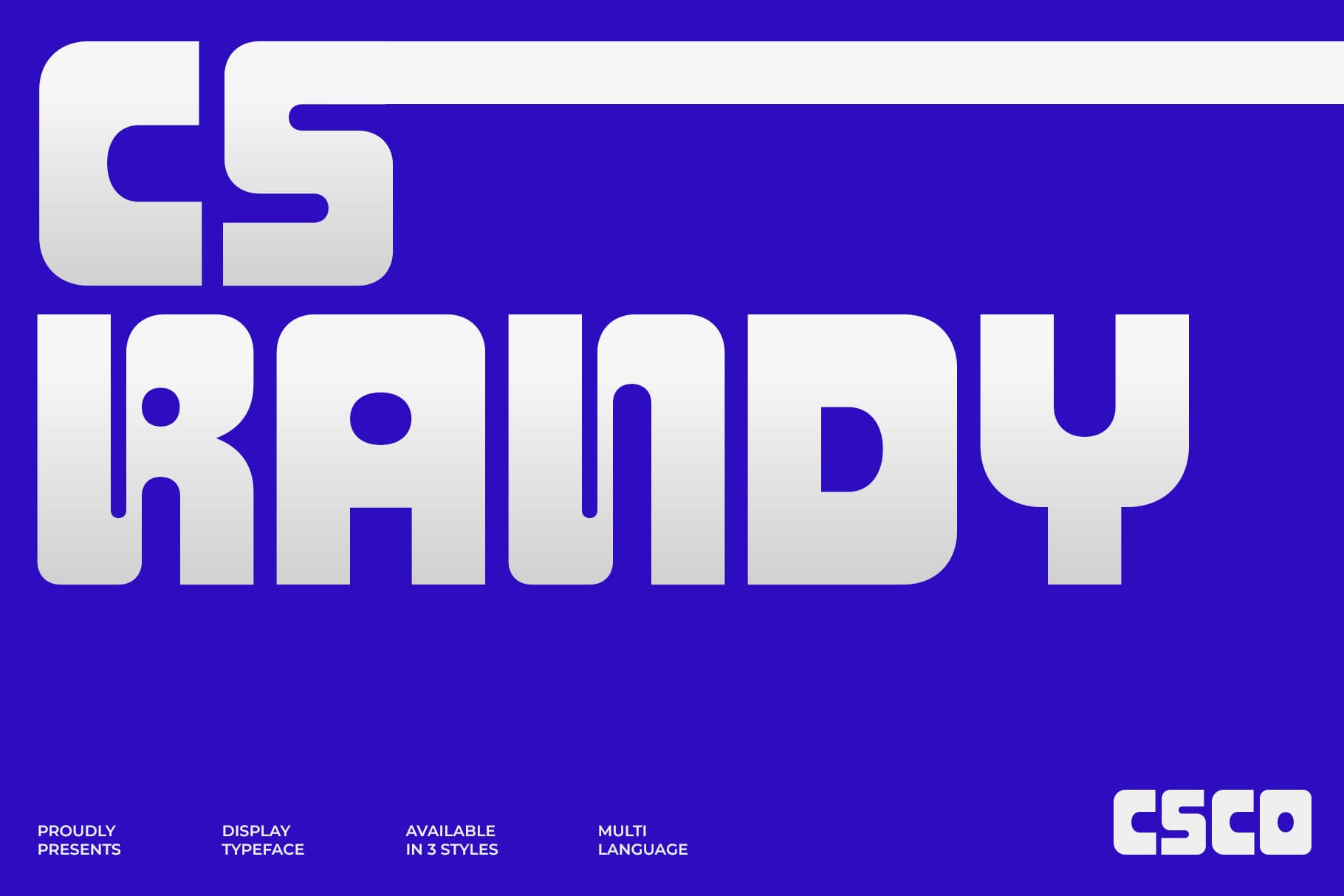
CS Randy brings a more playful personality to bold typography. It works well for brands that want to look energetic and approachable rather than corporate or overly formal. This makes it an interesting alternative for an Oloo inspired identity, especially when the brand needs to communicate fun and accessibility. Try using a generous wordmark with customized spacing to make the letters feel more active and connected.
3. CS Guner Bold Display Font
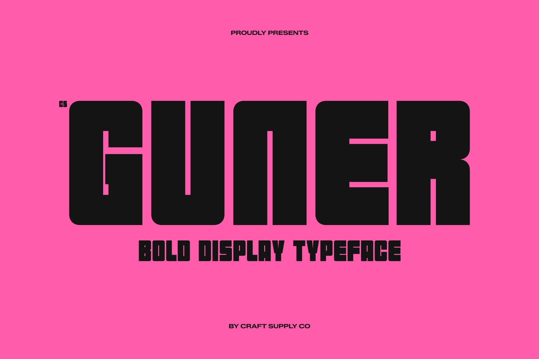
CS Guner offers a bold visual foundation for designers who want to create a logo with strong impact. A heavy display style can help a short name stand out across app interfaces, posters, signage, and social media graphics. Its visual strength also gives you an opportunity to create contrast through color. Pairing a bold wordmark with a restrained palette can produce a clean identity while still preserving the energetic qualities associated with Oloo.
4. CS Gumpo Bold Display Font

CS Gumpo is a useful choice when the goal is to make typography the main visual attraction. Its bold display approach can give a short brand name a distinctive silhouette, making the logo easier to remember. For a playful mobility or lifestyle brand, consider experimenting with lowercase lettering, rounded compositions, or customized letter connections. Small adjustments can transform a standard font treatment into a more unique wordmark.
5. CS Diora Bold Display Font

CS Diora provides another direction for creating a bold and personality driven logo. Its display character can help establish a strong visual voice without making the identity feel overly complicated. If you want to take inspiration from Oloo’s ability to combine simplicity with personality, use CS Diora selectively and let the typography remain the hero. A clean layout and carefully controlled color palette can help balance its expressive qualities.
6. CS Regime Bold Display Font

CS Regime works well when you want a logo to communicate confidence and structure. Its bold appearance can create a powerful wordmark that feels established while still supporting a contemporary identity. This makes it especially useful for brands that want to balance playful ideas with a stronger visual foundation. For an Oloo inspired concept, you could soften the overall result by using lowercase letters and introducing a subtle custom modification to one character.
7. CS Bard Bold Display Font

CS Bard gives designers another expressive option for bold logo typography. A display font like this can help a brand name occupy more visual space and create an identifiable shape even before people read every letter. That quality becomes valuable when developing a logo for an app or service that needs to compete visually in busy digital environments. Experiment with compact spacing and a simple supporting graphic to build a memorable identity.
8. CS Arola Bold Display Font

CS Arola can help create a bold wordmark with a strong graphic presence. It is a good starting point for brands that want typography to feel active rather than passive. When developing an Oloo inspired logo, consider how the letters interact with one another instead of treating them as isolated characters. Adjusting kerning, scale, and individual letter shapes can add movement and create a more custom result.
9. CS Ablaze Bold Display Font

CS Ablaze is suited to brands that want their typography to make an immediate statement. Its bold display character can bring energy to a logo and work particularly well when the brand has a youthful, active, or creative personality. If your logo concept takes inspiration from Oloo’s playful approach, use CS Ablaze as a foundation and explore unusual capitalization, compact layouts, or a custom letterform to make the result more distinctive.
10. CS Glastic Bold Font

CS Glastic offers a bold alternative for designers who want to push the personality of a wordmark further. Its strong typographic presence can help a short brand name become a visual asset rather than simply a label. For a modern lifestyle or mobility brand, you can combine the typeface with simple geometric elements, motion lines, or a restrained color palette. Keep the supporting graphics minimal so the lettering remains easy to recognize.
How to Create an Oloo Inspired Logo Without Copying It
Taking inspiration from an established logo does not mean reproducing its exact letterforms. Instead, focus on the design principles that make the identity successful. Oloo’s visual language demonstrates the value of movement, simplicity, humor, and a strong typographic personality.
Start by choosing a typeface that reflects the emotional direction of your brand. A bold display font can communicate confidence and energy, while rounded or more playful letterforms can make the identity feel approachable. Once you choose a font, customize the wordmark rather than leaving it completely untouched. Adjust the spacing, modify a distinctive character, or introduce a subtle visual gesture that relates to the brand’s product or story.
You should also consider how the logo behaves at different sizes. A successful wordmark needs to work on a mobile app icon, website header, social media profile, printed merchandise, and large scale signage. Avoid unnecessary details that disappear when the logo becomes small. Strong letterforms and a recognizable silhouette usually create a more flexible identity.
Why Bold Display Fonts Work for Modern Logos
Bold display fonts can make a brand feel confident almost instantly. Their heavier strokes create strong shapes, which helps logos remain visible and memorable across different applications. They also give designers enough visual weight to build a complete identity around typography alone.
For playful brands, however, bold does not have to mean serious. The ten typefaces above demonstrate how display typography can move in different directions. Some can feel energetic, some expressive, some structured, and others more experimental. The key is choosing a typeface that supports the brand’s personality rather than choosing one simply because it looks attractive.
Oloo fonts is a useful reference because its identity shows how typography can become part of the brand story. The customized “L” introduces movement into the wordmark, while the broader identity uses visual humor and dynamic elements to reinforce the idea of easy, enjoyable mobility.
Oloo proves that a memorable logo does not need to rely on complicated graphics. A distinctive wordmark, thoughtful typography, and a clear personality can create a strong visual identity. If you are developing a logo with a similarly playful, dynamic, and approachable character, bold display fonts provide an excellent starting point.
The best logo font is ultimately the one that supports the story behind the brand. As you explore Craft Supply Co to find the right assets, start with a strong typeface, refine the spacing, experiment with individual letters, and build a visual system that feels consistent wherever the logo appears.