
Some brand identities capture attention through bold colors and elaborate graphics, while others create a lasting impression through typography, atmosphere, and carefully chosen details. Earth & Ember font evokes a visual direction that feels connected to nature, warmth, and contemporary design. The name itself suggests a balance between grounded, organic materials and the energy of fire, creating an appealing starting point for a brand identity with character.
Recreating this kind of visual feeling requires more than choosing a font that looks attractive. Designers need to consider how letterforms, color palettes, spacing, textures, and supporting graphics work together to communicate a consistent personality. A thoughtful combination of these elements can make a brand feel warm without appearing rustic, sophisticated without becoming distant, and expressive without overwhelming the viewer.
In this guide, we explore the design principles behind an Earth & Ember font inspired aesthetic and introduce 10 font alternatives from Craft Supply Co. These typefaces offer different creative directions for building a distinctive logo, packaging system, website, or visual identity. Use them as starting points to develop a brand that captures a similar atmosphere while maintaining its own character.
Understanding the Earth & Ember Aesthetic
The name Earth & Ember creates a natural contrast between two visual ideas. Earth suggests stability, texture, organic forms, and a connection to the physical world. Ember introduces warmth, energy, intimacy, and a subtle sense of drama. Together, these associations can inspire a brand identity that balances natural simplicity with a more expressive, contemporary edge.
For designers, this concept offers several possibilities. A restrained typographic logo can communicate refinement, while warm colors and tactile materials can make the identity feel approachable. Subtle contrasts between clean layouts and imperfect textures can also help create depth without making the overall design feel crowded.
It is important to distinguish this conceptual direction from a verified analysis of a specific brand’s existing identity. The suggestions below interpret the visual associations of the Earth & Ember name as a design brief. They provide a practical framework for exploring a related aesthetic rather than claiming that every suggested feature appears in the original branding.
Key Design Elements to Recreate the Feel
1. Choose Typography With Character
Typography establishes the foundation of a brand’s personality. A refined sans serif can create a contemporary, understated identity, while a more experimental typeface can introduce energy and visual tension. The right choice depends on whether you want the brand to feel premium, artistic, youthful, or naturally understated.
For an Earth & Ember inspired logo, look beyond basic readability. Consider the shape of each letter, the spacing between characters, the weight of the strokes, and the overall silhouette of the wordmark. These details influence how people perceive the brand before they engage with its products or messaging.
2. Build a Warm, Grounded Color Palette
Earth inspired branding often benefits from colors that reference natural materials. Terracotta, clay, muted olive, charcoal, warm cream, and deep brown can create a grounded visual foundation. A restrained palette helps the typography remain prominent while giving the identity a recognizable atmosphere.
Ember-inspired accents can introduce contrast. Burnt orange, copper, rust, or a muted red can bring warmth to packaging, digital graphics, and promotional materials. Instead of using every color at once, choose one dominant neutral, one supporting earthy shade, and one accent color.
3. Balance Minimalism With Texture
A clean layout does not have to feel sterile. Paper grain, subtle surface irregularities, natural photography, and tactile packaging can introduce a sense of materiality. These elements work especially well when paired with carefully spaced typography and generous negative space.
Use texture selectively. A lightly textured background or a close up photograph of a natural material can provide enough visual interest without competing with the logo. The goal is to make the identity feel tangible while preserving clarity across both printed and digital applications.
4. Keep the Brand System Consistent
A successful identity extends beyond its logo. The same typographic principles, colors, and visual treatments should carry through packaging, websites, social media, menus, labels, and marketing materials. Consistency makes the brand easier to recognize and helps every touchpoint feel connected.
Before finalizing the design, test the logo in different contexts. A wordmark that looks beautiful on a large presentation board should also remain legible on a small product label or mobile screen. Practical testing helps ensure that the visual identity works outside the design process.
10 Font Alternatives to Recreate the Earth & Ember Feel
The following ten typefaces offer different ways to explore an earthy, contemporary, and expressive visual identity. As you explore Craft Supply Co to evaluate these selections, some provide a more refined foundation for premium branding, while others can introduce motion, visual distortion, or a more experimental character. Choose the option that best supports your intended brand personality, and consider pairing distinctive display typography with a simpler supporting Earth & Ember font for everyday communication.
1. CS Chevia Luxury Sans Serif

CS Chevia Luxury Sans Serif is a promising starting point for brands that want to communicate sophistication through clean, contemporary typography. A luxury oriented sans serif can give a wordmark a polished appearance while keeping the overall identity simple. For an Earth & Ember inspired concept, use it to create a restrained logo that lets warm colors, material textures, and photography add personality. This approach works particularly well for premium lifestyle products, homeware, boutique retail, and brands that want to connect understated design with a natural atmosphere.
2. Mikea Blur Font

Mikea Blur Font offers a more experimental direction for designers who want to introduce movement and visual intrigue. Blur-inspired typography can suggest motion, atmosphere, and transformation, making it useful when a brand needs more than a conventional wordmark. To incorporate this style into an Earth & Ember inspired identity, consider using it for a campaign headline, a limited-edition label, or a striking editorial graphic. Keep the supporting typography relatively simple so the more expressive lettering remains readable and does not overwhelm the overall composition.
3. CS Mordica Modern Sans Serif

CS Mordica Modern Sans Serif is an option to explore when you want a contemporary foundation for a versatile brand identity. Modern sans serif typography can communicate clarity, confidence, and simplicity, allowing other design elements to establish the mood. Pair it with a warm neutral palette, generous spacing, and natural photography to create a visual system that feels current without relying on decorative details. It can also serve as supporting typography for product descriptions, website navigation, and packaging information when a more expressive display font takes the lead in the logo.
4. Riffle Blur Font

Riffle Blur Font provides another route for introducing an unconventional visual element into branding. Blur-inspired lettering can create a sense of energy and atmosphere, especially when designers use it selectively rather than throughout every brand application. For a concept inspired by the contrast between earth and ember, consider placing the font against a solid clay or charcoal background. The contrast between a distinctive typographic treatment and a restrained palette can create a memorable campaign visual. Test the lettering at different sizes to ensure that its visual effect does not compromise readability.
5. Ginder Blur Font

Ginder Blur Font is worth exploring if your creative direction calls for a more atmospheric and unconventional typographic style. Rather than using it for every element, treat it as a distinctive accent within a broader visual identity. It could introduce personality to promotional headlines, editorial layouts, or special packaging while a cleaner typeface handles practical information. This combination creates a useful balance between experimentation and usability. Pair the expressive lettering with warm lighting, close up material photography, and understated graphic elements to develop a brand atmosphere that feels intentional.
6. Higery Blur Font

Higery Blur Font offers another option for designers interested in expressive typography and visually distinctive branding. A blur inspired font can make a headline feel less conventional and introduce a sense of movement into an otherwise static composition. This can be particularly useful for creative campaigns that interpret the ember side of the concept through energy and warmth. Combine it with a minimal layout and a limited color palette to prevent the overall design from becoming too busy. For small labels or detailed body copy, use a more legible companion font.
7. Akalime Mix

Akalime Mix provides an alternative for designers who want to explore a more distinctive typographic direction. Before building the complete identity around it, examine its letterforms and test how they interact with the brand name. The most effective choice is one that supports the intended personality while remaining legible across different applications. For an earthy, expressive identity, experiment with warm backgrounds, simple layouts, and carefully controlled spacing. A distinctive display treatment can work especially well for campaign graphics or packaging that needs a recognizable visual signature.
8. Belgium Mix

Belgium Mix is another font option to consider when developing a visual identity that needs its own typographic character. It can serve as a starting point for exploring a more expressive wordmark, provided its actual letterforms align with your chosen art direction. Consider how the typeface looks alongside organic shapes, muted colors, and tactile surfaces. If the lettering already has a strong personality, keep the surrounding design restrained. If it feels relatively understated, introduce character through color, image selection, and subtle graphic details instead.
9. CS Action Mix
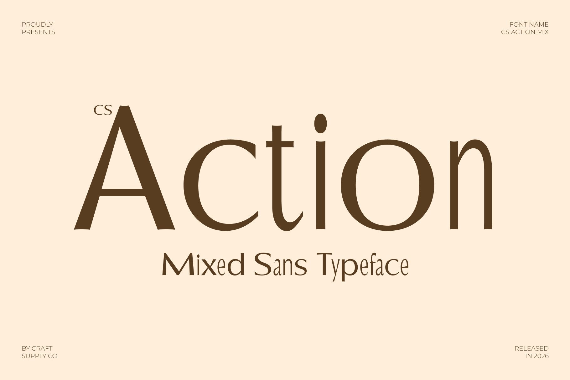
CS Action Mix is worth considering when you want to experiment with a more energetic approach to brand typography. A distinctive display treatment can help a logo or campaign headline stand out, particularly when the identity needs to balance grounded materials with a more dynamic visual voice. Explore it for promotional graphics, editorial headlines, or selected packaging elements. Pair the font with a quieter supporting typeface and avoid introducing too many competing visual effects. This gives the expressive typography enough room to make an impression while keeping the overall identity coherent.
10. Canpile Mix

Canpile Mix rounds out the selection with another opportunity to explore a more individual typographic personality. When evaluating this font, focus on how its letterforms complement the brand name and whether they communicate the desired balance of warmth, sophistication, and creativity. Use it as a starting point for logo sketches, then test the result in monochrome before introducing the full color palette. This process helps you judge the strength of the typography itself. Once the wordmark works independently, build the supporting identity around it with consistent colors, layouts, and imagery.
How to Choose the Right Font for Your Brand
With ten Earth & Ember font alternatives to explore, the best approach is to compare them against a clear creative brief rather than choosing a font based on appearance alone. Start by identifying three personality traits that your brand should communicate. For an Earth & Ember inspired concept, those traits might be grounded, expressive, and contemporary. Use them as criteria when evaluating each typeface.
Next, create simple wordmark studies using the actual brand name. Compare the proportions, spacing, visual weight, and overall silhouette of each option. Some fonts may work better for a short logo, while others may suit longer names or supporting headlines. Test the strongest candidates in black and white before adding color, because a distinctive wordmark should not depend entirely on its background or decorative effects.
Finally, consider the full brand system. A display font may create an excellent logo but prove impractical for long paragraphs or small product labels. Pair expressive typography with a legible companion font when necessary. This combination gives the identity a distinctive focal point while maintaining a consistent and usable communication system.
Putting the Visual Identity Together
Once you have chosen a Earth & Ember font, use it as the foundation for a coherent design language. Build a palette around warm neutrals, earthy greens, charcoal, or restrained ember inspired accents. Choose photography that emphasizes natural light, material details, and authentic environments. Use negative space to keep layouts clear, and introduce texture only where it contributes to the intended atmosphere.
You can also experiment with subtle contrasts between refined typography and organic imagery. For example, a clean wordmark can sit alongside textured paper packaging, while an expressive display font can appear in a campaign graphic supported by minimal product photography. These contrasts help the identity feel layered and distinctive without requiring excessive decoration.
Most importantly, develop a visual direction that belongs to your own brand. Earth & Ember can serve as a conceptual starting point, but your final logo should reflect your audience, products, values, and positioning. Custom spacing, thoughtful color choices, and carefully selected supporting elements can help transform a font into a recognizable identity.
Recreating the feel of Earth & Ember begins with understanding how typography, color, texture, and composition work together. A successful identity can feel grounded and natural while still expressing a contemporary point of view. The key is to establish a clear visual direction and make every design decision support it.
With the right font and a consistent visual system, you can create a brand identity that feels warm, distinctive, and memorable. You can explore Craft Supply Co to find the ideal assets, let typography establish the foundation, use color and texture to build atmosphere, and refine the details until the final design feels uniquely yours.