
Burrote is a great example of how a food brand can use typography, color, illustration, and a playful visual language to create a memorable identity. Burrote is a hot dog store in Buenos Aires, Argentina, and its branding was developed by Un Barco together with Cupla Arquitectura. The project uses a fun, simple, and fresh visual direction designed to create a relaxed atmosphere around the food experience. Other similar Burrote font alternatives are also available.
For designers, the Burrote identity offers more than a fun restaurant branding reference. It shows how bold typography can communicate energy and personality while supporting a wider visual system. The project uses playful typography, bright colors, and simple graphics across signage, packaging, digital media, and the physical space.
If you are researching the Burrote font alternatives or looking for fonts that can create a similarly energetic food-branding aesthetic, this collection gives you 10 Burrote font alternatives from Craft Supply Co. The selection focuses mainly on retro fonts and bold sans serif styles, giving you several ways to recreate the feeling of a lively, approachable, and contemporary food brand without simply copying an existing identity.
What Is Burrote?
Burrote is a hot dog store located in Valentin Alsina, Buenos Aires. The brand was created around a relaxed and enjoyable atmosphere, with the identity designed to feel fun, simple, and fresh. Un Barco developed the branding while Cupla Arquitectura worked on the architectural side of the project, allowing the graphic identity and physical environment to work together.
The visual identity extends beyond the logo. The designers created a system that could work across signs, packaging, digital applications, and the restaurant environment. This consistency helps turn individual design elements into a recognizable brand experience.
Typography plays an important role in that approach. According to the branding coverage, the identity uses bold and quirky typography to capture the lighthearted personality of the business. Bright colors and simple graphics complement the lettering rather than overwhelming it.
Why the Burrote Branding Works
Food businesses often need branding that feels immediate and approachable. Customers should understand the personality of the restaurant quickly, whether they see the logo on a storefront, menu, food package, social media post, or sign.
Burrote’s identity achieves this through a combination of simple graphics and expressive typography. The visual language does not depend on excessive detail. Instead, the design uses recognizable elements and a strong typographic personality to establish its character.
This is an important lesson for anyone researching the Burrote font alternatives. You do not necessarily need an identical typeface to create an effective food logo. What matters more is finding typography with characteristics that support your brand. Retro lettering can add nostalgia, while bold sans serif fonts can create a modern and energetic appearance.
10 Font Alternatives Inspired by Burrote
1. CS Risotto Retro Serif Font

CS Risotto provides a retro serif direction that can work beautifully for food and hospitality branding. Its vintage-inspired character can give a brand name a warm and established personality while maintaining enough visual strength for signage and packaging. Use it when you want your restaurant logo to feel nostalgic without becoming overly traditional. It can also work well for cafes, bakeries, diners, specialty food products, and neighborhood restaurants.
2. CS Maguire Retro Font

CS Maguire offers a bold retro personality for designers who want typography with a strong visual presence. Its vintage direction can help create a memorable wordmark for food brands, apparel, posters, and promotional graphics. Consider pairing it with simple illustrations and a restrained layout so the lettering remains the central feature of the identity.
3. CS Bingley Retro Font

CS Bingley brings another retro-inspired option to the collection. It can help a brand name feel distinctive and characterful, making it suitable for restaurants and food businesses that want a more expressive identity. Use it for menus, packaging, storefront signs, merchandise, or social media graphics. Its retro character can also complement simple mascot illustrations.
4. CS Bibury Retro Font

CS Bibury is a useful choice when you want a vintage-inspired logo with personality. Retro typography can create an inviting feeling that works particularly well for casual dining brands. Try CS Bibury for burger shops, hot dog restaurants, cafes, food trucks, bakeries, or specialty food packaging. Combining the font with bold color blocks can strengthen its visual impact.
5. CS Sorena Retro Font

CS Sorena offers another retro direction for designers developing a distinctive restaurant wordmark. Its nostalgic qualities can help establish a friendly and approachable personality. It is particularly useful for brands that want to reference classic food culture while still creating a fresh identity. Use it across menus, labels, posters, merchandise, and digital content for a consistent look.
6. CS Bugle Retro Font
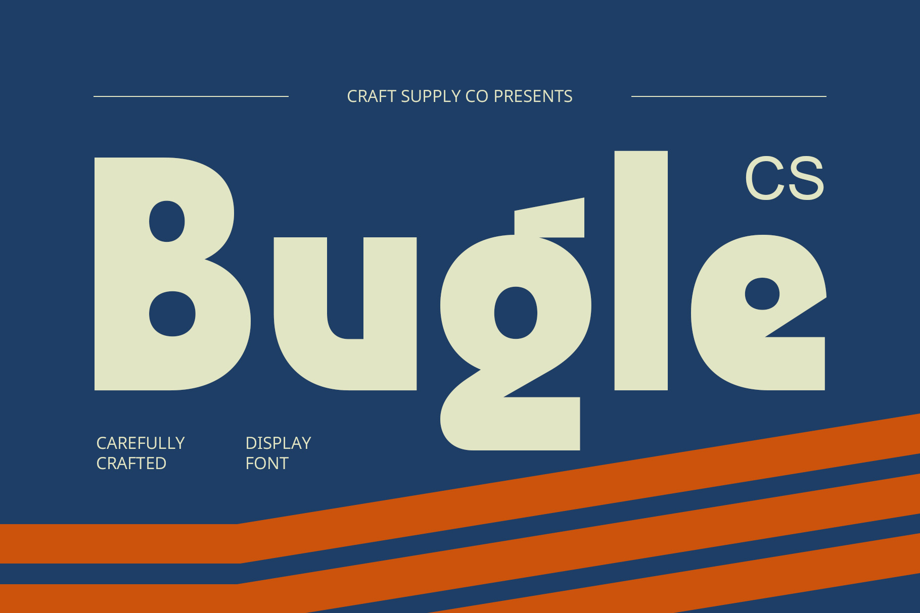
CS Bugle provides a bold vintage-inspired option that can make a short brand name immediately noticeable. Strong retro typography works well on storefronts because it can remain recognizable from a distance. Use this font for restaurants, food trucks, cafes, entertainment projects, or lifestyle brands that want a lively visual identity with a nostalgic influence.
7. CS Mondy Retro Font

CS Mondy offers another expressive retro alternative for logo design. It can help give a wordmark a distinctive personality while maintaining the visual energy that food brands often need. Consider using it for packaging, menu headers, promotional posters, social media graphics, or restaurant signage. A simple icon can complement the typography without competing with it.
8. CS Cranes Bold Sans Serif
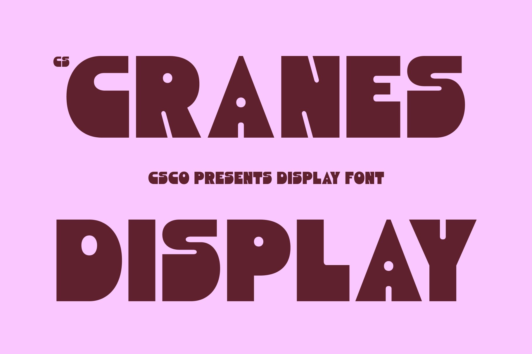
CS Cranes takes the design in a more modern direction with a bold sans serif character. This makes it a useful option when you want the visual strength of a food-brand logo without relying on a vintage style. Its bold construction can work well for contemporary restaurants, fast-casual businesses, food delivery brands, and modern packaging. Keep the composition simple to make the wordmark easy to recognize.
9. CS Debra Bold Sans Serif
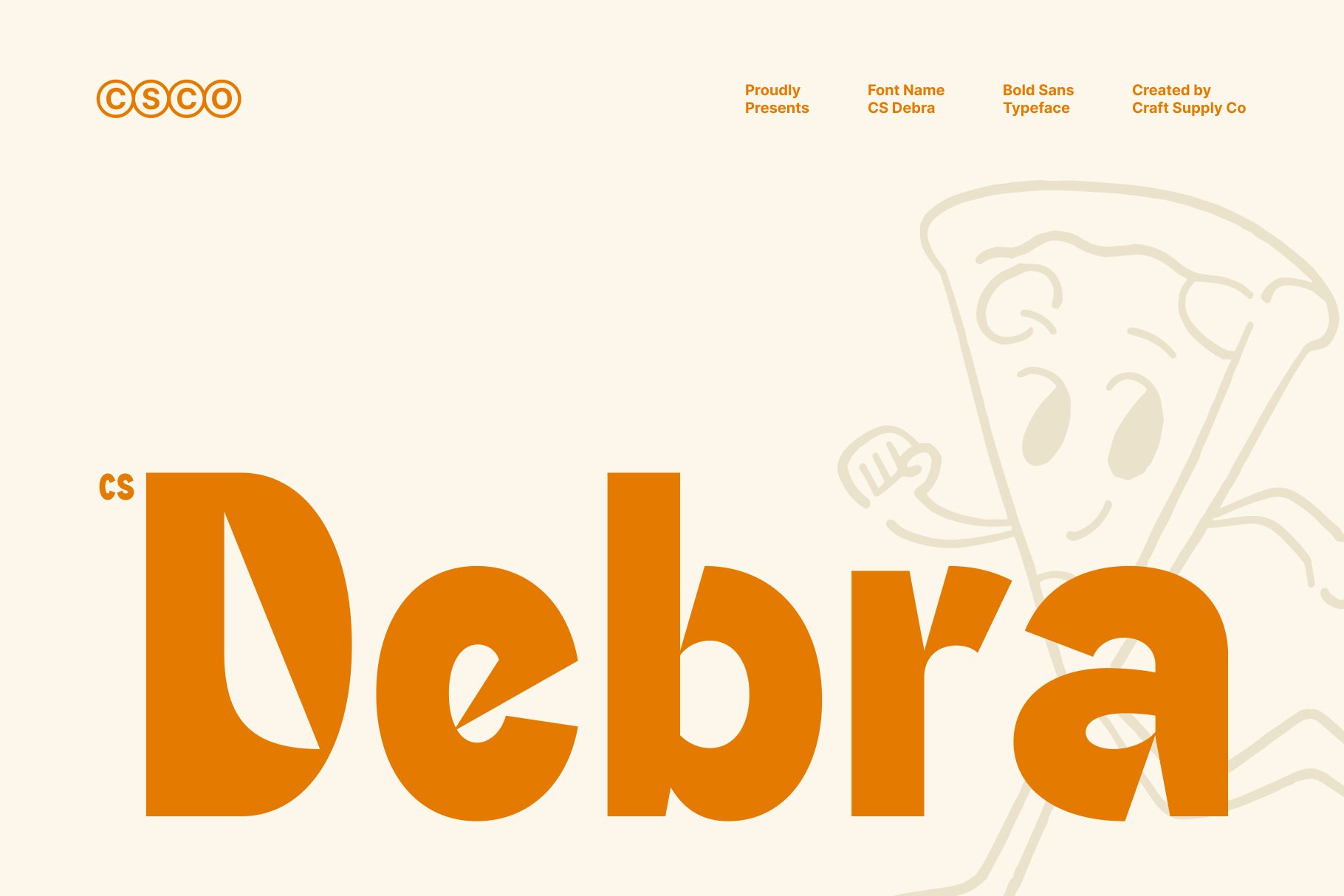
CS Debra provides a strong sans serif foundation for a clean and energetic logo. Bold sans serif typography can communicate confidence and simplicity while remaining highly adaptable across digital and physical applications. Use it for restaurants, cafes, food trucks, beverage brands, or lifestyle businesses. Pairing it with a simple graphic can create a complete identity without making the logo feel crowded.
10. CS Brolin Bold Sans Serif
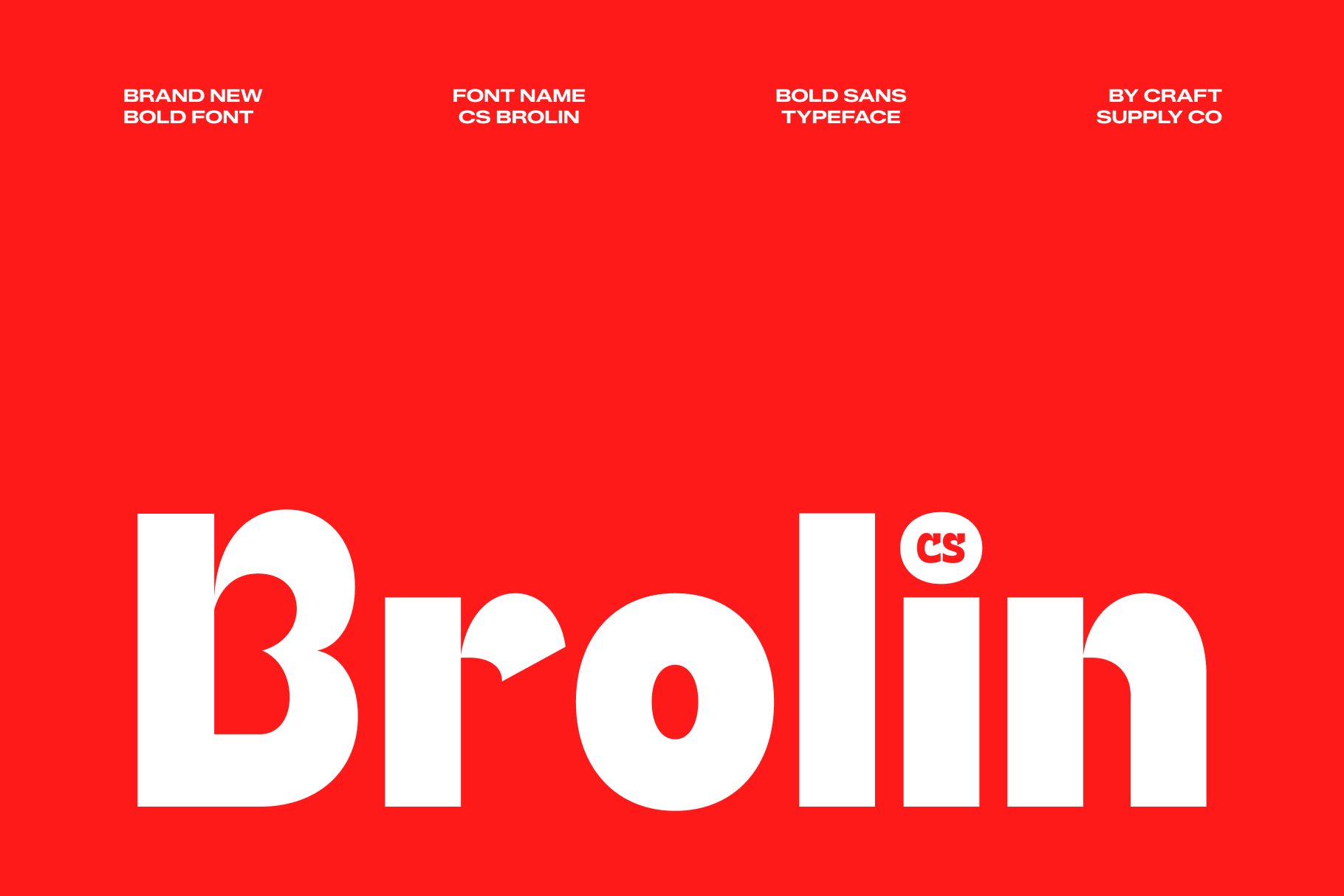
CS Brolin rounds out the collection with another bold sans serif option. Its strong typographic presence makes it useful for brands that need a logo to stand out on signs, packaging, menus, and social media. Choose it when you want a straightforward contemporary identity that can carry the personality of the brand through typography rather than complicated decorative elements.
How to Choose a Burrote Font Alternative
When choosing a Burrote font alternatives, start with the personality you want your own brand to communicate. Retro fonts can create a nostalgic and welcoming feeling, making them particularly useful for casual restaurants and food businesses. Bold sans serif fonts can create a cleaner, more contemporary appearance for brands that want to focus on simplicity and strong readability.
Next, test your actual business name in several typefaces. A font that looks excellent in a specimen may behave differently when combined with your specific letters. Look at the overall shape of the wordmark, the spacing between letters, and how the logo looks at both large and small sizes.
Consider your physical applications as well. Restaurant branding appears on storefronts, menus, packaging, takeaway bags, uniforms, stickers, signs, and social media graphics. Choose a font that can remain recognizable across all of these formats.
Tips for Creating a Fun Food Logo
Start with a clear concept. A food logo does not need dozens of visual elements to feel memorable. Choose one or two strong ideas and build the identity around them. Typography can provide one of those key elements.
Use color strategically. Bright colors can create an energetic atmosphere, while more restrained combinations can make a retro identity feel sophisticated. Make sure there is enough contrast between the lettering and its background so customers can read the logo quickly.
Simple illustrations can also complement a typographic logo. Consider using a food-related object, mascot, ingredient, or abstract shape as a supporting element. Keep the illustration simple enough that it does not compete with the brand name.
Finally, create a flexible logo system. Your primary logo might include the complete wordmark and illustration, while a simplified version can use only the name or a small symbol. This approach makes the brand easier to use across storefronts, social media profiles, packaging, and merchandise.
Explore More Typography Inspiration
If you want to explore more typography and branding projects, visit Craft Supply Co on Behance. Exploring different retro and bold display styles can help you find new ways to combine typography, illustration, and color in your own logo projects.
Burrote shows how a restaurant can build a memorable identity around a simple and playful visual language. The Buenos Aires hot dog store combines bold typography, bright colors, and simple graphics to create an approachable brand experience that extends across its physical and digital touchpoints.
The 10 Burrote font alternatives in this article give you several ways to explore a similar design territory. CS Risotto, CS Maguire, CS Bingley, CS Bibury, CS Sorena, CS Bugle, and CS Mondy provide retro-inspired directions, while CS Cranes, CS Debra, and CS Brolin offer bold sans serif alternatives.
Rather than copying the Burrote identity, use its design principles as inspiration. Choose typography that matches your brand personality, keep the supporting graphics simple, and make sure the final logo works across every important customer touchpoint. A strong combination of type, color, and simple graphics can give a food brand a distinctive identity that customers can recognize at a glance.