
Word marks continue to evolve as designers experiment with typography, digital aesthetics, unusual textures, and unexpected letterforms. A brand name no longer has to rely on a conventional typeface to make an impression. By manipulating shape, spacing, texture, and rhythm, designers can turn simple lettering into an identity that feels futuristic and memorable. many alternative Arcade Labs font share the same nuances as the original lettering.
Arcade Labs and the Future of Word Mark Design explores this idea through a technology meets entertainment perspective. The name Arcade Labs naturally suggests a combination of digital culture, experimentation, games, machines, and creative exploration. These themes provide plenty of opportunities to investigate typography that feels futuristic, nostalgic, handmade, or digitally constructed.
Rather than looking for one exact font match, this article explores 10 Arcade Labs font alternatives that can help create an original Arcade Labs inspired word mark. The collection includes futuristic stamp typography, blurred fonts, drawn lettering, pixel styles, and disco-inspired display fonts.
Why Word Marks Are Changing
Modern branding increasingly treats typography as an active design element. Instead of simply selecting a font and typing a name, designers can customize letterforms, experiment with unusual spacing, introduce texture, and combine visual influences from different eras.
This approach is particularly useful for technology and entertainment brands. Digital products can borrow visual cues from arcade machines, pixel graphics, electronic interfaces, retro games, and experimental art. A word mark can then communicate both the history of digital culture and a vision for the future.
The Arcade Labs Approach to Typography
An Arcade Labs inspired identity can explore the tension between nostalgia and innovation. Arcade design often brings to mind pixel graphics, glowing displays, mechanical controls, and bold lettering. The “Labs” concept adds another layer by suggesting experimentation and discovery.
Typography can combine these ideas in many ways. A pixel font can create a direct connection to digital culture, while a blurred typeface can make the word feel more experimental. Drawn fonts can add human creativity, and futuristic stamp styles can combine structure with a vintage production quality.
10 Font Alternatives for Arcade Labs-Inspired Word Marks
1. Alboth Stamp

Alboth Stamp offers a strong starting point for a futuristic Arcade Labs-inspired word mark. Its combination of futuristic symmetry and stamp-inspired character creates an interesting bridge between technology and vintage graphic design. This makes it useful when you want the identity to feel experimental without becoming completely disconnected from classic typography. It can work particularly well for gaming brands, creative studios, posters, packaging, and digital entertainment projects.
2. Alacus Blur

Alacus Blur takes the Arcade Labs concept into a more atmospheric direction. Blur effects can introduce a sense of motion and digital experimentation, making individual characters feel less static. This can be useful for brands connected to music, gaming, technology, or visual media. Use Alacus Blur when the word mark needs to suggest speed, movement, or an intentionally unconventional digital aesthetic.
3. CS Locked

CS Locked introduces a drawn character that can make an Arcade Labs-inspired word mark feel more human. While futuristic branding often focuses on precise geometry, hand-drawn typography can create an interesting contrast. This approach suggests experimentation and creative freedom rather than purely technical precision. It can work well for independent game studios, creative labs, merchandise, posters, and experimental brand identities.
4. CS Sphinx
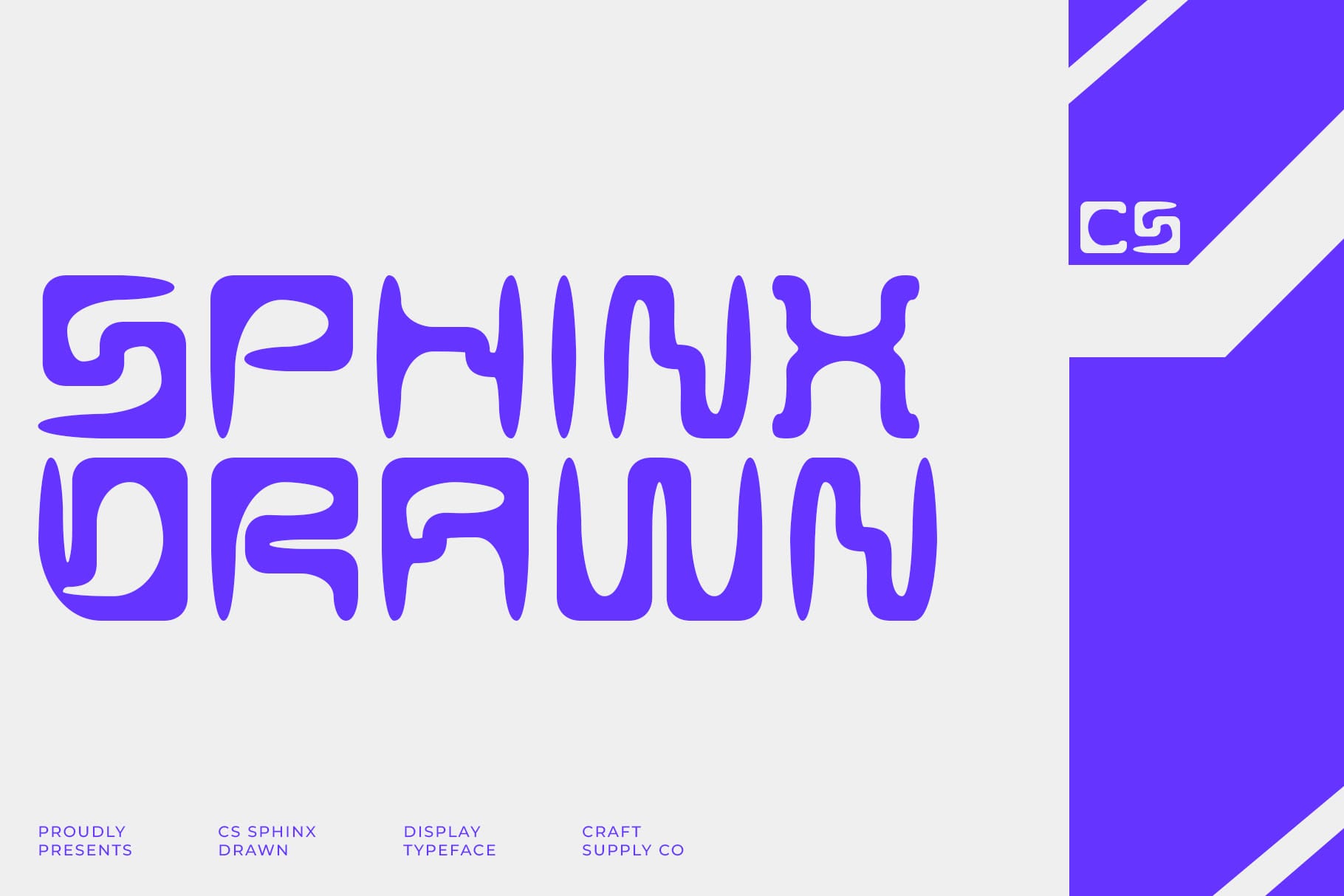
CS Sphinx provides another drawn alternative for expressive word mark design. Its handcrafted character can help transform a short brand name into a more distinctive visual statement. For Arcade Labs, this direction can emphasize the creative side of the “Labs” concept. Use it when you want the typography to feel artistic, unconventional, and approachable while still maintaining a strong display presence.
5. Renosa

Renosa brings another hand-drawn approach to the collection. Drawn lettering can create natural variations between characters, giving the word mark a sense of individuality. This makes Renosa useful for designers who want to avoid overly polished technology branding. An Arcade Labs-inspired logo using this direction could feel more like an experimental creative project than a conventional software identity.
6. CS Doma

CS Doma adds another expressive drawn style to the font alternatives. Its handcrafted quality can help balance the technical associations of the Arcade concept with a more personal visual voice. This can be especially useful for creative studios, game projects, apparel, posters, or brands that want to communicate imagination and experimentation. Large-scale lettering can give the drawn details more room to become part of the identity.
7. CS Dylan
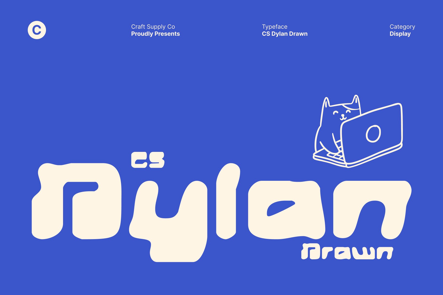
CS Dylan offers another creative drawn direction for the Arcade Labs typography search. Its character can make a word mark feel energetic and less predictable. This is useful when the goal is to create an identity that feels designed rather than simply typeset. Try CS Dylan in merchandise, promotional artwork, packaging, or social media graphics where the typography can interact with illustrations and other visual elements.
8. CS Signal
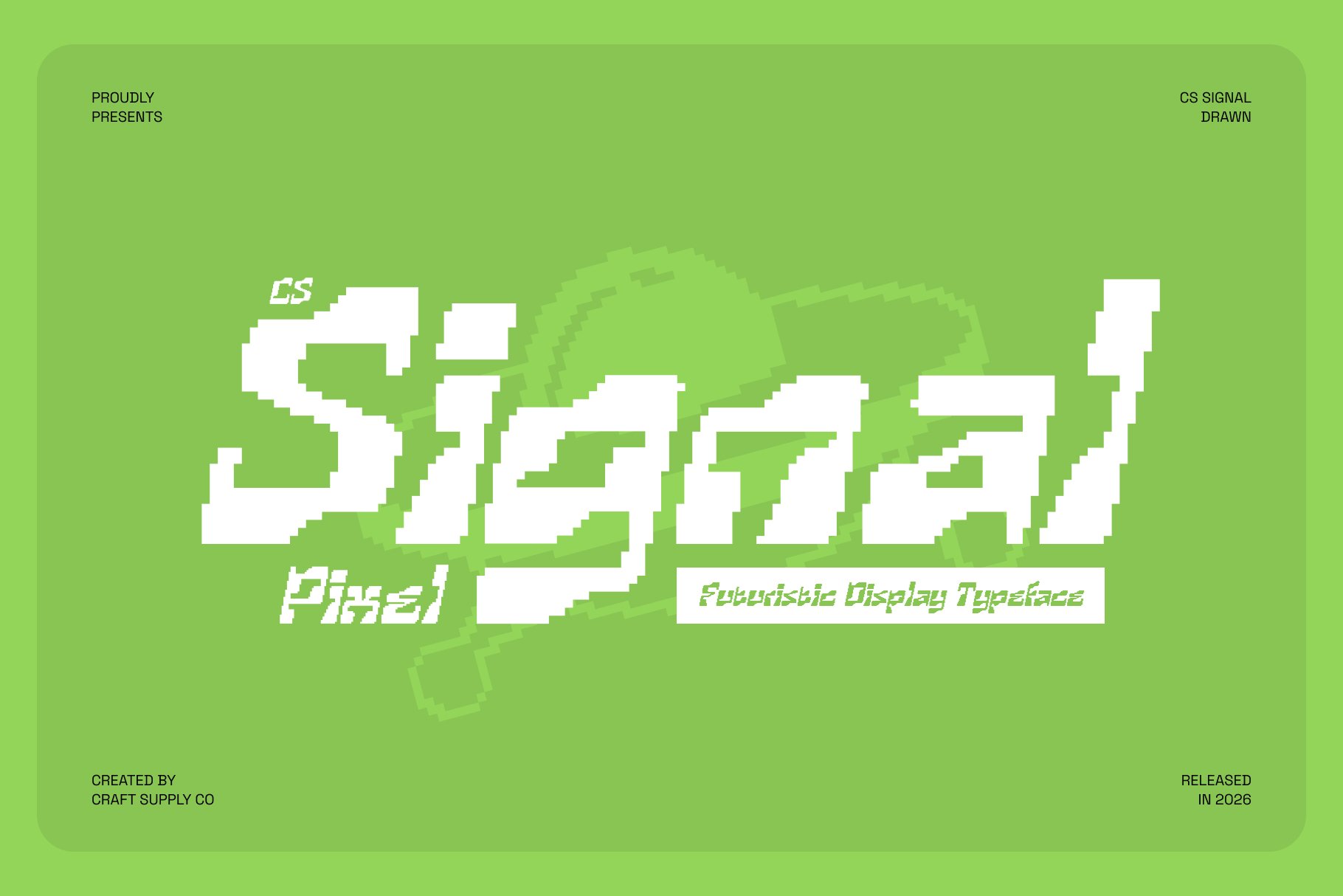
CS Signal moves the collection directly toward digital typography through its pixel-inspired construction. Pixel lettering immediately connects with retro computing, arcade graphics, games, and digital interfaces. For an Arcade Labs-inspired identity, this makes CS Signal a natural direction for exploring the relationship between nostalgic gaming aesthetics and contemporary branding. It can work especially well for game studios, esports concepts, digital products, and creative technology projects.
9. CS Apexis

CS Apexis brings a disco-inspired display character to the collection. At first, disco and arcade typography may seem like different worlds, but both can share bold visual energy and a strong connection to retro culture. This makes CS Apexis an interesting choice for designers who want an Arcade Labs word mark to feel colorful, energetic, and nostalgic. It can work particularly well for entertainment brands, events, posters, music projects, and experimental campaigns.
10. CS Henry
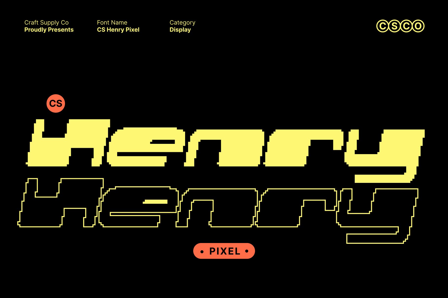
CS Henry completes the selection with another pixel-based direction. Pixel typography can give the Arcade Labs name a distinctly digital silhouette and make each character feel constructed from a visual grid. This can help establish a recognizable connection to classic arcade aesthetics while leaving room for modern layout and color treatments. Use CS Henry for gaming identities, digital entertainment, technology concepts, merchandise, and retro-inspired branding.
Pixel Typography and the Arcade Aesthetic
Pixel fonts are particularly useful when exploring arcade-inspired branding because they turn letters into visible graphic units. Instead of smooth curves and conventional terminals, pixel typography relies on a grid-like structure. This can create a strong visual connection to early digital graphics and game interfaces.
CS Signal and CS Henry demonstrate how this approach can shape a word mark. The pixel structure can become part of the identity itself, especially when combined with simple layouts, digital-inspired graphics, or retro visual references.
Why Drawn Fonts Can Work for Technology Brands
Technology branding does not always have to look perfectly geometric. Drawn typography can communicate experimentation, creativity, and human involvement. These qualities fit naturally with the idea of a laboratory, where testing and exploration are central to the concept.
CS Locked, CS Sphinx, Renosa, CS Doma, and CS Dylan offer different ways to introduce this handmade quality. They can help make a futuristic concept feel more approachable and less standardized.
Blur, Stamps, and Retro Energy
Alacus Blur adds motion and visual softness, while Alboth Stamp combines futuristic symmetry with a tactile treatment. These approaches show how different eras can coexist within one identity. A brand can reference the physical world of printed graphics while still communicating digital experimentation.
CS Apexis adds another retro direction through its disco inspired character. When used carefully, retro influences can make a modern word mark more memorable because they provide a recognizable visual reference without requiring the design to become completely nostalgic.
How to Choose the Right Arcade Labs Font Alternative
Start by deciding which part of the Arcade Labs concept should dominate. If the focus is gaming nostalgia, pixel fonts such as CS Signal and CS Henry are natural directions. If experimentation and human creativity matter more, explore the drawn options.
For a futuristic identity with vintage character, Alboth Stamp can provide an interesting balance. If movement and digital experimentation are the priority, Alacus Blur offers another route. CS Apexis can introduce a more energetic retro personality.
Once you have chosen a category, test the full word rather than individual letters. Look at the overall silhouette and check whether the typography creates a balanced rhythm from the first character to the last.
Tips for Designing a Future Focused Word Mark
Use contrast intentionally. Combining futuristic typography with vintage textures can create a more memorable identity than using one style throughout.
Think about scalability. Detailed pixel, drawn, or textured fonts may require adjustments when used at small sizes.
Keep the composition controlled. Experimental typography already creates visual activity, so a simple layout can help maintain clarity.
Customize the spacing. Adjust tracking and individual letter pairs to make the word mark feel intentional rather than simply typed.
Explore motion. Blur effects, tilted lettering, repeated forms, and directional layouts can reinforce the feeling of movement associated with digital culture.
The Future of Word Mark Design
The future of word mark design is likely to remain open to experimentation. Designers have access to an enormous range of typographic influences, from historical print styles to digital interfaces and generative visual systems. This makes it possible to create identities that combine seemingly unrelated references.
Arcade Labs provides a useful conceptual framework for this kind of exploration. The arcade represents nostalgia, play, and digital culture, while the laboratory represents experimentation and future facing creativity. Typography can connect both ideas through carefully selected letterforms.
A successful identity does not have to choose between retro and futuristic design. It can borrow qualities from both and organize them into a coherent visual system.
Explore More Typography Inspiration
For more creative type treatments, experimental lettering, and branding inspiration, explore Craft Supply Co. Studying different approaches to typography can help you discover new ways to combine digital, vintage, handmade, and futuristic influences in your own word mark projects.
Arcade Labs and the future of word mark design represent an exciting intersection between nostalgia and innovation. Typography can reference the visual language of arcade games while still creating something that feels fresh and original.
The 10 Arcade Labs font alternatives in this collection offer several routes into that creative space. Alboth Stamp and Alacus Blur explore futuristic and experimental qualities, while the drawn fonts introduce a more human touch. CS Signal and CS Henry bring pixel-based digital character, and CS Apexis adds retro entertainment energy.
The best approach is to treat these fonts as starting points rather than fixed solutions. Experiment with spacing, scale, texture, composition, and supporting graphics. By combining the right typographic personality with a thoughtful layout, you can create a word mark that feels connected to digital culture while still looking ready for the future.