
Some logos immediately communicate a sense of movement, personality, and creativity through typography alone. Spectra is an interesting example of how a name can become visually expressive when the lettering carries enough character. The right Spectra logo font can make a short word feel energetic, artistic, playful, or handcrafted without requiring a complicated graphic symbol.
Finding a Spectra logo font that carries the same energy does not necessarily mean searching for an identical typeface. Instead, designers can look for fonts that share important visual qualities, such as flowing strokes, expressive curves, hand-drawn details, unusual textures, or digital-inspired construction. This approach creates more opportunities to develop an original identity while maintaining a similar creative atmosphere.
In this guide, we explore 10 Spectra logo font alternatives that can help capture an energetic, expressive, and distinctive direction for Spectra inspired branding. The selection includes monoline scripts, elegant scripts, drawn lettering, whimsical styles, stamps, and pixel fonts.
Why Typography Gives Spectra Its Energy
Typography creates energy through movement. Curved strokes can guide the eye from one character to the next, while connected scripts can make a word feel continuous and fluid. Even when letters do not physically connect, carefully chosen shapes can create a visual rhythm that makes the word feel active.
Texture can create another type of energy. Rough or stamped lettering introduces physical character, while pixel typography gives a word a digital and structured personality. These different approaches demonstrate why font selection matters so much when building a memorable word mark.
What Makes an Energetic Font Alternative Work?
A strong alternative should match the mood you want without simply reproducing another identity. Start by identifying the qualities that appeal to you. If flowing movement is important, script Spectra logo font may be the best direction. If you want something handmade, drawn fonts can provide natural irregularity. For a nostalgic or tactile appearance, stamp styles can add texture. Pixel fonts offer a more digital interpretation.
Letter spacing also matters. Even an energetic font can lose its personality if the letters feel too crowded or disconnected. Testing the complete word helps reveal whether the typeface creates a smooth visual rhythm.
10 Font Alternatives That Carry the Spectra Energy
1. CS Elysia

CS Elysia brings a smooth monoline script character to the Spectra font alternative search. Monoline lettering uses relatively consistent stroke weight, which can create a clean and fluid appearance. This makes it useful when you want the word mark to feel expressive without becoming visually heavy. CS Elysia can work beautifully for lifestyle brands, creative businesses, packaging, invitations, and social media identities where flowing typography adds warmth.
2. CS Renita

CS Renita offers another script-based direction with an elegant and expressive personality. Script fonts can make a short name feel more personal because the letterforms often suggest handwriting and movement. For a Spectra-inspired identity, CS Renita can provide a graceful interpretation while keeping the typography visually prominent. Try it with generous spacing and a simple supporting layout to let the script remain the focus.
3. CS Astrid
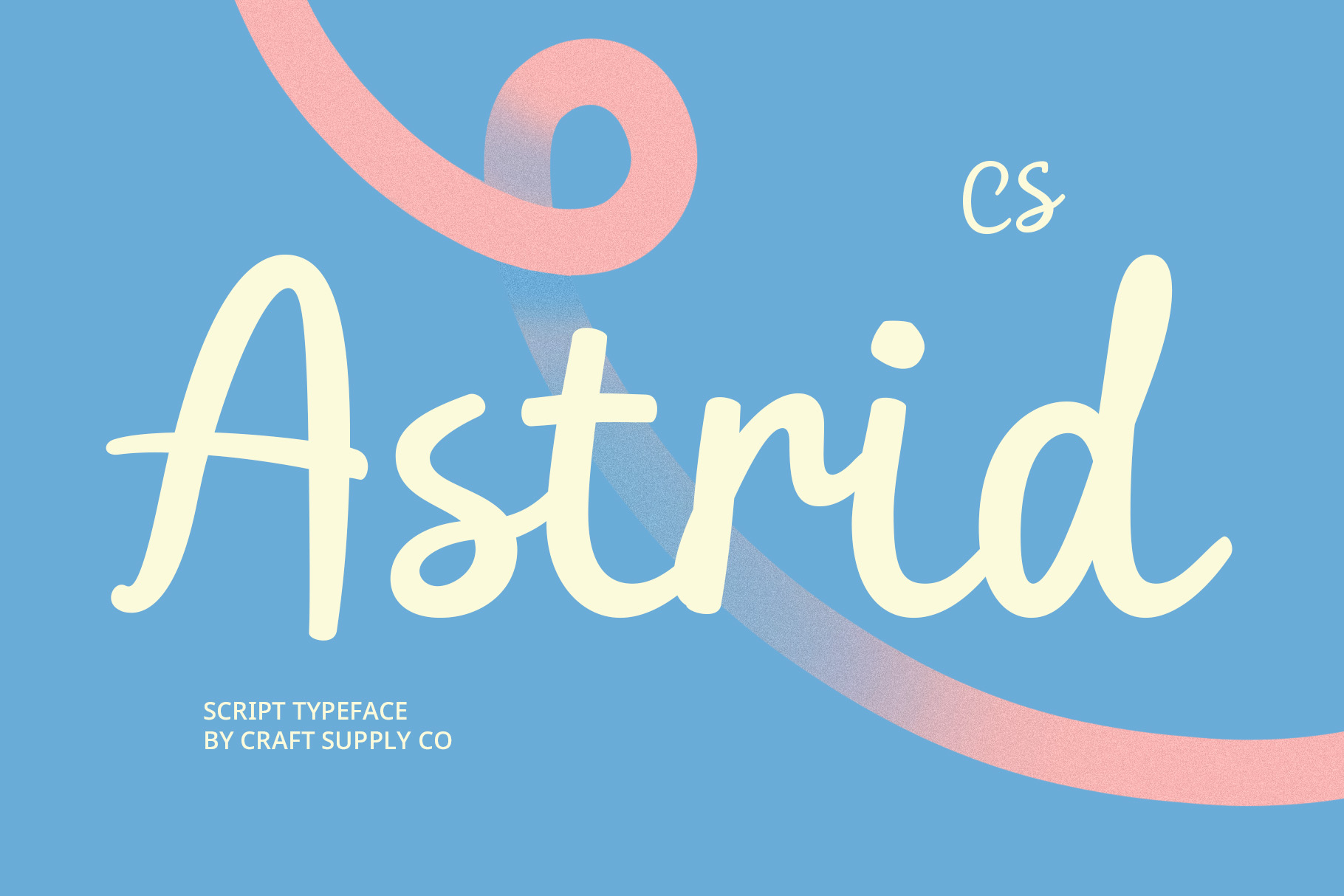
CS Astrid adds another flowing script alternative to the collection. Its expressive letterforms can create a sense of rhythm across the complete word, making it suitable for branding that needs elegance combined with personality. Use CS Astrid for fashion, beauty, creative services, stationery, packaging, or editorial applications where the typography needs to feel polished but still energetic.
4. CS Brenda

CS Brenda takes the concept in a more handcrafted direction. A drawn font can introduce natural irregularities that make the lettering feel personal and authentic. This makes CS Brenda a useful alternative when you want Spectra-inspired branding to feel less formal and more creative. It can work particularly well for independent brands, merchandise, posters, packaging, and projects where a handmade visual language is important.
5. CS Kiesa

CS Kiesa brings a whimsical quality to the search for an energetic Spectra font alternative. Whimsical typography can create a sense of playfulness through unexpected letter shapes and expressive details. This makes it suitable for brands that want to appear approachable, imaginative, or youthful. Consider using CS Kiesa for children’s products, creative projects, lifestyle branding, packaging, and playful editorial designs.
6. CS Ringo Stamp
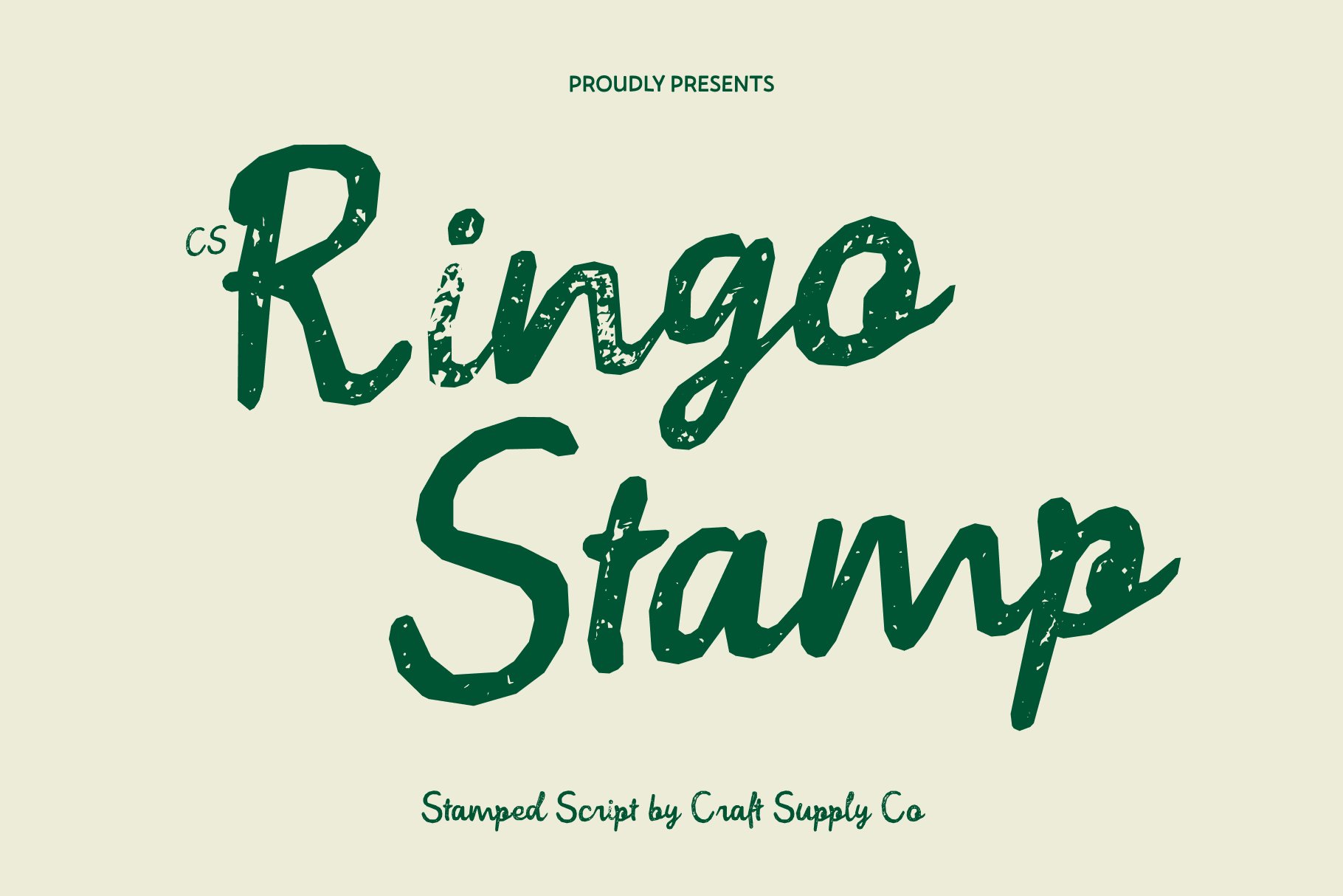
CS Ringo Stamp introduces a tactile and textured direction. Stamp-inspired typography can make a word feel physical, printed, and slightly imperfect. This creates a different kind of energy from a flowing script, but it can still produce a memorable visual identity. CS Ringo Stamp works well for packaging, apparel, labels, craft brands, posters, and projects that benefit from a vintage or handmade atmosphere.
7. CS Astrid Stamp

CS Astrid Stamp offers a textured interpretation of the Astrid character. The stamped treatment can add depth and visual roughness while maintaining the recognizable personality of the underlying style. For Spectra-inspired branding, this option can be useful when you want to combine expressive typography with a more tactile appearance. It can also work well in designs that use paper textures, distressed graphics, or vintage-inspired compositions.
8. CS Renita Pixel

CS Renita Pixel transforms the script-inspired personality into a digital direction. Pixel typography gives letters a constructed, grid-based appearance, creating an energetic connection to gaming, technology, digital art, and retro interfaces. This makes it an interesting alternative for designers who want to interpret the Spectra mood through a distinctly digital visual language.
9. CS Elysia Pixel

CS Elysia Pixel provides another digital interpretation, combining the personality associated with Elysia with a pixel-based treatment. The result can make a word mark feel contemporary while also referencing nostalgic digital aesthetics. Use it for gaming concepts, digital products, creative technology projects, social graphics, or experimental branding where a conventional script would feel too predictable.
10. CS Galysia

CS Galysia completes the collection with a drawn approach that emphasizes expressive character. Drawn lettering can create an organic sense of movement and make the typography feel less standardized. As a Spectra font alternative, CS Galysia is useful for brands that want a creative, approachable, and visually distinctive word mark. Experiment with large-scale lettering to highlight the unique details of its characters.
Script, Drawn, Stamp, and Pixel: Four Different Energies
The alternatives above show that “energy” does not have to come from one particular font category. Script fonts such as CS Elysia, CS Renita, and CS Astrid create energy through flowing movement. Their strokes guide the eye through the word and can give the logo an elegant, personal quality.
Drawn options such as CS Brenda and CS Galysia create energy through irregularity. Instead of perfectly controlled shapes, they can make the lettering feel more organic and handmade.
Stamp fonts such as CS Ringo Stamp and CS Astrid Stamp create energy through texture. Their physical looking treatment can give branding a more tactile and established appearance.
Pixel styles such as CS Renita Pixel and CS Elysia Pixel create energy through digital construction. Their grid based appearance can make a familiar typographic concept feel technological, experimental, or nostalgic.
How to Choose the Best Spectra Font Alternative
Begin with the emotion you want the logo to communicate. For elegance and fluidity, explore the script options. For handmade warmth, look at the drawn alternatives. If you want texture and a printed character, consider the stamp fonts. For a digital atmosphere, the pixel options offer the strongest contrast.
Next, type the full brand name and evaluate its silhouette. Look at how the first letter begins, how the middle characters create rhythm, and how the final letter completes the composition. The complete word should feel balanced rather than simply containing individually attractive letters.
Finally, consider practical applications. A highly detailed font may work beautifully as a large headline but become difficult to recognize at a smaller size. Test the logo on websites, packaging, social media, merchandise, and other places where the identity will appear.
Tips for Creating an Energetic Word Mark
Give expressive letters room. Decorative and flowing fonts often benefit from additional breathing space. Avoid forcing every character into a tight composition.
Experiment with scale. Enlarging one part of the word can create a stronger focal point, especially when working with drawn or whimsical lettering.
Keep supporting elements simple. If the font already has plenty of personality, a minimal layout can make the typography more effective.
Test contrast. Script and drawn fonts can change dramatically depending on the background. Test both light and dark applications before settling on a color system.
Customize when necessary. Small adjustments to letter spacing, connections, or individual characters can make a font-based logo feel more tailored to the brand.
Why Font Alternatives Are Useful for Branding
Spectra logo font alternatives give designers a way to explore the visual qualities they like without limiting themselves to one typeface. A single reference can inspire multiple creative directions. One designer may focus on flowing movement, another on handmade texture, and another on digital construction.
This flexibility is especially useful during the early stages of identity development. Instead of deciding immediately on one font, create several typographic concepts and compare their personalities. The strongest direction often becomes obvious when the alternatives appear side by side.
Explore More Creative Typography
If you want to discover more creative lettering styles, display fonts, and branding inspiration, explore Craft Supply Co. Looking through different typographic approaches can help you identify new combinations of movement, texture, and character for your own design projects.
Spectra demonstrates how typography can carry energy without relying on complicated graphics. The feeling comes from the movement, shape, texture, and rhythm of the letters. By exploring different font categories, designers can preserve that sense of energy while developing a completely different visual direction.
The 10 Spectra logo font alternatives in this collection provide a broad range of possibilities. CS Elysia, CS Renita, and CS Astrid emphasize script movement, while CS Brenda and CS Galysia bring a handmade quality. CS Ringo Stamp and CS Astrid Stamp add tactile texture, and CS Renita Pixel and CS Elysia Pixel create a digital interpretation. CS Kiesa adds a playful and whimsical option.
The best choice ultimately depends on the personality you want the brand to communicate. Explore several styles, test the complete word, refine the spacing, and consider how the typography will perform across different applications. When the typeface matches the brand’s energy, even a simple word can become a memorable and expressive identity.