
Sao Gerald Cafeteria offers an interesting reference for designers exploring food branding, expressive typography, and memorable visual identities. A cafeteria logo needs to do more than identify a business. It should communicate the atmosphere of the space, the personality of the food, and the kind of experience customers can expect. Consequently, many wish to experiment with similar typographic styles, creating a need for Sao Gerald font alternatives.
Typography plays a particularly important role in that process. The right font can make a cafeteria feel traditional, energetic, friendly, contemporary, or playful before a customer even reads the menu. That is why researching the Sao Gerald font alternatives can provide useful inspiration for anyone developing a restaurant, cafe, cafeteria, or food-related brand.
This article explores why Sao Gerald font alternatives matters for cafeteria branding and introduces 10 Sao Gerald font alternatives from Craft Supply Co. The selection includes drawn, bold serif, bold sans serif, and other strong display styles. These typefaces provide different ways to explore a memorable food-branding aesthetic rather than simply reproducing an existing identity.
Why Cafeteria Typography Matters
Food businesses depend heavily on first impressions. Customers may encounter a cafeteria through a storefront sign, menu, takeaway packaging, social media post, delivery platform, or printed advertisement. In each situation, the logo and typography need to communicate quickly.
A strong typeface can help establish the personality of the business. Bold lettering can communicate confidence and energy, while serif typography can create a more traditional or established feeling. Hand-drawn lettering can make a cafeteria appear casual and personal, while a clean sans serif can give it a contemporary appearance.
This is why the Sao Gerald font is an interesting subject for designers. Looking at a specific cafeteria identity encourages us to consider how typography works alongside food photography, illustrations, color, packaging, interior design, and signage.
The Role of Strong Typography in Food Branding
Restaurants and cafeterias often need typography that remains visible in busy environments. A storefront may contain menus, signs, food images, promotional messages, and other visual elements. A strong display font can help the brand name remain recognizable among all that information.
Bold typefaces can also work effectively across packaging and merchandise. A strong wordmark can appear on cups, bags, uniforms, stickers, menus, and social media graphics without requiring a different design for every application.
However, bold does not have to mean complicated. Some of the most effective food logos use straightforward typography with carefully considered proportions and spacing. The goal is to create a visual identity that customers can recognize quickly and remember easily.
10 Font Alternatives for a Sao Gerald Cafeteria-Inspired Identity
1. CS Morgana Drawn

CS Morgana Drawn offers a handmade direction that can work especially well for a casual cafeteria or food business. Its drawn character can give a logo a personal and approachable feeling, making the brand appear less formal and more welcoming. Use it for cafes, bakeries, neighborhood restaurants, food trucks, specialty food products, or businesses that want to emphasize a handcrafted atmosphere. Pair it with simple illustrations for an even more personal identity.
2. Celan Bold Serif Font

Celan provides a strong serif direction for designers who want a cafeteria logo with a confident and established appearance. Its bold construction can make a brand name highly visible on signage and packaging. The serif details add character while the heavier weight helps maintain readability. Consider it for restaurants, diners, cafes, food products, hospitality brands, and businesses that want a classic foundation with a strong visual presence.
3. Ralko Bold Serif Font

Ralko offers another bold serif alternative for food branding. Its strong letterforms can help a wordmark stand out across menus, storefronts, packaging, and promotional graphics. Use it when you want the brand to feel substantial and confident without relying on a complicated symbol. Ralko can also work well when paired with a simple food-related icon or illustration.
4. CS Bolt Bold Serif Font
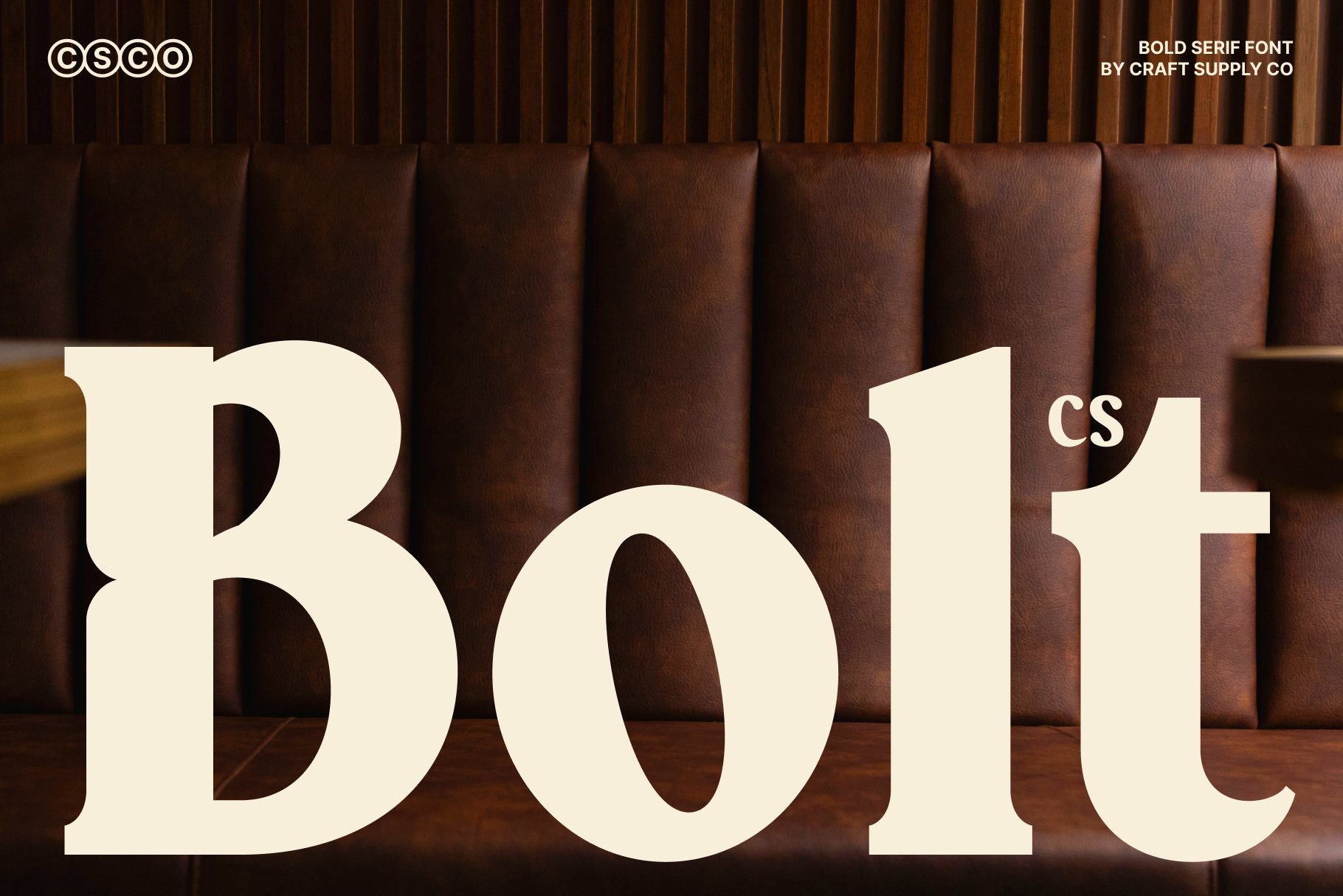
CS Bolt brings a powerful typographic quality to logo design. Its bold serif structure can give a cafeteria brand a strong visual anchor while maintaining the familiar character of serif typography. This font works well for food businesses that need their name to remain noticeable from a distance. Try it on storefront signs, menus, takeaway packaging, uniforms, and promotional materials.
5. CS Keiga Sans Serif Font

CS Keiga provides a cleaner sans serif alternative for a more contemporary cafeteria identity. Sans serif typography can create a straightforward and accessible appearance, making it useful for modern cafes, fast-casual restaurants, food delivery brands, and lifestyle businesses. Its clean direction also makes it easier to pair with photographs, illustrations, and other visual elements.
6. CS Aslan Bold Font
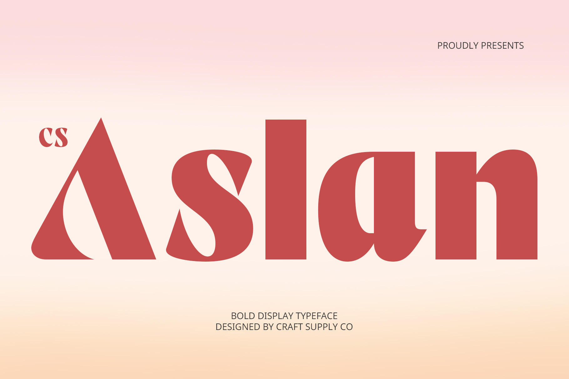
CS Aslan offers a bold display approach that can give a cafeteria logo plenty of visual impact. Strong lettering can work particularly well for brands that need to stand out on storefronts, menus, posters, and packaging. Use this font when you want the brand name to act as the main graphic element. A simple color palette can help keep the overall identity balanced.
7. CS Gibson Bold Font
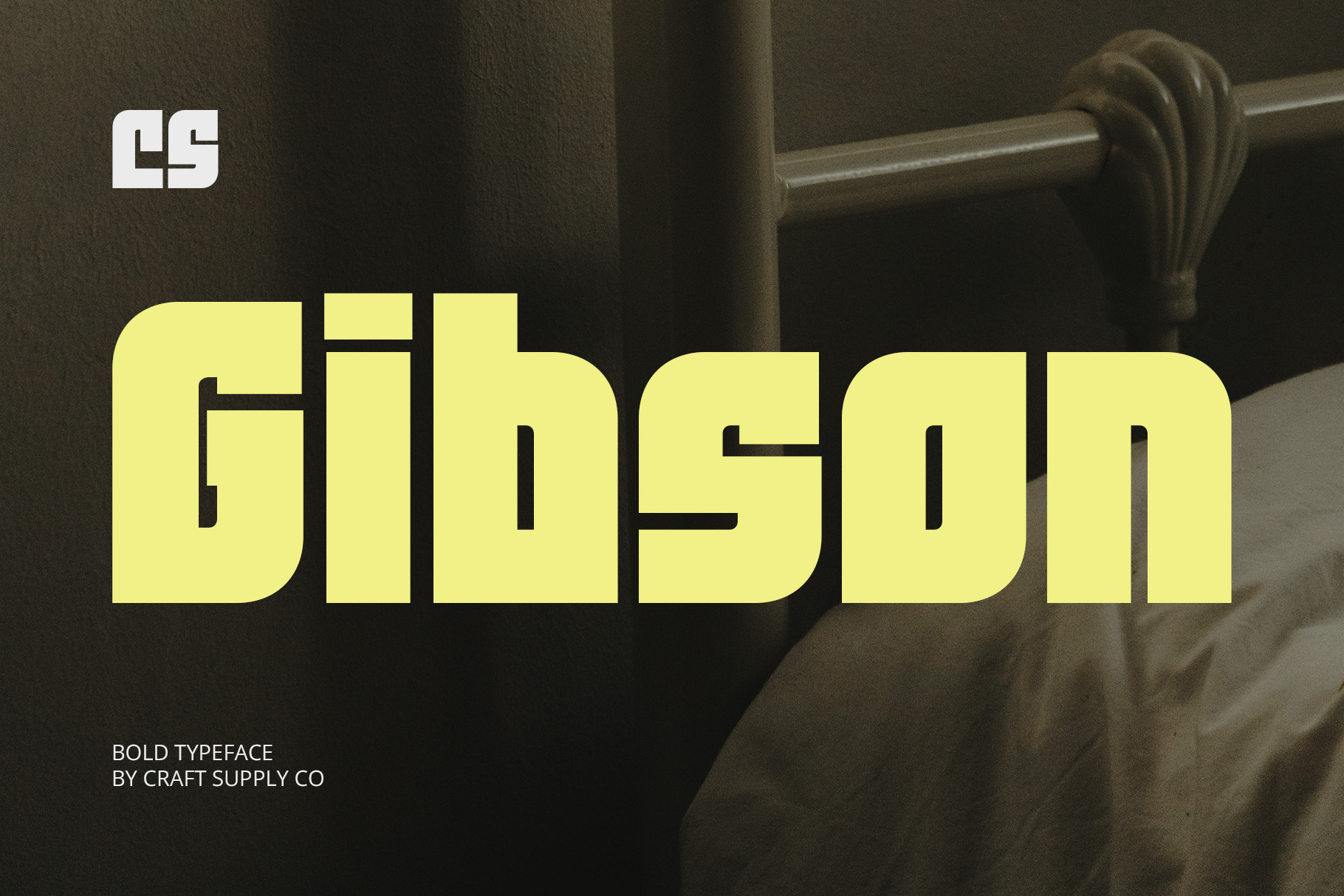
CS Gibson provides a confident bold style that can suit contemporary food and hospitality branding. Its strong letterforms can create an easy-to-recognize wordmark without excessive decoration. This makes it useful for cafeterias, restaurants, cafes, food trucks, beverage brands, and casual dining businesses. Combine it with a small icon or simple line illustration to create a complete logo system.
8. CS Anders Bold Font

CS Anders is another strong option for creating a prominent cafeteria wordmark. Its bold appearance can help the brand name remain visible in busy environments and at smaller sizes. Consider it for signage, menu headings, packaging, social media graphics, and merchandise. The font can also provide a strong foundation for a logo that relies primarily on typography.
9. CS Ruston Bold Font
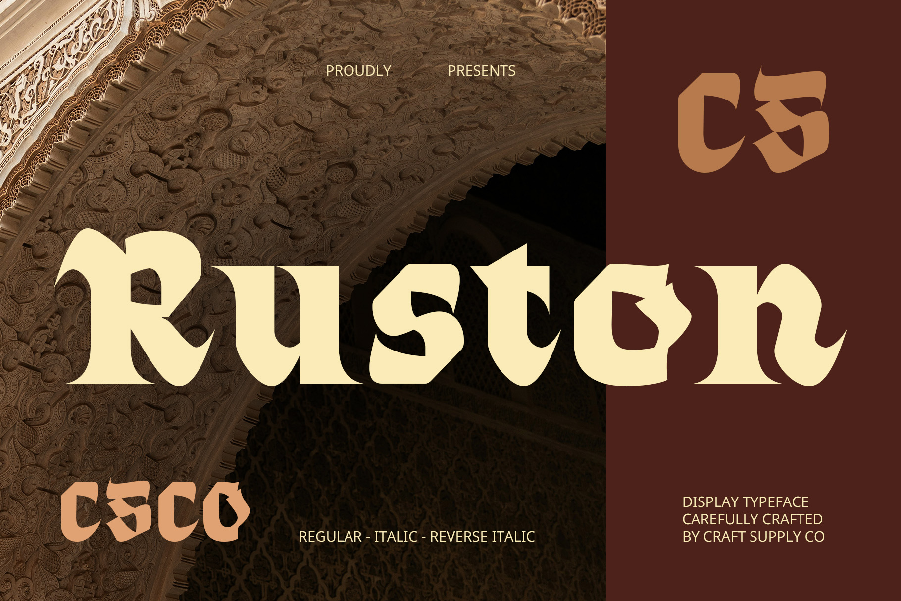
CS Ruston brings another bold typographic direction to the collection. It can help create a food logo with a confident and energetic character while keeping the brand name at the center of the design. Use it for casual restaurants, cafeterias, food trucks, street food businesses, or modern food products. Experiment with different tracking settings to find the right balance for the complete wordmark.
10. CS Globe Bold Font

CS Globe rounds out the collection with another bold display option. Its strong presence can make a cafeteria name easier to recognize across different brand applications. This font can work particularly well for businesses that want a straightforward but impactful identity. Try it on menus, storefront signage, cups, food packaging, social media graphics, and promotional materials.
How to Choose a Sao Gerald Cafeteria Font Alternative
When selecting a Sao Gerald Cafeteria font alternative, begin with the personality you want your own food business to communicate. A drawn font can create a handmade and friendly atmosphere, while a bold serif can make the brand feel established and confident. A bold sans serif can provide a cleaner and more contemporary direction.
Next, test the actual business name in several fonts. The appearance of a typeface can change significantly depending on the letters in the wordmark. Look at the overall shape, spacing, height, and weight of the complete name rather than judging the font from individual characters.
Think about where the logo will appear. A cafeteria brand often needs to work on large storefront signs as well as small social media images. Make sure the chosen typeface remains readable at both extremes.
Tips for Designing a Memorable Cafeteria Logo
Keep the concept simple. A cafeteria logo does not need to include every food item the business sells. Choose one strong visual idea and let the typography support it. A distinctive wordmark can sometimes work better than a logo filled with multiple illustrations.
Use color to establish atmosphere. Warm colors can create an inviting food-focused feeling, while neutral combinations can make the identity appear more contemporary. Whatever colors you choose, make sure there is enough contrast for the logo to remain readable.
Consider creating a flexible logo system. Your primary version might combine the wordmark with an illustration, while a secondary version can use the brand name alone. A compact symbol or initial can also work for social media avatars and other small applications.
Typography should remain consistent across the rest of the brand. Use the same primary font or complementary typefaces across menus, packaging, signage, and digital content. This consistency helps customers connect different touchpoints to the same cafeteria.
Why the Right Font Can Strengthen a Food Brand
The right font does more than make a cafeteria name look attractive. It helps establish a visual personality and creates consistency across the customer experience. When customers see the same typographic style on the storefront, menu, packaging, and social media, the brand becomes easier to recognize.
This is especially valuable for food businesses because customers often encounter the brand in fast-moving environments. A clear and distinctive logo can communicate the business personality in just a few seconds.
Whether you choose a hand-drawn style, bold serif, or strong sans serif, the most important factor is how well the typography supports the overall brand concept. A typeface should make the name easier to remember while reinforcing the atmosphere you want customers to associate with the business.
Explore More Typography Inspiration
If you want to discover more font and branding ideas for cafeterias, restaurants, and other creative businesses, visit Craft Supply Co on Behance. Exploring different bold, drawn, serif, and sans serif styles can help you find a typography direction that fits your own food brand.
Sao Gerald Cafeteria provides an interesting starting point for understanding why typography remains important in food branding. A cafeteria logo needs to communicate personality quickly while working across many different physical and digital applications.
The 10 font alternatives in this article offer several approaches to creating that identity. CS Morgana Drawn can provide a handmade feeling, while Celan, Ralko, and CS Bolt offer bold serif directions. CS Keiga, CS Aslan, CS Gibson, CS Anders, CS Ruston, and CS Globe provide additional bold and contemporary possibilities.
Rather than selecting a font simply because it looks attractive, consider how it works with your brand name, audience, colors, illustrations, and applications. Test the typography at different sizes, refine the spacing, and create consistent logo variations. With the right typographic foundation, a cafeteria can develop a visual identity that feels recognizable, inviting, and built to last.