
The Nola logo is an interesting reference for designers who want to explore playful, expressive, and eye-catching typography. A memorable logo does not always need a complicated symbol or detailed illustration. A distinctive typeface can turn a simple brand name into a strong visual identity, especially when the lettering uses bold shapes, rounded forms, dimensional effects, or an energetic display style. An font alternatives for Nola logo is required.
If you are searching for the font alternatives for Nola logo or looking for a similar typeface for your own branding project, playful display fonts can provide plenty of creative possibilities. Three-dimensional lettering, bubble shapes, rough textures, and graffiti-inspired details can all give a logo more personality.
The 10 font alternatives for Nola logo below come from Craft Supply Co and cover several playful display styles. Some fonts emphasize 3D depth, while others focus on bubble shapes, rough textures, or graffiti-inspired lettering. These fonts are creative alternatives for exploring a similar expressive direction and are not presented as the official typeface used by Nola.
What Makes the Nola Logo Style Stand Out?
Playful logo typography can make a brand feel approachable, energetic, and memorable. Instead of relying on traditional serif or minimalist sans serif lettering, expressive display fonts make the letters themselves part of the visual identity. This approach works especially well for brands targeting creative audiences or businesses that want a less formal personality.
Rounded and bubble-style lettering can create a friendly appearance, while 3D effects can add depth and visual impact. Rough fonts introduce texture and an imperfect handmade quality, while graffiti-inspired typefaces can communicate youthful energy and creativity.
When exploring a Nola logo font alternative, consider which of these characteristics best matches your own brand. You can use dimensional lettering for a bold identity, rounded forms for a friendly logo, or textured typography for a more handcrafted appearance.
10 Font Alternatives for a Nola-Inspired Logo
1. Bages 3D Font Whimsical Charm

Bages 3D brings a playful dimensional quality to logo typography. Its whimsical character can make a short brand name feel energetic and visually engaging. The dimensional treatment gives the lettering extra presence, making it suitable for entertainment brands, children’s products, creative projects, food businesses, and lifestyle brands. Use it when you want the typography itself to become the main attraction.
2. Bages Rough
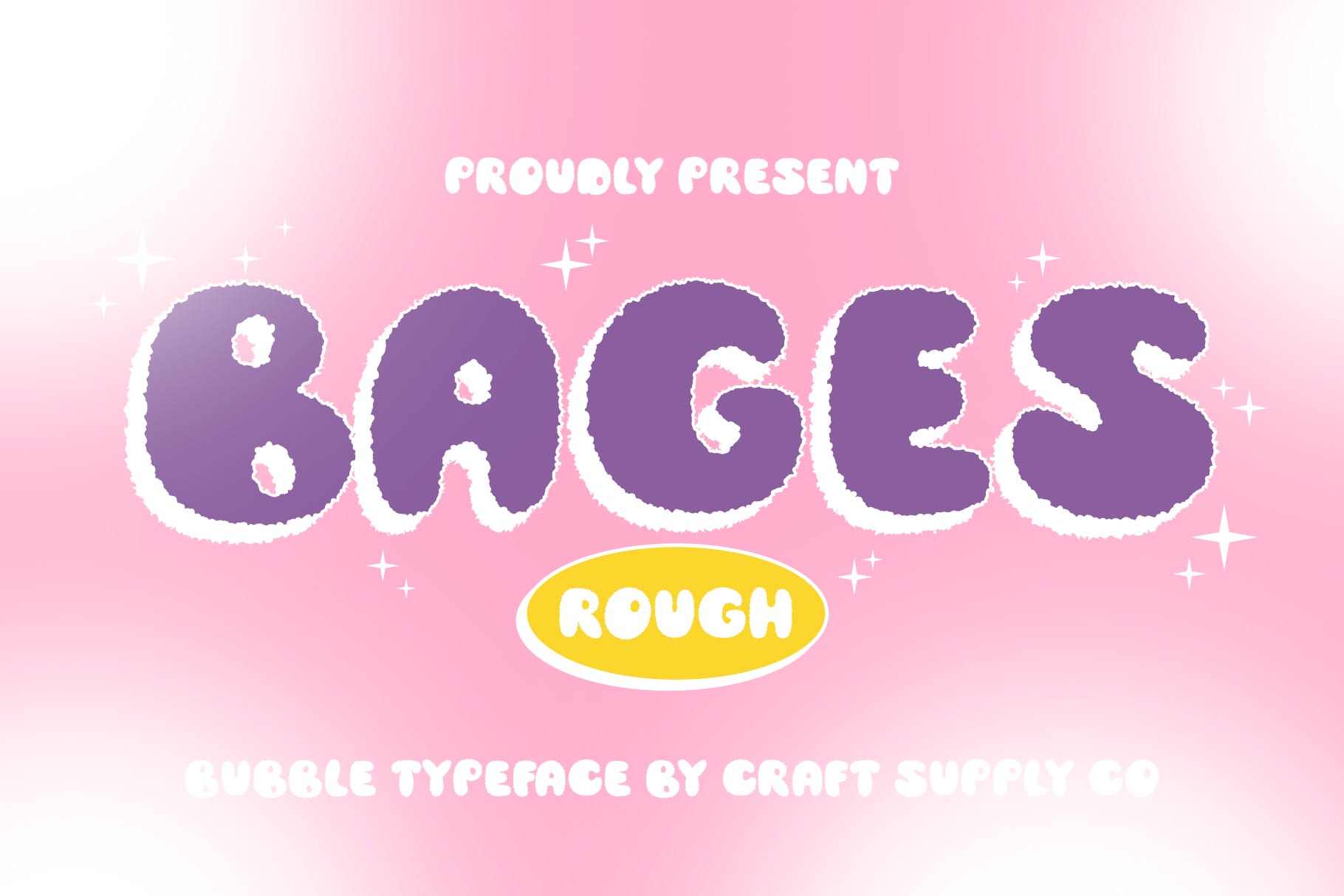
Bages Rough takes a more textured and informal approach to display typography. Its rough character can give a logo a handcrafted or experimental personality. This font works well for creative businesses, streetwear labels, craft brands, music projects, and independent studios. Pair it with a simple supporting graphic to balance its expressive texture.
3. Calley Fun Graffiti Display Font
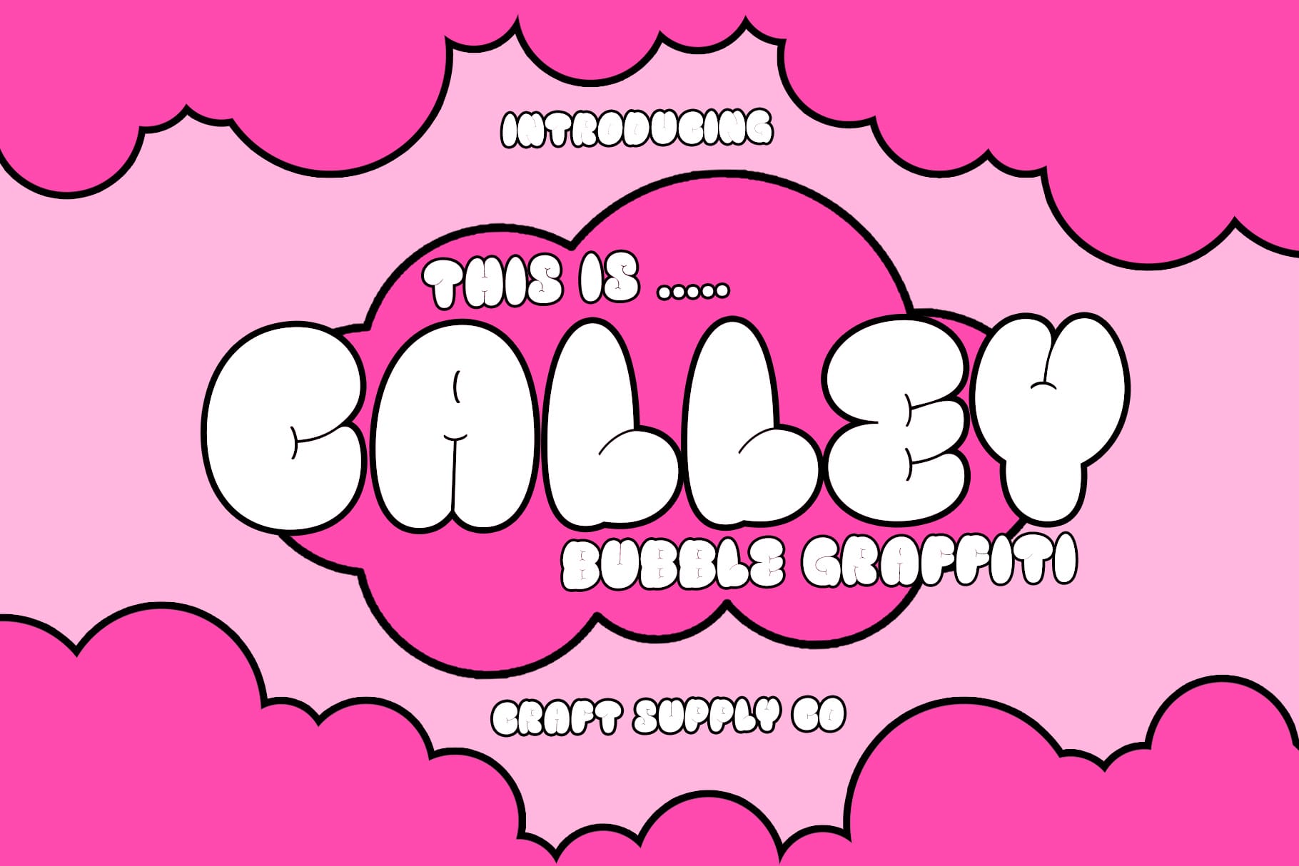
Calley Fun introduces a graffiti-inspired direction that can make a logo feel youthful and energetic. It is a useful choice for brands that want to communicate creativity, movement, and individuality. Consider it for clothing brands, art projects, music-related identities, youth-focused businesses, and social media brands. The expressive letterforms can work particularly well when the logo needs a strong street-inspired personality.
4. Busky 3D Dynamic Bubble Display Typeface

Busky 3D combines bubble-inspired lettering with a dimensional display treatment. The result can give a short brand name a bold and playful presence. This typeface is particularly useful when you want a logo to feel fun, friendly, and highly visible. Try it for entertainment projects, food brands, children’s products, gaming identities, or creative campaigns where a lively visual style can strengthen the brand.
5. Radey 3D Playful Bubble Display Typeface

Radey 3D offers another playful approach to dimensional logo typography. Its rounded bubble character can make a wordmark feel approachable while the 3D treatment adds visual depth. This combination can work well for brands that want a cheerful and modern identity. Experiment with bold colors, simple backgrounds, and generous spacing to let the lettering remain the focus.
6. Busky Rough Font
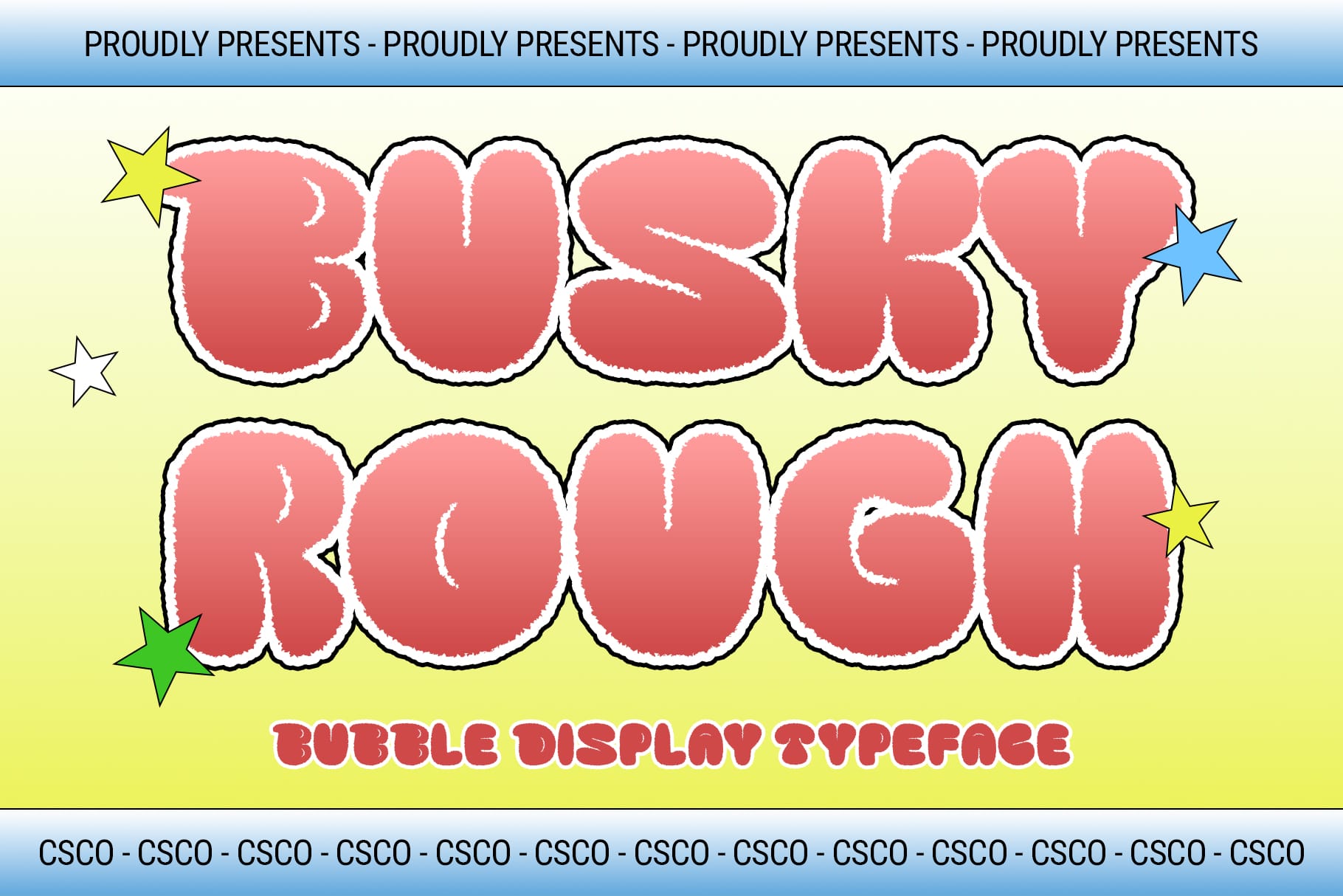
Busky Rough provides a textured alternative to smooth display typography. Its rough appearance can give a logo a more authentic, handmade, or rebellious quality. Use it when your brand needs personality rather than a polished corporate appearance. It can suit streetwear, creative studios, posters, music projects, craft businesses, and independent brands.
7. Agiven 3D Bubble Font

Agiven combines rounded bubble shapes with a dimensional appearance, making it suitable for fun and expressive logo concepts. The soft forms can create a friendly personality while the 3D styling helps the wordmark stand out. Consider this font for playful brands, children’s products, gaming projects, food businesses, and entertainment identities that need an immediately recognizable logo.
8. Clefy 3D Font

Clefy 3D provides a bold dimensional direction for designers who want their typography to have strong visual impact. A 3D treatment can make a relatively simple wordmark appear more dynamic without requiring a complex symbol. Use Clefy when creating promotional branding, event logos, merchandise, gaming graphics, or creative projects that need typography with a noticeable presence.
9. Calley 3D Font

Calley 3D can help transform a brand name into an energetic display logo. Its dimensional approach gives the lettering additional depth and can make a short wordmark particularly striking. This font can work well for entertainment, fashion, youth-oriented, creative, and promotional brands. For a cleaner result, keep the supporting elements simple so the dimensional lettering remains the focal point.
10. Radey Bubble Font Playful Design

Radey Bubble offers a softer alternative for brands that want playful typography without relying heavily on a dimensional effect. Its bubble-inspired forms can create a cheerful and approachable logo. This makes it useful for children’s brands, lifestyle businesses, food and beverage projects, creative communities, and social media identities. Pair it with simple illustrations or a minimal icon for a balanced visual system.
How to Choose a Nola Logo Font Alternative
Start by identifying the personality you want your logo to communicate. A bubble font can make a brand feel friendly and playful, while a rough display font can create a more handcrafted or rebellious impression. A 3D font can add energy and depth, while graffiti typography can create a youthful and creative atmosphere.
Next, test the typeface with your actual brand name. Display fonts can look very different depending on the letters they contain, so always review the complete wordmark instead of choosing a font from its preview alone. Check the proportions, spacing, and readability before finalizing the design.
Think about where you will use the logo. A highly detailed 3D or textured design can look impressive on posters and merchandise but may need a simplified version for small digital applications. Create a primary logo and a simplified variation so the identity remains flexible.
Tips for Creating a Playful Logo
Use contrast to keep an expressive logo readable. If the typography already has a strong 3D, bubble, or rough treatment, avoid adding too many competing graphic elements. A simple background can give the lettering enough space to make an impact.
Color can also dramatically change the personality of a playful logo. Bright combinations can create an energetic appearance, while neutral colors can make the same display font feel more sophisticated. Test your logo in both color and monochrome to make sure the design remains recognizable.
Consider the proportions of the complete logo as well. Short brand names often provide an excellent canvas for expressive display typography because the letters can become large and visually dominant. If the brand name is longer, experiment with spacing, stacking, or a compact layout to maintain readability.
Explore More Creative Font Inspiration
If you want to discover more typography and branding ideas, explore Craft Supply Co on Behance. Looking at different display styles can help you identify useful characteristics such as rounded forms, dimensional lettering, textured details, and expressive shapes before choosing a font for your own logo.
The Nola logo provides an interesting starting point for exploring expressive and playful logo typography. Instead of limiting your design to a traditional wordmark, you can use distinctive display fonts to make the lettering itself the central visual element.
The 10 alternatives in this collection cover 3D, bubble, graffiti, rough, and playful display styles. Each option can help you develop a different brand personality while maintaining a bold and memorable typographic approach.
Choose a font based on your brand’s personality, test it with the complete name, and consider how the logo will work across websites, social media, packaging, merchandise, and printed materials. With thoughtful typography and a clear visual direction, a playful logo can become a recognizable part of your overall brand identity.