
LenLen offers an interesting example of how contemporary restaurant branding can use LenLen typography alternatives to create personality, warmth, and cultural character. Designed by Pentagram New York for a Thai restaurant in Manhattan, the identity moves away from highly polished restaurant branding and instead embraces expressive lettering, loose illustrations, collage, and a deliberately casual visual language. Pentagram explains that the Thai phrase “เล่นเล่น” (LenLen) means “just for fun,” which became a central idea behind the restaurant’s identity.
The project is especially relevant to designers interested in LenLen typography alternatives because the identity does not depend on one conventional typeface. Instead, Pentagram developed a broader LenLen typography alternatives system with several distinct voices. A custom hand-drawn bubble typeface anchors the identity, while slanted lettering, informal handwriting, and Arial provide additional layers for different applications.
This approach makes LenLen a useful case study for modern branding. Rather than treating typography as a secondary detail, the identity makes lettering part of the restaurant’s personality. If you are searching for the LenLen typography alternatives or want to create a similar expressive identity, the following 10 font alternatives can help you explore bubble, playful, graffiti, drawn, and experimental directions.
What Is LenLen?
LenLen is a contemporary Thai restaurant in Manhattan inspired by the atmosphere of Bangkok shophouses. The restaurant combines traditional and reimagined Thai cuisine with a relaxed environment designed to feel welcoming rather than formal. Pentagram developed the brand identity to reflect that contrast between culinary precision and an unfussy, casual atmosphere.
The identity extends across menus, signage, murals, merchandise, packaging, and other touchpoints. Instead of creating a perfectly polished system, the designers intentionally used handmade and tactile qualities. Pentagram describes the identity as celebrating “casual imperfection,” using loose illustrations and collage elements to create a sense of warmth and spontaneity.
The result is a visual identity that feels personal and lived-in. Typography plays a major role in achieving that effect because the lettering does not look mechanically perfect. The custom bubble lettering gives the main identity a lively tone, while the other typographic voices create contrast and help organize different types of content.
How LenLen Uses Typography
One of the most interesting aspects of the LenLen identity is its use of multiple typographic voices. The custom hand-drawn bubble typeface creates an energetic focal point. Slanted and fluid lettering references the energy of street lettering in Bangkok, while Manu from Typotheque introduces an informal handwritten quality. Arial provides a familiar and highly legible body-text option.
This layered approach demonstrates an important principle in contemporary typography: a brand does not necessarily need to use one font for every purpose. Different typefaces can perform different jobs while still belonging to one coherent visual system.
The main lesson from LenLen typography is not simply to find a bubble font. It is to understand how typography can communicate mood. Rounded letters can feel friendly, hand-drawn forms can feel personal, and irregular details can create a sense of spontaneity. When these qualities work together, typography becomes part of the brand’s storytelling.
Why the LenLen Style Feels Modern
Modern branding does not always mean minimal branding. LenLen demonstrates another contemporary direction: carefully controlled imperfection. The identity uses expressive typography and illustrations while maintaining enough structure to remain recognizable and functional. The ADC Awards description similarly highlights expressive custom typography, illustration, and a controlled casual feel as central parts of the identity.
This approach feels relevant because audiences increasingly encounter brands across many environments. A restaurant identity needs to work on a storefront, menu, website, social media post, receipt, package, uniform, and merchandise. A flexible typographic system allows each application to feel connected without forcing every piece of content into exactly the same visual format.
For designers, this provides a useful alternative to the standard minimalist wordmark. Instead of removing personality in pursuit of simplicity, you can build a system that keeps expressive details while maintaining clear hierarchy and readability.
10 Font Alternatives Inspired by LenLen
1. CS Mikey Bubble Font

CS Mikey is a natural starting point for exploring the playful side of LenLen typography. Its bubble-inspired forms can create a friendly and energetic wordmark with a hand-drawn feeling. Use it for restaurants, cafes, food brands, children’s products, creative businesses, or lifestyle projects that want their typography to feel approachable. Its rounded character can also work well with simple illustrations and colorful branding.
2. CS Garlic Bubble Typeface
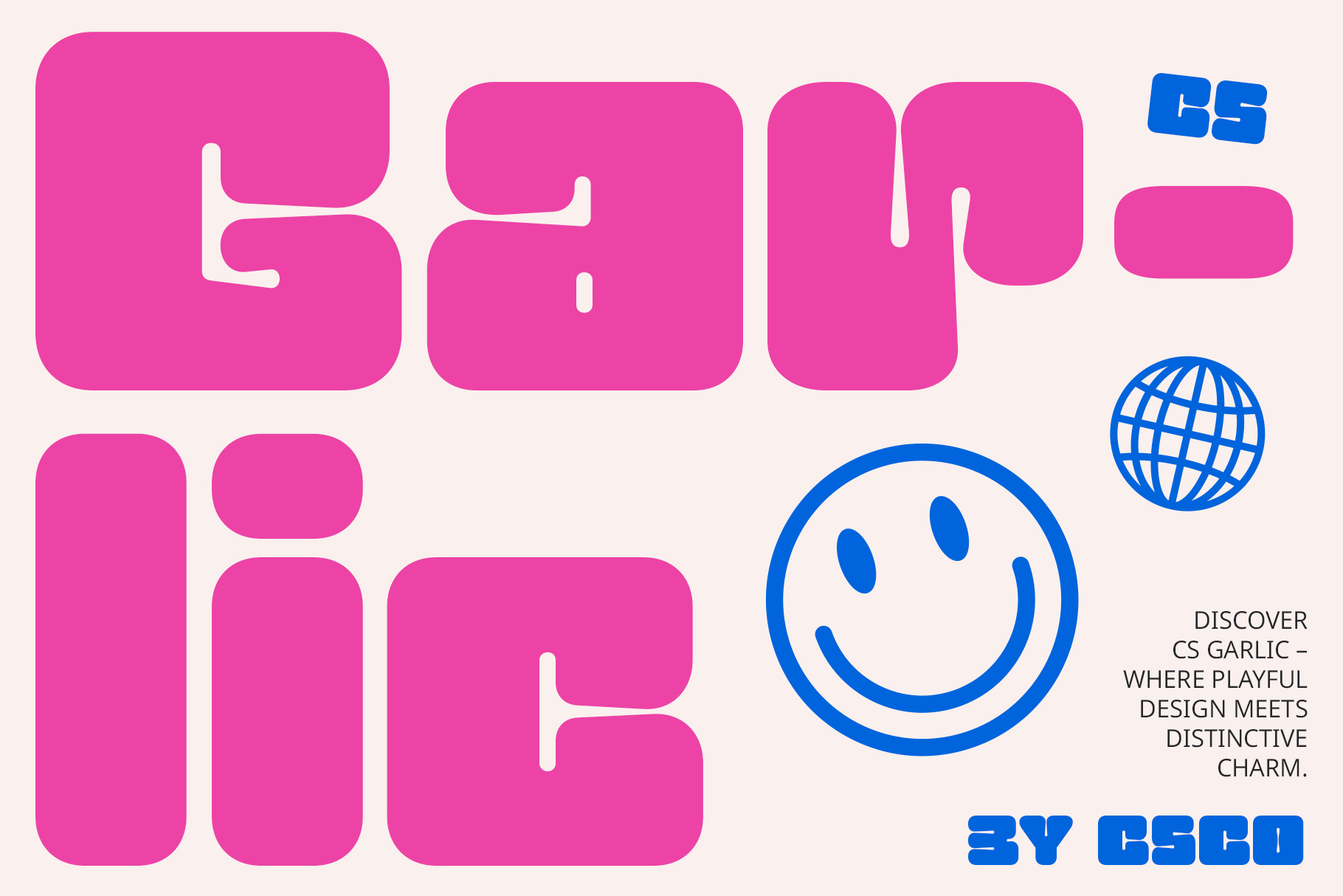
CS Garlic offers another rounded and playful direction. Bubble typography can make a brand name feel informal and welcoming, which suits food and hospitality branding particularly well. This font can work for restaurant logos, packaging, menus, merchandise, and social media graphics. Try pairing it with simple hand-drawn illustrations to develop a more tactile visual identity.
3. CS Macaron Bubble Font
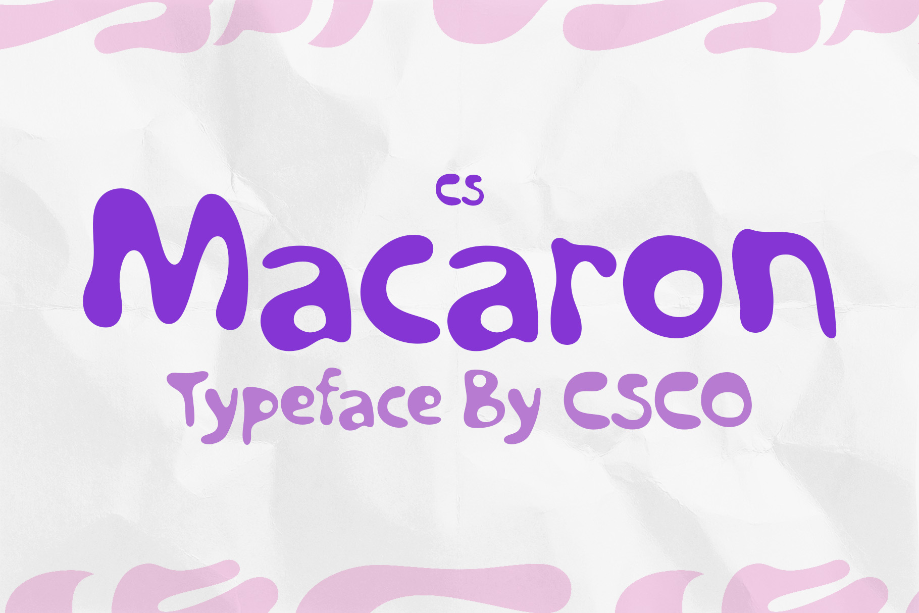
CS Macaron brings a soft and cheerful personality to display typography. Its bubble character can help create a logo that feels fun without relying on complicated graphic elements. Consider it for cafes, bakeries, dessert brands, lifestyle businesses, children’s projects, and creative restaurants. It can also provide a useful starting point when you want to explore rounded lettering with a contemporary feel.
4. Beonty Funky Bubble Display Font

Beonty takes the bubble concept in a more energetic and expressive direction. Its funky display character can help a brand name stand out in posters, signage, packaging, and digital graphics. Use it when you want typography to carry more personality. It can work particularly well for food brands, entertainment projects, youth-oriented businesses, events, and creative campaigns.
5. Balwine Bubble Font
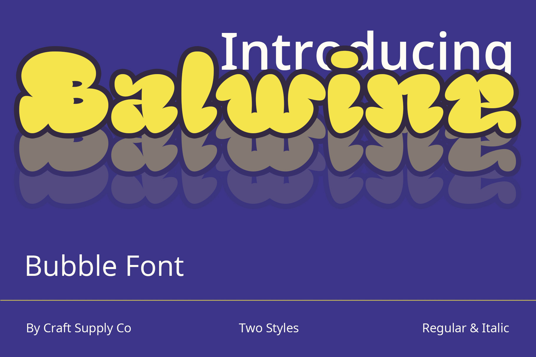
Balwine provides another playful alternative for designers interested in rounded display lettering. The bubble-inspired style can create a relaxed and friendly impression that works well for hospitality and lifestyle branding. Use it for a logo, menu heading, packaging title, or promotional graphic. Combining it with a simple body font can create the contrast needed for a complete identity system.
6. Urban Graffiti Font Busky
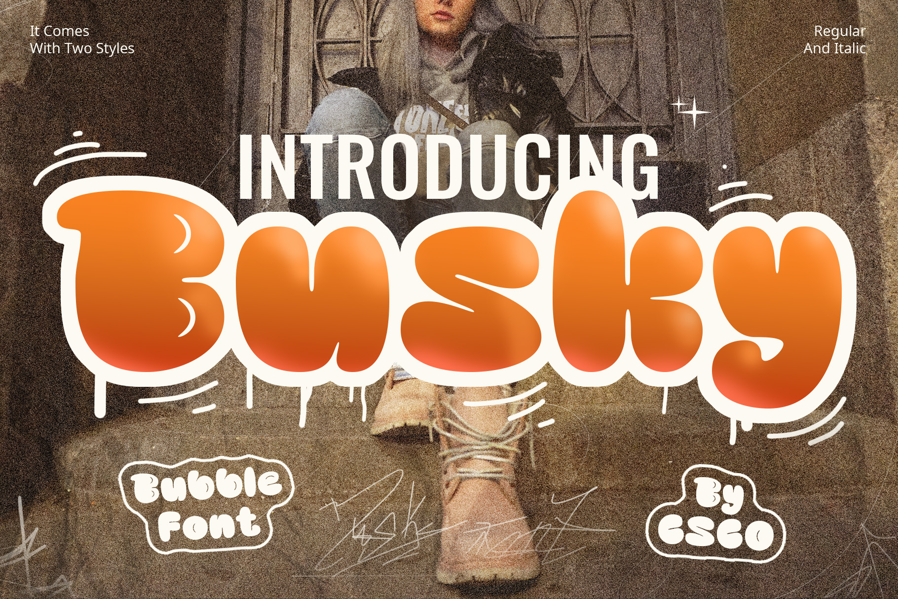
Urban Graffiti Font Busky introduces a more street-inspired visual language. This makes it useful for exploring the slanted, energetic side of LenLen’s typographic system rather than focusing only on bubble lettering. Try it for restaurants, streetwear, music projects, creative communities, posters, or food brands that want a stronger urban personality. Its expressive quality can work especially well with hand-drawn graphics.
7. Radey Bubble Font Playful Design

Radey Bubble offers a cheerful and approachable display style. Its rounded forms can help a logo feel friendly and informal, making it useful for restaurants, cafes, food packaging, lifestyle brands, and creative projects. If you are exploring a LenLen font alternative for a brand that wants a relaxed personality, this font can provide a useful starting point.
8. Cocana Bubble Font

Cocana provides another playful bubble direction for expressive branding. Its rounded display character can make short brand names visually prominent while maintaining a friendly tone. Use it for restaurant identities, children’s products, food and beverage projects, social media graphics, or merchandise. A clean secondary typeface can provide contrast when you need longer text or supporting information.
9. CS Mikey Drawn

CS Mikey Drawn is particularly useful when you want to emphasize the handmade quality of the LenLen identity. Drawn lettering can introduce imperfections that make a brand feel more personal and spontaneous. Use it for menus, packaging, posters, merchandise, restaurant signage, or creative campaigns. Pairing it with simple illustrations can reinforce the handmade visual language.
10. Radey Blur Font

Radey Blur takes the collection in a more experimental direction. A blurred typographic treatment can introduce movement and visual energy, making it useful for contemporary branding, posters, campaigns, music graphics, and digital content. It can also work as a secondary display style when you want certain parts of a brand system to feel more dynamic while keeping the primary wordmark clear.
How to Choose a LenLen Font Alternative
When choosing a LenLen typography alternatives, start by deciding which part of the identity interests you most. If you like the playful custom wordmark, explore bubble fonts such as CS Mikey, CS Garlic, CS Macaron, or Radey. If you prefer the energetic street-lettering influence, Urban Graffiti Font Busky can provide a different direction.
You should also consider the role the typeface will play. A decorative display font can work beautifully for a logo or headline, but it may not provide enough readability for long paragraphs. Create a typographic hierarchy by combining expressive display lettering with a simpler supporting font.
Test your chosen typeface using the actual brand name. Look at the overall silhouette, spacing, letter shapes, and readability. A font that looks appealing in a specimen can produce a very different result when used with specific letters.
Tips for Creating a LenLen-Inspired Typography System
Do not rely on one font for every situation. Instead, consider creating several LenLen typography alternatives voices. You might use a playful bubble font for the logo, a handwritten font for accents, and a clean sans serif for menus and longer text. This approach creates contrast while keeping the overall identity organized.
Embrace controlled imperfection. Hand-drawn typography can make a brand feel warmer and more human, but the imperfections should still support communication. Make sure important information remains easy to read.
Illustration can strengthen the typography. LenLen’s identity connects its lettering with loose illustrations inspired by everyday Thai life, including objects and food-related imagery. For your own project, develop a small collection of recurring visual motifs that can appear alongside your chosen fonts.
Finally, test the system across real applications. A logo may look excellent on a website but behave differently on a menu, package, sign, receipt, or social media post. Designing with these different contexts in mind will help you create a more flexible identity.
Explore More Typography Inspiration
If you want to explore more typography and branding ideas, visit Craft Supply Co on Behance. Looking through different bubble, drawn, graffiti, and display styles can help you discover new combinations for expressive logo and brand design.
LenLen shows how modern typography can move beyond polished minimalism and still create a clear, functional identity. Its custom bubble lettering, street-inspired marks, informal handwriting, and simple body typography work together to create a visual system that feels playful, personal, and connected to the restaurant’s cultural concept.
The 10 font alternatives in this article offer different ways to explore those qualities. Bubble fonts can provide friendliness and energy, graffiti styles can introduce an urban edge, drawn lettering can create a handmade feeling, and experimental fonts can add movement to supporting graphics.
The most useful lesson from LenLen is to think about typography as a system rather than a single font. Choose expressive lettering for the moments that need personality, pair it with readable typography for information, and maintain consistent visual relationships across your brand applications. This approach can help you create a modern identity that feels distinctive without sacrificing usability.