
The Calendly logo is a prime example of how simple typography and a recognizable visual identity can convey a modern digital brand image. Calendly is known for its meeting scheduling and coordination services, so its visual identity needs to reflect a sense of organization, friendliness, and clarity. The brand also applies its logo and identity elements throughout the scheduling experience, including on booking and event pages. An font alternatives for Calendly logo is required.
If you are researching the font alternatives for Calendly logo or looking for a similar typeface for your own branding project, geometric and modern sans serif fonts can provide a useful starting point. Clean letterforms can create a polished appearance while keeping the brand name easy to read across websites, social media profiles, presentations, and other digital applications.
This collection highlights 10 font alternatives for Calendly logo from Craft Supply Co. Each typeface offers a different interpretation of the clean, contemporary qualities that make sans serif typography useful for modern logo design. These fonts are not presented as the official Calendly typeface; instead, they can serve as creative alternatives when you want to explore a similar modern direction.
What Makes the Calendly Logo Style Work?
A strong technology logo often relies on clarity rather than unnecessary decoration. The Calendly brand operates in a digital environment where its visual identity appears alongside scheduling tools, booking pages, notifications, and other user-facing experiences. Calendly also allows users and organizations to customize branding, including adding their own logos to booking pages.
This makes typography particularly important. A logo needs to remain recognizable when it appears at different sizes and in different contexts. A clean sans serif can help achieve this because its straightforward letterforms remain readable without competing with the rest of the interface.
When exploring a font alternatives for Calendly logo, consider characteristics such as geometric construction, consistent stroke widths, rounded details, spacing, and overall simplicity. You can then adjust the tracking, weight, capitalization, and color to develop a distinctive identity instead of simply copying another brand.
10 Font Alternatives for a Calendly-Inspired Logo
1. Golane Geometric Sans Serif Font

Golane is a strong option for a clean and contemporary logo concept. Its geometric sans serif structure gives brand names a precise, organized appearance while maintaining a friendly digital character. Use it when you want a logo that feels modern without becoming overly technical. It can work particularly well for scheduling platforms, productivity tools, SaaS brands, consulting businesses, and other companies that want a polished visual identity.
2. CS Quipster Thin Geometric Sans Serif

CS Quipster Thin takes a lighter approach to geometric typography. Its thin construction can create an elegant and spacious logo, especially when paired with generous letter spacing. This style works well when you want your brand name to feel refined and lightweight. For a Calendly-inspired concept, try using this font in a minimalist wordmark with plenty of surrounding whitespace.
3. Napzer Geometry Sans Serif Font
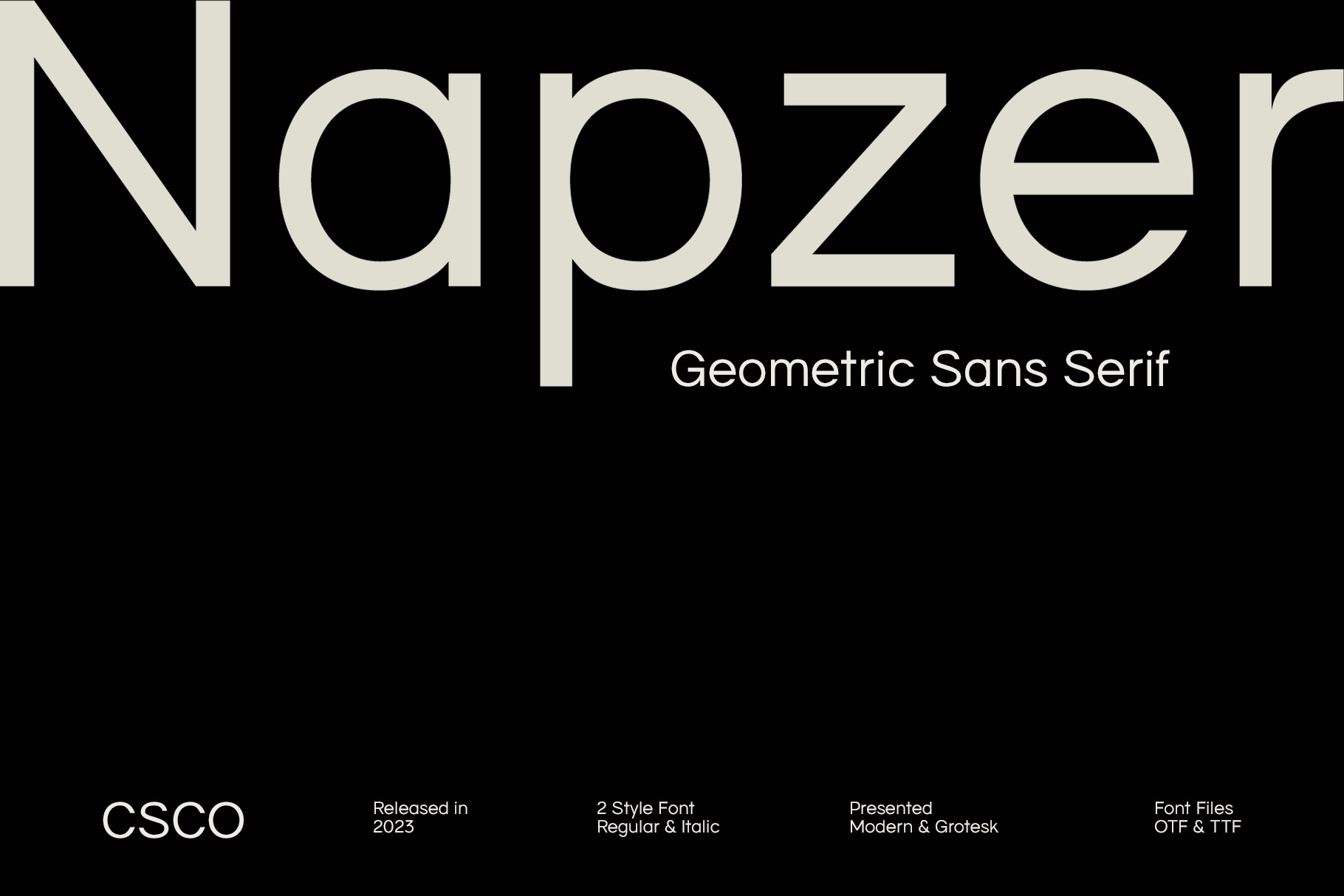
Napzer offers a geometric direction that suits modern branding projects. Its structured letterforms can give a logo a confident and professional appearance while preserving the simplicity expected from contemporary digital brands. Consider Napzer for technology companies, software products, startup identities, and service businesses that need a versatile wordmark.
4. CS Silvester Geometric Sans Serif

CS Silvester provides another geometric sans serif option for designers exploring a clean logo style. The structured character of this typeface can help create a memorable wordmark without relying on complicated graphics. Use it when you want the typography to become the main visual element of the logo. Adjusting the spacing can also help you create either a compact or more open composition.
5. Radeil Geometric Sans Serif Font

Radeil can bring a contemporary and professional tone to a logo design. Its geometric approach makes it suitable for brands that want a strong connection with modern technology and digital services. If you are developing a scheduling, productivity, communication, or business software brand, Radeil can help create a clean wordmark that remains easy to recognize across different applications.
6. CS Brando Modern Sans Serif
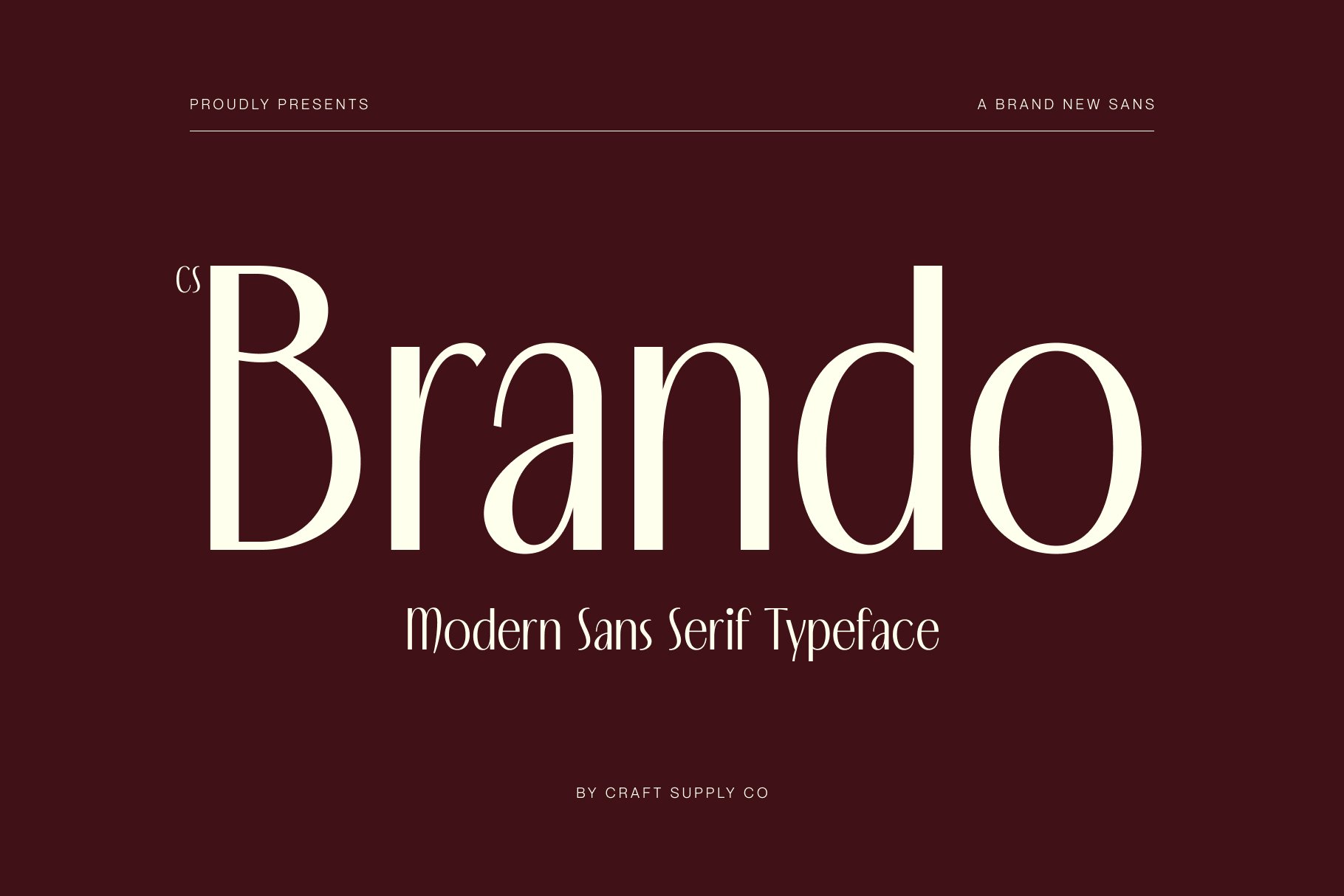
CS Brando offers a modern sans serif direction with a versatile personality. It can work well when you want a logo to feel contemporary but not overly geometric. The font can support a variety of brand identities, making it useful for companies that need a wordmark that works across websites, mobile interfaces, presentations, and marketing materials. Try pairing it with a simple icon for a balanced logo system.
7. Remond Retro Sans Serif Typeface
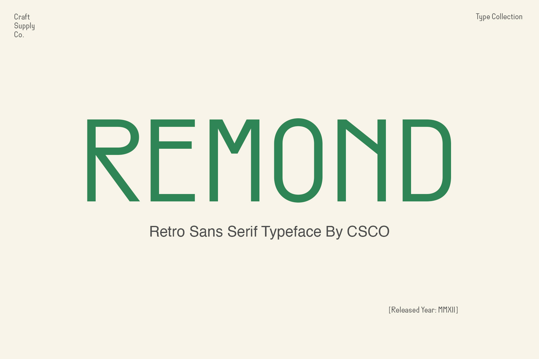
Remond introduces a different interpretation of sans serif typography by combining a clean foundation with retro-inspired character. This makes it useful if you like the simplicity of modern digital logos but want your own brand to have more personality. Instead of directly recreating the Calendly logo style, Remond can help you create a recognizable identity with a subtle nostalgic influence.
8. Lovnie Art Deco Font

Lovnie takes the concept in a more decorative direction. Its Art Deco influence can give a wordmark a sophisticated and distinctive personality. This is a useful alternative when you want to move away from the typical technology-logo appearance while still maintaining a structured typographic composition. Use it for lifestyle, hospitality, fashion, creative, or premium service brands that need a more expressive identity.
9. Golane Rounded Drawn Font
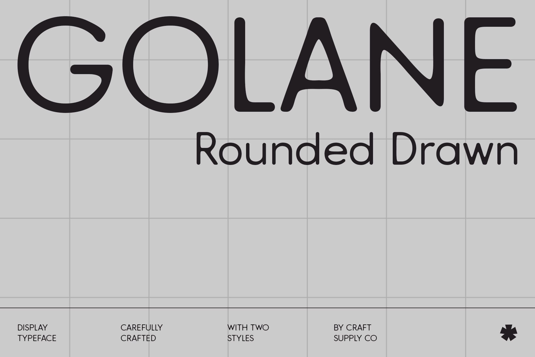
Golane Rounded Drawn can introduce a softer and more approachable quality to a logo. Rounded typography often works well for brands that want to communicate friendliness, accessibility, and simplicity. If you like the approachable side of modern scheduling and productivity brands, this font can provide a useful starting point for developing a warmer logo concept.
10. CS Harping Contemporary Font

CS Harping offers a contemporary alternative for designers who want something more distinctive than a standard geometric sans serif. Its modern character can help a wordmark stand apart while maintaining a professional appearance. Consider it for creative technology companies, digital services, agencies, and startups that want their logo to feel current without looking generic.
How to Choose a Calendly Logo Font Alternative
Choosing a font for a logo involves more than finding a typeface that looks similar to another brand. Start by identifying the personality you want your own brand to communicate. A geometric sans serif can suggest precision and modernity, while a rounded font can make the identity feel more approachable. A contemporary typeface can add personality without requiring a complex symbol.
Next, test your chosen font with the actual brand name. Some fonts look excellent in specimen previews but behave differently when used in a specific wordmark. Check the shape of important letters, the spacing between characters, and the overall width of the name. Try several weights and adjust tracking until the wordmark feels balanced.
It is also important to test the logo at multiple sizes. A logo should remain recognizable on a website header, social media profile, presentation, business card, and mobile screen. Calendly’s own platform demonstrates the importance of adaptable branding because logos can appear on scheduling and event pages.
Tips for Creating a Modern Scheduling or Technology Logo
Keep the visual system simple. A clean wordmark can often communicate more effectively than a logo packed with decorative details. If you use an icon, make sure it supports the brand name rather than competing with it.
Pay close attention to spacing. Proper kerning and tracking can dramatically change the appearance of a wordmark. Give the logo enough breathing room so that it remains clear when displayed beside interface elements or other branding.
Finally, create variations of your logo. A horizontal version can work well for website headers, while a compact symbol or monogram can work better for profile images and smaller digital applications. Maintaining consistent typography across these variations will help create a cohesive identity.
Explore More Font Inspiration
If you are developing a logo and want to explore more typography styles, browse the creative work from Craft Supply Co for additional font and design inspiration. Exploring different type categories can help you find a direction that fits your brand rather than limiting your design to one visual reference.
The Calendly logo provides a useful reference for understanding how a modern digital brand can use simple typography and a recognizable visual identity. However, your own logo should establish a distinctive personality rather than duplicate another company’s identity. The 10 font alternatives above give you several directions to explore, from geometric and minimalist styles to rounded, contemporary, retro, and decorative options.
Start with the personality of your brand, choose a typeface that supports that personality, and then refine the spacing, weight, proportions, and supporting graphics. With the right typography, even a simple wordmark can create a professional and memorable foundation for your visual identity.