
In a digital first world, typography plays an important role in how people recognize a brand and understand its message. A clean, modern typeface can make a technology company feel trustworthy, approachable, and easy to use. For brands working with QR codes, digital connections, and interactive experiences, utilizing a modern choice like the Uniqode font ensures typography needs to communicate innovation without sacrificing clarity
Uniqode font provides an interesting starting point for exploring this relationship between technology and visual identity. When a brand helps businesses connect physical touchpoints with digital destinations, its typography needs to work across websites, dashboards, QR code campaigns, marketing materials, and presentations. The right Uniqode font can support that experience by keeping communication consistent and making information easier to navigate.
If you want to explore a similar visual direction for your own project, this guide examines the typography considerations behind technology focused branding and introduces ten font alternatives from Craft Supply Co. From geometric sans serifs to futuristic display styles, these options offer different ways to create a contemporary identity.
Understanding Uniqode and Its Brand Direction
Uniqode operates in the QR code and digital connection space, where brands can use scannable codes to connect people with online content and experiences. This type of service requires a visual identity that communicates both technological capability and everyday usability. The design must feel modern enough to represent digital innovation while remaining approachable for businesses and their audiences.
Typography can help achieve this balance. Clean sans serif fonts often work well for technology brands because they support readable interfaces and straightforward communication. Geometric letterforms can introduce a contemporary, systematic quality, while carefully chosen display fonts help campaign headlines and brand messages stand out.
For a technology oriented identity, consistency also matters. A typeface used on a website should work alongside the typography on a presentation, promotional graphic, or printed QR code card. A well planned font system creates continuity across these different environments.
The Uniqode font recommendations in this article are independent alternatives for designers developing a Uniqode inspired visual direction. They are not claims about Uniqode’s official typeface, logo specifications, or proprietary brand guidelines.
Why Typography Matters for Technology Branding
Technology brands need typography that supports clear communication and establishes a recognizable personality. The right typeface can make a complex service feel easier to understand while helping the brand maintain a professional appearance across digital and physical applications.
- Clarity and readability: Legible letterforms help users navigate websites, dashboards, instructions, and product information.
- Trust and professionalism: Consistent typography can make a brand feel organized and dependable.
- Modern character: Geometric proportions, clean strokes, and contemporary details can reinforce an innovative image.
- Brand recognition: A distinctive headline font can help campaigns and promotional materials stand out.
- Cross platform consistency: A flexible typographic system can connect websites, presentations, advertisements, packaging, and printed materials.
When selecting a Uniqode font, consider the difference between a display typeface and a font intended for longer text. A futuristic or distorted font might make an excellent campaign headline, but a more restrained sans serif is often better for interface labels and explanatory copy. Assigning each typeface a clear role helps the entire identity feel cohesive.
10 Best Font Alternatives for a Uniqode Inspired Design
1. Golane Geometric Sans Serif Font

Golane Geometric Sans Serif Font is a strong option to explore when you want a modern, structured visual identity. Geometric sans serifs often use carefully balanced shapes and consistent proportions to create a clean, contemporary impression. These characteristics can suit technology brands that need to communicate efficiency, precision, and accessibility.
For a Uniqode inspired concept, consider using Golane for a wordmark, website headlines, or the main titles in a product presentation. Its geometric direction can help establish a consistent visual foundation while leaving room for QR code graphics, interface mockups, and supporting illustrations. A restrained palette and generous spacing can reinforce the clean aesthetic.
2. CS Melchior Contemporary Font

CS Melchior Contemporary Font offers another direction for designers seeking a contemporary look with a distinctive typographic character. A contemporary font can help a brand move beyond a generic technology aesthetic while retaining a polished and professional presentation. The key is to evaluate how its actual letterforms support the personality you want to communicate.
Use CS Melchior to explore headline treatments, brand statements, or promotional graphics for a digital service. A strong headline can introduce a campaign message, while a more restrained supporting typeface keeps the practical information easy to read. This contrast helps a design communicate innovation without making the entire composition feel overly decorative.
3. CS Felice Mono Rounded
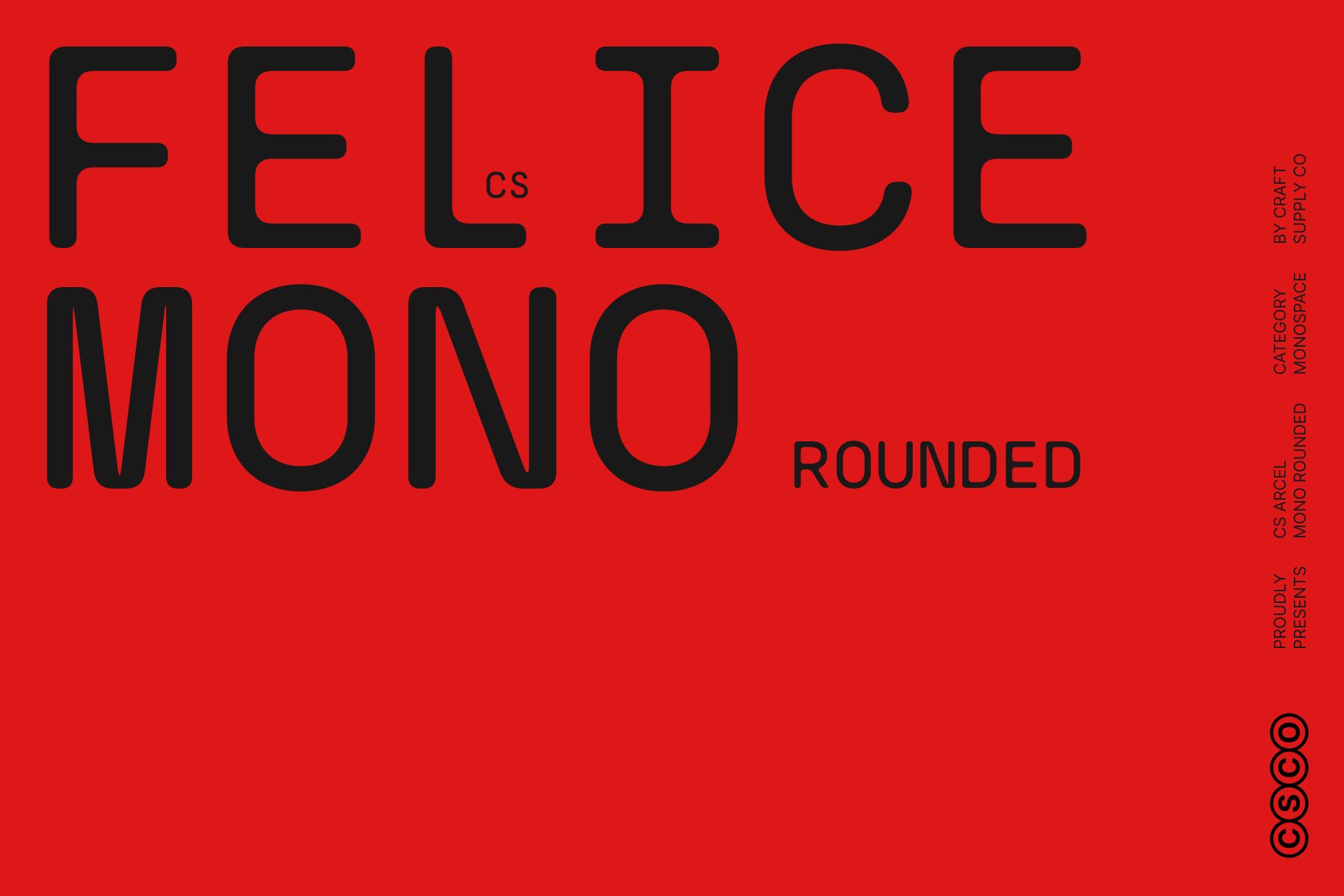
CS Felice Mono Rounded is an interesting alternative for projects that want to combine a technical visual reference with a softer, more approachable personality. Monospaced typography is commonly associated with coding, terminal interfaces, and technical information because each character occupies a consistent horizontal space. Rounded details can help balance that technical quality with a friendlier appearance.
This combination can work well in a Uniqode inspired design where digital functionality needs to feel accessible to a broad audience. Consider using CS Felice Mono Rounded for small labels, campaign details, numbered steps, or short technical annotations. Its monospaced character can introduce a subtle digital aesthetic without relying on obvious futuristic effects.
4. CS Melchior Stamp

CS Melchior Stamp introduces a more graphic and textured direction to this selection. Stamp inspired typography can create the impression of an imprint, mark, or label, giving a design a tangible quality that contrasts with the clean surfaces often associated with digital products. This makes it useful for projects that connect physical materials with online experiences.
For a Uniqode inspired campaign, consider using CS Melchior Stamp as an accent rather than the main interface font. It could highlight a promotional message on a printed QR code card, add character to a limited campaign, or introduce a distinctive label in a presentation. The texture can help printed collateral feel memorable while the rest of the design remains clean.
5. CS Oswald Modern Sans Serif

CS Oswald Modern Sans Serif is an option to investigate for projects that need a confident, contemporary typographic treatment. Modern sans serif fonts are versatile because they can support professional branding while still creating a strong visual presence in headlines and promotional materials.
In a Uniqode inspired design, consider using CS Oswald for campaign titles, presentation headings, landing page banners, or product feature statements. A bold headline can help communicate the value of a digital service quickly, especially when audiences encounter the message in a crowded advertising environment. Keep the supporting copy shorter and clearly organized so the main message remains easy to scan.
6. CS Merdian Elegant Sans Serif
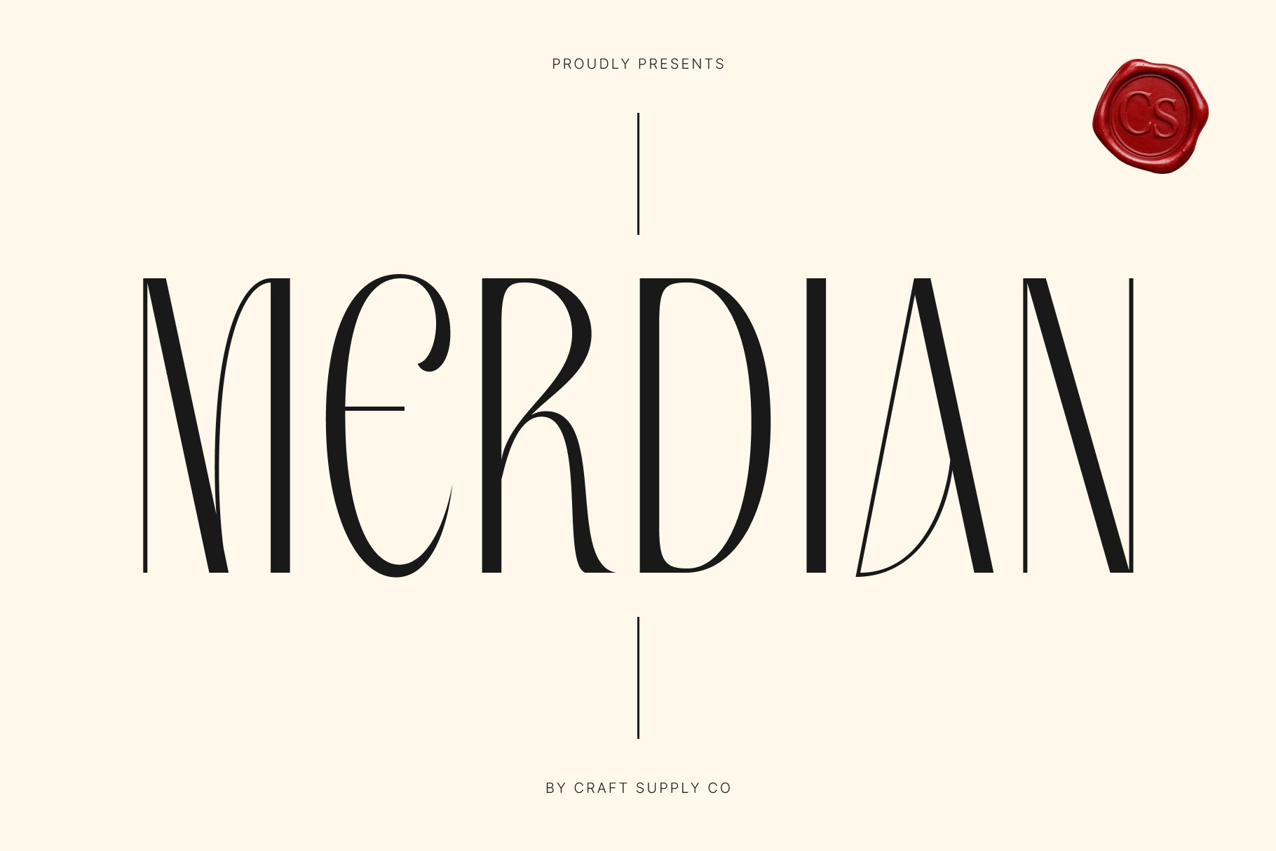
CS Merdian Elegant Sans Serif is worth exploring if your project needs a more refined approach to technology branding. Not every digital service needs to look aggressively futuristic. An elegant sans serif can communicate confidence and sophistication, making it useful for businesses that want to present technology as a seamless part of a premium customer experience.
Consider CS Merdian for brand presentations, website headlines, corporate communications, and campaign graphics. Its role in the design should depend on the font’s actual proportions and available styles, so test it with the words and phrases your brand will use most often. A well chosen elegant typeface can help balance technical subject matter with a polished visual tone.
7. CS Brasica Modern Sans Serif

CS Brasica Modern Sans Serif offers another potential foundation for a contemporary brand identity. A modern sans serif can be particularly useful when a company needs one recognizable typographic voice across marketing materials, digital products, and business communications. Its success depends on how its letterforms, spacing, and available weights align with the intended visual direction.
For a Uniqode inspired concept, test CS Brasica in a logo exploration, a website headline, and a product overview slide. Compare how it performs when paired with QR code imagery, interface screenshots, and simple geometric graphics. The typeface should provide enough character to feel distinctive while allowing functional content to remain the priority.
8. Rolide Distort
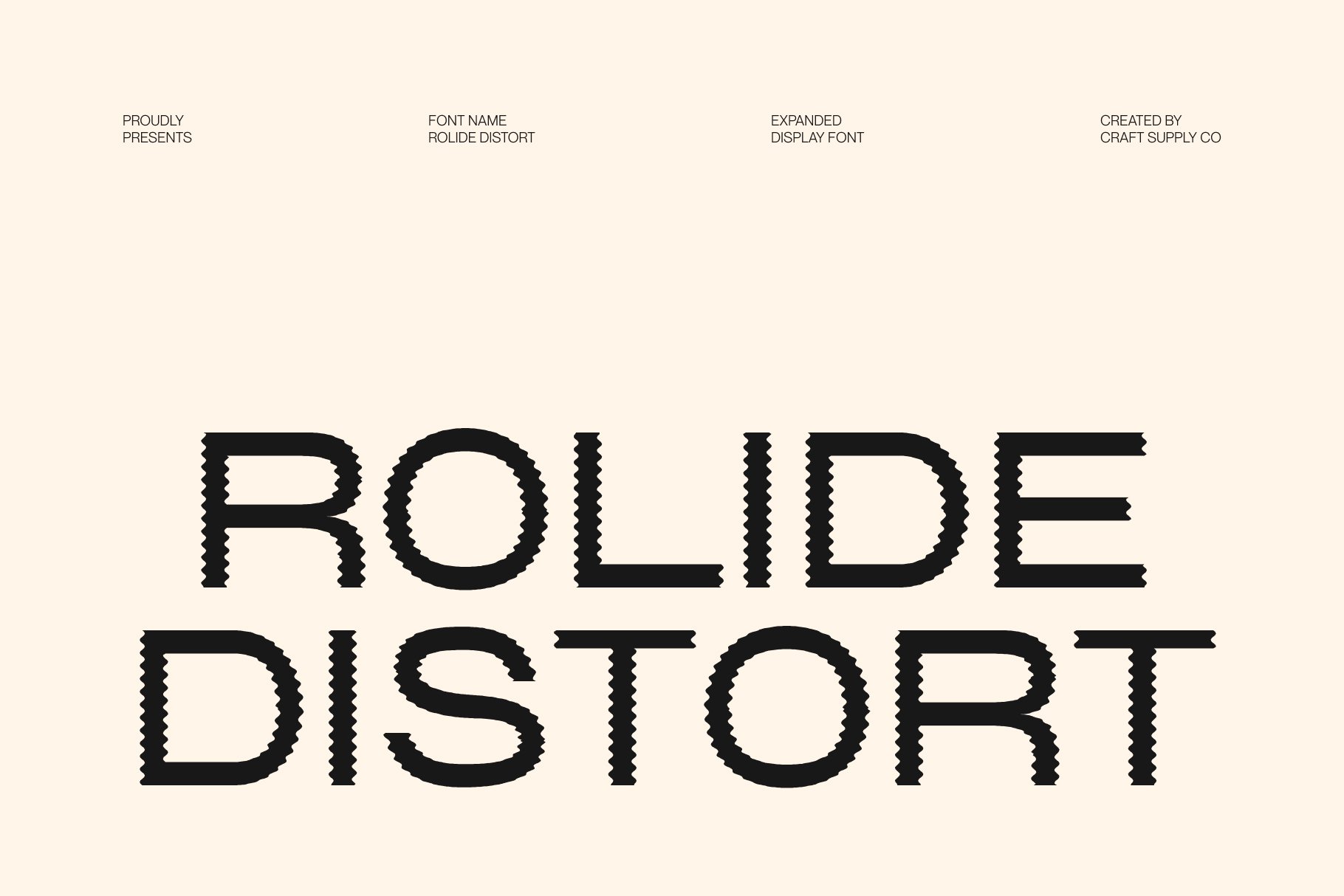
Rolide Distort offers a more experimental direction for designers who want to move beyond conventional technology branding. Distorted typography can create a sense of movement, disruption, and visual experimentation. It is often best suited to creative campaigns where attracting attention matters more than presenting large amounts of information.
In a Uniqode inspired visual concept, Rolide Distort could serve as a campaign headline or a graphic element in a launch announcement. Pair the expressive lettering with crisp QR code imagery, clean grids, and straightforward supporting text. The contrast between an experimental headline and an organized digital layout can create a memorable visual tension.
9. Agaline Font Futuristic Typography

Agaline Font Futuristic Typography is an option to explore for brands that want to emphasize innovation and forward looking ideas. Futuristic fonts can create a visual connection to emerging technology, digital experiences, and experimental design. They can also help a campaign stand out when a conventional sans serif does not communicate enough personality.
For a Uniqode inspired direction, consider using Agaline in a technology campaign, a presentation cover, or a landing page headline. Keep the layout relatively simple so the typeface remains the central feature. A monochromatic palette, precise alignment, and minimal geometric graphics can reinforce the futuristic impression without overwhelming the message.
10. CS Smash Drawn

CS Smash Drawn offers a more expressive alternative for designers who want to introduce a handmade or illustrative quality into a technology focused identity. Drawn typography can create a sense of spontaneity and human personality, providing contrast to the precise geometry of QR codes and digital interfaces.
Use CS Smash Drawn for selected campaign headlines, promotional messages, or special creative applications rather than relying on it for every brand touchpoint. A hand drawn typographic treatment can help a digital service feel more approachable, particularly when a campaign aims to communicate creativity or encourage users to explore a new feature.
How to Choose the Right Font Alternative
Each Uniqode font in this selection offers a different design direction. The best choice depends on your brand’s audience, communication needs, and visual goals. Before selecting a typeface, test it in real design applications rather than relying only on a font preview.
Define Your Brand Personality
Start by identifying three or four qualities that describe your intended identity. Words such as precise, approachable, innovative, premium, or experimental can help narrow your options. Geometric sans serifs may support a structured and modern direction, while futuristic or distorted fonts can make campaign graphics feel more expressive.
Separate Display Typography from Functional Text
Choose a display font for the moments when you need to attract attention, such as a logo, campaign headline, or presentation title. Use a readable supporting font for longer descriptions, website navigation, and instructions. This distinction is especially important for technology brands, where people must understand the service quickly.
Test the Font Across Different Touchpoints
Apply your shortlist to a website header, a QR code card, a mobile interface mockup, and a presentation slide. Check the font at different sizes and evaluate its performance on both light and dark backgrounds. A typeface that looks strong in a large headline may not work as well in a compact interface.
Build a Consistent Typographic System
Define rules for heading sizes, text weights, spacing, alignment, and supporting fonts. Consistent typography helps connect separate brand materials and makes future design work easier. Limit the number of typefaces unless the project has a clear reason to introduce additional styles.
Check Licensing and Technical Details
Before using a font commercially, review its license and confirm that it covers the intended applications. Check available weights, character support, file formats, and any restrictions that might affect web use, logos, or printed materials. These practical details help ensure that a visually appealing choice also works for the project.
Creating a Distinctive Technology Brand Identity
A successful technology identity needs more than a modern font. Typography works alongside color, imagery, spacing, and layout to shape the overall experience. For a brand connected to QR codes and digital interactions, a useful approach is to balance technical precision with approachable communication.
Start with a readable typographic foundation and introduce a more distinctive display font where it adds value. Use consistent spacing and a clear grid to organize information. QR codes already have a strong visual pattern, so surrounding elements should support the code rather than compete with it. Make sure the code itself remains scannable and that the contrast between the code and its background is sufficient.
For additional creative inspiration, explore the branding and typography projects on Craft Supply Co.. Study how typography interacts with layouts, graphic elements, and visual hierarchy, then adapt those principles to your own design requirements.