
The Times New Roman font is one of the most recognizable serif typefaces in the world. Known for its traditional letterforms, compact proportions, and professional appearance, it has long been associated with academic papers, formal documents, books, and editorial layouts. Its familiar style makes it a dependable choice when readability and a classic typographic look matter.
However, Times New Roman font is not the only option for projects that need traditional serif lettering. Designers can explore other serif fonts that offer a similar sense of sophistication while introducing different proportions, contrasts, and visual personalities. Some alternatives feel more editorial and refined, while others bring a contemporary touch to the familiar serif aesthetic.
Whether you are developing a brand identity, designing a magazine, creating invitations, or choosing typography for a website, the right alternative can help your project stand out. This guide introduces 10 times new roman font from Craft Supply Co that offer creative directions for designs inspired by the classic appeal of Times New Roman.
What Makes the Times New Roman Font So Popular?
Times New Roman font is a classic serif typeface recognized for its formal appearance and efficient use of space. Its serifs provide a traditional visual structure, while its relatively compact design makes it practical for text heavy documents. These characteristics have helped establish its reputation in academic, professional, and publishing environments.
Serif fonts are also popular in editorial design because they can communicate tradition, authority, and sophistication. Their distinctive letterforms create a recognizable texture across paragraphs, making them useful for books, magazines, reports, and long form reading experiences.
Despite these strengths, designers sometimes want a different typographic personality. A modern serif may offer a more contemporary appearance, while an elegant or nostalgic serif can create a more distinctive atmosphere. Choosing an alternative depends on the project’s purpose, audience, and visual direction. For more typography inspiration and creative type projects, explore Craft Supply Co on Behance.
10 Times New Roman Font Alternatives to Explore
1. Matina Typeface
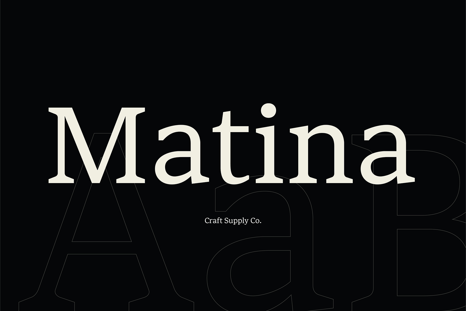
Matina Typeface is an option to explore when you want a serif alternative that can bring a distinctive personality to your typography. While Times New Roman is closely associated with traditional documents and familiar text layouts, experimenting with another typeface can help a design develop its own visual identity.
Consider Matina for editorial headlines, brand identities, invitations, packaging, and promotional materials. It can serve as a starting point for projects that need a classic typographic foundation without relying on the same familiar appearance. Test it with your intended words and compare its overall character with Times New Roman before deciding which style fits your project best.
2. CS Canile Elegant Serif Typeface

CS Canile Elegant Serif Typeface is a promising alternative for projects that call for a refined serif aesthetic. Elegant serif fonts can create a sense of sophistication while maintaining the traditional visual qualities associated with serif lettering. This makes them useful when you want a design to feel more distinctive than a standard document layout.
Explore this typeface for luxury inspired branding, beauty packaging, editorial covers, invitations, and business stationery. It can help establish a polished typographic identity when paired with generous spacing and a restrained color palette. For supporting text, choose a readable font that complements the serif rather than competing with its character.
3. Risley Classic Editorial Font

Risley Classic Editorial Font is worth considering for designs influenced by books, magazines, and traditional publishing. Editorial typography often balances readability with a strong visual identity, making it suitable for projects that need both structure and character. This direction can appeal to designers who appreciate the familiarity of Times New Roman but want a more intentional editorial presentation.
Use Risley for magazine layouts, article headlines, book covers, brand storytelling, and print publications. It can help create a cohesive visual language across titles and supporting design elements. When using it for long form text, test paragraph spacing, line length, and font size to ensure a comfortable reading experience.
4. CS Kineta Modern Serif Font
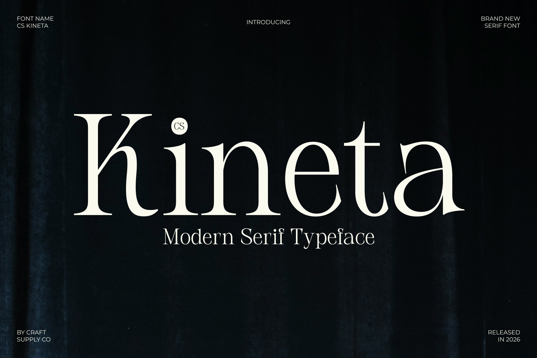
CS Kineta Modern Serif Font offers a direction for designers who want to move beyond a purely traditional typographic style. Modern serif fonts can retain the sophistication of serif lettering while presenting a fresher visual identity. They are useful for projects that combine established design conventions with contemporary branding or editorial layouts.
Consider CS Kineta for website headings, creative portfolios, fashion branding, magazine covers, and promotional graphics. It can provide a distinctive alternative when Times New Roman font feels too familiar for the intended design. Pair it with a clean sans-serif font to create contrast between expressive headings and straightforward supporting information.
5. Quenza Modern Elegance Font
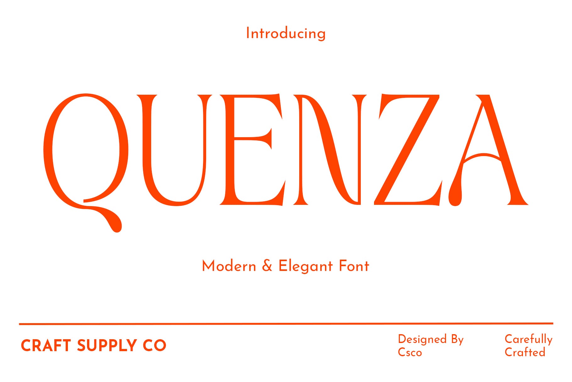
Quenza Modern Elegance Font is an option for projects that need a sophisticated typographic direction with a contemporary feel. Elegant serif lettering can make a brand appear polished and considered, while modern styling helps prevent the design from feeling overly traditional. This combination can be useful when you want to preserve a sense of formality without reproducing the look of a standard document.
Explore Quenza for premium product packaging, event invitations, editorial design, fashion related graphics, and brand identities. It can also work for large display text where the typeface has room to express its visual character. Keep supporting elements simple and use consistent spacing to create a balanced, professional composition.
6. Amaris Nostalgic Serif

Amaris Nostalgic Serif is worth exploring when you want typography that evokes a sense of history or familiarity. Nostalgic serif styles can help create a visual connection to print traditions, vintage publications, and heritage inspired design. This makes them an interesting alternative for projects that appreciate the classic qualities of Times New Roman but need a more distinctive mood.
Consider using Amaris for vintage inspired branding, book covers, packaging, editorial layouts, and stationery. It can support designs that combine traditional references with modern composition techniques. Try pairing it with muted colors, simple illustrations, or carefully selected textures to strengthen the nostalgic direction without overwhelming the lettering.
7. Chilia Stylish Serif Font

Chilia Stylish Serif Font provides another option for designers who want to explore serif typography beyond the conventional appearance of Times New Roman. Stylish serif fonts can help create a more expressive design while retaining the structural qualities that make serif lettering recognizable.
Use Chilia for branding, editorial headlines, posters, invitations, and creative portfolio projects. It can be particularly useful when a title needs to attract attention while maintaining a sophisticated tone. For a cohesive result, choose complementary colors and avoid combining too many competing display fonts in the same layout.
8. Riffle Font Family
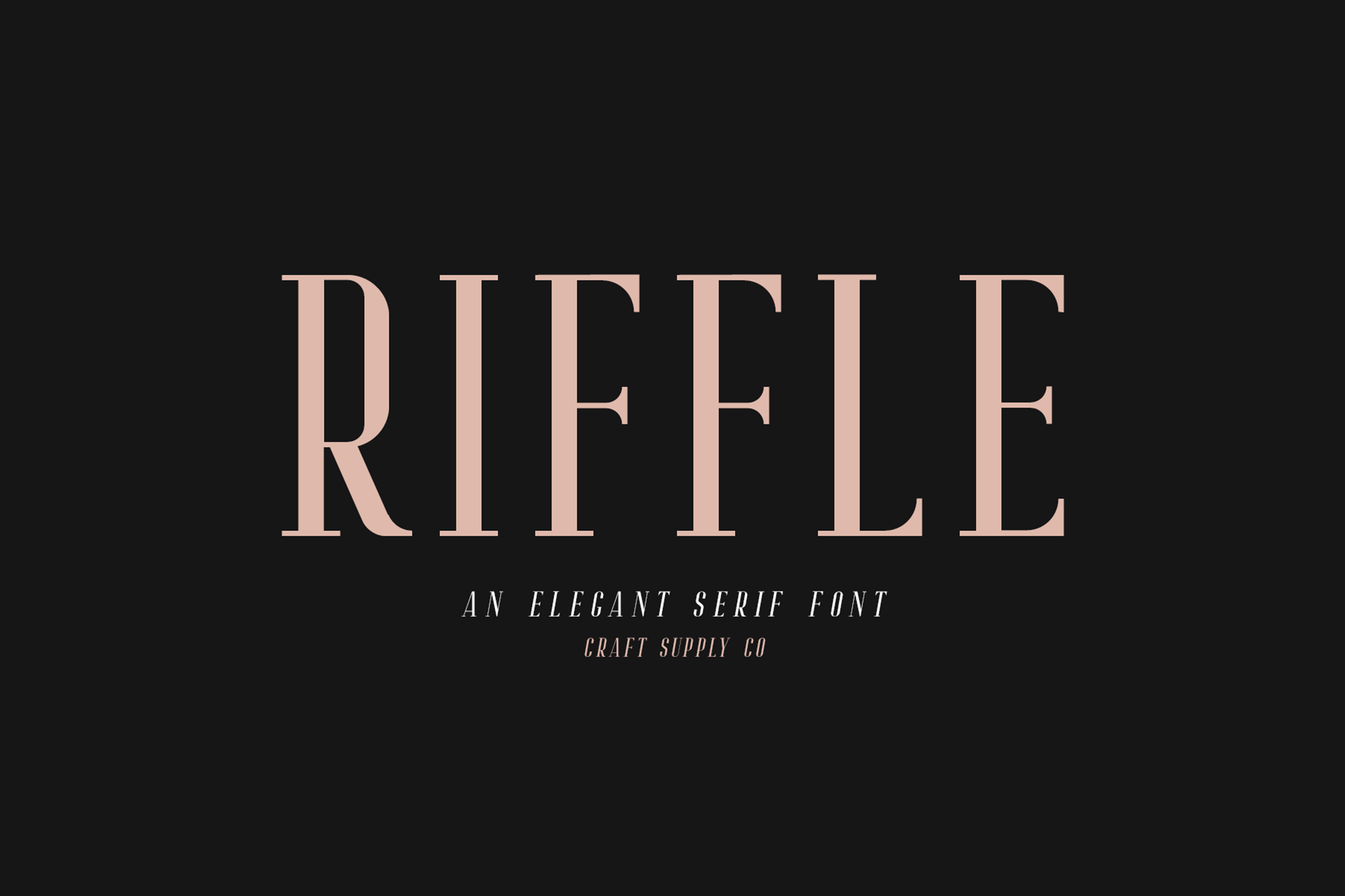
Riffle Font Family is an option to investigate when your project requires a more flexible typographic system. A font family can offer useful consistency across different text roles, depending on the styles included. This can make it easier to build a hierarchy between headlines, subheadings, captions, and supporting copy.
Consider Riffle for publication layouts, brand guidelines, websites, presentation materials, and other projects that use typography across multiple formats. When evaluating it as a Times New Roman alternative, examine the available styles and compare their readability with your existing text. A coordinated family can help keep a design consistent while allowing different sections to have their own emphasis.
9. Aguero Serif Clean Elegant Font

Aguero Serif Clean Elegant Font is worth considering for projects that call for a refined and uncluttered serif style. Clean typography can help a design feel organized and professional, while elegant serif details preserve a sense of sophistication. This makes it a useful direction for designers who want a polished alternative to a familiar classic font.
Explore Aguero for professional branding, business stationery, editorial headings, product packaging, and website typography. It can provide a clear visual foundation for layouts that need to balance elegance with simplicity. Test the typeface in both large and small sizes to determine where it performs best within your design system.
10. Eugerie Classic Modern Typeface
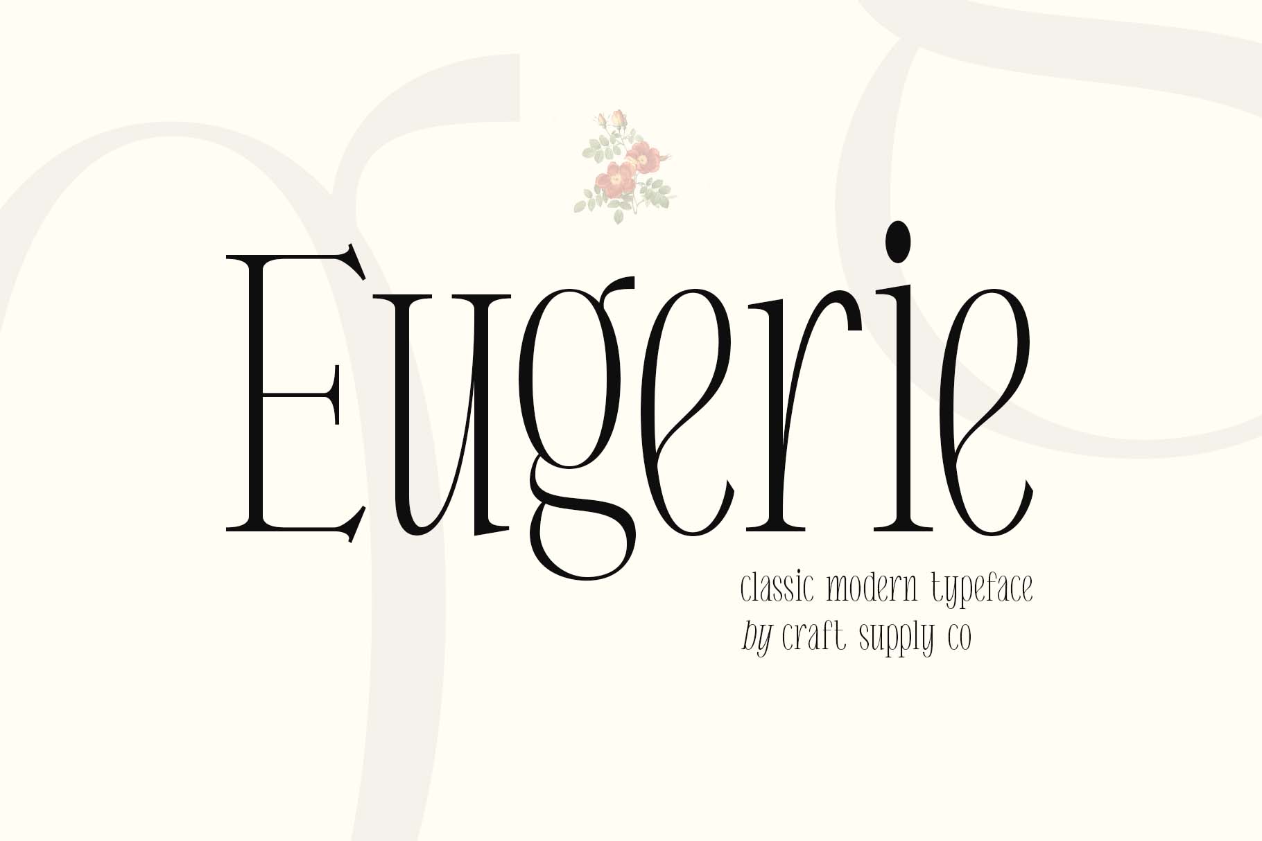
Eugerie Classic Modern Typeface is an option for projects that combine traditional typographic references with a contemporary visual direction. This balance can be useful when you appreciate the established character of Times New Roman but want a design that feels more current and distinctive.
Consider Eugerie for editorial branding, book covers, professional presentations, website headings, and print collateral. It can help create continuity between classic and modern design elements. Use a restrained layout and carefully selected supporting fonts to give the typeface room to establish the project’s visual identity.
How to Choose the Right Times New Roman Alternative
Begin by identifying the purpose of your project. If you are designing a long report or an article heavy publication, readability should be a priority. If you are creating a logo, packaging design, or editorial cover, the typeface’s personality and visual impact may carry more weight.
Next, consider the mood you want to communicate. Classic editorial styles can preserve a traditional publishing atmosphere, while modern serifs can give your project a contemporary edge. Elegant typefaces may suit premium branding, and nostalgic styles can reinforce heritage inspired concepts. Choose an alternative that supports the message rather than simply replacing one font with another.
Finally, test your chosen typeface in its actual application. Compare the letterforms, spacing, paragraph texture, and readability. A font that looks impressive in a headline may behave differently in a dense block of text. Reviewing these details helps ensure that your choice works both visually and practically.
Tips for Pairing Serif Fonts
- Pair serif headings with sans serif body text: This combination can create contrast and improve visual hierarchy in websites, presentations, and promotional materials.
- Keep long form text readable: Choose a comfortable font size, line height, and line length for articles and documents.
- Use display styles selectively: More expressive serif fonts can work well for headlines, while simpler styles may suit paragraphs and captions.
- Maintain consistent spacing: Pay attention to margins, line spacing, and letter spacing to create a polished layout.
- Consider the project context: A font for a formal report may need different qualities from one used for a fashion campaign or product label.
- Check licensing: Review each font’s license and usage terms before using it in commercial work or distributing a finished design.
Common Mistakes to Avoid
One common mistake is assuming that every serif font will behave like Times New Roman font. Serif typefaces can differ significantly in proportions, contrast, spacing, and overall personality. Always test a candidate with your actual content instead of judging it only by its category or name.
Another mistake is selecting a decorative display font for long paragraphs without checking readability. Some typefaces work best in short headlines and prominent text, while others may be more suitable for extended reading. Use the font according to its strengths and consider pairing it with a complementary typeface when necessary.
It is also important to avoid inconsistent typography across related materials. If a brand uses several unrelated serif fonts across its website, packaging, and printed collateral, its visual identity can feel fragmented. Establish a clear typographic system and apply it consistently.
The 10 options in this guide from Craft Supply Co provide several directions to explore, whether you are developing a brand identity, designing a publication, creating invitations, or refreshing your visual presentation. Compare each typeface in context, prioritize readability where it matters, and choose a style that supports your creative goals.
For more typography inspiration and creative design references, visit Craft Supply Co on Behance. With the right serif typeface and a thoughtful layout, you can create designs that feel distinctive while preserving the timeless appeal of classic typography.